Table of Contents
By ERYLIN — Home Décor & Interior Styling
There is something quietly thrilling about a living room that refuses to follow a single rulebook. Warm terracotta beside a deep indigo cushion. A brass lamp glowing over a hand-knotted rug in sage and rust. An eclectic living room doesn’t just hold furniture — it holds a life.
But color is the thread that either ties that life together or unravels it. Without intention, even the most beautiful collected pieces can feel jarring, restless, or just too much. That’s where color psychology comes in — not as a rigid formula, but as a compass.
At ERYLIN, we believe eclectic design is one of the most personal and emotionally resonant styles you can live in. And the best eclectic rooms don’t happen by accident. They happen when you understand how color feels, not just how it looks.
This guide will walk you through exactly how to build an eclectic living room palette that feels intentional, layered, and deeply liveable — from undertones and lighting to the 60-30-10 rule applied specifically to mixed-style spaces.
What Is Eclectic Living Room Color Psychology?
Color psychology is the study of how hues affect human mood, behavior, and perception. In interior design, it shapes how energized or calm you feel in a room, how large or intimate a space seems, and how connected you feel to your surroundings.
In an eclectic living room, color psychology becomes even more important — because you’re already layering patterns, eras, and materials. Without a thoughtful color strategy, the room speaks too many languages at once. With one, all those different voices find a common melody.
Why Eclectic Rooms Need Extra Color Intention
In a minimalist or Scandinavian room, a single neutral palette does the heavy lifting. In eclectic spaces, color has to anchor the visual variety without flattening it.
Think of it this way: the color palette is the grammar of your eclectic room. Mixed furniture and textures are the vocabulary. When the grammar is clear, the room reads as curated and collected. When it’s absent, it reads as cluttered.
The Mood You Want to Live In: Choosing Your Emotional Starting Point
Before you pick a single swatch, ask yourself one question: How do you want to feel in this room?
This is the foundational step that most color guides skip. Your living room isn’t a showroom — it’s a space you return to every evening, where you rest, gather, and exhale. The colors you choose will shape that experience daily.
Warm Tones for Energy and Welcome
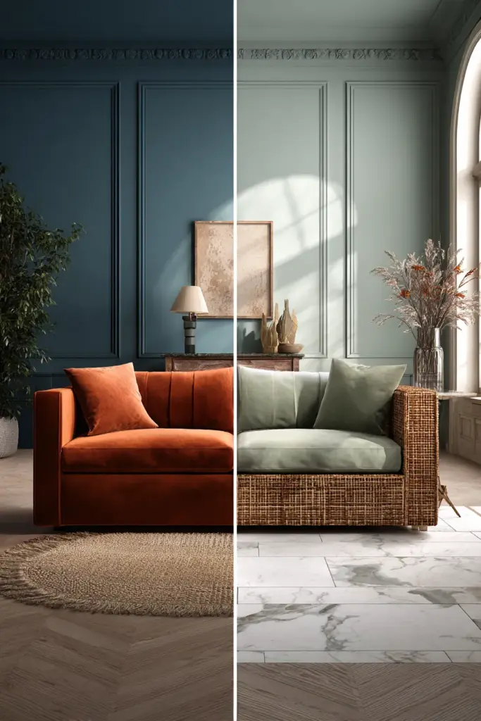
Warm colors — terracotta, amber, rust, dusty rose, ochre, warm cream — stimulate social energy and a sense of welcome. They make a room feel lived-in and generous.
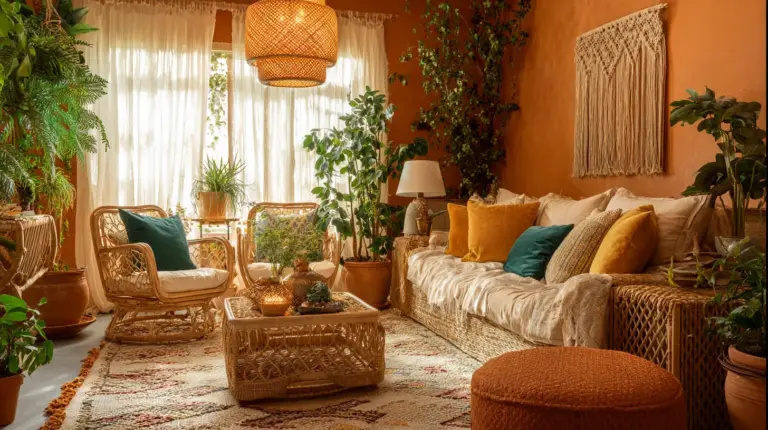
In an eclectic room, warm tones work beautifully as the dominant palette layer. Picture aged clay walls, a vintage velvet sofa in deep rust, rattan side tables, and linen curtains in warm sand. Every piece has a different origin, but the warmth of their undertones creates a quiet agreement.
Best for: Social living rooms, open-plan spaces, rooms with north-facing light that need warmth added.
Cool Tones for Calm and Depth
Cool colors — dusty blue, sage green, slate, soft teal, lavender, chalky white — evoke serenity, spaciousness, and a sense of considered rest. They give eclectic rooms a grounding quality that prevents visual overload.
A room anchored in sage green, for example, can hold a mix of mid-century modern chairs, Moroccan textiles, and contemporary art without feeling busy. The cool, earthy green acts as visual oxygen.
Best for: Rooms used for reading, unwinding, or introspection. Also ideal for south-facing rooms that receive intense afternoon light.
Moody Tones for Drama and Intimacy
Deep colors — forest green, charcoal, navy, plum, rich brown — bring drama, intimacy, and a sense of layered luxury. They make eclectic rooms feel like they’ve been assembled over decades, not styled in an afternoon.
These deeper shades work best as wall colors in rooms with strong natural light, or as accent layers — a deeply upholstered armchair, a velvet curtain panel, a dark-stained bookshelf.
Best for: Rooms with high ceilings, ample natural light, or spaces that host evening gatherings.
Understanding Undertones: The Hidden Language of Eclectic Color
Most people choose a color and miss the undertone — and that’s often why a palette that looked perfect on a swatch card feels wrong on the wall.
Every color has an undertone: a subtle hue beneath the surface that influences how it reads in context.
| Color | Warm Undertone | Cool Undertone | Effect in Eclectic Rooms |
|---|---|---|---|
| Beige | Peach or yellow | Pink or gray | Warm beige feels cozy; cool beige can feel stark |
| Gray | Yellow or green | Blue or purple | Warm gray harmonizes with wood tones; cool gray pairs with steel and marble |
| Green | Olive, khaki | Mint, teal | Earthy green grounds a boho room; cool green adds a modern edge |
| White | Cream, ivory | Bright, icy | Warm white feels layered; bright white can feel clinical in eclectic spaces |
| Terracotta | Deep red-orange | Pinker tones | Red-orange terracotta anchors warm palettes beautifully |
In an eclectic living room, the most important rule is: keep your undertones consistent, even when your colors vary widely. A dusty blue, a terracotta, and a warm cream can coexist harmoniously if they all carry warm undertones. The same three colors with mismatched undertones will vibrate uncomfortably.
The 60-30-10 Rule for Eclectic Living Rooms
The 60-30-10 rule is a classic palette formula, but in eclectic spaces it requires a more nuanced application. Here’s how to use it intentionally.
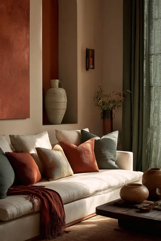
60%: Your Dominant Color
This is the color that sets the emotional tone of the room. It usually appears on walls, large upholstered furniture, or flooring.
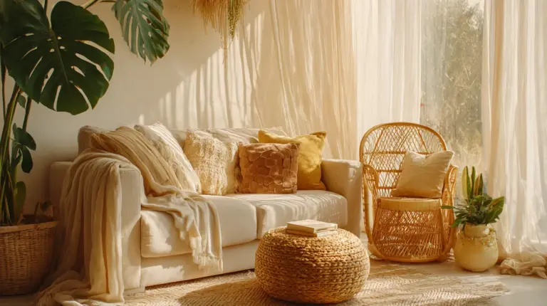
Example: Warm linen walls in aged cream. A large sectional sofa in soft camel. A sisal rug that carries the same warm-neutral base.
The 60% should feel like the room is exhaling. It’s the quiet space your eye returns to.
30%: Your Supporting Color
This adds depth, contrast, and visual rhythm without competing with your dominant tone. It typically appears on secondary seating, curtains, bookshelves, or a feature wall.
Example: Deep sage green curtains that pool slightly on the floor. An accent armchair in dusty teal velvet. Painted shelving in a warm forest green.
The 30% introduces a second emotional note — in this case, calm and grounding — that complements the warmth of the 60%.
10%: Your Accent Color
This is where your eclectic personality speaks most loudly. Accent colors appear in cushions, artwork, ceramics, candles, books, and small decorative objects.
Example: Terracotta throw cushions. A brass and amber glass vase. A vintage print with rust-orange tones. A single deep plum candle on the coffee table.
The 10% is intentionally small — but it’s what makes the room feel collected rather than coordinated. It’s the detail that guests notice and remember.
How Light Changes Everything: Natural vs. Artificial
Lighting is the single most underestimated factor in eclectic color decisions. A palette that looks grounded and warm in daylight can turn flat and muddy under cold LEDs.
Natural Light Direction
- North-facing rooms receive cool, indirect light all day. Warm undertones in paint and textiles counterbalance this. Avoid cool whites and pale blues, which will look icy.
- South-facing rooms receive warm, direct light for most of the day. Both warm and cool palettes work, but be cautious with very dark colors — they may feel oppressive by midday.
- East-facing rooms are warm in the morning, cool in the afternoon. Choose colors that feel intentional in both conditions, typically soft neutrals with earthy undertones.
- West-facing rooms glow beautifully in the evening. Deep, moody palettes come alive at dusk, making these rooms ideal for rich color choices.
Artificial Light and Eclectic Ambience
Warm-toned bulbs (2700K–3000K) enhance the richness of terracotta, amber, olive, and deep wood tones — making them the natural partner for cozy furniture and layered textiles.
Cool white bulbs (4000K and above) flatten warm eclectic palettes and can make natural wood look yellow or dull. Reserve them for task lighting in kitchens and workspaces, not living rooms.
ERYLIN tip: Layer your lighting — floor lamps, table lamps, candles, and pendant lights — rather than relying on a single overhead source. Multiple warm light sources at different heights create the kind of atmospheric depth that eclectic rooms deserve.
Small-Room Color Strategy: Eclectic Without the Overwhelm
A small eclectic living room presents a genuine challenge: you want layered personality, but you don’t want the room to feel crowded or chaotic. Color is your most powerful tool for managing this.
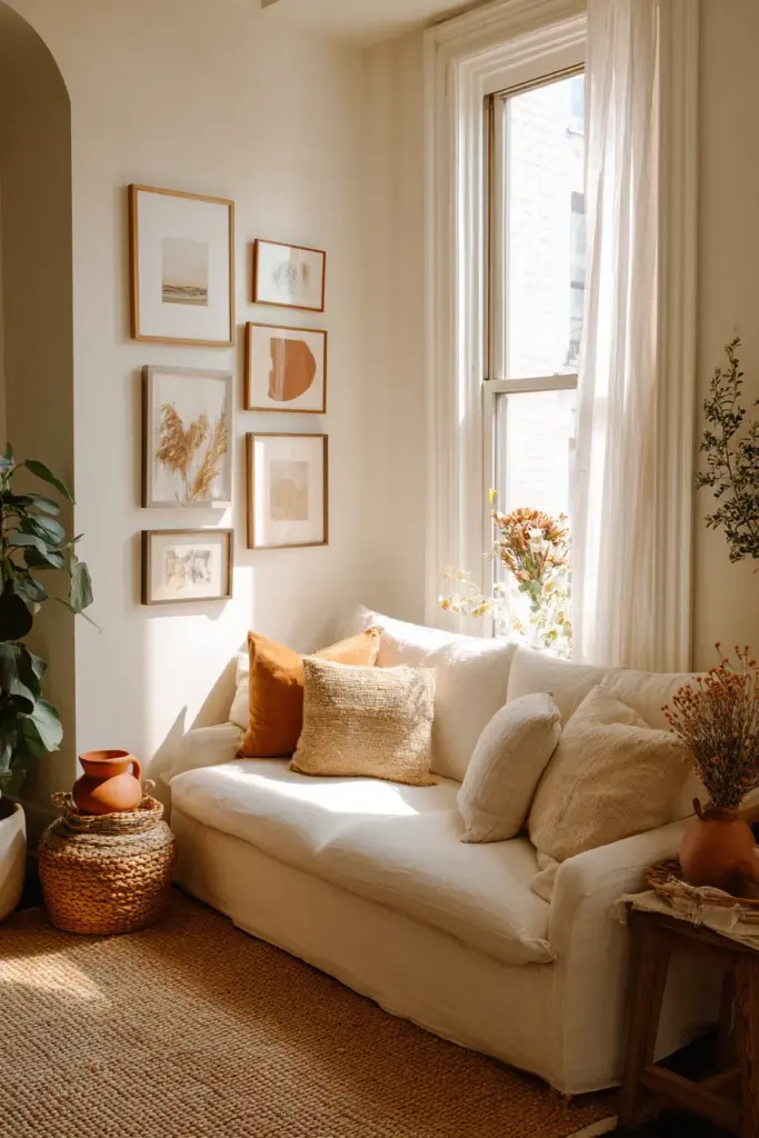
Do Light Colors Make a Room Look Bigger?
Yes — but the effect is about value, not just hue. Light colors reflect more light, which reduces shadow and makes walls appear to recede. In a small eclectic room, keeping your 60% layer light (warm cream, soft sage, dusty blush) creates breathing room for your layered 10% accents to register clearly.
Small Room Palette Formulas
Option 1: Warm Neutral Base with Deep Accents
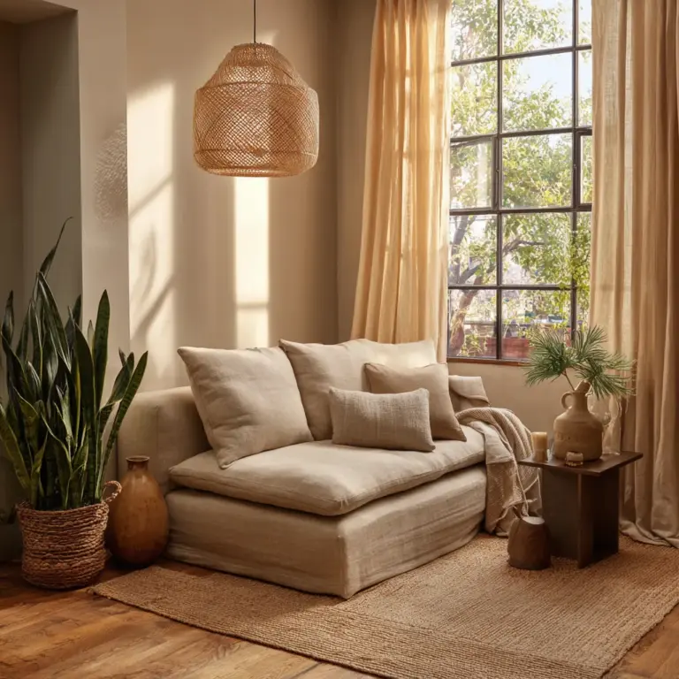
Walls in aged linen. Sofa in warm cream boucle. Rug in natural jute. Accents in deep terracotta and antique brass. The light base keeps the room open; the deep accents give it substance.
Option 2: Soft Sage with Earthy Warmth
Walls in chalky sage green. Sofa in natural flax linen. Cushions in warm rust and dusty pink. Accents in rattan and matte ceramic. Cool and grounding, but still full of personality.
Option 3: All-Warm Tonal Layering
Walls in warm white with a yellow undertone. Sofa in terracotta velvet. Rug in rust, ochre, and cream. Accents in antique gold and raw linen. All one warm family — but varied in depth and texture so it never reads as flat.
Material Psychology: Color Is Only Half the Story
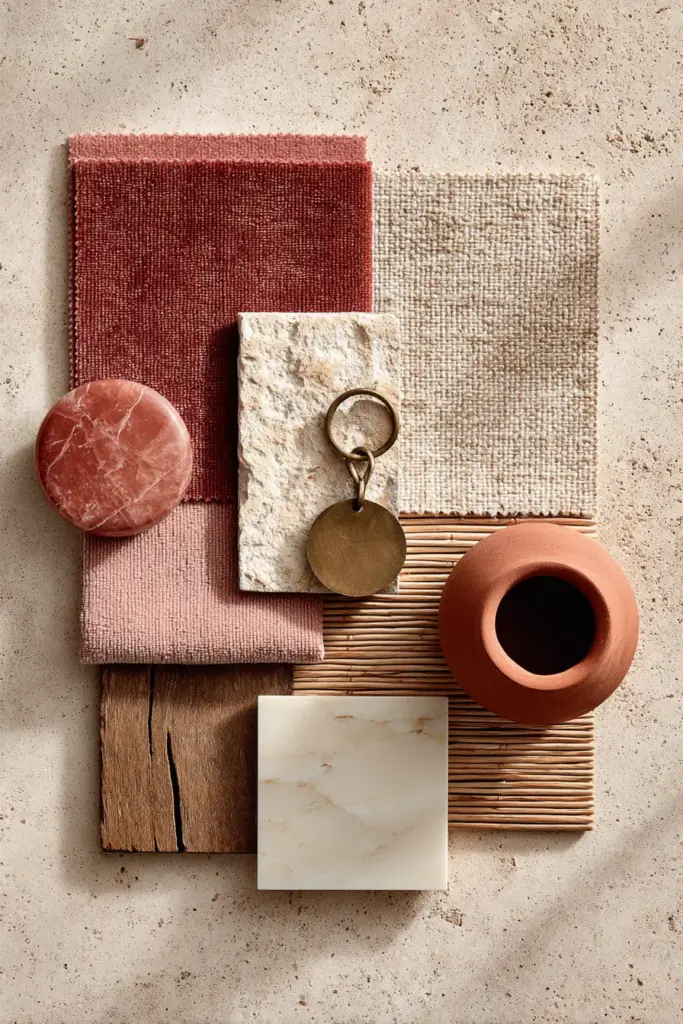
In eclectic rooms, the material a color sits on changes its psychological effect entirely. This is one of the most overlooked principles in interior color psychology.
- Terracotta on matte clay pottery feels ancient, grounding, and earthy.
- Terracotta on a velvet cushion feels rich, warm, and slightly luxurious.
- Terracotta on a linen throw feels relaxed, organic, and artisanal.
The same color, three different emotional registers — simply because the material changed. When building your eclectic palette, think in color + material combinations, not just hues.
| Material | Effect on Color | Best Eclectic Pairing |
|---|---|---|
| Velvet | Deepens and enriches | Deep jewel tones, dusty rose, forest green |
| Linen | Softens and mattifies | Warm neutrals, dusty blue, sage |
| Rattan / Cane | Warms and naturalizes | Terracotta, cream, earthy green |
| Brass | Amplifies warmth | Amber, rust, deep navy, black |
| Marble | Cools and elevates | Warm white, dusty blush, charcoal |
| Raw Wood | Grounds and humanizes | Olive, taupe, warm white, burnt orange |
Color Mistakes to Avoid in Eclectic Living Rooms
Even with the best intentions, eclectic rooms can go wrong. These are the most common color errors and how to sidestep them.
- Mixing too many undertone families. If your sofa is cool-toned, your rug warm-toned, and your walls a neutral that pulls in a third direction, the room will feel unsettled. Choose one undertone family and let it run through all your layers.
- Treating every surface as an accent. When everything competes for attention, nothing reads as intentional. Preserve your quiet 60% so your 10% can sing.
- Ignoring the ceiling. A warm-white ceiling reflects warmth back into the room. A stark bright-white ceiling on warm eclectic walls creates an uncomfortable disconnect.
- Choosing art last. In an eclectic room, art often contains multiple colors. Choose or acknowledge your key pieces early and let them inform your palette, not compete with it.
- Playing it too safe. Eclectic design rewards conviction. A room that errs toward beige in every layer to “stay safe” loses its personality entirely. Trust your accent color and commit to it.
Ready-Made Palette Ideas for Eclectic Living Rooms
Palette 1: Warm Bohemian
- Walls: Warm terracotta or clay
- Sofa: Aged cognac leather or rust linen
- Rug: Hand-knotted in rust, cream, and gold
- Curtains: Warm sand linen
- Accents: Brass, dried botanicals, deep plum cushions, rattan baskets
Palette 2: Modern Earthy
- Walls: Warm greige or limewash white
- Sofa: Sage green or olive boucle
- Rug: Natural jute or wool in cream and brown
- Curtains: Linen in warm white
- Accents: Matte black ceramics, antique bronze, terracotta vessels, forest green cushions
Palette 3: Moody Collected
- Walls: Deep forest green or charcoal
- Sofa: Dusty blush velvet or warm camel
- Rug: Persian-style in deep red, navy, and gold
- Curtains: Thick linen in warm ivory
- Accents: Antique gold frames, rich burgundy cushions, dark stained wood, amber glass
Palette 4: Calm Mediterranean
- Walls: Soft dusty blue or chalky white
- Sofa: Natural linen in warm white
- Rug: Flat-weave in blue, cream, and terracotta
- Curtains: Sheer white with blue trim
- Accents: Cobalt ceramics, raw clay pots, woven baskets, sea-glass tones
Key Takeaways: Your Eclectic Color Checklist
- Choose your emotional intention first — how do you want the room to feel?
- Select a dominant undertone family (warm or cool) and apply it consistently across all layers.
- Use the 60-30-10 rule: a quiet dominant, a grounding support, a brave accent.
- Consider the direction of natural light before committing to a wall color.
- Layer warm artificial light (2700K–3000K) to enhance eclectic warmth in the evening.
- Think in color + material combinations, not hues alone.
- In small rooms, keep your 60% light to create visual space for layered accents.
- Let meaningful objects — art, heirlooms, textiles — inform your palette choices.
- Avoid mismatched undertones, over-accenting, and last-minute art decisions.
A Closing Thought from ERYLIN
An eclectic living room is, at its heart, a portrait. It holds the places you’ve been, the things you’ve loved, and the comfort you’ve built over years of living. Color is how that story becomes readable — not just to guests, but to yourself, every time you walk through the door.
You don’t need to choose between beauty and belonging. With the right palette, your room can hold both — layered, intentional, and entirely yours.
Explore more from ERYLIN: living room styling ideas, lighting guides, and our curated home collections.
Frequently Asked Questions
What colors are best for an eclectic living room?
Warm neutrals like terracotta, sage green, dusty blue, and warm cream are excellent foundations for eclectic living rooms. The key is keeping undertones consistent across your palette — this allows diverse furniture and textiles to feel curated rather than chaotic. Bold accent colors like deep plum, rust, or antique gold can then be layered in as the 10% of your scheme.
How does color psychology affect a living room?
Color psychology shapes how energized, calm, or at ease you feel in a space. Warm tones like amber and terracotta stimulate warmth and social energy, while cool tones like sage and dusty blue encourage relaxation. In a living room, the right palette can make the space feel welcoming after a long day, intimate during an evening gathering, or expansive when the light is low.
How do you mix warm and cool colors in an eclectic room without it looking chaotic?
The most reliable approach is to establish a dominant undertone family — either warm or cool — and let it run through the majority of your palette. You can introduce a complementary cool or warm tone as your 30% supporting layer, but anchor it with the same undertone logic. Avoid equal quantities of warm and cool, which creates visual tension with no clear resolution.
Do light colors make a small eclectic living room look bigger?
Yes — lighter hues reflect more natural and artificial light, which reduces shadow and makes walls feel further away. In a small eclectic living room, keeping your 60% base layer in a light warm neutral (aged cream, chalky white, soft sage) creates the visual breathing room needed to layer in bolder textures and accent colors without overwhelming the space.
Which accent colors work best in eclectic interiors?
The best accent colors in eclectic rooms are ones that appear organically in the pieces you already love — the rust in a vintage rug, the gold in a ceramic lamp, the deep blue in a piece of art. Terracotta, antique brass, deep teal, warm plum, and burnt orange are perennially strong eclectic accent choices. The rule is to commit: pick one or two accent colors and let them recur throughout the room in different materials and scales.