Table of Contents
There is a particular kind of room that stops you at the doorway. It holds a vintage velvet chair beside a raw linen sofa. A terracotta lamp glows next to an indigo painting. Nothing matches — and yet, somehow, everything belongs.
That is the quiet magic of an eclectic living room. And color is the thread that holds it all together.
At ERYLIN, we believe your home should feel like a conversation — layered, honest, and alive. An eclectic palette does not follow rules blindly. It follows feeling, guided by a few gentle principles that keep beauty from tipping into chaos.
This guide will walk you through how to build a color palette that is bold, personal, and grounded — one that makes guests lean in and makes you breathe out.
What Is an Eclectic Color Palette, Really?
Eclectic does not mean random. It means intentionally curated from many places.
Think of it the way a seasoned traveler arranges keepsakes on a shelf. Each piece comes from somewhere different — a Moroccan market, a Tokyo ceramics shop, a grandmother’s attic — but together they tell one coherent story.
In color terms, an eclectic palette mixes hues from different families and temperatures, then anchors them with a shared undertone, a dominant neutral, or a recurring accent. The key is proportion. One strong idea, supported by the rest.
How to Choose a Neutral Base for a Bold Eclectic Palette
Start with What Grounds the Eye
Every bold room needs a resting place. Your neutral base is that exhale — the quiet wall, the unadorned floor, the undyed linen that lets every other color sing without competing.
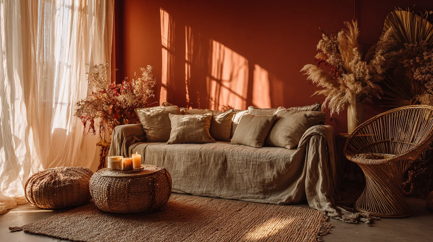
Warm neutrals work especially well in eclectic spaces. Think raw linen, aged white, warm greige, dusty plaster, or pale terracotta. These tones carry enough pigment to feel alive, but enough restraint to welcome anything beside them.
The 60-30-10 Rule, Reimagined for Eclectic Spaces
The classic interior design ratio still applies here — but with a looser hand.
| Role | Proportion | Example Colors |
|---|---|---|
| Dominant Base | ~60% | Warm white, soft greige, plaster beige |
| Secondary Color | ~30% | Terracotta, sage, dusty blue, olive |
| Accent | ~10% | Rust, cobalt, ochre, deep plum |
Your walls, large sofa, and area rug typically carry the 60%. Your upholstered chairs, curtains, and large artwork carry the 30%. Your cushions, ceramics, throws, and small objects carry the 10%.
This ratio creates visual breathing room — which is what separates an eclectic room from an overwhelming one.
The Best Eclectic Color Palette Combinations for Living Rooms
Terracotta, Sage, and Warm White
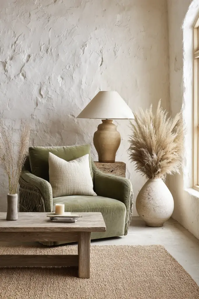
This palette pulls from the earth and the garden. It feels both ancient and fresh — like a sunlit courtyard in a slow afternoon.
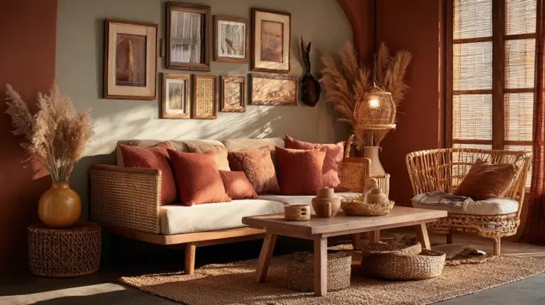
Layer a warm white plaster wall with a sage linen sofa, rust-toned ceramic lamps, and a woven jute rug. Bring in terracotta through a large pot plant, cushions, or a textured wall hanging. Add weathered wood furniture to deepen the organic warmth.
Dusty Blue, Warm Cream, and Amber
This combination holds the light beautifully — especially in rooms that catch the afternoon sun.
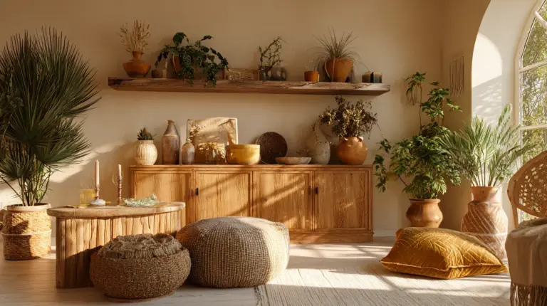
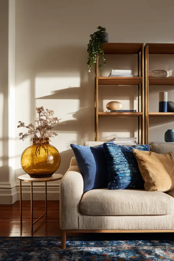
Start with warm cream walls, then layer a dusty blue velvet armchair or side sofa. Amber glass vases, brass candleholders, and honey-toned timber shelving carry the warmth. A kilim rug with flecks of both tones ties the whole palette into one visual sentence.
Charcoal, Blush, and Natural Linen
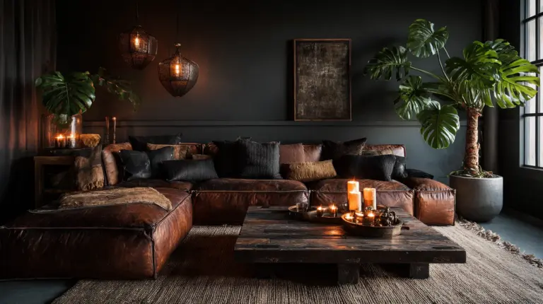
For those who want eclectic with an edge of drama. Charcoal grounds without heaviness when used in the right proportions.
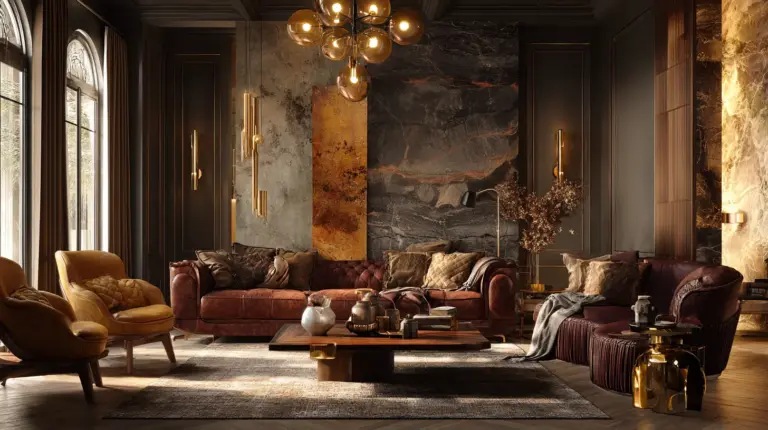
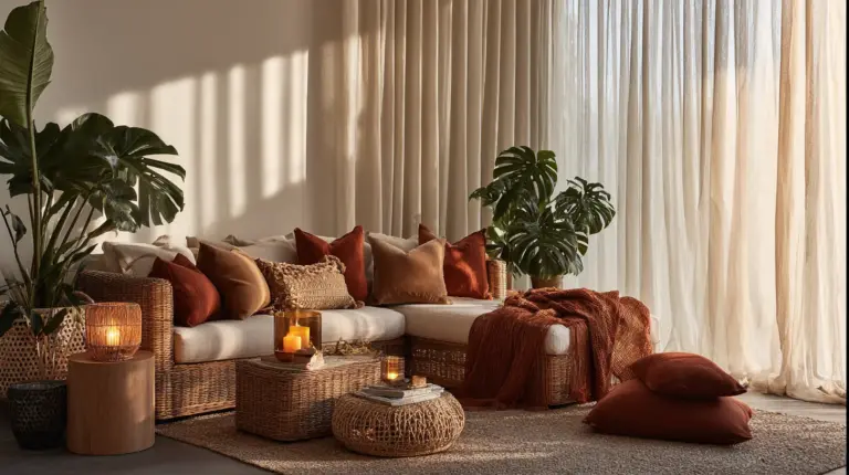
Use charcoal as an accent wall or a single large sofa. Let blush linen cushions and sheer blush curtains soften the contrast. Natural rattan, woven baskets, and dried botanicals keep it earthy and textured. This palette works especially well in rooms with good natural light.
Olive, Rust, and Cream
Deeply warm, richly layered, and completely livable. This palette references the Italian countryside and aged leather travel journals.
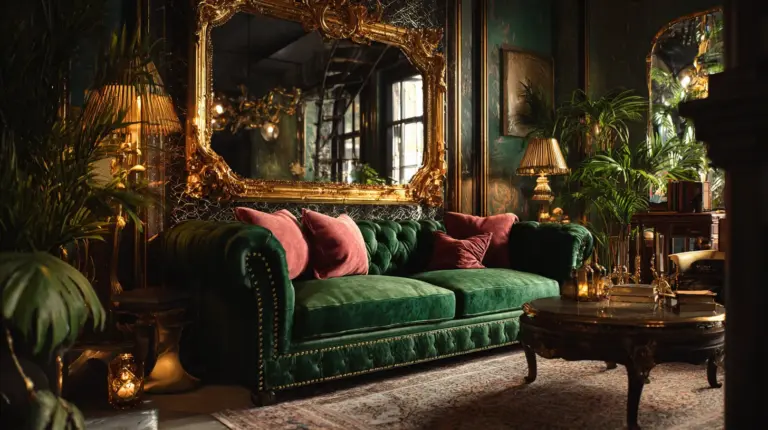
Pair cream walls with an olive linen sofa and rust leather accent chairs. A vintage Persian rug brings the colors together without trying. Macramé wall art, terracotta pots, and dark timber frames add depth and patina.
How to Mix Patterns and Colors in an Eclectic Space
The Rule of One Repeated Hue
The fastest way to make pattern mixing feel intentional is to repeat one color across every pattern. If your floral cushion has blush in it, find that blush again in a stripe, a geometric, or a solid. The eye follows the thread, and the room feels composed rather than cluttered.
Scale Matters as Much as Color
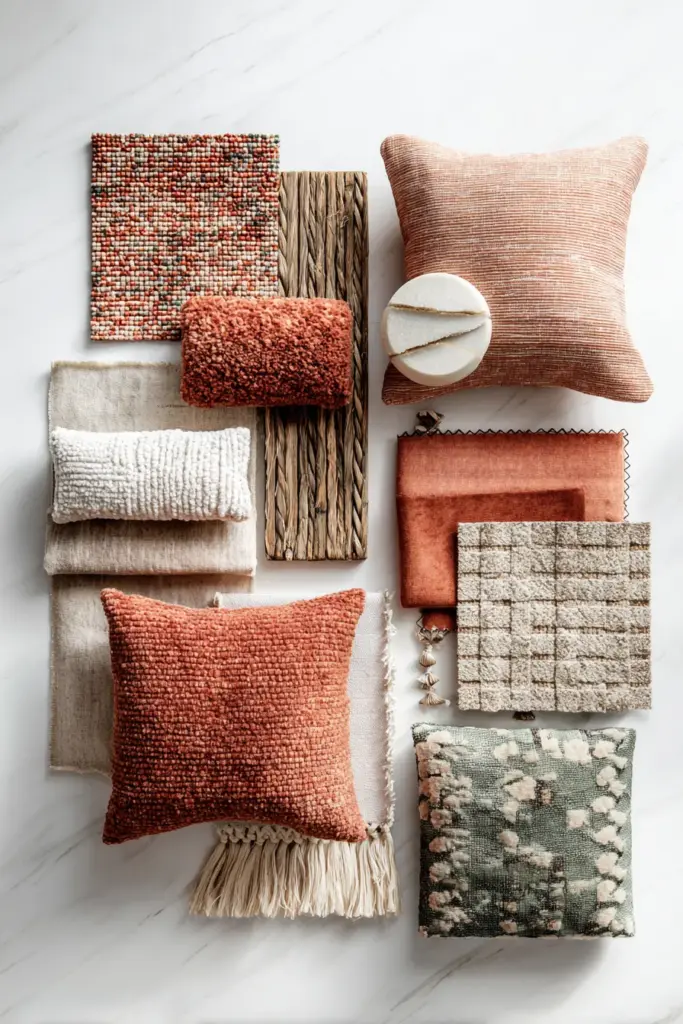
Vary the scale of your patterns: one large, one medium, one small. A large botanical print, a medium geometric weave, and a small embroidered cushion can all share the same color family without competing. Scale contrast is what makes pattern mixing feel curated instead of chaotic.
Texture Is a Pattern Too
Do not overlook texture as part of your visual mix. Rough-weave linen, smooth velvet, braided jute, hammered brass, and matte ceramic all speak differently to the eye. Mixing textures adds richness without adding more color — and it is one of the most underused tools in eclectic design.
Palette Cards: Your Visual Reference Guide
Use these ratios as starting points when you shop, paint, or style.
Palette 1 — The Earth Edit
- 60% Warm White / Plaster
- 30% Terracotta / Burnt Sienna
- 10% Sage / Olive
Palette 2 — The Afternoon Light
- 60% Warm Cream / Beeswax
- 30% Dusty Blue / Faded Denim
- 10% Amber / Old Gold
Palette 3 — The Quiet Drama
- 60% Natural Linen / Oat
- 30% Charcoal / Graphite
- 10% Blush / Dusty Rose
Palette 4 — The Wanderer
- 60% Cream / Aged White
- 30% Olive / Moss
- 10% Rust / Paprika
Print these or save them on your phone. Bring them with you when you shop for cushions, rugs, or paint swatches. Having a reference keeps your decisions intentional, even in the middle of a market or a furniture store.
Troubleshooting: When Your Eclectic Room Feels Chaotic Instead of Curated
How to Neutralize an Overwhelming Palette Without Repainting
Sometimes you bring a piece home and the room suddenly feels like too much. Before you reach for the paint roller, try these targeted fixes.
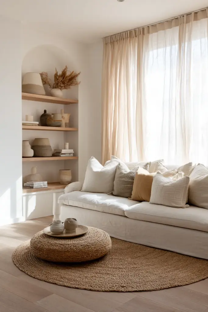
Add more of your neutral base. Layer in cream throws, linen cushions, or a natural jute rug. Neutral elements do not compete — they calm. Even a large cream curtain panel can reset the visual temperature of a room.
Remove one color entirely. If your room has five colors fighting for attention, eliminate the weakest link. Box away those teal cushions. Move the bright yellow chair to another room. Reducing the palette by even one hue can bring instant cohesion.
Introduce a unifying finish. Aged brass, matte black, or warm timber can be added through small objects — a lamp, a tray, a picture frame — to create a repeating material thread that ties disparate colors together without changing a single paint color.
Anchor the floor. A large area rug that holds two or three of your palette colors acts like a visual container for the whole room. If your floor is chaotic, no amount of careful styling above it will read as calm.
When the Room Feels Flat Instead of Layered
Eclecticism needs dimension. If everything sits at the same visual height or the same saturation level, the room loses life.
Introduce a dark anchor — a deep-toned side table, a black-framed mirror, or a charcoal accent wall — to give the eye somewhere to rest. Then raise the contrast with something bright or reflective: a brass lantern, a white ceramic sculpture, sheer curtains that catch the light.
Key Takeaways: Your Eclectic Palette Checklist
- Choose one warm neutral as your 60% base — walls, large sofa, or rug
- Select one secondary color (30%) that speaks to the base without matching it exactly
- Reserve bold or saturated color for the 10% accent layer — cushions, ceramics, art
- Repeat at least one hue across every pattern in the room
- Vary pattern scale: large, medium, and small
- Mix at least three textures — rough, smooth, and woven
- When overwhelmed, add neutral first before removing anything
- Use a unifying material finish (brass, timber, matte black) to create cohesion across colors
- Anchor with a rug that holds two to three palette colors
- Trust your instinct — eclectic design is autobiographical
A Final Thought from ERYLIN
The most beautiful eclectic rooms we have ever encountered were not designed by a committee or assembled from a single store. They were gathered — slowly, lovingly, over time.
Your color palette is not a formula. It is a mood you are trying to live inside. When you get it right, you will feel it — the same way you feel it when a song matches the weather outside your window exactly.
Start with one warm neutral. Add the color that makes your chest open a little. Layer in texture, light, and the objects that carry meaning. Trust the process. Come back to it. Edit gently.
ERYLIN is here every step of the way — because your home deserves to feel exactly like you.
Frequently Asked Questions
How can I stop my eclectic living room from appearing messy?
The fastest fix is the 60-30-10 rule: 60% neutral base, 30% secondary color, 10% bold accent. When a room feels cluttered, it usually means too many colors are fighting for the same visual weight. Add more of your neutral — through throws, cushions, or a large rug — and remove one competing color entirely. Cohesion comes from restraint, not restriction.
What is the best base color for an eclectic living room?
Warm neutrals perform best: warm white, plaster beige, soft greige, or pale terracotta. These tones carry enough warmth to feel alive but enough subtlety to welcome bold colors beside them. Avoid stark bright whites in eclectic spaces — they can make saturated colors feel harsh rather than curated.
How do I choose colors for an eclectic style?
Start with a feeling, not a color wheel. What atmosphere do you want the room to hold — earthy and grounded, cool and calm, warm and dramatic? Once you have a mood, select one neutral, one secondary color in the same temperature family, and one bold accent that creates contrast. Keep your undertones consistent — warm with warm, cool with cool — and the palette will feel cohesive even across very different hues.
How do I mix patterns and colors in an eclectic space?
Repeat one color across every pattern in the room, and vary the scale of your patterns — large, medium, and small. A large botanical, a medium stripe, and a small geometric can all coexist if they share a common hue. Texture mixing — velvet, linen, jute, ceramic — adds richness without adding more color, which is often exactly what an eclectic room needs.
Can I use dark colors in an eclectic living room?
Absolutely — and they often elevate the whole space. Dark tones like charcoal, deep olive, or navy work best as your 30% secondary layer or as a single accent wall. Balance them with generous amounts of your neutral base and soften with natural textures like rattan, linen, or aged timber. Dark colors in proportion create depth and drama; out of proportion, they simply need more light and more neutral breathing room beside them.