Table of Contents
There is a particular feeling that comes with stepping into a living room that just feels right. The light is soft. The walls seem to breathe. The colors do not shout — they hold you.
That feeling is not an accident. It is the result of deliberate color choices that understand how light moves, how texture speaks, and how a palette tells a story without saying a word.
At ERYLIN, we believe your living room should feel like an exhale. And in 2026, the colors that do that best are not the ones chasing drama — they are the ones chasing presence.
Whether you are painting a compact apartment in the city, refreshing a bright tropical home, or rethinking a rental space with minimal commitment, this guide will walk you through every shade, pairing, finish, and lighting tip you need to make your living room quietly, beautifully alive.
The 2026 Color Mood: Warm, Grounded, and Quietly Alive
This year’s color direction is a collective sigh of relief. We are moving away from the stark, cold, gray-everything aesthetic and into something richer, warmer, and more human.
The dominant 2026 palette draws from earth, mineral, and botanical sources. Think sun-dried clay, the inside of a walnut shell, a field of silver-green sage, the pale face of limestone. These are colors that age beautifully, work across seasons, and feel equally at home under morning light as they do under the warm glow of an evening lamp.
This shift is not just aesthetic — it is emotional. People want their homes to feel like restoration. And warm, nature-inspired color does exactly that.
The Six Defining Color Families of 2026
| Color Family | What It Feels Like | Best Used In |
|---|---|---|
| Warm White & Cream | Soft, airy, expansive | Small rooms, low-light rooms |
| Clay & Terracotta | Grounded, sun-warmed, textural | Accent walls, cozy niches |
| Muted Olive & Sage | Botanical, calm, earthy | Japandi, minimalist, open-plan |
| Mineral Neutrals | Cool-warm balance, sophisticated | Larger living rooms, high ceilings |
| Softened Browns | Rich, nesting, cocoon-like | Reading corners, evening rooms |
| Moody Accents | Depth, drama, artistic | Feature walls, built-in shelving |
Trending Living Room Colors for 2026 (and How to Use Them)
Warm White and Cream: The New Neutral Standard
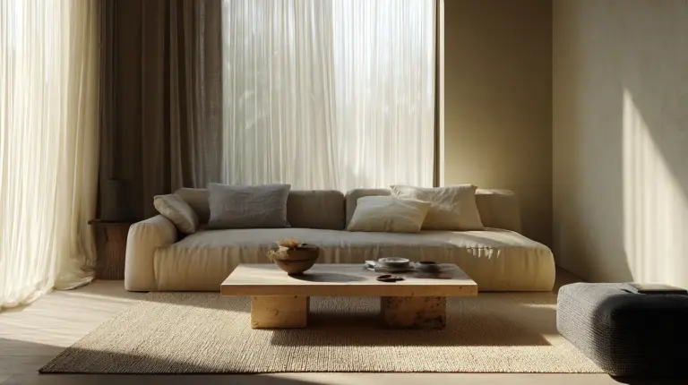
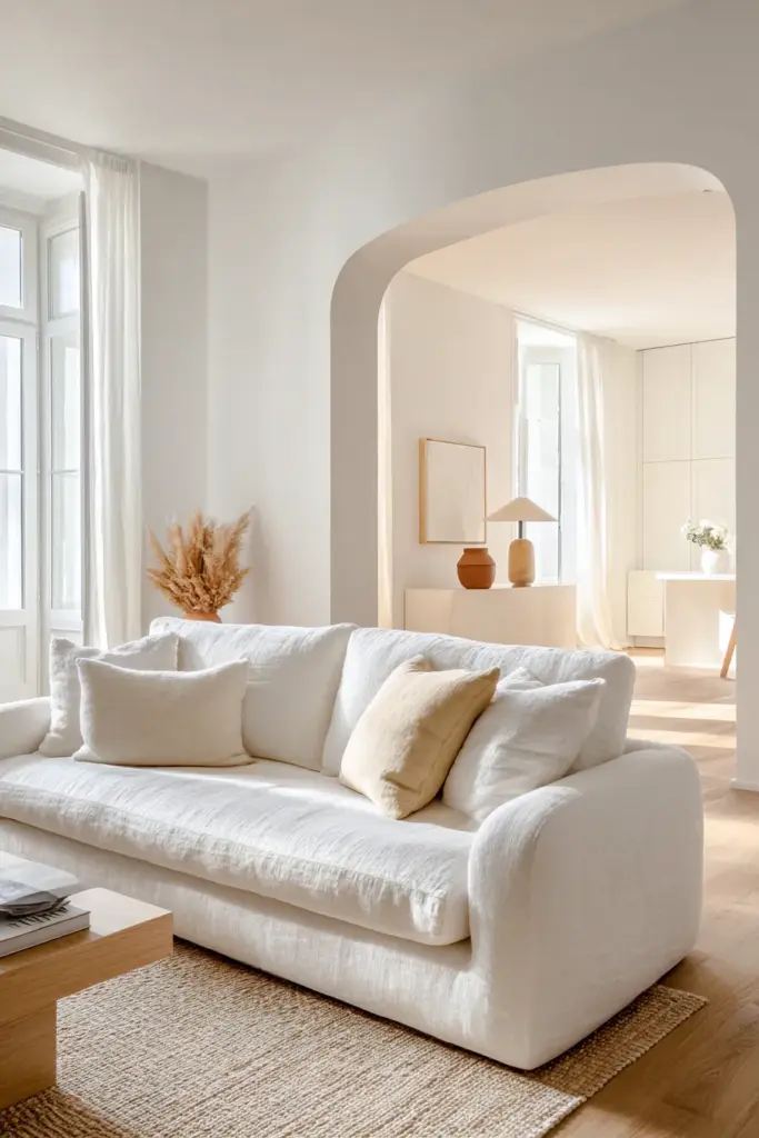
Warm white is having its quiet moment. Not the sharp, blue-tinged white of the last decade — this is the warm off-white that softens a room the way morning light softens shadows.
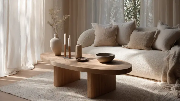
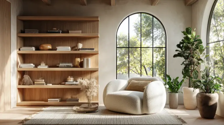
Look for shades with a hint of sand, linen, or honey underneath. These are the whites that feel clean without feeling clinical, and they pair beautifully with natural wood, rattan, and textured linen cushions.
Best pairing: warm white walls with honey oak floors, a cream linen sofa, and matte terracotta ceramics on open shelving.
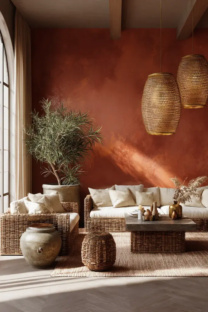
Clay and Terracotta: Earth at Its Most Beautiful
Clay tones carry the warmth of handmade things. They reference the color of sun-baked earth, of pottery thrown by hand, of a warm afternoon in a Mediterranean courtyard.
In a living room, a single terracotta accent wall anchors the entire space. Surround it with natural rattan furniture, aged brass light fixtures, and soft cotton throws in cream or burnt sienna. The result is a room that feels curated without trying.
This color works especially well in rooms with direct natural light — tropical homes included. The brightness does not wash it out; it deepens it.
Muted Olive and Sage Green: The Japandi Favorite
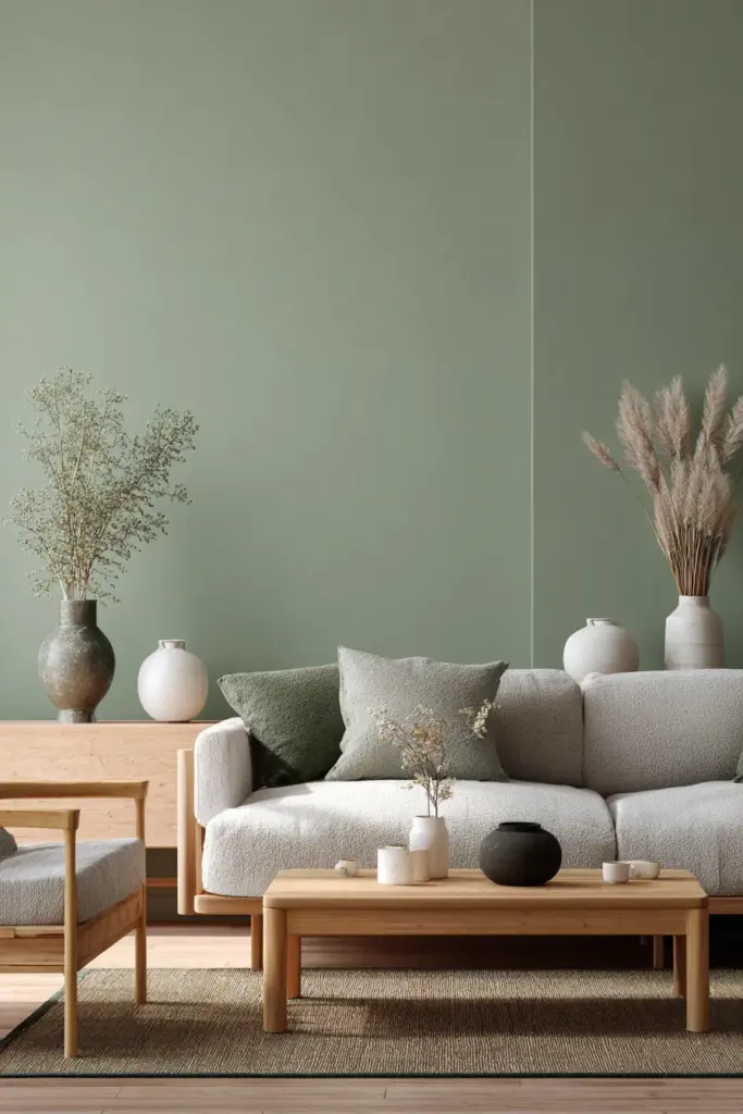
Sage and muted olive are the colors of considered living. They bring the outside in without mimicking nature too literally. Instead, they translate it — distilling forest and meadow into something hushed and refined.
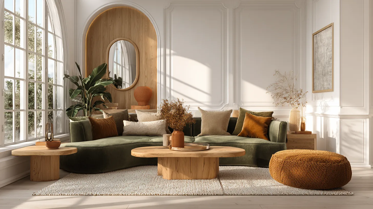
These greens layer beautifully with light wood furniture, textured wall finishes, and off-white or natural linen accents. They are the foundation of the Japandi aesthetic: a blend of Japanese minimalism and Scandinavian warmth that is dominating thoughtful interior design right now.
For small living rooms: a sage green wall with white trim and minimal furniture creates the illusion of a space that is both larger and calmer than it actually is.
Mineral Neutrals: Sophisticated Without Coldness
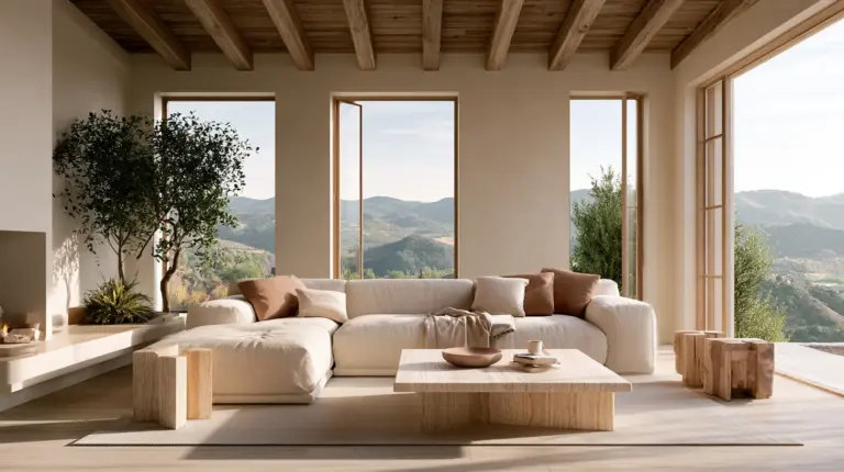
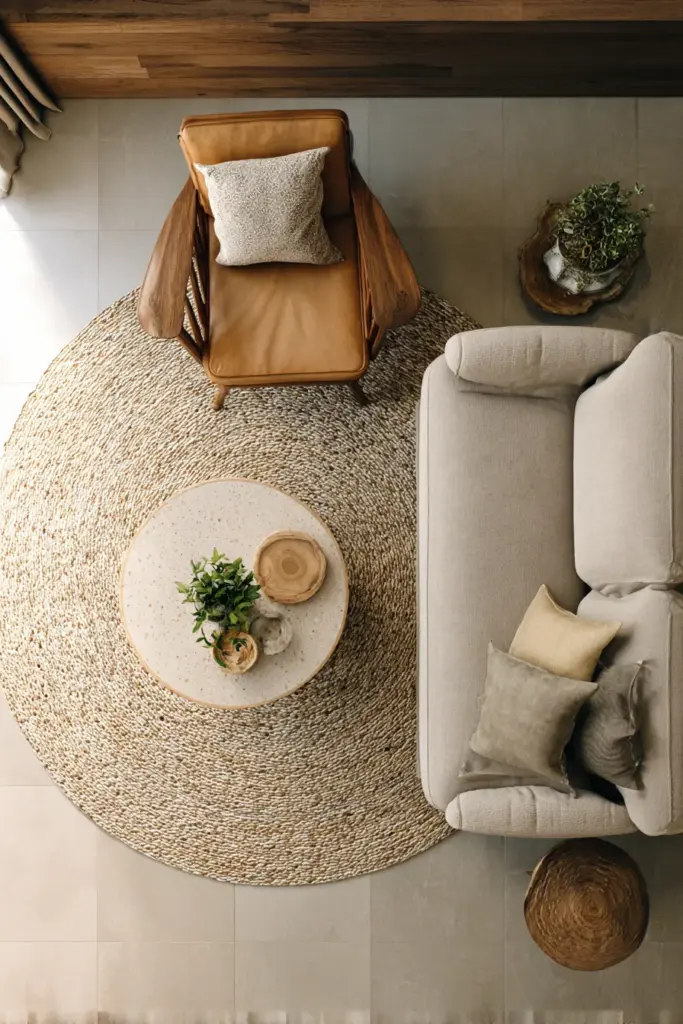
Mineral neutrals sit between warm and cool — think greige (gray-beige), stone, pale taupe, and washed concrete tones. They are the colors of polished rock and quiet coastlines.
These shades work brilliantly in larger living rooms where you want sophistication without heaviness. Pair them with deep indigo or forest green accent cushions, sculptural ceramics, and layered wool rugs for a palette that feels intellectually and visually complete.
Softened Browns: The Cozy Comeback
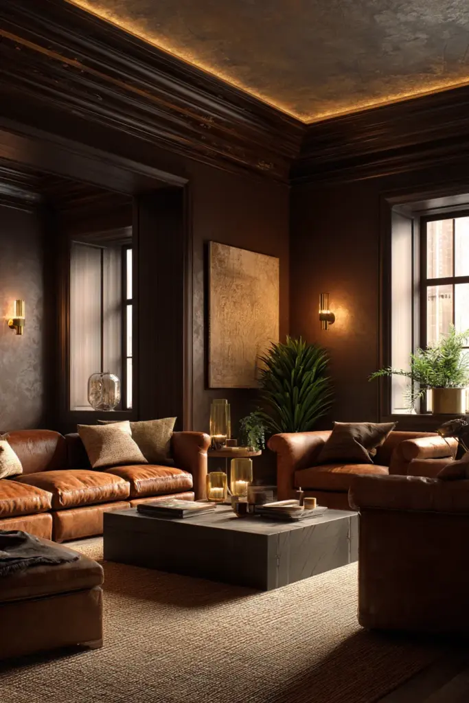
Rich brown is back — but not the brown of the early 2000s. This is elevated brown: warm chestnut, muted mocha, soft amber-wood. These shades create a cocooning effect, perfect for living rooms where the goal is true rest.
Layer a softened brown on your walls with cream ceiling, warm brass light fixtures, and a deep velvet sofa in cognac or dusty rose. Add a textured jute rug and the room becomes a place you genuinely do not want to leave.
Moody Accents: Drama with Purpose
Deep teal, dark terracotta red, forest-floor green, dusty charcoal — moody colors are not for every wall. But on one feature wall, or inside a built-in bookshelf, they become the most memorable thing in the room.
The key is balance. A moody accent wall works best when the remaining walls breathe in a light neutral, and when the furniture is kept deliberately simple. Let the color do the work.
Choosing Color by Room Condition
The right color is not just about trend — it is about your room. Here is how to match shade to space.
Small Living Rooms
- Use warm whites, soft creams, or pale sage to expand the sense of space visually.
- Keep the ceiling a shade lighter than the walls — this lifts the room upward.
- Avoid dark colors on all four walls; use them only on a single accent wall with ample natural light.
- Mirrors, light wood furniture, and open shelving amplify the effect.
Rooms with Low or Limited Natural Light
- Warm whites with yellow or beige undertones glow softly in artificial light — avoid cool whites, which look stark.
- Warm greige or pale clay tones respond beautifully to lamplight.
- Avoid mid-tone grays — in low light, they read as dull and lifeless.
- Add layered lighting: a floor lamp, a table lamp, and warm-toned candles create depth that paint alone cannot.
Bright Rooms with Direct Sunlight
- Clay, terracotta, and olive green deepen and enrich in strong light — use them confidently here.
- Mineral neutrals hold their tone beautifully in brightness without washing out.
- Tropical homes with large windows can handle bolder saturations that would overwhelm a darker space.
High-Ceiling Rooms
- Bring the ceiling down visually with a slightly deeper tone — a warm greige or soft clay ceiling against white walls creates intimacy.
- Tall rooms can carry moody accents on all four walls without feeling oppressive.
Open-Plan Living Spaces
- Use a consistent base neutral across connected zones, then differentiate with accent colors, rugs, and furniture.
- A sage wall in the living area that transitions into a warm white kitchen feels cohesive without being monotonous.
Color Pairing Formulas That Always Work
A great palette is not one color — it is a conversation between several. Here are four formulas that are proven, beautiful, and endlessly adaptable.
Formula 1: Warm Earth Palette
Wall: warm terracotta or clay | Trim: soft cream | Ceiling: warm white | Sofa: linen beige or camel | Accents: olive green, aged brass, natural wood
Formula 2: Japandi Serenity
Wall: muted sage or pale olive | Trim: white with warm undertone | Ceiling: pure warm white | Sofa: charcoal or slate gray | Accents: light ash wood, ceramic white, dried botanicals
Formula 3: Modern Rustic
Wall: warm greige or stone | Trim: white | Ceiling: white | Sofa: deep cognac or dusty rose velvet | Accents: dark walnut, brass, terracotta ceramics
Formula 4: Quiet Drama
Wall: soft cream or warm white | Feature wall: deep forest green or dusty charcoal | Trim: white | Sofa: cream bouclé or camel | Accents: matte black, sculptural stone, amber glass
How Lighting Changes Every Color You Choose
This is the piece most color guides leave out — and it is possibly the most important.
The same sage green wall looks different at 8am (cool, blue-leaning morning light), at 2pm (bright, warm midday sun), and at 8pm (golden lamplight). Understanding this helps you choose a color that works all day, not just at the paint store.
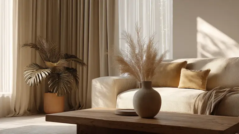
Warm daylight (south-facing rooms, tropical climates): Intensifies warm tones. Clay becomes richer. Cream glows. Sage deepens into something more saturated.
Cool daylight (north-facing rooms): Flattens warm tones. Choose shades a step warmer than you think you need. Avoid cool grays and blue-toned whites entirely.
Evening lamplight: Everything shifts amber. Warm whites glow golden. Earthy tones become intimate. Moody colors come fully alive under soft, warm lamp glow.
Tip: Always test a paint swatch at different times of day before committing. A 30cm square on the actual wall, observed morning, afternoon, and evening, will tell you more than any paint chip.
Paint Finish Guide: Which Finish for Which Wall
Color choice matters — but so does finish. The same color in two different finishes can feel entirely different.
| Finish | Sheen Level | Best For | Notes |
|---|---|---|---|
| Matte / Flat | No sheen | Feature walls, bedrooms, low-traffic areas | Hides imperfections beautifully; not washable |
| Eggshell | Very low sheen | Living room walls | The ERYLIN favorite — soft, elegant, wipeable |
| Satin | Slight gloss | High-traffic living rooms, hallways | Durable and subtly polished |
| Semi-gloss | Noticeable sheen | Trim, doors, window frames | Highlights architectural details crisply |
For most living rooms, eggshell is the ideal choice. It has just enough sheen to reflect light softly without making imperfections obvious, and it is easy to clean.
Ceiling and Trim: The Details That Complete the Palette
Most people paint their ceiling builder white and call it done. But the ceiling is the fifth wall — and how you handle it changes the entire atmosphere of a room.
A warm white ceiling (slightly warmer than a pure cool white) works in almost every room. It softens the light that bounces off it, making the entire space feel cozier.
For trim and door frames, a bright or semi-gloss white creates crisp definition — especially beautiful against earthy or saturated wall colors. If you want a softer, more wrapped feeling, paint trim in a tone just a shade lighter than your walls.
Budget-Friendly and Rental-Friendly Color Ideas
Not every home allows for a full repaint. Here is how to introduce 2026’s color trends without a roller in hand.
- Peel-and-stick wallpaper in clay, sage, or mineral tones for one accent wall with zero commitment.
- Large-scale art in your chosen palette — one statement piece on a white wall tells a full color story.
- Textiles: A cream bouclé throw, a terracotta lumbar cushion, an olive green linen curtain. Color lives in fabric just as richly as on walls.
- Painted furniture: A single clay-colored side table or sage bookshelf introduces trend color without touching the walls.
- Ceramics and vessels: Sculptural pieces in earthy tones are inexpensive and endlessly rearrangeable.
A Quick Checklist: Your 2026 Color Decision Guide
- Choose a color family that matches your room’s natural light condition first
- Test swatches at morning, afternoon, and evening before committing
- Pick your wall color, then build trim, ceiling, and furniture tones around it
- Use the eggshell finish for walls in most living room situations
- Add your accent color in textiles and objects before committing to a feature wall
- In small rooms, keep walls light and add depth through layers of texture
- In bright tropical rooms, lean into warm, saturated earthy tones with confidence
- In low-light rooms, always go warmer than your instinct tells you
Conclusion
Color is not decoration. It is atmosphere. It is the thing you feel before you consciously notice it — the reason one room makes you want to stay, and another makes you want to leave.
The most beautiful living rooms of 2026 are not the boldest ones. They are the most considered ones. The rooms where every shade was chosen with intention, where the light was thought about, where the palette speaks quietly and clearly.
At ERYLIN, we believe home is the most personal space you will ever design. Take your time with it. Test your colors in real light, in your real room, at different hours of the day. Let the walls do the quiet work of making your life feel a little more beautiful.
That is what good color always does.
Frequently Asked Questions
What are the trending living room colors for 2026?
The leading colors for 2026 include warm whites, clay and terracotta tones, muted sage and olive greens, mineral neutrals like greige and stone, softened browns, and moody accents like deep forest green or dusty charcoal. The overall direction is warmer, earthier, and more nature-inspired than the gray-dominated palettes of recent years.
What is the best color for a modern living room?
There is no single best color, but warm neutrals — creamy whites, soft greiges, and muted sage greens — are the most versatile and enduring choices. They create a calm, elevated foundation and pair well with almost any furniture style or accent color.
Which living room paint colors make a room look bigger?
Light, warm-toned colors such as warm white, pale cream, and soft sage green create the strongest illusion of space. Keep the ceiling slightly lighter than the walls, use minimal furniture, and add mirrors to amplify the effect. Avoid mid-tone grays in small rooms — they tend to flatten and shrink the space visually.
What paint finish is best for living rooms?
Eggshell is the ideal finish for most living room walls. It has a very low, soft sheen that reflects light gently, hides minor imperfections, and is easy to wipe clean — making it both beautiful and practical.
How do I choose a living room color based on lighting?
Start by identifying your room’s light source and direction. North-facing or low-light rooms need warmer shades — go one tone warmer than your instinct suggests. South-facing and tropical rooms with strong natural light can handle richer, more saturated earthy tones. Always test a swatch on the actual wall at different times of day before making your final decision.