Table of Contents
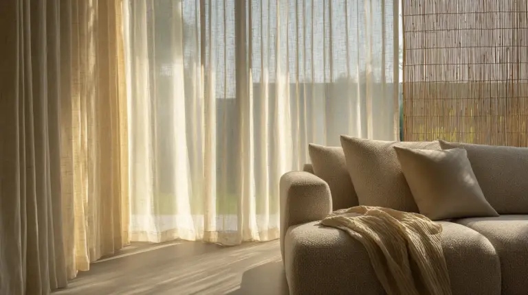
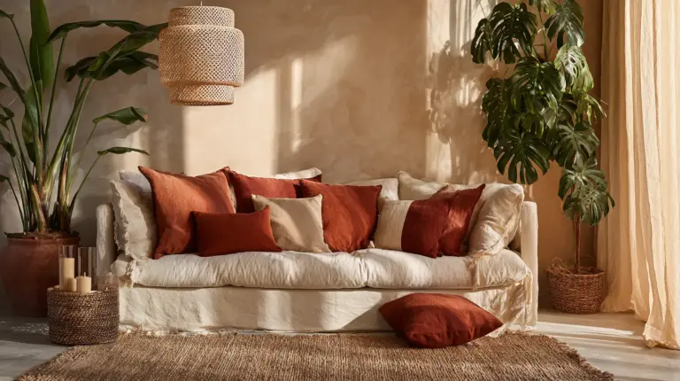
There is something quietly powerful about a wall that tells your story. Not through words, but through light catching a linen print, the warm grain of a walnut frame, or a Polaroid tucked between two gallery pieces that means everything to you and nothing to anyone else.
A modern living room gallery wall is one of the most personal things you can design. Done well, it transforms a flat surface into a conversation — one that speaks of where you’ve been, what you love, and how you want to feel when you come home.
At ERYLIN, we believe your walls deserve the same intention you give your furniture, your textiles, and your morning light. This guide will walk you through every step: choosing art, spacing frames, working with small walls, and building something that feels curated rather than assembled.
Whether you love the clean minimalism of Japandi, the warmth of modern rustic, or the layered personality of eclectic chic — there is a gallery wall waiting for you here.
Start With an Anchor: The One Piece That Sets the Tone
Every beautiful gallery wall begins with a single, confident choice.
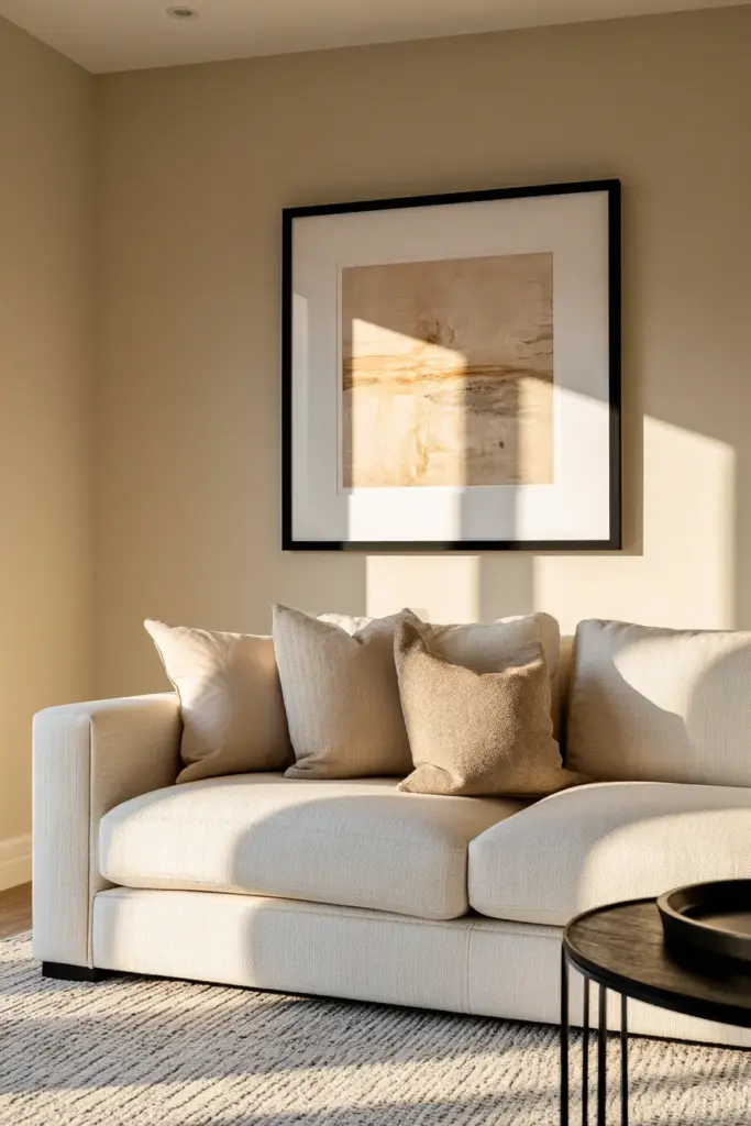
Choose one large anchor piece — ideally 24 by 36 inches or larger — and place it slightly off-center rather than in the middle of your wall. This creates natural visual movement and keeps the eye traveling across the composition rather than stopping at a fixed point.
Your anchor sets the emotional register of the entire wall. A moody black-and-white landscape reads differently than a soft botanical print or a warm abstract in terracotta. Choose it the way you would choose a throw pillow for your sofa — with feeling first, then logic.
How High Should You Hang Your Gallery Wall?
Center your anchor piece at 57 to 60 inches from the floor — this is the standard gallery height used in art museums and for good reason. It aligns with the average eye level and creates a comfortable viewing experience whether your guests are seated or standing.
If your gallery wall sits above a sofa, hang the bottom edge of the lowest piece 5 to 6 inches above the top of the sofa. This grounds the wall art to the furniture beneath it and makes the entire arrangement feel intentional.
How to Space Frames on a Gallery Wall
Spacing is where most gallery walls quietly succeed or fail. The difference between a wall that feels curated and one that feels cluttered is often just a matter of inches.
Keep 2 to 3 inches of space between each frame. This is the sweet spot — close enough to feel connected, far enough to let each piece breathe. Consistent spacing creates visual rhythm, much like the measured pause between words in a well-written sentence.
Use paper templates or painter’s tape on the wall before hammering a single nail. Lay your frames on the floor first, photograph the arrangement, then transfer it to the wall with confidence.
The 30–40% Negative Space Rule
Here is the detail most articles skip: negative space is not wasted space. It is an active design element.
Aim to leave 30 to 40 percent of your wall empty. This breathing room is what allows each piece to stand out, what gives the whole composition a sense of calm and intention rather than visual noise. Think of it as the silence between notes in music — it is what makes the melody meaningful.
If your gap between panels feels uncertain, use this guide: the space between pieces should equal roughly 4 to 6 percent of the longest edge of your arrangement.
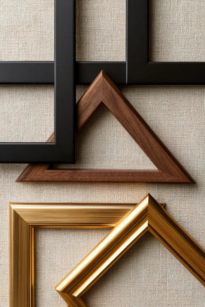
Choosing Frames: The Three-Style Rule
Frame choices can make or break a gallery wall. Mix too many styles and the wall feels chaotic. Stick to one style and it can feel flat.
The golden rule: use no more than three frame styles. A combination of matte black, warm walnut wood, and brushed gold is endlessly versatile — it works in modern, rustic, and transitional spaces alike. These three tones carry warmth without shouting, and they layer beautifully across a neutral wall.
| Frame Style | Best Paired With | Mood It Creates |
|---|---|---|
| Matte Black | White or cream walls, graphic art | Crisp, modern, editorial |
| Warm Walnut Wood | Beige, sage, warm grey walls | Earthy, cozy, Japandi |
| Brushed Gold | Soft neutrals, botanical prints | Elegant, warm, elevated |
| White or Natural | Light-filled rooms, airy art | Fresh, Scandinavian, serene |
Mix these thoughtfully — not randomly. Let one frame style dominate (about 50 percent), the second accent (30 percent), and the third provide a quiet contrast (20 percent).
Mixing Sizes, Orientations, and Shapes
A gallery wall that uses only one size of frame in one orientation will always feel static. The goal is controlled variety — a mix that feels intentional, not accidental.
Combine horizontal and vertical pieces to create flow. Use larger prints to anchor corners and smaller pieces to fill gaps. And here is a detail worth remembering: add at least one round or oval piece — a circular canvas, an embroidery hoop, or an arched print — to break the hard lines of the grid. It adds softness and makes the entire arrangement feel more alive.
Adding 3D and Textile Elements
A truly layered gallery wall moves beyond flat prints. Consider adding one or two three-dimensional elements for depth and texture:
- A small ceramic wall piece or sculptural disc
- A woven wall hanging in natural linen or jute
- A vintage mirror in an interesting shape
- An embroidery hoop with simple stitched botanicals
- A small quilt or textile square mounted on a dowel
These pieces catch light differently throughout the day and introduce warmth that printed art alone cannot achieve.
What Colors Work Best for a Modern Gallery Wall?
The wall behind your art matters as much as the art itself.
Neutral backgrounds — white, warm white, soft beige, or light grey — allow your art to do the talking. They create a clean canvas that makes colors in your prints pop and gives the overall arrangement a polished, gallery-like quality.
If your walls are already a stronger color — sage green, dusty blue, terracotta — choose art with a cohesive palette rather than a mix of competing hues. Pull two or three colors from your anchor piece and let those guide the rest of your selections.
For a cohesive, modern gallery wall, aim for a 3-color art palette within your arrangement. This does not mean everything must match — it means the colors should converse, not clash.
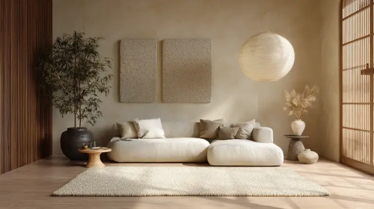
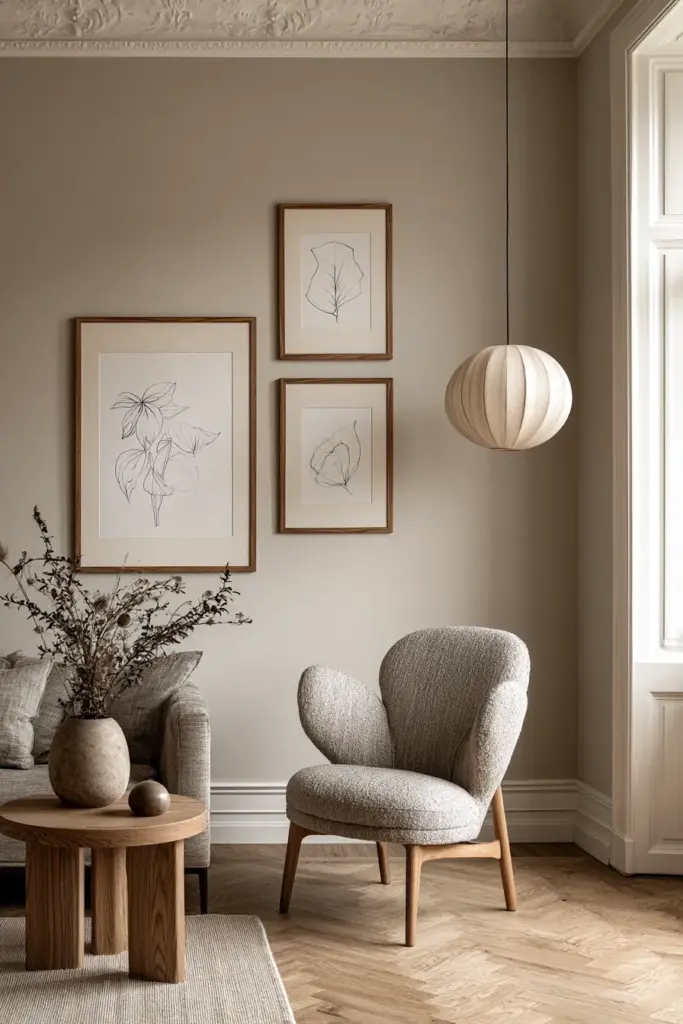
The Japandi Gallery Wall: Minimalism With Soul
The Japandi aesthetic — a blend of Japanese wabi-sabi and Scandinavian hygge — is one of the most searched gallery wall styles, and one of the least addressed in mainstream design guides.
A Japandi gallery wall uses restraint as a design tool. Choose 3 to 4 prints maximum, in a neutral palette of warm whites, soft greys, stone, and muted earth tones. Pair them with warm walnut or light ash wood frames and leave generous negative space between pieces.
Subject matter matters here: botanical studies, abstract ink brushstrokes, architectural line drawings, or nature photography in desaturated tones. The result is a wall that feels meditative and deeply personal — not decorated, but considered.
This approach also works beautifully in small spaces, where simplicity reads as sophistication rather than limitation.
Gallery Wall Ideas for Small Living Rooms
Small walls are not a design problem — they are a design opportunity.
For walls between 8 and 10 feet wide, follow these principles:
- Use 1 large anchor piece rather than many small ones
- Keep spacing tighter — around 2 inches between frames
- Choose vertical orientations to draw the eye upward and make ceilings feel taller
- Limit the arrangement to 3 to 5 pieces for a composed, uncluttered look
- Place the anchor piece slightly off-center to avoid a static, symmetrical feel
A small gallery wall done with intention is far more powerful than a large one done without it.
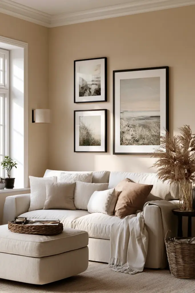
What Size Should a Gallery Wall Be Above a Sofa?
Your gallery arrangement should span one-half to two-thirds of your sofa’s width. For a standard 84-inch sofa, that means an arrangement roughly 42 to 56 inches wide. This keeps the visual weight proportional and prevents the art from feeling either lost or overwhelming above the furniture.
Gallery Wall Around a TV: How to Make It Work
The television used to be the wall’s focal point by default. A gallery wall can change that — or complement it beautifully.
When building a gallery wall around a TV, keep these rules in mind:
- Use black and white or low-contrast art on either side of the screen to avoid visual competition
- Keep art at or below screen height — nothing directly above the TV
- Balance the console table below with objects (a lamp, a plant, a stack of books) to ground the arrangement
- Leave clear space between the screen and the frames — at least 6 to 8 inches on each side
The goal is harmony, not competition. Your TV and your art can coexist gracefully when they are given clear visual boundaries.
How to Hang a Gallery Wall Without Nails (Rental-Friendly Solutions)
Beautiful walls should not be limited to homeowners.
Command strips work for most lightweight to medium-weight frames on smooth, painted walls. Follow the weight guidelines precisely and use two strips per frame rather than one for better hold. Note: they perform less reliably on textured or bumpy plaster.
For heavier frames or brick walls, look into adhesive picture-hanging strips, magnetic poster hangers, or adhesive frame clips designed for gallery use. These solutions are renter-friendly, damage-free, and increasingly sophisticated in their design.
Lean art against the wall on a shelf or console for a relaxed, unfussy look that requires zero hardware — and can be rearranged whenever the mood strikes.
DIY and Budget-Friendly Art Sources
A gallery wall does not require a gallery budget.
Some of our favorite ways to source art affordably:
- Digital art prints — download and print at your local print shop for a fraction of gallery prices
- Polaroid or instant film prints — personal photographs bring irreplaceable warmth and authenticity
- Thrift store frames — spray painted in matte black or gold, thrifted frames look intentional and elevated
- DIY textile hangings — macramé, simple weaving, or mounted fabric swatches add texture on any budget
- Your own drawings or watercolors — imperfect and personal is always more interesting than perfect and generic
Mix one or two quality art prints with personal pieces and DIY finds. The contrast is what makes a gallery wall feel lived-in and real.
How Many Pieces for a Living Room Gallery Wall?
For most living rooms, 3 to 7 pieces create a balanced, considered arrangement. Fewer than three can feel sparse; more than seven risks visual overwhelm unless the wall is very large or the pieces are small.
A good starting point: 1 large anchor + 2 medium pieces + 2 small accent pieces. This gives you enough variety in scale to create rhythm without tipping into clutter.
Gallery Wall Quick-Reference Checklist
- Start with a large anchor piece, placed slightly off-center
- Hang center of arrangement at 57–60 inches from the floor
- Keep 2–3 inches of space between frames
- Leave 30–40% of wall as negative space
- Use no more than 3 frame styles
- Mix horizontal and vertical orientations
- Add at least one round or oval piece for softness
- Include one 3D or textile element for depth
- Choose a 3-color palette within your art
- Hang the bottom of art 5–6 inches above sofa back
- Size arrangement to cover 1/2 to 2/3 of sofa width
- Use Command strips or adhesive hangars for rental walls
- Include personal items — Polaroids, drawings, handwritten notes — to make it yours
Conclusion
A gallery wall is not just decoration. It is an act of curation — of choosing, again and again, what deserves a place in your home and your daily line of sight.
When done with intention, it becomes something quieter and more lasting than any single piece of art could be alone. It becomes the wall you pause in front of on a slow Sunday morning, coffee warm in your hands, and feel at home.
Start with one piece you truly love. The rest will follow.
From our home to yours — ERYLIN.
Frequently Asked Questions
How high should I hang a gallery wall in my living room?
Center your arrangement at 57 to 60 inches from the floor, which aligns with the average eye level. If hanging above a sofa, place the bottom of the lowest frame 5 to 6 inches above the top of the sofa back.
How many pieces should a living room gallery wall have?
For most living rooms, 3 to 7 pieces create a balanced look. Start with one large anchor piece, add medium prints, and finish with 1 to 2 smaller accent pieces or 3D elements.
What is the best frame style for a modern gallery wall?
Use no more than three frame styles. A combination of matte black, warm walnut wood, and brushed gold is timeless, versatile, and works beautifully across modern, rustic, and Japandi aesthetics.
How do I hang a gallery wall without damaging the walls?
Use Command strips for lightweight to medium frames on smooth painted walls. For heavier frames or textured walls, try adhesive picture-hanging strips or magnetic poster hangers. Leaning art on a shelf or console is another zero-nail option.
What is a Japandi gallery wall?
A Japandi gallery wall uses minimalist principles: 3 to 4 prints maximum, neutral tones (warm whites, stone, muted earth), warm wood frames, and generous negative space. It prioritizes feeling over filling — calm, considered, and deeply personal.