Table of Contents
There’s something quietly transformative about the right color palette. In a small living room, it’s not just décor—it’s architecture without walls, light without windows, breath without square footage.
The Japandi style understands this intimacy. Born from the marriage of Japanese wabi-sabi and Scandinavian hygge, it speaks in whispers of beige and sage, in the gentle authority of charcoal and cream.
Today, we’re exploring color palettes specifically crafted for small Japandi living rooms—schemes that don’t just beautify, but expand, calm, and elevate your most-lived-in space. Because in small rooms, every shade becomes a strategy, and every tone tells a story.
Understanding Japandi Colors in Small Spaces
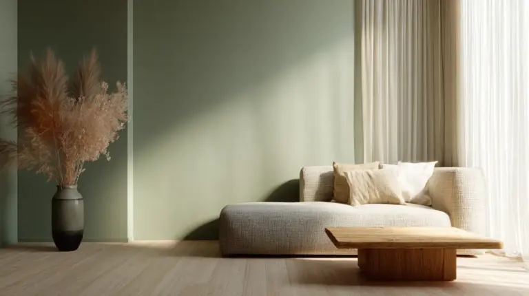
Japandi color philosophy centers on nature’s quietest moments. Think early morning mist, sun-bleached linen, river stones smoothed by time.
For small living rooms, these colors perform double duty. Warm beige (#F5F5DC) reflects natural light across limited square footage. Soft sage (#A8B5A2) brings the outdoors in without overwhelming sightlines. Charcoal grey (#4A4A4A) grounds the palette while maintaining visual flow.
The genius lies in their restraint. Unlike bold palettes that fragment small spaces into competing focal points, Japandi tones create a unified canvas that tricks the eye into perceiving continuity—and therefore, spaciousness.
The Small-Space Color Rule
In compact Japandi living rooms, follow the 70-20-10 proportion. Seventy percent should be light neutrals on walls and ceilings—cream (#F0EAD6), warm white (#FAFAF8), or pale oatmeal (#F5F5F4). These lift the visual plane upward.
Twenty percent becomes mid-tone furniture and textiles: tan leather (#D2B48C), natural oak, taupe linen. These anchor without heaviness.
The final ten percent? Strategic accents in slate (#708090), muted terracotta (#C9856B), or olive green (#6B8E23). Just enough contrast to create depth, never enough to crowd.
Five Ready-to-Use Small Japandi Living Room Color Palettes
Palette 1: Nordic Warmth
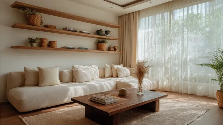
Primary: Warm beige walls (#F5F5DC)
Secondary: Natural oak furniture (light wood tones)
Accent: Soft sage green (#A8B5A2) in throw pillows and one accent chair
This palette performs beautifully in rooms with limited natural light. The beige base reflects artificial lighting efficiently, while sage introduces organic life without competing for attention. Perfect for Philippine homes where humidity favors lighter, breathable color stories.
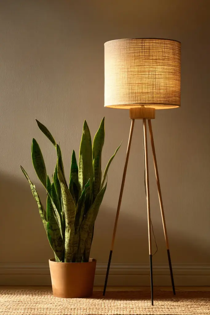
Pair with warm 2700K LED bulbs in recessed ceiling fixtures. The amber glow makes beige read richer, almost honeyed, while sage pops with surprising vitality after sunset.
Palette 2: Minimalist Serenity
Primary: Pale oatmeal (#F5F5F4) on all walls
Secondary: Charcoal grey (#4A4A4A) in one statement piece—sofa or credenza
Accent: Cream (#FFFDD0) textiles with stone grey (#928E85) ceramics
When your living room measures under 150 square feet, this palette creates breathing room through tonal subtlety. The near-white oatmeal erases visual boundaries between walls and ceiling, extending perceived height.
The single charcoal piece prevents the space from floating away into blandness. It’s your visual anchor—substantial without dominating. Add texture through jute rugs, raw linen curtains, and matte stoneware to prevent monotony.
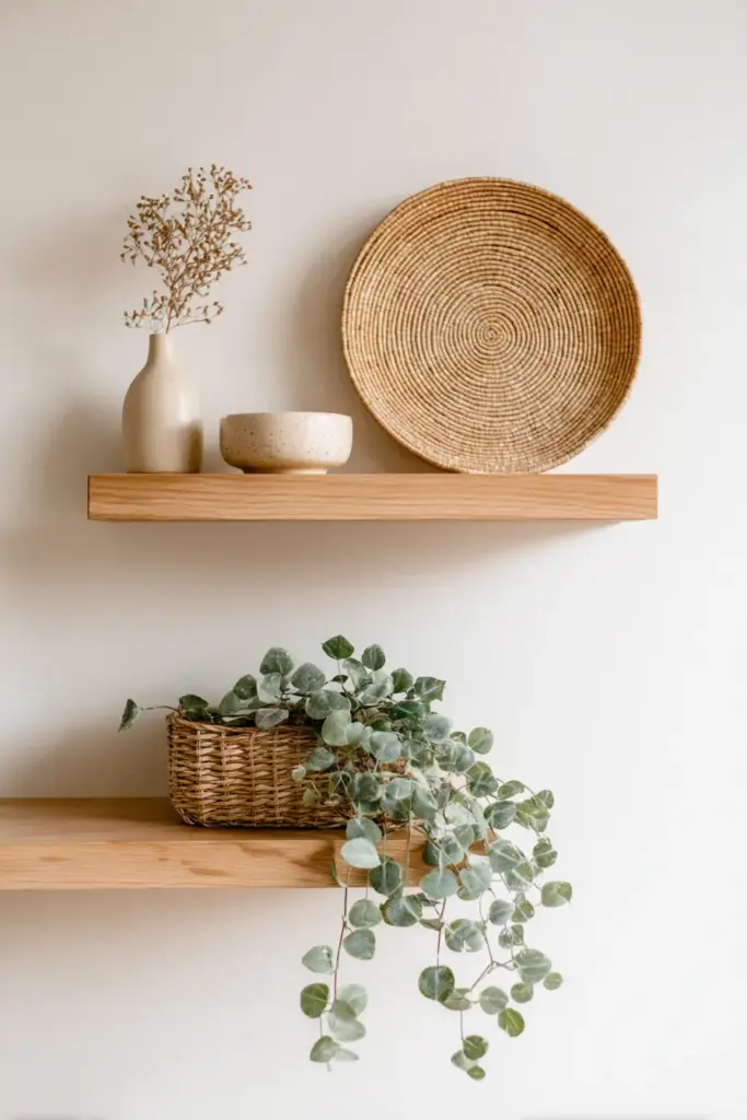
Palette 3: Earthen Comfort
Primary: Cream (#F0EAD6) walls and ceiling
Secondary: Warm brown (#8B7355) rattan furniture
Accent: Muted terracotta (#C9856B) in 2-3 small accessories
This palette sings in tropical climates. Cream stays cool psychologically even in warm weather, while terracotta brings warmth that feels earned, not applied. The rattan—ideally sourced from sustainable Philippine craftspeople in regions like Calabarzon—introduces organic texture that Japandi design craves.
Avoid terracotta on large surfaces in small rooms. Instead, use it in a single ceramic vase, two throw pillows, or framed art matting. The restraint is what makes it elegant.
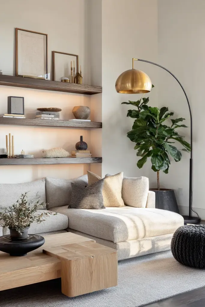
Palette 4: Cool Tranquility
Primary: Soft grey (#D3D3D3) on walls
Secondary: Natural wood mid-tones (ash or maple)
Accent: Pale blue-green (#B8D4D3) in textiles
For modern minimalists, this palette offers Japandi’s cooler register. The soft grey provides a neutral backdrop that doesn’t read as sterile, especially when layered with the warmth of natural wood.
The pale blue-green accent—almost celadon—references traditional Japanese pottery glazes. Use it sparingly: a single throw blanket, sheer curtains that filter morning light, or a subtle stripe in your area rug. In small rooms, this whisper of color becomes memorable precisely because it’s understated.
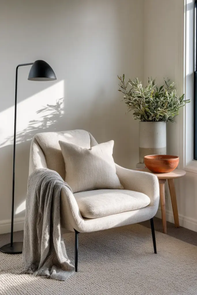
Palette 5: Warm Greige Harmony
Primary: Taupe (#C9A186) walls
Secondary: Beige linen (#F5F5DC) upholstery
Accent: Olive green (#6B8E23) and charcoal (#36454F) equally distributed
This is Japandi’s sweet spot—the perfect marriage of warm and cool that defines “greige.” Taupe walls have enough pigment to feel cocooning without closing in the space.
Distribute olive and charcoal evenly: olive in three medium-sized plants (real, not faux), charcoal in side table frames and one textural basket. The 50-50 accent split creates dynamic balance that keeps small rooms visually interesting across seasons.
Small-Space Optical Tricks with Color
Avoid dark floors in compact Japandi living rooms. While charcoal or espresso wood looks sophisticated in spacious interiors, it visually lowers the ceiling plane in small spaces. Instead, choose light ash, whitewashed oak, or pale bamboo flooring.
The contrast between light floors and slightly darker walls creates depth perception—your eye travels the distance between them, making the room feel dimensionally larger.
Paint your ceiling the same shade as your walls, or one shade lighter. When the color plane continues unbroken upward, the eye can’t measure where the wall ends and ceiling begins. This ambiguity reads as height.
We’ve seen transformations where simply painting a beige ceiling to match cream walls added perceived inches to a 8-foot ceiling.
Strategic Color Placement
Position your darkest accent color at eye level or below. A charcoal sofa sits comfortably in your sightline without pulling visual weight downward like a dark rug would.
Save your lightest neutrals for vertical surfaces and anything that reflects light—walls, curtains, tall cabinets. Horizontal surfaces can handle slightly richer tones: a tan coffee table, oatmeal area rug, or taupe ottoman.
This vertical-light, horizontal-medium strategy mimics how natural landscapes work (sky above, earth below) and feels inherently balanced to the human eye.
Lighting Integration for Japandi Palettes
Color lives or dies by its lighting. In small Japandi living rooms, this relationship becomes critical.
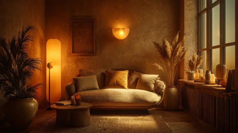
Choose warm 2700K LED bulbs for all primary lighting. This temperature makes beiges read inviting rather than institutional, and brings out the golden undertones in natural wood furniture.
Sage green truly pops under this warm light—it gains depth and complexity that cooler bulbs wash away. If you’re using our Palette 1 (Nordic Warmth), warm LEDs are non-negotiable.
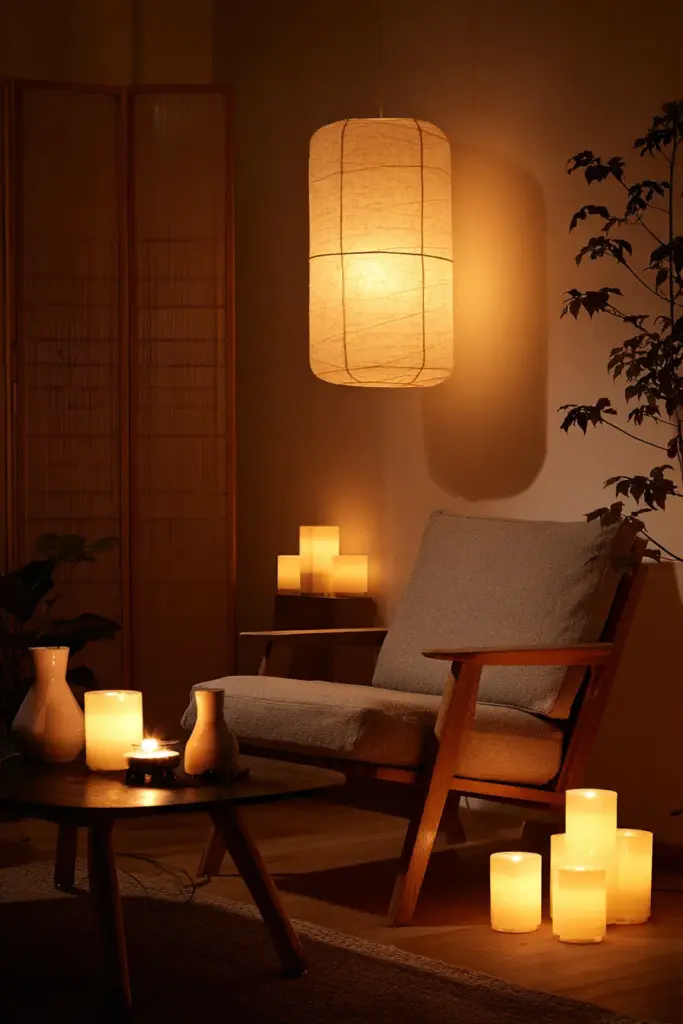
Recessed Lighting Placement
Install recessed lights 18-24 inches from walls to create “wall washing” effects. Light grazing down a cream or oatmeal wall eliminates harsh shadows and makes the wall appear to glow from within.
This technique visually pushes walls outward—an optical expansion that’s particularly effective in narrow living rooms common in apartment living.
Add one adjustable track light or picture light aimed at your charcoal or olive accent piece. This creates depth through shadow play and draws the eye to intentional focal points rather than letting it wander to the room’s limitations.
Sustainable Material Choices for Humid Climates
If you’re implementing these palettes in tropical regions like the Philippines, material selection matters as much as color choice.
Opt for low-VOC, humidity-resistant paints. Standard beige can yellow in high humidity; eco-rated formulas with mildew inhibitors maintain true color longer. We recommend testing small swatches in your actual room for at least a week before committing.
The way afternoon light through a west-facing window hits warm beige at 4 PM might completely change your perception of the color.
Sustainable Textiles
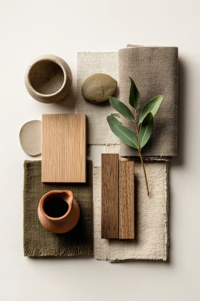
Choose linen over velvet for your 20% mid-tone layer. In humid climates, linen’s breathability prevents that muggy, heavy feeling velvet can create. It also takes natural dyes beautifully—perfect for achieving authentic taupe, oatmeal, or sage tones.
Look for recycled linen or hemp blends when possible. These materials align with Japandi’s wabi-sabi appreciation for natural imperfection while offering superior durability in moisture-rich environments.
Philippine-sourced rattan and bamboo furniture naturally resist humidity while providing the warm brown tones (#8B7355) that ground many Japandi palettes. Supporting local craftspeople in Calabarzon and similar regions adds meaningful sustainability to your design story.
Budget-Friendly DIY Color Testing
Before investing in full gallons, create DIY color swatches for under $20. Purchase sample sizes of your chosen neutrals and paint 2-foot squares directly on your wall.
Live with these swatches for at least five days. Observe how morning light, afternoon shadows, and evening lamp glow transform each shade. Cream that looks perfect at noon might read too yellow at dusk.
Free digital tools can help too. Upload a photo of your living room to online palette generators and test virtual color combinations. While these can’t replace physical swatches, they help narrow options before you spend.
Mix your own custom taupes and greiges by combining small amounts of base colors. Start with white paint, add tiny amounts of grey, beige, or olive until you achieve your ideal tone. This hands-on approach often yields more nuanced colors than off-the-shelf options.
Common Small Japandi Living Room Color Mistakes
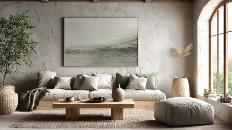
Using too many neutrals without texture variation. An all-beige room needs sensory diversity to avoid looking flat: smooth linen against chunky knit, matte walls beside glossy ceramics, soft textiles near rough jute.
Color is only one dimension. In Japandi design, texture provides the depth that prevents monochrome from becoming monotonous.
Placing bold colors in large doses. That beautiful muted terracotta should never cover more than 10% of your small living room. One terracotta accent wall will overwhelm rather than accent. Instead, distribute it across three small touchpoints: a pillow, a small art piece, a ceramic bowl.
Ignoring undertones. Not all beiges play well together. A pink-beige sofa against yellow-beige walls creates subtle discord that your eye registers as “something’s off” without knowing why. When selecting your 70-20-10 layers, ensure all neutrals share either warm or cool undertones.
Test potential combinations side-by-side in natural light before purchasing.
Adapting Palettes Across Seasons
Small living rooms benefit from seasonal color adaptation without requiring complete redesigns. Your base 70% stays constant—cream walls remain cream year-round.
For cooler months, swap your 10% accent from sage green to warm terracotta or rust. Add a chunky knit throw in oatmeal or tan. The shift feels cozy without cluttering.
For warmer months, introduce more white and pale blue-green accents. Replace heavier textiles with sheer linen curtains in cream. The same walls suddenly read fresher, airier.
This approach honors Japandi’s principle of mindful consumption—you’re not buying new furniture, just thoughtfully rotating small accent pieces that transform the room’s emotional temperature.
Color Palette Quick Reference
Here’s your at-a-glance guide to implementing small Japandi living room colors:
Base Layer (70%)
- Cream: #F0EAD6
- Warm white: #FAFAF8
- Pale oatmeal: #F5F5F4
- Soft grey: #D3D3D3
- Taupe: #C9A186
Mid-Tone Layer (20%)
- Tan: #D2B48C
- Natural oak/ash (light wood)
- Beige linen: #F5F5DC
- Warm brown rattan: #8B7355
Accent Layer (10%)
- Sage green: #A8B5A2
- Charcoal: #4A4A4A
- Slate grey: #708090
- Muted terracotta: #C9856B
- Olive green: #6B8E23
- Pale blue-green: #B8D4D3
Lighting
- Warm LED: 2700K
- Recessed lights: 18-24″ from walls
- Accent lights: aimed at dark focal points
Sustainable Materials
- Low-VOC, mildew-resistant paints
- Recycled linen or hemp textiles
- Locally sourced rattan/bamboo
The Emotional Impact of Getting It Right
When you nail your small Japandi living room palette, something shifts. The room doesn’t just look better—it feels different.
You’ll notice yourself lingering longer over morning coffee, the cream walls catching sunrise in ways you hadn’t anticipated. Guests comment that your space feels larger than its square footage, though they can’t articulate why. That’s the magic of intentional color working quietly in the background.
The sage green pillow you agonized over becomes the element that ties everything together. The charcoal ceramic vase—your single bold statement—gives the room its personality without shouting.
This is Japandi’s gift: beauty through restraint, spaciousness through simplicity, comfort through careful curation.
FAQs
What are the best Japandi colors for a small apartment in the Philippines?
For humid tropical climates, prioritize cream (#F0EAD6), warm beige (#F5F5DC), and natural wood tones that resist moisture. Add sage green (#A8B5A2) or pale blue-green (#B8D4D3) accents for freshness. Use low-VOC, mildew-resistant paints and breathable linen textiles over heavy fabrics.
Can I use grey instead of beige in a small Japandi living room?
Yes—soft grey (#D3D3D3) works beautifully for modern minimalists. However, beige tends to feel warmer and more inviting in compact spaces, especially with limited natural light. If choosing grey, balance it with warm wood furniture and 2700K lighting to prevent coldness.
How do I create a Japandi palette on a budget?
Start with DIY paint swatches using sample sizes (under $20 for multiple tests). Use free online palette generators to visualize combinations. Invest your budget in the 70% base color—quality paint for walls—and thrift or DIY your 10% accent pieces like terracotta ceramics or sage pillows.
Are dark floors okay in small Japandi living rooms?
Avoid dark floors in very small spaces (under 150 sq ft)—they visually lower ceilings and compress the room. Instead, choose light ash, whitewashed oak, or pale bamboo flooring. This maintains Japandi’s natural material aesthetic while enhancing spaciousness.
What’s the difference between a Japandi palette for small versus large living rooms?
Small rooms require stricter adherence to the 70-20-10 rule with lighter base colors to maximize visual expansion. Large rooms can handle slightly darker base tones (like deeper taupe) and more varied accent colors without feeling cramped. Small spaces succeed through restraint; large spaces through layering.