Table of Contents
There is a moment — you know the one — when you walk into a living room and everything just settles. The light falls softly, the colors breathe, and the furniture seems to hold you without effort. That feeling is never an accident. It is the quiet result of two things working in harmony: thoughtful furniture arrangement and intentional color choice.
Most guides talk about layout or color. We are here to talk about both, because the truth is they are inseparable. The sofa you choose affects the wall color that works. The wall color you paint affects how large or small the room feels. And the rug you lay down ties every decision together.
This is your complete guide — built for real rooms with real constraints. Whether your living room is narrow and shadowy, open and flooded with morning light, or small enough that every inch counts, we have a path forward for you.
Pull up a chair. Let us begin.
How to Arrange Living Room Furniture by Room Shape
The shape of your room is the first thing to read before you move a single piece of furniture. It tells you where the natural focal point lives, how traffic wants to flow, and which arrangement style will feel easiest to inhabit.
Small Living Rooms
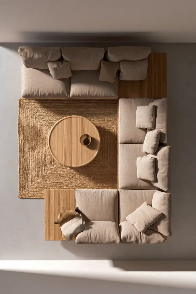
In a small living room, the biggest mistake is pushing every piece of furniture against the wall. It feels logical but it actually makes a room look smaller, not larger, because it creates a hollow, disconnected center.
Instead, pull the sofa slightly away from the wall — even 6 to 10 inches — and anchor the seating group with a rug. This defines a conversation zone and gives the room a sense of intentional scale rather than furniture simply stored around the edges.
Arrangement tips for small rooms:
- Choose one sofa and two lightweight chairs instead of a full sectional
- Use a round or oval coffee table to ease movement
- Keep walkways at least 36 inches wide for comfortable circulation
- Float furniture toward the center, not pinned to the perimeter
Narrow Living Rooms
A long, narrow room needs furniture arranged along the length, not fighting it. Place the sofa on the longest wall and face two chairs or a loveseat across from it, creating a clear conversation axis that runs lengthwise.
Avoid centering a large coffee table in the middle — it blocks the natural path. Try a pair of small side tables instead, one at each end of the sofa.
Square Living Rooms
Square rooms are generous but they can feel static. Break the symmetry gently by angling one accent chair slightly, or floating the sofa slightly off-center from the main focal point.
A diagonal rug placement can also give a square room movement and energy without requiring you to rearrange any furniture.
Open-Plan Living Rooms
In an open-plan space, the sofa does double duty as both furniture and architecture. Position it with its back facing the kitchen or dining area — this creates a subtle visual wall that defines the living zone without blocking light.
Use a large area rug to anchor the seating group so it reads as its own room within the room.
Before You Arrange: A Practical Checklist
Before moving furniture, take ten minutes to measure and note these:
- Room dimensions: length, width, ceiling height
- Focal point: fireplace, window wall, TV, or architectural feature
- Outlet and vent locations: these limit where the sofa and media console can go
- Natural light direction: morning vs. afternoon sun changes how colors read
- Traffic paths: mark where people naturally walk from entry to kitchen or hallway
- Minimum walkway width: 36 inches for main paths, 18–24 inches for secondary paths
How to Choose a Color Scheme That Supports the Layout
Color is not decoration layered on top of layout. It is part of the structure itself. A pale wall makes a room feel wider. A dark sofa creates visual weight that grounds a conversation area. The right rug color can unify furniture pieces that would otherwise feel mismatched.
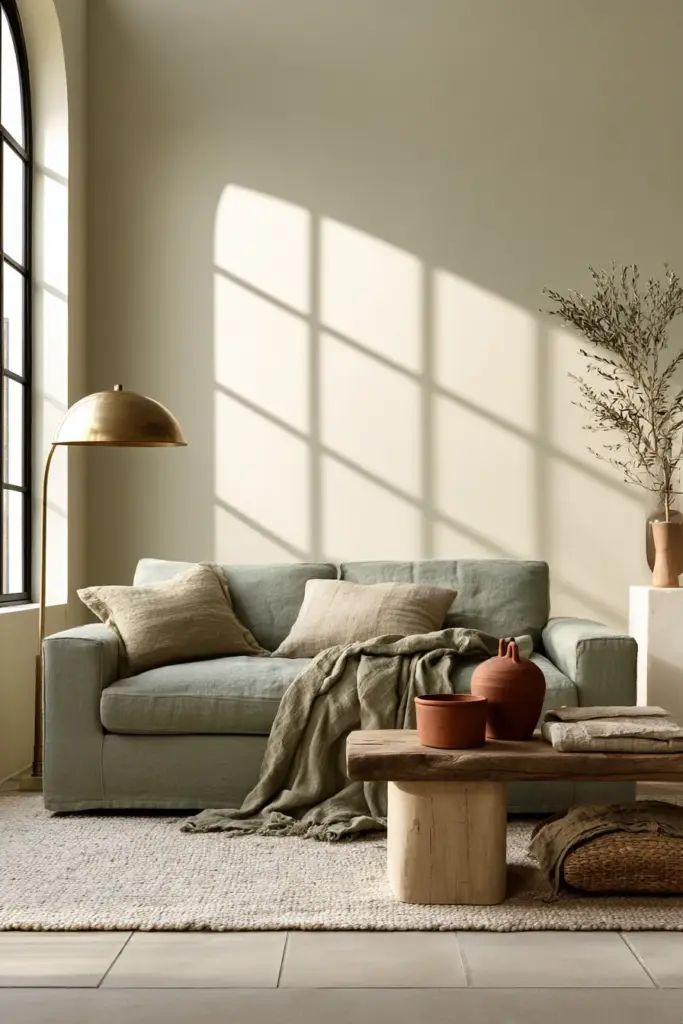
The 60-30-10 Rule for Living Rooms
The 60-30-10 rule is the clearest framework for building a color scheme that feels balanced without being boring.
| Color Role | Percentage | Where It Lives |
|---|---|---|
| Dominant color | 60% | Walls, large sofa, area rug |
| Secondary color | 30% | Accent chairs, curtains, bookshelves |
| Accent color | 10% | Throw pillows, vases, small decor objects |
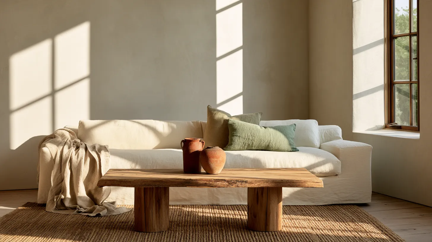
In practice, this might look like a soft warm white on the walls (60%), a sage green linen sofa (30%), and terracotta pillows and a brass lamp as the accent (10%). Every element has a role. Nothing competes for attention.
Warm vs. Cool Palettes and Why It Matters
Color temperature — warm or cool — should be chosen based on the room’s natural light, not just personal preference.
Warm palettes (creams, toffees, warm grays, terracotta, soft olive) feel most natural in rooms with north-facing or limited light. They add radiance where sunlight is sparse.
Cool palettes (soft blues, stone gray, sage, blush white) work beautifully in south- or west-facing rooms that get strong afternoon light. They prevent a sunny room from feeling harsh or overheated.
Match your palette to your light first, then layer in personal preference.
How Wood Tone Affects Color Choice
The wood tone of your furniture — whether it is a light Scandinavian birch, a warm honey oak, or a deep walnut — should harmonize with your wall color and rug.
| Wood Tone | Pairs Well With |
|---|---|
| Light ash or birch | Cool whites, soft sage, pale blues |
| Warm honey or oak | Warm whites, cream, terracotta, olive |
| Dark walnut or espresso | Deep teal, warm charcoal, dusty rose, forest green |
Mismatched undertones are one of the most common reasons a room feels “off” even when individual pieces are beautiful on their own.
Best Furniture Colors for Light, Dark, and Small Living Rooms
The color of your furniture is not just a style choice — it is a spatial tool. Understanding how color affects perceived size and light will save you from costly mistakes.
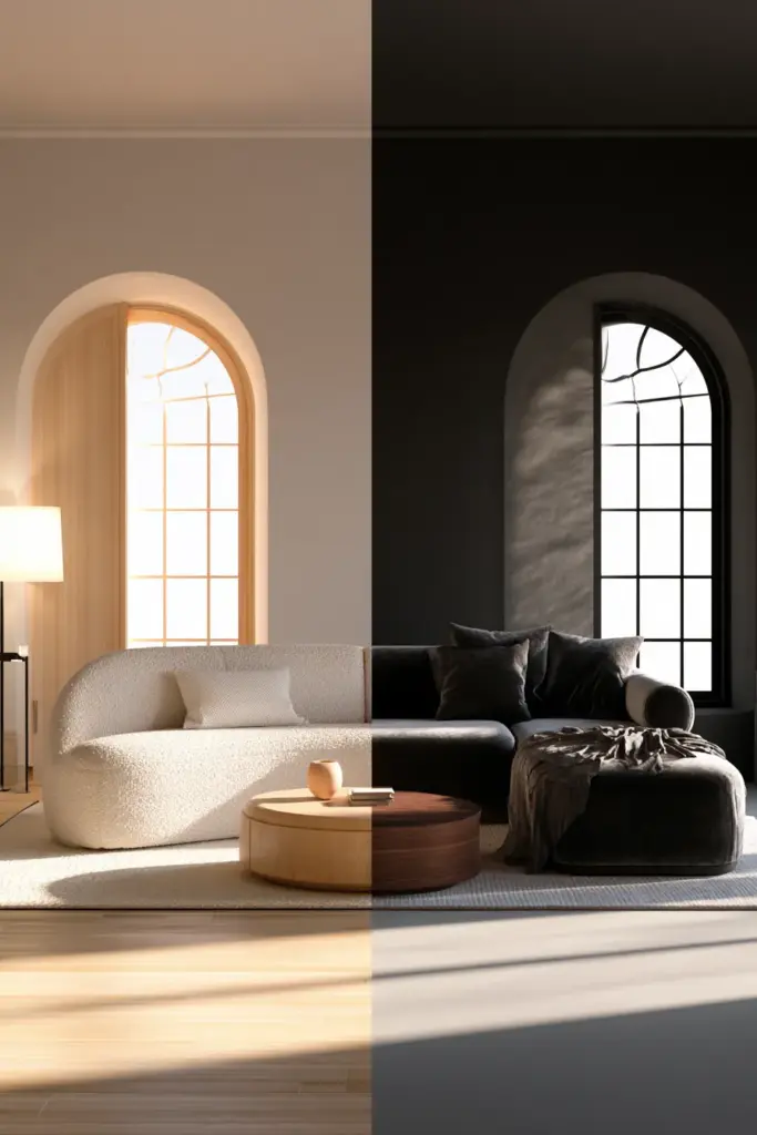
Light Rooms
In a light-filled room, you have the freedom to anchor the space with a deeper sofa color — charcoal, navy, forest green, or warm cognac leather. These darker tones add richness and prevent a very pale room from feeling washed out.
Balance a deep sofa with lighter walls and a natural fiber rug in jute or sisal.
Dark or Low-Light Rooms
In a room that receives little natural light, resist the instinct to paint everything white. A flat, stark white in a dark room can look gray and cold rather than bright.
Instead, choose warm mid-tones: a creamy linen, a soft terracotta, or a muted sage green. These tones catch and amplify what light exists and make a dim room feel cozy and considered rather than simply dark.
For furniture, choose lighter upholstery — a natural linen sofa, a pale bouclé chair — to reflect light within the space.
Small Rooms: The Three-Color Rule
For a small living room, limit the entire palette to three elements: one dominant neutral, one wood tone, one accent color. This constraint is not limiting — it is liberating. It creates visual quiet, which makes a small room feel larger and more restful.
- Dominant neutral: soft white, warm greige, or light stone on walls and sofa
- One wood tone: blonde oak side table, walnut shelf, or rattan chair
- One accent: a single color in pillows, a small rug, or one statement vase
Avoid mixing multiple wood tones or introducing more than one accent color in a small room. Visual clutter shrinks a space faster than any piece of furniture.
How Rugs, Curtains, and Lighting Affect Color Balance
These three elements — rug, curtains, lighting — are where color arrangements are either completed or undone.
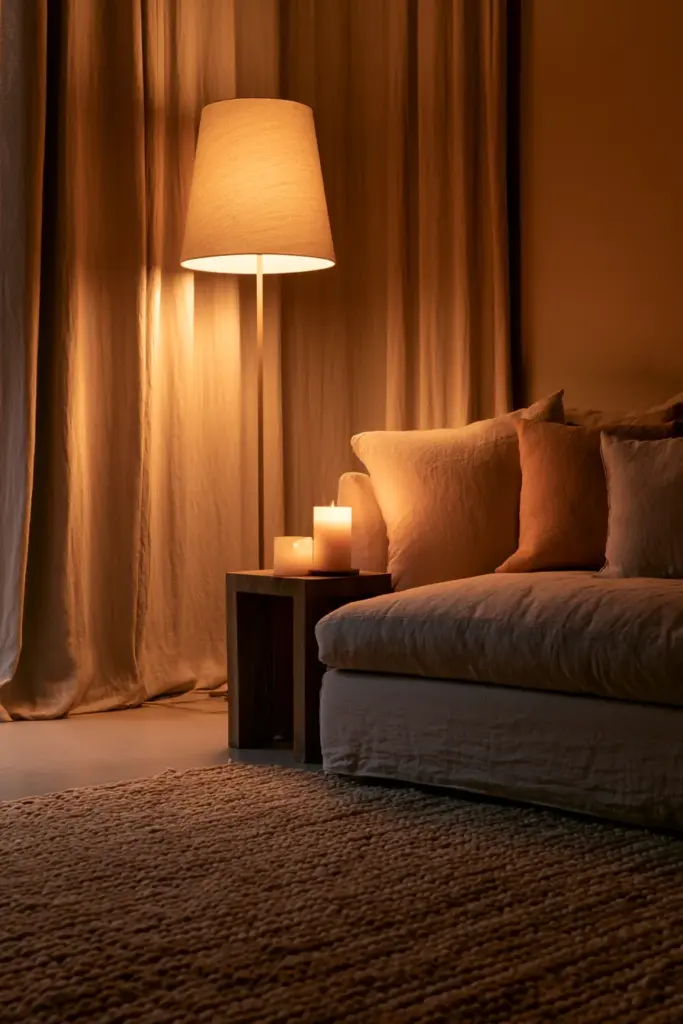
Rug Placement and Color
The rug is the largest color field at floor level, which means it has enormous influence on how the rest of the room reads. A rug with warm terracotta tones will make even a neutral sofa feel warm. A cool blue-gray rug will cool down an otherwise warm palette.
Rug sizing rule: In a typical living room, the front legs of all seating pieces should sit on the rug. This unifies the furniture into a cohesive group rather than a collection of separate objects floating on bare floor.
Curtains and Wall Color
Curtains that match the wall color — especially in a light linen or soft cotton — make walls appear taller and rooms feel calmer. This works especially well in small rooms or rooms with low ceilings.
Curtains in a contrasting color act as an accent and draw attention to the window. Use this technique intentionally and only when the window is a feature worth emphasizing.
Layered Lighting and Color Perception
Overhead lighting alone flattens color and makes every shade look duller than it actually is. Layered lighting — a floor lamp beside the sofa, a table lamp on a console, soft warm bulbs throughout — brings color to life.
Always choose warm white bulbs (2700K–3000K) for living rooms. Cool white or daylight bulbs shift warm tones gray and strip the room of its warmth.
Candlelight, even the flameless variety, adds a layer of amber warmth that no overhead fixture can replicate.
The Psychology of Arrangement and Color
There is a reason certain rooms feel immediately comfortable and others feel subtly wrong. It comes down to the psychological relationship between spacing, symmetry, and visual weight.
Visual Weight: Dark vs. Light Furniture
A dark sofa feels heavier and more grounding. A light sofa feels airy and recessive. Neither is better — they serve different rooms and different intentions.
In a large room, a dark sofa anchors the space and prevents furniture from looking small. In a small room, a light sofa keeps the eye moving freely without creating a visual block.
Symmetry and Perceived Comfort
Symmetrical arrangements — two matching chairs flanking a sofa, a pair of lamps on either side of a console — create a sense of calm and order. They work well in formal living rooms or spaces where relaxation is the primary purpose.
Asymmetrical arrangements feel more dynamic and casual. One accent chair instead of two, a floor lamp on one side and a plant on the other. These feel more lived-in and personal.
Use symmetry to create calm. Use asymmetry to create personality.
Color and Room Function
The color palette should reflect how the room is actually used, not just how it looks in photographs.
| Room Function | Recommended Palette |
|---|---|
| Quiet relaxation | Soft neutrals, muted sage, warm linen, dusty blush |
| Social and entertaining | Warmer tones, deeper accents, layered textures |
| Media and movie watching | Deeper wall tones, low contrast, minimal pattern |
| Family and everyday use | Durable mid-tones, textured fabric, grounded earthy palette |
Common Mistakes and How to Fix Them
Even beautiful furniture can underperform in a room that has not been arranged or colored thoughtfully. These are the most common missteps.
Too many focal points. Every room needs one primary focal point — a fireplace, a window wall, a piece of art. When the TV competes with the fireplace and a gallery wall competes with the window, the eye has no place to rest. Fix: choose one focal point and arrange seating to face it.
Wall-hugging furniture. Furniture pushed to every wall creates an empty center and a formal, disconnected feeling. Fix: float furniture toward the center and anchor with a rug.
Mismatched undertones. A cool gray sofa with warm yellow-toned wood floors creates a subtle but persistent visual discomfort. Fix: identify whether your fixed elements (floors, trim, fireplace) are warm or cool, then choose all other colors to match.
Too many wood tones. Two or three different wood finishes in one room create visual noise. Fix: choose one primary wood tone and use it consistently. A second tone is acceptable if it is very similar in warmth and depth.
Overly busy patterns. Pattern is wonderful in small doses but exhausting at scale. Fix: use pattern on one element only — a rug, one set of pillows, or a single accent chair — and keep everything else solid.
Budget-friendly impact swaps: Before buying new furniture, try these in order of visual impact — new throw pillows, a new rug, a new lamp, a new accent chair. Each of these changes the color balance of a room dramatically at a fraction of the cost of new upholstery.
A Quick Decision Guide by Room Type
| If your room is… | Choose… |
|---|---|
| Small | One neutral, one wood tone, one accent; light upholstery; round coffee table |
| Dark or north-facing | Warm mid-tone walls; light linen or bouclé sofa; layered warm lighting |
| Large and open | Anchor with a large rug; deep sofa color; symmetrical arrangement |
| Narrow | Furniture along the long wall; slim coffee table or side tables; vertical art |
| Open-plan | Sofa as divider; large rug to define zone; consistent palette across areas |
| Square | Slight asymmetry; diagonal rug; mix of chair heights |
Key Takeaways
- Float furniture away from walls and anchor with a rug
- Let room shape guide arrangement before you choose a style
- Use the 60-30-10 rule to build a balanced color palette
- Match color temperature (warm or cool) to natural light direction
- Choose furniture color based on room brightness, not just preference
- Layer three light sources: overhead, floor lamp, table lamp
- Limit small rooms to one neutral, one wood tone, one accent color
- Fix undertone mismatches before adding more color
- Let room function guide your palette: calm for relaxation, contrast for social spaces
Conclusion
The living room is the room that holds the most of you — your mornings with coffee, your evenings with company, your quiet afternoons with a book. It deserves to be arranged with care and colored with intention.
When layout and color work together, the room stops being a collection of furniture and becomes a place you actually want to be in. That is the design we believe in at ERYLIN — not rooms that photograph well, but rooms that feel right the moment you walk through the door.
Start with your room’s shape. Understand its light. Choose one focal point and build outward from there. Then layer in color slowly, like you are seasoning something worth tasting.
The most beautiful room you will ever live in is the one that feels exactly like you.
Frequently Asked Questions
How do I arrange furniture in my living room?
Start by identifying your room’s natural focal point — a fireplace, window wall, or TV — and arrange seating to face it. Float furniture away from walls, anchor the group with an area rug, and ensure walkways are at least 36 inches wide for comfortable movement.
What is the best color for a living room?
The best color depends on your room’s light direction and function. Warm neutrals (cream, warm white, soft greige) work in most rooms and support a wide range of furniture colors. For relaxation, choose muted cool tones; for social spaces, warmer mid-tones with deeper accents feel more energizing.
How do I match sofa color with wall color?
Identify whether your room has warm or cool undertones first, then match your sofa and wall to the same temperature. A warm beige wall pairs naturally with a honey-toned wood sofa or warm linen upholstery. A cool white wall works well with sage, soft gray, or dusty blue upholstery.
What color furniture makes a room look bigger?
Light upholstery — natural linen, soft white, pale bouclé — reflects light and makes a room feel more open. Pair light furniture with a consistent wall color (rather than a sharp contrast) and keep patterns minimal. Round or glass-top coffee tables also help small rooms feel less crowded.
What is the 60-30-10 rule in interior design?
The 60-30-10 rule divides a room’s color palette into three roles: 60% dominant color (walls, main sofa, large rug), 30% secondary color (accent chairs, curtains), and 10% accent color (pillows, lamps, small décor objects). This ratio creates visual balance without making a room feel flat or chaotic.