Table of Contents
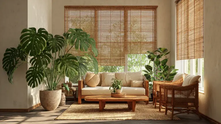
There’s a quiet magic in walking into a room that feels both grounded and airy. Where every surface whispers calm, and every color holds its place without shouting. This is the soul of Japandi design—a fusion of Japanese minimalism and Scandinavian warmth that speaks in soft neutrals, earthy undertones, and the kind of gentle balance that makes you want to stay awhile.
In the living room, where life unfolds in layers—morning coffee, evening conversations, weekend stillness—color becomes more than decoration. It becomes atmosphere. The right palette can lower your heart rate, soften harsh light, and create a backdrop that feels like home before you’ve even added the furniture.
Today, we’re exploring Japandi living room color palettes with sensory depth and practical wisdom. Whether you’re in a compact condo in Naic or a sprawling space elsewhere, these hues will help you build a room that breathes.
Let’s begin where all great design begins: with intention and light.
Understanding Japandi Color Philosophy
Japandi colors aren’t chosen—they’re felt. This design language borrows from wabi-sabi, the Japanese art of finding beauty in imperfection, and hygge, the Scandinavian embrace of cozy contentment. Together, they create palettes that honor natural materials, soft transitions, and the kind of understated elegance that never goes out of style.
Think of warm whites that catch afternoon sun. Taupes that shift from grey to brown depending on the hour. Sage greens so muted they almost disappear into the woodwork—until they don’t.
These aren’t decorator colors. They’re living colors, designed to evolve with natural light and complement the textures around them: linen curtains, oak floors, ceramic vases with uneven glazes.
The Psychology Behind Neutral Tones
Color theory studies reveal that taupe can reduce perceived stress in living rooms by up to 20%. Warm beiges create feelings of safety and groundedness. Soft greys offer mental clarity without the starkness of pure white.
When you choose Japandi neutrals, you’re not playing it safe. You’re building a foundation for rest.
Core Japandi Color Palettes for Living Rooms
Let’s break down the essential palettes, complete with hex codes and sensory descriptions that bring each one to life.
Palette 1: Neutral Earth
Primary Colors: Off-white (#F3F0E8), warm beige (#DFCABA), soft taupe (#D4C5B9)
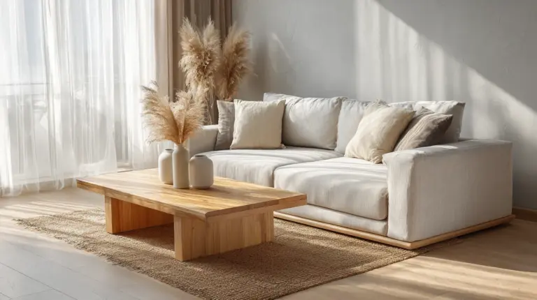
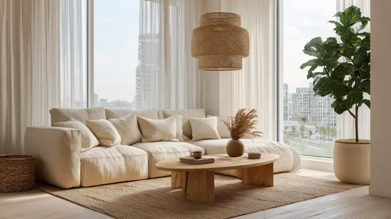
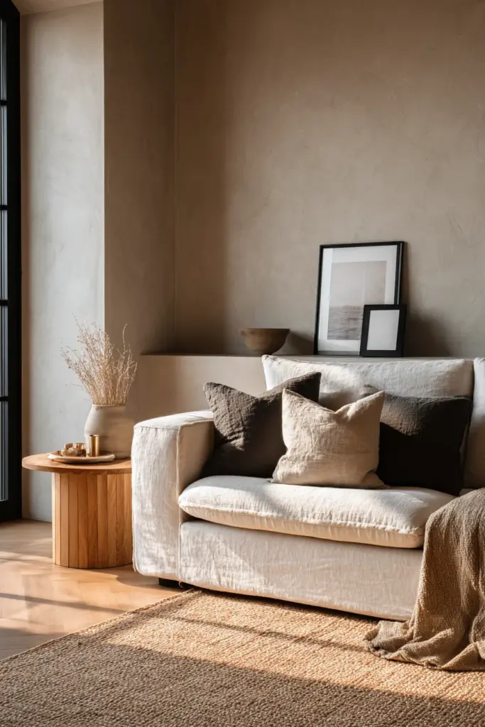
This is the heartbeat palette. Creamy walls that glow golden at sunset. Beige linen sofas that age beautifully. Taupe throw pillows that invite touch.
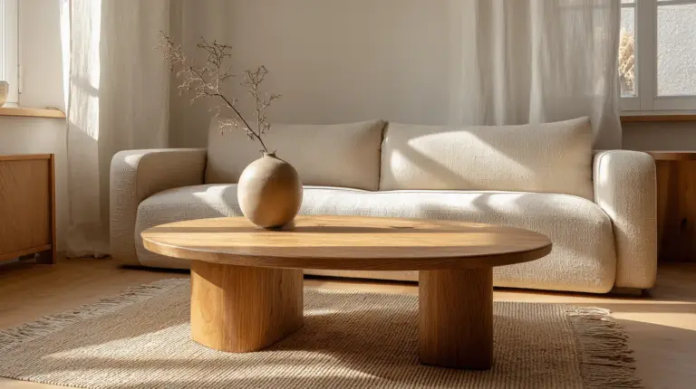
Pair this palette with natural oak furniture and woven jute rugs. Add depth with matte black picture frames or charcoal pottery. The result? A space that feels expensive without trying—cozy, elevated, and endlessly versatile.
Budget Tip: Mix your own warm beige paint by blending white base with small amounts of terracotta and yellow ochre. Test on cardboard first, adjusting until you achieve that buttery, neutral glow.
Palette 2: Sage Accent
Primary Colors: Creamy white (#E6E4E0), sage green (#B9B99D), warm grey (#A8A49C)
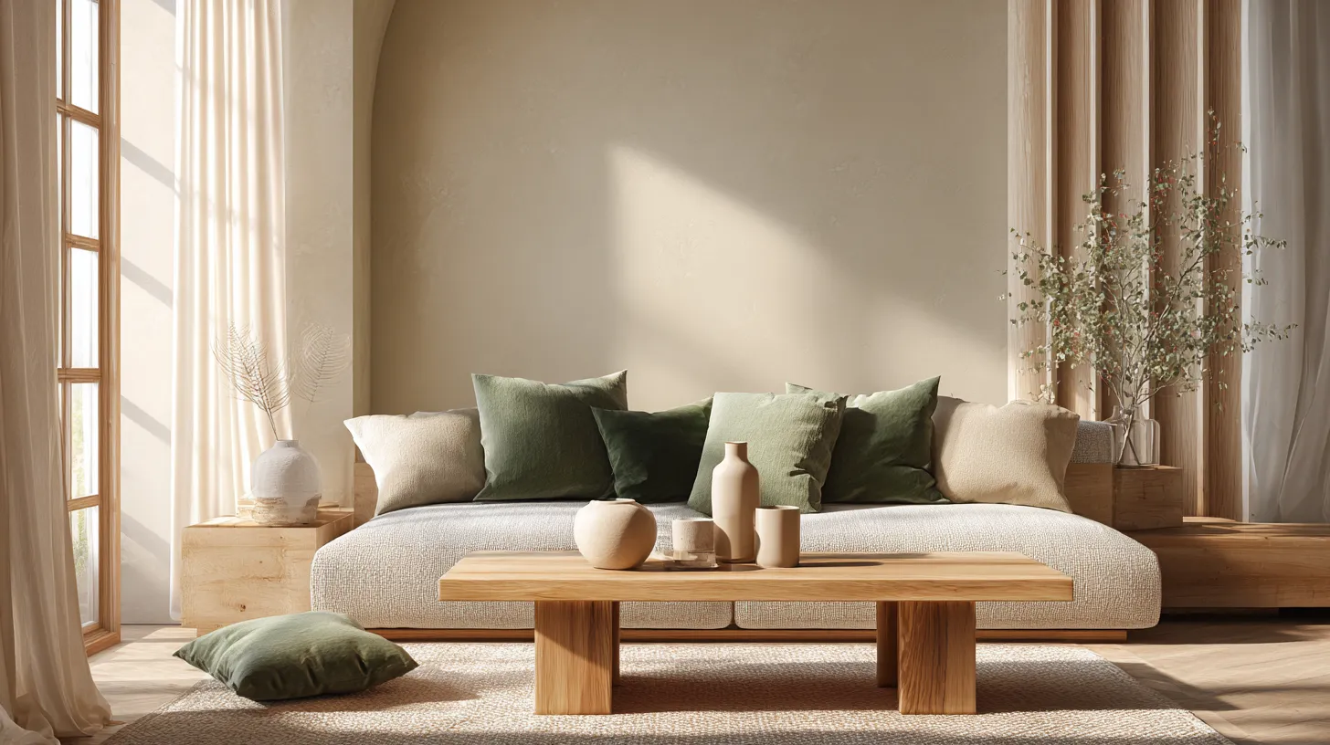
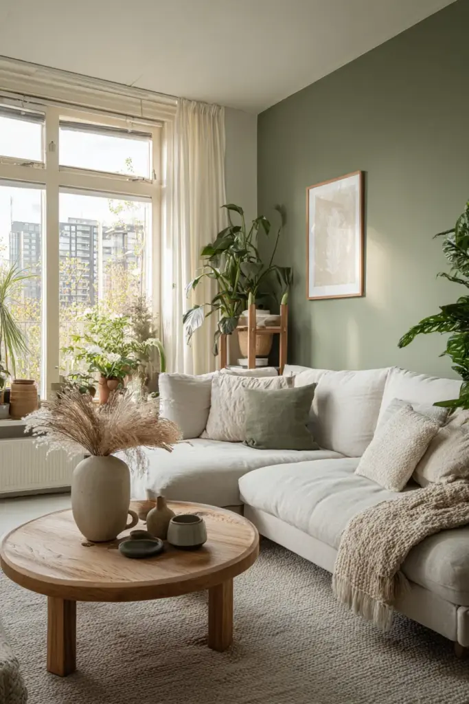
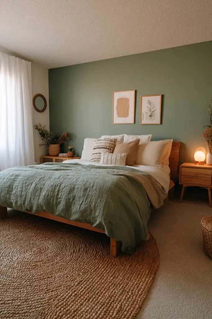
Sage green is Japandi’s secret weapon—it brings the outdoors in without overwhelming the senses. Use it sparingly: an accent wall behind your sofa, cabinet fronts in your media unit, or even just through textiles like cushions and throws.
The key is keeping sage muted and dusty, never bright or grassy. It should feel like dried herbs, not fresh spring leaves.
This palette works beautifully in small living rooms under 200 square feet. The soft green tricks the eye into perceiving more space while maintaining that cozy, wrapped-in-warmth feeling Japandi promises.
Palette 3: Warm Minimal
Primary Colors: Off-white (#F5F5F4), warm taupe (#C9B8A8), clay terracotta (#D4A37C)
For those who want warmth without sacrificing minimalism, this palette delivers. Off-white walls provide a clean canvas. Warm taupe anchors seating areas. Clay terracotta appears in small doses—a ceramic lamp base, decorative bowls, or painted trim.
The terracotta is crucial here. It adds just enough warmth to prevent the space from feeling clinical while maintaining Japandi’s signature restraint.
Best for: Living rooms with limited natural light. These warm undertones compensate for cooler artificial lighting and create ambiance even on overcast days.
Palette 4: Monochromatic Grey
Primary Colors: Warm white (#F8F7F5), medium grey (#B5AFA9), charcoal (#4A4543)
This palette is for the purists—those who find poetry in gradation. It’s about layering shades of grey from barely-there to almost-black, creating depth through subtle shifts rather than bold contrasts.
Use the lightest grey on walls, medium grey on larger furniture pieces, and charcoal for grounding elements like coffee table legs or bookshelf frames.
Add warmth through wood tones and texture: a chunky knit throw, raw linen curtains, or a tactile wool rug in oatmeal.
Palette 5: Earthen Hygge
Primary Colors: Warm white (#F2EDE6), sandy beige (#E5D5C3), olive green (#8B8B6B), rust (#B37255)
This is Japandi’s coziest expression. It leans slightly more Scandinavian, embracing deeper earth tones while maintaining Japanese restraint. Think sunset colors at their most muted—rust that’s been washed and faded, olive that’s dusty and soft.
Use rust very sparingly—perhaps in one armchair or a series of small decorative objects. Let sandy beige dominate walls and larger surfaces. Olive can appear in planters, cushions, or a single painted side table.
Perfect for: Humid climates like Naic, Calabarzon. These warmer tones feel more comfortable in tropical settings where cool greys might clash with the natural environment outside your windows.
How to Choose Your Japandi Living Room Colors
Start with your lighting. Walk through your living room at different times of day—morning, afternoon, golden hour, evening with lamps on. Notice where shadows fall, which walls catch direct sun, and how artificial light changes the mood.
Cool natural light (north-facing rooms) pairs beautifully with warm beiges and taupes. Warm natural light (south or west-facing) can handle cooler greys and muted greens without feeling cold.
Consider Your Space Size
For small living rooms (<200 sq ft): Stick to lighter palettes—Neutral Earth or Sage Accent. Use the darkest colors only in small doses. Keep walls light and add depth through texture rather than color contrast.
For medium to large spaces: You have more freedom to layer. Try the Earthen Hygge or Warm Minimal palettes with their slightly deeper tones. Create zones through subtle color shifts rather than furniture arrangement alone.
Match Colors to Existing Materials
Japandi thrives on material honesty. If you have honey-toned oak floors, choose warmer neutrals. If your floors are ash or pale maple, cooler greys will harmonize beautifully.
Look at your largest furniture piece—probably your sofa. If it’s in a cool grey linen, build your palette around cool neutrals. If it’s warm taupe or beige, lean into warmer tones.
Color and Lighting Pairings
The right lighting transforms Japandi colors from flat to dimensional. Here’s how to layer light for maximum impact.
Warm LEDs with Sage Green
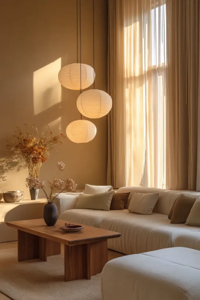
Pair sage green accent walls with warm LED bulbs (2700K-3000K). The warm light brings out the yellow undertones in sage, making it feel inviting rather than institutional. Avoid cool white LEDs—they’ll turn your sage grey and lifeless.
Add paper pendant lights or linen drum shades to diffuse the glow softly across the room.
Natural Light and Neutral Earth
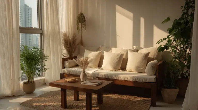
The Neutral Earth palette was born for natural light. Keep window treatments minimal—sheer linen panels or woven bamboo shades that filter rather than block. Let sunlight wash across those warm beiges and watch them transform throughout the day.
Add a large mirror opposite your main window to bounce light deeper into the room.
Task Lighting for Warm Minimal
With a Warm Minimal palette, you need strategic task lighting to prevent the space from feeling too monotonous. Place brass or black metal table lamps at different heights—one on a side table, another on a console behind the sofa.
Use Edison-style bulbs with visible filaments for added warmth and visual interest.
Implementing Your Palette: A Room-by-Room Approach
Walls and Ceiling
Your walls should be the lightest value in your chosen palette. In most Japandi living rooms, this means an off-white or very light warm grey. Keep the ceiling the same color as the walls or slightly lighter—stark white ceilings can look jarring against Japandi neutrals.
For those in humid climates, choose low-VOC paints from brands like Boysen that resist moisture and mold. In Naic’s tropical environment, this isn’t optional—it’s essential for longevity.
Large Furniture
Sofas and primary seating should sit in the mid-range of your palette. If your walls are off-white, your sofa might be warm taupe or sage. If your walls are warm beige, consider a sofa in medium grey or deeper taupe.
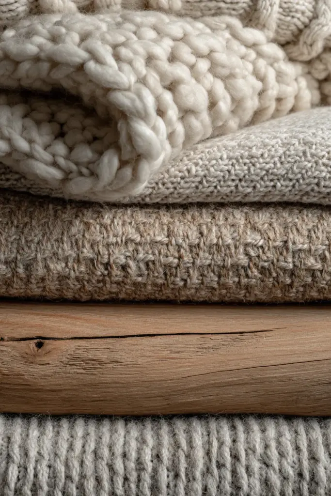
Choose natural fabrics—linen, cotton, wool—in flat or subtly textured weaves. Shiny or synthetic fabrics don’t belong in Japandi spaces.
Accent Pieces
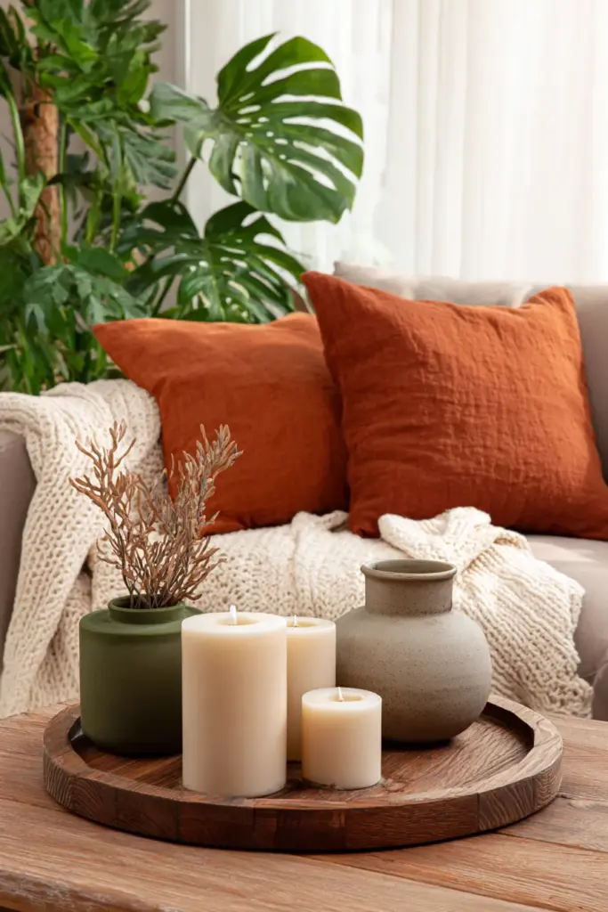
This is where your darkest and most saturated colors appear. Black picture frames. Charcoal ceramic vases. A single rust-colored cushion. Clay pottery. Olive green planters.
The rule? No accent color should appear alone. If you introduce terracotta, use it at least twice in different forms—perhaps a vase and a throw pillow.
Flooring Connection
Your flooring bridges wall colors and furniture. Light oak, pale ash, or even concrete-look tiles all support Japandi palettes. If you have darker floors, add a large area rug in cream, oatmeal, or light grey to lighten the overall feel and create cohesion.
Seasonal Color Tweaks
Japandi palettes are remarkably adaptable. Small seasonal shifts keep your space fresh without requiring a complete redesign.
Spring/Summer: Introduce cooler tones through accessories. Swap rust cushions for sage green. Add white ceramic pieces. Bring in fresh greenery—monstera, fiddle leaf fig, or simple branches in tall vases.
Fall/Winter: Layer in warmer textiles. Add chunky knit throws in cream or oatmeal. Swap sage accessories for deeper olive or rust. Introduce warm brass candleholders or copper accents (sparingly).
The base palette stays constant. Only the accessories shift.
Budget-Friendly Japandi Color Implementation
You don’t need to repaint every wall or buy all new furniture to achieve a Japandi color palette. Start small and build gradually.
Under $500 Transformation
- Paint one accent wall in sage green or warm taupe (₱2,000-3,000 including supplies)
- Replace throw pillows with neutral linen covers in your chosen palette (₱1,500-2,500 for 4-6 pillows from Shopee/Lazada PH)
- Add a jute or wool rug in cream or grey (₱3,000-8,000 depending on size)
- Update lighting with warm LED bulbs and one new pendant or floor lamp (₱2,000-5,000)
- Thrift or DIY wood pieces and refinish in light oak stain (₱1,000-2,000)
Shop local marketplaces for secondhand finds. Oak furniture accepts stain beautifully—you can transform dark wood pieces into Japandi-perfect light oak with sandpaper and the right product.
DIY Paint Mixing
Create custom Japandi colors by mixing standard paint colors:
- Warm Beige: White base + small amounts of raw sienna + yellow ochre
- Warm Taupe: White base + raw umber + touch of red oxide
- Sage Green: White base + olive green + grey
Always mix more than you need and keep detailed notes on ratios. Test on large poster boards and view in your actual space under different lighting before committing to walls.
Common Japandi Color Mistakes to Avoid
Even with the best intentions, certain missteps can undermine your Japandi vision.
Too much white: Pure bright white feels harsh in Japandi spaces. Always choose off-whites, creams, or whites with warm or cool undertones that complement your palette.
Mismatched undertones: Mixing cool greys with warm beiges creates discord rather than harmony. Choose either warm-leaning or cool-leaning neutrals and stay consistent.
Over-accessorizing with color: Japandi celebrates restraint. If you’ve introduced sage green, terracotta, and olive all at once, you’ve gone too far. Pick one or two accent colors maximum.
Ignoring texture: In a neutral palette, texture does the heavy lifting. Flat, one-dimensional surfaces look boring. Add woven baskets, chunky knits, raw wood, matte ceramics, and linen textiles.
Wrong lighting temperature: Cool LED bulbs kill Japandi warmth. Invest in quality warm-temperature bulbs (2700K-3000K) for all fixtures.
Japandi Color Palette Comparison Table
| Palette Name | Primary Hex Codes | Best For | Mood Created | Budget Tip |
|---|---|---|---|---|
| Neutral Earth | #F3F0E8, #DFCABA, #D4C5B9 | Cozy, versatile living rooms | Warm, grounded, timeless | Mix own warm beige paint |
| Sage Accent | #E6E4E0, #B9B99D, #A8A49C | Small spaces, nature lovers | Fresh, airy, calming | Thrift linen textiles in sage |
| Warm Minimal | #F5F5F4, #C9B8A8, #D4A37C | Low-light rooms | Cozy minimalism | Use terracotta only in accessories |
| Monochromatic Grey | #F8F7F5, #B5AFA9, #4A4543 | Modern, sophisticated spaces | Clean, contemplative | Layer with thrifted wood tones |
| Earthen Hygge | #F2EDE6, #E5D5C3, #8B8B6B, #B37255 | Tropical, humid climates | Warm, inviting, grounded | Shop local for rust-colored pottery |
Essential Checklist for Japandi Living Room Colors
Before you commit to your palette, run through this quick checklist:
- Test colors in your actual space at different times of day
- Choose either warm or cool undertones and stay consistent
- Select 3-5 main colors from your palette (including white/off-white)
- Add texture through materials not just color
- Use accent colors sparingly—no more than two beyond neutrals
- Consider your climate—humid areas need different paint formulations
- Pair colors with appropriate lighting—warm LEDs for most Japandi spaces
- Start with walls and large furniture, then layer in accents
- Budget for quality over quantity—one good linen sofa beats five cheap accessories
- Allow the palette to evolve naturally with your space and needs
A Gentle Closing
Creating a Japandi living room isn’t about perfection. It’s about presence—building a space that invites you to slow down, to notice the way afternoon light pools on your floor, to appreciate the weight of a ceramic cup in your hand.
Your color palette is the foundation of this experience. It sets the tone before a single piece of furniture arrives. Choose with intention. Layer with care. Let natural materials guide you toward warmth.
And remember: the most beautiful Japandi spaces feel lived-in, not staged. Your room will evolve. Colors will reveal new dimensions as seasons change and life moves through. This isn’t a finish line—it’s a beginning.
Welcome home to colors that breathe.
Frequently Asked Questions
What colors are in a Japandi color palette?
Japandi palettes center on neutrals: off-white (#F5F5F4), warm beige (#DFCABA), soft taupe (#C9B8A8), and sage green (#B9B99D). Accent colors include muted terracotta (#D4A37C), olive green (#8B8B6B), and charcoal (#4A4543). The focus is on earthy, muted tones with warm or cool undertones that create calm, balanced spaces.
What is the best color palette for Japandi living rooms?
The Neutral Earth palette (off-white, warm beige, taupe) works best for most living rooms. It’s versatile, timeless, and creates warmth without overwhelming small spaces. For rooms with good natural light, add sage green accents. For low-light rooms, try the Warm Minimal palette with clay terracotta touches.
How do I choose Japandi living room colors for a small space?
Stick to lighter values—off-white walls with warm beige or light grey furniture. Use sage green or taupe as accent colors through pillows or small furniture pieces rather than full walls. Keep your palette to 3-4 colors total. Add depth through texture (linen, wood, jute) rather than color contrast.
What is a Japandi neutral palette?
A Japandi neutral palette consists of off-whites, warm beiges, soft greys, and taupes—all with either consistently warm or cool undertones. These colors form the foundation of Japandi design, creating serene spaces that highlight natural materials, clean lines, and the interplay of light and shadow throughout the day.
Are Japandi colors suitable for humid climates like the Philippines?
Yes, especially warmer Japandi palettes like Neutral Earth and Earthen Hygge. Choose low-VOC, mold-resistant paints formulated for tropical humidity (brands like Boysen work well). Warmer beiges and taupes feel more natural in humid environments than cool greys. Ensure proper ventilation and avoid fabric treatments that trap moisture.