Table of Contents
There’s something quietly powerful about walking into a room that breathes. Where light pools on warm wood, where every shade whispers rather than shouts, where the air itself feels softer. This is the essence of Japandi—a marriage of Japanese minimalism and Scandinavian coziness that has captivated hearts and homes across the world.
The magic lives in the colors. Not just any palette, but one that honors simplicity, celebrates natural materials, and invites you to exhale. Japandi living room furniture color palettes are more than design choices—they’re invitations to slow down, to notice, to feel grounded in your own space.
If you’re dreaming of a living room that feels like a sanctuary, you’re in the right place. Let’s explore the hues that define this beloved aesthetic, from the softest creamy whites to the earthiest terracotta touches. We’ll show you how to layer tones, choose furniture that sings, and create a space that feels both intentional and effortless.
Because your living room should be more than beautiful. It should feel like home.
Understanding the Japandi Color Philosophy
Japandi isn’t about following rigid rules. It’s about finding harmony between two design philosophies that share a deep respect for nature, quality, and quietude.
Japanese design brings wabi-sabi—the beauty of imperfection, the poetry of aging wood, the elegance of restraint. Scandinavian design offers hygge—warmth in candlelight, comfort in textured throws, joy in simplicity. Together, they create something transcendent: spaces that feel both minimal and cozy, clean-lined yet inviting.
The color palette reflects this balance. You’ll find neutral tones as your foundation, earthy hues that ground the space, and occasional muted accents that add personality without disruption. Think of your palette as a breath—natural, necessary, and never forced.
Core Japandi Color Palette for Living Room Furniture
The Foundation: Neutral Tones
Your Japandi living room begins with neutrals—the colors that create calm and let everything else breathe.
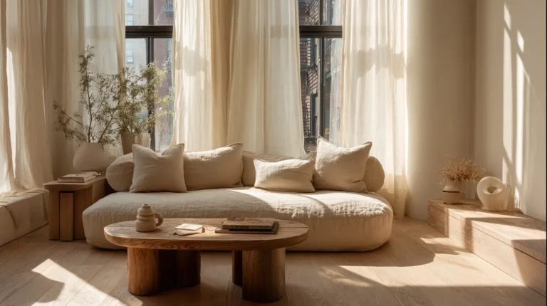
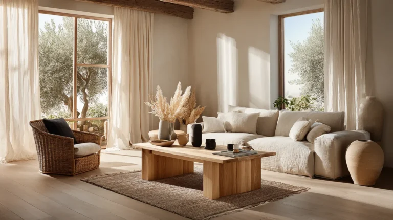
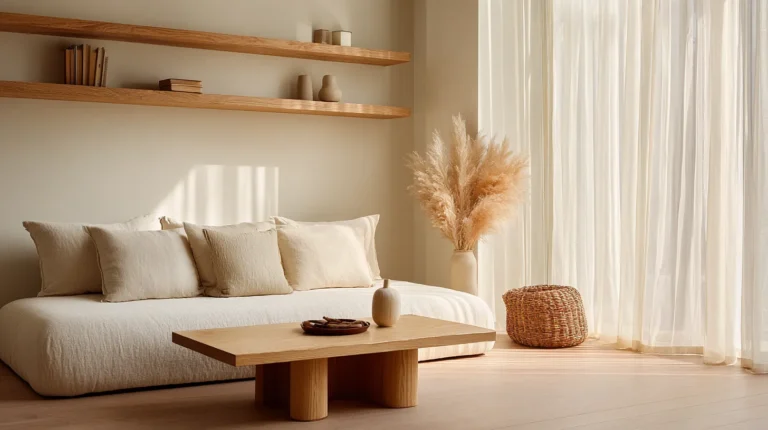
Creamy whites and warm beige form the backbone of most Japandi spaces. These aren’t the stark whites of modern minimalism, but softer, warmer tones that catch afternoon light and glow at dusk. Consider warm white walls paired with a beige linen sofa—the combination feels like wrapping yourself in comfort.
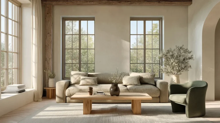
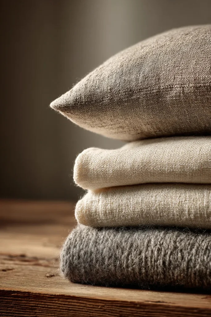
Warm taupe and greige bridge the gap between grey and beige, offering sophistication without coldness. A taupe sectional anchors your space while maintaining that essential Japandi lightness. These tones work beautifully with natural wood furniture, creating layers of warmth that never overwhelm.
Soft greys appear in their gentlest forms—think fog, not concrete. Use them sparingly on accent chairs or storage pieces. The key is choosing greys with warm undertones, avoiding anything too blue or industrial.
| Color | HEX Code | RGB Values | Best For |
|---|---|---|---|
| Creamy White | #F5F1E8 | 245, 241, 232 | Walls, large sofas |
| Warm Beige | #D9CFC1 | 217, 207, 193 | Upholstery, rugs |
| Warm Taupe | #C4B5A0 | 196, 181, 160 | Sectionals, ottomans |
| Soft Grey | #D3D0CB | 211, 208, 203 | Accent chairs |
Natural Wood Tones: The Heart of Japandi Furniture
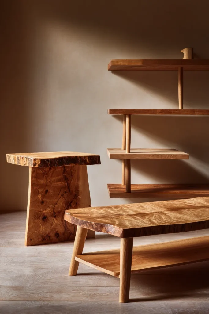
Wood isn’t just furniture in Japandi spaces—it’s the soul. The right wood tones transform a room from decorated to lived-in, from designed to deeply personal.
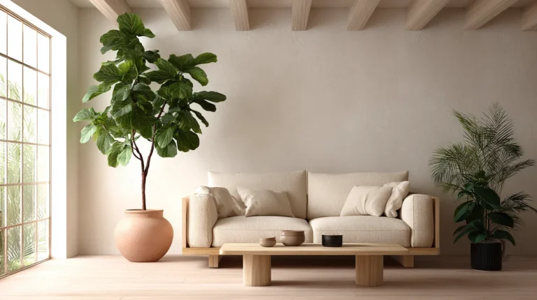
Light oak and ash bring Scandinavian brightness. These pale woods reflect light beautifully, making even small living rooms feel expansive. Picture a low-profile oak coffee table, its grain visible and honest, paired with beige seating. This is Japandi at its purest.
Walnut and medium browns add Japanese depth. Darker than Scandinavian staples but never heavy, walnut furniture grounds your space with quiet elegance. A walnut media console or side table creates visual weight without darkness.
Mixing wood tones is not only acceptable—it’s encouraged. Pair light oak legs on your sofa with a darker walnut bookshelf. The variation adds interest while staying within the natural palette. Just ensure all woods share similar undertones (warm or cool) for cohesion.
Earthy Accents: Adding Warmth and Character
Once your foundation is set, earthy accents bring your Japandi living room to life.
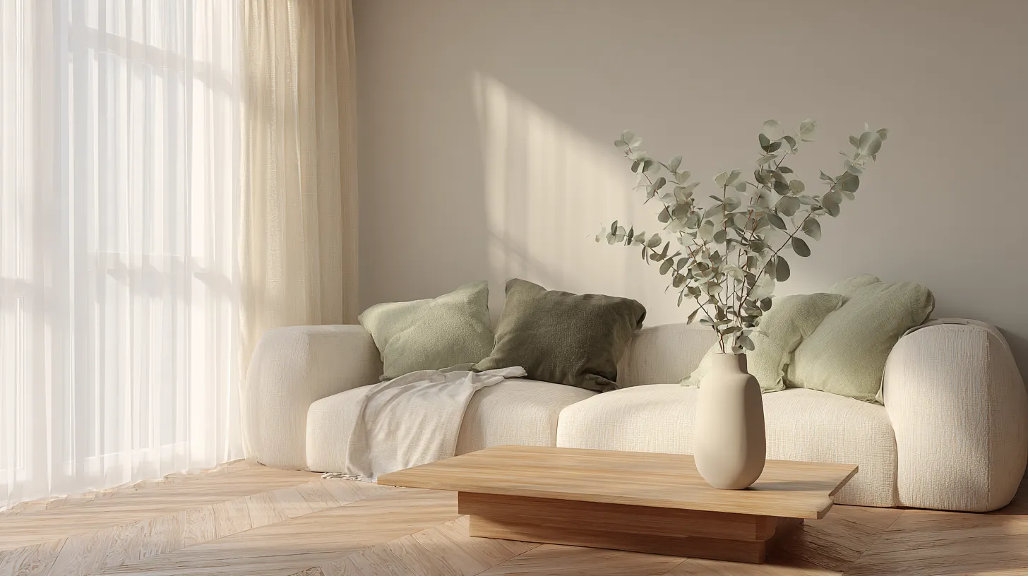
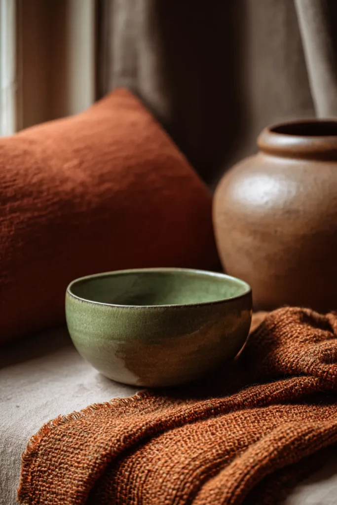
Sage green and muted olive connect your indoor space to nature. These aren’t bright botanical greens, but soft, dusty hues that feel aged and gentle. A sage green throw pillow on your neutral sofa, eucalyptus stems in a ceramic vase—these touches ground you without demanding attention.
Terracotta and rust warm the palette during colder months. Think of a rust-colored ceramic bowl on your coffee table or terracotta-dyed cushions that catch the golden hour light. Use these warmer tones sparingly—they’re the spice, not the main ingredient.
Charcoal and deep brown anchor larger pieces when you need more visual weight. A charcoal accent chair in the corner, deep brown leather on your reading chair—these darker tones create cozy pockets within your airy space.
The 60-30-10 Rule for Japandi Color Schemes
This classic interior design principle becomes particularly elegant in Japandi spaces, where balance is everything.
60% Dominant Color: Your main neutral—typically warm white, beige, or soft grey—covers 60% of the visible space. This includes your largest furniture pieces like sofas and walls. The dominance of neutral tones creates that essential Japandi calm.
30% Secondary Color: Natural wood tones or a complementary neutral fill 30%. Your coffee table, media console, shelving, and accent seating live here. This layer adds warmth and prevents monotony.
10% Accent Color: Your earthy accent—sage green, terracotta, or charcoal—appears in 10% of elements. Cushions, throws, artwork, and small decorative objects carry this color. The restraint makes each accent feel intentional and special.
Imagine: a large cream sofa (60%), oak furniture and a taupe armchair (30%), sage throw pillows and a terracotta vase (10%). The room feels complete but never cluttered, balanced but never boring.
Color Palettes for Different Living Room Sizes
Small Living Room Japandi Palettes
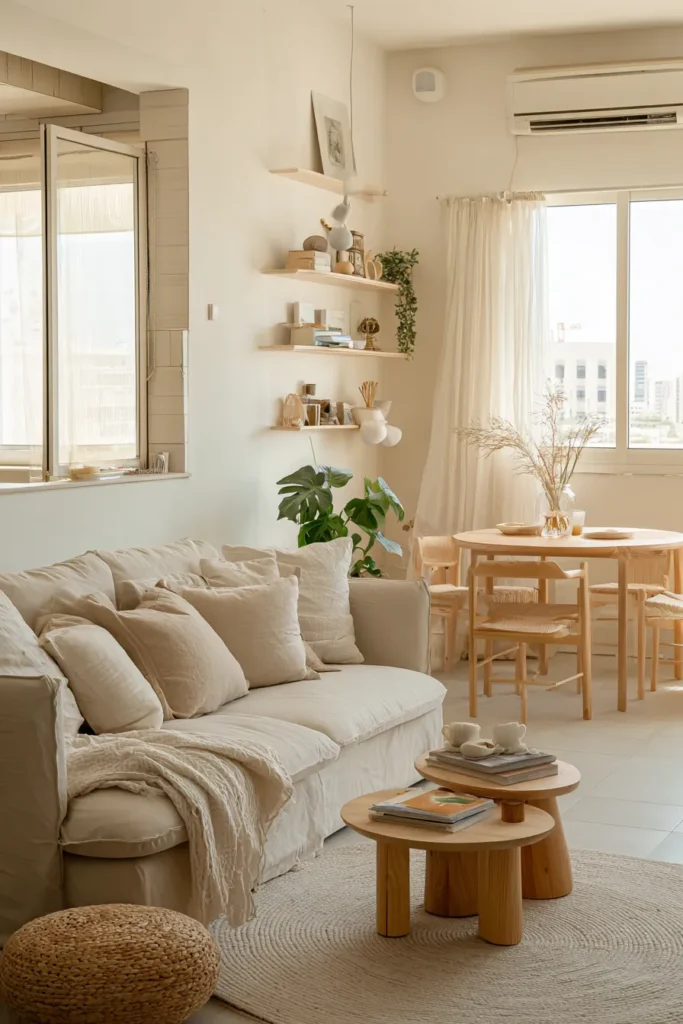
Small spaces demand lighter, more reflective color choices. Stick to the palest end of the Japandi spectrum—creamy whites, light beiges, and pale grey-toned wood like ash or birch.
Choose furniture in lighter wood finishes to maintain visual spaciousness. A light oak low-profile sofa in warm white linen keeps sight lines open. Add one or two sage accents rather than multiple colors—restraint creates breathing room.
Maximize natural light by keeping window treatments minimal and in matching neutral tones. The goal is creating flow, where colors blend seamlessly from wall to furniture to floor.
Large Living Room Japandi Palettes
Generous spaces can embrace darker wood tones and richer neutrals without feeling heavy. Consider a deeper taupe sectional, walnut furniture, and bolder use of charcoal or terracotta accents.
Create distinct zones within your large living room using subtle color shifts. A reading nook might feature deeper browns and olive tones, while your main seating area stays lighter and more neutral. The variation adds interest to expansive spaces.
Don’t be afraid of larger accent pieces in earthy hues—a rust-colored armchair or deep olive ottoman becomes a focal point that grounds the room’s scale.
Furniture-Specific Color Pairings
Sofas and Sectionals
Your sofa sets the tone for everything else. In Japandi spaces, upholstery leans toward natural, breathable fabrics in warm neutrals.
Choose linen or cotton in cream, warm beige, or light grey. These fabrics age beautifully, softening over time in that perfectly wabi-sabi way. Pair a beige linen sofa with light oak legs for quintessential Japandi style.
For leather lovers, opt for warm cognac or deep brown rather than black. Leather adds texture and warmth while maintaining the natural materials ethos. A cognac leather sofa paired with pale wood side tables creates stunning contrast.
Coffee Tables and Side Tables
Tables are your opportunity to showcase beautiful wood grain. Low-profile designs in oak, ash, or walnut feel authentically Japandi—functional sculpture rather than mere furniture.
Light wood coffee tables pair perfectly with any neutral sofa palette. The visible grain adds organic pattern to your minimalist space. For visual interest, consider a walnut side table next to your cream sofa—the dark-light contrast feels intentional without being dramatic.
Round or organic shapes soften the clean lines of Japandi furniture. A round oak coffee table feels more inviting than sharp corners, encouraging gathering and connection.
Accent Chairs and Seating
This is where personality emerges. An accent chair can introduce your sage green or rust tones while providing practical extra seating.
Consider a low-slung lounge chair in muted olive linen with oak arms. Or a papasan-style chair in natural rattan with cream cushions. These pieces add texture and slight color variation without disrupting your palette’s harmony.
Mixing materials keeps things interesting—pair upholstered seating with wooden stools or benches. The variety creates visual rhythm while staying within your color story.
Storage and Media Furniture
Media consoles, bookshelves, and storage pieces typically embrace medium to dark wood tones in Japandi spaces. These grounding elements anchor your lighter upholstered pieces.
A walnut media console with clean lines and minimal hardware exemplifies Japandi design—beautiful, functional, honest. Style it with ceramic pieces in cream or terracotta, keeping surfaces largely clear to maintain that essential breathing room.
Open shelving in natural oak or walnut provides storage while displaying carefully curated objects in your accent colors—a sage ceramic bowl, cream woven baskets, a single stem in a brown clay vase.
Seasonal Palette Shifts for Year-Round Comfort
Spring and Summer Japandi Palettes
As seasons warm, shift toward the cooler, lighter end of your Japandi palette. Emphasize sage green and eucalyptus tones in throw pillows and lightweight linens.
Swap heavier textiles for lighter cottons and open-weave fabrics. Your furniture stays constant, but accessories bring seasonal freshness. Consider adding pale green throws or switching to cream-colored cushions for an airier feel.
Maximize natural light by removing any winter window treatments. Let sunshine flood your neutral palette, creating those luminous moments Japandi spaces are famous for.
Fall and Winter Japandi Palettes
Colder months call for warmth—introduce more terracotta, rust, and deeper beiges through textiles and accessories. The furniture foundation remains unchanged, but layered textures create coziness.
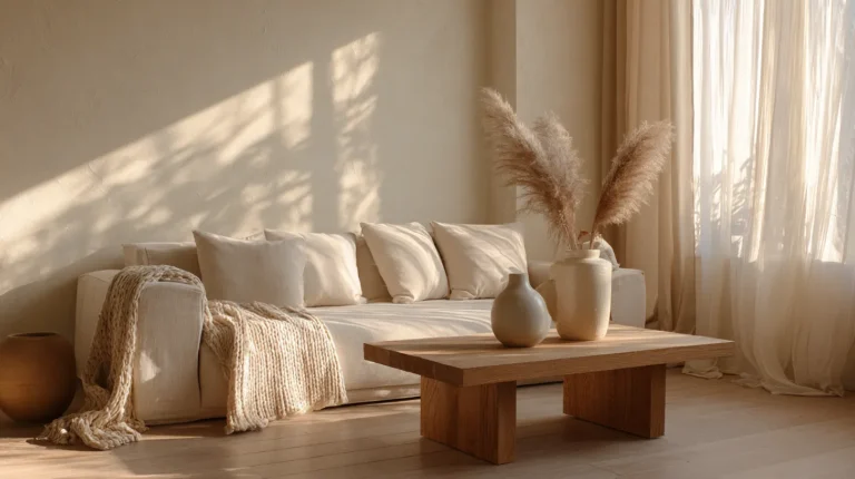
Add chunky knit throws in warm taupe or rust. Swap summer cushions for heavier linens in ochre or deep olive. These shifts feel substantial without requiring furniture changes or major palette departures.
Embrace darker evenings with warm lighting. The interplay of candlelight on your neutral furniture and earthy accents creates that hygge glow Japandi spaces do so beautifully.

Bringing It All Together: Creating Your Japandi Living Room
Start with Your Largest Piece
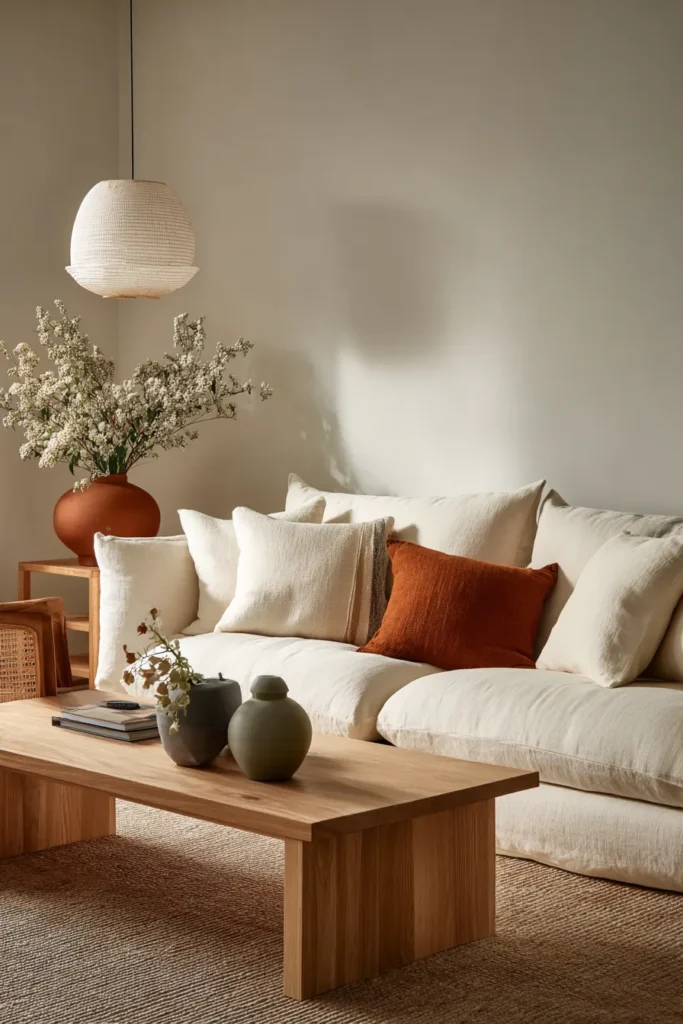
Begin with your sofa—the room’s anchor. Choose a neutral tone you genuinely love, in a natural fabric that invites touch. Everything else builds from here.
If you’re keeping existing furniture, work with what you have. A dark leather sofa can absolutely work in a Japandi space—just lighten everything around it with pale walls, light wood tables, and cream textiles.
Layer Your Wood Tones
Add furniture pieces in complementary wood finishes. Don’t overthink matching—focus instead on whether woods feel warm or cool, light or dark. Variety within a cohesive undertone creates sophisticated depth.
A light oak coffee table, medium-toned wooden shelving, and darker walnut side tables can coexist beautifully. The natural variation feels organic and intentional.
Add Accents Thoughtfully
This is where restraint shines. Choose one or two accent colors from the earthy palette—perhaps sage and terracotta, or olive and rust. Introduce them through pillows, throws, ceramics, and artwork.
Remember the 10% rule. If your living room has ten visible elements (cushions, throws, vases, art pieces, plants), only one should be in your accent color. This discipline creates impact through scarcity.
Consider the Light
Natural light transforms Japandi palettes throughout the day. Notice how your colors shift from morning to evening. Warm beiges glow golden at sunset. Sage greens soften in afternoon light. This living quality is part of the magic.
Supplement with warm-toned lighting—avoid cool white LED bulbs that flatten your carefully chosen palette. Warm white (2700-3000K) enhances the cozy, natural feeling you’ve created.
Sustainable and Budget-Friendly Japandi Color Choices
Affordable Furniture Options
Japandi style doesn’t require luxury budgets. IKEA offers excellent light wood furniture pieces—their oak veneer coffee tables and ash dining chairs fit perfectly into Japandi spaces. Wayfair provides budget-friendly beige and cream upholstery options.
Focus spending on one or two quality pieces in real wood, then supplement with budget finds. A genuine oak coffee table paired with an affordable linen sofa creates authentic Japandi style without breaking the bank.
Sustainable Material Choices
Honor Japandi’s respect for nature by choosing sustainable materials. Look for FSC-certified wood furniture, organic cotton or linen upholstery, and recycled textile accessories.
Vintage and secondhand furniture often provides better quality at lower prices. A vintage walnut sideboard or used teak chair brings authentic patina and sustainability to your space.
DIY Color Updates
Transform existing furniture with Japandi-inspired paint colors. Annie Sloan’s “Old White” or similar warm whites can refresh outdated pieces. Sand and oil dark wood furniture to reveal lighter, more Japandi-appropriate tones.
Reupholster chairs in natural linen or dye existing cushion covers in sage or terracotta using plant-based dyes. These hands-on projects deepen your connection to your space while saving money.
Common Japandi Color Palette Mistakes to Avoid
Too Much White
Pure, stark white feels cold and clinical—the opposite of Japandi’s warmth. Always choose warm whites with cream, beige, or grey undertones. Test paint samples in your space’s natural light before committing.
Ignoring Undertones
Mixing warm and cool undertones creates visual discord. If your wood furniture has warm honey tones, don’t pair it with grey-toned beige upholstery. Stay consistently warm or consistently cool throughout your palette.
Over-Accessorizing with Accents
More isn’t better in Japandi spaces. Five sage pillows dilute impact—one perfect sage pillow makes a statement. Edit ruthlessly, keeping only pieces that feel essential.
Forgetting Texture
Color isn’t enough. Vary textures within your neutral palette—nubby linen, smooth wood, rough ceramic, soft wool. Tactile variation creates interest that pure color cannot.
Psychological Benefits of Japandi Color Palettes
There’s science behind why Japandi spaces feel so calming. Neutral tones lower cortisol levels and reduce visual stress. Your nervous system relaxes when surrounded by colors found in nature.
Earthy hues ground us, literally connecting us to the earth through color psychology. Sage green and terracotta reference forest floors and clay—primal, comforting associations hardwired into our brains.
The absence of bright, competing colors allows your mind to settle. In our overstimulated world, a Japandi living room becomes a genuine refuge—a space designed for restoration rather than stimulation.
Japandi Living Room Color Palette Checklist
Before finalizing your Japandi color scheme, run through this checklist:
- Foundation neutrals chosen: Warm white, beige, or soft taupe for main furniture
- Wood tone selected: Light oak, ash, walnut, or mixed natural woods
- Accent colors limited: One to two earthy hues (sage, terracotta, olive, rust)
- 60-30-10 rule applied: Dominant neutral, secondary wood/neutral, minimal accents
- Undertones consistent: All colors share warm or cool undertones
- Natural materials prioritized: Linen, cotton, wool, genuine wood, ceramic, rattan
- Textures varied: Multiple tactile experiences within neutral palette
- Lighting considered: Warm-toned bulbs to enhance natural palette
- Breathing room maintained: Space between elements, visual calm preserved
- Sustainable choices made: Eco-friendly materials and finishes when possible
Your Japandi Living Room Awaits
Creating a Japandi living room isn’t about perfection—it’s about intention. It’s choosing each color, each piece of furniture, each small accent with care and purpose. It’s honoring simplicity without sacrificing warmth.
Your space should tell your story while embracing these timeless principles. Maybe your sage green speaks to morning walks in the forest. Perhaps that terracotta bowl reminds you of travels or grandmother’s kitchen. These personal touches, nestled within the Japandi palette, make your living room truly yours.
Start slowly. Change one thing—paint a wall in warm white, add a single sage cushion, bring in a piece of light wood furniture. Notice how it feels. Let your space evolve naturally, just as the Japandi philosophy suggests. Trust the process of creating beauty through restraint.
Because at the end of the day, your living room should be more than beautiful. It should be the place where you exhale. Where your shoulders drop. Where you return to yourself. And that—that’s what Japandi color palettes offer: not just a aesthetic, but a way of living more gently in the world.
Frequently Asked Questions
What is the Japandi color palette?
The Japandi color palette combines neutral tones (warm white, beige, taupe, soft grey) with natural wood finishes and earthy accent colors (sage green, terracotta, olive, rust). It emphasizes warm, nature-inspired hues that create calm, balanced spaces through the fusion of Japanese minimalism and Scandinavian coziness.
What colors go best with Japandi living room furniture?
Japandi furniture works beautifully with warm neutrals as the foundation—think creamy white sofas, beige upholstery, and light-to-medium wood tones in oak, ash, or walnut. Add depth with muted accent colors like sage green throw pillows, terracotta ceramics, or soft olive textiles. Keep the palette limited to 3-4 total colors for authentic Japandi simplicity.
How do I apply the 60-30-10 rule to Japandi color schemes?
Use 60% dominant neutral (your main sofa color and walls), 30% secondary color (natural wood furniture and complementary neutral pieces), and 10% accent color (earthy-toned pillows, throws, and décor). For example: cream sofa and walls (60%), oak coffee table and taupe chair (30%), sage cushions and rust vase (10%). This creates balanced, harmonious Japandi spaces.
What are the best wood tones for Japandi living room furniture?
Light oak and ash provide Scandinavian brightness, while walnut and medium brown woods add Japanese depth. The key is choosing natural, visible grain finishes rather than painted or heavily stained pieces. Mixing wood tones is encouraged—pair light oak legs on your sofa with a darker walnut media console for authentic Japandi layering.
How can I create a Japandi color palette on a budget?
Start with affordable neutral furniture from IKEA or Wayfair in beige or cream. Add budget-friendly wood-look pieces or shop secondhand for genuine wood furniture with character. Transform existing pieces with warm white paint or natural wood stain. Invest in just one or two quality items like a real oak coffee table, then build around them with thrifted and budget finds in your chosen palette.