Table of Contents
There’s something quietly powerful about a living room that breathes with intention. Where every hue whispers rather than shouts, and furniture colors flow together like a curated art collection.
The Japandi aesthetic understands this dance between Japanese minimalism and Scandinavian warmth. It’s not just about choosing beige or gray—it’s about composing a palette that makes your living room feel like a sanctuary.
In this guide, we’ll explore furniture color palettes that honor both wabi-sabi’s imperfect beauty and hygge’s cozy embrace. You’ll discover how to pair your sofa with accent chairs, which wood tones elevate your coffee table, and why certain muted greens actually reduce stress in your living space.
Let’s create a room that feels both grounded and luminous.
What Is the Japandi Color Palette?
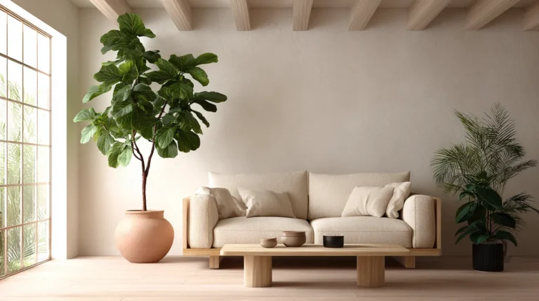
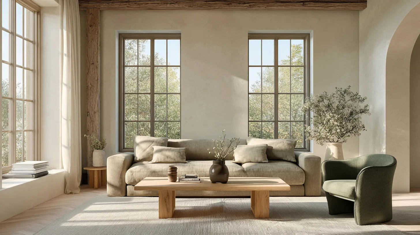
The Japandi color palette is a marriage of restraint and warmth. It draws from Japan’s reverence for natural materials and Scandinavia’s love of light-filled spaces, creating a neutral foundation that never feels cold.
Think soft beige, warm taupe, gentle gray, and creamy off-white as your base colors. These aren’t stark or clinical—they’re the color of linen sheets dried in the sun, of smooth river stones, of morning fog over a pine forest.
Accent colors arrive quietly: muted sage green, dusty olive, terracotta blush, warm caramel, and soft charcoal. Black appears sparingly, like a signature on a watercolor painting, adding definition without dominance.
Core Furniture Colors in Japandi Spaces
Your primary furniture pieces should anchor the room in these foundational neutrals:
- Taupe sofas (think linen or textured cotton in shades like mushroom or greige)
- Warm gray sectionals (dove gray to charcoal, avoiding cool blue-grays)
- Beige accent chairs (oatmeal, sand, or wheat tones)
- Natural wood coffee tables (light oak, ash, or warm walnut)
- Cream upholstered ottomans (ivory to ecru range)
Each piece becomes a layer in your color story, creating depth through subtle variation rather than contrast.
Why Choose Japandi Colors for Living Rooms?
Your living room deserves a palette that serves your nervous system, not just your Instagram feed. Japandi colors create psychological calm through their connection to nature and balanced composition.
Research suggests that neutral palettes with earthy accents can reduce visual stress and promote relaxation. When your sofa is the color of smooth stone and your accent chair echoes forest moss, your mind registers safety and serenity.
This approach also offers remarkable versatility. Unlike trend-driven color schemes, Japandi palettes age gracefully, allowing you to refresh accessories and textiles without replacing major furniture pieces.
The Practical Benefits
Longevity: Neutral furniture colors won’t feel dated in three years.
Flexibility: You can shift seasonal accents without clashing with your sofa.
Resale value: Timeless furniture colors appeal to future buyers or renters.
Light enhancement: Soft neutrals reflect and diffuse natural light beautifully.
7 Essential Japandi Living Room Furniture Color Schemes
1. The Warm Minimalist
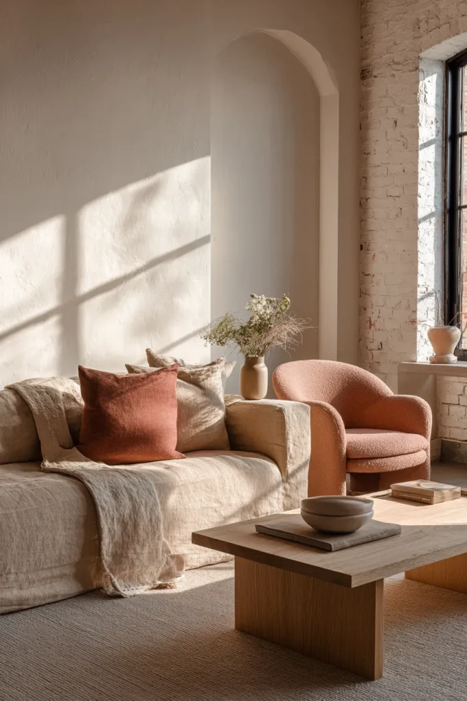
Main sofa: Warm beige linen (think Sherwin Williams Accessible Beige #SW 7036)
Accent chairs: Terracotta blush upholstery with light oak legs
Coffee table: Natural ash wood with visible grain
Media console: Walnut with matte black hardware
This palette wraps your room in gentle warmth. The beige sofa acts as a neutral canvas while terracotta accents add earthy depth without overwhelming. Light wood keeps the space feeling airy, and walnut grounds the composition.
2. The Muted Forest
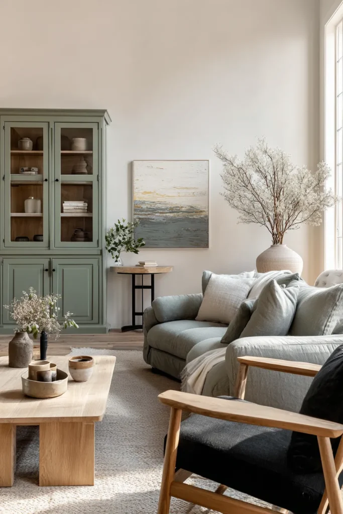
Main sofa: Soft gray-green (similar to Farrow & Ball Vert de Terre)
Accent seating: Charcoal linen armchair with natural legs
Side tables: Light oak or bamboo
Storage units: Two-tone—natural wood with sage green cabinet fronts
Muted green furniture introduces nature’s calming influence without feeling overtly “green.” This is the color of sage leaves and weathered pine, sophisticated enough for adults but soothing for the entire household.
3. The Nordic Warmth
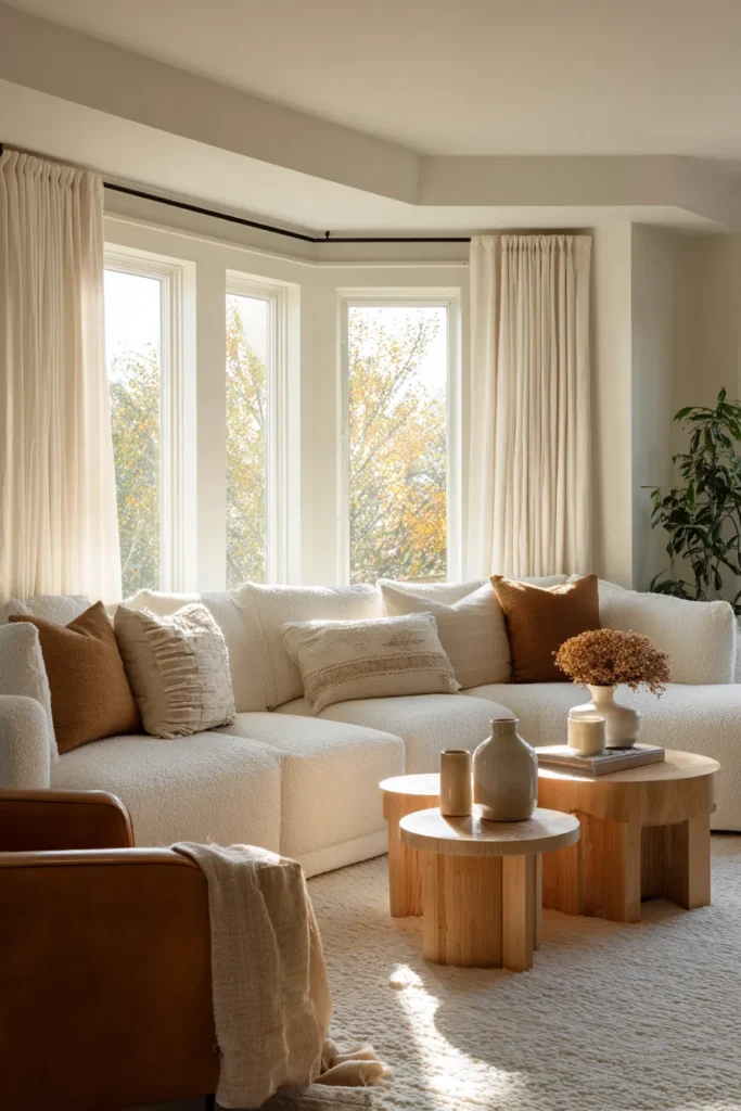
Sectional sofa: Oatmeal bouclé or textured cream
Accent chair: Caramel leather with light wood frame
Nesting tables: White oak in varying heights
Floating shelves: Natural birch with warm undertones
This scheme celebrates hygge’s cozy spirit. Cream and caramel create a cocoon effect, especially beautiful in rooms with abundant natural light. The leather accent adds tactile richness and ages beautifully.
4. The Wabi-Sabi Earth
Sofa: Warm taupe in nubby linen
Pouf ottoman: Rust-colored wool felt
Coffee table: Reclaimed wood with natural imperfections
Bookshelf: Charcoal gray with light wood shelving
Here, imperfection becomes intentional. The taupe sofa’s texture matters as much as its hue, while the rust pouf echoes clay pottery and autumn leaves. Reclaimed wood tells a story through its weathered character.
5. The Japanese Contrast
L-shaped sofa: Soft gray (like Benjamin Moore Classic Gray #1548)
Accent bench: Natural wood with black cushion
Media unit: Black-stained oak
Side tables: Brass-legged with marble tops (white/gray veining)
This palette honors Japanese aesthetics’ comfort with contrast. Soft gray provides serenity while black accents create definition and visual interest. The brass and marble add a whisper of luxury.
6. The Scandi Simplicity
Sofa: Pure white linen (high-performance fabric recommended)
Armchairs: Light gray wool blend
Coffee table: Bleached oak or whitewashed pine
Console: White with natural wood drawer fronts
For maximalists of light, this scheme opens your living room like a Nordic summer sky. White furniture requires commitment to maintenance but rewards you with an ethereal, expansive feeling.
7. The Balanced Neutral
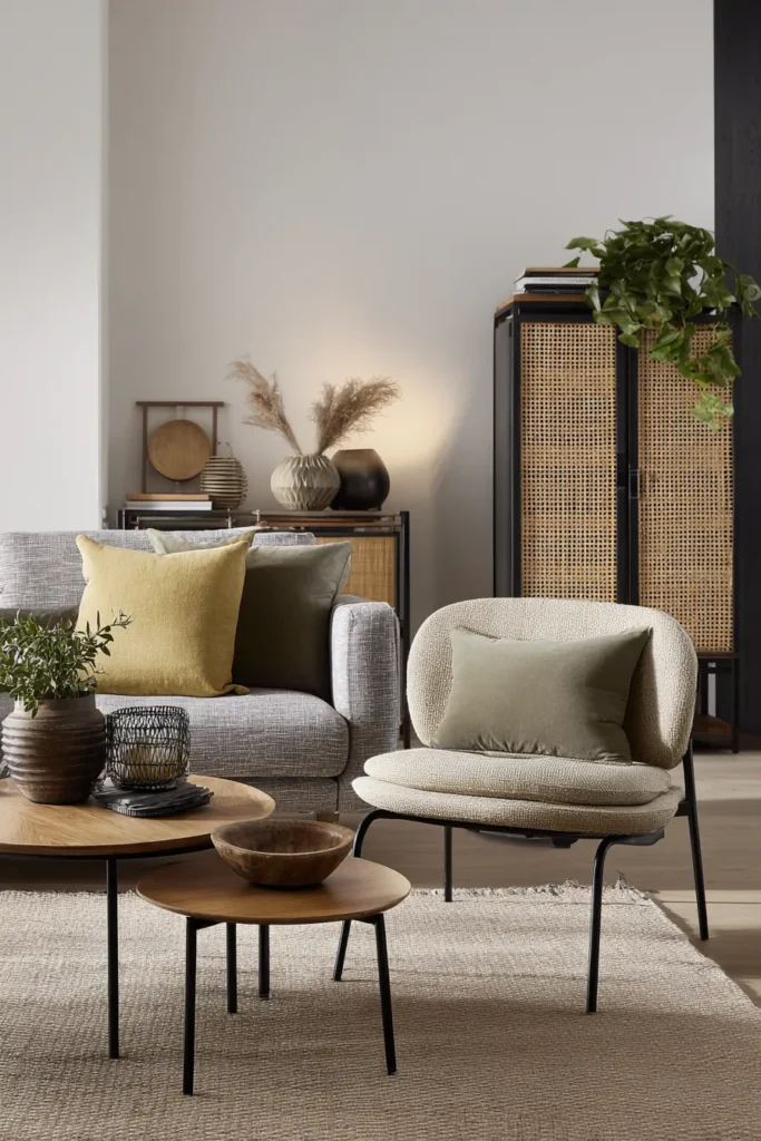
Sofa: Medium gray (think greige—gray with warm undertones)
Accent chair: Beige with olive green throw pillow
Nesting tables: Mixed woods (one light oak, one walnut)
Storage: Natural rattan with black metal frame
This is Japandi’s sweet spot—the middle path. Gray and beige coexist peacefully, neither too cool nor too warm. Mixed wood tones add interest without chaos, and rattan introduces organic texture.
Pairing Furniture Colors with Walls and Flooring
Your furniture colors should dance with your room’s bones, not fight them. Consider the existing palette before committing to that beautiful taupe sofa.
With Light Walls (White, Cream, Soft Gray)
Light walls give you freedom. Choose furniture in mid-tone neutrals (taupe, warm gray, sage) to create gentle contrast. A cream sofa against white walls works only if you add depth through darker accent chairs or wood tones.
Avoid: Matching your sofa exactly to your walls—the room will feel flat and undefined.
With Warm Wood Floors (Oak, Bamboo, Maple)
Warm floors love cool-neutral furniture. A soft gray or greige sofa prevents the space from skewing too yellow. Balance warm floors with cooler upholstery, then reintroduce warmth through accent furniture in caramel or terracotta.
Color temperature tip: If your floors are warm, let your larger furniture pieces cool things down.
With Dark Floors (Walnut, Dark Stain)
Dark floors are dramatic anchors. Choose lighter furniture (beige, cream, light gray) to prevent the room from feeling cave-like. A white or oatmeal sofa against dark floors creates beautiful contrast while maintaining Japandi serenity.
Add warmth back through wood accent tables and natural fiber rugs.
Accent Chair Colors That Complete Your Sofa
Your accent chairs are the supporting actors that make your sofa shine. Choose colors that relate to your main piece while adding dimension.
If your sofa is beige: Try olive green, dusty rose, warm charcoal, or caramel leather chairs.
If your sofa is gray: Pair with natural wood chairs with cream cushions, sage upholstery, or textured white bouclé.
If your sofa is white/cream: Ground it with deeper neutrals like taupe, mushroom, or even a single black leather chair.
If your sofa has color (sage, dusty blue): Keep accent chairs neutral in beige, gray, or natural wood to maintain balance.
The goal is harmony, not matching. Your chairs should feel like they belong to the same family without being identical twins.
Wood Tones for Japandi Coffee Tables and Consoles
Wood is Japandi’s soul material. The tone you choose affects your entire palette’s warmth and character.
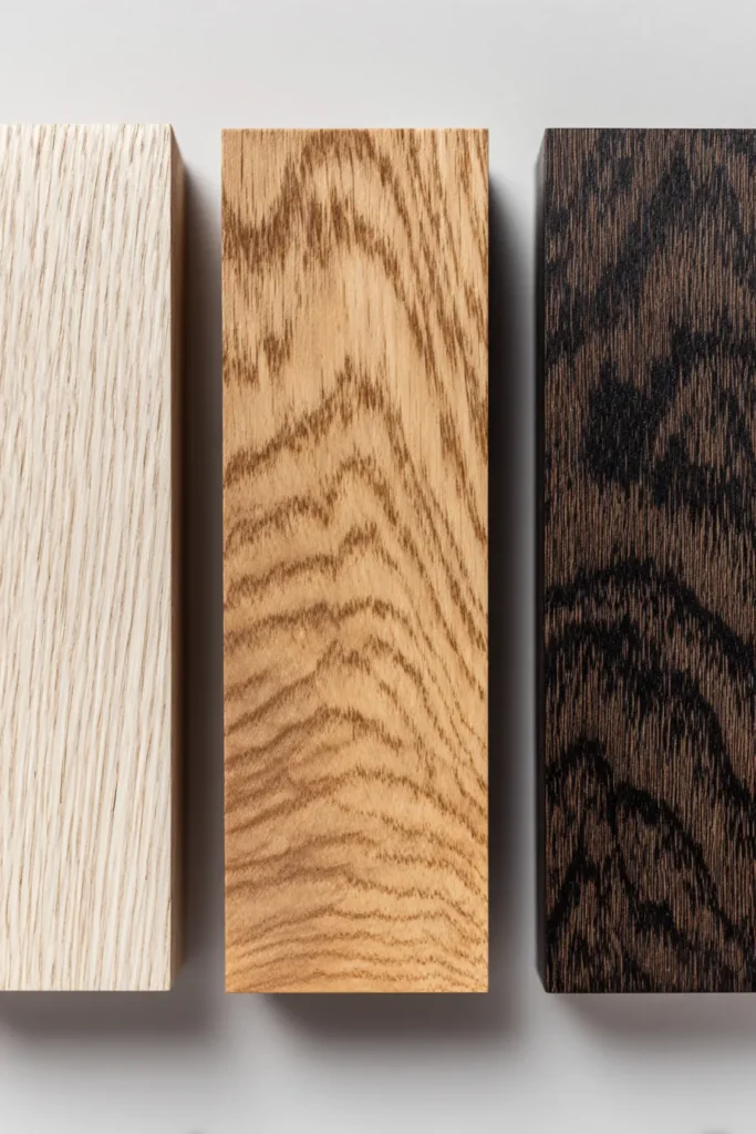
Light Woods (Ash, Light Oak, Maple, Bamboo)
HEX reference: #D4C5B0 to #E8DCC4
Light woods feel airy and Scandinavian. They pair beautifully with any upholstery color and won’t visually weigh down smaller living rooms. Choose these when you want an open, expansive feeling.
Best with: Gray, white, or beige sofas; small spaces; modern Japandi leanings.
Medium Woods (Natural Oak, Teak, Elm)
HEX reference: #B89968 to #C9A870
Medium woods are the versatile middle ground. They add warmth without darkness, making them ideal for living rooms with mixed lighting conditions. These woods often show beautiful grain patterns that honor wabi-sabi.
Best with: Taupe, greige, or muted green sofas; balanced light; traditional Japandi style.
Dark Woods (Walnut, Dark Oak, Black-Stained Wood)
HEX reference: #6F4E37 to #4A3728
Dark woods bring gravitas and definition. Use them strategically—a walnut coffee table or media console adds weight that grounds lighter furniture. Too much dark wood can overwhelm a Japandi space.
Best with: Light sofas (cream, beige, light gray); rooms with excellent natural light; Japanese-leaning Japandi.
Small Space Japandi Color Strategies
Smaller living rooms demand thoughtful color choices. The right palette makes eight-foot walls feel like breathing room.
Light base, varied texture: Choose a light neutral sofa (cream, light gray) and add dimension through textured cushions, nubby throws, and woven rugs rather than darker furniture.
Vertical contrast: Keep low furniture (sofa, coffee table) in light colors and add darker tones higher up through wall-mounted shelves or taller plants.
Mirror placement: Position mirrors to reflect your lightest furniture pieces, multiplying the sense of space.
Monochromatic layering: In very small rooms, work within a single color family (beige to taupe to caramel) using different materials to create interest.
Color Palette for Compact Living Rooms
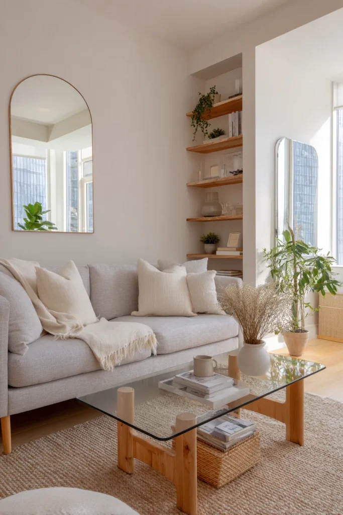
| Furniture Piece | Color Choice | Why It Works |
|---|---|---|
| Sofa | Light gray or cream | Reflects light, feels expansive |
| Accent chair | Natural wood with beige cushion | Lightweight visual footprint |
| Coffee table | Glass with light oak legs | Transparency maintains openness |
| Storage | White or natural rattan | Blends with walls, reduces visual clutter |
Sustainable and Budget-Conscious Color Choices
Japandi philosophy honors sustainability—choosing furniture colors that last rather than trend-chasing. This approach also protects your budget.
Investment Pieces in Timeless Colors
Spend more on these in classic neutrals:
- Sofa: Taupe, gray, or beige in quality, durable fabric
- Dining chairs (if open concept): Natural wood with neutral upholstery
- Coffee table: Solid wood in natural or medium tone
These pieces should serve you for 10+ years. Choose colors you won’t tire of.
Budget-Friendly Accent Colors
Save and experiment with:
- Throw pillows: Swap seasonally between sage, terracotta, dusty blue
- Poufs and small ottomans: Try trendy colors here
- Decorative objects: Accent your neutral base with colorful ceramics
FSC-Certified Wood Colors and Sustainability
Look for FSC (Forest Stewardship Council) certified furniture in these finishes:
- Natural oak (usually unfinished or minimally treated)
- Bamboo (rapidly renewable, often in natural blonde tone)
- Reclaimed wood (varied tones with character)
Sustainable wood often showcases its natural color rather than heavy staining, which aligns perfectly with Japandi authenticity.
2026 Palette Trends: Adaptive Lighting and Smart Color
The evolution of Japandi embraces technology that enhances natural living. Adaptive LED lighting now allows your furniture colors to shift subtly throughout the day.
Consider furniture near smart bulbs in adjustable color temperatures. Your beige sofa looks peachy-warm in 2700K evening light, cool and crisp in 5000K afternoon light. This mimics natural daylight changes.
Tech-forward tip: Choose furniture colors that perform well in both warm (2700K) and cool (4000K) light. Greige, taupe, and true gray adapt beautifully. Avoid beiges with strong yellow undertones—they can look sickly in cool light.
Color Psychology: How Furniture Hues Affect Your Living Room
Color isn’t just aesthetic—it’s atmospheric. Your furniture palette influences mood, energy, and even how long guests linger.
Beige and taupe furniture: Creates warmth and approachability. These colors make spaces feel welcoming and reduce social anxiety. Ideal for family living rooms.
Gray furniture: Promotes calm and sophistication. Cooler grays can feel slightly formal, while warm grays (greige) balance serenity with coziness.
Muted green furniture: Reduces stress and eye strain. Sage and olive tones connect us to nature, lowering cortisol levels. Perfect for high-stress households.
White/cream furniture: Expands space psychologically and reflects light. Can feel pristine and peaceful but may create maintenance anxiety in active homes.
Natural wood furniture: Activates our biophilic response—humans instinctively relax around natural materials and their earth tones.
Creating Emotional Balance Through Color Ratios
The 60-30-10 rule works beautifully in Japandi spaces:
- 60%: Dominant neutral (your sofa, larger pieces) in beige, gray, or taupe
- 30%: Secondary neutral (accent chairs, wood furniture) in complementary tone
- 10%: Accent color (pillows, small furniture) in sage, terracotta, or charcoal
This ratio prevents overwhelming the senses while maintaining visual interest.
Quick Reference: Japandi Furniture Color Checklist
Before purchasing living room furniture, consider:
- Does this color work in both morning and evening light?
- Will it pair with at least two other neutrals in my existing palette?
- Can I see the fabric/wood in person, not just photos? (Colors vary dramatically)
- Is the undertone warm, cool, or neutral? Does it match my floors and walls?
- Will this color show wear gracefully or become dingy?
- Does the material’s texture add dimension to the color?
- If buying online, have I checked return policies for color mismatches?
- Am I choosing this color because I love it or because it’s trending?
- Does this furniture color support the calm, intentional feeling I want?
- For wood furniture: Is the finish matte, satin, or glossy? (Matte is most Japandi)
Conclusion: Your Living Room as Color Sanctuary
The most beautiful Japandi living rooms don’t announce themselves. They unfold slowly, revealing layers of considered color choices that reward quiet attention.
Your furniture palette is an investment in daily peace. When you choose that perfect greige sofa or the coffee table in warm oak, you’re not just decorating—you’re curating the emotional landscape of your home.
Trust neutrals that make you breathe deeper. Choose accent colors that spark gentle joy. Let wood tones remind you of forests and afternoons.
Your living room is waiting to become the sanctuary you deserve. Start with one beautiful, intentional color choice, and let the rest follow like a conversation between old friends.
Frequently Asked Questions
What is the best Japandi sofa color for a small living room?
Light gray or cream works beautifully in small spaces, reflecting light and creating an airy feeling. Choose a textured fabric like linen or bouclé to add dimension without relying on darker colors. Pair with a glass or light wood coffee table to maintain openness.
Can I use black furniture in a Japandi living room?
Yes, but sparingly. Black works best as an accent—a media console, metal chair legs, or cabinet hardware. A black leather accent chair can add sophisticated contrast against a light sofa. Avoid large expanses of black furniture, which can overwhelm Japandi’s light-filled aesthetic.
How do I choose between warm and cool gray furniture?
Consider your room’s natural light and flooring. Cool grays (with blue undertones) work in rooms with abundant natural light and cool-toned floors. Warm grays (greige) suit rooms with warm wood floors or less natural light. When in doubt, greige is more forgiving and aligns with Japandi’s warmth.
What accent chair colors pair with a beige sofa?
Olive green, sage, terracotta, warm charcoal, caramel leather, or natural wood chairs with cream cushions all complement beige beautifully. Choose one accent color and repeat it in smaller doses (pillows, throws) for cohesion. Avoid bright or cool-toned colors that clash with beige’s warmth.
Are white furniture and light wood sustainable in high-traffic living rooms?
White furniture requires high-performance, cleanable fabrics like Crypton or treated linen. Light wood (oak, ash) actually hides minor scratches better than dark wood and ages gracefully. Consider slipcovered white sofas for easy washing, and choose matte-finished light wood that doesn’t show fingerprints. Both can be practical with the right materials.