Table of Contents
There is a certain kind of quiet that only a well-chosen color can create.
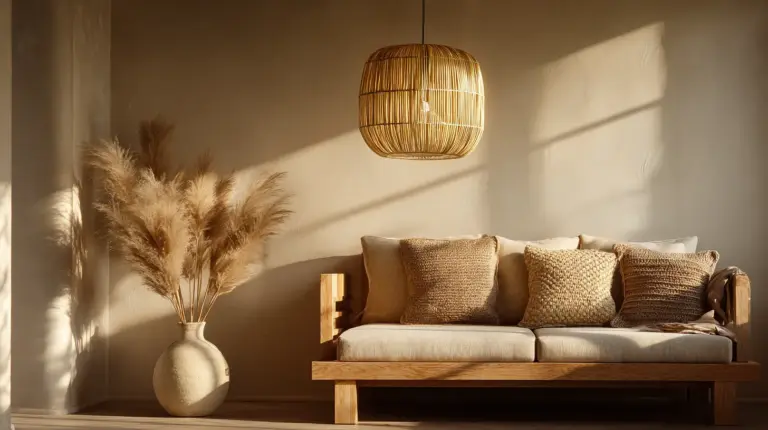
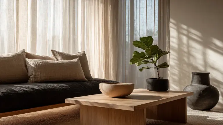
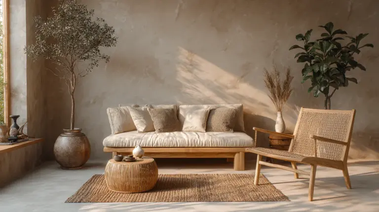
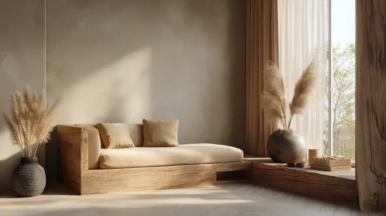
Step into a Japandi room and you feel it before you fully see it — a hush, a warmth, a sense that everything belongs. That feeling is not accidental. It is built, layer by layer, from a palette that honors both the soft warmth of Scandinavian hygge and the disciplined stillness of Japanese wabi-sabi.
At ERYLIN, we believe color is the first conversation a room has with you. Get the palette right, and every piece of furniture, every shaft of afternoon light, every linen throw will feel like it was always meant to be there.
This guide will walk you through exactly how to build a Japandi color palette — from your walls to your wood tones to that one perfect accent — with practical advice tailored for Philippine homes, local paint brands, and our warm, sun-drenched light.
The Japandi Color Formula
A winning Japandi color palette follows one clear rule:
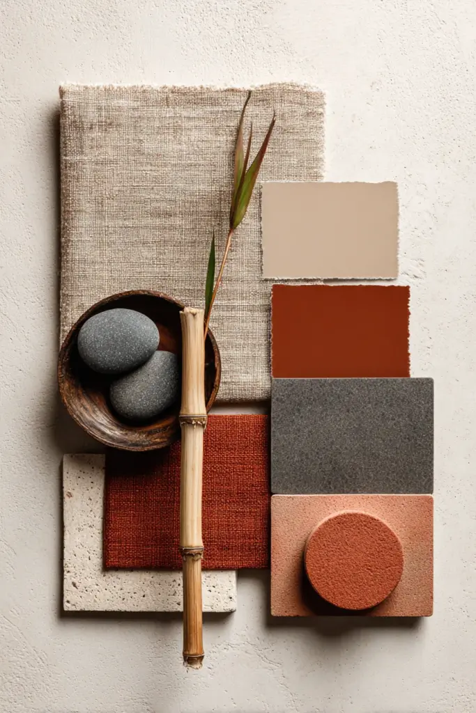
70% warm neutrals + 20% light wood warmth + 10% dark accents + 1 muted accent color
That is the whole formula. It sounds simple because it is — but every percentage matters. Too much dark and the room feels heavy. Too many accent colors and the calm dissolves. The beauty of Japandi is in its restraint, and restraint is a skill worth practicing.
What Colors Are Used in a Japandi Color Palette?
Japandi does not reach for bold or bright. It reaches for honest.
The core palette draws from nature’s quietest moments: the color of unbleached linen, morning fog over a rice field, weathered driftwood, stone after rain. These are colors that age beautifully and never exhaust you.
The Core Japandi Color Family
| Category | Colors | Feeling |
|---|---|---|
| Warm Whites | Warm white, cream, alabaster | Airy, clean, light-filled |
| Soft Neutrals | Beige, sand, oat, linen | Grounded, breathable |
| Earth Tones | Taupe, warm gray, greige | Stable, sophisticated |
| Deep Anchors | Charcoal, soft black, dark walnut | Grounding, intentional |
| Muted Accents | Sage green, terracotta, dusty blue, olive | Alive, organic, warm |
Think of the first four as your foundation and the last one as your signature — the single color that makes the palette yours.
Is Japandi Just Beige and Gray?
This is the most common misunderstanding, and it is worth clearing up directly.
Japandi is not beige and gray. Those who reduce it to that are missing the warmth entirely. Pure Scandinavian design leans into cool, bright whites and light grays. Japandi takes those same Nordic bones and warms them — pulling in the earthy, organic, tactile sensibility of Japanese aesthetics.
The difference in practice:
| Element | Scandinavian | Japandi |
|---|---|---|
| White | Cool, bright, stark | Warm, creamy, soft |
| Gray | Cool-toned, blue-gray | Warm-toned, greige |
| Accents | Pops of color, graphic | Muted, earthy, tonal |
| Wood | Light pine, blonde | Mid-toned oak, ash, walnut |
| Feel | Fresh, light, airy | Grounded, still, warm |
Japandi breathes warmth into Scandinavian structure. That is the distinction — and it changes everything about how a room feels to live in.
How to Build Your Japandi Color Palette: Step by Step
Step 1: Choose Your Wall Color
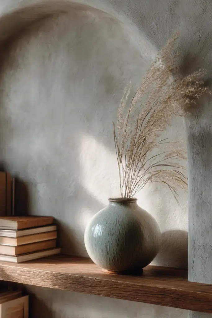
Your walls set the entire emotional temperature of the room. In Japandi, you want warm neutrals — not cold, not stark, not gray-white.
Look for paint names that include words like warm white, linen, oat, sand, or cream. Avoid anything with a blue or violet undertone; these will fight with your wood tones and make the space feel clinical rather than calm.
For Philippine homes, consider these local and accessible options:
| Brand | Suggested Color | Finish | Notes for PH Conditions |
|---|---|---|---|
| Davies | Antique White, Linen | Flat or Eggshell | Use flat for feature walls; eggshell for humid areas |
| Boysen | Navaho White, Bamboo | Flat | Holds well in tropical humidity |
| Nippon Paint | Warm Sand, Ivory Cream | Flat or Velvet | Resists fading under strong sun |
| Dutch Boy | Cream Puff, Soft Linen | Eggshell | Good UV resistance for sun-facing rooms |
In Philippine conditions, strong afternoon sun can wash out or yellow warm whites. Test your color at two times of day — morning light and 3 PM light — before committing. A color that looks perfect at 9 AM may feel stark or overly warm by afternoon.
For rooms with strong direct sunlight, choose a color one shade cooler than your instinct. The sun will warm it back to exactly where you want it.
Finish guidance:
- Flat or matte: bedrooms, feature walls, low-traffic areas
- Eggshell or velvet: living rooms, dining areas, any room in a humid zone
- Semi-gloss: avoid on large walls in Japandi — too reflective for the aesthetic
Step 2: Pick Your Wood Tone
Wood is Japandi’s heartbeat. It is where the warmth lives, where texture becomes something you almost want to touch the moment you enter a room.
Choose one dominant wood tone and stay consistent. Mixing too many wood tones pulls the eye in too many directions and breaks the sense of quiet.
| Wood Tone | Character | Best Paired With |
|---|---|---|
| Light ash or blonde oak | Bright, Scandinavian-leaning | Warm white walls, soft beige |
| Mid-toned oak | Balanced, grounded | Cream, oat, warm greige |
| Walnut or dark teak | Rich, Japanese-leaning | Sand, taupe, muted green |
| Bamboo (PH-friendly) | Natural, warm, light | Any warm neutral |
For Philippine homes, locally-sourced bamboo and narra are beautiful Japandi materials that are also practical — they handle humidity well and connect the aesthetic to our own natural landscape.
Pair your wood with natural fiber textures — rattan, jute, capiz — and the room immediately feels grounded and alive.
Step 3: Lock In Your Dark Accents
Every Japandi space needs a dark anchor. Without it, the palette floats — beautiful but slightly unfinished.
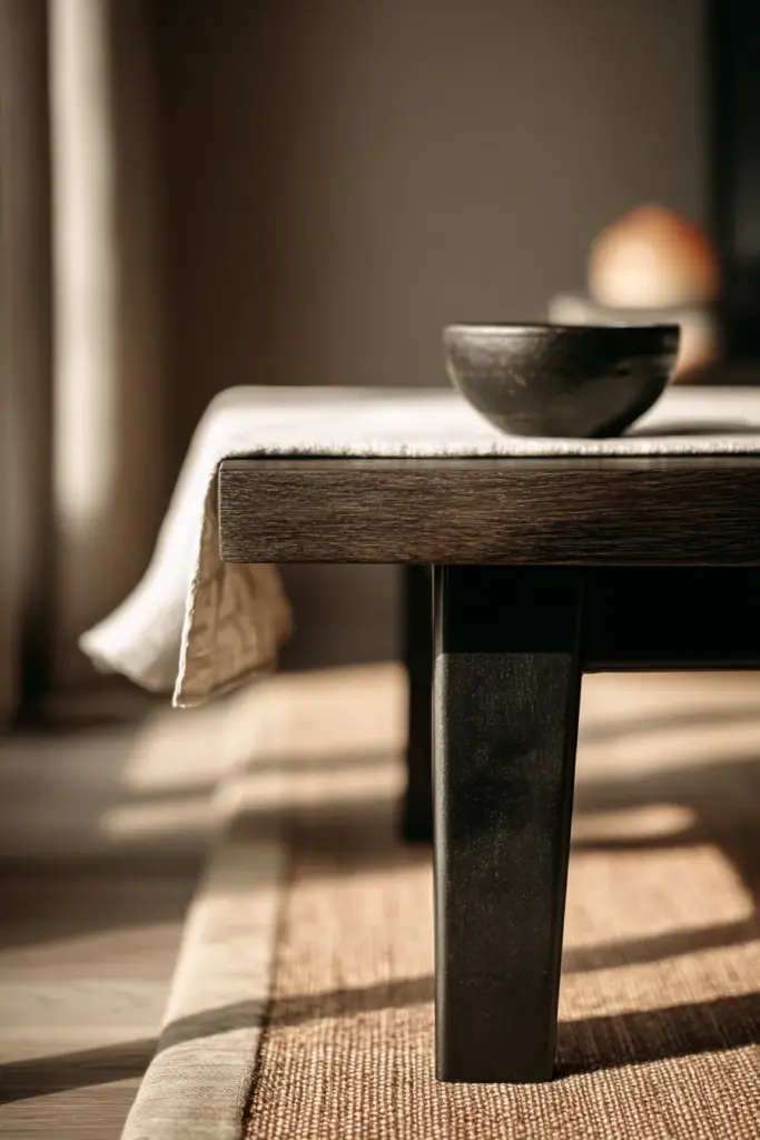
Can you use black in a Japandi color palette? Yes, and you should. Black is one of Japandi’s most essential tools. The key is proportion: use it in small, intentional doses.
Dark accents work best in:
- Furniture legs (iron, blackened steel, or dark-stained wood)
- Thin picture frames
- Hardware on cabinets or drawers
- A single dark ceramic vase or bowl
- The outline of a shoji-inspired partition or room divider
Think of dark accents as punctuation in a sentence. They do not dominate — they clarify. They tell the eye where to stop and rest.
Step 4: Choose Your One Accent Color
This is where your palette becomes yours.
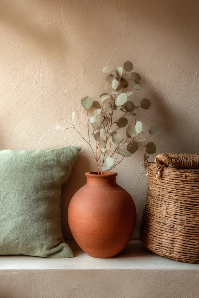
A muted accent color adds the breath of nature that makes Japandi feel alive rather than sterile. The word muted is critical — you are not looking for a bright pop of color. You are looking for something that feels like it grew in the wild: soft, complex, slightly grayed.
The three most loved Japandi accent colors:
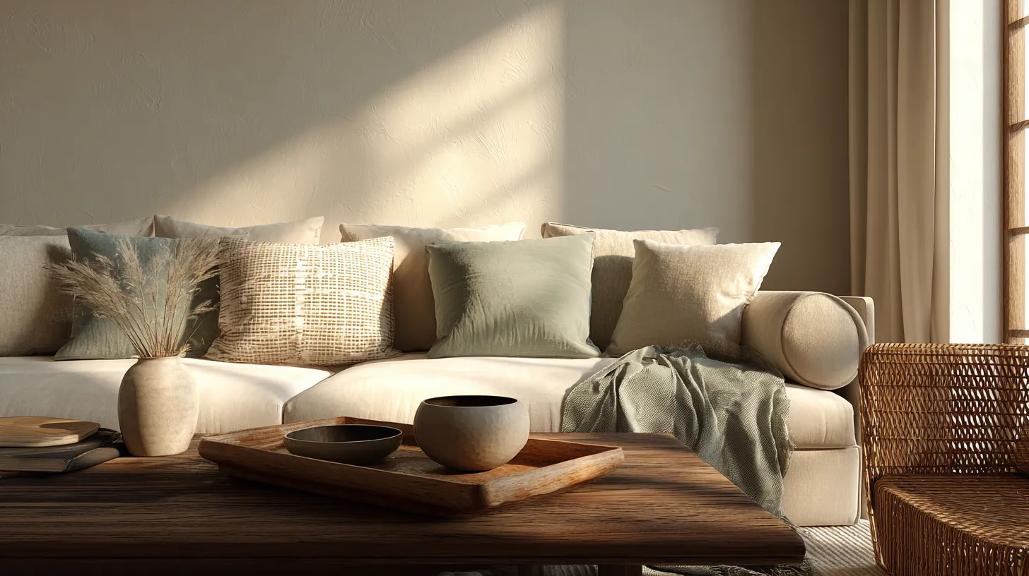
Sage green feels like early morning in a garden. It pairs beautifully with warm wood tones and reads as organic without being obvious.
Terracotta brings in the warmth of sunbaked earth. In Philippine homes, it resonates deeply — it feels both global and local at once.
Dusty blue is the quietest of the three. It adds a whisper of coolness that balances warm neutrals without disrupting the calm.
Choose one. Use it in textiles first — a throw, a cushion, a small rug — before committing to furniture or décor.
Japandi Color Palettes for Small Philippine Rooms
Space is precious in most Philippine homes, and Japandi was made for small rooms. Its palette does exactly what small spaces need: it makes walls recede, light feel amplified, and clutter feel unnecessary.
For small living rooms:
- Keep walls and ceiling in the same warm white or cream — this erases the visual boundary and lifts the ceiling.
- Choose low-profile furniture in natural wood to keep sightlines open.
- Limit your accent color to two or three small items — too many accent pieces shrink a small room visually.
- Use warm lighting ideas — soft bulbs in the 2700K–3000K range mimic natural light and enhance the palette beautifully.
For small bedrooms:
- A warm neutral wall with a dark accent headboard creates depth without heaviness.
- Add your accent color in one pillow or a folded throw at the foot of the bed.
- Natural linen bedding in oat or sand is both Japandi-correct and practical in Philippine weather.
What Paint Colors Work Best for Japandi Interiors?
The best Japandi paint colors share one quality: they look different in different light, and they always look beautiful.
Avoid paint colors that are:
- Too stark or bright-white (cool undertone)
- Too yellow or golden (dates quickly)
- Gray with a blue or purple cast
Aim for colors with a LRV (Light Reflectance Value) between 65–80 for walls — light enough to feel airy, warm enough to feel cozy.
Some specific shades worth exploring from local PH brands:
- Boysen: Navaho White (B-2081), Bamboo (B-2061)
- Nippon Paint: Warm Ivory, Antique Lace
- Davies: Antique White, Linen White
Always test with a large painted swatch (at least 30cm × 30cm) on your actual wall before purchasing full quantities. Paint swatches look completely different under Philippine afternoon light than they do in a hardware store.
Japandi Accent Colors: Which Works Best?
| Accent Color | Mood | Best Used In |
|---|---|---|
| Sage green | Organic, calming | Textiles, plants, ceramics |
| Olive green | Earthy, grounded | Cushions, art, a single chair |
| Terracotta | Warm, tactile | Vases, bowls, a throw blanket |
| Muted dusty blue | Cool, serene | Bedroom textiles, a cushion |
| Warm clay | Sunset warmth | Candles, trays, small décor |
The safest way to introduce an accent: start with a throw blanket or two cushion covers. If the color feels right after a week of living with it, you can add a ceramic or a small upholstered piece.
Your Japandi Color Palette Checklist
Before you begin painting or shopping, run through this:
- Wall color has a warm undertone (cream, sand, oat — never cool gray or stark white)
- One dominant wood tone chosen and consistent throughout the space
- Dark accents kept to 10% or less of the visual space
- One muted accent color selected — in textiles first
- Paint finish appropriate for room humidity (eggshell or velvet for humid zones)
- Color tested at both morning and afternoon light before committing
- Lighting bulbs in the 2700K–3000K warm range
- Natural textures present — linen, jute, rattan, bamboo, ceramic
In Closing
The Japandi palette is not about choosing the right color so much as choosing the right feeling — and then working backward to find the colors that create it.
Calm. Warmth. The particular beauty of things that are simple and made well.
When you get the palette right, your home stops being a backdrop and becomes a sanctuary. Not because you spent more, but because every color, every texture, every slant of light is speaking the same quiet language.
That is what we at ERYLIN are always working toward — spaces that hold you gently and let you breathe.
Frequently Asked Questions
What colors are used in a Japandi color palette?
Japandi uses warm whites, cream, beige, sand, taupe, soft gray, muted brown, charcoal, and one muted accent color — typically sage green, terracotta, or dusty blue. The key is warmth and restraint: every color should feel as if it belongs in nature.
Is Japandi only beige and gray?
Not at all. While beige and warm gray are foundational, Japandi layers these with earthy wood tones, dark anchor accents, and one muted organic accent color. The result is far warmer and more textured than simple beige-and-gray ever feels.
What is the best accent color for a Japandi palette?
Sage green, terracotta, and muted dusty blue are the most consistent choices. All three are earthy, low-saturation, and feel as though they belong in nature — which is exactly the quality Japandi asks for.
Can I use black in a Japandi color palette?
Yes — black is actually essential. Use it in small doses: furniture legs, thin frames, hardware, or a single dark ceramic. It grounds the palette and gives the eye a place to anchor without overwhelming the warmth.
What paint brand works best for Japandi interiors in the Philippines?
Boysen, Davies, and Nippon Paint all have excellent warm neutral options suited to Philippine conditions. Look for shades with warm undertones and choose eggshell or velvet finishes for humid rooms. Always test your color in the actual room before purchasing the full quantity — Philippine light is strong and will shift the color from what you see in the hardware store.