Table of Contents
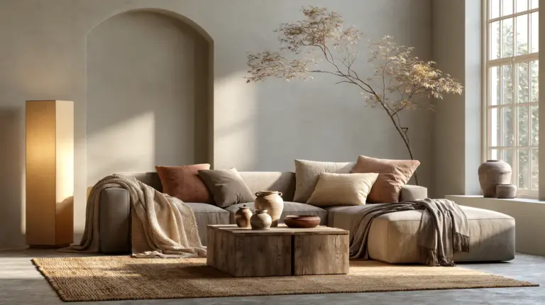
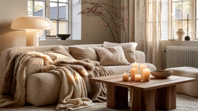
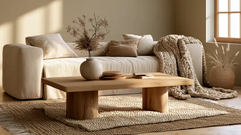
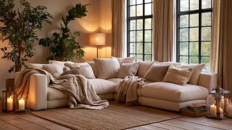
Some rooms simply feel like a held breath let out slowly. The light lands soft on a linen sofa, the walls hum with warmth instead of shouting for attention, and every texture invites your hand to linger. That feeling isn’t luck. It’s color, chosen with intention.
At Erylin, we believe a living room should feel like a soft landing at the end of the day. Not staged. Not sterile. Just quietly beautiful, in a way that suits how you actually live.
This guide goes beyond another list of pretty swatches. We’ll help you match a palette to your room’s real light, real size, and real furniture — because the prettiest color in a magazine can fall flat in the wrong space.
By the end, you’ll have a palette that works with your morning light, your evening lamps, and the sofa you already own. Let’s begin.
Why Color Feels Like Comfort
Color isn’t just visual. It’s sensory memory. Warm ochre recalls late afternoon sun; deep clay recalls a favorite ceramic mug. Our brains read warm, muted tones as safety and rest, which is exactly why they anchor a cozy room.
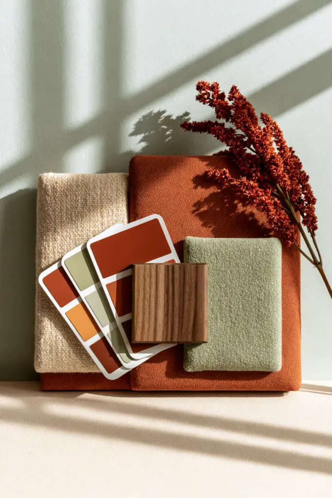
The goal isn’t to pick a trendy color. It’s to build a small, cohesive family of tones — a base, a warm neutral, and one grounding accent — that repeats gently across walls, textiles, and wood.
7 Cozy Palettes and Who They’re Best For
Each palette below pairs a dominant wall tone with supporting textile and wood tones, plus the room type it flatters most.
| Palette Name | Wall Tone | Textile & Accent Tones | Wood/Metal | Best For |
|---|---|---|---|---|
| Warm Linen | Soft off-white with a yellow undertone | Oatmeal, camel, dusty rust | Light oak, brushed brass | Bright rooms, small apartments |
| Greige Retreat | Warm greige | Taupe, cream, soft sage | Walnut, matte black | Medium-light rooms, modern homes |
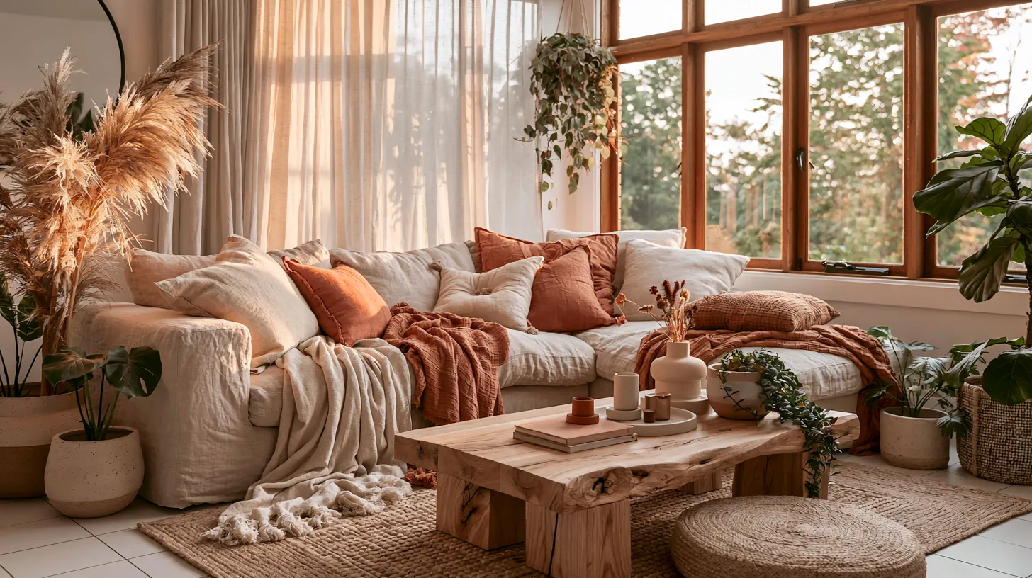
| Terracotta Hearth | Warm terracotta or clay | Rust, olive, sand | Dark oak, aged brass | Low-light rooms, eclectic style |
| Sage & Stone | Muted sage green | Stone gray, bone, soft brown | Natural oak, pewter | North-facing rooms, Japandi style |
| Moody Olive | Deep olive or forest green | Camel, charcoal, cream | Walnut, matte black | Dark, dramatic rooms, open-plan spaces |
| Dusty Rose Neutral | Warm dusty pink | Greige, ivory, soft rust | Light oak, brushed gold | Small rooms, feminine modern spaces |
| Renter’s Warm White | Crisp warm white (paintable trim only) | Camel, terracotta, sage accents | Any existing wood tone | Rentals, narrow living rooms |
Tip: choose one wall tone, one warm neutral, and one grounding accent — resist adding a fourth color until the room is fully styled.
Matching Your Palette to Natural Light
Light changes color more than almost anything else in a room, so this is where most palette choices go wrong.
Bright, South-Facing Rooms
Bright rooms can handle deeper, richer tones without feeling heavy. Lean into Terracotta Hearth or Moody Olive here, since abundant daylight keeps the color from feeling closed-in.
Medium-Light, East or West-Facing Rooms
These rooms shift character across the day, so a flexible mid-tone like Greige Retreat or Sage & Stone works best. Both stay warm at 8am and calm at 8pm.
Low-Light, North-Facing Rooms
Low light needs warmth, not more darkness. Choose Warm Linen or Dusty Rose Neutral, and pair with warm-toned lighting ideas to keep the space glowing rather than dim.
Matching Your Palette to Room Size
Small Apartments and Narrow Living Rooms
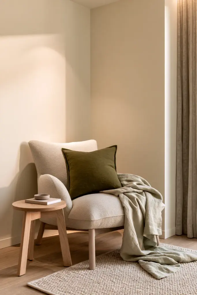
Small spaces benefit from a soft, unified backdrop rather than heavy contrast. Keep walls light and warm, then let one grounding accent — a rust throw pillow, an olive vase — do the visual work.
Open-Plan Spaces
Open layouts can absorb bolder tones since the eye has more room to travel. Moody Olive or a deep greige reads intentional rather than cramped when it flows into an adjoining kitchen or dining area.
Undertones and Paint Finishes, Explained Simply
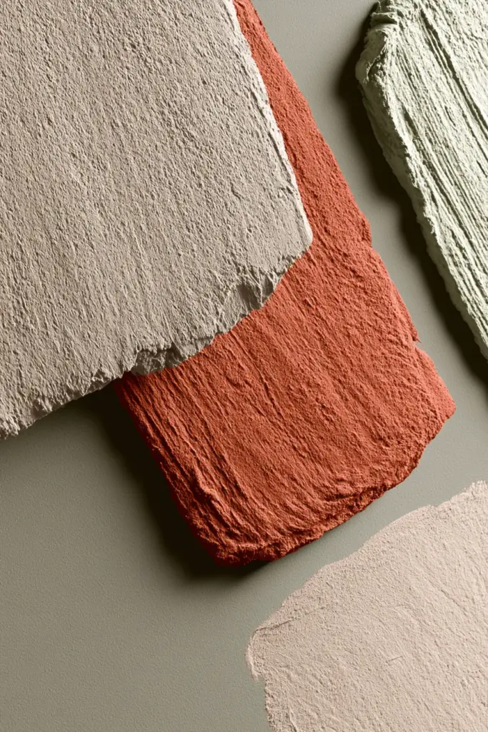
Two people can pick “the same beige” and end up with very different rooms, because undertone is the hidden variable.
- Warm undertones (yellow, red, orange) lean cozy and are safest for low-light rooms.
- Cool undertones (blue, green, gray) can feel crisp but risk reading cold in north-facing spaces — test a sample swatch at both morning and night before committing.
Finish matters just as much as color:
- Matte hides wall imperfections and deepens color, ideal for a moody accent wall.
- Eggshell is the most forgiving all-purpose finish for main living room walls — soft sheen, easy to clean.
- Satin suits trim, doors, and high-traffic walls where durability matters more than depth of color.
Coordinating Your Existing Furniture Instead of Starting Over
You don’t need to replace your sofa to embrace a new palette. Pull one existing tone — your rug’s beige, your sofa’s warm gray — and build the wall color around it rather than against it.
If your furniture already leans cool, choose a warm-neutral wall to balance it. If your furniture is neutral and safe, this is your chance to bring in a richer accent tone through pillows, a throw, or a single piece of cozy furniture like a boucle armchair.
A Real Styling Formula You Can Copy
Here’s a simple formula that works across most of the palettes above:
- Wall: one warm neutral or muted earth tone
- Sofa: a slightly lighter or darker version of the wall tone, never identical
- Rug: texture-forward, in oatmeal, sand, or soft charcoal
- Curtains: linen in a shade close to the wall for a seamless, soft frame around windows
- Wood tone: pick one — light oak or walnut — and repeat it in at least two pieces
- Metal accent: brass for warmth, matte black for modern contrast, never both in the same room
Don’t Forget the Ceiling and Trim
Ceilings are the most overlooked color decision in a cozy room. A stark white ceiling against warm walls can feel jarring, so consider a soft warm white or a whisper-tint of the wall color instead.
Trim should either disappear (matching the wall in a slightly lighter sheen) or intentionally frame the room in a warm off-white — avoid bright white trim in a moody palette, as it breaks the cozy effect.
Seasonal Flexibility Without Repainting
A well-chosen base palette should last for years, with only accents shifting by season.
- Fall/Winter: add rust, deep olive, and heavier knit textures through throws and pillows.
- Spring/Summer: swap in sage, sand, and lighter linen weaves, keeping the same wall and wood tones.
This is the quiet luxury of a good palette — it flexes with the seasons instead of needing a full refresh.
Troubleshooting: When a Palette Falls Flat
- Too beige or bland: add one saturated accent — terracotta, olive, or rust — through a single object like a vase or throw.
- Too dark or closed-in: increase warm-toned lighting and add one reflective texture, like a brass lamp or mirror.
- Too cold: check your undertone — you may have picked a gray-blue instead of a warm gray, and a fresh swatch test will confirm it.
- Too busy: remove one texture or pattern at a time until only the essentials remain.
Quick Chooser Checklist
- Identify your room’s light level: bright, medium, or low.
- Identify your room’s size: small, standard, or open-plan.
- Choose one wall tone from the palette table above.
- Pull one accent color from existing furniture or rug.
- Pick one wood tone and repeat it twice.
- Choose eggshell for walls, matte for accent walls, satin for trim.
- Add warm-toned lighting before judging the final look.
- Test paint swatches at both morning and evening light.
A Soft Place to Land
A cozy room isn’t built in a single afternoon, and it isn’t built from a single perfect purchase. It’s layered slowly — a warm wall, a familiar textile, a lamp that glows just right at dusk.
Choose the palette that fits your light and your life, and let the rest settle in gently over time. That, more than any trend, is what makes a room feel like home.

Frequently Asked Questions
What colors make a living room feel cozy?
Warm neutrals like greige, oatmeal, and warm white feel cozy because they read as soft and inviting rather than stark. Earthy accents like terracotta, olive, and rust deepen that warmth without overwhelming the space.
What is the best color palette for a cozy living room?
There’s no single best palette — it depends on your room’s light and size. A warm linen palette suits bright, small rooms, while a terracotta or moody olive palette suits low-light or open-plan spaces.
How do I choose a living room color scheme based on lighting?
In bright rooms, richer tones like terracotta or olive stay balanced. In low-light rooms, stick with warm, light tones like linen or dusty rose so the space doesn’t feel dim.
Are warm neutrals better than bold colors for a cozy living room?
Warm neutrals are a safer, more flexible base, but a single bold accent — like a deep olive or rust tone — often makes a neutral room feel intentional rather than plain.
What accent colors work with cozy neutral walls?
Terracotta, olive, rust, and soft sage all pair well with neutral walls, since they echo the same warm, earthy family without competing with the base tone.