Table of Contents
There’s something quietly transformative about color. It shapes the way light falls across your furniture, the way your morning coffee tastes in a sun-drenched corner, the way you breathe a little deeper when you walk through your door. As we step into 2025, the colors calling us home are rich, grounded, and deeply intentional—hues that wrap around you like a cashmere throw on a cool evening.
This year’s trending living room colors aren’t about making bold statements for the sake of attention. They’re about creating spaces that feel like an exhale—rooms that ground us, inspire us, and gently remind us of the natural world just beyond our windows. From heathered plums to sun-bleached neutrals, the palette of 2025 invites texture, warmth, and a certain poetry into our everyday lives.
Whether you’re drawn to the moody sophistication of inky blues or the optimistic glow of warm oranges, these colors offer more than aesthetic appeal. They offer a feeling, a mood, an emotional landscape that turns a living room into a true living space. Let’s explore the hues that are defining this year—and how to bring them home with grace and intention.
The 2025 Color Landscape: What’s Shaping Our Choices
The color trends of 2025 reflect a collective yearning for connection—to nature, to comfort, to authenticity. Leading paint brands like Benjamin Moore, Sherwin-Williams, and BEHR have unveiled palettes that celebrate earthy richness and quiet complexity. These aren’t the sterile grays of years past or the stark whites that once dominated modern interiors.
Instead, we’re seeing a beautiful shift toward colors with depth and soul. Think of Cinnamon Slate, Benjamin Moore’s Color of the Year 2025—a sophisticated blend of heathered plum and velvety brown that feels both timeless and utterly contemporary. Or consider Sherwin-Williams’ Grounded, a brown so warm it practically hums with contentment.
This movement toward earth tones, jewel tones, and nature-inspired hues speaks to our desire for spaces that feel lived-in and loved. We’re choosing colors that age beautifully, that tell stories, that make us want to kick off our shoes and stay awhile.
Warm Neutrals: The Foundation of Comfort
Camel, Beige, and Sun-Bleached Tones
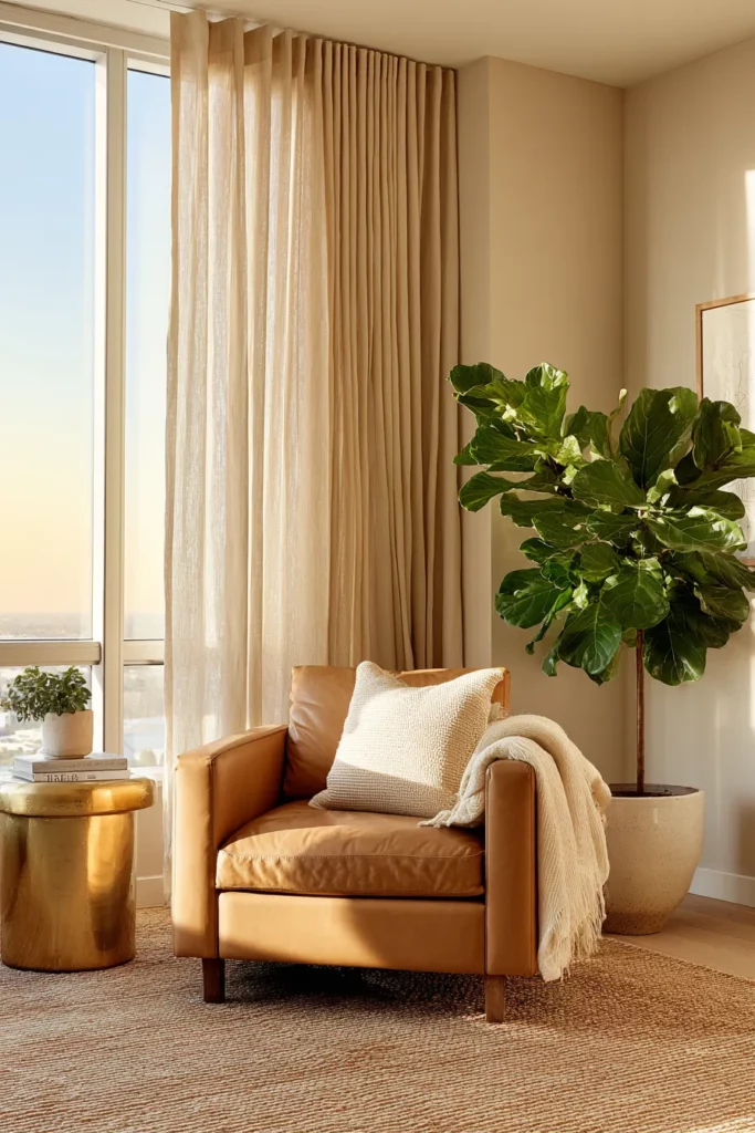
Warm neutrals are having their moment—and for good reason. These colors create a canvas that’s anything but boring. Picture a living room painted in Sherwin-Williams’ Sunbleached, a light neutral that captures the soft glow of morning light filtering through linen curtains. It’s the color of sun-warmed stone, of vintage textiles, of quiet Sunday mornings.
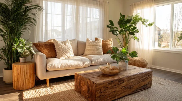
Camel and beige tones bring an effortless sophistication that pairs beautifully with natural materials. Layer in a jute rug, leather accent chairs, and linen throw pillows, and you’ve created a space that feels both elevated and utterly approachable. These neutrals don’t compete for attention—they enhance everything around them, making your favorite pieces shine.
The beauty of warm neutrals lies in their versatility. They work equally well in small apartments and sprawling family rooms, in modern minimalist spaces and vintage-inspired havens. They’re the colors that make you feel immediately at home, no matter where you’re coming from.
Styling Tips for Warm Neutral Living Rooms
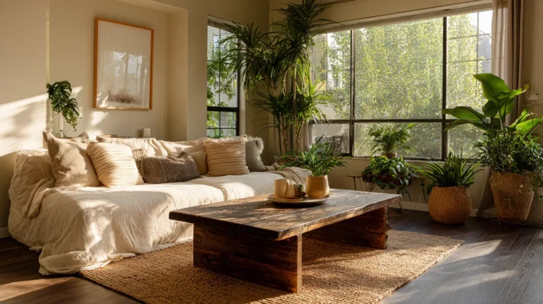
Start with your largest surfaces—walls in soft beige create an instant sense of spaciousness and calm. Then layer in deeper camel tones through upholstered furniture or a statement sofa. The magic happens in the textures: think woven baskets, raw wood coffee tables, and the occasional metallic accent in brushed brass or aged bronze.
Lighting is crucial with warm neutrals. These colors truly come alive when you mix natural light with warm artificial lighting—consider amber-toned bulbs in your table lamps and floor lamps to enhance that golden glow. Add greenery liberally; plants become living artwork against these backdrops.
Earth Tones: Grounding Your Space in Nature
Deep Browns and Rich Chocolate Hues
Earth tones anchor us. There’s something profoundly comforting about colors that remind us of fertile soil, tree bark, and autumn leaves. Sherwin-Williams’ Clove and BEHR’s deep chocolate browns are making living rooms feel more like elegant refuges than just places to sit.
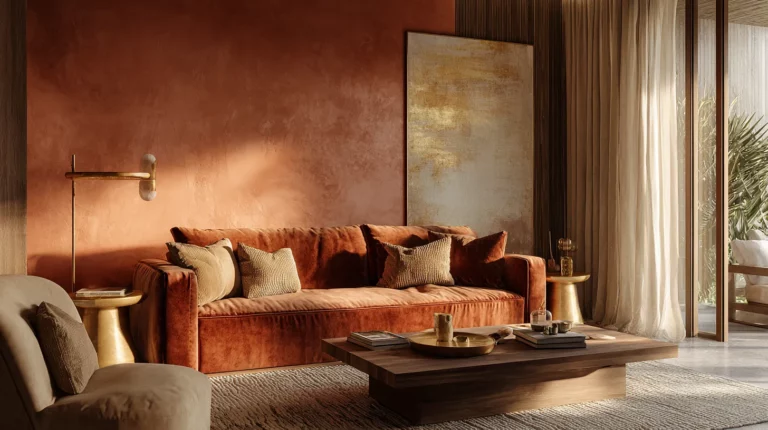
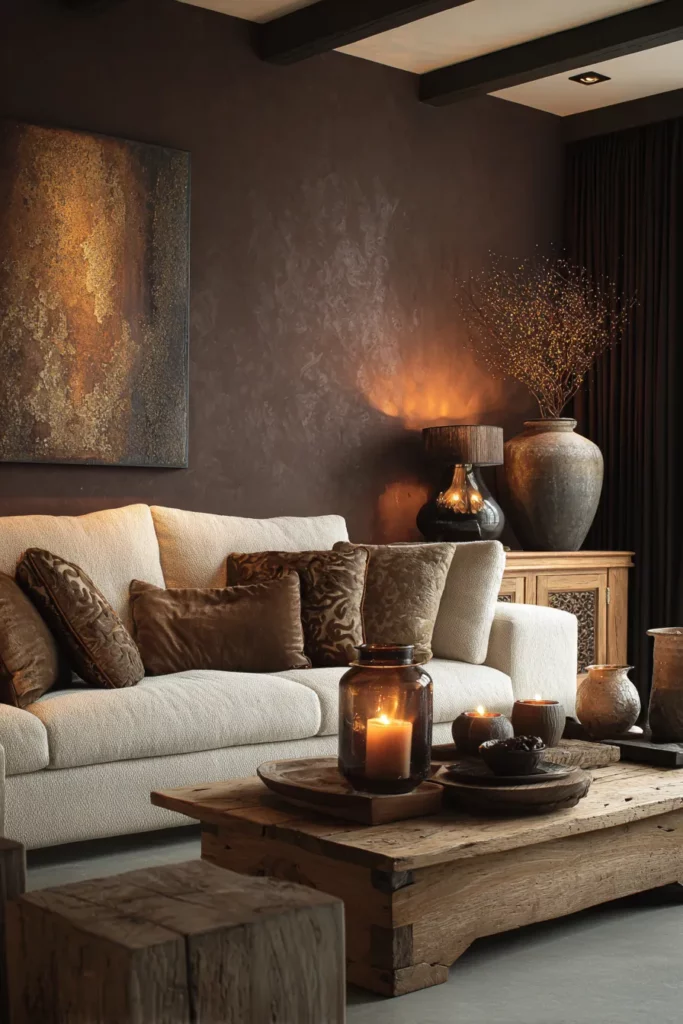
These deeper browns work beautifully as accent walls or, for the brave, as full-room envelopes. Imagine a living room with walls in a rich, warm brown—it becomes a cocoon, especially when paired with cream-colored sofas and natural wood furniture. The key is balancing the darkness with plenty of light sources and lighter textiles.
Don’t shy away from these dramatic hues because you have a smaller space. Dark colors can actually make rooms feel more intimate and sophisticated when done thoughtfully. Consider painting just one wall in deep brown and keeping the others in complementary warm neutrals.
Olive, Sage, and Forest Greens
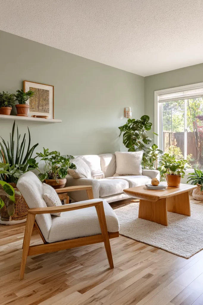
Green is the color of life, growth, and renewal—no wonder it’s dominating 2025 living room trends. From soft sage to deep olive to moody forest green, these hues bring the outdoors in with effortless grace. They pair beautifully with natural wood tones and create a sense of tranquility that’s almost medicinal.
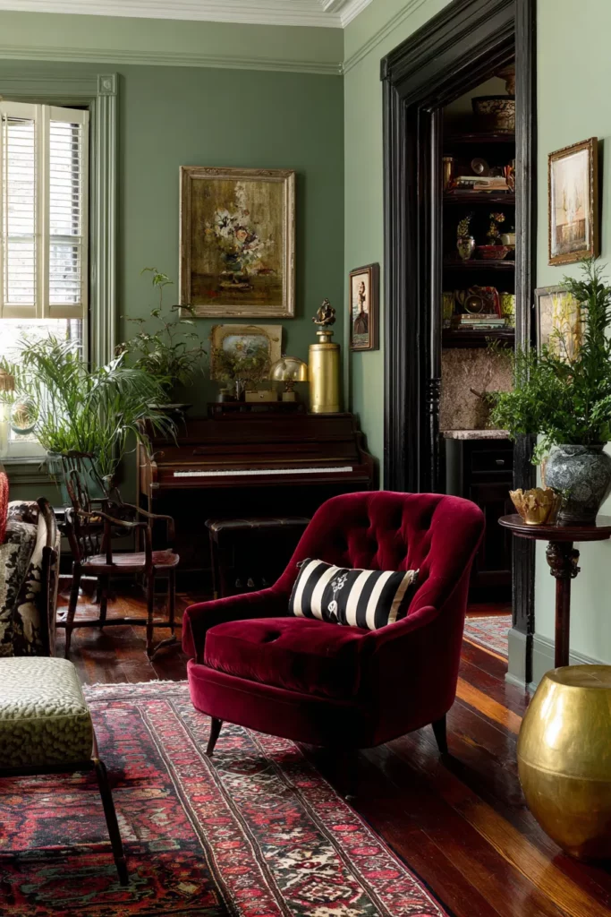
A living room painted in sage green feels like a breath of fresh air. It’s calming without being cold, interesting without being demanding. Olive tones add more drama and sophistication, perfect for creating a vintage-inspired or library-like atmosphere. For those who love depth, dark forest green can transform a living room into a jewel box—especially when paired with velvet upholstery and antique brass fixtures.
These greens are incredibly forgiving and work across design styles. They complement both modern and traditional furniture, making them ideal for those who like to mix eras and aesthetics.
Moody and Rich: Colors with Emotional Depth
Heathered Plums and Saturated Mauves
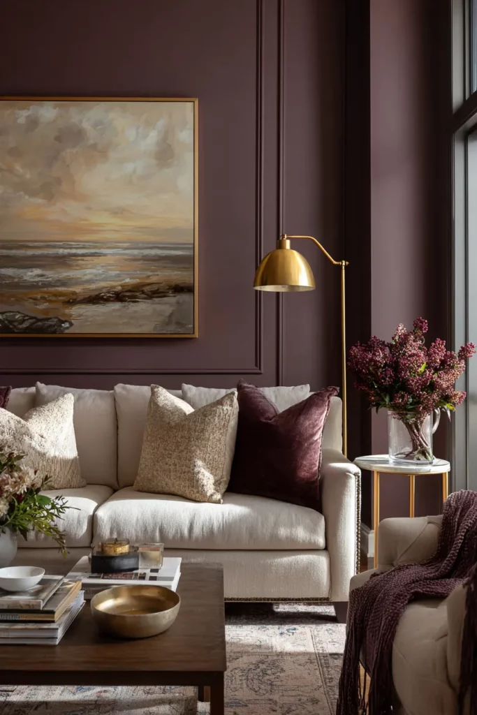
Benjamin Moore’s Cinnamon Slate has opened the door to a whole world of complex, quietly colorful hues. These aren’t the bright purples of your childhood bedroom—they’re sophisticated, nuanced colors that shift beautifully throughout the day as light changes.
Heathered plum creates a living room that feels both cozy and refined. It’s unexpected without being shocking, bold without being loud. Pair it with warm wood furniture, cream or ivory textiles, and gold or brass accents for a look that’s timelessly elegant. These colors work particularly well in rooms with excellent natural light, where their complexity can truly shine.
Saturated mauve, like Sherwin-Williams’ Mauve Finery, offers a softer alternative. It’s warm, welcoming, and surprisingly versatile—working with everything from mid-century modern furniture to French country antiques.
Inky Blues and Rain Cloud Grays
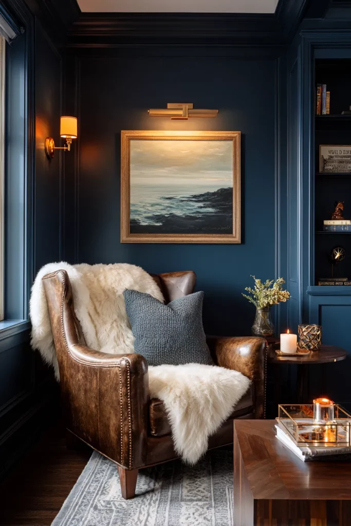
There’s a romance to deep, moody blues that’s impossible to resist. These aren’t the navy blues of corporate offices—they’re richer, more complex, with hints of gray and black that make them feel sophisticated and current. Think of the color of the sky just after sunset, when everything takes on a soft, mysterious quality.
Sherwin-Williams’ Rain Cloud—a gray-blue hybrid—captures this perfectly. It’s grounding yet ethereal, serious yet somehow playful. These colors create living rooms that feel like sanctuaries, spaces where you can think deeply and rest fully. They’re particularly stunning when paired with warm wood tones and plenty of soft, layered lighting.
Inky blues work beautifully as full-room colors or as dramatic accent walls. They make artwork pop, they make white trim look crisp and intentional, and they create a backdrop that never feels boring.
Optimistic Accents: Bringing Joy and Energy
Warm Oranges and Sunshine Yellows
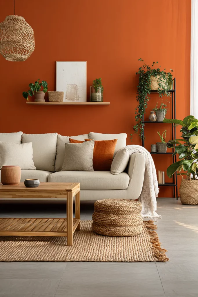
Not every trending color for 2025 is moody and subdued. There’s also room for joy, for optimism, for colors that make you smile when you walk into the room. Warm oranges and sunshine yellows are finding their way into living rooms as accent walls, painted furniture, or bold decorative choices.
These colors work best when used thoughtfully—a single wall in a burnt orange can energize an entire space without overwhelming it. Pair it with neutral furniture and natural materials to keep things balanced. Sunshine yellow, meanwhile, brings instant cheerfulness and works beautifully in rooms that need a lift, especially those with limited natural light.
The key with these brighter hues is restraint and intention. Let them be the surprise, the exclamation point in an otherwise calm sentence. Use them where they’ll catch light and create moments of delight throughout your day.
Chartreuse and Lime: Botanical Beauty
For those who love color with personality, chartreuse and lime are offering fresh, botanical-inspired options. These yellow-greens feel alive and growing, perfect for creating spaces that celebrate nature and vitality. They’re unexpected, yes, but when used in the right context—perhaps as an accent wall in a sun-filled living room—they’re absolutely magical.
These colors pair surprisingly well with both warm and cool neutrals. Try chartreuse with soft grays and natural wood, or lime with warm whites and brass accents. They’re particularly effective in modern or eclectic spaces where a touch of the unexpected is celebrated.
Jewel Tones: Luxury and Richness
Jewel tones—deep burgundy, sapphire blue, emerald green—are bringing a sense of luxury and richness to living rooms in 2025. These colors feel opulent without being ostentatious, sophisticated without being cold. They’re the colors of velvet and silk, of candlelight and good wine.
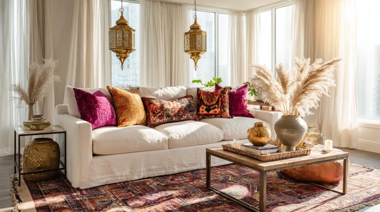
A living room with jewel-tone accents feels special, like a place reserved for meaningful conversations and quiet reflection. Consider burgundy velvet throw pillows on a neutral sofa, or a sapphire blue accent chair that becomes a focal point. These colors work particularly well in spaces with vintage or antique furniture, where they enhance the sense of timeless elegance.
The beauty of jewel tones is their ability to make a space feel more intimate and cocooning. They’re perfect for creating living rooms that feel like escapes from the everyday world.
Understanding Color Psychology in Your Living Room
How Colors Affect Mood and Ambiance
Color isn’t just visual—it’s emotional. The hues we choose for our living rooms directly impact how we feel when we’re in them. Warm colors like oranges, reds, and yellows tend to energize and stimulate conversation. They make spaces feel more intimate and can even make a room seem warmer temperature-wise.
Cool colors like blues and greens, on the other hand, tend to calm and soothe. They can make a space feel more spacious and serene—perfect for living rooms intended as quiet retreats. Earth tones ground us and connect us to nature, reducing stress and promoting a sense of stability.
Understanding these emotional impacts helps you choose colors aligned with how you want to feel in your living room. If it’s a space for entertaining and energy, lean toward warmer, more vibrant hues. If it’s your sanctuary for unwinding, consider cooler, more subdued tones.
Creating Balance with Color Temperature
The most successful living rooms in 2025 aren’t monochromatic—they balance warm and cool tones to create spaces that feel both energizing and restful. This might mean painting walls in a cool-toned sage green but bringing in warm wood furniture and camel-colored textiles. Or it could mean starting with warm beige walls and adding cool-toned artwork and accessories.
This balance prevents spaces from feeling either too sterile or too heavy. It creates visual interest and depth while maintaining harmony. Pay attention to undertones—even “neutral” colors have warm or cool undertones that affect how they interact with other elements in your room.
Practical Guide: Choosing and Applying Your 2025 Colors
Assessing Your Space and Lighting
Before you commit to any color, spend time observing your living room’s light throughout the day. How does morning light enter? What about afternoon and evening? Natural light reveals a color’s true character—what looks perfect in a paint store might look completely different in your home.
North-facing rooms tend to receive cooler, softer light, which can make colors appear slightly more muted. These rooms often benefit from warmer colors to compensate. South-facing rooms receive warm, bright light that can intensify colors—here, cooler tones or softer hues might work better. East and west-facing rooms experience dramatic light shifts throughout the day, so choose colors that work in both bright and dim conditions.
Consider your artificial lighting too. Warm-toned bulbs enhance warm colors but can muddy cool ones. Cool-toned bulbs do the opposite. Test paint samples under both natural and artificial light before making your final decision.
The Sample-Test-Live Process
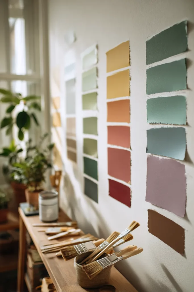
Never skip the sampling phase. Purchase small paint samples of your top choices and paint large swatches on different walls—at least 2′ x 2′ squares. Live with these samples for several days, observing them in different lights and at different times.
Notice how the colors make you feel. Do they energize you in the morning? Calm you in the evening? How do they interact with your existing furniture and textiles? Sometimes a color you loved in theory doesn’t work in practice, and that’s okay—better to discover this with a $5 sample than after painting an entire room.
Consider painting samples on poster board if you’re hesitant to paint directly on walls. This allows you to move the samples around and see how colors work on different walls with varying light exposure.
Color Pairing and Coordination
| Primary Color | Complementary Pairs | Accent Options | Best For |
|---|---|---|---|
| Warm Neutrals (Beige, Camel) | White, Cream, Soft Gray | Terracotta, Sage, Brass | Traditional, Transitional |
| Earth Browns | Ivory, Warm White, Tan | Deep Green, Rust, Gold | Rustic, Organic |
| Sage/Olive Green | Cream, Warm Gray, Natural Wood | Terracotta, Mustard, Coral | Modern, Bohemian |
| Deep Plum/Mauve | Cream, Blush, Gray | Gold, Copper, Burgundy | Sophisticated, Eclectic |
| Inky Blue | White, Cream, Warm Wood | Brass, Cognac, Coral | Contemporary, Transitional |
| Chartreuse/Lime | Warm White, Natural Wood, Gray | Navy, Coral, Black | Modern, Eclectic |
The key to successful color pairing is the 60-30-10 rule: 60% dominant color (usually walls), 30% secondary color (furniture, large textiles), and 10% accent color (accessories, artwork, throw pillows). This creates visual balance while allowing personality to shine through.
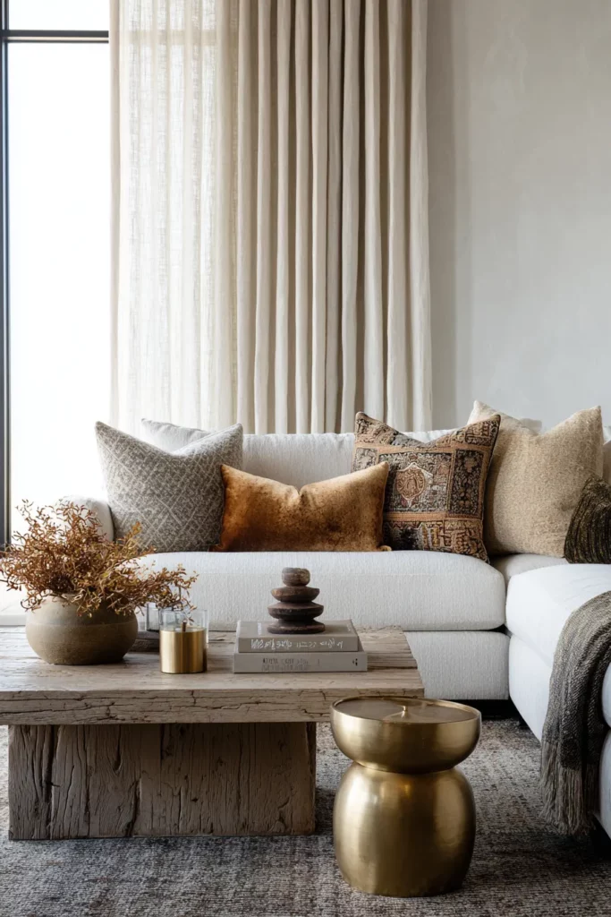
Furniture and Texture Considerations
Your wall color should enhance, not fight, your furniture. If you have a beloved sofa in a cool gray, warm browns on the walls will create beautiful contrast. If your furniture is mostly warm woods and earth tones, consider cooler wall colors for balance.
Texture becomes even more important when working with the richer, more complex colors of 2025. A room painted in deep brown needs the relief of varied textures—smooth velvet, nubby linen, rough-hewn wood, smooth brass. These textural variations catch light differently and create visual interest that prevents the space from feeling flat.
Don’t forget flooring in your color considerations. Light wood floors work with virtually everything but can feel cold with very cool wall colors. Dark floors ground a space beautifully but may make very dark wall colors feel heavy unless balanced with plenty of light-colored furniture and textiles.
DIY Tips for a Professional-Looking Living Room Paint Job
Preparation is Everything
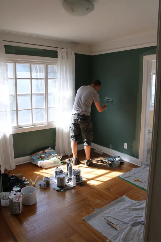
A beautiful paint job starts long before you open the paint can. Proper preparation ensures your 2025 colors look their absolute best. Begin by cleaning walls thoroughly—dust, grease, and dirt prevent paint from adhering properly. Fill any holes or cracks with spackle, let dry completely, and sand smooth.
Remove outlet covers, light switch plates, and any wall-mounted décor. Protect your floors with drop cloths (canvas works better than plastic—it won’t slip) and use quality painter’s tape on trim, ceilings, and adjacent walls. Press the tape edge firmly to prevent paint bleed.
Prime if you’re making a dramatic color change, painting over dark colors, or working with new drywall. Primer ensures even color coverage and can actually save you money by reducing the number of paint coats needed.
Application Techniques for Rich, Even Color
For the rich, complex colors trending in 2025, application technique matters. Use a high-quality angled brush for cutting in (painting edges and corners) and a roller with appropriate nap for your walls—typically 3/8″ to 1/2″ for smooth walls, 3/4″ for textured.
Work in natural light when possible, and maintain a “wet edge”—always paint into the wet area you just completed to avoid lap marks. For deep, saturated colors like inky blues or chocolate browns, expect to apply at least two coats, sometimes three for even coverage.
Don’t rush the drying process. Follow the paint manufacturer’s recommendations for drying time between coats. Proper drying ensures durability and the most accurate final color.
When to Consider an Accent Wall vs. Full-Room Color
Accent walls work beautifully when you want drama without commitment, or when working with bolder colors like chartreuse or deep burgundy. The ideal accent wall is the one your eye naturally goes to when entering the room—often the wall behind the sofa or the wall with the fireplace.
However, many of 2025’s trending colors—particularly the earth tones and warm neutrals—actually work better as full-room applications. These colors are designed to envelope, to cocoon, to create a complete atmosphere. A single accent wall in sage green might feel timid, while four walls create a proper sanctuary.
Consider full-room color when you want a transformative effect, when working with colors that benefit from consistent light interaction, or when your room lacks a clear focal wall. Consider an accent wall when testing a bold color, working with small spaces where full-room color might overwhelm, or when you have strong architectural features to highlight.
Maintaining Your Newly Painted Living Room
Care Tips for Longevity
Your beautiful 2025 colors deserve proper care to maintain their richness and depth. Most quality interior paints can be gently cleaned with a soft, damp cloth for minor marks. For more stubborn stains, use a mild soap solution, testing in an inconspicuous area first.
Avoid abrasive cleaners or scrubbing, which can damage the paint finish, especially on flat or matte paints (popular choices for achieving the subtle, sophisticated look of colors like Cinnamon Slate or Grounded). For high-traffic living rooms, consider using satin or eggshell finishes on walls—they’re more washable while still maintaining the soft appearance these colors deserve.
Touch-ups are inevitable over time. Save at least a pint of your paint for future touch-ups, and note the brand, color name, and finish on the can for future reference. Keep the paint sealed tightly and stored in a temperature-controlled environment.
Protecting Against Fading and Damage
Even the most beautiful living room colors can fade over time, particularly in rooms with strong, direct sunlight. Protect your investment by using window treatments during peak sun hours, or consider UV-protective window film that blocks harmful rays without reducing natural light.
Furniture placement matters too—avoid placing dark furniture directly against painted walls, as oils from wood and upholstery can transfer over time. Use felt pads under lamps and décor items to prevent scratches and marks.
Regular dusting of walls, crown molding, and baseboards prevents buildup that can dull your color’s appearance. This simple maintenance keeps your living room looking fresh and intentional for years to come.
Quick Reference: 2025 Living Room Color Checklist
Before You Paint:
- Observe natural light patterns throughout the day
- Test large samples on multiple walls for at least 3-5 days
- Consider existing furniture colors and materials
- Assess room size and ceiling height
- Determine desired mood and ambiance
- Check paint finish options (matte, eggshell, satin)
Top Trending Color Families:
- Warm neutrals: camel, beige, sunbleached tones
- Earth browns: chocolate, warm brown, taupe
- Greens: sage, olive, forest, chartreuse
- Moody purples: heathered plum, mauve, wine
- Rich blues: inky blue, gray-blue, rain cloud
- Optimistic accents: warm orange, sunshine yellow
- Jewel tones: burgundy, sapphire, emerald
Essential Pairings:
- Layer warm and cool tones for balance
- Mix multiple textures with bold colors
- Use the 60-30-10 rule for color distribution
- Coordinate undertones across all elements
- Balance dark colors with adequate lighting
Sustainability Considerations:
- Choose low-VOC or zero-VOC paints
- Select colors that age beautifully to avoid frequent repainting
- Consider long-term versatility over trendy appeal
- Use quality paint for better coverage and durability
Conclusion: Creating Your Color Story
The colors we choose for our living rooms tell stories—about who we are, what we value, how we want to feel when we come home. The trending hues of 2025 invite us to be braver, to embrace depth and complexity, to create spaces that truly nourish us.
Whether you’re drawn to the quiet sophistication of Cinnamon Slate, the grounding warmth of chocolate brown, or the optimistic energy of sunshine yellow, trust your instincts. The best color for your living room isn’t the one that’s most popular—it’s the one that makes your heart settle and your shoulders drop when you walk into the room.
These colors aren’t just paint on walls. They’re invitations to slow down, to notice light as it shifts throughout the day, to feel texture beneath your fingertips, to breathe more deeply in the spaces that hold our lives. Choose colors that feel like home, and let them transform not just your living room, but the way you live within it.
Welcome to 2025, where color is connection, where beauty is intentional, and where your living room becomes a true sanctuary.
Frequently Asked Questions
What are the most popular living room paint colors for 2025?
The most popular living room colors for 2025 include warm neutrals like camel and beige, earth tones such as chocolate brown and olive green, moody hues like heathered plum and inky blue, and optimistic accents including warm orange and sunshine yellow. Benjamin Moore’s Cinnamon Slate (a heathered plum-brown blend) and Sherwin-Williams’ Grounded (a warm brown) are leading the year as colors of the year. These colors reflect a broader movement toward nature-inspired, grounding tones that create cozy, sophisticated living spaces.
How do I choose the right living room color for my space?
Start by assessing your room’s natural lighting—observe how light enters throughout the day, as this dramatically affects how colors appear. Consider your existing furniture and the mood you want to create. Test large paint samples on multiple walls and live with them for several days before deciding. Think about whether you prefer warm colors (energizing, intimate) or cool colors (calming, spacious). Factor in your room size: darker colors can make large rooms feel cozier, while lighter colors help small spaces feel more open. Trust your emotional response—the right color should make you feel at home.
Are dark or light colors better for living rooms in 2025?
Both dark and light colors are trending equally in 2025, but the choice depends on your specific space and goals. Dark colors like deep browns, forest greens, and inky blues create intimate, cocooning atmospheres perfect for relaxation and conversation. They work beautifully in large rooms with good natural light. Light colors like beige, sunbleached neutrals, and soft sage create airy, spacious feelings ideal for smaller rooms or spaces with limited light. The key is choosing colors with warmth and complexity—whether dark or light—rather than stark, cold tones. Many successful 2025 living rooms actually combine both, using darker accent walls with lighter surrounding walls.
How do living room colors affect mood and well-being?
Living room colors have profound psychological impacts on our daily well-being. Warm colors like oranges, reds, and warm browns increase energy, stimulate conversation, and create feelings of intimacy and comfort. Cool colors like blues and greens promote calmness, reduce stress, and can even lower blood pressure. Earth tones ground us and foster feelings of stability and connection to nature. The trending colors of 2025—particularly warm neutrals and nature-inspired hues—are specifically chosen for their ability to create balanced, nurturing spaces that support both relaxation and social connection. Choosing colors that align with how you want to feel in your living room is just as important as aesthetic considerations.
What colors pair well together in 2025 living room design?
The most successful 2025 color combinations balance warm and cool tones while incorporating varied textures. Warm neutrals like camel pair beautifully with sage green and terracotta accents. Deep browns work wonderfully with ivory, rust, and forest green. Heathered plums and mauves combine elegantly with cream, gold, and burgundy accents. Inky blues look stunning with warm wood tones, brass fixtures, and coral accents. The key is using the 60-30-10 rule: 60% dominant wall color, 30% secondary furniture color, and 10% accent color through accessories and artwork. Mix textures liberally—pair smooth painted walls with nubby linens, rough wood, and soft velvets for visual depth and interest.