Table of Contents
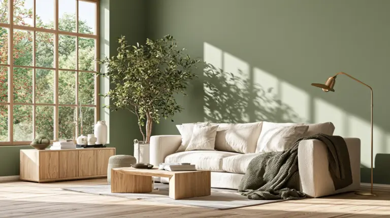
There’s a particular kind of quiet courage in choosing a bold wall color. It’s the moment you stop playing it safe and let your living room say something about you.
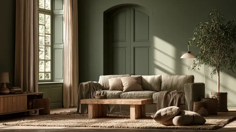
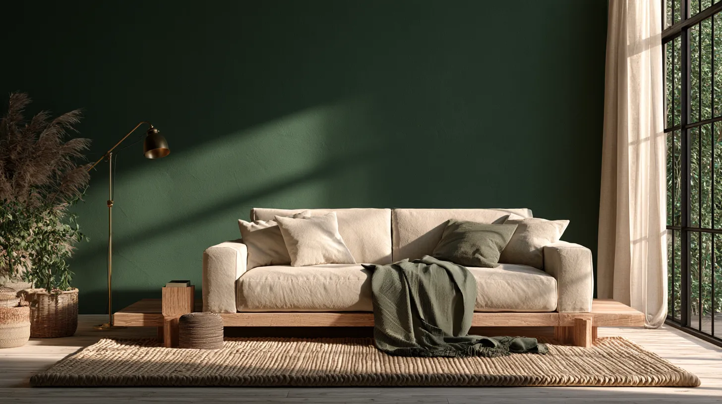
We believe color is one of the most underused tools in a home. A warm clay wall can feel like a held breath. A deep forest green can feel like stepping into shade on a summer afternoon.
This guide isn’t another gallery of pretty rooms to scroll past. It’s a real decision path — from blank wall to bold, balanced, lived-in space — built for actual homes with actual light, furniture, and budgets.
By the end, you’ll know which bold hue suits your room’s light, how to pair it with what you already own, and how to keep it cozy instead of chaotic.
Why Bold Living Room Colors Work (When Done Right)
A bold color isn’t about drama for drama’s sake. It’s about creating atmosphere — the feeling you get the second you walk into a room.
Color affects mood more than most people realize. A saturated blue can slow your pulse in the evening; a warm terracotta can make a gray afternoon feel golden.
The key difference between a bold room that feels chaotic and one that feels intentional almost always comes down to balance, not boldness itself.
The Psychology Behind Bold Hues
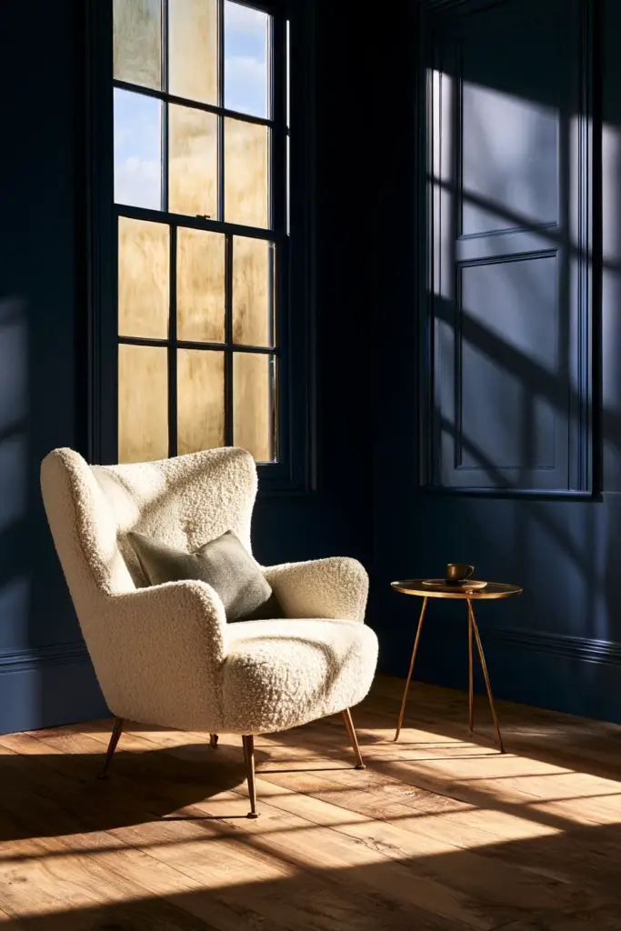
Deep, saturated colors absorb light rather than bounce it, which makes a room feel enveloping rather than empty. That’s why a moody navy living room often feels more relaxing, not less.
Warm bold tones like rust, ochre, and burnt sienna borrow their comfort from nature — think autumn leaves, clay pottery, aged leather. Cooler bold tones like emerald and indigo lean toward stillness and focus.
Best Bold Colors by Natural Light
Light is the single biggest factor in whether a bold color will sing or sulk in your room. Most articles skip this step, but it should be your first one.
North-Facing Rooms (Cool, Flat Light)
North light stays cool and consistent all day, which means bold colors can read flat or slightly gray if you’re not careful. Lean into warm, saturated tones to counteract the chill.
- Best picks: burnt terracotta, deep amber, warm burgundy, spiced cinnamon
- Avoid: icy blues or cool grays, which can feel sterile in this light
South-Facing Rooms (Warm, Abundant Light)
South-facing rooms get generous, warm sunlight for most of the day, giving you the most freedom to experiment. Cooler bold tones like forest green or deep navy will feel rich rather than heavy here.
- Best picks: forest green, deep navy, aubergine, charcoal blue
- Bonus: these rooms can also handle warm bold tones beautifully
East and West-Facing Rooms (Shifting Light)
These rooms change personality throughout the day, so test your color at both morning and evening light before committing. A color that feels romantic at sunset might feel murky at 9 a.m.
- Best picks: muted teal, dusty plum, warm clay
- Tip: Paint a sample swatch and observe it for a full 24 hours before deciding
Best Bold Colors for Small Living Rooms
Bold doesn’t have to mean overwhelming, even in a compact apartment or narrow condo living room. The trick is controlling where the saturation lives, not avoiding it altogether.
A small room painted entirely in a deep color can actually feel more cohesive than one with multiple competing light tones, because the eye isn’t searching for edges. This is sometimes called the “cocoon effect,” and it works beautifully in studio apartments.
If a full-room commitment feels like too much, try one of these lower-risk approaches instead.
- Bold ceiling: Paint the ceiling in a deep tone while keeping walls neutral — it draws the eye up and makes the room feel taller
- Bold trim: Keep walls light, but paint trim, doors, or window casings in a saturated shade for graphic contrast
- Bold accent wall: Choose the wall with the least furniture, often behind a sofa, for maximum visual payoff with minimal commitment
- Bold built-ins: If you have shelving or a media console, paint just that for a contained dose of color
Mirrors and unlined sheer curtains help bounce whatever light you do have, which keeps bold small spaces from feeling closed in.
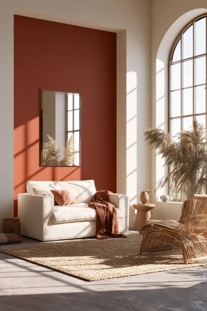
How to Choose Bold Living Room Colors With Confidence
Choosing a bold color shouldn’t feel like a gamble. It should feel like matching a feeling to a formula.
Start With What You’re Keeping
Before you fall in love with a paint chip, look at your largest furniture pieces — sofa, rug, wood flooring — since these are the most expensive things to change. Let their undertones guide your color family.
| Existing Element | Undertone to Watch | Bold Colors That Pair Well |
|---|---|---|
| Warm oak or honey wood floors | Yellow/orange | Forest green, deep teal, burnt sienna |
| Cool gray or whitewashed floors | Blue/gray | Navy, charcoal plum, slate blue |
| Beige or cream sofa | Neutral, warm | Terracotta, ochre, rust |
| Black or dark gray sofa | Neutral, cool | Emerald, deep burgundy, indigo |
| Light linen curtains | Neutral | Almost any bold tone, since linen softens contrast |
Test Like a Designer, Not a Guesser
Buy a sample pot before a gallon. Paint a poster-board square instead of the wall directly, so you can move it around the room and see it in every light condition.
Look at your swatch in the morning, midday, and evening — under your actual lighting fixtures, not daylight alone. The same green can read sage at noon and almost black by lamp light.
How to Pair Furniture and Textiles With Bold Walls
A bold wall is the easiest part. The room comes together through what surrounds it.
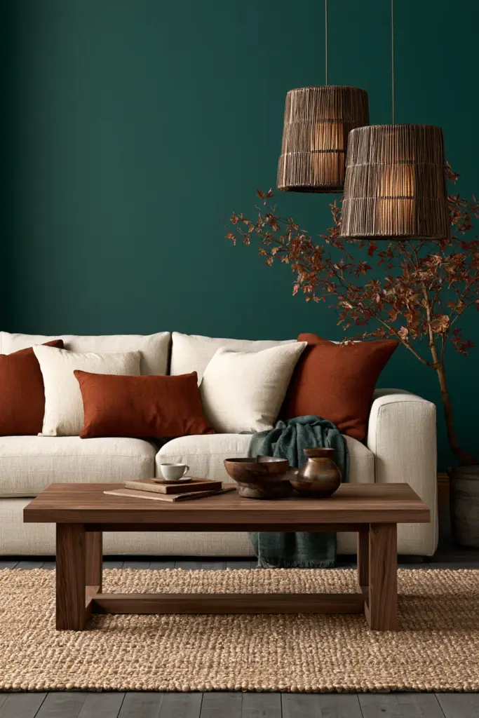
Real Pairing Rules, Not Just Suggestions
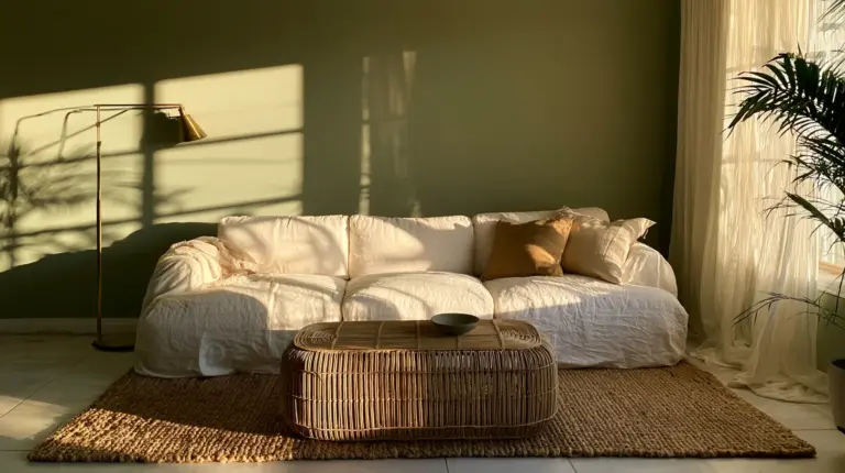
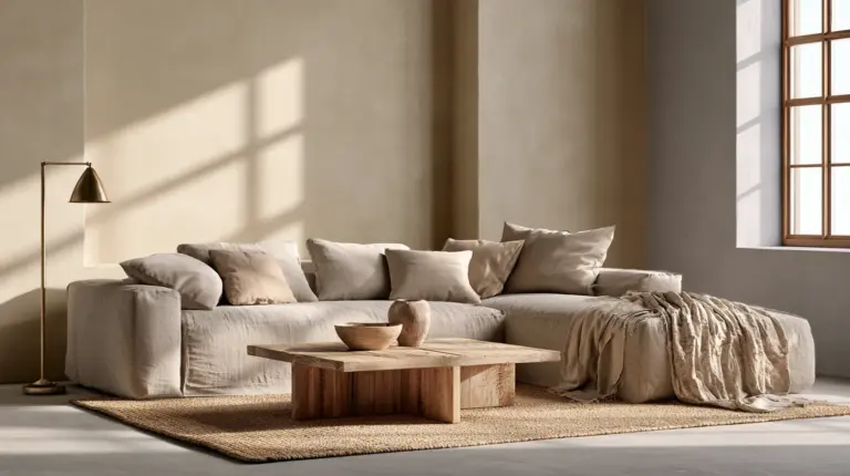
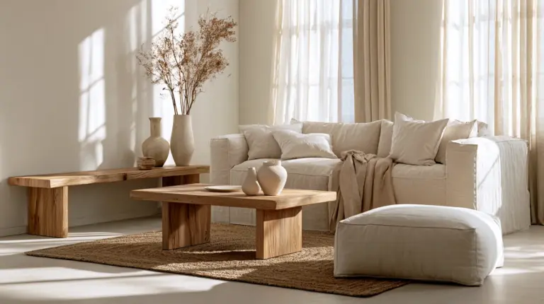
- Sofas: Stick to neutral, textural upholstery — boucle, linen, soft velvet in cream, oatmeal, or warm gray — so the wall stays the star
- Wood tones: Match warm bold walls (terracotta, rust) with warm woods like oak or walnut; match cool bold walls (navy, emerald) with either warm or cool wood, since dark colors are forgiving
- Rugs: Choose a rug with at least one tone that echoes the wall color at lower saturation, which visually “grounds” the room
- Curtains: Avoid heavy patterns competing with a bold wall; instead choose solid linen or a subtle weave in a complementary neutral
- Metal finishes: Warm bold walls love brass and aged gold; cool bold walls pair beautifully with matte black or brushed nickel
For a deeper dive into layering textures and finishes around a statement wall, our guide to cozy furniture pairs naturally with this approach.
Choosing the Right Paint Finish for the Effect You Want
Finish changes how a bold color feels, not just how it looks. This is one of the most overlooked decisions in bold color planning.
| Desired Effect | Recommended Finish | Why It Works |
|---|---|---|
| Cozy, enveloping | Matte or flat | Absorbs light, softens the saturation, hides imperfections |
| Luxe, elevated | Eggshell or soft velvet | Subtle sheen catches light without looking glossy |
| Dramatic, gallery-like | Satin | Adds depth and a slight glow under lighting ideas like picture lights or sconces |
| High-traffic durability | Satin or semi-gloss | Easier to wipe clean, holds up better to daily life |

Mistakes That Make Bold Rooms Feel Chaotic
Bold color goes wrong far more often from small missteps than from the color choice itself. Here’s what tends to derail an otherwise great room.
- Ignoring undertones: Pairing a warm bold wall with cool-toned furniture (or vice versa) creates visual tension your eye can’t quite settle
- Over-saturating every surface: Bold walls plus bold rug plus bold art equals visual noise; let one element lead and the rest support
- Skipping the swatch test: A color that looked perfect on a screen or in a showroom can shift dramatically under your home’s actual light
- Forgetting the ceiling and trim: Painting walls boldly but leaving trim a mismatched white can create a jarring, unfinished edge
- Going straight to a full gallon: Committing to four walls of color before living with a sample is the single most common regret
Bold Color, Budget-Friendly Style
You don’t need a full repaint to test whether bold color belongs in your life. Start small, then expand once you’re sure.
- Paint one accent wall instead of the whole room, which uses a fraction of the paint
- Use leftover sample pots to color a single piece of furniture, a vintage frame, or a side table
- Try a bold pillow or throw in your target color before committing to paint, as a low-risk preview
- Rent or thrift one statement piece — a velvet chair, a ceramic lamp — in your bold color family to “test drive” the mood
Bold Colors by Design Style
Bold doesn’t look the same in every aesthetic, and matching your color choice to your existing style keeps the room feeling intentional.
- Modern rustic (our favorite): Warm terracotta or olive green against natural wood, linen, and matte black accents
- Scandinavian: A single deep navy or forest wall against light oak and plenty of white space
- Japandi: Muted clay or charcoal, paired with low-profile furniture and natural fiber textures
- Eclectic maximalist: Layered jewel tones — emerald, plum, sapphire — mixed confidently across walls, textiles, and art
- Minimalist: One saturated wall as the room’s single statement, with everything else kept deliberately quiet
Quick Reference: Key Takeaways
- Match your bold color to your room’s natural light direction before anything else
- In small spaces, try a bold ceiling, trim, or single wall instead of full saturation
- Let your existing furniture’s undertones guide your color family
- Choose finish based on the feeling you want: matte for cozy, satin for drama
- Test samples across a full day’s light, not just one glance
- Keep furniture and textiles neutral so the wall color stays the focal point
- Start small with accent zones or accessories if you’re budget-conscious or unsure
A Final, Softer Thought
A bold living room isn’t about being fearless. It’s about trusting that color, like light and texture, is simply another way of making a house feel like yours.
Start with one wall, one swatch, one quiet afternoon spent watching how the light moves across it. The rest of the room, in time, will follow that lead.
Frequently Asked Questions
What are the best bold colors for a living room?
Deep forest green, warm terracotta, navy, and burnt sienna are some of the most versatile bold choices, since they pair well with both warm and cool furniture tones.
How do you choose bold living room colors?
Start by looking at your largest existing pieces — flooring, sofa, rug — and choose a bold tone that complements their undertone, then test it with samples in your actual lighting.
Are bold colors good for small living rooms?
Yes, bold colors can work beautifully in small rooms when used on a single wall, ceiling, or trim, since full saturation often feels more cohesive than several competing light tones.
How do you make a bold living room feel cozy, not overwhelming?
Keep furniture and textiles neutral and textural, choose a matte or eggshell finish, and let the bold wall remain the single dominant statement in the room.
What paint finish works best for bold living room walls?
Matte or flat finishes create a cozy, enveloping feel, while satin finishes add subtle depth and work well in more dramatic, gallery-style rooms.