Table of Contents
There’s a particular kind of stillness that fills a room dressed in the right neutral. The light moves differently across the walls. The air feels softer somehow, like the whole space exhaled.
That’s the quiet power of neutral living room colors. Done well, they don’t fade into the background — they set the mood for everything else in the room.
But neutral doesn’t mean flat, and it certainly doesn’t mean boring. The best neutral living rooms feel layered, lived-in, and warm to the touch, even before you sit down.
At ERYLIN, we believe color should feel like a mood, not just a swatch. This guide walks you through choosing neutrals that actually work — for your light, your floors, and your style.
Why Neutral Living Room Colors Work So Well
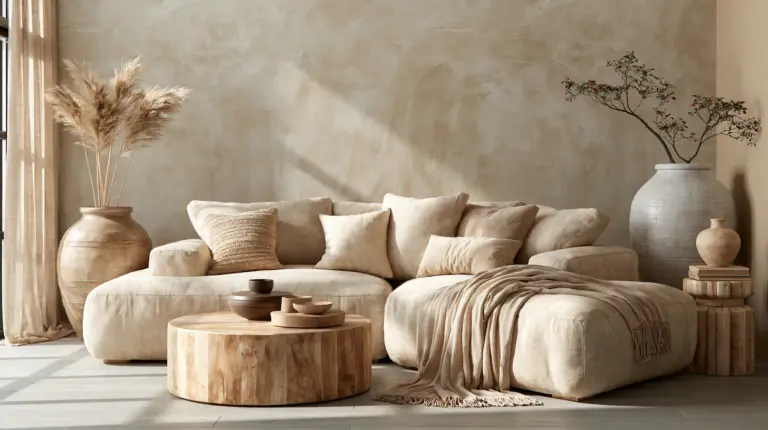
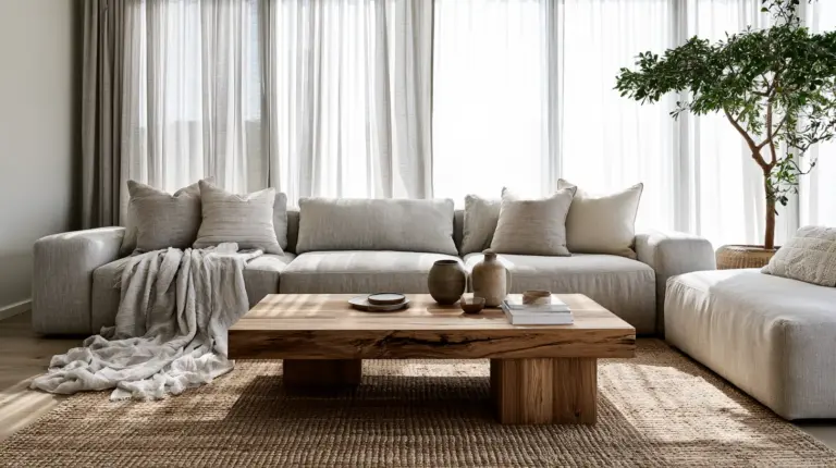
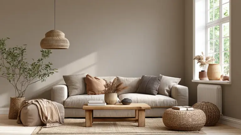
Neutrals are the foundation of modern rustic elegance. They let natural materials — linen, oak, stone, woven rattan — do the talking.
A neutral wall doesn’t compete with your sofa, your art, or your favorite ceramic vase. It simply makes room for them.
This is also why neutrals age so gracefully. While bold colors can feel trendy one year and dated the next, a well-chosen beige, greige, or warm white quietly stays in style.
Understanding Undertones: The Secret Behind Every Great Neutral
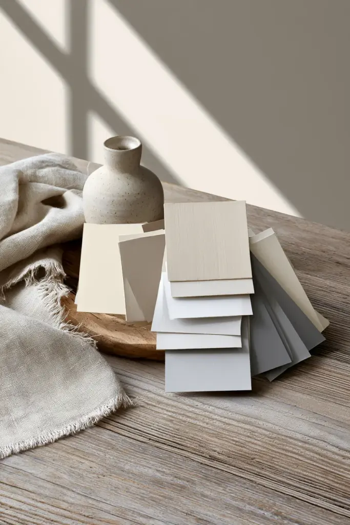
Every neutral paint has a hidden personality, called an undertone. It’s the faint hint of another color living beneath the surface, and it’s the single biggest reason a neutral can look stunning in one room and strange in another.
Warm Neutrals
Warm neutrals carry hints of yellow, peach, or red beneath the surface. Think buttery beige, soft ivory, or warm taupe.
They feel cozy and grounded, especially in rooms with wood floors, brass fixtures, or natural textiles like linen and jute.
Cool Neutrals
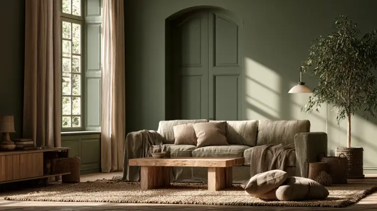
Cool neutrals lean toward gray, blue, or green undertones. They feel crisp, calm, and a little more contemporary.
These shades pair beautifully with black accents, glass, and sleek modern furniture, but they can feel cold in rooms that already lack warmth.
Greige and Taupe: The In-Between Favorites
Greige blends gray and beige into one balanced, almost chameleon-like tone. Taupe leans slightly deeper and earthier, with a soft brown-gray hush to it.
Both are forgiving, adaptable, and a safe bet if you’re torn between warm and cool.
A Quick Decision Chart: Which Neutral Fits Your Room
| Mood You Want | Best Neutral Type | Why It Works |
|---|---|---|
| Cozy, grounded, traditional | Warm beige or taupe | Plays well with wood tones and soft lighting |
| Crisp, airy, modern | Cool gray or warm white | Feels clean without going stark |
| Balanced, low-risk | Greige | Adapts to changing light throughout the day |
| Moody, sophisticated | Deep taupe or clay | Adds depth without overwhelming a small space |
How Lighting Changes Everything
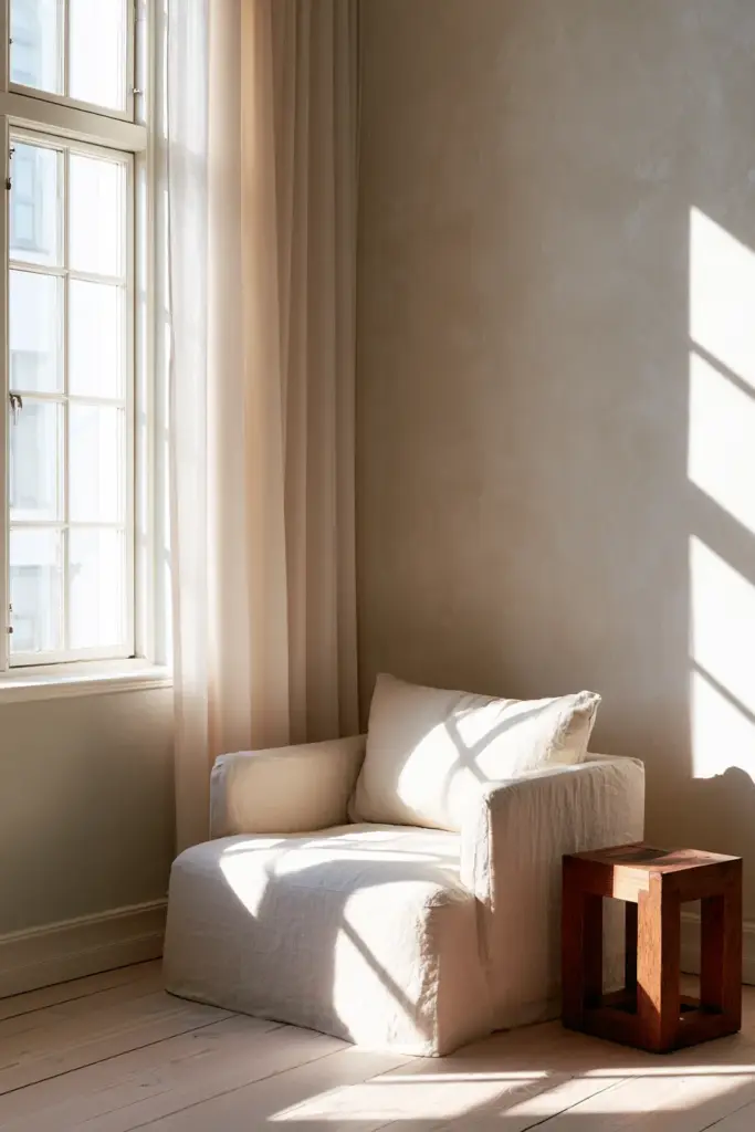
The same paint chip can look completely different depending on where the sun falls. This is the step most lighting ideas guides skip, and it’s often the difference between a love-it and a return-it paint.
North-Facing Living Rooms
North light is cool and consistent throughout the day, which means cool neutrals can turn flat or slightly blue. Lean toward warm beige, soft ivory, or warm greige to counterbalance the coolness.
South-Facing Living Rooms
South-facing rooms get warm, golden light for most of the day. This gives you more flexibility — cool grays won’t feel harsh, and warm neutrals will glow even richer.
Low-Light or East/West Rooms
Rooms with limited natural light need neutrals with a bit more warmth and depth, since dim light tends to mute color and make pale shades look washed out. Avoid icy whites here; they tend to read gray and lifeless without sunlight to soften them.
Matching Neutrals to Your Floors
Your flooring sets the undertone conversation before the paint can even join in. A mismatch here is one of the most common styling mistakes.
- Dark wood floors — pair with warm whites or soft greige to keep the room from feeling heavy.
- Light oak floors — almost any neutral works, but warm taupe enhances the honey tones beautifully.
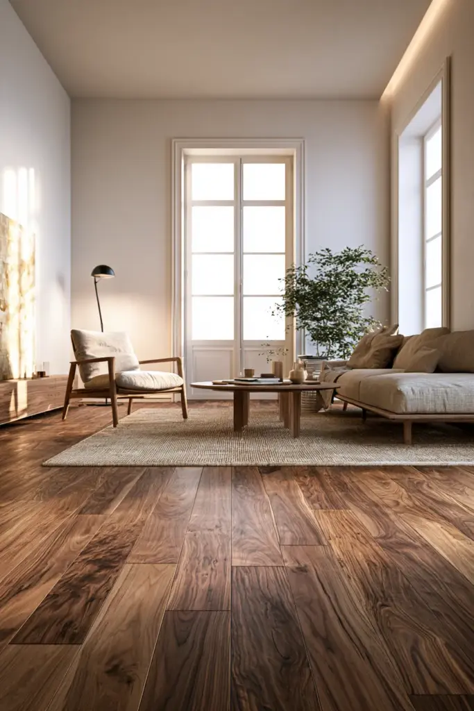
- Walnut floors — lean into deeper, warmer neutrals like clay or warm beige to match the wood’s richness.
- Gray floors — cool greige or soft white keeps the palette cohesive without feeling sterile.
- Beige tile — choose a slightly cooler neutral on the walls to avoid an overly monochrome, flat look.
Making Neutral Rooms Feel Warm, Not Flat
This is where most neutral living rooms lose their charm — by stopping at the paint color and forgetting the layers that make a room feel alive.
Stack Your Textures
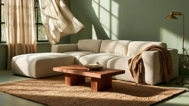
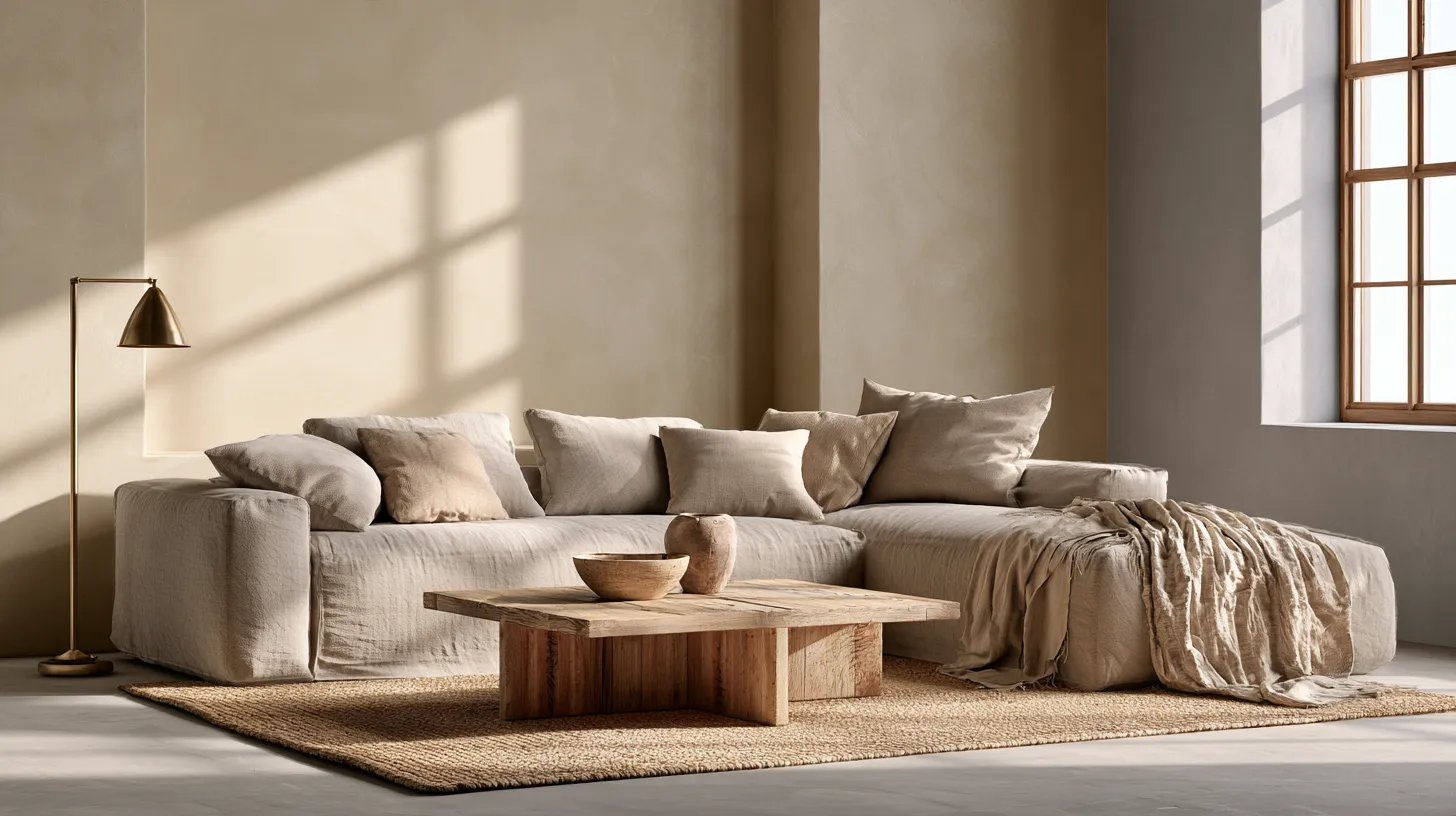
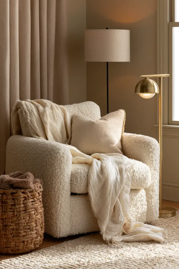
Mix matte and shine, rough and smooth. A boucle armchair, a linen throw, a brass lamp, and a jute rug can all live in the same neutral room and somehow feel intentional rather than busy.
This kind of textural layering is at the heart of cozy furniture styling — it’s not about more stuff, it’s about more feeling.
Add Contrast With Black Accents
A few black accents — a slim floor lamp, picture frames, or a coffee table — give a neutral room definition. Without contrast, even the most beautiful greige can start to blur together.
Bring in Natural Materials
Wood, stone, linen, and rattan all carry their own quiet texture. They add warmth and dimension that paint alone can’t deliver, no matter how perfect the undertone.
Layer Your Lighting
A single overhead light flattens a neutral room instantly. Combine a floor lamp, a table lamp, and warm-toned bulbs to create soft pools of light that make beige feel golden and greige feel inviting.
The Japandi and Modern Minimalist Angle
If you love clean lines but still crave warmth, the Japandi approach blends Japanese minimalism with Scandinavian coziness — and neutrals are its backbone.
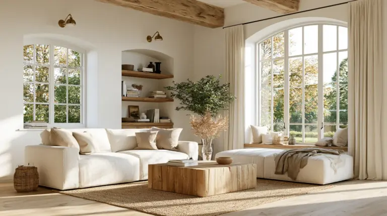
Think soft white walls, warm wood furniture, stone accessories, and linen textiles in muted, earthy tones. The palette stays quiet, but the materials do the storytelling.
This style proves that “neutral” and “minimal” don’t have to mean cold or empty. A few well-chosen pieces, placed with intention, can feel more complete than a room full of decor.
Common Mistakes to Avoid
- Choosing a too-cool gray in a room with little natural light, which can read as flat or even slightly blue.
- Picking a washed-out beige that looks creamy on the swatch but disappears entirely under bright daylight.
- Ignoring undertones, leading to a muddy clash between walls, floors, and furniture.
- Using one flat tone everywhere, which removes all depth and makes a room feel unfinished.
- Skipping a sample test on your actual wall before committing to a full gallon.
Choosing the Right Finish
The sheen of your paint changes how a neutral color behaves just as much as the undertone does.
- Matte — hides imperfections beautifully but shows scuffs more easily; best for low-traffic walls.
- Eggshell — a popular middle ground for living rooms, with a soft glow and easier cleaning.
- Satin — slightly more reflective and durable, good for high-traffic family rooms.
Budget-Friendly Ways to Refresh a Neutral Room
You don’t need a full renovation to shift the feel of a neutral living room.
- Swap a few accent pillows for different textures, like linen or boucle.
- Add a woven basket or two for warmth and quiet texture.
- Introduce one or two black accents to sharpen the room’s edges.
- Change a single lampshade to warm the overall glow.
- Layer a new rug to ground the furniture and add depth underfoot.
Quick Checklist: Choosing Your Neutral Living Room Color
- Identify your room’s light direction before picking a shade.
- Match your undertone to your flooring, not just your furniture.
- Choose warm neutrals for cozy, traditional spaces and cool neutrals for crisp, modern ones.
- Layer textures — linen, wood, wool, brass — to avoid a flat finish.
- Add at least one black or deep accent for contrast.
- Test your paint sample on the actual wall, in daylight and at night.
- Choose your finish based on traffic and wall imperfections.
A Soft Place to Land
A neutral living room, done thoughtfully, doesn’t ask for attention — it simply offers comfort. It’s the kind of room that feels like a long, quiet breath after a busy day.
The right shade, paired with the right light and the right textures, turns a plain wall into something that feels like home. That’s the soul of modern rustic elegance: quiet color, honest materials, and a little bit of warmth in every corner.
May your neutrals always feel less like a color choice, and more like a soft place to land.

Frequently Asked Questions
What are the best neutral colors for a living room?
Warm beige, soft greige, taupe, and warm white are some of the most versatile choices, since they adapt well to different lighting conditions and pair easily with natural materials.
How do I make a neutral living room not look boring?
Layer your textures, mix in natural materials like wood and linen, add black accents for contrast, and use layered lighting instead of one overhead source.
Should I choose warm neutrals or cool neutrals?
Choose warm neutrals for cozy, traditional spaces or rooms with limited natural light, and cool neutrals for crisp, modern spaces with plenty of sunlight.
What neutral color works best in a small living room?
Soft, warm whites and light greige tend to open up small spaces, reflecting light without feeling stark or clinical.
Which neutral paint colors work best with natural light?
South-facing rooms suit almost any neutral, while north-facing or low-light rooms look best with warmer tones that counterbalance the cooler, dimmer light.