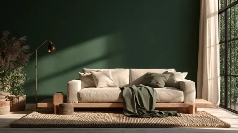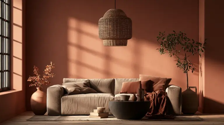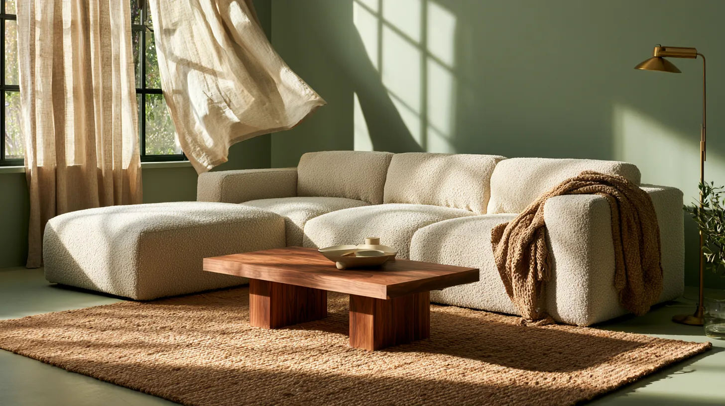
Table of Contents
Some rooms hold you the moment you walk in. The light feels softer. Your shoulders drop an inch. That’s the quiet power of color, chosen with care.
At ERYLIN, we believe a living room should feel like an exhale. Not sterile, not staged — just settled. The kind of space where linen throws pool on the sofa and the afternoon sun has somewhere warm to land.
Choosing calming living room colors isn’t about following a trend chart. It’s about understanding how a shade behaves in your light, against your floors, beside your favorite worn armchair. Undertones shift. Bulbs change everything. A “greige” that glows at noon can turn cold by dusk.
This guide goes further than a simple color list. We’ll walk through undertones, lighting, finish, pairing recipes, and small-space tricks — the details that turn a nice color into a room that actually feels calm.
What Makes a Color Feel Calming, Really?
Calm isn’t one shade. It’s a relationship between hue, saturation, and light. Muted, low-contrast colors tend to soothe the nervous system, while high-contrast brights keep the eye — and the mind — a little more alert.
Soft blues and greens echo sky and foliage, which is likely why they read as restful to most people. Warm neutrals, meanwhile, borrow comfort from natural materials like wood, clay, and linen.
The finish matters just as much as the hue. A matte or eggshell sheen softens light reflection, which keeps a color feeling gentle rather than glossy and busy.
Six Calming Color Families for a Modern Rustic Living Room
Each of these palettes pairs beautifully with natural textures — think raw wood, boucle, and woven rattan — for that light, elevated, cozy feeling ERYLIN loves.
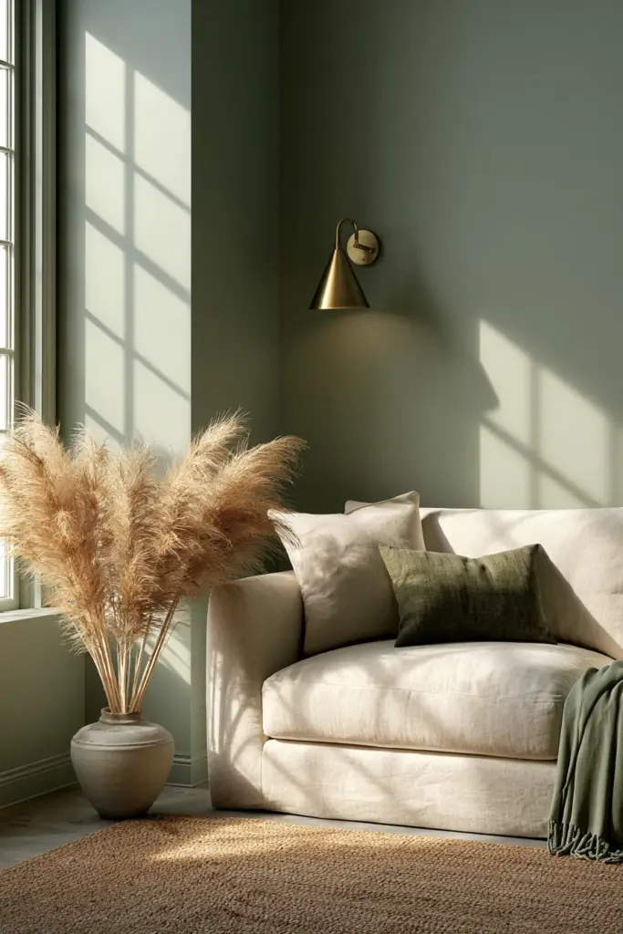
1. Soft Sage and Muted Greens
Sage carries warmth without tipping into a full “forest” statement. It’s grounding, plant-like, and endlessly easy to live with.
- Undertone watch: Choose a sage with gray or yellow undertones for warm rooms; avoid blue-leaning greens in north-facing spaces, where they can turn chilly.
- Pairing recipe: A boucle sofa in oat, a jute rug, and brushed-brass lighting ideas for a warm evening glow.
- Finish: Matte or eggshell keeps the color velvety rather than flat.
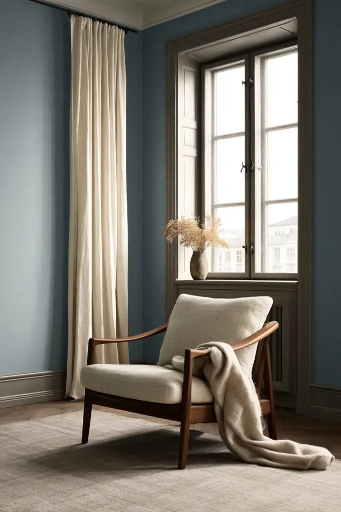
2. Cloud and Sky Blues
A pale, dusty blue feels like an overcast morning — quiet, unhurried, easy on the eyes.
- Undertone watch: Warm-gray undertones prevent the blue from reading cold under LED bulbs.
- Pairing recipe: Pair with warm walnut furniture, cream linen curtains, and a woven wool throw.
- Finish: Satin on trim, matte on walls, for gentle contrast without shine.
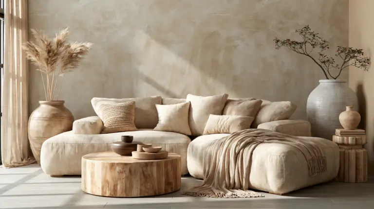
3. Warm Greige and Soft Taupe
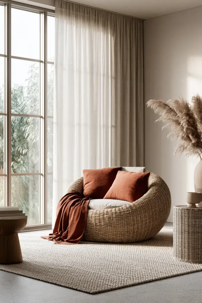
Greige is the quiet workhorse of calming palettes — neither cold gray nor overly beige.
- Undertone watch: Test a sample against your floor in daylight; taupes can lean pink or green depending on the base.
- Pairing recipe: Layer with terracotta accents, a low-pile wool rug, and cozy furniture in bouclé or corduroy.
- Finish: Eggshell for durability in high-traffic living rooms.
4. Muted Aubergine and Soft Plum
A gentle, dusty plum brings depth without the drama of a true dark navy or black.
- Undertone watch: Keep the saturation low; a highly saturated plum reads as bold rather than calming.
- Pairing recipe: Combine with warm oak, brass hardware, and a cream or oatmeal sofa to keep the room airy.
- Finish: Matte, to soften the depth of the color.
5. Deep Navy, Used Intentionally
Yes, dark colors can be calming — navy included. Depth can feel enveloping rather than heavy when it’s balanced with light textures and enough natural light.
- Undertone watch: In low-light rooms, choose navy sparingly (an accent wall, not all four) so the space doesn’t feel closed in.
- Pairing recipe: Pair with linen-white trim, a jute rug, and warm wood shelving to keep it grounded, not gloomy.
- Finish: Satin, which catches just enough light to prevent the wall from feeling flat.
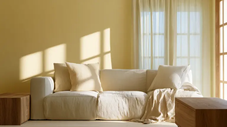
6. Warm Off-Whites (Swiss Coffee, Skylight-Type Shades)
A warm off-white is the softest possible calming choice — ideal for small or low-light rooms that need brightness without starkness.
- Undertone watch: Look for a whisper of yellow or beige; a stark white can feel clinical rather than cozy.
- Pairing recipe: Layer with textured linen pillows, a woven pouf, and warm wood accents so the room doesn’t feel empty.
- Finish: Matte for walls, eggshell for trim.
Undertones: The Detail Most Guides Skip
The same paint name can look completely different from house to house. That’s undertone at work — the subtle secondary hue hiding beneath the main color.
How to check it: hold your swatch next to your floor and your largest piece of cozy furniture in daylight. If the color pulls warmer or cooler than expected, that’s your undertone revealing itself.
Quick rule: warm floors (oak, walnut, terracotta tile) usually pair best with warm-undertone colors. Cooler floors (gray-washed wood, polished concrete) can handle cooler-leaning shades without feeling stark.
How Light Changes a Calming Color
A color is never just one color — it shifts with the sun. Morning light tends to be cool and blue-toned; midday is neutral and bright; evening light warms everything toward amber.
Testing tip: paint a large poster-board swatch (not just a small chip) and move it around the room across a full day. Watch how it behaves under your actual lighting ideas, from warm bulbs to daylight-balanced ones.
North-facing rooms benefit from warmer, slightly richer colors to counteract cool, flat light. South-facing rooms have more flexibility and can carry cooler tones beautifully.
A Quick Reference Table
| Color Family | Best Light Condition | Pairs Well With | Recommended Finish |
|---|---|---|---|
| Soft Sage | Bright, indirect light | Oat boucle, jute, brass | Matte / Eggshell |
| Cloud Blue | East or south-facing | Walnut, cream linen | Satin trim, matte wall |
| Warm Greige | Any light condition | Terracotta, wool rug | Eggshell |
| Muted Plum | Moderate to bright | Oak, brass, cream sofa | Matte |
| Deep Navy | Bright rooms, accent use | Linen white, jute, wood | Satin |
| Warm Off-White | Low-light, small rooms | Linen, rattan, wood | Matte / Eggshell |
Calming Colors for Small or Multifunctional Living Rooms
In a studio or a combined living-dining space, one continuous, warm neutral across all walls can make the footprint feel larger and calmer at once.
Use a single calming color as the base, then create gentle “zones” with textiles rather than contrasting paint — a woven rug under the seating area, a different lamp glow near the reading nook.
Mirrors and matte finishes both help small spaces breathe, bouncing soft light around without the glare a glossy sheen would create.
Budget-Friendly and Low-VOC Testing
You don’t need a dozen sample pots to find your color. Peel-and-stick swatches or a single large poster-board sample, moved around the room, will tell you almost everything.
Look for low-VOC or zero-VOC paint lines, which keep the room feeling calm in more than one sense — better air quality alongside a softer palette.
Your Calming Color Checklist
- Test large swatches in real daylight, not just paint chips
- Check undertones against your floor and favorite furniture piece
- Match finish to function: matte or eggshell for a soft, calming feel
- Choose warmer tones for low-light or north-facing rooms
- Use dark colors intentionally, balanced with light textures
- Layer in natural materials — wood, linen, wool, rattan — for texture
- Consider low-VOC paint for a healthier, calmer home
A Softer Kind of Beautiful
A calming living room isn’t built in a single afternoon of painting. It’s layered slowly — one warm swatch, one linen throw, one better lamp at a time.
Choose the color that makes you want to linger. The rest, gently, follows.
Frequently Asked Questions
What colors are calming for a living room?
Soft sage, dusty blue, warm greige, muted plum, and warm off-whites are among the most reliably calming choices, especially with a matte or eggshell finish.
Are dark colors calming in a living room?
Yes — deep navy or charcoal can feel enveloping and cozy when used intentionally, paired with light textures and enough natural light to keep the room from feeling closed in.
What paint colors are best for low-light living rooms?
Warm off-whites and warm-undertone greiges brighten low-light rooms without feeling stark, since their yellow or beige base counters cool, flat daylight.
What paint finish is best for a calming room?
Matte or eggshell finishes soften light reflection, helping a color feel gentle rather than glossy or busy.
How do I test paint colors before committing?
Paint a large poster-board swatch, move it around the room, and observe it under morning, midday, and evening light before choosing your final shade.