Table of Contents
There’s a particular kind of quiet joy in walking into a living room that simply feels right. The walls hold a warmth you can’t quite name. The light falls softly, never harsh, never flat. Everything just settles.
That feeling isn’t luck. It’s the result of two design decisions working together: your wall color and your lighting. Most guides treat them as separate projects, but they’re really one conversation.
At ERYLIN, we believe a living room should feel like a held breath released — natural, textured, a little imperfect, deeply comforting. Getting there means understanding how color shifts under light, and how light should shift to support your color.
This guide walks you through both, room by room, direction by direction, style by style — so you can stop guessing and start living in a space that finally feels finished.
Why Color and Lighting Can’t Be Separated
Paint chips lie a little. That gorgeous greige on the store card can turn muddy in a north-facing room, or wash out entirely under cool white bulbs. Color is not fixed — it’s a response to light.
Every wall color you choose will shift throughout the day as natural light changes, and shift again at night when your lamps take over. Understanding this relationship is the real secret behind rooms that feel effortlessly warm.
How Room Direction Changes Your Palette
Your windows are the first light source you’re designing around, long before any lamp gets switched on.
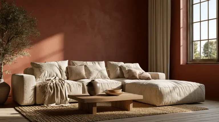
North-facing rooms receive cool, flat, bluish light most of the day. Choose warm-based neutrals — soft terracotta, warm greige, buttery cream — to counteract the chill. Avoid cool grays or icy whites; they’ll feel sterile rather than serene.
South-facing rooms get warm, golden light for much of the day, which gives you room to play. Soft blues, sage greens, and warm whites all glow beautifully here without tipping into starkness.
East-facing rooms enjoy bright, energizing morning light that fades to cooler tones by afternoon. Mid-tone neutrals with warm undertones handle this shift gracefully.
West-facing rooms get soft light early, then intense golden-orange light in the evening. Deeper, richer tones — clay, olive, warm charcoal — hold their own against that late-day glow instead of looking blown out.
| Room Direction | Natural Light Quality | Best Color Direction |
|---|---|---|
| North-facing | Cool, flat, consistent | Warm neutrals, terracotta, cream |
| South-facing | Warm, golden, bright | Soft blue, sage, warm white |
| East-facing | Bright morning, cooler afternoon | Warm mid-tone neutrals |
| West-facing | Soft morning, intense evening glow | Deep clay, olive, warm charcoal |
Understanding Bulb Temperature: The Missing Half of Every Color Decision
Here’s what most paint guides skip entirely: the same wall color can look like two different colors depending on your bulb’s Kelvin rating. This single detail changes everything about how your lighting ideas should pair with paint.
Kelvin (K) measures the warmth or coolness of a bulb’s light. Lower numbers glow amber and cozy. Higher numbers read crisp and clinical.
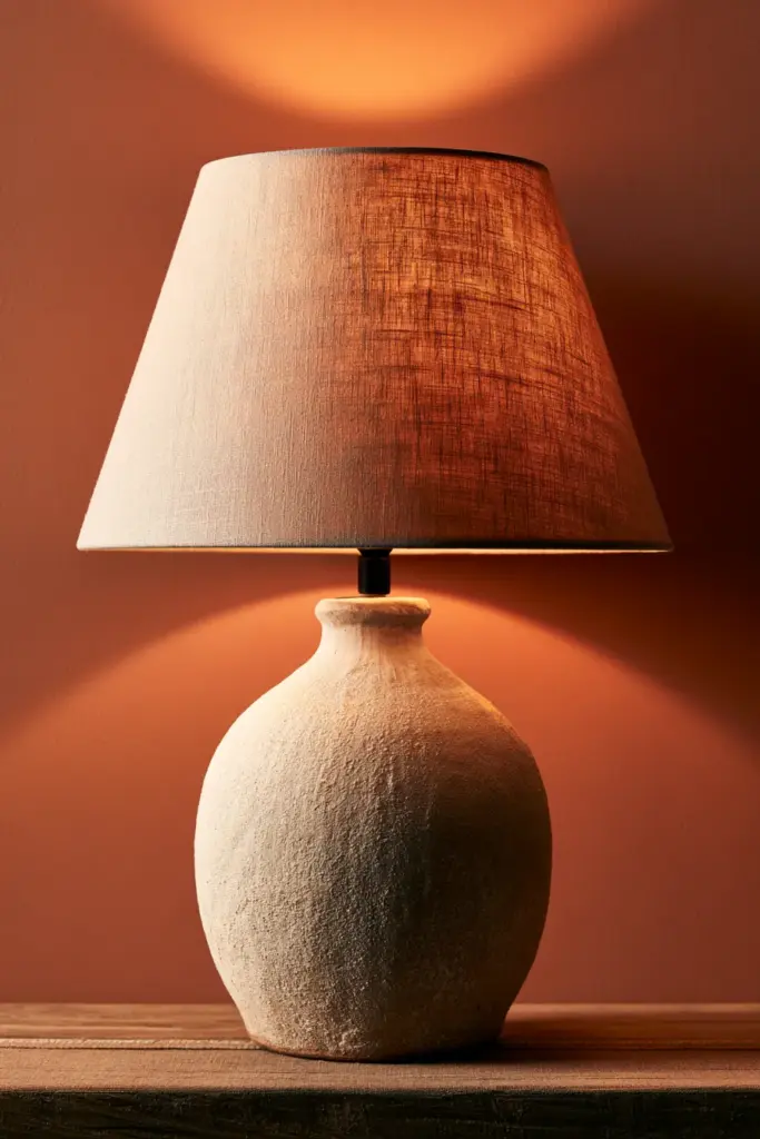
2700K — Soft, Amber, Candlelit
This is the warmest common bulb temperature, and it’s the closest thing to firelight. It deepens warm neutrals beautifully but can push cool grays toward a slightly greenish or muddy cast.
Best paired with: terracotta, warm beige, cream, soft blush, deep clay.
3000K — Warm White, Balanced
A gentle middle ground that flatters almost any neutral without overwhelming it. This is our go-to recommendation for most living rooms because it keeps color true while still feeling inviting.
Best paired with: greige, sage, warm gray, soft taupe, off-white.
4000K–5000K — Daylight, Crisp, Cool
Closer to natural daylight, this range can make warm colors look slightly flat and cool colors look their truest, cleanest self. Reserve it for task-focused corners rather than the whole room.
Best paired with: cool blue-grays, true white, black accents — and almost never as your only light source in a space meant for relaxing.
Layering Light: Ambient, Task, and Accent
A single overhead fixture will never make a living room feel finished. Real warmth comes from layers — light sources working at different heights, doing different jobs.
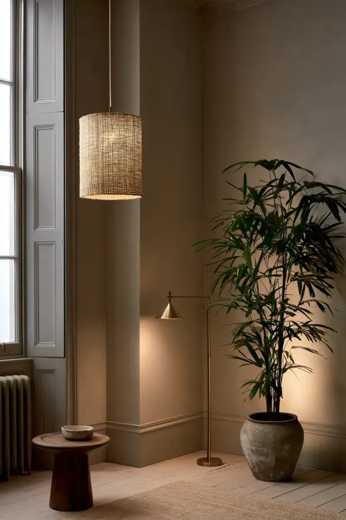
Ambient Lighting: The Foundation
This is your room’s base glow — often a ceiling fixture, flush mount, or dimmable recessed lighting. Keep it soft and always dimmable, since a room’s mood should shift from afternoon to evening.
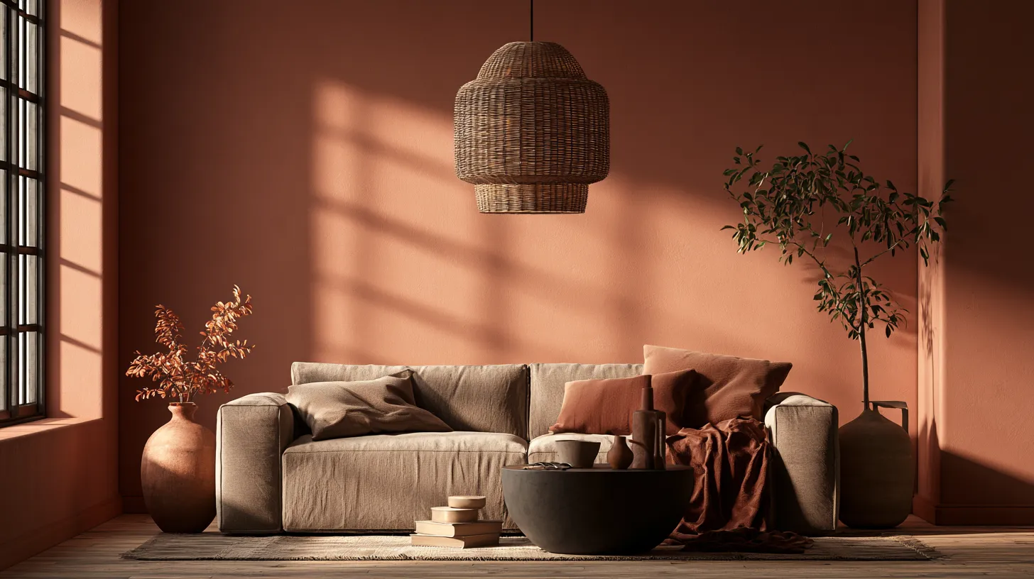
A woven pendant or a plaster flush mount adds textural warmth here, echoing the natural materials that define modern rustic style.
Task Lighting: Where You Actually Live
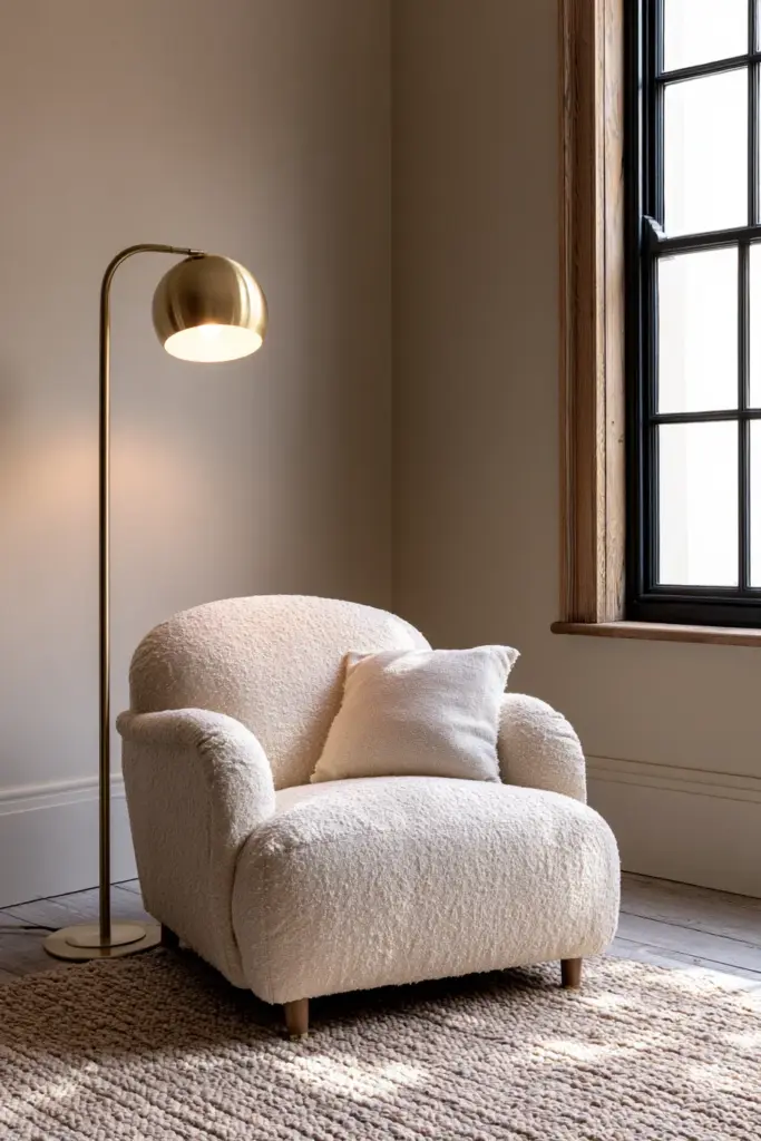
Reading nooks, side tables, and work corners need focused light that ambient fixtures can’t provide. A brass or ceramic table lamp beside your favorite armchair does quiet, essential work.
Choose shades in linen or rice paper — they soften the light beautifully rather than casting it in a harsh, direct beam.
Accent Lighting: The Emotional Layer
This is the layer most rooms skip, and it’s the one that makes a space feel styled rather than simply lit. Picture lights, LED strips behind a shelf, or a small uplight on a plant all add depth and dimension after dark.
Accent lighting is what turns a flat, evenly-lit room into one with genuine atmosphere — soft shadows, warm pockets, visual rhythm.
Solving the Living Room’s Real Pain Point: TV Glare
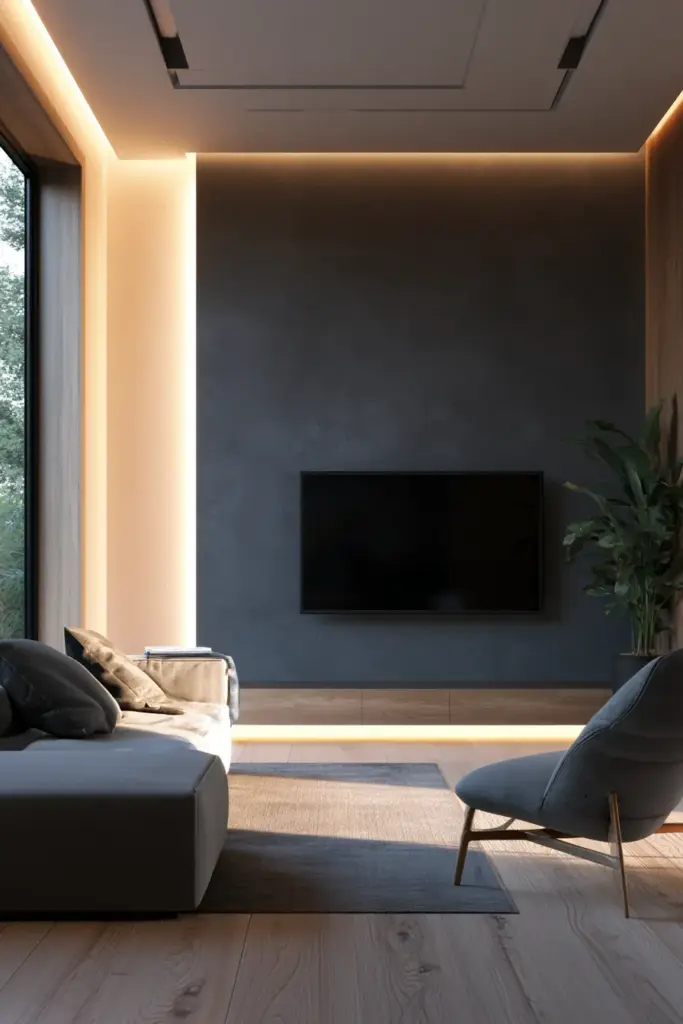
Almost no guide addresses this, yet it’s one of the most common frustrations in living room design. A poorly placed light source or the wrong wall finish behind your screen can turn movie night into a glare-filled headache.
A few simple adjustments solve most of it:
- Choose a matte or eggshell finish on the wall behind your TV — glossier sheens bounce light directly into the screen.
- Position ambient lights to the side of the seating area rather than directly opposite the screen.
- Add a low-glow bias light behind the TV itself; it reduces eye strain and softens screen contrast beautifully.
- Keep evening viewing light around 2700K–3000K, dimmed low, rather than switching to bright overhead light.
How Paint Finish Changes Perceived Color
Finish matters just as much as hue, and it’s rarely explained clearly. The same exact color will read differently depending on how much light it reflects.
Matte finishes absorb light and deepen color, which is why they photograph so richly but can look slightly darker in person than expected. Eggshell offers a gentle, low-key sheen — our favorite for living rooms, since it hides imperfections while still catching light softly. Satin reflects more directly, which can make bold colors feel brighter and more saturated, sometimes more than intended.
Color and Lighting by Style
Japandi Living Rooms
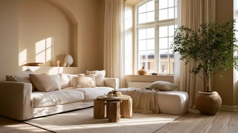
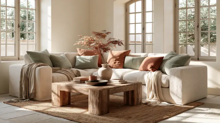
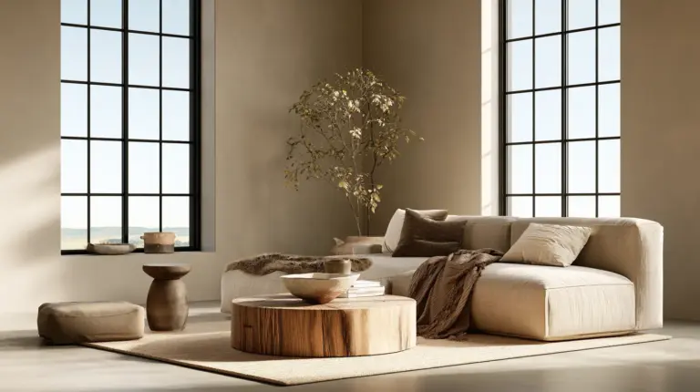
Think warm oat, soft stone, and muted sage against natural oak and linen. Pair these with 2700K–3000K bulbs in woven or paper-shaded fixtures, and let one statement piece of cozy furniture — like a low-slung linen sofa — anchor the calm.
Modern Living Rooms
Crisp warm whites, charcoal accents, and the occasional deep navy or forest green feel current without losing warmth. Layer 3000K ambient light with a sculptural floor lamp for contrast and a touch of drama.
Eclectic Living Rooms
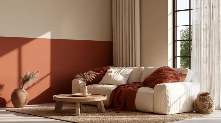
This style thrives on contrast — a deep terracotta wall against brass fixtures and jewel-toned textiles. Mix bulb temperatures intentionally here: warmer light near seating, slightly cooler light on art or bookshelves to let colors pop.
Small and Low-Ceiling Living Rooms
Small spaces need light that expands rather than compresses. Choose warm whites over stark colors, keep sheens soft to avoid glare bounce, and favor wall-mounted or slim floor lamps over anything bulky.
Vertical light — wall sconces, tall slender lamps — draws the eye upward and makes low ceilings feel taller than they are.
Mistakes to Avoid
- Relying on a single overhead light. Flat, shadowless lighting drains warmth from even the best paint color.
- Choosing paint without testing it under your actual bulbs. A swatch under store lighting rarely matches home lighting.
- Mixing bulb temperatures randomly. Stick to one consistent range per room, layering intentionally rather than accidentally.
- Painting a north-facing room in cool tones. It amplifies the chill instead of balancing it.
- Ignoring finish. The same color in matte versus satin can look like two different paints entirely.
The ERYLIN Testing Method
Before committing to a full room, test your palette against real conditions. It takes one week and saves months of regret.
- Paint a large swatch — at least 12×12 inches — on two different walls.
- Observe it at 9am, 1pm, and 8pm under your actual bulbs.
- Note which direction the wall faces and how the color shifts.
- Test one warm lamp (2700K) and one balanced bulb (3000K) beside the swatch.
- Photograph each observation — photos often reveal undertones the eye misses in the moment.
Quick Reference Checklist
- Match wall color warmth to your room’s natural light direction.
- Choose 2700K–3000K for most living rooms; reserve daylight bulbs for task-only corners.
- Layer ambient, task, and accent lighting rather than relying on one fixture.
- Use matte or eggshell finishes behind TVs to reduce glare.
- Test paint and bulbs together for a full week before committing.
- Let dimmers do the emotional work — one fixture, many moods.
A Softer Kind of Finished
A living room isn’t finished when the paint dries. It’s finished when the evening light hits the wall just right, when a lamp glows low enough to invite you to stay a little longer, when the room stops feeling decorated and starts feeling like yours.
That’s the quiet promise behind every color and every bulb we recommend — not perfection, just warmth, done thoughtfully. May your walls hold the light well, and may your evenings linger a little longer in them.
Frequently Asked Questions
What are the best colors for a living room?
Warm neutrals like greige, cream, and soft terracotta work well in most living rooms, especially when matched to your room’s natural light direction and paired with warm-toned bulbs.
What color light is best for a living room?
Warm white light between 2700K and 3000K is best for most living rooms, since it flatters skin tones, deepens wall color, and creates a relaxed, inviting atmosphere.
What color makes a living room cozy?
Warm, muted tones — terracotta, deep clay, warm taupe, and soft olive — create coziness, especially when layered with soft ambient and accent lighting rather than one bright overhead source.
Should living room lights be warm or cool?
Warm lighting, generally 2700K to 3000K, suits most living rooms best, since cooler light above 4000K tends to feel clinical in a space meant for relaxing.
How do I match wall color with lighting?
Test your paint swatch under your actual bulbs at different times of day, and choose bulb temperature based on your wall’s undertone — warm bulbs for warm neutrals, balanced 3000K bulbs for cooler or more muted tones.