Table of Contents
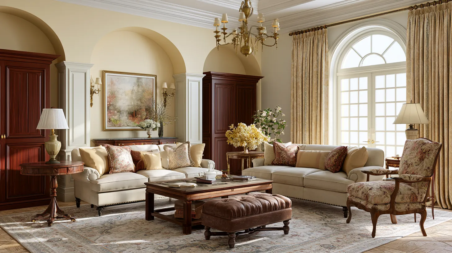
There’s a particular kind of quiet that fills a well-colored traditional living room. It’s the hush of a space that feels finished, not trendy — the kind of room where a fire could be lit, a book could be opened, and nothing would feel out of place.
Traditional living room colors aren’t loud. They’re warm whites that catch afternoon light, deep greens that echo old libraries, and soft taupes that make mahogany glow instead of fight for attention.
This guide skips the generic paint gallery. Instead, we’re walking through the undertones, pairings, and room conditions that actually determine whether a traditional palette reads as classic — or accidentally dated.
By the end, you’ll know exactly which colors to trust for your walls, trim, ceiling, and curtains, and how to make them work with the wood tones and brass already living in your space.
What Makes a Color “Traditional”
Traditional color choices lean on warmth and depth rather than stark contrast. Think of them as colors with a history — hues that would have looked just as at home a century ago as they do now.
They tend to have warm or neutral undertones, never icy-cool ones. A traditional palette also tends to pair, meaning each shade is chosen to sit comfortably beside wood, brass, and fabric rather than compete with them.
Core Traditional Palette Families
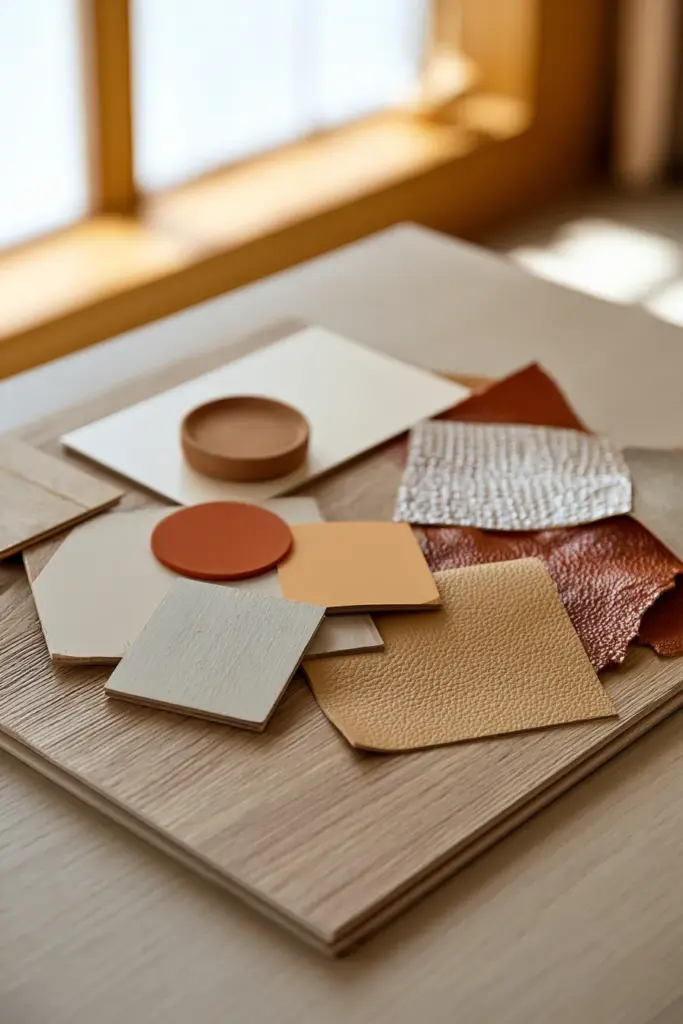
- Warm white — soft, creamy, never stark or blue-based
- Creamy beige — a gentle backdrop for ornate millwork
- Greige — the bridge between warm and cool, works with most wood tones
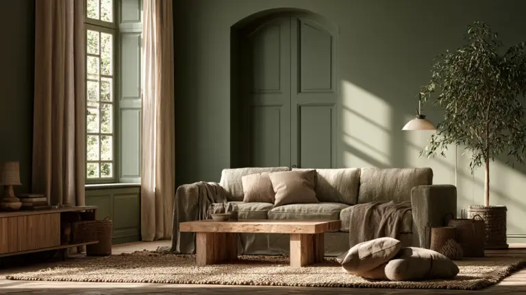
- Muted sage — an updated neutral that still feels rooted in classic decorating
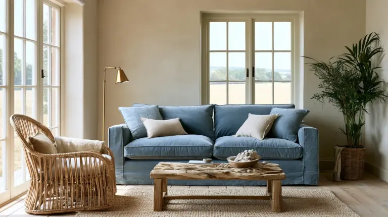
- Dusty blue — calm, slightly faded, evokes old English interiors
- Navy — formal, grounding, excellent in low-traffic rooms
- Soft taupe — quiet and flexible, flatters both cool and warm woods
- Heritage green — deep, botanical, reminiscent of libraries and studies
Each of these works because it has enough warmth to soften hard architectural lines like crown molding, while still feeling sophisticated rather than heavy.
Undertones: The Detail Most Guides Skip
Undertone is where traditional palettes succeed or quietly fail. A white that leans slightly yellow can clash with cool-toned oak. A gray with a green undertone can make brass fixtures look tarnished instead of warm.
Before committing to a color, hold a large sample beside your existing wood floors and upholstery in natural daylight. Traditional wood tones — mahogany, walnut, cherry, oak — each pull differently, and the wall color should support, not compete with, that pull.
| Wood Tone | Undertone to Match | Colors to Avoid |
|---|---|---|
| Mahogany | Warm, reddish-brown | Cool blues, stark white |
| Walnut | Deep, neutral-warm | Overcool grays |
| Oak (light) | Golden, honeyed | Pink-toned beiges |
| Cherry | Warm red-brown | Green-gray undertones |
| Dark Leather | Warm, saturated | Icy pastels |
If a color sample looks slightly “off” beside your furniture, it’s almost always the undertone talking. Trust that instinct before you trust the paint chip name.
Pairing Guide: Wall, Trim, Ceiling, and Curtains
A traditional room is rarely one color. It’s a conversation between several — wall, trim, ceiling, and drapery — each playing a supporting role. For more on how these choices extend into the room’s furnishings, our lighting ideas and cozy furniture guides pick up where paint leaves off.
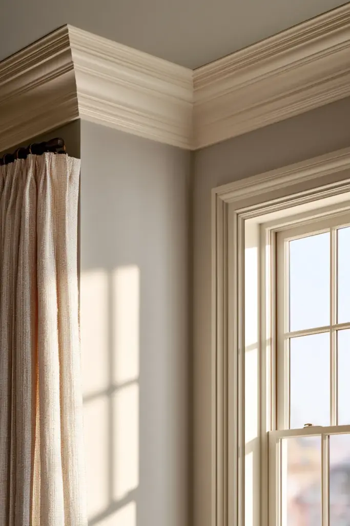
The Classic Formula
- Walls: the anchor tone — warm white, greige, or a deeper hue like navy or heritage green
- Trim and crown molding: a soft white or warm ivory, slightly lighter than the wall for gentle contrast
- Ceiling: often a whisper-lighter version of the wall color, which keeps a room feeling grounded rather than boxed in
- Curtains: a textured neutral or a muted tone-on-tone pattern that echoes the wall without matching it exactly
This layered approach is what separates traditional rooms from flat, one-note spaces. The eye moves gently from wall to trim to ceiling instead of hitting a hard stop.
Traditional Style by Substyle
Not all traditional interiors want the same palette. The right color often depends on which traditional aesthetic you’re working toward.
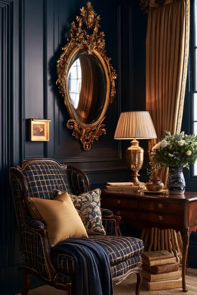
Formal Traditional
Formal spaces lean into depth — navy, deep green, or a rich burgundy-adjacent brown. These colors feel intentional beside gilt mirrors, dark wood, and heavier drapery.
Classic Colonial
Colonial interiors favor warm, slightly muted colors like creamy beige or soft sage, paired with crisp white trim. The goal is understated elegance, not drama.
English Traditional
English-style rooms welcome more saturation — dusty blues, heritage greens, warm terracottas — often layered with pattern. The walls can hold more color because the overall look embraces texture and print.
Updated Traditional
This softer, modern-rustic take leans on greige, warm white, and muted taupe, letting architectural details like molding do the talking instead of a bold wall color.
Traditional Colors by Room Condition
Light changes everything, and traditional palettes are especially sensitive to it because they rely on subtle undertones to feel warm rather than washed out.
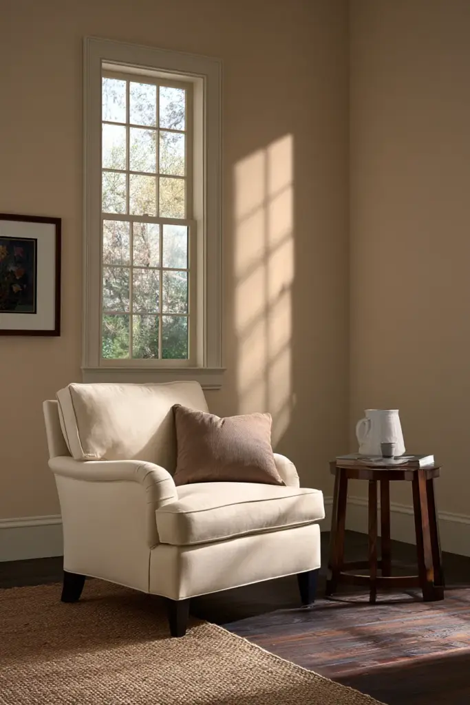
North-Facing and Low-Light Rooms
These rooms receive cooler, flatter light, so colors can look muddier than the paint chip promised. Choose warmer, slightly deeper tones — creamy beige over pale greige, warm taupe over cool gray — to compensate.
South-Facing and Bright Rooms
Bright rooms can handle more nuance and even slightly cooler neutrals without losing warmth. This is where a soft sage or dusty blue truly shines, since ample daylight keeps the color from feeling flat.
Small Traditional Living Rooms
Lighter, warmer neutrals — warm white or soft greige — help a smaller room feel open without losing its traditional character. Reserve deeper colors like navy for an accent wall or a cozy reading nook instead of the full room.
Large Formal Living Rooms
Larger spaces can support deeper, more saturated colors like navy or heritage green, since there’s enough scale to keep the room from feeling closed in.
How to Avoid a Dated Look
Traditional doesn’t have to mean old-fashioned, and the difference usually comes down to a handful of avoidable mistakes.
- Skip overcool grays that clash with warm wood tones
- Avoid stark, blue-based white — it reads clinical, not classic
- Resist an overly trendy accent wall that will feel dated within a few years
- Don’t choose colors that fight ornate details like carved millwork or medallions
- Favor matte or eggshell finishes on walls, which soften light rather than bounce it harshly
A timeless room usually has less contrast, not more. The colors work together quietly instead of demanding individual attention.
Best Paint Finishes for Traditional Living Rooms
Finish matters almost as much as color in a traditional space, since sheen affects how light plays across molding and paneling.
- Walls: matte or eggshell, for a soft, non-reflective glow
- Trim and molding: satin or semi-gloss, to catch light and define architectural detail
- Ceiling: flat, to keep attention on the walls and furnishings below
Quick Checklist: Choosing Traditional Living Room Colors
- Test samples beside your actual wood floors and furniture, not just on a blank wall
- Match undertones — warm to warm, avoiding cool grays with warm woods
- Choose a slightly warmer color for north-facing or low-light rooms
- Reserve saturated colors like navy or heritage green for larger or brighter rooms
- Keep trim lighter than walls for gentle, classic contrast
- Use matte or eggshell on walls, satin or semi-gloss on trim
- Avoid stark white, cool gray, and trend-driven accent walls
A Room That Feels Like Home
The best traditional living rooms don’t announce themselves. They simply feel right the moment you walk in — the light softened, the wood glowing, the walls holding everything together like a quiet, steady hand.
That’s the real goal here: not a trend, but a room you’ll still love in ten years. Choose the color that feels like it already belongs, and let the rest of the room settle in around it.
FAQs
What is the most favored color for a traditional living room?
Warm white and soft greige remain the most trusted choices, since both flatter wood tones and brass fixtures while staying timeless rather than trend-driven.
Which colors should I choose for my living room if I have dark wood furniture?
Lean toward warm neutrals like creamy beige or soft taupe, which support reddish or golden wood tones instead of clashing with them.
What color combinations work best in a traditional living room?
A warm wall tone paired with a lighter warm-white trim and a whisper-lighter ceiling shade creates classic, layered depth without feeling flat.
What paint can brighten up a low-light traditional living room?
A warm, slightly deeper neutral — rather than a pale cool gray — tends to brighten low-light rooms more successfully, since it avoids looking muddy under weak daylight.
Can muted colors work as neutrals in traditional decorating?
Yes. Muted sage, dusty blue, and soft taupe all function beautifully as neutrals, offering more personality than plain white while still staying quiet enough to let furniture and millwork lead.