Table of Contents
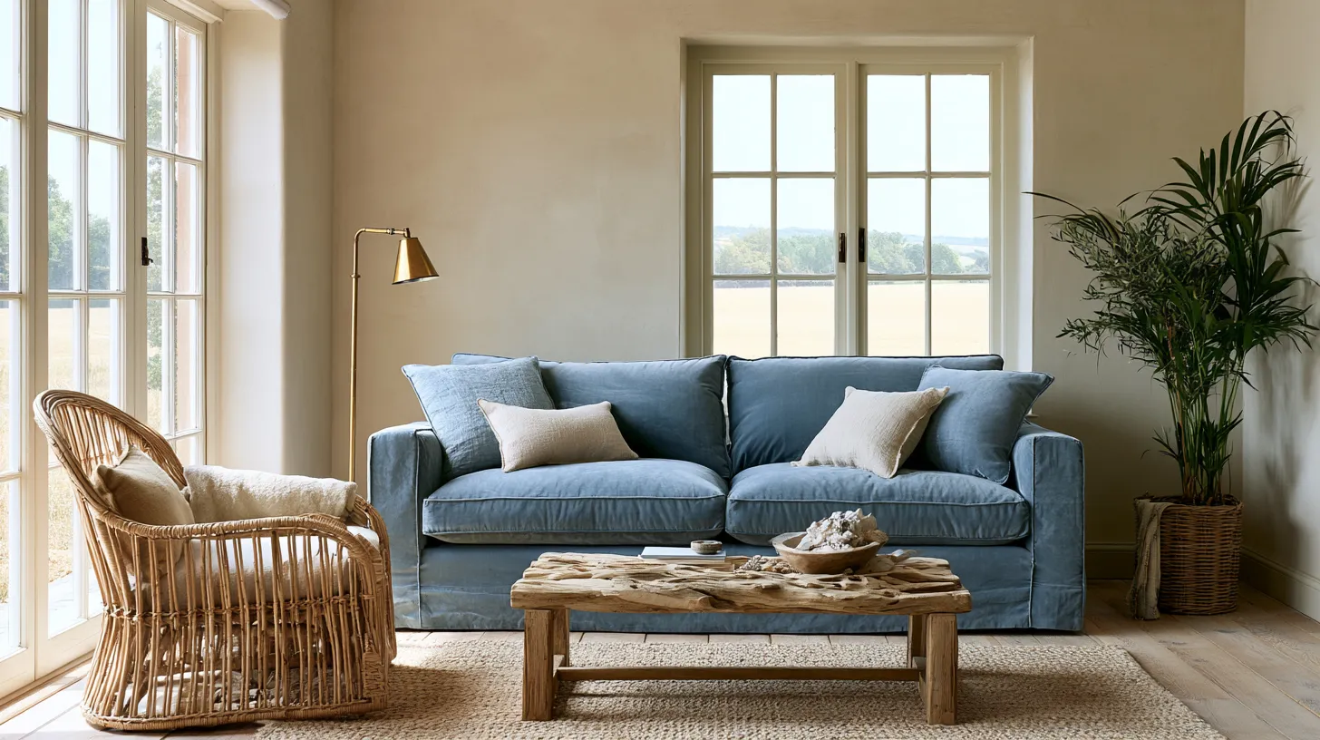
There’s a reason coastal rooms feel like a held breath. The light moves slower. The walls seem to soften. Even on a Tuesday afternoon, the room smells faintly of linen and salt air, even if the nearest shoreline is miles away.
That feeling isn’t an accident. It’s built, layer by layer, from color choices that respect how light actually moves through a room.
At ERYLIN, we believe coastal living rooms shouldn’t feel like a theme. They should feel like a mood — one that’s calm, textured, and quietly elegant, rather than nautical-flag literal.
This guide goes beyond a list of paint swatches. It walks you through choosing coastal living room colors based on your room’s light, size, and materials, so the palette actually works in your space — not just in a showroom photo.
What “Coastal” Really Means in Color Terms
Coastal color isn’t one shade. It’s a family of tones borrowed from sky, sand, sea glass, and driftwood, softened so nothing feels too saturated or too loud.
Think of it as a conversation between warm and cool. A sandy neutral warms up a room; a blue-gray cools it back down. The balance is what makes the space feel serene instead of sterile.
Modern Coastal vs. Relaxed Coastal vs. Nautical vs. Organic Coastal
Not every coastal room should look the same, and knowing which lane you’re in makes color decisions much easier.
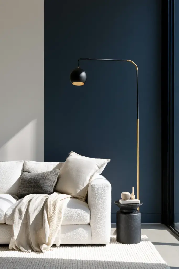
- Modern coastal leans on crisp whites, charcoal accents, and blue-gray, paired with clean-lined furniture and matte black or brass fixtures.
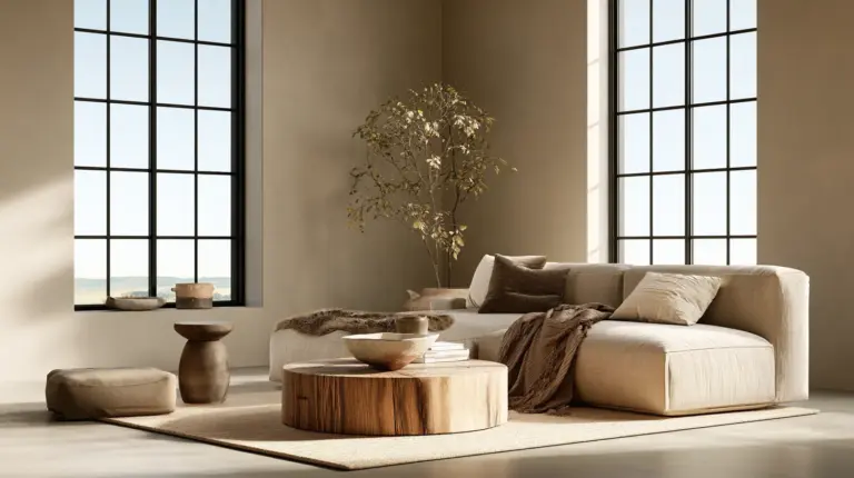
- Relaxed coastal favors sandy neutrals, soft greige, and weathered wood tones, with a slower, sun-bleached feel.
- Nautical uses deeper navy, crisp white, and red or brass accents — the most literal and boldest of the four.
- Organic coastal blends misty greens, warm plaster, and unbleached linen for an earthier, botanical feel.
Choosing your lane first keeps the rest of your palette from feeling like a mismatched mood board.
Best Coastal Colors by Mood
Color sets the emotional temperature of a room before anyone even sits down. Here’s how the major coastal tones tend to feel once they’re on the wall.
| Color Family | Mood It Creates | Best Paired With |
|---|---|---|
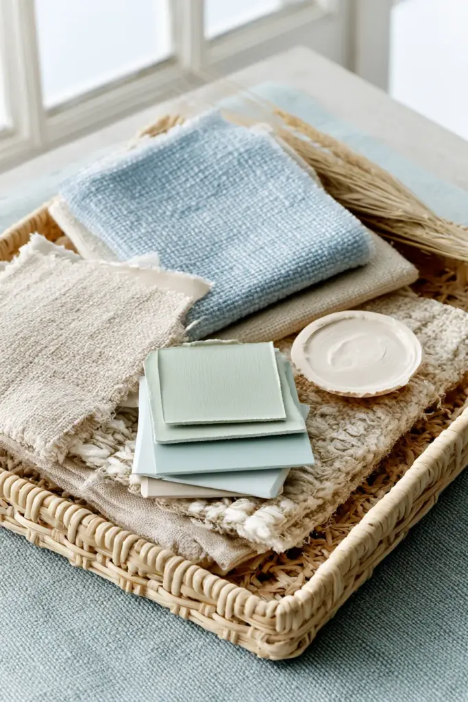
| Soft blues | Airy, calm, contemplative | White trim, rattan, linen |
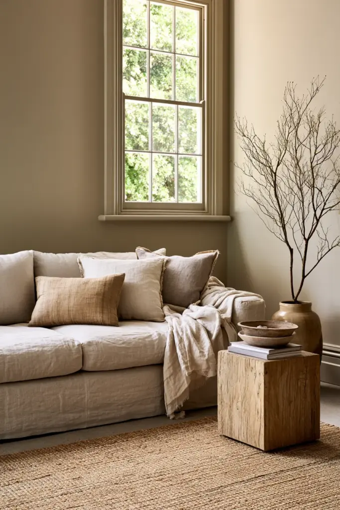
| Sandy neutrals | Warm, grounded, easygoing | Oak, jute, boucle |
| Sea glass green | Fresh, organic, gentle | Cane, travertine, brass |
| Stormy gray-blue | Moody, sophisticated | Walnut, black iron, wool |
| Airy white | Open, light-filled, timeless | Driftwood, linen, plaster |
Each of these works beautifully alone, but the real magic happens when two or three are layered — one wall color, one trim tone, one textile accent.
Choosing Coastal Colors by Light Direction
This is the step most paint guides skip, and it’s often the difference between a color that glows and one that falls flat.
North-Facing Living Rooms
North light is cool and consistent, but it can push blues and grays toward looking a little flat or chilly. Warm the palette slightly with a sandy white or a greige with yellow undertones, so the room doesn’t read cold by 3 p.m.
Avoid icy, high-blue-undertone whites here — they tend to look gray and lifeless without direct sun to warm them.
South-Facing Living Rooms
South-facing rooms get generous, warm light for most of the day, which gives you more room to experiment. Cooler coastal blues and soft sea greens actually look their best here, since the sunlight keeps them from feeling cold.
East and West-Facing Rooms
East-facing rooms get soft morning light and cooler afternoons, so a warm-neutral base with a blue-gray accent wall balances both halves of the day. West-facing rooms get strong, golden afternoon light, which can intensify warm tones — so lean slightly cooler than you think you need to.
Low-Light or Open-Plan Rooms
In low-light or open-plan spaces, undertones matter more than the color name on the swatch. A “soft blue” with too much gray can look muddy without direct light, so test large swatches on the actual wall before committing.
Best Coastal Colors for Small Living Rooms
Small rooms need color that expands the space rather than boxing it in, and coastal palettes are naturally suited to this.
- Choose a single soft, light base color for walls, trim, and ceiling to remove visual breaks.
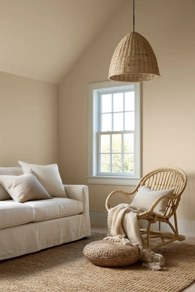
- Add texture instead of contrast — a linen sofa, a jute rug, a rattan chair — so the room feels rich without extra color.
- Use one deeper accent, like a stormy gray-blue, only on a single wall or through pillows and throws.
- Keep ceilings a whisper lighter than the walls to lift the sense of height.
A small coastal room should feel like a soft exhale, not a crowded gallery of competing tones.
How to Keep Coastal Colors From Looking Cold or Bland
This is the most common coastal color mistake, and it usually comes down to undertones and missing warmth, not the paint itself.
Undertones to Watch For
Cool-toned whites and blues can tip into looking sterile or hospital-like when a room lacks warm materials to balance them. Always check a color’s undertone in both morning and evening light before painting the whole room.
Add Warmth Through Materials, Not More Color
Instead of adding another paint color, bring in warmth through natural textures: oak flooring, rattan seating, woven jute, or a linen sofa in a warm ivory. These materials do the emotional work that color alone can’t.
A living room can be entirely blue, gray, and white and still feel warm — if the materials around it are soft, organic, and tactile.
Pairing Coastal Colors With Materials
Color and material are a package deal in coastal design. The wrong pairing can make a beautiful blue look cold, and the right one can make a plain neutral feel expensive.
| Material | Best Coastal Colors to Pair | Why It Works |
|---|---|---|
| Oak | Sandy neutrals, soft white | Warms the wood without competing |
| Walnut | Stormy gray-blue, deep navy | Adds richness and contrast |
| Rattan and cane | Sea glass green, airy white | Keeps the look light and organic |
| Linen and boucle | Any soft coastal base | Softens edges, adds coziness |
| Jute | Sandy neutrals, greige | Grounds the palette naturally |
| Travertine and plaster | Warm white, sea glass | Adds an earthy, organic finish |
If you’re refreshing your cozy furniture alongside a new palette, choose the material first, then let the wall color respond to it — not the other way around.
Best Trim, Ceiling, and Cabinet Colors With Coastal Walls
Trim and ceiling color are where many coastal rooms either come together or fall apart.
- Keep trim a true, soft white rather than stark white, so it doesn’t clash with warmer wall tones.
- For ceilings, use the wall color at a lighter tint rather than plain white, which helps the room feel taller and more cohesive.
- Cabinets or built-ins can carry a deeper coastal tone, like navy or charcoal-blue, as a grounding anchor.
- Avoid pure black trim in coastal rooms — it reads more modern-industrial than coastal.
A Complete Coastal Living Room Color Recipe
If you want a formula rather than a guessing game, this combination works reliably across most room types and light conditions.
- Walls: Soft sandy white or pale greige
- Trim: Warm off-white, slightly softer than the walls
- Ceiling: Same wall color at a lighter tint
- Accent wall or cabinetry: Stormy blue-gray or soft navy
- Textiles: Linen, boucle, and jute in warm neutrals
- Metals: Brushed brass or warm black for lighting ideas and hardware
This recipe leaves room for your own materials and light conditions, while keeping the coastal mood intact from wall to window.
Mistakes to Avoid With Blue and White Coastal Schemes
Blue and white is the most iconic coastal combination, and also the easiest to get wrong.
- Avoid using more than one or two shades of blue in the same sightline — it can start to look themed rather than styled.
- Don’t skip warm materials; an all-cool palette without wood, rattan, or linen reads sterile.
- Resist matching every accessory to the theme, like anchors or rope details — one subtle nod is enough.
- Test your blue in the room’s actual light before committing to a full wall or open-plan space.
Quick Checklist: Choosing Your Coastal Living Room Colors
- Identify your coastal style: modern, relaxed, nautical, or organic.
- Match your base wall color to your room’s light direction.
- Choose one accent tone, not three or four.
- Pair every color with a warm, natural material.
- Keep trim and ceiling tones close to the wall color, not stark white.
- Add texture before adding more color, especially in small rooms.
- Check undertones in both morning and evening light before painting.
A Final, Softer Thought
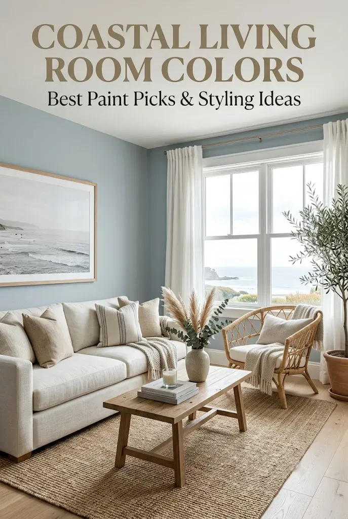
A coastal living room isn’t about recreating a beach house. It’s about creating a space that breathes — where the light lands gently, the textures invite touch, and the colors never ask for attention, only offer comfort.
Choose your palette slowly. Let it respond to your windows, your wood, your afternoons. The room will tell you when it feels right.
FAQs
What are the best coastal paint colors for a living room?
Soft blues, sandy neutrals, sea glass green, and warm whites tend to work best, especially when paired with natural materials like oak, linen, and rattan.
What colors go with a coastal living room?
Warm neutrals, driftwood tones, and soft blue-grays all complement a coastal base, along with brushed brass or warm black metal accents.
How do you make a coastal living room look modern?
Lean into crisp whites, charcoal or navy accents, clean-lined furniture, and matte black or brass fixtures rather than nautical motifs.
What colors make a small living room feel coastal?
A single light, warm base color across walls, trim, and ceiling — paired with natural textures like jute and rattan — keeps small coastal rooms feeling open and calm.
How do you keep a coastal living room from looking cold?
Balance cool tones like blue and gray with warm materials such as oak, linen, and jute, and check undertones in real daylight before painting.