Table of Contents
There’s a moment when you step into a living room and your eyes just know where to land. That’s no accident. It’s the quiet architecture of a living room color focal point, working softly in the background.
Most of us think focal points mean furniture, a fireplace, or a gallery wall. But color is the fastest, most affordable way to give a room its heartbeat.
At ERYLIN, we believe a home should feel like it’s breathing — layered with natural light, warm textures, and one confident hue that ties it all together. This guide goes deeper than “just paint an accent wall.”
We’ll walk through color psychology, light direction, small-space strategy, and even renter-friendly options — so your focal point feels intentional, not accidental.
What Is a Color Focal Point in a Living Room?
A color focal point is the single hue-driven feature that draws the eye first — before furniture, before decor, before anything else competes for attention.
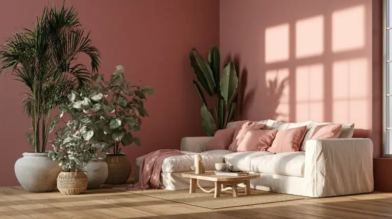
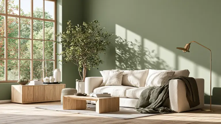
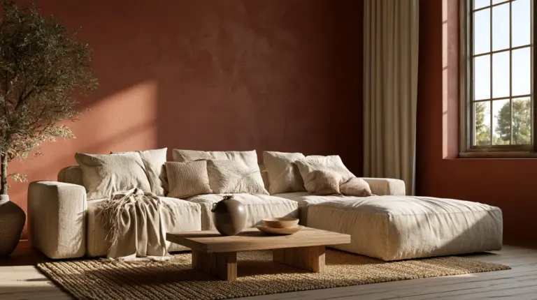
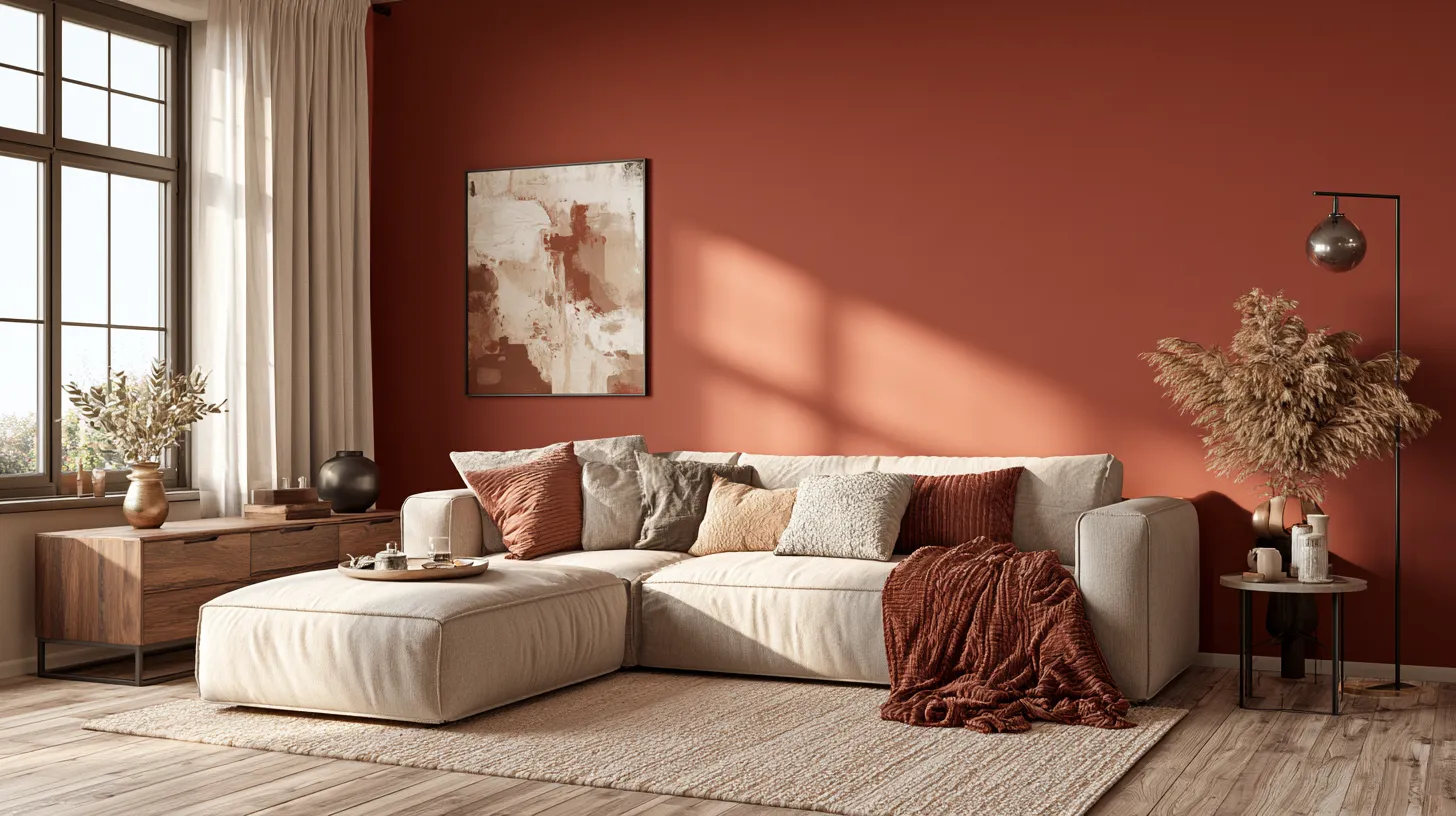
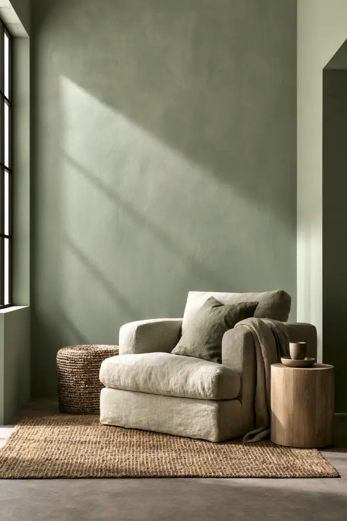
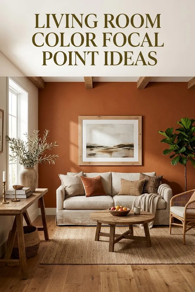
It could be a deep terracotta accent wall, a sage green media wall, or even a rust-colored linen sofa anchoring an otherwise neutral room. The point is contrast, not clutter.
Unlike a general focal point (fireplace, window, artwork), a color focal point uses pigment itself as the visual anchor. Everything else in the room supports it.
Focal Point vs. Accent Wall
An accent wall is one technique. A color focal point is the broader strategy — it can live on a wall, a piece of furniture, a textile, or even a plant wall.
Think of the accent wall as one tool in a larger toolbox built around color, light, and texture working together.
How to Choose the Right Color for Your Focal Point
Choosing your focal hue isn’t about trends — it’s about reading your room first. Light direction, ceiling height, and existing furniture all shape what will actually work.
Start With Light Direction
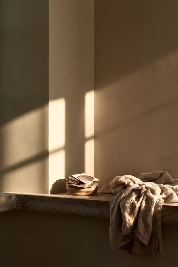
North-facing rooms receive cooler, flatter light, so warm focal colors like terracotta, amber, or burnt sienna keep the space from feeling cold.
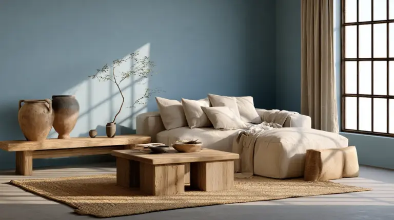
South-facing rooms get warmer, golden light most of the day, which means cooler tones like sage, dusty blue, or soft olive stay balanced instead of overwhelming.
In tropical climates — think Philippine condos and bungalows with strong, direct daylight — muted earth tones and warm neutrals tend to hold their richness without turning harsh by midafternoon.
Match Color to Room Size
Small rooms benefit from one saturated color used sparingly, rather than a full wall of intense pigment that shrinks the space visually.
Larger rooms can handle a bolder, higher-contrast focal wall because there’s enough breathing room around it.
| Room Size | Recommended Focal Color Intensity | Best Placement |
|---|---|---|
| Small / condo (under 20 sqm) | Muted, mid-tone (sage, clay, dusty rose) | Single wall panel or furniture piece |
| Medium (20–35 sqm) | Medium-bold (terracotta, forest green) | Full accent wall behind sofa |
| Large / open-plan | Bold, saturated (deep navy, burnt orange) | Media wall or architectural feature |
Coordinate With Existing Furniture
Pull your focal hue from something already in the room — a rug thread, a cushion, a wood tone — so the color feels grown from the space, not dropped into it.
This is where a good cozy furniture piece can quietly guide your palette before you even open a paint can.
Color Psychology: Calm, Energizing, Cozy Focal Points
Color doesn’t just decorate a room — it sets its emotional temperature. Choosing intentionally means choosing how you want to feel when you walk in.
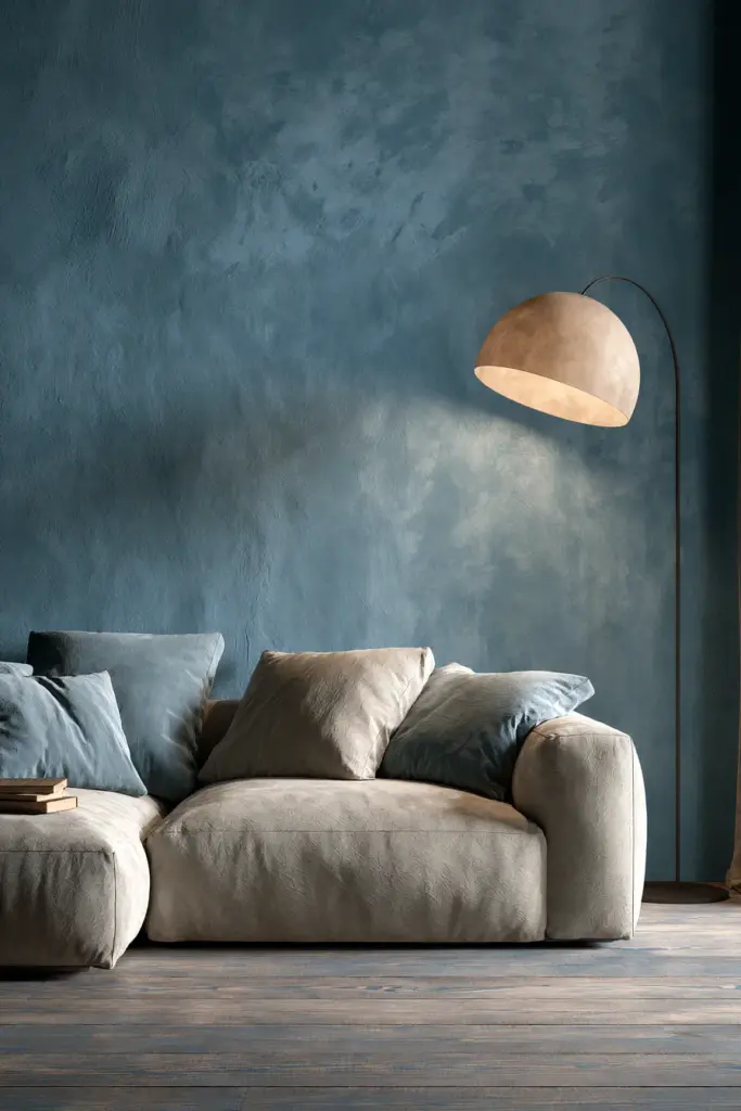
Calm focal points lean on sage greens, soft blues, and clay neutrals — ideal for rooms meant for rest, reading, or slow evenings.
Energizing focal points use warmer, higher-saturation tones like burnt orange or deep coral — better suited to social, high-traffic living rooms.
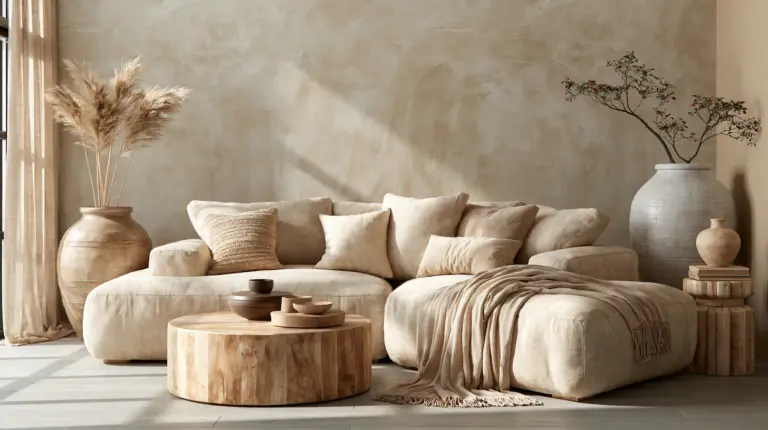
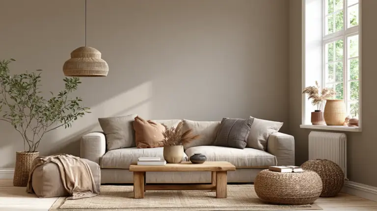
Cozy focal points favor warm neutrals and earthy browns, often paired with matte textures and soft lighting ideas like sconces or warm-dimmed pendants.
Step-by-Step: Build a Color Focal Point Without Chaos
A confident focal point still needs restraint. Here’s the sequence we use with every ERYLIN styling project.
1. Set the Mood First
Decide on one word — calm, warm, energized — before touching a swatch. Every color decision after this should serve that word.
2. Build the Palette
Apply the 60–30–10 rule: 60% neutral base, 30% secondary tone (often wood or textile), and 10% your bold focal hue.
3. Choose the Focal Hue
Pick one saturated color that supports your mood word and complements your room’s light direction.
4. Test Before Committing
Paint a large sample swatch — at least a 2×2 foot section — and observe it at morning, midday, and evening light before deciding.
5. Apply With the Right Prep
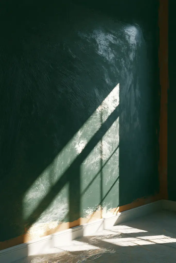
Use a proper primer to prevent patchiness, a quality base coat, and consider a matte or eggshell sheen for a softer, more rustic-elegant finish.
6. Avoid Color Chaos
If you already have a bold rug or statement artwork, let one element lead. Everything else should quiet down into neutrals so the room doesn’t compete with itself.
Color Focal Points for Small Living Rooms & Rentals
Small and rented spaces need focal points that punch above their size without demanding permanent commitment.
Vertical Focal Points for Small Rooms
Painting a narrow vertical strip, or extending color from floor to ceiling on one segment of wall, tricks the eye into reading more height.
Light, warm neutrals with a single saturated accent — like a clay-colored reading nook — keep small rooms feeling open rather than boxed in.
Renter-Friendly Color Options
Peel-and-stick wallpaper in bold, textured patterns delivers a full focal-wall effect without touching the original paint underneath.
Removable fabric panels, painted furniture, and a richly colored console or sideboard can carry the same visual weight as an accent wall.
Even a single oversized textile — a woven wall hanging or dyed linen drop — can act as a temporary, renter-safe color anchor.
Combining Color With Texture, Lighting, and Furniture
Color rarely works alone. It needs texture and light to feel finished rather than flat.
Texture Contrast Makes Color Pop
Matte finishes absorb light and deepen a color’s richness, while gloss or satin sheens bounce light and heighten intensity — choose based on how bold you want the effect.
Pairing a painted wall with raw wood, woven rattan, or nubby linen adds the sensory depth that modern rustic elegance is built on.
Lighting Shapes the Way Color Reads
A spotlight or track light aimed at your focal wall intensifies its presence after dark, while a soft pendant or sconce nearby keeps the mood gentle.
Warm-toned bulbs (around 2700K) flatter earthy palettes, while cooler bulbs can wash out warm hues and make them feel muddier than intended.
Arrange Furniture to Support the Focal Point
Face your sofa toward the color anchor, not away from it, and let a console or sideboard sit beneath it to ground the eye’s path.
Biophilic Color as a Focal Point
A living plant wall or a cluster of large-leaf greenery introduces natural green tones as your color focal point — soft, breathing, and endlessly on-trend for rustic-elegant spaces.
Does a Focal Point Have to Be a Wall?
No. A focal point can be a fireplace, a large window, a piece of statement artwork, or even a richly upholstered sofa — color is simply the fastest way to make any of these features louder.
Can I Have More Than One Focal Point?
Yes, but hierarchy matters. Choose one dominant color focal point, and let any secondary features — a gallery wall, a mirror, a media wall — echo the same palette in smaller doses so the eye still knows where to rest first.
Quick Checklist Before You Choose Your Color Focal Point
- Room size — bold and saturated for large rooms, muted and contained for small ones
- Light direction — warm colors for north-facing rooms, cooler tones for south-facing ones
- Desired mood — calm, energizing, or cozy, decided before choosing hues
- Existing furniture colors — pull your focal hue from something already in the room
- Budget — consider furniture, textiles, or removable panels if a full repaint isn’t in reach
A Final, Soft Word
A color focal point isn’t about being bold for boldness’s sake. It’s about giving your living room one clear, honest note to return to — a warm wall to sink into, a hue that catches the evening light just right.
Start small if you need to. One tested swatch, one honest mood word, one wall that finally feels like you. The rest of the room will follow its lead.
FAQs
What is a living room focal point?
It’s the first feature your eyes notice when entering the room — often a wall, fireplace, window, or piece of furniture that anchors the space.
How do you create a focal point in a living room?
Combine one dominant element — like a bold paint color, fireplace, or statement artwork — with furniture arranged to face it and lighting that highlights it.
How can I use color to create a focal point in my living room?
Apply the 60–30–10 rule, choose one saturated hue based on your room’s light and mood, and let neutrals do the supporting work around it.
What color should I use for a living room focal wall?
Choose warm tones for north-facing or cooler rooms, and cooler tones for south-facing or naturally warm rooms, adjusting intensity to your space’s size.
Can I have more than one focal point in a living room?
Yes — but keep one dominant color focal point and let secondary features echo the same palette so the room still feels cohesive.