Table of Contents
There is a particular kind of disappointment that comes from a wall the wrong color. You stood in the shop, swatch in hand, so sure. Then the paint dried, the sun moved, and the room felt nothing like the one in your mind.
This happens to almost everyone. Color is not just pigment on plaster — it is light, mood, and memory, all shifting together throughout the day. A living room, more than any other space, has to hold every version of your family’s life: quiet mornings, loud evenings, the in-between hours of a Tuesday.
At ERYLIN, we believe color should feel like something you live in, not something you correct for. So this guide is not another list of “don’ts.” It is a practical companion — the mistake, why it happens, how to test for it, and exactly what to do instead.
Settle in. Let’s walk through this together, one wall at a time.
Why Living Room Color Mistakes Happen in the First Place
Most color mistakes are not about taste. They are about timing, testing, and context. A shade chosen under shop lighting, at 11am, on a tiny card, rarely survives contact with your actual room.
Your living room has its own light, its own furniture, its own undertones already at play in the floor and the sofa. Color doesn’t exist in isolation — it reacts to everything around it, the way a good scent changes on skin.
The Small-Room Myth: Pale Isn’t Always Safer
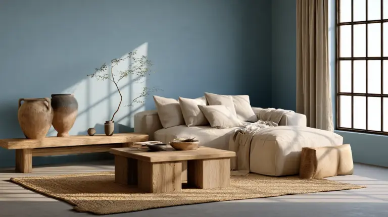
The most repeated advice in decorating is that small living rooms need pale, cool colors to “open up” the space. It’s tidy advice, but it isn’t always true.
Why it happens: Pale walls feel like a safe, reversible choice, so they get recommended by default rather than by design.
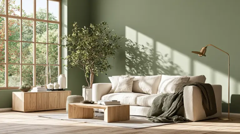
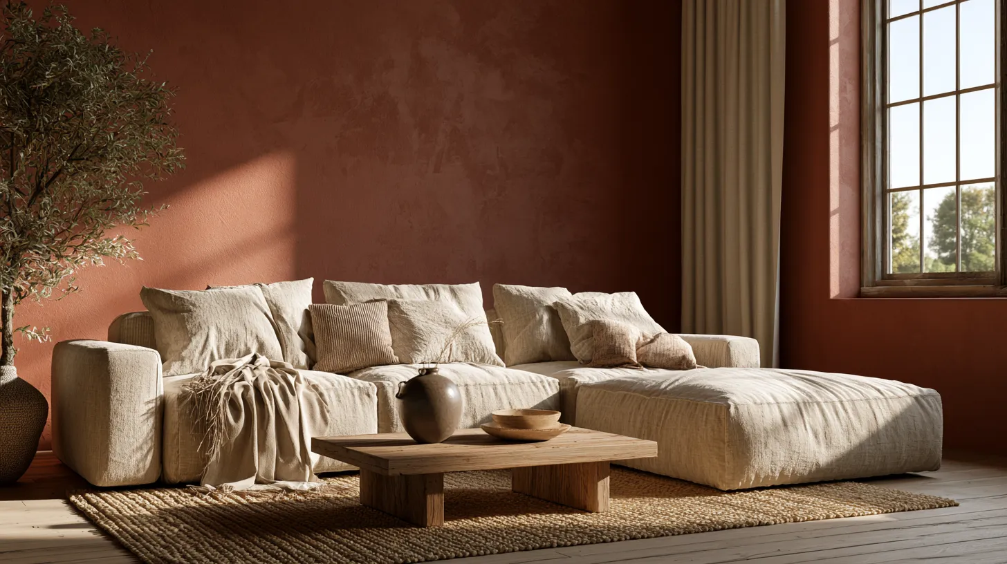
The fix: A small room with rich, warm color — think clay, deep olive, or warm charcoal — can feel enveloping rather than cramped, especially with layered lighting and soft textiles. Deep tones blur the corners instead of highlighting them, which often makes a room feel held, not boxed in.
When pale still works: In genuinely low-light rooms with little natural sun, a soft warm neutral can keep things breathing without draining the coziness. The mistake isn’t the pale color itself — it’s choosing it automatically, without testing the alternative.
Ignoring How Light Changes Everything
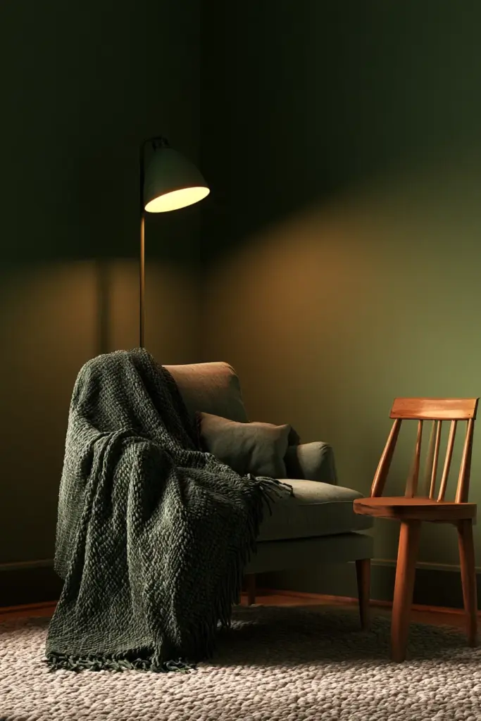
Color is not fixed. It’s a conversation between pigment and light, and that conversation changes hour by hour.

North-Facing Rooms
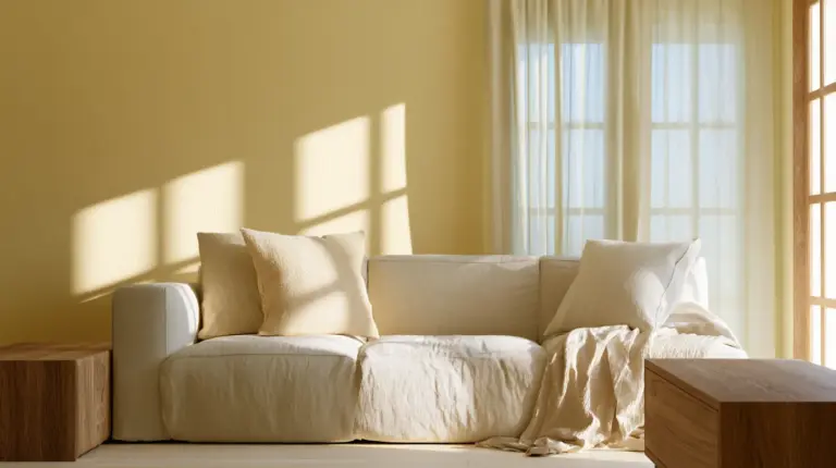
North light is cool and constant, which can make many colors read flatter and greyer than expected. Warm off-whites, soft terracottas, and honeyed neutrals tend to hold their character better here than cool blues or icy greys.
South-Facing Rooms
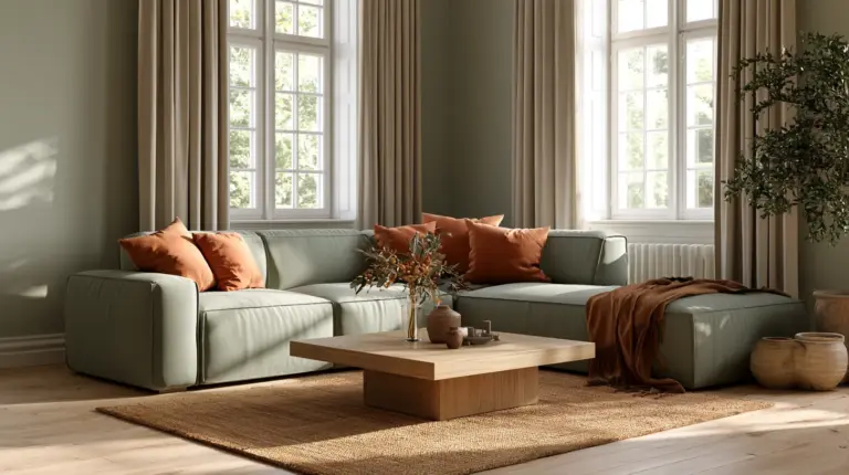
South-facing rooms get warm, golden light for much of the day, which is forgiving to almost any palette but can push warm colors toward looking overly yellow by afternoon. Cooler greens, soft blues, and muted sages often find their balance here.
The Simple Fix: Test Properly, Not Casually
A single swatch card taped to the wall will mislead you. Instead:
- Paint a sample directly on the wall, in a patch at least 40cm wide
- Check it in morning light, midday, and evening — including lamp light after dark
- View it near your sofa fabric, rug, and flooring, not in isolation
- Live with it for at least two to three days before deciding
This one habit prevents more regret than any color chart ever could.
The Undertone Trap: When Colors Clash Quietly
This is the mistake almost no one talks about, yet it’s behind most “why does this look wrong” moments. Undertones are the subtle hue hiding beneath a color — the pink in a “warm white,” the green in a “neutral grey.”
| Element | Common Undertone | What It Clashes With |
|---|---|---|
| Oak flooring | Warm yellow/orange | Cool blue-grey walls |
| Grey sofa | Cool blue or purple | Warm beige or cream walls |
| White walls | Pink, yellow, or blue base | Mismatched trim white |
| Neutral rug | Green or taupe base | Pure cool greys |
The fix: Before choosing a wall color, hold your paint sample against your flooring, sofa fabric, and rug in daylight. If something feels quietly “off” without an obvious reason, it’s almost always an undertone clash, not a color clash.

Painting the Ceiling and Woodwork as an Afterthought
For decades, the rule was simple: walls get color, ceilings and trim get white. That rule is quietly dissolving.
The mistake: Leaving the ceiling stark white while the walls go deep or warm can make a room feel disconnected — like the top half belongs to a different house.
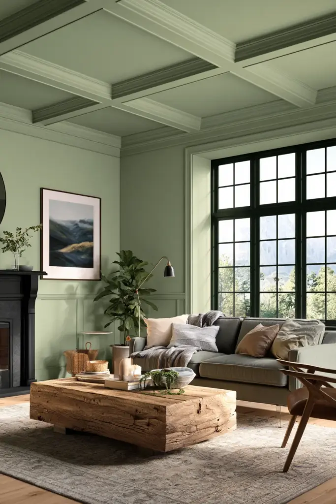
What to do instead: Try color drenching — carrying the wall color up onto the ceiling and trim in the same or a slightly softer tone. This technique blurs the hard edges of a room and makes low ceilings feel taller, since the eye no longer stops at a sharp white line.
A softer alternative: If full drenching feels bold, paint the ceiling a shade lighter than the walls rather than pure white. It keeps the cohesion without the commitment.
Choosing the Wrong Finish for a Living Room
Color gets most of the attention, but finish quietly shapes how that color behaves in the room.
- Matte: Soft and forgiving, hides minor wall imperfections beautifully, but marks more easily — best for lower-traffic walls.
- Eggshell: A gentle in-between; enough sheen to wipe clean, enough softness to stay warm. A strong all-around choice for most living rooms.
- Satin: More durable and easier to clean, ideal for busy households, though it can highlight uneven walls under strong light.
If your living room doubles as a play space, a hallway pass-through, or a pet’s favorite lounging spot, lean toward eggshell or satin. If it’s a quieter, adult-only retreat, matte can feel wonderfully soft.
Forgetting the Rest of the House
A living room rarely exists alone. If it opens onto a hallway, kitchen, or dining space, its color has to make sense from every angle it’s seen.
The mistake: Choosing a living room color in isolation, then discovering it fights with the hallway or open-plan kitchen the moment you step back.
The fix: Walk the sightlines. Stand in the kitchen and look toward the living room, or stand at the front door and look through to the sofa. Colors should feel like a gentle handoff from space to space, not a hard stop.
Open-Plan Living Rooms Need Zoning, Not Matching
In open-plan homes, you don’t need one identical color everywhere. Instead, choose a consistent undertone family — all warm, or all cool — and let each zone shift in depth rather than direction. A warm oat in the kitchen and a deeper warm clay in the living area will feel related, not repetitive.
The Screen Glare Nobody Mentions
Modern living rooms often center around a television, yet color advice rarely accounts for it. Glossy dark walls behind a TV can create distracting reflections in the evening, especially with overhead lighting.
The fix: Use a matte or eggshell finish on the wall behind the screen, and favor warm, muted tones — soft charcoal, deep sage, warm taupe — over anything glossy or high-contrast, which competes with the screen rather than framing it.
Renter-Friendly Color Fixes
Not everyone can repaint freely, and that shouldn’t mean sacrificing warmth.
- Use a large, richly colored rug to anchor the room without touching the walls
- Layer warm-toned textiles — linen cushions, a wool throw, cozy furniture pieces — to shift the room’s temperature
- Add a bold accent through art or a gallery wall, which draws the eye before the wall color does
- Introduce warm lighting ideas like dimmable lamps, which soften even a stark white rental wall
Quick Checklist: Avoiding Living Room Color Mistakes
- Test samples on the wall itself, in daylight, lamplight, and evening light
- Check your color against flooring, sofa, and rug for undertone clashes
- Consider carrying color onto the ceiling and trim instead of defaulting to white
- Match paint finish to how the room actually gets used
- Walk the sightlines between your living room and connected spaces
- Keep glossy, dark finishes away from the wall behind your TV
- In open-plan homes, unify undertones rather than matching every shade exactly
A Soft Place to Land
A living room’s color is never just decoration. It’s the light your family gathers in, the backdrop to slow mornings and long evenings, the tone that greets you when you finally come home.
Choose it the way you’d choose anything meant to last — slowly, with attention, and with a little grace for the process. The right color rarely announces itself. It simply feels, quietly, like rest.

FAQs
What are the biggest living room color mistakes to avoid?
The most common ones are choosing pale colors by default in small rooms, ignoring how natural light changes a shade throughout the day, overlooking undertone clashes with flooring and furniture, and leaving the ceiling stark white when the walls carry a bold color.
What colors should you never paint a living room?
There’s no universally u0022wrongu0022 color, but very cool, stark shades in a north-facing room, or high-gloss dark finishes behind a television, tend to cause the most regret.
Should a small living room always be painted pale or cool colors?
Not necessarily. Deep, warm tones can make a small room feel cozy and enveloping rather than cramped, especially when paired with soft lighting and layered textures.
How do you choose a living room color that works with the rest of the house?
Walk the sightlines between connected rooms and keep undertones within the same warm or cool family, even if the shades themselves differ in depth.
What finish should you use for living room paint?
Eggshell suits most living rooms well, balancing softness with everyday durability, while matte works beautifully in lower-traffic, quieter rooms.