Table of Contents
There’s a quiet joy in walking into a living room that feels like the season outside. Spring light filtering through soft green cushions. Winter evenings wrapped in deep navy and warm cream. Your living room can hold that rhythm too.
Most color guides stop at inspiration. They show you a palette and leave you standing there, paint swatch in hand, wondering how it actually works in your room, with your windows, on your budget.
This guide goes further. We’ll walk through seasonal living room color ideas by light direction, by texture, by style, and by real budget-friendly application — not just what to choose, but how to live with it.
Think of this as your seasonal color companion. One you can return to every few months, whether you’re repainting a wall or simply swapping a throw pillow.
Why Seasonal Living Room Colors Matter
Color shifts how a room feels, not just how it looks. A pale, airy palette in summer keeps a space feeling loose and breathable. A deep, grounded palette in winter makes the same room feel like a hug.
Your living room is where light, texture, and mood meet every single day. Letting it shift gently with the seasons keeps that meeting point alive instead of static.
This isn’t about redecorating four times a year. It’s about small, intentional shifts — a rug here, a lampshade there — that let your space breathe with the calendar.
Best Living Room Colors for Spring
Spring asks for lightness. After months of deep tones, the eye craves air, softness, and a hint of green pushing through.
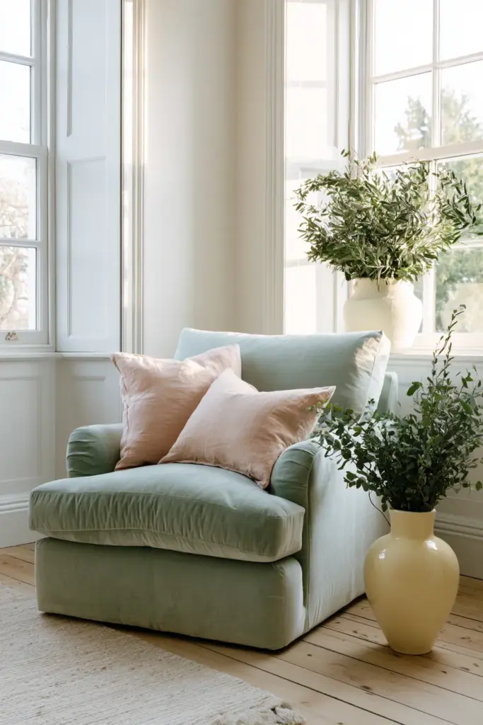
Soft green brings the outdoors in without overwhelming the space — think sage on a linen sofa or a single botanical-toned armchair. Butter yellow works beautifully as an accent, warming a neutral base without shouting for attention. Blush softens hard edges, especially on cushions or a ceramic vase. Airy white ties it all together, especially on trim and ceilings where it reflects the season’s growing daylight.
Where to Use Spring Tones
- Walls: a whisper of sage or warm white
- Textiles: linen throws in blush or soft green
- Accessories: butter-yellow ceramics, fresh florals, woven baskets
What to Avoid in Spring
Avoid stacking too many pastels at once — it can read as nursery-soft rather than elevated. One dominant spring tone with warm neutrals underneath keeps the modern rustic elegance feel intact.
Best Living Room Colors for Summer
Summer calls for a lighter hand. The goal is a room that feels cool, breezy, and unhurried, even on the warmest afternoons.
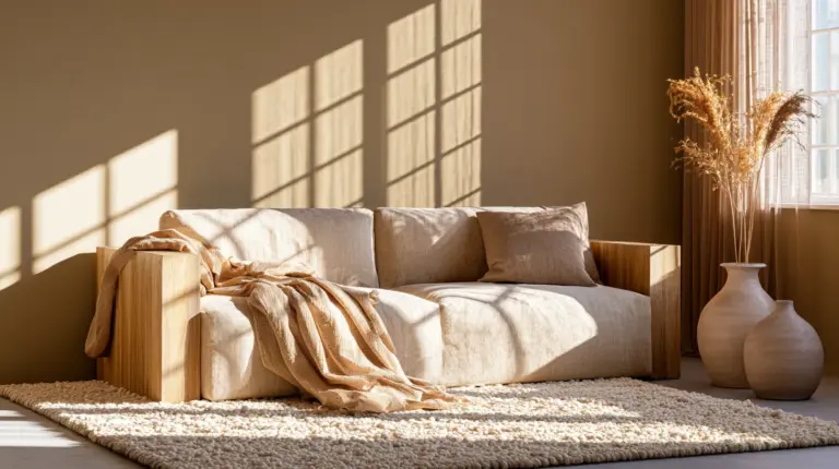
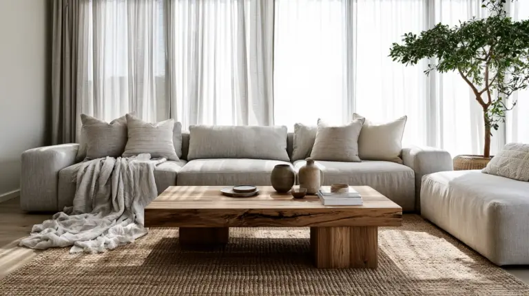
Crisp white grounds the palette and bounces natural light around the room. Sandy beige adds warmth without weight — perfect for a jute rug or linen upholstery. Coastal blue brings a sense of calm, especially in accent pillows or ceramics. Muted teal is the season’s quiet showstopper, best used sparingly on a single statement piece.
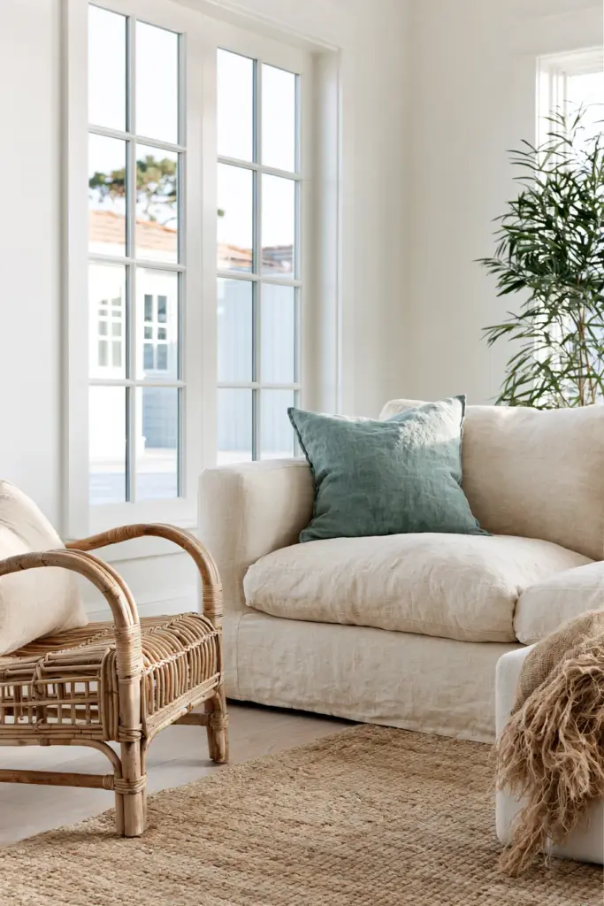
Where to Use Summer Tones
- Walls: crisp white or sandy beige as a backdrop
- Textiles: linen slipcovers, lightweight cotton throws
- Accessories: coastal blue vases, rattan trays, driftwood accents
Natural materials matter as much as color here. Rattan, linen, and light oak all carry summer tones better than glossy or heavy finishes.
Best Living Room Colors for Fall
Fall is where the room deepens. It’s the season of low light, longer evenings, and textures that ask to be touched.
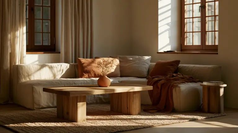
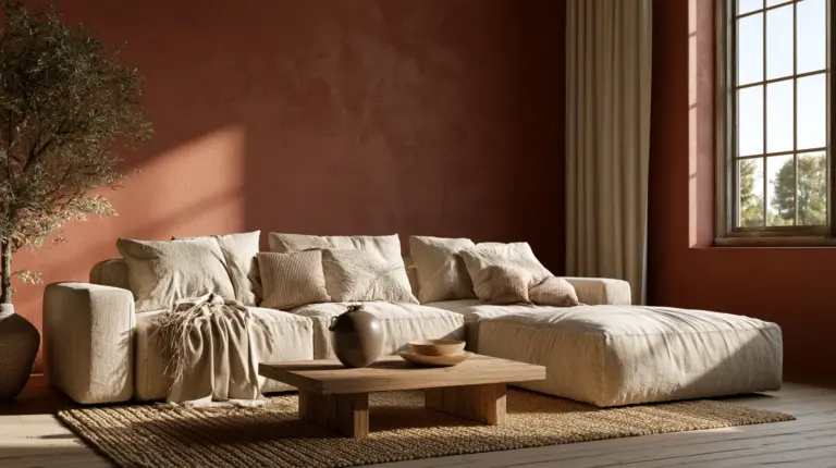
Terracotta brings warmth without darkness — a beautiful choice for an accent wall or a set of throw pillows. Olive grounds a room in a way that feels organic, not trendy. Rust works as a strong accent color, especially against warm wood tones. Camel and tobacco brown add richness to upholstery, leather, or wood furniture.
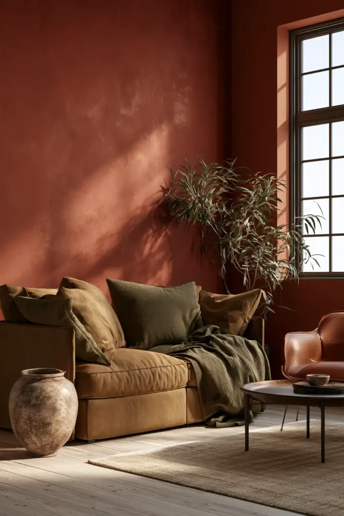
Where to Use Fall Tones
- Walls: terracotta or olive as a feature wall
- Textiles: boucle cushions, wool throws, corduroy upholstery
- Accessories: amber glassware, ceramic pumpkins (used sparingly), wood bowls
Texture as Color Support
Fall is the season where texture does half the work. A matte terracotta vase reads warmer than a glossy one in the same shade. Boucle and wool add visual weight even in smaller doses of color.
Best Living Room Colors for Winter
Winter is about depth, stillness, and a sense of shelter. This is the season for your boldest tones and your coziest textures — pair them together for real cocooning effect.
Navy is winter’s most versatile deep tone — sophisticated on walls, striking on a sofa. Charcoal adds quiet drama without feeling cold, especially paired with warm lighting. Deep green brings a jewel-toned richness that feels both traditional and current. Black works best as an accent — a lamp base, a picture frame, a coffee table — rather than a dominant tone. Warm cream balances all of the above, keeping the room from feeling heavy.
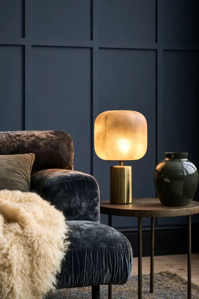
Where to Use Winter Tones
- Walls: charcoal or deep green, especially in rooms with strong natural light
- Textiles: velvet cushions, chunky knit throws, wool rugs
- Accessories: black-framed art, brass or matte gold lighting ideas, cream ceramics
Layer in warm lighting here — a soft-glow floor lamp does more for winter coziness than any single color choice.
Matching Colors to Your Room’s Light
Seasonal palettes only work if they suit the light your room actually gets. This is the piece most color guides skip entirely.
| Light Condition | Best Approach | Colors to Favor | Colors to Limit |
|---|---|---|---|
| North-facing (cool, consistent light) | Lean warm to balance the coolness | Terracotta, camel, warm cream, butter yellow | Cool blues, stark white |
| South-facing (bright, warm light) | Almost anything works; balance with cool tones | Sage, coastal blue, charcoal | Very saturated warm tones (can feel hot) |
| Low-light rooms | Keep it light and reflective | Warm white, sandy beige, soft blush | Navy, charcoal, black as dominant wall colors |
| Bright, sun-filled rooms | Go bolder — the light supports depth | Deep green, navy, olive | Very pale, washed-out tones (can look flat) |
If you’re working with a low-light room, lean on lighter walls and save your deep winter tones for smaller accents — cushions, a single chair, or a piece of art — rather than the whole wall.
How to Change Seasonal Colors Without Repainting
Repainting four times a year isn’t realistic, and it shouldn’t be the goal. The real skill is building a base that stays constant, then rotating the layer on top.
Start with a neutral foundation — walls, sofa, and rug in warm white, greige, or taupe. This base works quietly through every season without ever feeling wrong.
Then rotate the season on top of that base:
- Pillow covers — the fastest, cheapest seasonal shift
- Throws and blankets — swap weight and tone (linen in summer, wool in winter)
- Artwork — rotate one or two pieces to shift the room’s mood
- Lamp shades — a warm cream shade in winter, a linen shade in summer
- Vases and florals — seasonal blooms do more visual work than most people expect
- Slipcovers — if your sofa allows it, this is the single biggest seasonal lever
This is the same logic behind cozy furniture choices that stay timeless — a neutral piece gives you room to style around it, season after season.
Seasonal Palettes by Style
Modern Living Rooms
Favor clean, singular seasonal accents against a neutral base — one terracotta cushion, not five. Modern spaces reward restraint.
Japandi Living Rooms
Lean into muted, earthy versions of each season’s palette — think dusty sage over bright green, or soft charcoal over true black. Natural materials like oak and linen should always outweigh color.
Eclectic Living Rooms
This is the one style where you can layer two seasonal palettes at once — a terracotta throw against a navy sofa, for example. Balance boldness with at least one grounding neutral.
Small Living Rooms
Keep walls light year-round and let seasonal color live in accessories. A small room in navy walls can feel cozy in winter but cramped by spring — accessories give you flexibility a wall color doesn’t.
A Simple Palette Formula
If you only remember one thing from this guide, remember this formula. It works for every season, every style, every room size.
One base neutral + one seasonal accent + one grounding dark + one metallic or natural material.
For example, in fall: warm white walls (base) + terracotta cushions (accent) + tobacco brown leather chair (grounding dark) + brass lamp or rattan basket (metallic/natural). Swap just the accent and grounding tones each season, and the formula holds.
Mistakes to Avoid
- Clashing undertones — a cool grey sofa against warm terracotta accents can feel visually “off,” even if you can’t name why
- Overusing trendy colors — one statement piece ages better than an entire room in this year’s shade
- Ignoring natural light — a color that glows in a showroom can fall flat in a north-facing room
- Seasonal inconsistency — mixing spring pastels with winter velvets rarely reads as intentional
Quick Reference: Seasonal Color Checklist
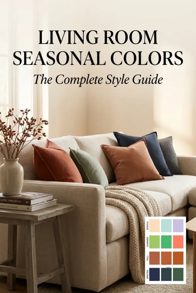
- Spring — soft green, butter yellow, blush, airy white
- Summer — crisp white, sandy beige, coastal blue, muted teal
- Fall — terracotta, olive, rust, camel, tobacco brown
- Winter — navy, charcoal, deep green, black, warm cream
- Keep one neutral base year-round; rotate accents seasonally
- Match saturation to your room’s natural light
- Use texture (linen, boucle, wool, rattan) to support color, not just fill it
- Refresh through pillows, throws, and lighting ideas before reaching for paint
A Soft Closing Thought
A living room doesn’t need to shout to feel alive. It just needs to notice the season — a little more green in spring, a little more shadow in winter — and hold that feeling gently in its textures and tones.
Let your room breathe with the year. That’s the quiet luxury ERYLIN believes every home deserves.
FAQs
What are the best living room colors for each season?
Spring favors soft green and butter yellow, summer leans into crisp white and coastal blue, fall calls for terracotta and olive, and winter deepens into navy, charcoal, and warm cream.
How do I transition living room colors between seasons without repainting?
Keep a neutral base on your walls and major furniture, then rotate pillows, throws, artwork, and lamp shades to reflect each season’s palette.
What colors make a living room feel cozy?
Warm, grounded tones like terracotta, tobacco brown, and deep green feel cozy, especially when paired with soft textures like wool and boucle.
How do lighting and texture affect living room colors?
Natural light changes how saturated a color reads, while texture — matte versus glossy, woven versus smooth — shifts how warm or cool the same color feels.
How do I use seasonal colors in a small living room?
Keep walls light and neutral year-round, then bring seasonal color in through smaller, swappable pieces like cushions and accessories.