Table of Contents
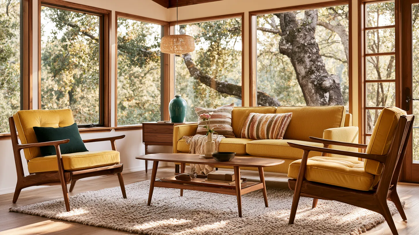
There’s a particular kind of light that mid-century rooms seem to hold onto — soft, golden, unhurried. It falls across a walnut credenza, settles into a mustard cushion, and makes the whole room feel like it’s exhaling.
That’s the quiet magic of mid-century color. It isn’t loud. It isn’t trendy in the way of fleeting seasons. It’s earned warmth, built from natural tones that have always known how to sit together.
At ERYLIN, we believe color is never just decoration — it’s mood, memory, and light working in harmony. And nowhere is that more true than in the mid-century living room, where every hue seems to carry the scent of teak oil and afternoon sun.
So let’s talk about the colors that define this style, how to pair them without guesswork, and how to make them feel like yours — not a museum replica of 1962.
What Colors Define Mid-Century Modern Style
Mid-century modern color palettes are built from nature first, accent second. Think warm neutrals as your foundation, then a few confident, saturated tones layered on top like a well-worn favorite scarf.
The Neutral Base
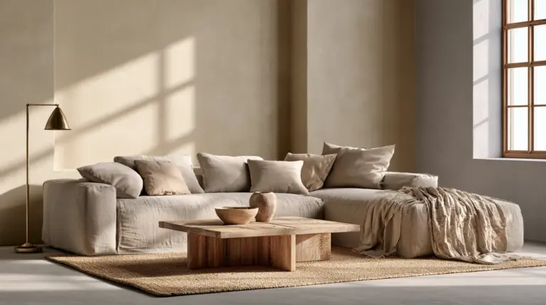
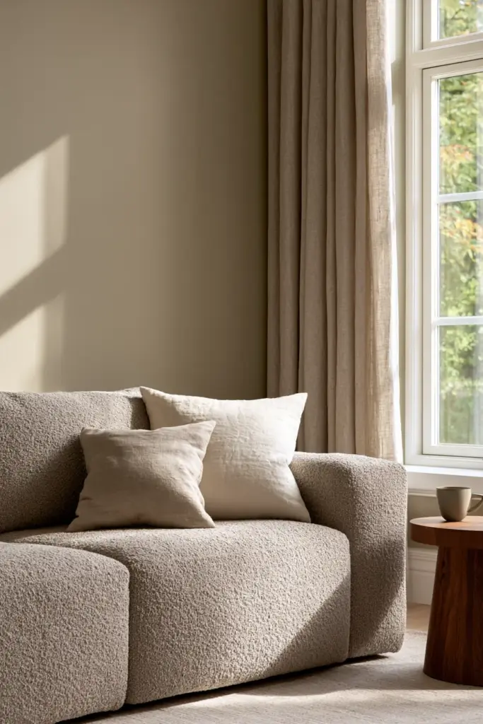
Every mid-century room starts with a neutral that feels alive, not sterile. Oatmeal, taupe, warm white, and cream all read as soft rather than cold, especially under warm lighting.
- Warm white — for walls that want to glow, not blank out
- Taupe — grounding, quiet, endlessly flexible
- Oatmeal — cozy, textural, plays well with wood
- Cream — softer than white, closer to candlelight
These aren’t afterthoughts. They’re the canvas that lets your walnut furniture and accent colors actually breathe.
The Signature Accent Colors
Once your base is set, mid-century color leans into a handful of iconic accents — the ones that instantly signal this era, this warmth.
| Accent Color | Feeling it Evokes | Best Used On |
|---|---|---|
| Mustard | Sunlit, cozy, nostalgic | Sofa, throw pillows, accent chair |
| Teal | Cool, grounding, retro-fresh | Accent wall, drapery, ceramics |
| Burnt orange / terracotta | Earthy, warm, inviting | Rug, cushions, art |
| Olive green | Natural, calm, sophisticated | Upholstery, planters, trim |
| Chartreuse | Playful, unexpected brightness | Small accents only — a vase, a book spine |
| Black | Sharp definition, modern edge | Metal legs, frames, lighting fixtures |
Use these accents like seasoning, not the whole meal. One or two per room keeps the palette feeling curated rather than chaotic.
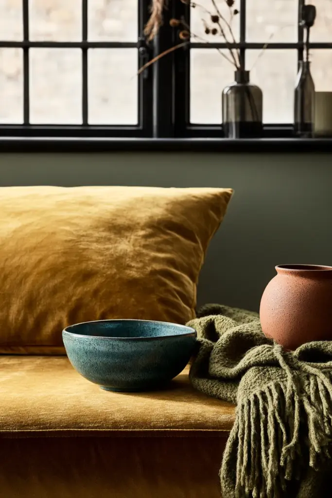
The Formula: How to Pair Mid-Century Colors Without Guesswork
Most articles hand you a color list and leave you to figure out the ratios. We’d rather give you a method you can actually use this weekend.
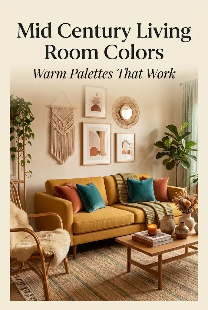
Neutral base + one warm accent + one cool accent + one dark anchor.
That’s it. That’s the formula behind almost every mid-century room that feels effortless rather than overstyled.
- Neutral base: warm white or oatmeal walls
- Warm accent: mustard sofa or terracotta rug
- Cool accent: teal cushions or olive drapery
- Dark anchor: black floor lamp, walnut coffee table, or dark-framed art
This balance keeps the eye moving without overwhelming the senses — the same way a good lighting ideas plan keeps a room from feeling flat or overexposed.
Matching Colors to Wood Tones
Wood is the quiet backbone of mid-century style, and getting the pairing right changes everything about how a color reads.
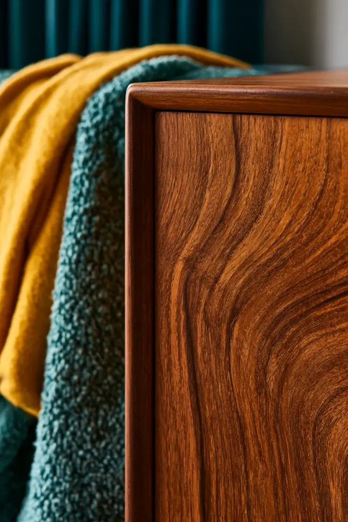
Walnut Furniture
Walnut’s deep reddish-brown warmth pairs beautifully with teal, olive, and warm white. Avoid anything too orange nearby — it competes rather than complements.
Teak Furniture
Teak leans lighter and more golden than walnut, so it loves mustard, cream, and soft chartreuse accents. It also holds its own against black metal hardware beautifully.
Oak Furniture
Oak’s pale, honeyed tone is the most forgiving of all. It works with almost every accent on this list, though taupe and burnt orange bring out its natural grain especially well.
A simple rule: warmer wood tones ask for cooler accent colors, and paler woods can flirt with brighter, warmer ones.
How Lighting Changes Your Mid-Century Colors
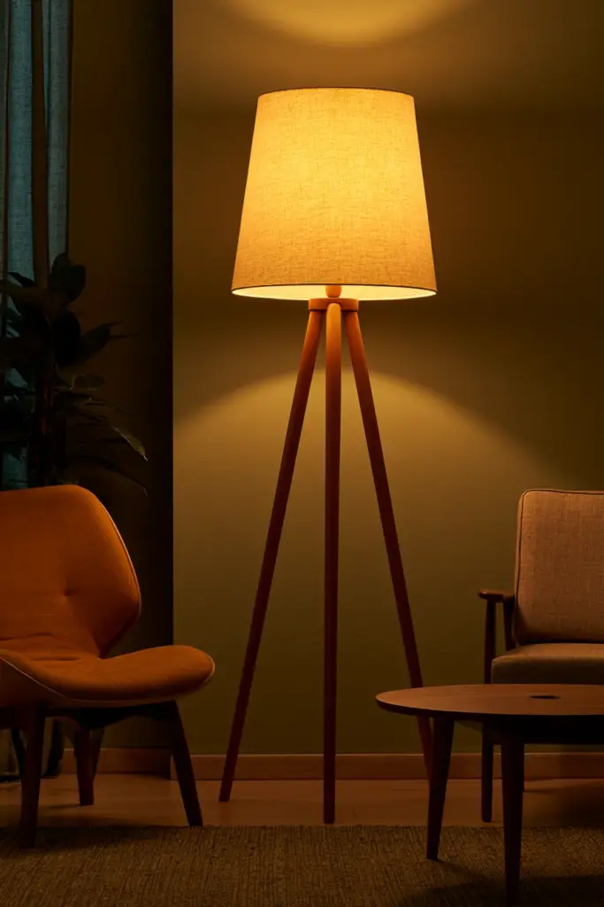
Color never lives in isolation — it lives in light. And warm LED bulbs (2700K–3000K) do something wonderful to mid-century palettes.
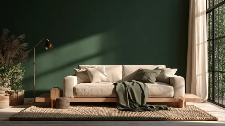
Mustard deepens into something closer to honey. Teal softens, losing its coldest edge. Olive becomes richer, almost mossy, while walnut wood seems to glow from within.
Cooler white light (4000K+), on the other hand, can make mustard feel washed out and teal feel sharp rather than soothing. If you love this palette, warm light is non-negotiable — it’s the difference between a room that feels staged and one that feels lived-in.
Color Solutions for Real Rooms
Inspiration photos rarely match your actual living room. Here’s how to adapt the palette to the space you actually have.
Small Living Rooms
Keep walls in a warm neutral like oatmeal or warm white to avoid visual weight, then let one bold accent — a mustard chair, a teal vase — do the talking. Too many saturated colors in a small footprint can feel cluttered fast.
Dark or North-Facing Rooms
Lean into warmth everywhere. Cream walls, terracotta textiles, and walnut furniture counteract the coolness of indirect light, while black accents add just enough contrast to keep things from feeling muddy.
South-Facing, Sun-Filled Rooms
These rooms can handle more coolness. Teal, olive, and even chartreuse feel balanced here, since the abundant natural light keeps them from reading as heavy.
Open-Plan Spaces
Choose one neutral base that flows through the whole footprint, then let each zone carry its own accent — mustard in the seating area, olive near the dining space — so the eye reads it as one connected story, not competing rooms.
Rental-Friendly Updates
No paint allowed? No problem. A mustard throw, a teal ceramic lamp, an olive rug, and a few walnut-finish accent pieces can transform a rental’s neutral walls into something that feels intentional and warm — all fully reversible with your cozy furniture picks.
Paint Finish Guide for Mid-Century Walls
Finish matters as much as color. It changes how light bounces and how a hue reads across the day.
- Matte — best for main walls; softens color and hides imperfections beautifully
- Eggshell — a gentle step up in durability, still soft-looking; good for high-traffic living rooms
- Satin — best for trim, doors, and any wood accents you’re painting black or white
Avoid glossy finishes on large walls — they can make warm mid-century tones feel plasticky rather than organic.
What Not to Do
A few missteps turn mid-century warmth into something that reads more costume than home.
- Don’t use every accent color at once — pick two, maybe three
- Don’t pair cool white LED lighting with warm palettes; it flattens everything
- Don’t go glossy on large wall surfaces
- Don’t ignore wood undertones when choosing your accent colors
- Don’t overdo geometric patterns — one statement textile is plenty
Budget-Friendly Ways to Bring the Palette Home
You don’t need a renovation to feel this shift. Small, intentional swaps go further than you’d think.
- A mustard or olive throw blanket over a neutral sofa
- Terracotta or teal ceramic vases on open shelving
- New curtains in a warm, textural linen
- One accent chair in a saturated hue
- A single gallon of warm-white or oatmeal paint on the main wall
Quick Takeaways
- Start with a warm neutral base — oatmeal, taupe, cream, or warm white
- Layer in one warm accent, one cool accent, and one dark anchor
- Match walnut with teal and olive; match teak with mustard and cream
- Use warm LED lighting (2700K–3000K) to keep colors glowing, not flat
- Adapt the palette to your room’s light — warmer for dark rooms, cooler for sunlit ones
- Choose matte or eggshell finishes for walls, satin for trim and accents
- Keep it to two or three accent colors, never more
A Room That Feels Like Golden Hour
The best mid-century living rooms don’t shout for attention — they simply feel right the moment you walk in. Warm wood, a color that catches the light just so, a cushion that invites you to sit a little longer.
That’s the feeling we chase at ERYLIN: rooms that feel less designed and more discovered, like they’ve always belonged to you. May your walls hold a little of that golden hour glow, every hour of the day.
Frequently Asked Questions
What colors are used in mid-century modern living rooms?
Warm neutrals like oatmeal, taupe, and cream form the base, layered with accent colors such as mustard, teal, olive, terracotta, and black.
What is the best color palette for a mid-century modern living room?
A warm neutral wall paired with one warm accent (mustard or terracotta), one cool accent (teal or olive), and one dark anchor (black or walnut) creates a balanced, timeless look.
Can you use bright colors in a mid-century modern space?
Yes, in small doses. Bold tones like chartreuse or burnt orange work best as accents — a vase, a cushion, an art piece — rather than covering large surfaces.
What colors go with walnut or teak furniture?
Walnut pairs beautifully with teal, olive, and warm white, while teak leans into mustard, cream, and soft chartreuse.
How do you make a mid-century living room look modern, not dated?
Limit yourself to two or three accent colors, use warm LED lighting, choose matte or eggshell paint finishes, and avoid overusing geometric patterns.