Table of Contents
There’s a particular kind of quiet that settles into a large living room when the color is right. The walls stop shouting for attention. The light seems to breathe a little slower. You walk in and exhale.
Big rooms carry big promise, but they also carry big risk. Too pale, and the space feels like an empty gallery. Too dark, and it can swallow the very openness you love. Finding the large living room colors that actually work is less about trend-chasing and more about understanding how scale, light, and texture move together.
This guide gives you a real decision framework, not just a mood board. You’ll find palettes by light exposure, by style, by function, and by the specific challenges that come with generous square footage.
Think of it as a conversation with a design-savvy friend who’s stood in dozens of oversized rooms and knows exactly which whites go cold by 4pm.
Which Colors Work Best For A Large Living Room
Large rooms can hold more color confidence than small ones. The extra wall space gives depth and saturation somewhere to land without feeling cramped.
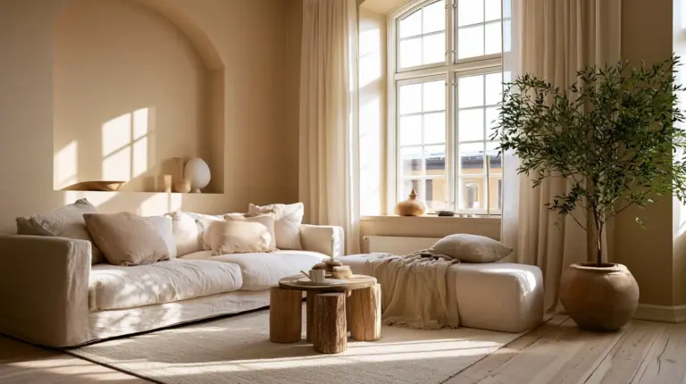
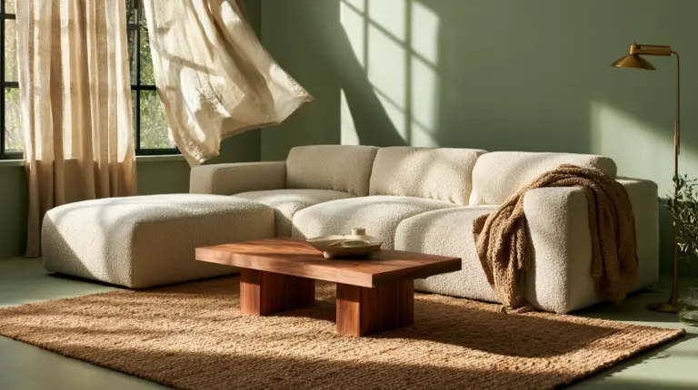
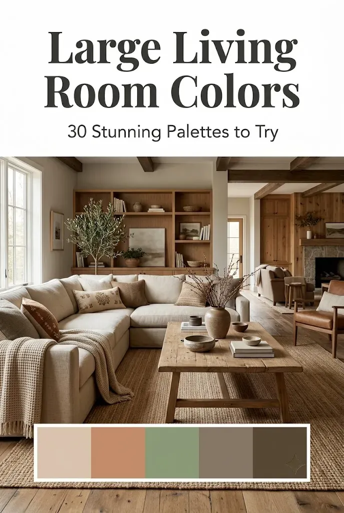
Warm neutrals like greige, oatmeal, and soft clay ground a big room without flattening it. Muted greens and sages bring the outdoors in, especially paired with natural wood. Deep charcoal or ink blue can work beautifully on a large accent wall, creating a cozy anchor point in an otherwise expansive space.
| Palette Style | Wall Color (Hex) | Trim/Ceiling | Best Finish |
|---|---|---|---|
| Warm Neutral Airy | #E8DFD3 | Soft white #F5F1EA | Eggshell |
| Modern Sage | #A8B79C | Warm white #F4F0E6 | Matte |
| Moody Dramatic | #2E3532 | Same as wall (flat ceiling) | Satin on trim |
| Japandi Calm | #D9CFC1 | Natural wood tone | Matte |
| Bright Coastal | #F2EFE9 | Crisp white #FFFFFF | Eggshell |
Are Dark Colors Good For A Large Living Room
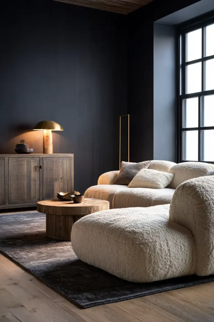
Yes, and this is where large rooms have an advantage small ones don’t. Darker tones need square footage to breathe properly; without it, they can feel like a box.
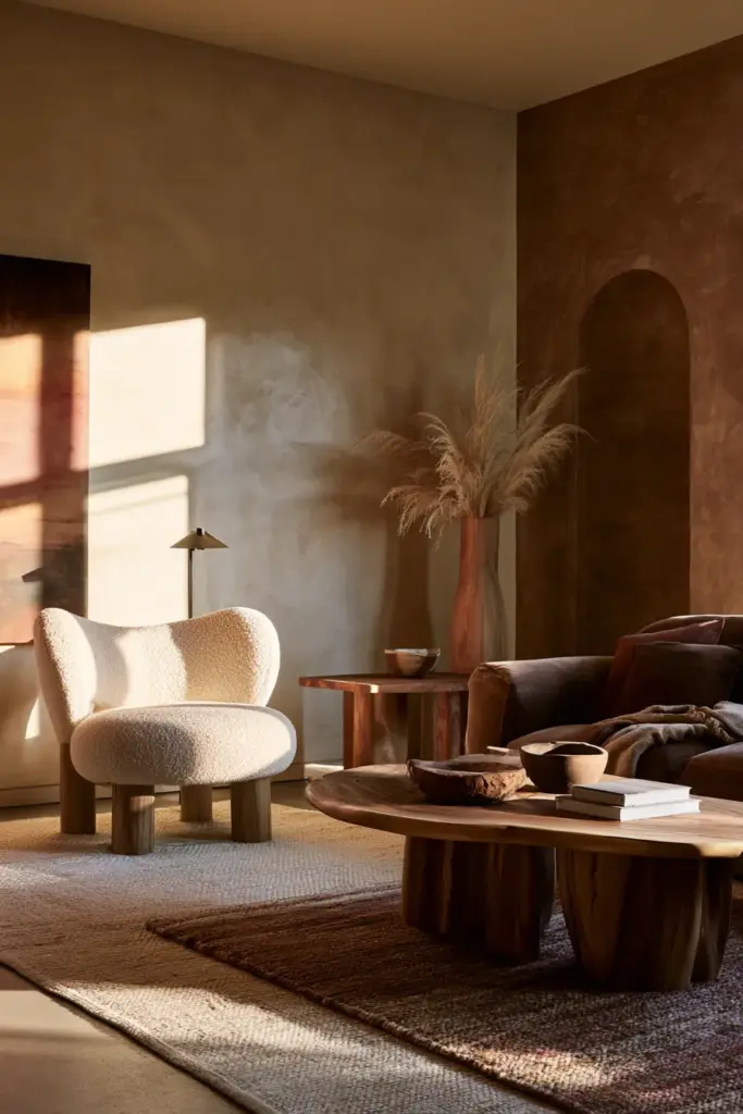
In a spacious living room, a deep charcoal or forest green can pull the far walls in just enough to create intimacy. Pair it with brass or warm wood accents so the room still glows in lamplight, and keep at least one wall or a bank of windows lighter to prevent a cave-like effect.
The trick is balance. Reserve the darkest hue for the wall that anchors your seating area, and let adjoining walls stay a shade or two lighter to keep the flow of light moving through the room.
How Natural Light Changes Color Choices
Orientation changes everything about how a color behaves on your wall, and this matters even more across a large surface area where shifts in light are more visible throughout the day.
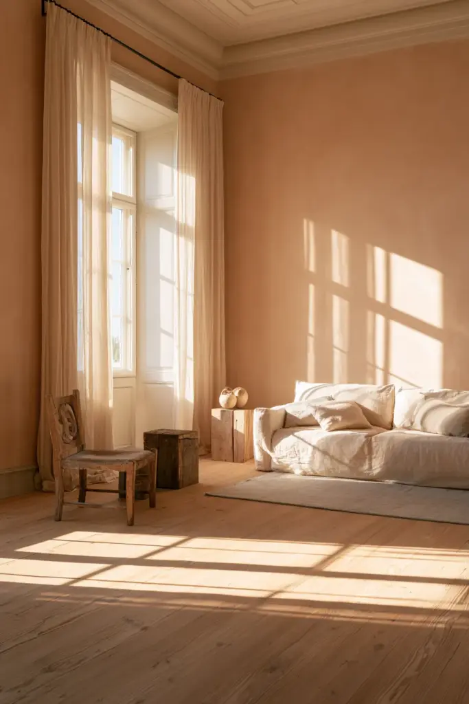
North-facing rooms receive cool, flat light, so warm off-whites, terracotta, and honeyed neutrals prevent the space from feeling chilly. South-facing rooms get strong, warm light most of the day, which means cooler tones like soft sage or dove grey stay balanced rather than washing out. East-facing rooms shine brightest in the morning, so mid-tone neutrals hold their character as the light shifts to cooler in the afternoon. West-facing rooms glow gold in the evening, making deeper, moodier colors feel especially rich at the hours you’re most likely entertaining.
Quick Light-to-Color Matrix
- North light + relaxing mood → warm greige, soft terracotta
- South light + airy mood → cool sage, dove grey
- East light + energizing mood → warm taupe, soft coral undertone
- West light + cozy evening mood → deep clay, ink blue, forest green
What Color Should I Paint The Ceiling And Trim
In a large room, the ceiling is a fifth wall, and ignoring it is one of the most common missed opportunities. A ceiling painted the same soft tone as the walls (just one shade lighter) can make an expansive room feel intentional rather than cavernous.
For trim, crisp white creates a classic, architectural contrast, while a trim color matched closer to the wall softens the whole room into one continuous, calming gesture. If your large living room connects to an open-plan kitchen or hallway, carry a consistent trim color throughout to keep the transition seamless.
Baseboards in large rooms tend to be taller, so consider a satin finish there for durability against furniture and foot traffic, while keeping walls in a softer matte or eggshell.
How To Pick A Color Palette For A Large Open-Plan Room
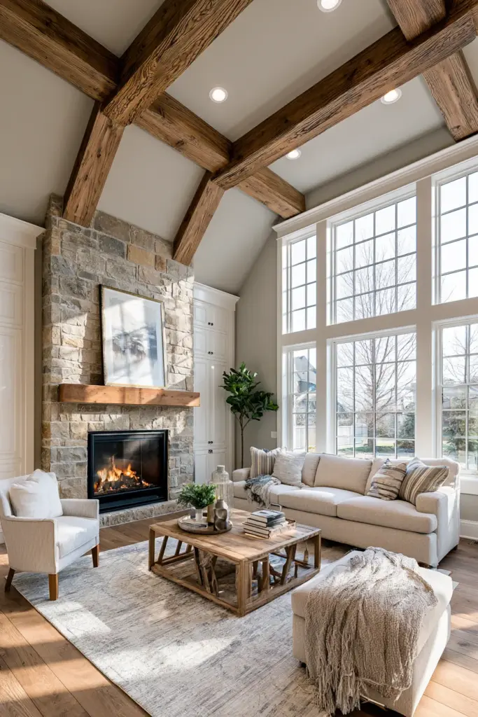
Open-plan layouts ask color to do double duty: unify the space while still marking out separate zones. Start with one dominant neutral that flows across all connected areas, then use color-blocking on a single wall to define your conversation or media zone.
A layout-aware approach considers where your seating cluster begins and ends. Paint the wall behind your main sofa a deeper tone to visually “hold” that zone, while keeping walls near the kitchen or dining area lighter to maintain brightness where task lighting matters most.
Zoning Color Techniques
- Use one wall color as a “frame” behind your primary seating group
- Keep sightlines light where natural light travels furthest into the room
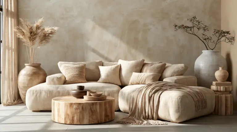
- Introduce texture, not just color, to separate zones — a boucle sofa near a plaster-finish wall reads differently than the same wall near sleek media furniture
Which Paint Finish Is Best For Large Living-Room Walls
Finish affects how color reads across a big surface just as much as the hue itself. Matte finishes absorb light beautifully and hide minor wall imperfections, making them ideal for large, unbroken wall expanses.
Eggshell offers a soft sheen with more durability, a smart choice for high-traffic large rooms with kids or pets. Satin works well on trim, doors, and any wall that sees frequent contact, like behind a media console.
Avoid high-gloss on large walls; it can highlight every roller mark and bounce light unevenly across a big surface.
Which Palettes Suit Specific Styles In Big Rooms
Style gives your color choice a personality, and large rooms have enough real estate to let that personality fully unfold.
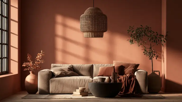
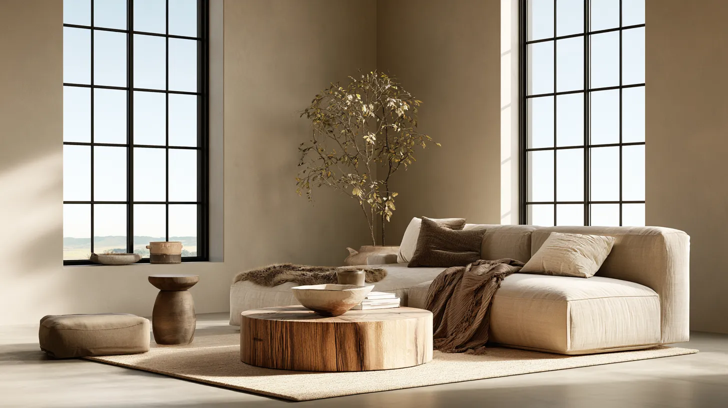
Japandi leans into warm, sandy neutrals and soft charcoal accents, paired with natural wood and linen textures for a calm, grounded feel. Modern neutral favors layered greiges and warm whites with black metal accents for crisp definition. Dramatic moody embraces deep green, ink, or aubergine walls balanced by brass fixtures and plush cozy furniture in cream or camel. Bright airy keeps walls close to white with warm undertones, letting natural textures like rattan and linen carry the visual interest. Warm cozy blends terracotta, cream, and soft brown for a room that feels like a permanent golden hour.
How To Test Paint Colors Before Committing
Never trust a paint chip alone in a large room; light behaves too differently across that much wall space. Paint test patches roughly two feet by three feet in at least three spots: near a window, on an interior wall, and on the wall that gets the least direct light.
Observe each patch at morning, midday, and evening. Photograph them at each interval so you can compare later without relying on memory. Colors that look perfect at noon can shift entirely by lamplight.
How Much Paint Will I Need
A rough formula: measure the total wall square footage (height × width of each wall, minus doors and windows), then divide by 350, since one gallon typically covers about 350 square feet with one coat. Large living rooms often need two coats, so double your gallon estimate for full coverage and richer color depth.
Can Bold Accent Walls Work In A Large Living Room
Absolutely, and a large room is actually the ideal canvas for a bold accent wall since there’s enough surrounding neutral space to let it feel intentional rather than overwhelming. Choose the wall that naturally draws the eye first, often behind the sofa or fireplace, and let the remaining walls stay quiet in a complementary neutral.
Checklist: Choosing Large Living Room Colors
- Identify your room’s light orientation before choosing a hue
- Test 2×3 ft patches in at least three locations, viewed across a full day
- Choose a finish suited to wall size and traffic (matte or eggshell for large walls)
- Treat the ceiling as a fifth wall; consider a softer version of your wall color
- Anchor open-plan zones with one deeper wall color, keep sightlines light
- Calculate paint quantity generously; large rooms often need two full coats
- Let a bold accent wall be a statement, not a repetition, across the room
A Soft Place To Land
A large living room, done well, doesn’t feel like a challenge to solve. It feels like an invitation to slow down, to let the light move across the walls through the day, to gather people into a space that holds them gently.
Choose your color the way you’d choose a favorite sweater: for how it feels against the light, against your furniture, against the quiet moments you’ll spend there. That’s the ERYLIN way — calm, considered, and made for real life.
FAQs
What is the best color for a large living room with little natural light?
Warm neutrals like soft terracotta or honeyed greige help counter the coolness of low light, keeping the room feeling inviting rather than dim.
Should all walls in a large living room be the same color?
Not necessarily. A single anchor wall in a deeper tone paired with lighter surrounding walls often creates more depth than one flat color throughout.
Do dark colors make a large room feel smaller?
Not when balanced correctly. In a spacious room, dark tones can add coziness without sacrificing openness, especially when paired with good lighting and lighter adjacent walls.
What ceiling color works best in a large living room?
A softer version of your wall color, roughly one shade lighter, keeps the room feeling cohesive and prevents the ceiling from looking disconnected.
How do I choose a color palette for an open-plan large living room?
Pick one unifying neutral for the overall space, then use a deeper accent color to define your main seating zone without breaking the visual flow.