Table of Contents
There’s a quiet kind of disappointment that comes from painting a living room the “perfect” white, only to watch it turn faintly pink at sunset or oddly gray under lamplight. That shift isn’t bad luck. It’s undertone — the hidden color hum beneath every paint chip you’ve ever loved.
At ERYLIN, we believe a living room should feel like a long, slow exhale. Warm light pooling on linen. Wood grain catching the afternoon sun. A wall color that agrees with everything around it instead of quietly fighting it.
Living room color undertones are the difference between a space that feels effortless and one that feels slightly off, even when you can’t say why. Once you learn to see them, you’ll never un-see them again — in the best way.
This guide walks you through undertones step by step: how to spot them, test them, and match them to your floors, lighting, and style, whether you’re working with a sunlit loft or a smaller, tropical-facing living room.
What Are Color Undertones (and Why They Break or Make a Living Room)
Every paint color, even a “plain” white or gray, carries a secondary color beneath its surface. That secondary color is the undertone, and it reveals itself under certain light or beside certain materials.
Think of undertone as a color’s personality rather than its outfit. A gray can lean blue and feel crisp, or lean green and feel earthy — same gray family, completely different mood.
Undertones matter because your living room is never just paint. It’s paint reacting with your flooring, your sofa fabric, your light bulbs, and the direction your windows face. Ignore undertone, and even a beautifully chosen color can clash or fall flat.
Step 1: Map Your Living Room’s Fixed Elements and Their Undertones
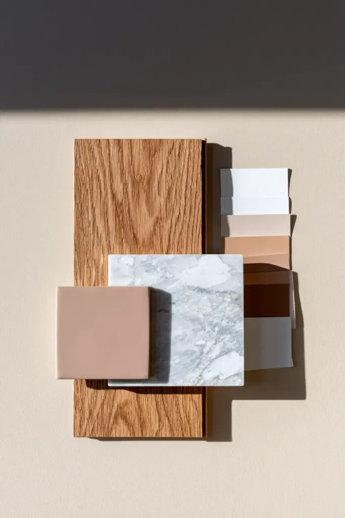
Before you touch a single swatch, look at what you can’t easily change — your floors, trim, countertops, and any built-in stone or tile.
- Wood floors: Red oak and cherry-toned wood pull warm, golden, or reddish undertones. White oak and ash lean neutral to slightly cool. Walnut sits deep and warm-brown.
- Ceramic and porcelain tile: Common in many homes, these often carry a cool gray-blue or soft beige-pink glaze that’s easy to miss until you compare it to white paper.
- Marble or stone accents: Veining can hide pink, green, or blue undertones that will fight a mismatched wall color.
Lay a plain white sheet of paper against each fixed surface. The paper resets your eye, making hidden undertones suddenly obvious.
Step 2: Diagnose Your Lighting Direction and Bulb Temperature
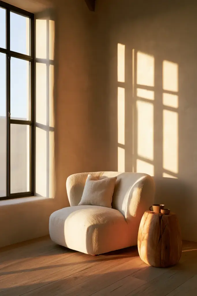
Light is the storyteller of undertone. The same paint can look buttery at 9 a.m. and steely by 6 p.m.
Reading Your Window Direction
- North-facing rooms receive cool, indirect light, which can make warm paints feel muddier and cool paints feel flatter.
- South-facing rooms get warm, generous light most of the day, softening cool undertones beautifully.
- East-facing rooms feel warm in the morning and cooler by afternoon.
- West-facing rooms stay cool most of the day, then flood warm and golden at sunset.
Reading Your Bulbs
Bulb temperature, measured in Kelvin, changes undertone just as much as sunlight does.
- 2700K–3000K reads warm and cozy, ideal for enhancing warm undertones.
- 3500K sits balanced, neither warm nor cool.
- 4000K and above reads crisp and cool, which can push a warm paint toward gray.
A simple ritual: set your living room lights to each temperature for a full evening before deciding on a final color. Your eyes will tell you more than any chart.
Step 3: Choose Your Undertone Family — Warm, Cool, or Balanced
Once you understand your fixed elements and light, you can choose a lane with confidence.
| Undertone Family | Feels Like | Pairs Beautifully With | Watch Out For |
|---|---|---|---|
| Warm | Golden, honeyed, inviting | Red oak floors, brass hardware, linen textiles | Can feel dated or heavy in low light |
| Cool | Crisp, airy, calm | Marble, chrome fixtures, blue-gray tile | Can feel sterile in north-facing rooms |
| Balanced (Greige) | Soft, grounded, flexible | Almost any wood tone or tile | Can look muddy if lighting is inconsistent |
Popular warm-neutral choices include Sherwin-Williams Alabaster and Benjamin Moore White Dove. For a cooler lean, Agreeable Gray and Edgecomb Gray offer gentle, livable versatility. Sea Salt and Pale Oak sit gracefully in the balanced middle.
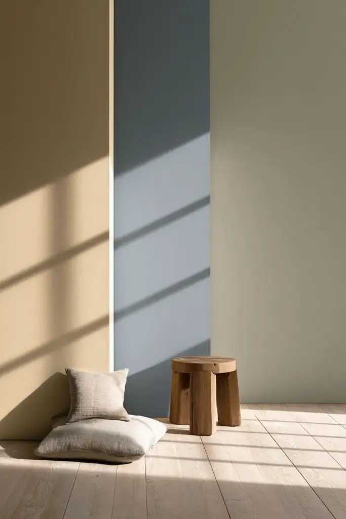
Step 4: Test Large Samples with a Day-and-Night Routine
Small chips lie. Big samples tell the truth.
- Paint 2 ft x 2 ft sample patches, or use peel-and-stick paint samples, on at least two different walls.
- Check the patch at morning light, midday light, and evening lamplight.
- Step back ten feet — undertones intensify at a distance in ways they don’t up close.
This single habit — patience over three lighting moments — prevents nearly every regretted repaint.
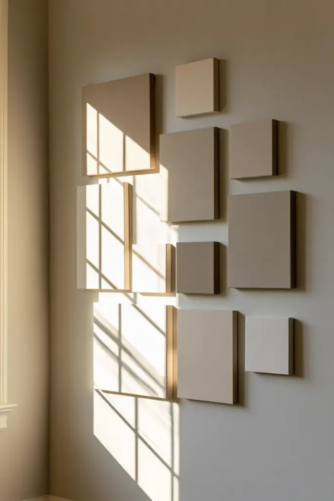
Step 5: Match Paint to Floors, Sofa, Rug, and Trim
Undertone harmony isn’t about matching exactly. It’s about not contradicting.
- If your tile leans blue-gray, avoid very warm honey beiges; a balanced greige or warm-gray white will feel intentional instead of accidental.
- If your sofa is a warm camel or rust, a cool-leaning wall can feel jarring; choose a warm white or soft greige instead.
- Trim generally reads best a touch lighter and cooler than the wall color, which keeps architectural lines crisp without competing.
Common Mistakes That Make Undertones Look Wrong
- Choosing paint under store fluorescent lighting instead of your own [lighting ideas] for the room.
- Ignoring the undertone of large, unchangeable elements like tile or stone.
- Testing only a small chip instead of a full sample patch.
- Mixing strongly warm and strongly cool tones without a neutral bridge, like a warm-gray sofa or a linen rug.
- Assuming “greige” is automatically safe — some greiges swing surprisingly pink or green.
Living Room Color Undertones by Design Style
Japandi Living Rooms
Japandi thrives on warm-neutral undertones: soft beige, muted green-gray, and gentle warm whites. Avoid stark cool whites or high-contrast cool grays, which fight the style’s quiet, organic warmth.
Modern Living Rooms
Modern spaces lean toward balanced-to-cool neutral whites, cool greiges, and charcoal paired with warm wood accents. Save warmer undertones for [cozy furniture] and textiles rather than the walls themselves.
Eclectic Living Rooms
A neutral base with a subtle warm or balanced undertone gives bold furniture and art room to shine. Very pink or very green undertones tend to clash unless echoed intentionally elsewhere in the room.
Living Room Color Undertones in Small, Tropical, or Low-Light Spaces
Not every living room enjoys generous natural light or cool climates, and undertone strategy shifts accordingly.
- In warm, humid climates, counter the ambient golden light with balanced or slightly cool undertones to avoid a muddy, overheated feel.
- In small or low-light living rooms, keep your Light Reflectance Value (LRV) above 60 unless you’re intentionally color-drenching a moody, well-lit space.
- Layered artificial lighting — an overhead fixture, a table lamp, and a floor lamp — helps a small room hold its undertone steady after dark instead of drifting cool and flat.
An Under-$50 Way to Test Undertones
You don’t need a professional consultation to get this right.
- Use plain white printer paper as a neutral reference beside your samples.
- Pin painted foam board samples near your existing rug and cushions before buying full cans of paint.
- Borrow a warm and a cool bulb from a hardware store to preview how your top choice shifts under each one.
Checklist: Choosing the Right Living Room Undertone
- Identify the undertones in your floors, tile, and any stone surfaces.
- Note your window direction and how light changes through the day.
- Check your bulb temperatures, and test your top color at 2700K, 3500K, and 4000K.
- Choose a warm, cool, or balanced undertone family based on what surrounds it.
- Paint large 2 ft x 2 ft samples and observe them morning, midday, and evening.
- Cross-check your final color against your sofa, rug, and trim.
- For small or tropical rooms, favor an LRV above 60 unless intentionally going moody.
A Soft Place to Land
A living room isn’t finished when the paint dries. It’s finished when the light moves through it at 7 a.m. and again at 7 p.m., and the room still feels like you — steady, warm, unhurried.
Undertones are simply the quiet grammar behind that feeling. Learn to read them once, and every color decision after this one gets easier, gentler, and far more sure of itself.
May your walls hold the kind of warmth that makes people linger just a little longer.

FAQ: Living Room Color Undertones
How can I tell if my living room paint has a pink or warm undertone?
Hold a plain white sheet of paper against the painted sample in natural daylight. Any pink, yellow, or peach hue hiding beneath the main color will become clearly visible by comparison.
What undertones work best with gray tiles or marble floors?
Cool-neutral or balanced greige tones typically pair best, since they won’t fight the blue-gray or veined undertones common in tile and marble.
Is warm white better than cool white for a small tropical living room?
Often a balanced or slightly cool white works better, since it counters ambient warm, humid light and helps a smaller space feel airy rather than heavy.
How do I test undertones without painting an entire wall?
Paint 2 ft x 2 ft sample patches or use peel-and-stick paint samples on two different walls, then observe them across morning, midday, and evening light before committing.
Can I mix warm and cool undertones in one living room?
Yes, as long as you introduce a neutral bridge, such as a warm-gray sofa, linen textiles, or a balanced greige wall, to keep the mix feeling intentional rather than accidental.