Table of Contents
Color is never just decoration. It’s the first thing your body feels when you walk into a room, long before your mind catches up.
At ERYLIN, we believe your living room should feel like an exhale — a space shaped by light, texture, and the quiet logic of living room color psychology. The right hue doesn’t just look beautiful. It shifts your heart rate, softens your shoulders, or wakes you up.
This is especially true in Philippine homes, where tropical sun pours through windows most of the day and living rooms often double as everything — TV lounge, home office, playroom, and gathering space. The paint color for your living room has to work harder here than in a cooler, dimmer climate.
So let’s slow down and choose with intention. Not “what’s trending,” but what color mood living room truly fits your life.
What Color Is Best for a Living Room? (Based on Mood and Use)
There’s no single “best” living room color — only the best color for how you actually use the room.
Start by asking yourself what your living room is for, most days of the week. A room meant for winding down needs a completely different palette than one built for hosting.
If You Want to Relax After Work
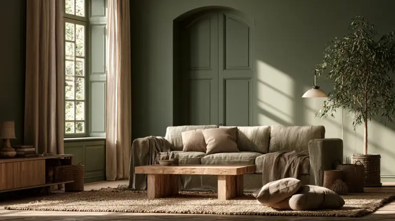
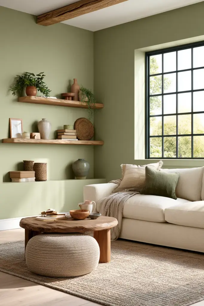
Soft blues and muted sage greens lower visual noise the moment you sit down. Pair them with warm beige textiles — a linen throw, a woven rug — so the coolness never feels sterile.
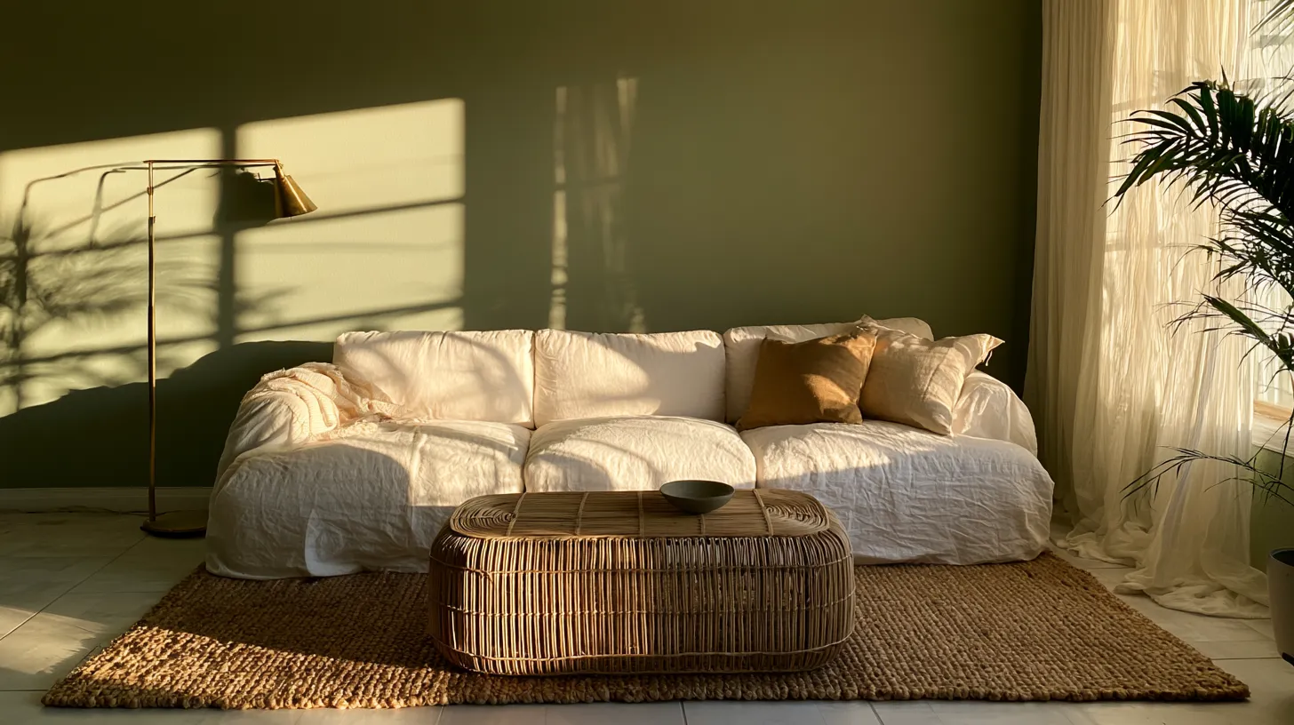
Think of a dusty eucalyptus wall behind a bouclé sofa, lit by a warm-toned floor lamp at dusk. The room seems to hum quietly instead of shout.
If You Host Often
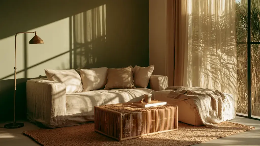
Warm white and soft beige walls act as a gentle stage, letting terracotta cushions, rust-colored throws, or a mustard accent chair take the spotlight. These warm tones read as inviting rather than sleepy, perfect for evenings with friends.
A rattan coffee table and brass lighting fixtures echo those same warm undertones, tying the whole space together.
If It’s a Family Space with Kids
Balanced greens and soft yellows keep energy up without overstimulating. Avoid saturated reds near play areas — they’re proven to heighten alertness and can make a shared space feel tense rather than joyful.
A washable matte-finish paint in soft olive or buttery cream also forgives crayon marks and sticky fingers, which matters more than any color chart.
If the Room Doubles as a Home Office
Cooler neutrals with a hint of blue-grey support focus, especially paired with natural wood shelving and a single grounding accent color, like deep forest green in a cushion or lampshade.
Color, Light, and Space: How Philippine Sun Changes Everything
Tropical sunlight is intense, warm, and long-lasting, which means colors behave differently here than in temperate-climate design guides.
West and South-Facing PH Living Rooms
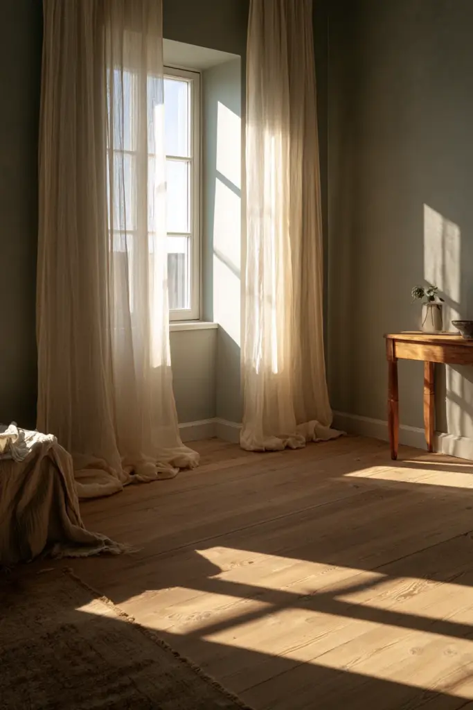
Afternoon sun in Calabarzon and similar regions can turn a “soft yellow” into something closer to neon by 3 p.m. If your living room faces west or south, lean toward cooler undertones — think warm greys, sage, or pale blue-green — to balance the heat visually and literally.
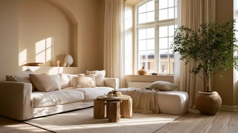
A sheer linen curtain filters that golden light beautifully, softening both temperature and glare.
North and East-Facing Rooms
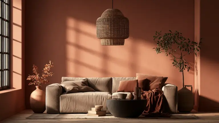
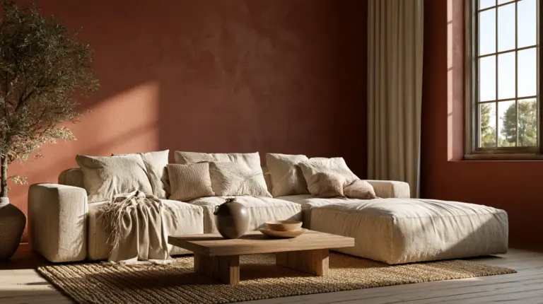
These spaces get gentler, cooler light, so warmer paint tones — think soft terracotta or warm sand — feel inviting rather than overwhelming. They also make mornings feel warmer than they actually are.
Small Living Rooms and Perceived Size
Off-white, pale sage, and soft blue expand a small room visually, especially when the ceiling and walls share a similar tone. High-gloss finishes bounce more light, which helps compact condo living rooms feel airier.
Dark colors can work in small PH living rooms, but only with strong natural light and minimal furniture bulk — otherwise the room can feel closed in, especially with the humidity trapping visual heaviness.
Which Neutral Colors Work Best in a Living Room?
Neutrals are the quiet backbone of modern rustic elegance, but not all neutrals behave the same way.
| Neutral | Best For | Pairs Beautifully With |
|---|---|---|
| Warm white | Small or dim rooms, blank canvas | Any bold accent color |
| Greige (grey-beige) | Balanced, calming base | Wood tones, olive greens |
| Soft sand | West-facing rooms, warmth without heat | Rattan, terracotta, brass |
| Warm grey | Cosy, intimate spaces | Deep red, burnt orange |
| Pale sage | Airy, nature-inspired calm | Linen, light oak |
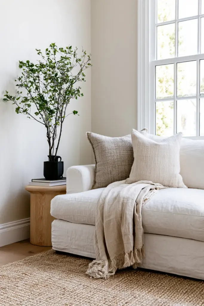
A neutral palette isn’t boring when it’s layered with texture — a jute rug, a nubby wool throw, unlacquered brass hardware. Neutrals let materials speak instead of color.
Color Combos by Sofa and Flooring Type (PH Context)
Most Philippine homes work with a handful of common tile and wood tones, so matching your walls to what’s already on the floor makes decisions much easier.
| Existing Element | Recommended Wall Color | Accent Suggestions |
|---|---|---|
| Grey sofa | Warm beige or soft sand | Mustard, terracotta cushions |
| Light wood flooring | Off-white or pale sage | Sky blue, olive green |
| Dark wood flooring | Warm white or soft grey | Burnt orange, deep teal |
| White or beige tiles | Warm greige | Rust, forest green |
| Grey tiles | Soft warm white | Blush pink, ochre |
If your flooring runs cool (grey tiles, cool-toned wood), balance it with a warmer wall. If it runs warm, a slightly cooler wall keeps the room from feeling heavy.
Japandi, Modern, and Eclectic: Applying Color Psychology to Your Style
Your design style shapes how much color psychology should show up on your walls versus in your textiles.
Japandi Living Rooms
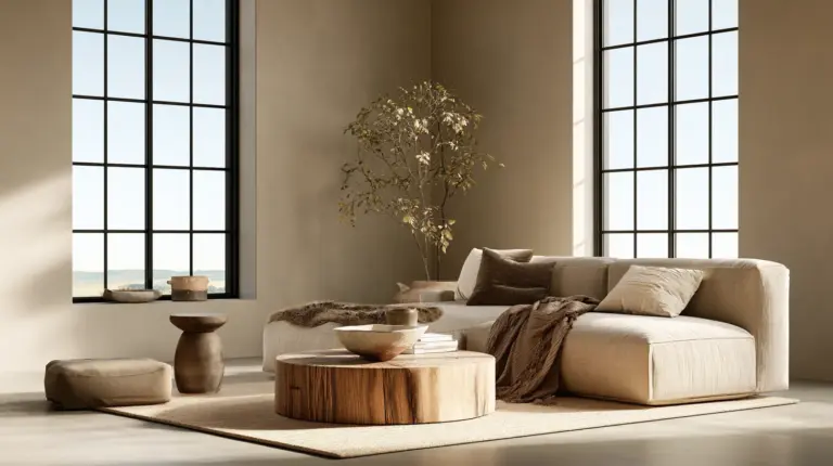
Japandi thrives on restraint — warm neutrals, muted clay, soft moss green — so the emotional work happens in subtle shifts, not bold statements. A slightly warmer white than “true white” can make an entire Japandi room feel more grounded and less clinical.
Modern Living Rooms
Modern spaces can hold more contrast: a cool grey base with one confident accent wall in deep blue or forest green. The psychology here leans on clarity — one dominant emotional note instead of many competing ones.
Eclectic Living Rooms
Eclectic spaces can layer several emotional tones at once, but they need one neutral anchor — usually the wall color — so the mix of patterns and accent pieces doesn’t overwhelm the senses.
Color and Wellbeing: Stress, Kids, and Elderly Family Members
Color psychology isn’t only about aesthetics. It genuinely affects the nervous system, and that matters most for the people most sensitive to their environment.
- For stress reduction: desaturated blues and greens have been consistently linked to lower heart rate and a calmer nervous system.
- For elderly relatives: softer, less saturated tones reduce visual strain and support easier navigation, especially with mixed lighting throughout the day.
- For children’s play areas: balanced greens and soft yellows support focus and calm play, while heavy reds and very bright oranges can heighten restlessness over time.
Designing with these groups in mind isn’t a compromise. It’s simply thoughtful, generous design.
Paint Strategy: Accent Wall vs. Full Room
Committing to full-room color is a big decision, but it isn’t the only option.
An accent wall behind the sofa or TV console lets you experiment with a bolder, more emotionally charged color — like a deep terracotta or forest green — without shifting the whole room’s mood. A full-wall approach, meanwhile, creates a more immersive, cohesive feeling, which suits smaller rooms that benefit from visual continuity.
How to Test Paint Colors Properly
- Paint a large swatch (at least A3 size) on your actual wall, not a spare board.
- Observe it at three points in the day — morning, midday, and evening.
- Check how it looks under both natural sunlight and your evening lighting ideas, since warm bulbs shift undertones significantly.
- Hold your sofa fabric or a flooring sample next to the swatch before deciding.
- Live with it for at least 48 hours before committing to a full room.
Quick Checklist: Choosing Your Living Room Color
- How many hours a day do you actually spend in this room?
- What’s the main activity — relaxing, hosting, working, or family time?
- Which direction does the room face, and how strong is the afternoon sun?
- What colors are already fixed — sofa, flooring, tiles?
- What mood do you want to feel the moment you sit down?
A Final, Softer Word
Choosing a living room color isn’t really about paint. It’s about deciding how you want to feel every time you come home, sink into your favorite chair, and let the day settle off your shoulders.
Let your walls hold that feeling gently — warm where you need comfort, cool where you need calm, quiet where you need rest. That’s the quiet art of modern rustic elegance: nothing forced, everything felt.
At ERYLIN, we design with that instinct, not against it — because a beautiful room should always feel like it already knows you.
FAQs
What color is best for a living room?
There’s no universal best color — it depends on how you use the space. Soft blues and greens suit relaxation, while warm whites and terracotta suit social, lively living rooms.
What color should I paint my living room to feel calm?
Muted blues, sage greens, and warm greiges are the most consistently calming choices, especially paired with soft, warm lighting in the evening.
What colors make a living room look bigger?
Off-white, pale sage, and soft blue tones visually expand a room, particularly when walls and ceiling share a similar tone and finishes lean toward matte or soft satin.
What colors should I avoid in a small living room?
Very dark, saturated colors can make a compact room feel smaller unless there’s strong natural light and minimal furniture. Overly bright reds or oranges can also feel overwhelming in tight spaces.
What living room colors work best with strong natural light, like west-facing PH homes?
Cooler, muted tones — warm greys, sage, or soft blue-green — balance intense afternoon sun better than bright yellows or warm oranges, which can feel overheated by mid-afternoon.