Table of Contents
Walk into a room and you feel it before you notice it. The color on the walls sets the pulse of the space long before a single lamp is switched on.
That’s the quiet power of a living room. It’s not just where you sit — it’s where your personality settles into the walls, the light, and the textures around you.
At ERYLIN, we believe a living room should feel like you, not like a showroom. So instead of handing you another list of pretty paint chips, we’re going to help you find the color that actually matches who you are, how your room is lit, and how you live in it.
Grab a cup of tea and let’s find your shade of home.
What Your Living Room Color Says About You
Color isn’t decoration — it’s communication. The palette you choose quietly tells guests (and yourself) how you want to feel in this room.
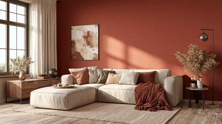
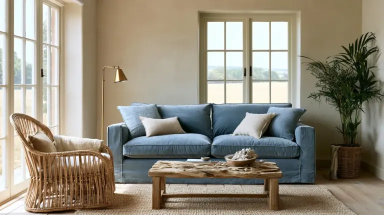
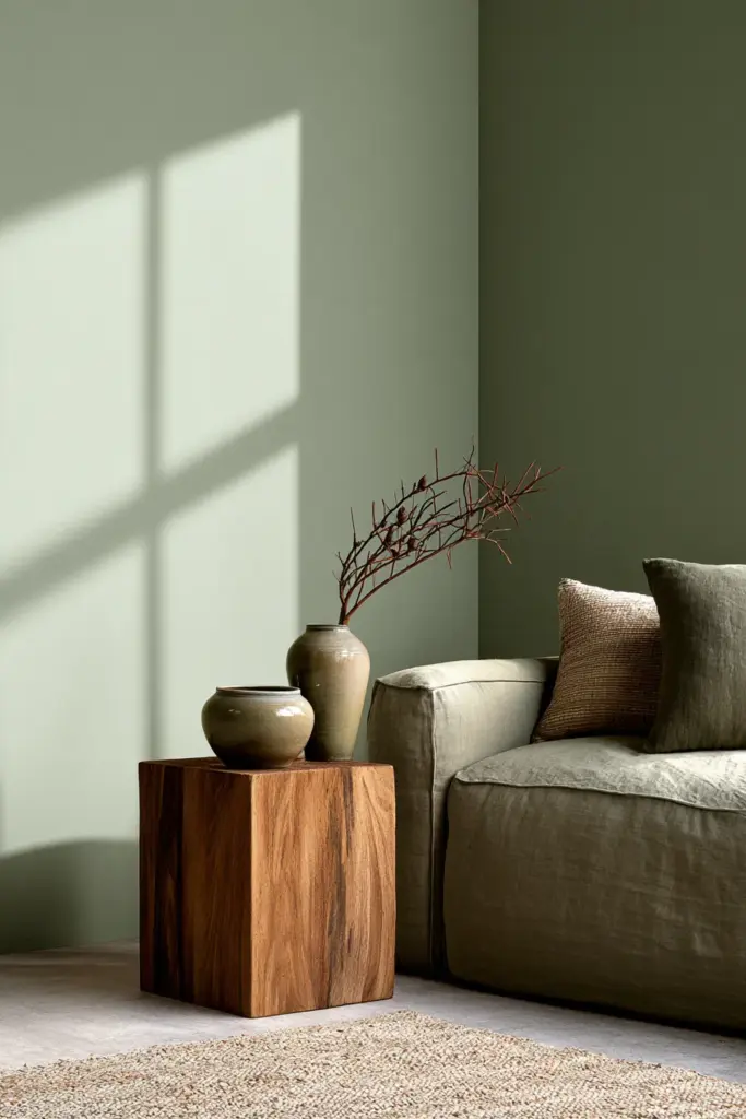
A warm terracotta says come sit, stay a while. A soft sage says breathe, slow down. A deep navy says this room means business, in the coziest way.
Before you pick a swatch, it helps to ask what mood you’re actually chasing — not what’s trending this year.
Find Your Color Personality
Think of this as a starting point, not a rulebook. Most people are a blend of two or three types, and that’s exactly where the most interesting rooms come from.
| Personality Type | How You Live | Best Color Family |
|---|---|---|
| Calm & Minimal | You crave quiet, uncluttered spaces | Warm whites, soft greige, oat |
| Creative & Maximal | You layer pattern, art, and color fearlessly | Terracotta, forest green, ochre |
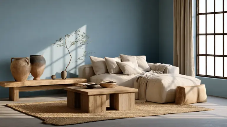
| Introvert / Restful | You want the room to feel like a soft exhale | Muted sage, dusty blue, clay |
| Extrovert / Hospitality-First | You entertain often and love a lively room | Warm rust, burnt orange, deep gold |
| Family-Friendly | You need durability and warmth together | Earthy taupe, warm greige, soft olive |
Notice which row sounds like your Saturday afternoon. That’s usually your true color personality talking.
How Light Changes Your Color
Paint never lives in a vacuum — it lives in your light. The same swatch can feel completely different depending on which way your windows face.
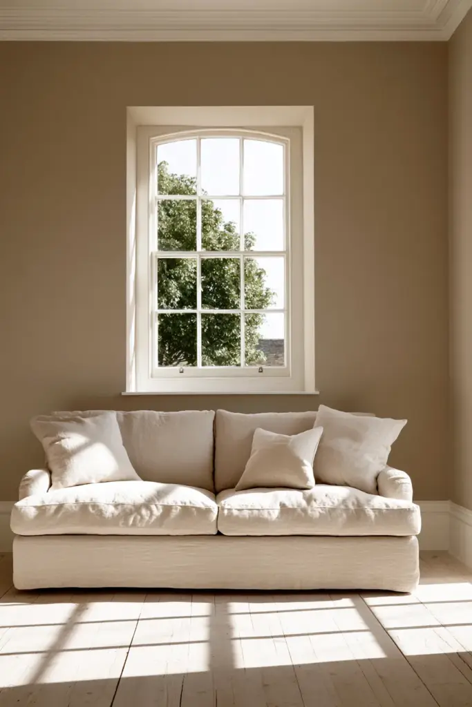
North-Facing Rooms
North light is cool and even, which can make some colors feel a little flat or gray. Lean into warm undertones like honeyed beige, soft terracotta, or warm greige to counter the coolness.
South-Facing Rooms
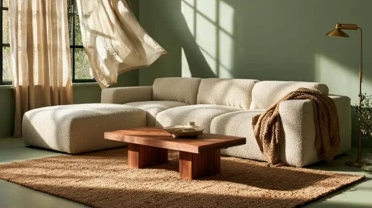
South-facing rooms get generous, warm daylight for most of the day. This is where cooler tones like sage, soft blue, or warm gray really shine without turning icy.
Dark or Low-Light Rooms
If natural light is limited, avoid deep, saturated colors on every wall — they can swallow the little light you have. Instead, try a warm off-white or pale clay, and save the drama for one accent wall or a textured lighting ideas moment with layered lamps.
Rooms with Mostly Artificial Light
Evening bulbs tend to add warmth, so cooler colors read better under lamp light. Test your swatch in the evening as well as at noon, since a color that looks perfect at 2pm can shift entirely by 8pm.
Best Colors by Room Size
Size changes how bold you can go — but it doesn’t mean small rooms are stuck with plain white.
- Small living rooms — Soft, warm neutrals like oat, warm white, or pale clay open the space up gently.
- Medium living rooms — This is where you have the most freedom: sage, warm taupe, soft terracotta, or dusty blue all work beautifully.
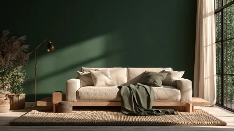
- Large living rooms — Deeper, richer tones like forest green, navy, or burnt umber feel grounding instead of overwhelming.
Best Colors by Design Style
Your color choice should feel like an extension of your style, not a fight against it.
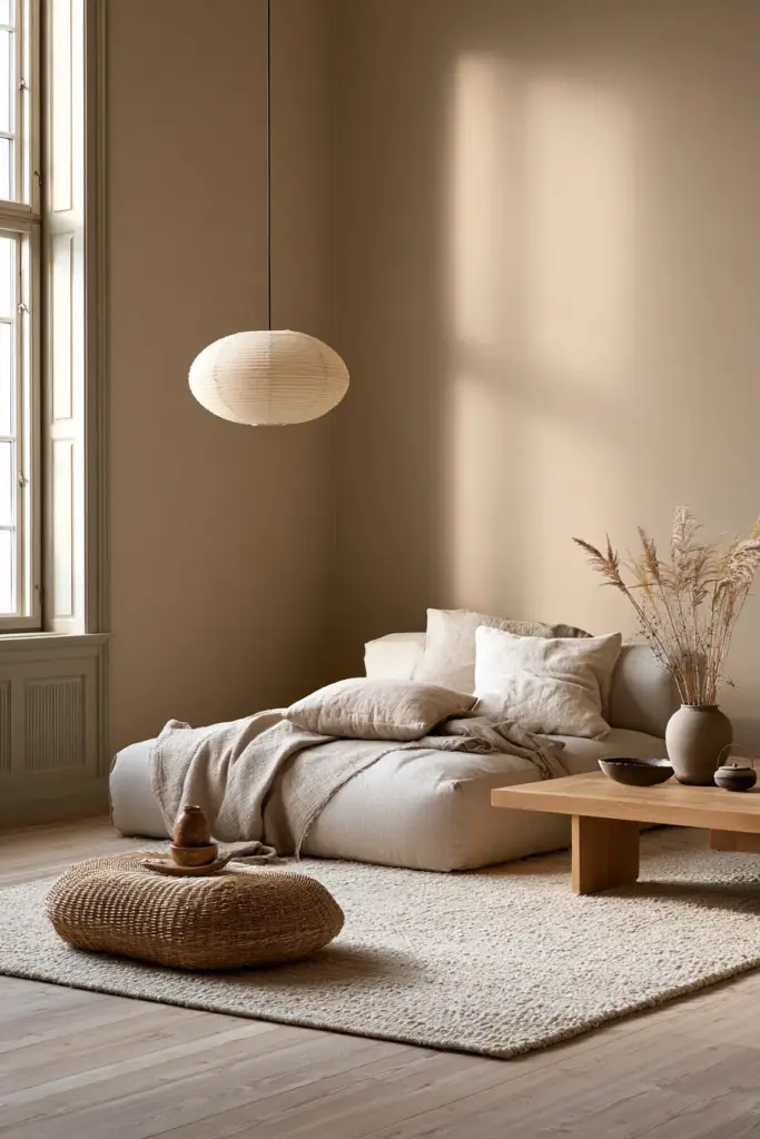
Japandi
Think warm oat, soft clay, and muted greige, paired with natural wood and quiet negative space.
Modern Organic
Earthy greens, warm sand, and soft stone tones let natural materials like linen and rattan do the talking.
Eclectic
Don’t be afraid of contrast — a warm terracotta wall can hold its own against jewel-toned textiles and vintage brass.
Cozy Rustic Elegance
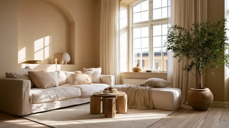
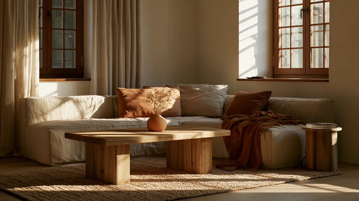
This is ERYLIN’s sweet spot: warm whites, soft greige, and touches of honeyed wood, layered with linen textures and gentle, diffused light.
Luxe & Moody
Deep navy, charcoal, or forest green paired with brushed gold and velvet upholstery creates a rich, evening-glow atmosphere.
Pairing Guide: What to Wrap Around Your Color
A wall color rarely stands alone. It’s the conversation between paint, wood, and fabric that makes a room feel finished.
| Wall Color | Wood Tone | Sofa Color | Rug Color | Metal Finish |
|---|---|---|---|---|
| Warm White | Honey oak | Oatmeal linen | Warm ivory | Brushed brass |
| Sage Green | Walnut | Cream or clay | Natural jute | Matte black |
| Terracotta | Light oak | Soft stone | Woven neutral | Warm brass |
| Navy | Dark walnut | Camel or tan | Cream with pattern | Brushed gold |
| Greige | Mixed wood tones | Warm white | Soft taupe | Brushed nickel |
If you’re layering in new pieces, our guide to cozy furniture can help you match texture as thoughtfully as you match color.
Common Color Mistakes and How to Fix Them
Even a beautiful color can go wrong in the wrong context. Here’s what to watch for.
- Choosing a trendy color that fights your floors. Test your swatch next to your actual flooring, not just on a white card.
- Using saturated color without balance. Pair a bold wall with soft, neutral textiles so the room can breathe.
- Ignoring undertones. Most “beige” and “white” paints lean pink, green, or gray — check the undertone in both daylight and evening light before committing.
- Painting a small room too dark on every wall. Reserve deep color for one wall or a cozy nook instead.
- Skipping the swatch test. Always view your color at 9am, 2pm, and 8pm before you paint the whole wall.
Quick Matrix: Best Color by Goal
| Your Goal | Best Color Direction |
|---|---|
| Calm & restful | Sage, dusty blue, warm greige |
| Entertaining & sociable | Terracotta, burnt orange, warm gold |
| Making a room feel larger | Warm white, oat, pale clay |
| Cozy warmth | Honeyed beige, soft rust, warm taupe |
Checklist: Finding Your Color
- Identify your color personality from the table above.
- Note your room’s light direction — north, south, dark, or mostly artificial.
- Match your room size to a color intensity that suits it.
- Choose a design style direction so wood, metal, and fabric feel unified.
- Test your swatch in three different lighting moments before painting.
- Avoid saturated color without a neutral partner in the room.
A Soft Place to Land
A living room isn’t finished when the paint dries — it’s finished when you walk in and exhale. The right color doesn’t shout for attention; it simply feels like you, quietly, every single day.
Take your time with this choice. Let the light guide you, let your personality lead, and let the room become the soft, honest space you deserve to come home to.

FAQs
What color living room matches my personality?
Start with how you actually live — calm and minimal leans toward warm whites and greige, while creative and social personalities often glow in terracotta or warm gold tones.
What does your living room color say about you?
Your color choice reflects the mood you want to create, whether that’s restful and quiet, warm and social, or bold and expressive.
Which living room colors create a calm, cozy mood?
Soft sage, dusty blue, warm greige, and muted clay tones are the most reliable choices for a calm, grounded feeling.
Which colors work best for a small or dark living room?
Warm, pale neutrals like oat, warm white, or soft clay keep small or dark rooms feeling open, especially when paired with layered lighting.
How does natural light change my living room paint color?
North-facing rooms benefit from warm undertones to offset cool light, while south-facing rooms can handle cooler tones like sage or soft blue without feeling icy.