Table of Contents
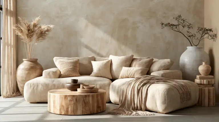
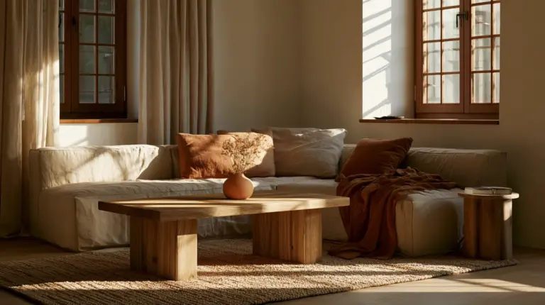
Close your eyes and picture a room that feels like a slow morning. Sunlight pools across a rattan chair. A terracotta vase catches the light near a linen sofa. This is what bohemian color truly is — not a trend, but a feeling you build one warm tone at a time.
Erylin believes color should feel like home before it looks like a magazine page. Boho living rooms aren’t about clutter or chaos. They’re about layering earth-born hues until the space breathes.
If you’ve ever wondered why some boho rooms feel curated and calm while others feel busy and cold, the answer almost always comes back to color — and more specifically, to undertone, light, and texture working together.
This guide walks you through the best bohemian living room colors, how to adapt them to your room’s size and light, and the exact palette formulas that make a space feel effortlessly collected. For more ideas on setting the mood once your palette is chosen, our lighting ideas guide pairs beautifully with everything below.
The Core Bohemian Color Families
Bohemian color lives in nature’s palette. Think sun-baked clay, dried sage, aged wood, and dusk-colored skies. These aren’t loud colors — they’re quiet ones that deepen with the light.
Earthy Neutrals
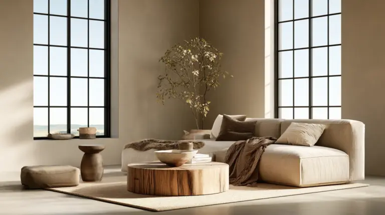
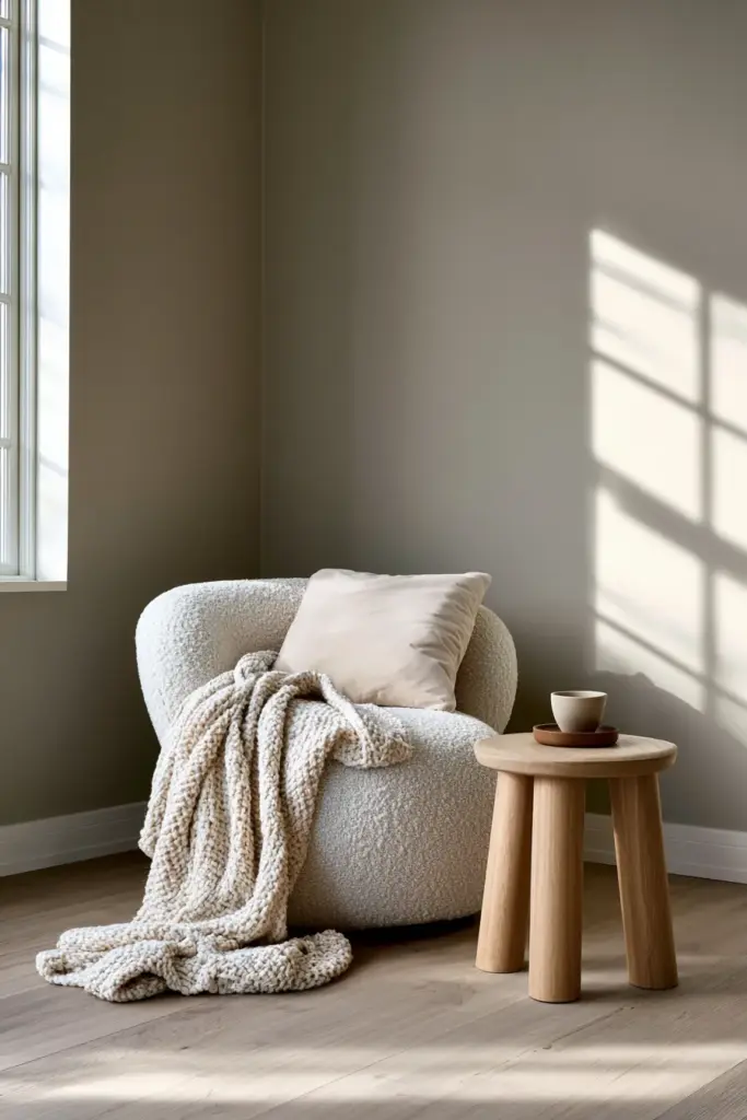
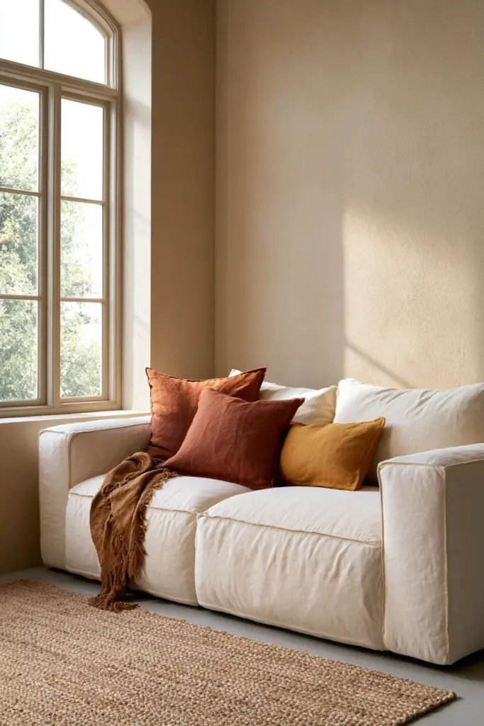
Warm beige, sand, and putty form the resting base of almost every boho room. They let texture do the talking.
- Warm beige walls with jute rugs and cream boucle
- Sand-toned linen curtains against raw plaster texture
- Putty grey paired with light oak furniture
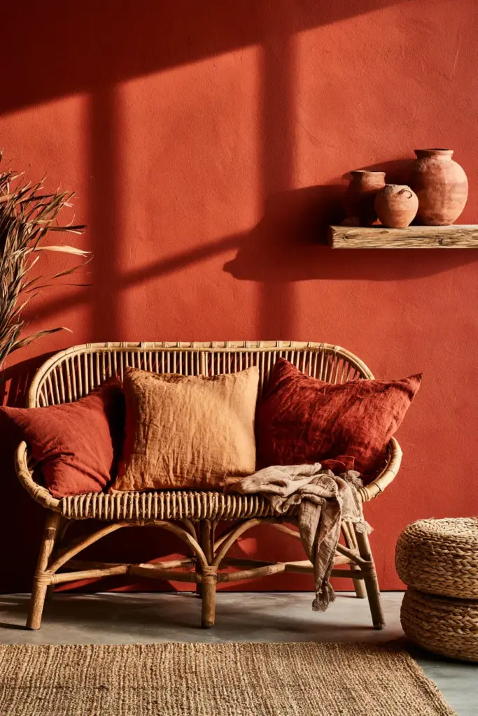
Terracotta and Clay
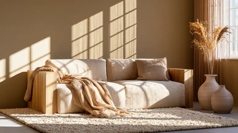
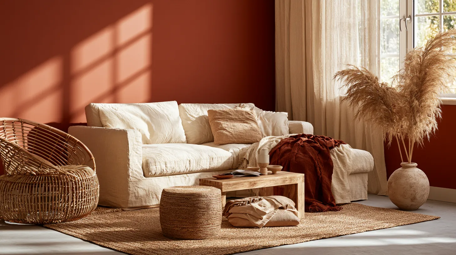
Terracotta is the soul of boho color. It carries warmth without shouting, especially against natural light in the late afternoon.
- A single terracotta accent wall behind a rattan headboard-style bench
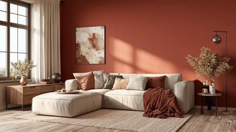
- Terracotta throw pillows against a warm beige sofa
- Clay pottery grouped on open wood shelving
Sage, Olive, and Deep Green
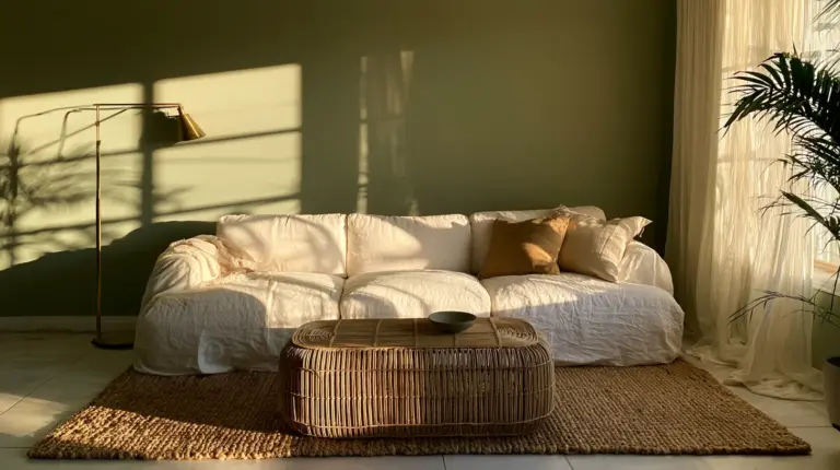
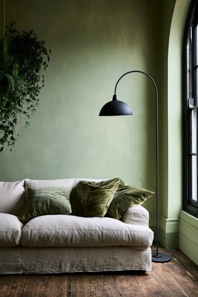
Green brings the outdoors in, and boho spaces lean toward muted, dusty greens rather than bright ones. Olive especially plays well with brass and wood.
- Sage green walls with black iron light fixtures
- Olive velvet cushions on a natural linen sofa
- Trailing plants against a deep green accent nook
Ochre, Mustard, and Dusty Pink
These hues add personality without overwhelming a room. They work best in small doses — a chair, a throw, a piece of art.
- Mustard accent chair beside a beige base
- Dusty pink ceramic lamp on a wood side table
- Ochre woven wall hanging above a linen sofa
Jewel Tones as Accents
Deep teal, rust, and burgundy add sophistication when used sparingly. They anchor a room rather than decorate it.
- A single teal accent chair in an otherwise neutral room
- Burgundy woven pillow against jute texture
- Rust-colored ceramic vase on a walnut console
Choosing Boho Colors by Room Condition
Generic color lists rarely account for the room you actually have. Light, size, and orientation change how every one of these colors behaves.
Small Living Rooms
Small spaces need a light, warm base so the room doesn’t feel closed in. Save deeper tones for accents only.
| Element | Color Choice | Why It Works |
|---|---|---|
| Walls | Warm sand or putty | Keeps the room open and airy |
| Sofa | Cream or oatmeal linen | Reflects light without feeling stark |
| Accents | Terracotta and ochre | Adds warmth without shrinking the space |
| Textiles | Light jute, rattan | Adds texture without visual weight |
Dark or North-Facing Rooms
Cooler, north-facing light can make boho colors feel flat or muddy. Lean into warmth to counteract the cool cast.
- Choose ochre or terracotta over sage or olive as your dominant tone
- Add brass or warm gold fixtures to bounce light
- Use a matte finish to soften shadows rather than highlight them
Bright, South-Facing Rooms
Abundant natural light lets you use deeper, moodier colors without the room feeling heavy.
- Deep olive or teal accent walls read rich rather than dark
- Layer in black iron and dark wood for grounding contrast
- Let one jewel-toned piece anchor an otherwise neutral room
Rental-Friendly Boho
You don’t need paint to build a boho palette. Color can arrive entirely through layering instead of walls.
- Removable wall art or tapestries in ochre and rust tones
- Textured throws and pillows in sage, terracotta, and cream
- Woven rattan and wood furniture pieces to anchor the palette
Exact Palette Formulas to Try
Sometimes it helps to see the combination laid out plainly, so you can shop with confidence.
| Palette Name | Formula | Best For |
|---|---|---|
| Warm Earth | Warm beige + terracotta + olive + black accents | Living rooms with natural light |
| Desert Dusk | Sand + dusty pink + rust + brass | Small or cozy spaces |
| Quiet Jungle | Putty + sage + walnut wood + cream | Bright, airy rooms |
| Modern Boho | Warm white + ochre + charcoal + rattan | Minimal, Japandi-inspired spaces |
Understanding Undertones (The Detail Most Guides Skip)
Undertone is the quiet variable that decides whether a palette feels cohesive or slightly off. Warm undertones — yellow, red, or orange bases — are the backbone of boho design.
- Match warm-toned wood furniture with warm neutrals, not cool greys
- Check rugs and textiles under natural daylight, not indoor bulbs
- Avoid pairing cool-toned sofas with warm terracotta walls; the clash reads as unfinished
A simple test: hold your paint swatch, rug sample, and wood tone together near a window at midday. If any piece looks distinctly cooler or pinker than the others, it will fight the palette rather than support it.
Modern Boho vs Traditional Boho vs Boho-Chic
These three styles share a color family but differ in how saturated and layered the palette feels.
| Style | Color Approach | Texture Level |
|---|---|---|
| Traditional Boho | Rich, saturated jewel tones with layered patterns | High — rugs, textiles, patterns combined |
| Modern Boho | Warm neutrals with one or two accent colors | Low to medium — clean lines, fewer patterns |
| Boho-Chic | Sophisticated earth tones with metallic accents | Medium — curated, not cluttered |
Texture-First Styling: Let Materials Carry the Color
Color alone doesn’t create a boho feeling — texture is what makes it believable. Think of every material as a color in itself.
- Rattan and jute add warm, golden texture that softens any wall color
- Linen and boucle bring a matte, lived-in softness to neutral bases
- Aged wood and pottery ground the palette in something tactile and real
- Layer at least three textures in every room for a collected, not curated-to-death, look
Pairing the right cozy furniture with these textures is often what separates a boho room that feels styled from one that feels staged.
Common Mistakes to Avoid
A few missteps quietly undo an otherwise beautiful boho palette.
- Using too many saturated colors at once, which reads as busy rather than layered
- Choosing cool grays as a base, which fights the warmth boho relies on
- Mixing warm and cool undertones without a bridging neutral
- Skipping texture and relying on color alone to do the work
- Painting a small room in a single deep, saturated tone with no lighter relief
Paint Testing and Finish Guide
Before committing to a full wall, test your instincts against real light and real materials.
- Choose a matte or eggshell finish for a soft, lived-in wall look
- Test swatches in morning, midday, and evening light before deciding
- Sample against your existing rug or sofa fabric, not just a white card
- For accent walls, go one shade deeper than your instinct — color often reads lighter once it’s on the wall
Quick Checklist: Building Your Boho Palette
- Start with one warm neutral as your base
- Add one earthy accent — terracotta, olive, or ochre
- Layer in one jewel tone for depth, used sparingly
- Match undertones across walls, furniture, and textiles
- Bring in at least three natural textures
- Test paint in real daylight before committing
A Soft Place to Land
A bohemian living room isn’t built in a day, and it was never meant to be. It’s gathered slowly — a color here, a texture there — until the room finally feels like you. Let it be warm. Let it be a little imperfect. Let it be home.
FAQs
What are the best boho living room colors?
Warm neutrals like sand and beige, paired with terracotta, sage, olive, and ochre accents, form the most reliable boho palette.
What colors go with boho style?
Earthy tones such as terracotta, olive, mustard, and dusty pink pair naturally with warm neutrals and jewel-toned accents.
Is boho style warm or neutral?
Boho is fundamentally warm, built on a neutral base with warm accent colors layered on top.
What boho colors work in a small living room?
Light, warm neutrals like sand or putty work best as a base, with terracotta or ochre used only in small accent doses.
How do undertones affect boho color choices?
Matching warm undertones across walls, wood, and textiles keeps the palette cohesive, while mixing warm and cool tones can make a room feel unfinished.