Table of Contents
White is never really just white. It shifts with the hour, the season, and the walls that hold it.
At ERYLIN, we think of white as a canvas that breathes — not a blank space to fill, but a quiet backdrop that lets texture, wood, and light do the talking.
If you already have a white sofa, white trim, or white cabinets and you’re wondering what color to build around them, you’re in the right place. This guide skips the generic gallery scroll and gives you real answers: which whites pair with which tones, how your climate changes the equation, and how to keep a white living room feeling warm instead of stark.
Let’s find your palette.
Warm White vs Cool White: How to Choose Your Living Room Colors
Not all whites behave the same way, and this is the detail most guides skip. The undertone hiding inside your white — warm, cool, or true — decides which colors will feel harmonious and which will clash.
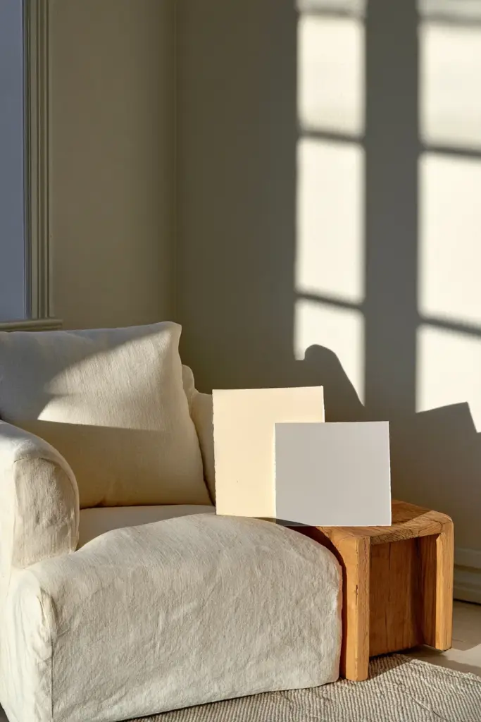
Here’s a simple test: hold a plain white sheet of paper next to your sofa, trim, or wall. If your white looks slightly yellow or creamy against it, it’s warm. If it looks slightly blue or gray, it’s cool. If there’s barely any shift at all, you’re working with a bright, true white.
If Your White Is Warm
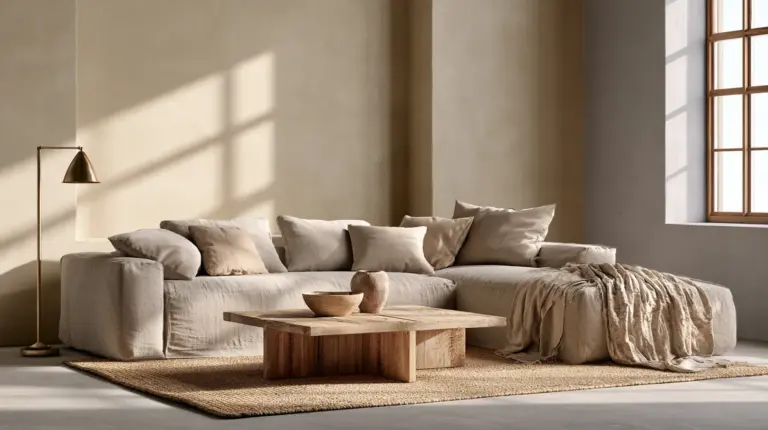
Warm whites — creamy, buttery, soft — pair beautifully with equally warm companions. Think warm greys, taupes, soft sage greens, and honey-toned woods like oak or rattan.
Avoid stark cool greys or icy blues here; they’ll fight your white instead of framing it.
If Your White Is Cool
Cool whites carry a whisper of blue or grey. They feel crisp and modern, so lean into cool greys, slate blue, or muted sage-grey greens.
Warm terracotta or golden mustard tones can look slightly off against a cool white base, so use them sparingly, if at all.
If Your White Is Bright and True
A bright white gives you the most freedom. It has almost no undertone to clash with, so you can go bold — deep navy, charcoal, or forest green — without the room feeling heavy or dull.
Best Living Room Colors With White Furniture, Sofas, and Trim
Your furniture and trim set the rules for your walls. Here’s how to work with each.
White Sofa
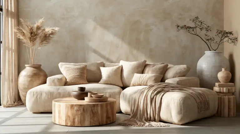
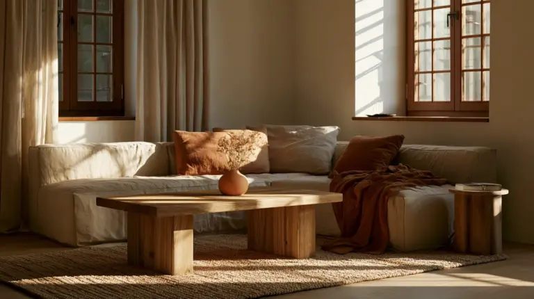
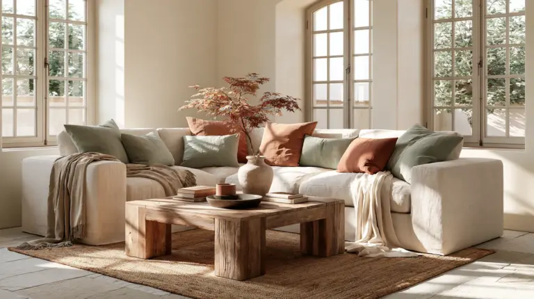
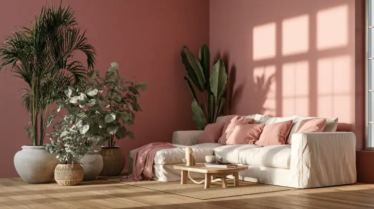
A white sofa is the heart of the room, so the wall behind it should feel like a soft exhale, not competition. Warm greige, dusty sage, or a muted terracotta all let the sofa stay the star.
Layer in a linen throw or a woven jute rug to keep the whole space feeling touchable rather than showroom-perfect.
White Cabinets or Open Shelving
White cabinetry loves contrast, but gentle contrast. Pair it with soft clay, warm taupe, or a muted olive on the surrounding wall to add depth without shouting.
Avoid painting walls in a color with the exact same undertone as your cabinets — it flattens the layered look you’re after.
White Trim Only
If your trim is your only white element, treat it as a frame. Deeper wall colors — think revere pewter, soft charcoal, or a muted forest green — will make white trim pop with quiet elegance.
Keep ceilings white or off-white to let light bounce and the room breathe.
Quick-Start Palette Picker: 8 Color Combos That Work With White
Sometimes you just want the answer. Here are eight ready-to-use palettes, each built around a mood and a room type.
| Palette | Mood | Best For | Sample Direction |
|---|---|---|---|
| White + Warm Greige + Natural Oak | Calm, grounded | Any size, warm white base | Benjamin Moore Edgecomb Gray |
| White + Sage Green + Rattan | Soft, organic | Japandi, small rooms | Benjamin Moore Saybrook Sage |
| White + Warm Taupe + Linen | Cozy, timeless | North-facing rooms | Benjamin Moore Revere Pewter |
| White + Soft Terracotta + Wood | Inviting, sunny | South-facing, bright rooms | Warm clay tones |
| White + Slate Blue + Cool Grey | Modern, crisp | Cool white base | Farrow & Ball Hague Blue (accent) |
| White + Charcoal + Brass | Sophisticated | Larger rooms | Deep charcoal accent wall |
| White + Alabaster + Warm Wood | Bright, airy | Small or low-light rooms | Sherwin-Williams Alabaster |
| White + Olive + Woven Textures | Earthy, layered | Style-forward homes | Muted olive accent |
Pick the row that matches how you want the room to feel first, then let the paint code follow.
Japandi Living Room Colors With White Walls
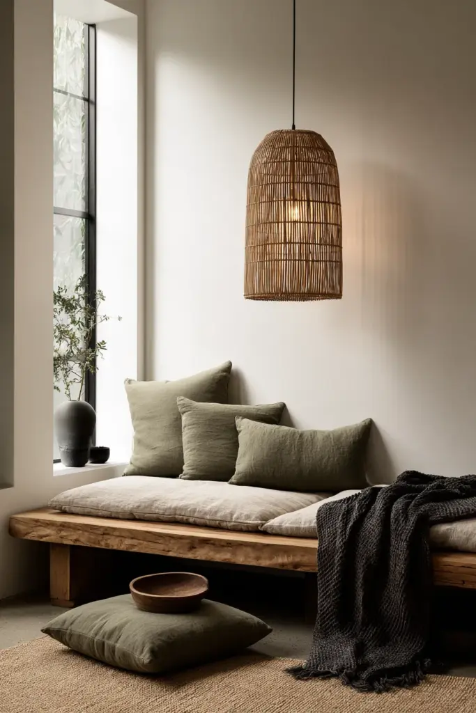
Japandi — that gentle marriage of Japanese calm and Scandinavian warmth — treats white as a resting point, not a statement. It’s one of our favorite palettes to design around at ERYLIN.
Lean into soft oat, moss green, and warm charcoal. These tones feel quiet and considered, echoing raw wood, stone, and linen.
Steer away from saturated reds, neon brights, or heavy black-on-white contrast — they pull the eye and disrupt the sense of stillness Japandi is built on.
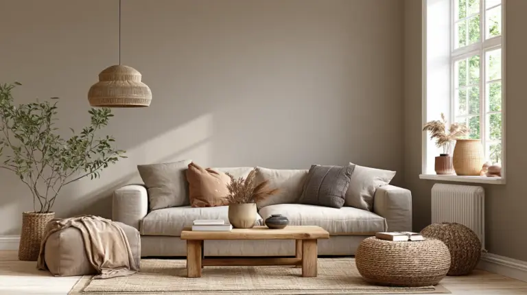
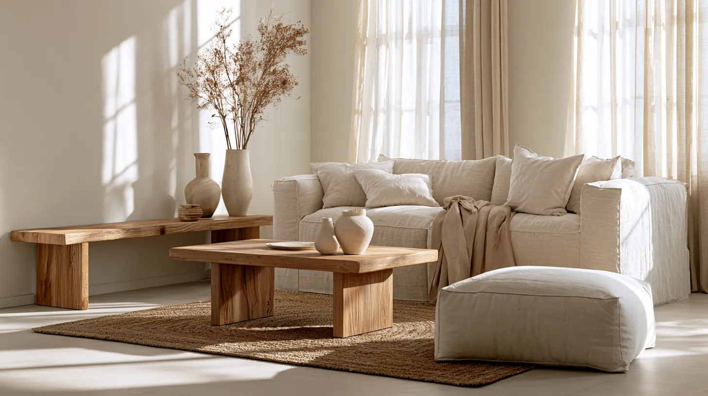
Add a low wooden bench, a woven lamp shade, or a ceramic vase with dried pampas grass, and the palette starts to feel lived-in rather than styled.
Small Living Room Colors With White: Light, Calm, and Spacious
Small rooms need color choices that expand the space rather than close it in. White gives you a head start, but the wrong accent can undo that instantly.
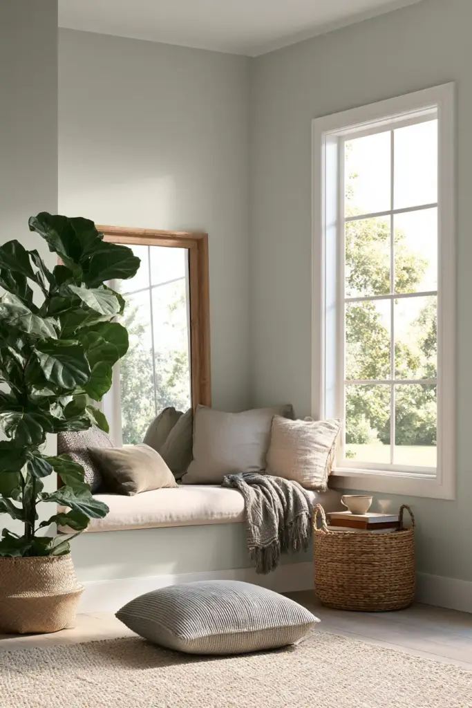
Use one gentle accent color to define a zone — a reading nook painted a shade darker, or a media wall in soft sage — rather than scattering multiple colors around the room.
A helpful formula: white + very light warm grey + one muted accent (like sage or dusty blue) keeps the room calm and spacious without tipping into bland.
Mirrors, sheer curtains, and matte-finish paint (rather than glossy) also help small rooms feel like they’re breathing, not shrinking.
Philippine-House Guide: Whites and Neutrals That Work in Bright Sunlight
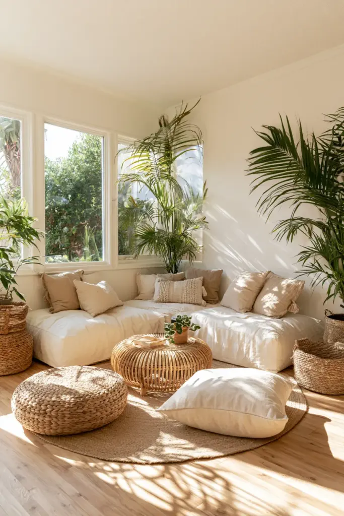
If you’re decorating in Calabarzon, Metro Manila, or anywhere with strong tropical sun, your white behaves differently than it would in a cooler, greyer climate.
Bright, direct sunlight can make cool whites look almost sterile, and it can wash out pale accent colors until they lose their character entirely.
For Philippine homes, warm whites and soft, muted neutrals tend to hold their character better under strong light. Think warm greige, soft sand, or muted sage rather than icy grey or pastel blue.
Local paint brands like National and Boysen carry warm off-white and taupe shades that work similarly to international favorites like Benjamin Moore’s White Dove or Edgecomb Gray, so you don’t need an imported can to get the look.
Test any color at three points in the day — morning, midday, and late afternoon — since tropical light shifts fast and a color that looks soft at 9am can look harsh by noon.
Color Psychology: Matching Your Palette to How You Live
Color isn’t only visual — it shapes how a room feels to live in day to day.
- Want a relaxation zone? Lean toward sage green, soft taupe, or dusty blue.
- Host often and want energy? Warm terracotta or muted mustard adds life without overwhelming.
- Watch a lot of TV? Avoid high-contrast colors directly behind the screen; a mid-tone neutral reduces eye strain.
- Work from your living room? Soft greys and warm whites support focus without feeling cold.
Practical Checks Before You Paint
A little testing now saves a repaint later. Here’s how to do it properly.
- Paint a swatch at least 12×12 inches on the wall, not just a small sample card.
- Test your top 2–3 colors next to your actual white furniture or trim, not in isolation.
- Photograph the swatch in morning, midday, and evening light to see how it shifts.
- Compare under both natural daylight and your evening lamp lighting, since lighting ideas can change a color’s entire mood.
- If the color looks flat or lifeless in every light, it likely lacks enough undertone contrast with your white.
Checklist: Key Takeaways
- Identify your white’s undertone first — warm, cool, or true — before choosing any wall color.
- Warm whites pair with warm greys, taupes, and wood tones; cool whites pair with cool greys and muted blues.
- Bright white gives the most flexibility for bold, saturated colors.
- Use one accent color per zone in small spaces to keep things calm, not cluttered.
- In tropical, sun-drenched rooms, favor warm, muted neutrals over icy or pastel tones.
- Always test swatches at multiple times of day before committing.
A Soft Place to Land
A living room isn’t finished when the paint dries. It’s finished when the light moves across the wall in the late afternoon and the whole room feels like it’s exhaling.
That’s what we chase at ERYLIN — rooms that feel gathered rather than decorated, where every color and texture earns its place.
Choose the palette that matches how you actually live, not just how a room photographs, and the rest will follow.

FAQs
What colors go well with white in a living room?
Warm greige, soft sage, muted taupe, and warm wood tones all pair naturally with white, especially when matched to your white’s undertone.
What is the best color for a living room with white furniture?
Soft, muted tones like warm greige or dusty sage work well, since they let white furniture stand out without harsh contrast.
How do I make a white living room look cozy and not cold?
Add warm wood furniture, cozy furniture with woven or linen textures, layered lighting, and a warm-undertone accent color like terracotta or oat.
What neutral colors look good with white in a Japandi living room?
Soft oat, moss green, and warm charcoal all complement white walls in a Japandi-style space without breaking its calm, minimal feel.
What wall color works best with white trim?
Deeper, warmer neutrals like revere pewter or soft charcoal make white trim stand out with a quiet, elegant contrast.