Table of Contents
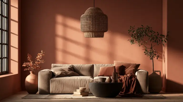
There’s a particular kind of morning light that makes a living room feel like it’s holding its breath. It slides across a linen sofa, catches the edge of a clay vase, and settles into a wall the color of warm rain. That’s the moment good color creates.
At ERYLIN, we believe color isn’t decoration. It’s mood, memory, and light working together in one room.
Complementary colors — the pairs that sit opposite each other on the color wheel — can feel intimidating. Too much contrast, and a room shouts. Too little, and it goes flat and forgettable.
This guide is your decision-making companion, not just another gallery of pretty rooms. We’ll walk through what complementary color actually means, how light and room size change everything, and how to soften bold contrast into something that feels like home.
What Complementary Colors Actually Mean in Interior Design
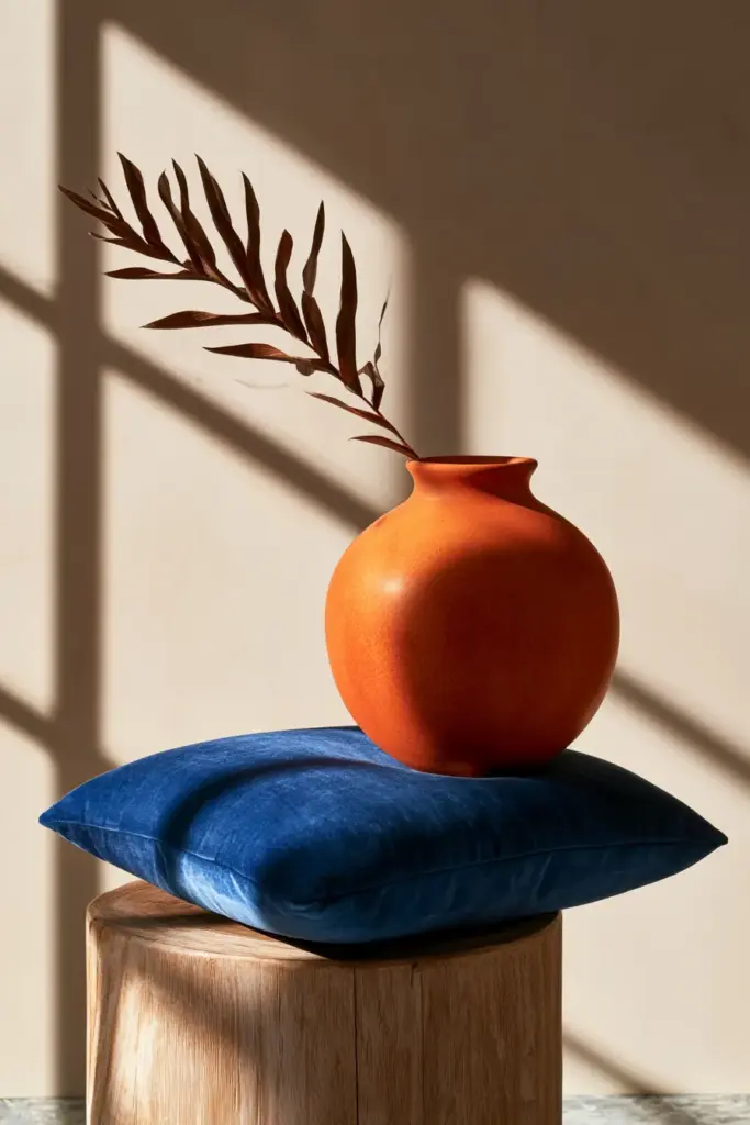
Complementary colors sit directly across from each other on the color wheel — blue and orange, red and green, purple and yellow. Together, they create natural visual tension that feels alive rather than chaotic.
In interior design, this doesn’t mean painting one wall orange and the opposite wall blue. It means layering a dominant hue with small, intentional touches of its opposite — in a rug, a set of cushions, or a piece of wall art.
The result is a room with depth. Your eye moves, rests, and moves again, instead of settling into monotony.
Warm and Cool Tones, Working Together
Every complementary pair balances a warm tone against a cool one. This warmth-coolness relationship is what makes the pairing feel resolved instead of jarring.
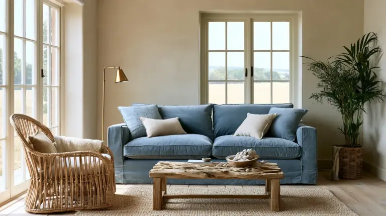
Terracotta and sage. Rust and denim blue. Mustard and plum. Each pair carries one grounding, sun-touched tone and one calming, shadowed one.
Why Undertones Matter More Than Hue
Most color mistakes aren’t about choosing the wrong hue — they’re about ignoring undertones. A warm beige paired with a cool-toned blue can feel oddly mismatched, even if both colors look “neutral” on the swatch.
Before committing to a pair, hold your fabric swatches and paint chips together in the room’s actual daylight. Undertones reveal themselves in natural light far more honestly than they do under a store’s fluorescent bulbs.
Best Complementary Color Pairs for Living Rooms
Some pairings simply belong together in a living space. Here’s a quick reference table for the moods we return to again and again.
| Mood | Complementary Pair | Best For |
|---|---|---|
| Calm & Restorative | Sage green + soft terracotta | North-facing rooms, reading corners |
| Cozy & Grounded | Rust + dusty denim blue | Family rooms, evening gatherings |
| Dramatic & Elegant | Deep plum + warm mustard | Formal living rooms, statement walls |
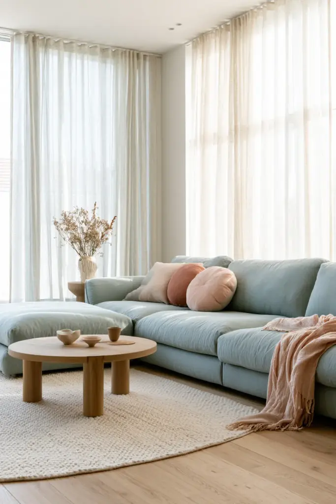
| Airy & Light | Powder blue + blush clay | Small apartments, sun-filled rooms |
| Japandi-Friendly | Charcoal + soft ochre | Minimalist, texture-forward spaces |
Each of these pairs works because one color leads and the other supports — never a fifty-fifty fight for attention.
Calm and Restorative: Sage and Terracotta
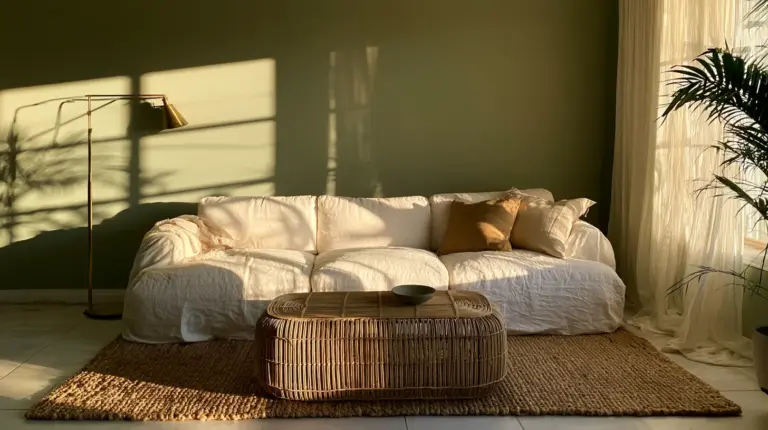
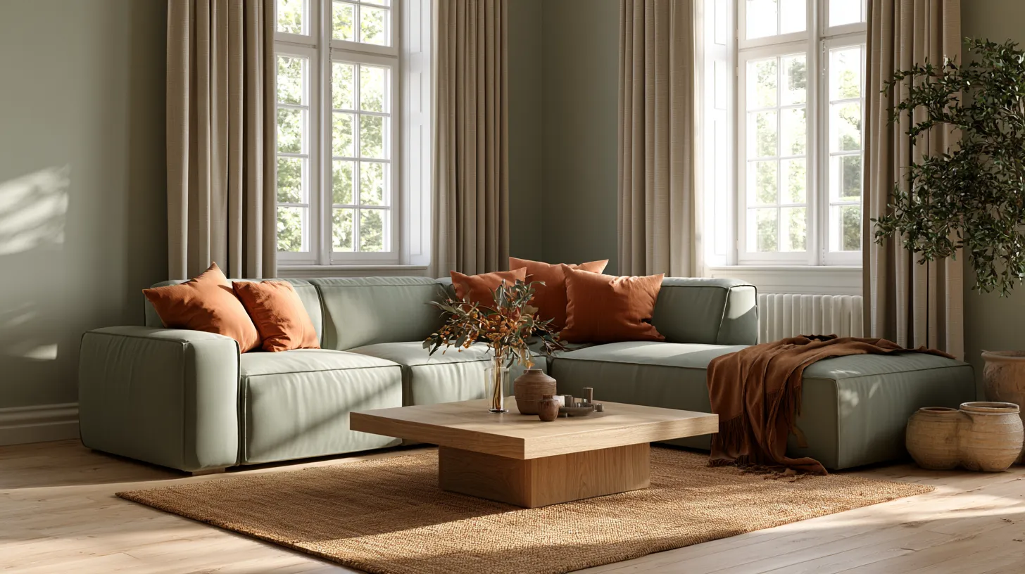
Picture a linen sofa in muted sage, warmed by a terracotta throw folded across the armrest. This pairing feels like an afternoon spent somewhere slow and sunlit.
Add a woven jute rug and unglazed ceramic pottery to keep the palette breathing.
Dramatic and Elegant: Plum and Mustard
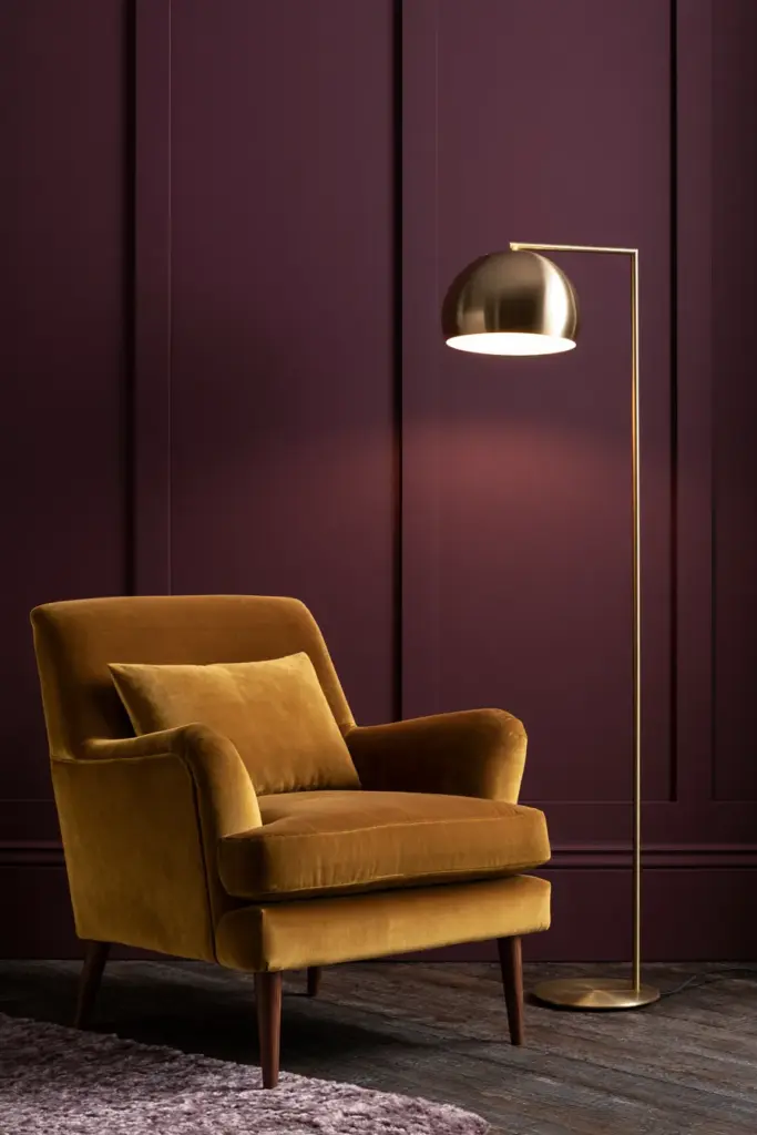
Deep plum walls paired with mustard velvet cushions create a room that feels rich without tipping into heavy. This combination loves brass fixtures and warm, low lighting ideas that pool rather than flood.
Keep the plum on just one wall or the sofa upholstery, letting mustard appear only in smaller accents.
How to Choose the Right Pair by Room Size and Light
Color behaves differently depending on where the sun lands and how much space it has to move through.
North-Facing Rooms
North-facing living rooms receive cool, indirect light most of the day. Lean into warm complementary pairs — terracotta, rust, mustard — to counteract the natural coolness and keep the space from feeling flat or clinical.
South-Facing Rooms
South-facing rooms are flooded with warm, golden light for much of the day. Cooler pairings like denim blue and blush, or sage and clay, stay balanced instead of turning overly warm or saturated by afternoon.
Small and Dark Living Rooms
In compact spaces, full-saturation complementary pairs can overwhelm quickly. Choose one muted, dominant tone for walls and larger furniture, then let the complementary color appear only in small doses — a vase, a cushion, a single framed print.
How to Balance Contrast With Neutrals and Texture
The secret to complementary color that feels sophisticated rather than loud is restraint. This is where the classic 60-30-10 rule becomes your best design friend.
- 60% — your dominant neutral or muted tone (walls, large upholstery)
- 30% — your secondary complementary color (rug, curtains, an accent chair)
- 10% — a bold pop of true, saturated complementary color (cushions, art, ceramics)
This ratio keeps contrast intentional instead of accidental. Your eye always has somewhere calm to land.
Softening Contrast With Natural Materials
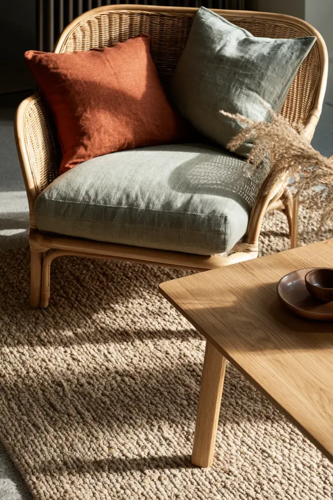
Wood, linen, and wool naturally mute color intensity, which is exactly why modern rustic rooms feel so effortless. A rattan chair or oak coffee table between two contrasting colors acts like a visual pause.
Layer in raw-edge textiles and unbleached cotton to let the palette breathe. Texture does half the balancing work that color alone cannot.
Using Complementary Colors Beyond the Walls
Complementary color doesn’t have to start with paint. Try building the palette through your cozy furniture first — a rust-toned boucle sofa against sage green curtains creates the pairing without touching a single wall.
Rugs, throw pillows, and wall art are lower-commitment ways to experiment before repainting anything.
Mistakes to Avoid With Complementary Colors
Even well-intentioned pairings can go wrong without a little discipline.
- Don’t use two fully saturated complementary colors with no neutral break between them — the room will visually vibrate rather than relax.
- Do let one color lead and the other support, following the 60-30-10 ratio.
- Don’t ignore undertones when matching “neutral” pieces to your accent color.
- Do test paint and fabric swatches in the room’s actual daylight, morning and evening.
- Don’t forget texture — flat, matte-on-matte pairings feel harsher than layered, tactile ones.
Budget-Friendly Palette Ideas Using Paint Alone
You don’t need a full furniture overhaul to enjoy complementary color. A single accent wall in rust, paired with existing sage or olive textiles, can transform a room for the cost of one paint can.
For renters or small apartments, painted terracotta plant pots, a mustard-framed mirror, or a single plum throw blanket introduce the pairing without any permanent commitment.
Quick Checklist: Choosing Your Complementary Living Room Palette
- Identify your room’s natural light direction before choosing hues
- Choose one dominant color and one true complementary accent
- Apply the 60-30-10 ratio for balance
- Check undertones in daylight, not store lighting
- Introduce natural materials — wood, linen, wool — to soften contrast
- Start small with textiles before committing to paint
- Keep saturated complements to accents only, never two full walls
A Soft Place to Land
A living room isn’t just where color lives — it’s where the day quietly ends. The right complementary palette doesn’t demand attention; it simply makes the room feel like it was always meant to hold you.
Let your walls whisper instead of shout, and let one perfect accent do the talking. That’s the ERYLIN way — calm, considered, and quietly beautiful.
Frequently Asked Questions
What are complementary colors in interior design?
Complementary colors are pairs that sit opposite each other on the color wheel, such as blue and orange or green and red. In interior design, they’re used in unequal proportions to create balanced contrast rather than a fifty-fifty clash.
How do you use complementary colors in a living room?
Choose one dominant tone for walls and large furniture, then introduce its complementary color through smaller elements like cushions, rugs, or art. Following the 60-30-10 ratio keeps the pairing intentional rather than overwhelming.
What is the 60-30-10 rule for living room colors?
It’s a simple ratio: 60% dominant color, 30% secondary color, and 10% bold accent. This keeps complementary pairings visually balanced instead of competing for attention.
Should a living room be warm or cool toned?
It depends on your room’s natural light. North-facing rooms benefit from warm tones to counter cool daylight, while south-facing rooms often look best with cooler tones to balance strong golden light.
What colors go with gray, beige, or white living room walls?
Neutral walls pair beautifully with warm complementary accents like terracotta, rust, or mustard, or cooler accents like sage and dusty blue, depending on the room’s undertone and light direction.