Table of Contents
A monochromatic living room should feel like a held breath — quiet, warm, and complete. It’s the kind of space that doesn’t shout for attention, yet you never want to leave it.
Done well, one color can hold an entire room together. Done poorly, it can flatten a space into something cold and forgettable.
The difference isn’t the color you choose. It’s how you layer it.
At ERYLIN, we believe monochrome isn’t about matching — it’s about depth within restraint. This guide walks you through the exact decisions that separate a flat, builder-grade room from one that feels curated, tactile, and alive.
What Is a Monochromatic Color Scheme, Really?
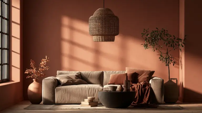
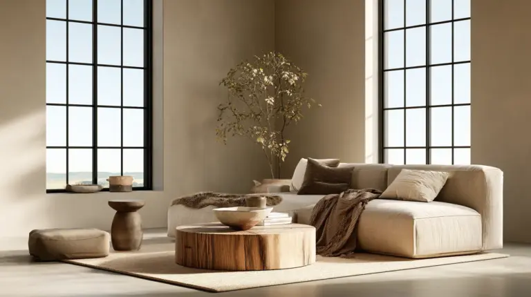
A monochromatic color scheme uses variations of a single hue — different tints, tones, and shades of one color family — rather than mixing several distinct colors together. Think soft clay walls, a warm caramel sofa, and rust-toned pillows, all living in the same color story.
It’s not about painting everything the exact same shade. It’s about staying within one family while letting the values shift lighter, darker, warmer, and cooler.
This is what gives monochrome rooms their calm, cohesive feeling — and why they photograph so beautifully in lighting ideas that highlight texture over contrast.
Step 1: Choose Your Base Color With Intention
Every monochromatic room starts with one anchor color — usually the wall color, since it sets the emotional tone for everything else.
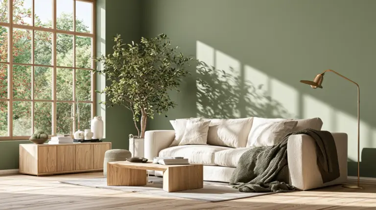
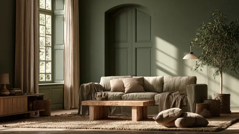
Warm neutrals like greige, soft brown, and warm beige feel inviting and grounded. Cooler options like blue-gray or muted sage feel serene and a little more modern.
Consider how much natural light your room receives before committing. A north-facing room with limited light will read cooler and flatter than a south-facing room with golden afternoon sun.
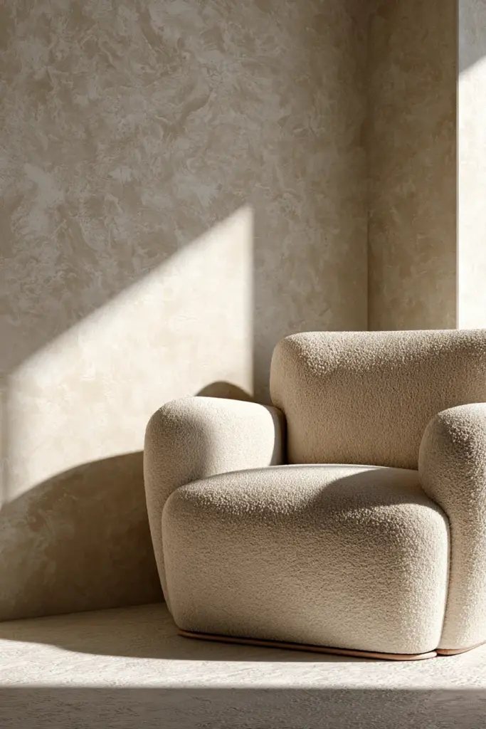
Warm Monochrome vs. Cool Monochrome
| Palette Type | Best For | Signature Colors | Mood |
|---|---|---|---|
| Warm Monochrome | Low-light rooms, cozy homes | Terracotta, caramel, warm beige | Grounded, inviting |
| Cool Monochrome | Bright, sunny rooms | Blue-gray, sage, soft charcoal | Calm, airy |
| Neutral Monochrome | Small or transitional spaces | Greige, oatmeal, dove white | Timeless, flexible |
Step 2: Match Your Undertones Before Anything Else
This is the step most home decorators skip — and it’s the reason so many monochrome rooms feel off without anyone knowing why.
Undertones are the subtle color beneath the visible color. A “white” paint can lean pink, yellow, or gray depending on its undertone, and mixing warm-undertone whites with cool-undertone grays creates visual static, even if both colors look neutral on their own.
Before buying anything, hold your paint swatch, fabric samples, and wood tones together in the room’s actual daylight. If something feels quietly wrong, it’s almost always a clashing undertone.
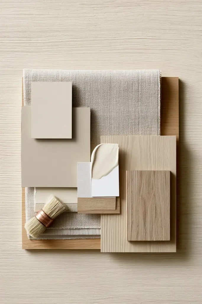
Step 3: Layer Light-to-Dark Values Like a Gradient
A one-note room reads flat. A room with three to five values of the same color reads intentional.
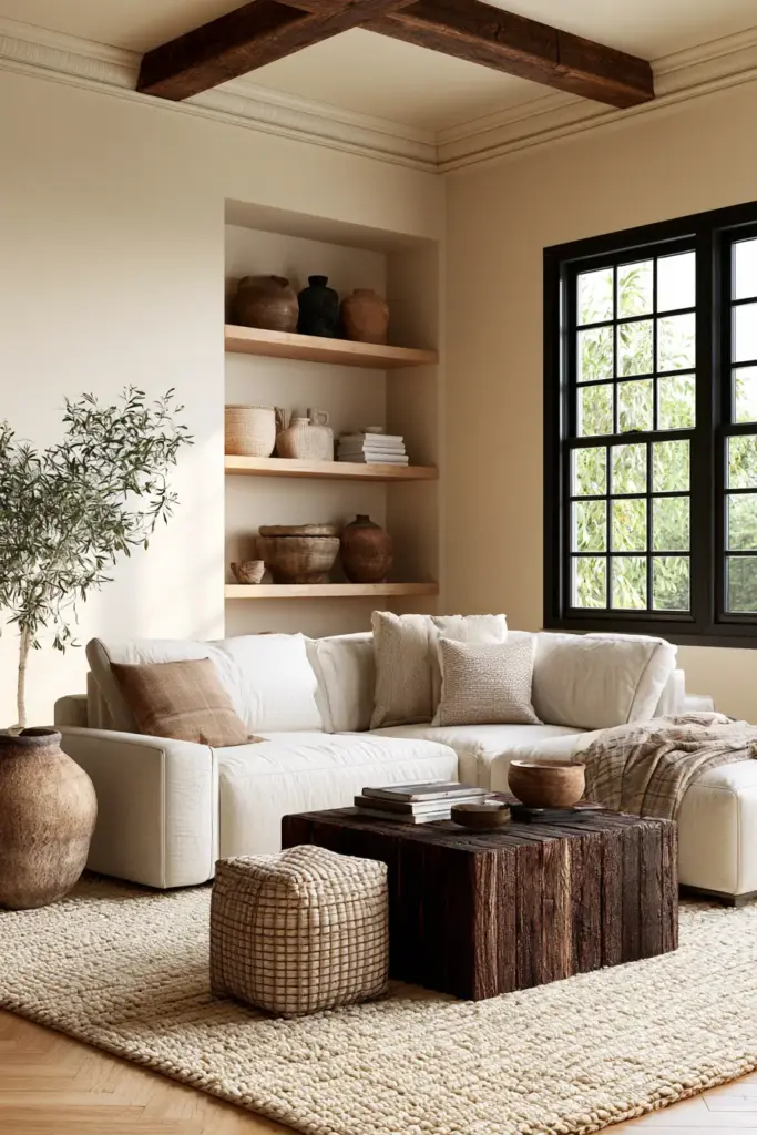
Start with your lightest value on the largest surfaces — walls and ceiling. Move to a mid-tone for your sofa or rug, then finish with your darkest value in small, deliberate doses: a coffee table, picture frames, or a set of cozy furniture legs in a rich espresso wood.
How Many Shades Should You Use?
As a general rule, aim for three to five distinct values within your chosen color family:
- Lightest — walls, ceiling, sheers
- Light-mid — large upholstery, rugs
- Mid — accent chairs, drapery
- Dark-mid — wood furniture, frames
- Darkest — small accents, lamp bases
This range gives the eye enough movement to stay interested without ever leaving the color family.
Step 4: Let Texture Do the Talking
Texture is the single biggest reason some monochrome rooms feel rich and others feel sterile. When color variation is limited, your materials have to carry the visual interest instead.
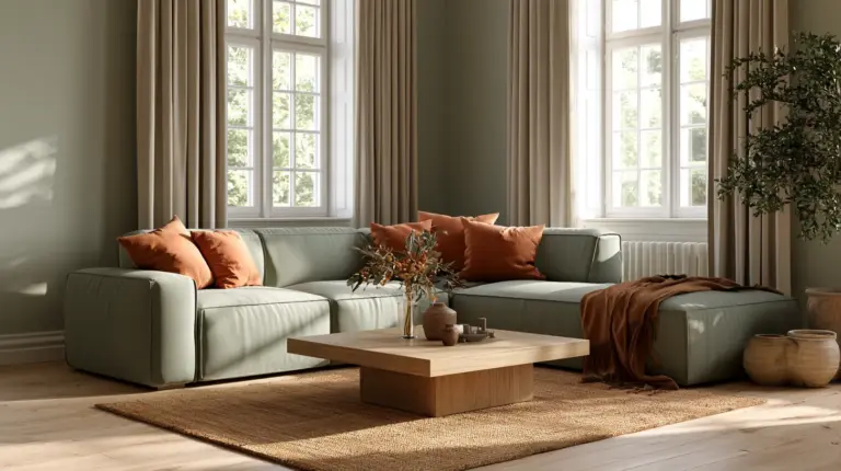
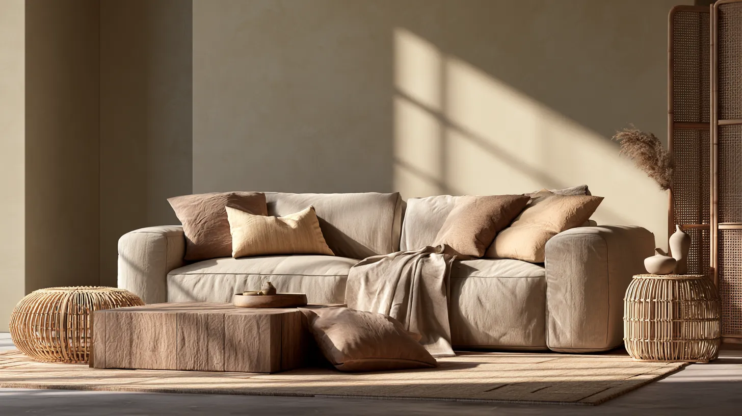
Mix matte and shine deliberately. A linen sofa, a velvet cushion, a rattan chair, and a brushed-metal lamp can all live in the same beige family and still feel completely distinct from one another.
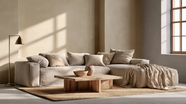
Natural materials do heavy lifting here, too. Wood grain, woven jute, boucle, and raw stone all catch light differently, which keeps a single-color room from ever looking flat under changing daylight.

Materials That Add Depth Without Adding Color
- Linen and boucle for soft, matte warmth
- Velvet or silk-blend pillows for gentle sheen
- Rattan or wicker for organic texture
- Brushed brass or matte black for quiet contrast
- Raw wood or stone for grounding weight
Step 5: Choose the Right Sheen for Walls vs. Trim
Sheen is texture’s quiet partner, and it’s often overlooked entirely. Using the same paint sheen on walls, trim, and ceiling is one of the fastest ways to make a monochrome room look one-dimensional.
A general approach: use matte or eggshell on walls, satin on trim and doors, and semi-gloss on any millwork you want to highlight. The shift in light reflection creates dimension even when the color itself never changes.
This small technical detail is often what separates a designer-styled monochrome room from a DIY attempt that “just doesn’t look right.”
Step 6: Use Black, White, and Wood as Neutral Connectors
Here’s a common question: can you use black and white in a monochromatic scheme? Yes — and you often should.
Black and white aren’t technically colors in the pigment sense, which makes them flexible connectors across almost any monochrome palette. A black metal lamp, white ceramic vase, or black-framed mirror can ground a warm beige room without breaking the color story.
Wood tones function the same way. A natural oak floor or walnut console reads as a neutral bridge rather than a competing hue, which is why almost every successful monochrome room includes at least one warm wood element.
Small Spaces and Low-Light Rooms: Special Considerations
Monochrome is often more forgiving in small living rooms, not less — because it removes the visual chopping that happens when multiple colors compete for attention in a tight footprint.
For small or low-ceiling rooms, keep your lightest value on walls and ceiling to maintain a sense of openness, and reserve your darkest values for furniture and accents rather than large surfaces.
In low-light rooms, lean warm. Cool grays and blues can turn muddy or flat without strong natural light, while warm beiges and clays hold their richness even under lamp light in the evening.
Renter-Friendly and Budget-Friendly Monochrome
You don’t need to repaint every wall to build a convincing monochromatic scheme, which is good news if you’re renting or working with a tighter budget.
Start with textiles: a tonal throw, matching pillow covers, and a rug in your chosen family will do more visual work than paint alone. Add a peel-and-stick wallpaper panel or a single accent wall if your lease allows it, and let furniture and accessories carry the rest of the palette.
Secondhand wood furniture is one of the easiest budget wins here, since natural wood grain slots into almost any warm monochrome scheme without needing to match a specific shade.
Common Mistakes That Make Monochrome Look Flat
Do this: vary your values, mix matte and glossy finishes, and bring in at least one natural material like wood, stone, or woven fiber.
Not this: paint every surface the identical shade, skip texture entirely, or rely only on paint sheen without varying scale and material.
A monochrome room without variation in value, finish, or material will always read as unfinished, no matter how beautiful the base color is on its own.
Quick Checklist: Building a Monochromatic Living Room
- Choose one base color family and confirm undertones match across paint, fabric, and wood
- Layer three to five values from light to dark
- Mix at least three textures (matte, sheen, natural fiber)
- Vary paint sheen between walls, trim, and millwork
- Add one black or white accent as a neutral connector
- Include a natural wood or stone element for grounding
- For small or low-light rooms, keep walls light and reserve dark tones for accents
- Use textiles and secondhand pieces for a renter-friendly, budget-conscious version
A Room That Feels Like a Deep Breath
The most beautiful monochromatic rooms don’t ask to be noticed. They simply hold you — through soft light on linen, the quiet weight of wood, the gentle sheen of a painted trim catching afternoon sun.
That’s the real goal of monochrome decorating: not sameness, but harmony. A living room that feels finished, considered, and entirely, calmly yours.
Frequently Asked Questions
What is a monochromatic color scheme?
A monochromatic color scheme uses different tints, tones, and shades of a single color family, rather than combining multiple distinct hues, to create a cohesive, layered look.
How do you decorate a monochromatic living room?
Choose one base color, match undertones across all materials, layer three to five values from light to dark, and mix textures like linen, velvet, wood, and metal to add depth.
How do you keep a monochromatic room from looking flat?
Vary your paint sheen, mix matte and glossy textures, include a natural material like wood or stone, and use at least three distinct value levels within your color family.
What colors work best in a monochromatic living room?
Warm beige, greige, soft brown, muted sage, and blue-gray are among the most popular and reliable choices, since they hold their tone well across different lighting conditions.
Is monochromatic decorating good for small living rooms?
Yes. It often works better in small spaces because it eliminates visual clutter from competing colors, especially when lighter values are used on the largest surfaces like walls and ceilings.