Table of Contents
There’s a moment when you step into a room and something just feels right. The light pools warmly across the floor. Your shoulders drop. You exhale.
Often, that feeling begins beneath your feet—with a rug whose color speaks to something deeper than design. Color isn’t just decoration; it’s dialogue. It whispers to your nervous system, influences your mood, and quietly shapes how you live in a space.
In the living room, where life unfolds in layers—morning coffee, evening conversations, Sunday stillness—your rug becomes an anchor. Its color sets the emotional tone for everything that happens there. Understanding color psychology transforms rug selection from aesthetic choice to intentional wellness.
Let’s explore how the hues beneath your feet can nurture calm, spark creativity, or wrap your space in warmth.
Why Color Psychology Matters in Living Room Design
Your brain processes color before it registers shape or form. Within milliseconds, a shade triggers associations, memories, and physiological responses. Heart rate shifts. Cortisol levels adjust. Attention sharpens or softens.
Research in environmental psychology shows that color exposure influences mood, productivity, and even social behavior. In living spaces, where we spend hours unwinding and connecting, these effects accumulate. A rug—covering significant visual real estate—becomes a primary color influencer in your room.
The living room rug sits at eye level when seated, grounds furniture arrangements, and frames movement through space. Its color doesn’t just complement your sofa; it shapes how you feel on that sofa. This is where science meets sanctuary.
The Science Behind Color and Emotion
Color perception happens through a fascinating cascade. Light wavelengths hit the retina, triggering neural pathways to the limbic system—your brain’s emotional command center. Simultaneously, signals reach the hypothalamus, which regulates stress hormones and circadian rhythms.
Different wavelengths create measurably different effects. Studies document that blue light exposure (440-495nm wavelength) increases alertness and can reduce anxiety by up to 12% in controlled environments. Warm spectrum colors (600-700nm) stimulate appetite and social warmth, raising ambient temperature perception by 2-4 degrees Fahrenheit.
In interior spaces, these responses compound through prolonged exposure. A blue rug in your living room doesn’t just look cool—it physiologically encourages relaxation. Understanding these mechanisms helps you design with purpose, not just preference.
Warm Tones: Creating Energy and Connection
Red Rugs: Passion and Vitality
Red speaks to primal energy. It quickens the pulse, stimulates conversation, and draws the eye with magnetic intensity. In living rooms designed for gathering and celebration, red rugs create instant warmth and drama.
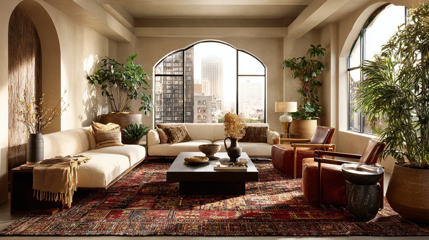
Consider a deep burgundy Persian rug anchoring a seating area with rich leather and brass accents. The space feels collected, worldly, alive. Or imagine a coral-red flatweave bringing Mediterranean heat to whitewashed walls and natural linen.
Red works beautifully in social living rooms but requires balance. Pair it with neutral furniture to prevent overwhelm. Use it when you want your space to energize rather than soothe. Evening gatherings, lively conversation, creative collaboration—red supports it all.
Orange Rugs: Optimism and Appetite
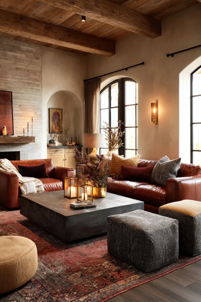
Orange combines red’s energy with yellow’s cheerfulness, creating inviting, sociable spaces. It’s the color of sunset, autumn leaves, and fired clay—earthy yet uplifting. Orange rugs make living rooms feel welcoming without the intensity of pure red.
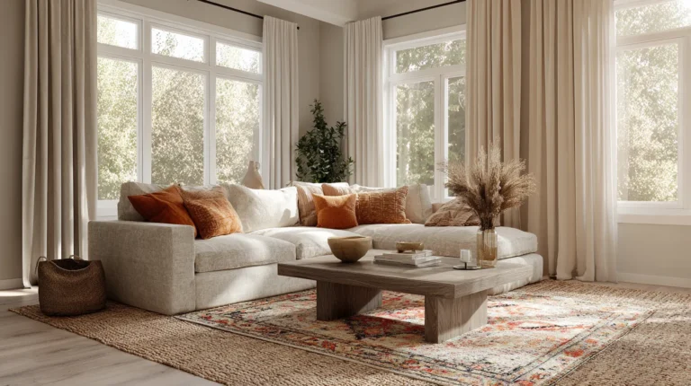
A terracotta Moroccan rug brings warmth to minimalist Scandinavian furniture. Rust-toned vintage kilims add depth to modern spaces with their weathered, collected quality. Burnt orange grounds bohemian living rooms filled with plants and textured throws.
Psychologically, orange enhances appetite and conversation. It’s ideal for open-plan living-dining spaces where connection happens around food. The color encourages participation, making shy guests feel included and sparking animated discussion.
Yellow Rugs: Clarity and Joy
Yellow activates analytical thinking while simultaneously uplifting mood—a rare dual effect. Soft yellows evoke morning light and butter-cream warmth. Deeper golds suggest richness and timeless elegance.
A butter-yellow wool rug brightens basement living rooms starved for natural light. Golden-ochre runners add warmth to long, narrow spaces. Pale lemon brings Scandinavian simplicity to life, especially paired with white walls and blond wood.
Research indicates yellow stimulates the nervous system, increasing focus and mental clarity. It’s excellent for living rooms that double as workspaces or creative zones. However, overly bright yellows can cause agitation. Choose muted, creamy yellows for everyday comfort.
Cool Tones: Fostering Calm and Clarity
Blue Rugs: Serenity and Focus
Blue remains the most universally calming color across cultures. It lowers blood pressure, slows respiration, and encourages introspective calm. For living rooms designed as retreats from daily chaos, blue rugs provide instant tranquility.
Navy grounds traditional spaces with sophisticated restraint. Sky blue opens up small rooms, creating airiness and peace. Teal bridges cool and warm, offering calm with personality. Denim-blue vintage rugs bring casual comfort to family-focused living rooms.
Studies show blue environments reduce cortisol levels by measurable margins within 20-30 minutes. It’s ideal for meditation corners, reading nooks, or living rooms where relaxation takes priority. Pair blue rugs with warm wood tones and soft lighting to prevent coldness.
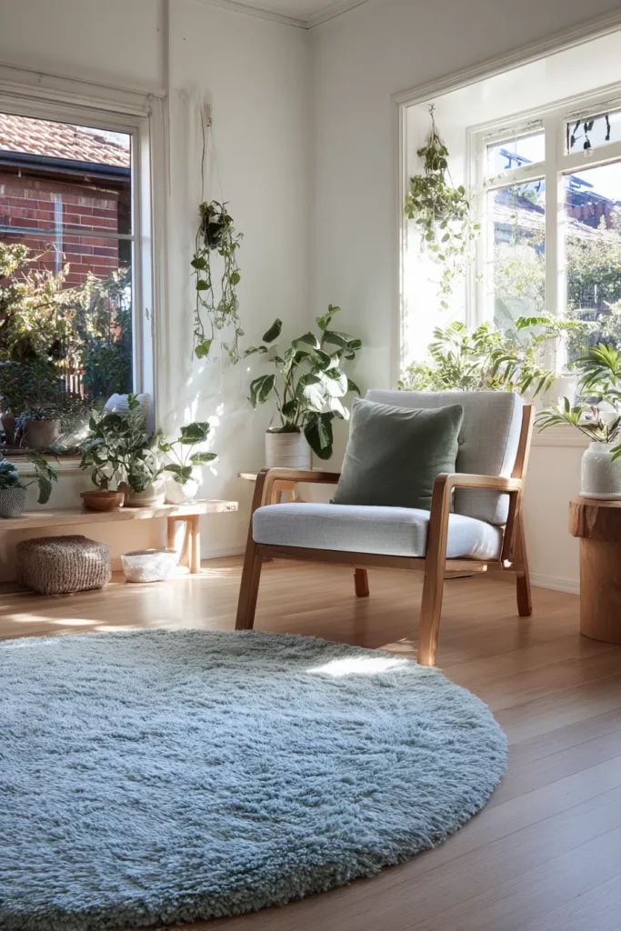
Green Rugs: Balance and Renewal
Green connects us to nature—our most fundamental source of wellbeing. It occupies the center of the visible spectrum, creating visual balance that feels inherently harmonious. Green rugs bring the restorative qualities of the outdoors inside.
Sage green flatweaves complement modern rustic interiors with their subtle, grounding presence. Forest green vintage rugs add drama and depth to spaces with high ceilings. Olive-toned natural fiber rugs enhance organic, plant-filled living rooms.
Green has documented stress-reduction properties similar to blue but with added vitality. It encourages growth, renewal, and emotional equilibrium. Perfect for living rooms where families regroup after busy days, green creates sanctuary without sedation.
Purple Rugs: Creativity and Depth
Purple combines blue’s calm with red’s energy, creating sophisticated spaces that stimulate creativity while maintaining serenity. Historically associated with luxury and spirituality, purple rugs bring depth and distinction.
Lavender introduces gentle color to neutral palettes without overwhelming. Deep plum or eggplant creates moody elegance in living rooms with strong architectural features. Mauve offers vintage charm, especially in spaces with antique furniture and warm metallics.
Purple activates creative thinking and problem-solving. It suits living rooms used for artistic pursuits, deep conversation, or contemplative activities. Balance purple’s intensity with cream, gray, or natural materials to prevent it from dominating.
Neutral Tones: The Foundation of Flexibility
Beige and Cream: Timeless Warmth
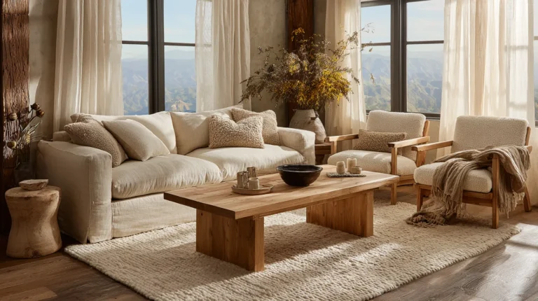
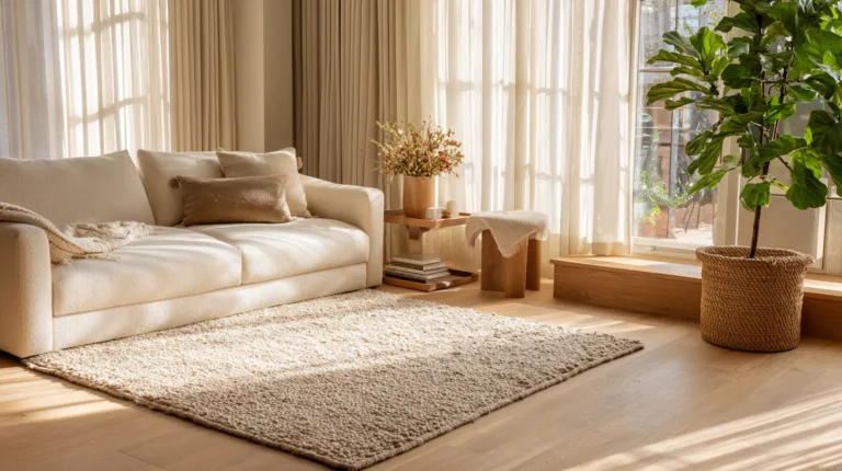
Neutrals aren’t absence of color—they’re sophisticated restraint. Beige, cream, and ivory create serene foundations that let other elements shine. They reflect light beautifully, making rooms feel larger and more luminous.
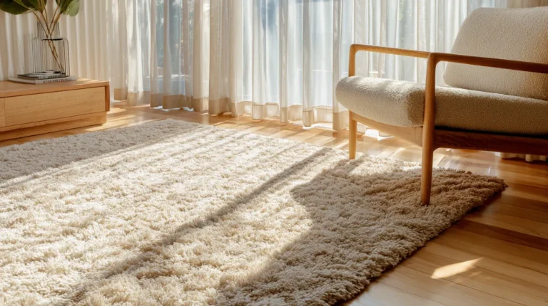
A natural jute rug brings texture and earthiness. Cream wool adds softness underfoot. Beige flatweaves provide durability and quiet elegance. These rugs work everywhere because they don’t compete—they support.
Psychologically, neutrals reduce cognitive load. Your brain doesn’t have to process strong color stimuli, creating effortless calm. They’re ideal for minimalist living rooms or spaces where art, books, or views deserve focus.
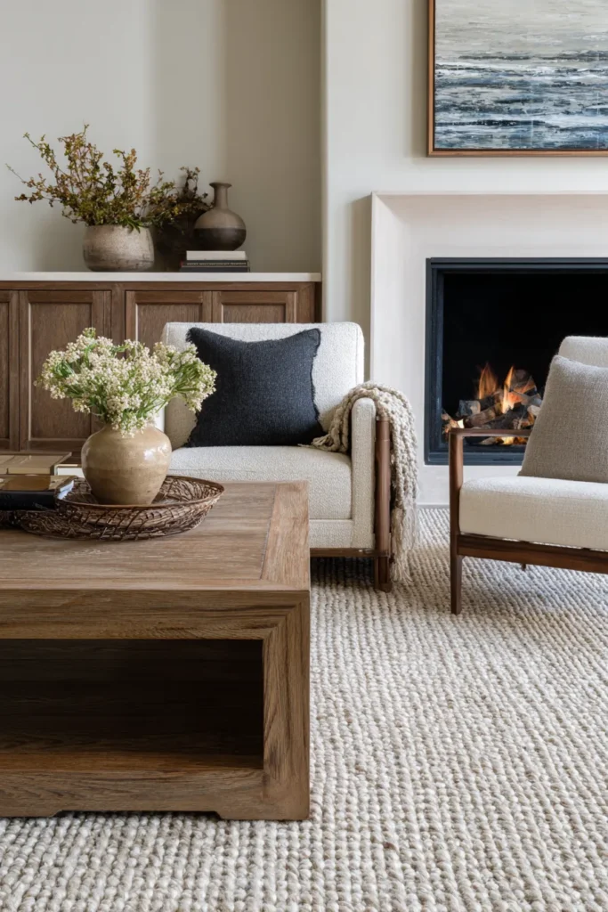
Gray: Modern Sophistication
Gray ranges from dove to charcoal, offering coolness with versatility. It’s urban, contemporary, and endlessly adaptable. Gray rugs provide clean backdrops for colorful furniture or create monochromatic serenity.
Light gray opens up space visually. Dark gray adds grounding weight. Mid-tone gray balances beautifully with both warm and cool accent colors. Heathered gray blends multiple tones, adding subtle visual interest.
Gray promotes mental clarity and focus without blue’s coolness or beige’s warmth. It’s neutral territory—ideal for living rooms serving multiple functions or households with diverse taste preferences.
Black and White: Dramatic Clarity
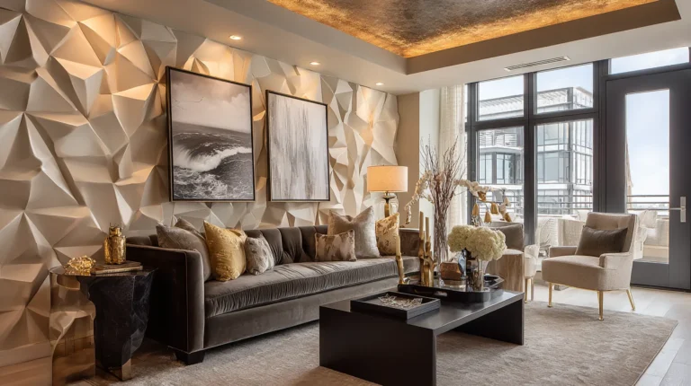
High-contrast rugs make bold statements. Black grounds spaces with definitive edges. White expands and brightens. Together, they create graphic drama that transcends trends.
Black wool rugs define seating areas in open-plan spaces. White Moroccan rugs brighten boho-modern living rooms. Black-and-white geometric patterns add visual energy to minimalist interiors. Striped designs guide the eye and elongate space.
Psychologically, high contrast increases alertness and definition. These rugs work in design-forward living rooms where intentionality matters. They’re less suited to relaxation-focused spaces, where softer gradations create ease.
Texture and Color: The Multi-Sensory Experience
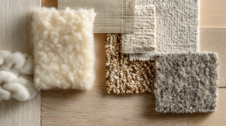
Color psychology intensifies through texture. A navy velvet rug feels luxurious and enveloping—maximizing blue’s calming effect. The same blue in sisal feels crisp and coastal—introducing refreshing energy.
Plush textures enhance warm colors’ coziness. High-pile burgundy rugs invite barefoot padding and floor seating. Flatweaves in the same shade feel more formal and intentional. Texture modulates color psychology, adding sensory dimension.
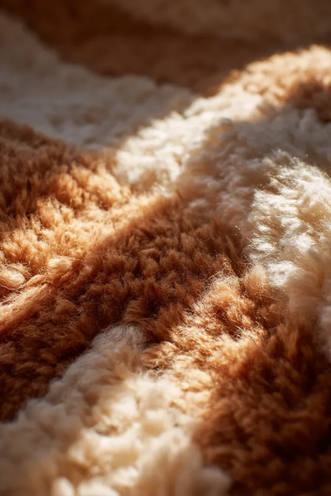
Consider how light interacts with texture too. Shag rugs catch light in their fibers, making colors appear luminous and alive. Flat weaves reflect light cleanly, rendering colors more saturated. Hand-knotted wool adds subtle variation, preventing color from feeling flat.
The combination creates embodied experience. Your feet register softness. Your eyes process color. Together, they signal comfort, luxury, formality, or ease. This multi-sensory integration amplifies psychological impact exponentially.
Lighting and Color: The Dynamic Relationship
Rug color transforms throughout the day as light shifts. Morning sun warms cool grays. Evening lamps deepen burgundy to wine. Overhead lighting flattens color; ambient lighting creates depth.
Natural light reveals true color. North-facing rooms cast blue undertones, cooling warm rugs. South-facing rooms intensify yellows and reds. Consider your room’s light when selecting rug colors—what looks perfect in the store may read differently at home.
Layered lighting amplifies color psychology. Table lamps add pools of warmth, making red rugs feel more intimate. Floor lamps create upward glow, softening blue’s coolness. Dimmer switches let you adjust the emotional tone by controlling how dramatically colors present.
Test rug samples in your actual space at different times. Note morning light, afternoon shadows, evening ambiance. Choose colors that serve your space across all lighting conditions, or select intentionally for your primary use time.
Room Function and Color Choice: A Practical Guide
Different activities benefit from different color psychology. Matching rug color to room function creates spaces that truly serve their purpose.
Conversation-Focused Living Rooms: Warm oranges, soft yellows, and gentle corals encourage openness and dialogue. These colors reduce social barriers and create welcoming energy. Pair with comfortable seating and warm lighting.
Relaxation Retreats: Blues, greens, and lavenders promote stress reduction and tranquility. These spaces benefit from soft textures, minimal patterns, and calming neutrals. Think sanctuary over stimulation.
Multi-Functional Spaces: Neutrals or muted mid-tones provide flexibility. Gray-greens, warm beiges, and soft grays adapt to various activities without overwhelming any single function. They’re the chameleons of color psychology.
Creative Living Rooms: Jewel tones—emerald, sapphire, amethyst—stimulate imagination while maintaining sophistication. These colors work beautifully in spaces dedicated to music, art, reading, or contemplation. Balance bold colors with neutral furniture.
Lifestyle and Personality: Choosing Colors That Reflect You
Your rug should resonate with who you are and how you live. Color preferences often align with personality traits and lifestyle needs.
Social Butterflies: Warm, energetic colors suit extroverted households. Reds, oranges, and warm yellows support your love of gathering and celebration. These colors match your energy and encourage connection.
Contemplative Souls: Cool, muted tones align with introspective personalities. Blues, greens, and soft grays create the quiet you crave. These colors support depth, thoughtfulness, and peaceful solitude.
Creative Spirits: Unusual color combinations and jewel tones reflect artistic sensibilities. Purple, teal, or deep rose speak to your need for inspiration. Don’t shy from colors that feel distinctive—they’re part of your voice.
Practical Families: Durable neutrals in forgiving tones (grays, beiges, heathered blends) serve busy households. These colors hide wear while providing calm foundations. They grow with changing needs and tastes.
Pattern, Color, and Psychological Impact
Pattern complexity interacts with color to create layered psychological effects. Solid colors make bold, clear statements. Patterns introduce movement, tradition, or playfulness.
Geometric patterns in contrasting colors increase alertness and visual energy. They suit modern spaces prioritizing clarity and definition. Floral or organic patterns in muted colors promote relaxation and naturalistic calm.
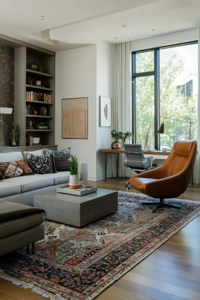
Traditional Persian patterns in jewel tones create richness and cultural depth. The complexity engages the eye, making spaces feel collected and intentional. Tribal patterns in earthy tones ground spaces with primal, authentic energy.
When patterns combine multiple colors, consider which shade dominates visually. A primarily blue rug with red accents will still read as calming with energy pops. A red rug with blue details projects warmth first, serenity second.
Color Trends 2025: Contemporary Palette Directions
Current rug color trends reflect broader cultural movements toward sustainability, wellness, and authenticity. Earth tones dominate—terracotta, olive, rust, and clay. These colors connect interiors to nature’s palette, promoting grounding and calm.
Sage green leads as the most popular choice, bridging neutral and color. It works across styles—modern, rustic, traditional—and pairs beautifully with both warm woods and cool metals. Sage signals sophistication without pretension.
Warm grays with taupe undertones replace cool grays, adding softness. These hues feel more organic, less industrial. They support cocooning interiors designed for comfort and retreat.
Muted jewel tones—dusty rose, soft teal, mauve—add personality without overwhelming. They satisfy the desire for color while maintaining serenity. These shades work in maximalist and minimalist spaces alike, adapting through styling.
Practical Checklist: Choosing Your Perfect Rug Color
- Identify your room’s primary function: Relaxation, socializing, creativity, or multi-purpose
- Assess natural lighting: Note morning, afternoon, and evening light quality
- Consider existing color palette: Will your rug complement or contrast with walls and furniture?
- Define your mood goals: Do you want calm, energy, focus, or warmth?
- Match personality and lifestyle: Choose colors that resonate with how you actually live
- Test samples in your space: View colors at different times before committing
- Balance color intensity with room size: Bold colors suit large spaces; soft tones open small rooms
- Consider texture alongside color: Plush enhances coziness; flatweave adds formality
- Think long-term: Will this color grow with you, or serve a temporary need?
- Trust your instinct: Your emotional response to color is data worth honoring
The Emotional Core: Why Color Matters
At day’s end, color psychology isn’t about rules—it’s about creating spaces that hold you. A living room should feel like home, not a showroom. The right rug color supports your actual life, not an imagined one.
When you choose a rug whose color resonates deeply, something shifts. The room becomes more than decorated—it becomes inhabited. You linger longer over morning coffee. Conversations deepen. Reading feels more immersive.
This is color psychology’s real gift: spaces that nurture the life you’re living. Not someday, not aspirationally, but right now. Your living room rug grounds your daily rituals, witnesses your small joys, softens your landings. Its color shapes all of it, quietly and constantly.
Choose colors that make you exhale when you walk through the door. That’s when design becomes dwelling, and your living room becomes truly alive.
Frequently Asked Questions
How do different rug colors affect mood and psychology?
Warm colors (red, orange, yellow) stimulate energy, conversation, and appetite, making spaces feel more social and invigorating. Cool colors (blue, green, purple) lower stress levels, promote relaxation, and enhance focus. Neutrals provide calm flexibility, reducing cognitive load and creating serene foundations. The psychological impact depends on shade intensity, texture, and surrounding elements—bold colors create drama while muted tones offer subtlety.
What rug colors are best for calming a living room?
Blue and green top the list for stress reduction, with documented effects on lowering blood pressure and cortisol levels. Soft gray, sage, lavender, and cream also promote tranquility. Choose muted versions rather than saturated shades—sky blue over electric blue, sage over kelly green. Pair calming colors with plush textures and warm lighting to maximize their restorative effects.
Can rug color actually impact my stress and anxiety levels?
Yes, measurably. Research shows blue environments reduce cortisol (stress hormone) levels within 20-30 minutes. Green spaces promote emotional equilibrium and recovery from mental fatigue. Conversely, overly bright colors or high-contrast patterns can increase visual stimulation and mental activity. For anxiety reduction, choose cool, muted tones with soft textures and minimal pattern complexity.
Which rug colors work best for small living rooms?
Light colors—cream, soft gray, pale blue, light sage—reflect light and visually expand space. They create airiness and prevent rooms from feeling cramped. Avoid dark, saturated colors that absorb light and make boundaries feel closer. If you love bold colors in small spaces, use them in patterns with light backgrounds rather than solid dark rugs.
How do I choose rug colors that match my personality?
Consider your energy level and preferences: extroverts often gravitate toward warm, social colors (oranges, reds, yellows), while introverts prefer cool, contemplative tones (blues, greens, grays). Creative types enjoy jewel tones and unexpected combinations. Practical personalities lean toward durable neutrals. Your instinctive attraction to certain colors often reflects genuine psychological alignment—trust it while considering how you actually use your space.