Table of Contents
There’s something quietly thrilling about stepping into a room that refuses to whisper. A contemporary living room dressed in bold colors doesn’t shout—it speaks, with conviction and warmth. It tells a story about confidence, about choosing beauty that moves you rather than beauty that simply matches.
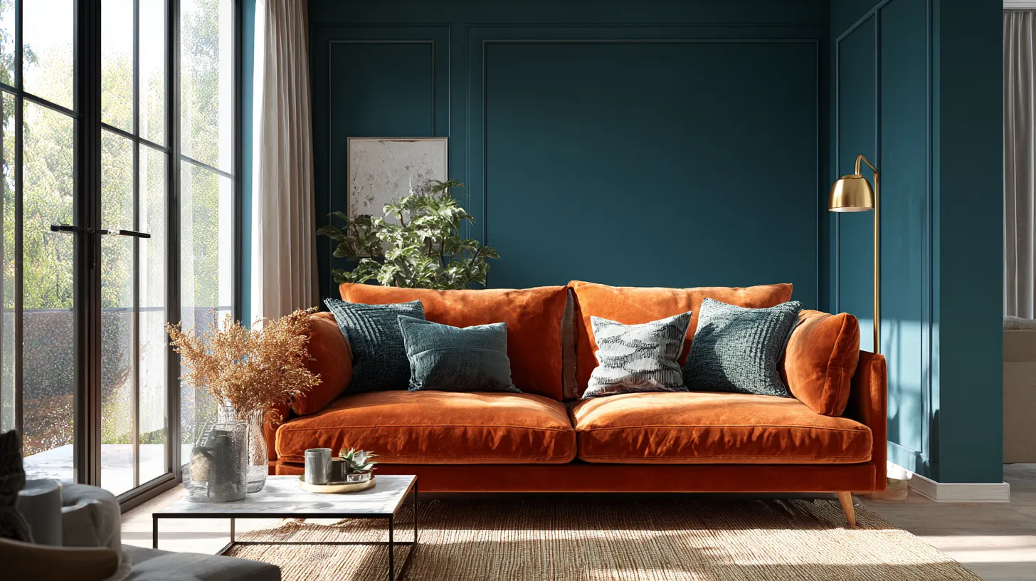
Bold color in a living space is more than decoration. It’s an invitation to feel something—energy, calm, joy, grounding. The deep teal that wraps your walls at dusk, the burnt orange chair that catches morning light, the charcoal ceiling that makes everything below feel intimate and held.
This is where contemporary design gets interesting. Clean lines meet saturated hues. Minimalist forms become canvases for chromatic courage. And you, the one who lives there, get to decide what bold means in your own home.
Let’s explore how to bring these colors into your living room with intention, artistry, and a little bit of magic.
Understanding Bold Color in Contemporary Spaces
Bold doesn’t mean chaotic. In contemporary design, bold colors work best when they’re purposeful—chosen for their emotional resonance and visual impact, not just their intensity.
Think of a living room anchored by a single wall painted in deep olive or saturated mauve. The rest of the space breathes around it in neutrals and textures. This is strategic boldness: one strong statement that elevates everything else.
Contemporary interiors favor clean silhouettes and uncluttered surfaces. Bold color becomes the ornament, the personality, the heartbeat of a room that might otherwise feel too austere.
The Psychology Behind Your Color Choices
Colors carry weight. A room painted in inky blue feels contemplative, almost library-like—a space for deep conversations and quiet evenings. Lime green brings playfulness and energy, perfect for a living room that doubles as a creative hub.
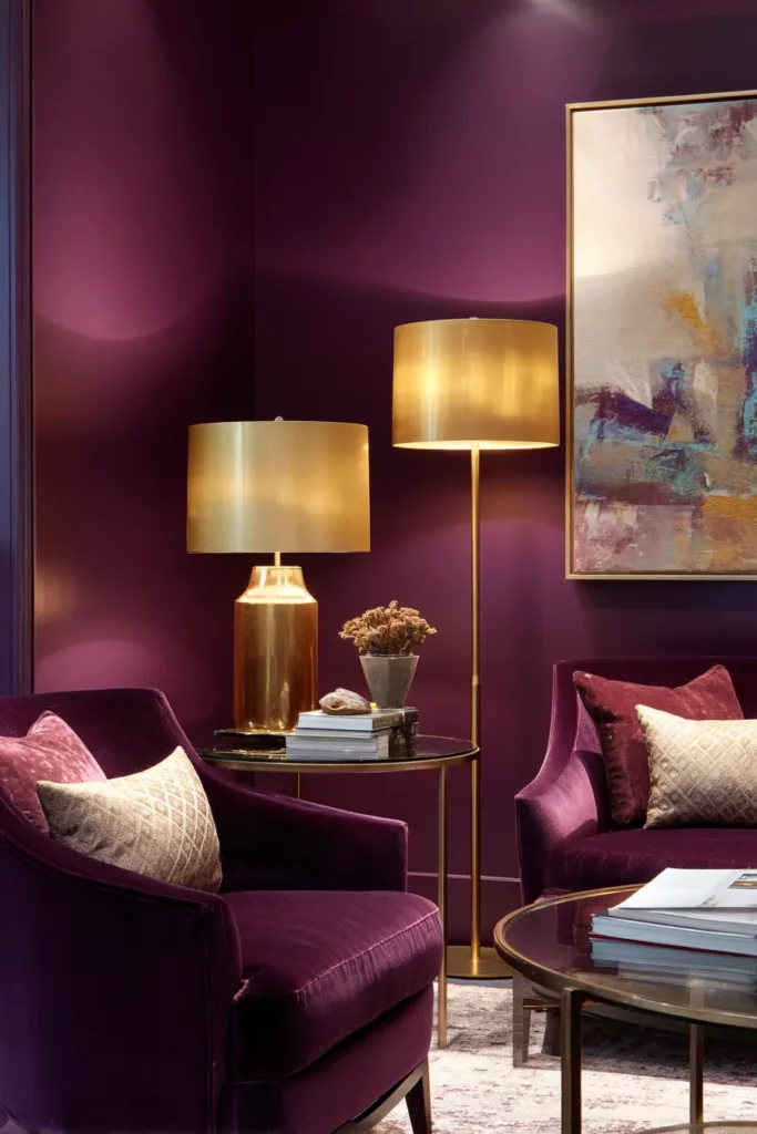
Saturated reds and oranges activate the space, making it feel warmer and more intimate. They’re grounding colors, earthy despite their intensity. Purples lean luxurious, especially in jewel tones that catch light like silk.
Consider how you want to feel in your living room, not just how you want it to look. That feeling will guide your palette more honestly than any trend.
Architectural Elements as Color Canvases
The smartest contemporary spaces use architecture itself to carry bold color. This creates visual interest without overwhelming the room.
Paint your trim in a contrasting bold shade—charcoal trim against cream walls, or glossy lime against soft gray. Suddenly the room has definition, structure, a sense of intentional framing. Crown molding becomes sculpture.
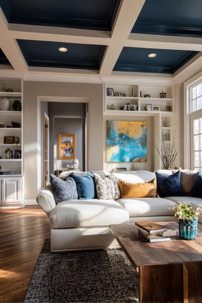
Ceilings are the most underused canvas in residential design. An inky blue or deep charcoal ceiling adds drama and intimacy, making the room feel cocooned without feeling small. The walls stay neutral, but your eye travels upward to discover something unexpected.
Color Blocking with Built-Ins and Niches
Built-in shelving offers perfect opportunities for color blocking. Paint the interior back panel of your bookshelf in saturated coral or forest green. Your books and objects become a curated gallery against that bold backdrop.
Niches and alcoves can hold pockets of intense color—a sunny yellow recess behind a sculptural vase, a deep plum nook that frames your reading chair. These architectural moments create layers of visual discovery.
This technique works beautifully in open-concept spaces where you need to define zones without walls. A bold painted column or half-wall becomes both art and architecture.
Furniture as Statement Pieces
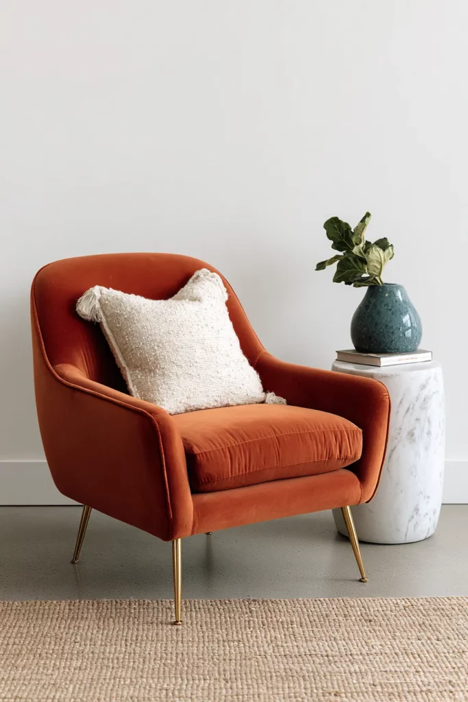
Contemporary furniture in bold colors transforms the living room into a gallery of functional art. A single burnt orange velvet sofa becomes the room’s anchor, its color deepening throughout the day as light shifts.
Look for pieces with clean lines—mid-century modern silhouettes, Scandinavian-inspired forms, minimalist sectionals. The simplicity of the shape allows the color to be the star. A teal accent chair with tapered legs. A mustard yellow ottoman with brass feet.
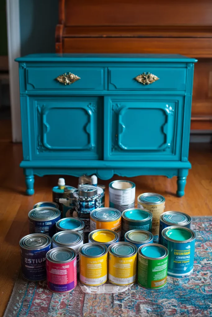
Painting existing furniture is a budget-conscious way to introduce bold color. A vintage credenza in glossy navy. Side tables in contrasting jewel tones. Even wooden coffee tables can be transformed with high-gloss lacquer in unexpected colors.
Mixing Materials and Finishes
Bold-colored furniture works best when balanced with varied textures. Pair a saturated blue sofa with a chunky natural-fiber rug, leather poufs in cognac, and linen throw pillows in cream. The color stays bold, but the textures soften its impact.
High-gloss finishes amplify bold colors, making them feel more contemporary and polished. Matte finishes feel earthier, more organic. In the same room, you might use glossy navy on trim and matte terracotta on a feature wall—the contrast in finish creates depth.
Metal accents in brass, copper, or blackened steel ground bold colors beautifully. They add weight and sophistication without competing for attention.
Pattern Layering and Color Flow
Patterns multiply the impact of bold colors without adding more paint. Geometric rugs, abstract art, patterned throw pillows—these elements create rhythm and movement.
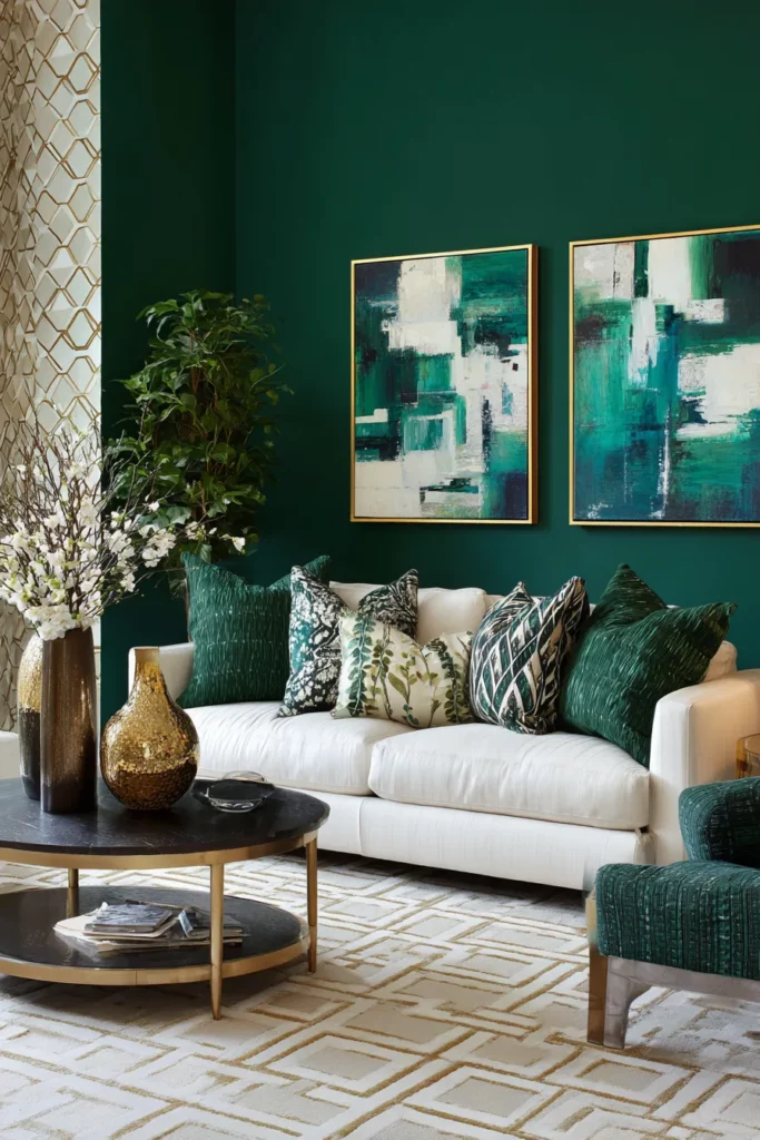
Choose patterns that share at least one color from your bold palette. If your walls are deep teal, incorporate patterns with teal threads woven through them. This creates visual flow—the eye travels naturally around the room rather than bouncing between unrelated elements.
Contemporary pattern mixing works best when you vary the scale. A large-scale abstract print on your sofa, medium geometric pillows, small-scale texture in your rug. The colors connect them; the varied scales keep them interesting.
Creating Continuity Between Spaces
In open-concept homes, bold colors should create conversation between rooms, not competition. Use complementary colors—orange in the living room flows beautifully into blue in the adjacent dining space.
Or choose different values of the same color family. Saturated emerald in the living room, sage green in the hallway, forest green accents in both. The spaces feel connected but distinct.
Architectural features like doorways and transitions are perfect places to bridge bold colors. Paint the doorframe in a shade that borrows from both rooms.
Lighting’s Role in Bold Color Perception
Bold colors transform throughout the day, and lighting dictates how you experience them. Natural light shows truest color—that deep plum wall looks richest in afternoon sun streaming through west-facing windows.
Artificial lighting requires strategy. Warm LED bulbs make bold oranges and reds feel inviting rather than aggressive. Cool-toned lights work better with blues and greens, maintaining their clarity.
Layer your lighting sources. Ambient ceiling fixtures provide overall illumination, but table lamps and floor lamps create pools of warmth that soften bold walls. Picture lights on artwork add dimension and focus.
The Magic of Dimmers and Accent Lighting
Dimmers are essential in rooms with bold color. Being able to lower the lights transforms the mood entirely—that energizing lime green wall becomes soothing and atmospheric after sunset.
Accent lighting highlights textures and creates shadow play against bold walls. Wall sconces cast beautiful patterns upward and downward. LED strips behind floating shelves add contemporary flair while showcasing objects against your bold backdrop.
Consider the view from outside the room, too. Bold-colored living rooms with thoughtful lighting become glowing jewel boxes visible from other parts of the home.
Balancing Bold with Neutral Grounding
Even the most courageous color palette needs breathing room. Contemporary design relies on negative space—areas where the eye can rest.
Large expanses of white, cream, or gray serve as visual silence between bursts of bold color. A white ceiling above dark walls. Cream upholstery flanking a vibrant accent chair. Gray concrete floors grounding everything above them.
Natural materials provide neutral grounding with added warmth. Light oak flooring, jute rugs, linen curtains—these elements don’t compete with bold color but enhance it by offering textural contrast.
The 60-30-10 Rule, Reimagined
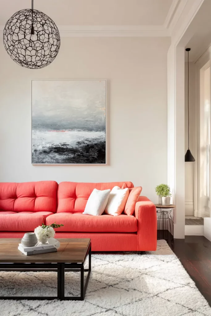
Traditional design wisdom suggests 60% dominant color, 30% secondary, 10% accent. In contemporary bold design, flip it: 60% neutral, 30% bold, 10% metal or black accents.
This creates impact without overwhelm. Your walls might be cream (60%), your sofa and art deeply saturated (30%), and your lighting fixtures and hardware providing punctuation (10%).
Of course, rules are starting points, not mandates. Some of the most stunning contemporary spaces are 80% one bold color with minimal contrast. Trust your instinct.
Sustainable and Budget-Conscious Approaches
Bold color doesn’t require expensive renovation. Strategic use of color in small doses—one feature wall, painted furniture, colorful textiles—creates significant impact for minimal investment.
Look for eco-friendly paint options with low or zero VOCs. Brands increasingly offer bold, saturated colors in sustainable formulations. Your home stays healthier while looking fearless.
Thrift and vintage stores are treasure troves for furniture you can paint. A dated credenza becomes contemporary art with the right color and quality finish. Reupholstering a single chair in bold velvet costs less than buying new.
DIY Techniques for Professional Results
Painter’s tape and careful prep work are your allies. For clean color blocking and architectural contrast, invest time in proper taping—it’s the difference between amateur and polished.
Sample pots are essential. Paint large swatches (at least 2’x2′) on your walls and live with them for several days. Colors shift dramatically between morning and evening light.
High-gloss paints require more skill but create stunning contemporary effects. Consider hiring a professional for glossy trim work while DIYing matte walls yourself.
Integrating Bold Colors with Existing Styles
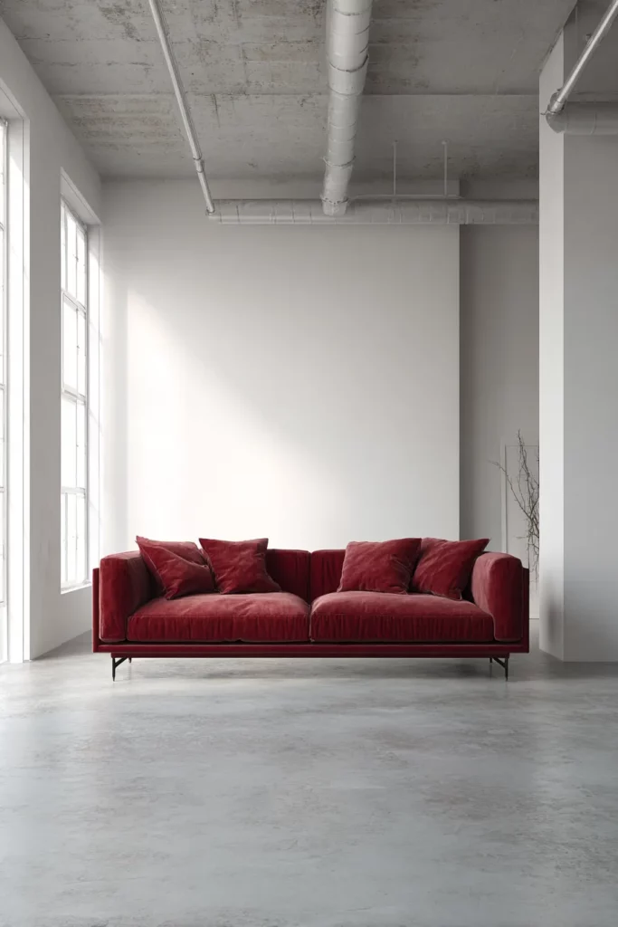
Bold color adapts to any design aesthetic when applied thoughtfully. In minimalist spaces, one bold element against stark white creates powerful simplicity—a crimson sofa, nothing more.
Scandinavian-inspired rooms welcome muted bold colors: dusty terracotta, sage green, warm ochre. These colors feel bold against pale wood and white walls but maintain Nordic restraint.
Industrial spaces love bold color as contrast to raw materials. A teal wall behind exposed brick. Orange metal stools against concrete floors. The juxtaposition feels urban and intentional.
Retro and Vintage Bold Color Integration
Contemporary doesn’t mean abandoning history. Vintage-inspired bold colors—mustard, burnt orange, avocado green—bring nostalgic warmth to modern spaces.
Mix retro colors with contemporary furniture forms. A curved 1970s-inspired sofa in modern teal velvet. Geometric 1960s patterns in current color palettes. This creates layered, collected-over-time ambiance.
Statement art pieces often bridge vintage and contemporary beautifully. A bold abstract painting from the 1980s feels perfectly at home in a 2025 living room.
Seasonal Considerations and Trend Awareness
Bold colors can shift with seasons if you design for adaptability. Warm bold colors (reds, oranges, warm purples) feel naturally cozy in winter. Cool bolds (blues, greens) refresh the space in summer.
Textiles make seasonal shifts easy. Swap throw pillows and blankets to adjust the room’s temperature. Coral pillows in summer become burgundy in winter, all against the same bold teal wall.
Current trends favor nature-inspired bold colors: terracotta, deep forest green, clay red, ocean blue. These colors feel both timely and timeless—rooted in the earth rather than fleeting fashion.
Quick Reference Guide: Bold Color Success
Before you commit to bold color in your contemporary living room, consider these essential points:
- Start with one bold element and build around it rather than painting everything at once
- Test samples in multiple lighting conditions for at least 72 hours before committing
- Balance color intensity with room size—darker bolds work beautifully in spacious rooms but can overwhelm small spaces
- Use architectural features (trim, ceilings, niches) as color canvases for dimension
- Layer textures and materials to prevent bold colors from feeling flat
- Consider furniture as moveable color for flexibility and budget-friendliness
- Create visual flow between rooms with complementary or related bold colors
- Invest in quality paint with good coverage and durability, especially for high-traffic living rooms
- Add dimmers to all lighting for mood flexibility with bold colors
- Ground bold walls with neutral floors and ceiling for balance
- Mix high-gloss and matte finishes to add depth and contemporary sophistication
- Think long-term—choose bold colors you’re excited to live with for years
| Bold Color | Mood Created | Best Paired With | Lighting Consideration |
|---|---|---|---|
| Inky Blue | Contemplative, cocooning | Brass, cream, natural wood | Warm ambient lighting |
| Saturated Mauve | Luxurious, sophisticated | Marble, velvet, black accents | Dimmers essential |
| Deep Olive | Grounding, elegant | Cognac leather, linen, stone | Natural light shows best |
| Burnt Orange | Energizing, warm | Charcoal, brass, white oak | Warm LEDs enhance |
| Emerald Green | Rich, dramatic | Gold, blush, crisp white | Multiple light sources |
A Living Room That Lives
The most beautiful contemporary living rooms with bold colors aren’t magazine-perfect frozen moments. They’re spaces that shift and breathe, where morning light reveals different aspects of the same terracotta wall, where evening transforms your teal sofa from energizing to soothing.
Bold color asks something of you. It asks you to commit, to trust your instincts, to believe that beauty doesn’t always need to be safe. It rewards that courage with a room that feels entirely, authentically yours.
These colors will hold your gatherings, witness your quiet moments, age alongside you. They’ll fade slightly in the sunny spot by the window, showing where light loves to rest. They’ll become the backdrop of your life, so familiar you stop seeing them as bold and start simply seeing them as home.
That’s when you know you’ve chosen right.
Frequently Asked Questions
What are the best bold colors for small contemporary living rooms?
Darker bold colors like deep teal, navy, or charcoal actually work beautifully in small spaces by eliminating visual boundaries. The walls seem to recede rather than close in, especially when paired with adequate lighting and light-colored furniture. Avoid using too many different bold colors in a compact space—stick to one or two for cohesion.
How do I choose between matte and glossy finishes for bold paint colors?
Matte finishes feel organic and sophisticated, hiding wall imperfections while giving bold colors depth. Glossy finishes amplify color intensity and reflect light, creating contemporary drama perfect for trim work and furniture. Most successful spaces mix both—matte on walls, gloss on architectural details. Test both finishes with your chosen color before deciding.
Can I use bold colors if I rent my living space?
Absolutely. Focus on moveable bold color through furniture, large-scale art, colorful rugs, and statement curtains. If you’re allowed to paint, feature walls are easy to repaint when you move. Consider peel-and-stick wallpaper in bold patterns for temporary but impactful color without permanent commitment.
How do bold colors work with minimalist or Scandinavian design?
Bold colors integrate beautifully when used sparingly in these styles. Choose one bold element—a single terracotta chair, a deep green feature wall, burnt orange throw pillows—against otherwise pale, natural spaces. The restraint of minimalist design actually makes bold colors more impactful. Stick to nature-inspired bold shades that feel grounded rather than artificial.
What’s the easiest way to update a living room with bold color without painting walls?
Start with a bold-colored sofa or large sectional—it’s the biggest visual element in most living rooms and instantly transforms the space. Add complementary bold artwork and a patterned rug that incorporates your chosen color. Layer in throw pillows, blankets, and perhaps one painted vintage furniture piece. This approach offers maximum impact with complete flexibility to change your mind.