Table of Contents
By ERYLIN — Your guide to calm, beautiful, and intentional living.
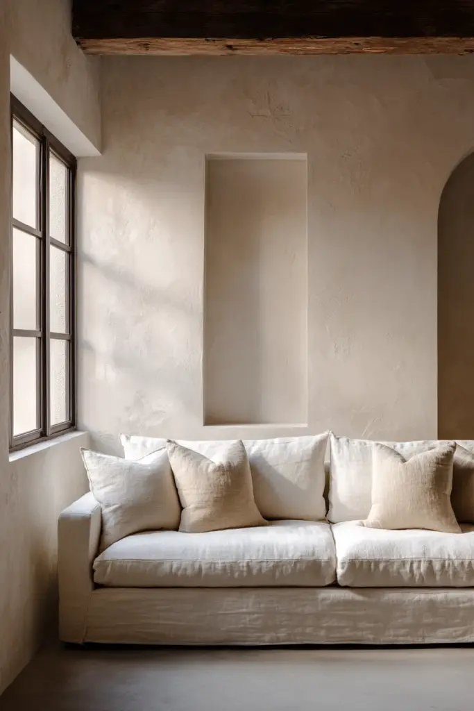
There is something quietly thrilling about a small living room. It asks you to be thoughtful. It invites you to choose only what matters — a linen-draped sofa, a single wooden shelf holding a candle and a favorite book, walls that breathe.
But here is what most of us miss: the room does not end at eye level. Above your gaze, there is an entire landscape of untouched potential — walls that climb, corners that reach, ceilings that wait to be drawn into the story of your space.
Vertical space is the most underused resource in a small living room. When you learn to plan your walls from floor to ceiling, the room stops feeling like a constraint and starts feeling like a considered, layered home.
This guide will walk you through exactly how to do that — where to place shelves, how high to hang curtains, which furniture earns its keep, and what to avoid. Think of it as designing upward with intention.
Why Vertical Space Changes Everything in a Small Room
Most small-room advice tells you to declutter, add mirrors, and choose light colors. That advice is not wrong — but it stops short. It treats the walls as decoration rather than as architecture.
When you activate vertical space, you shift the eye upward. The room feels taller, airier, and more composed. You also free the floor, which is the single greatest trick for making a small living room feel open and generous.
The goal is not to fill every inch of wall. It is to use height strategically — pulling the eye up, creating purposeful zones, and placing function exactly where it is needed.
Finding Your Dead Wall Zones
Before you hang a single shelf, walk slowly around your living room and look up. Most rooms have at least two or three “dead zones” — stretches of wall above furniture, beside windows, or flanking the TV that are doing nothing.
These zones are your opportunity. A slim console wall, a cluster of floating shelves, a tall leaning ladder — each can transform an unused stretch of plaster into something both beautiful and functional.
Common dead zones to look for:
- The wall above a sofa or loveseat
- The space beside and above a window
- Corners, especially upper corners
- The wall flanking a TV unit
- The narrow strip of wall beside a doorframe
Once you identify them, you can begin to assign each zone a purpose: storage, art, lighting, or simply a beautiful negative space that gives the eye a place to rest.
Vertical Height Guide: Where to Place Everything
This is the information most design articles skip entirely. Saying “go vertical” without telling you how high is like saying “cook with heat” without giving you a temperature.
Use this as your planning reference:
| Element | Recommended Height |
|---|---|
| Curtain rod | 4–6 inches below ceiling (not above window frame) |
| Wall art center point | 57–60 inches from floor |
| Floating shelves (decorative) | 68–72 inches from floor |
| Above-sofa shelves | 8–10 inches above sofa back |
| Wall sconces | 60–65 inches from floor |
| TV wall mount | Center screen at 42–48 inches from floor |
| Upper storage shelves | 72–84 inches (above eye level, for items used less often) |
These measurements are starting points, not rules. Adjust for your ceiling height, your furniture scale, and your own comfort. But having a number to begin with removes the guesswork that leads to crooked shelves and mismatched arrangements.
Tall Storage Over Wide Storage
This is the most important furniture decision you will make in a small living room. Wide, low storage — a long media console, a squat bookcase, an oversized ottoman with drawers — consumes floor space and pushes the eye down.
Tall, slim storage does the opposite. It draws the eye upward, uses a smaller footprint, and holds just as much — often more.
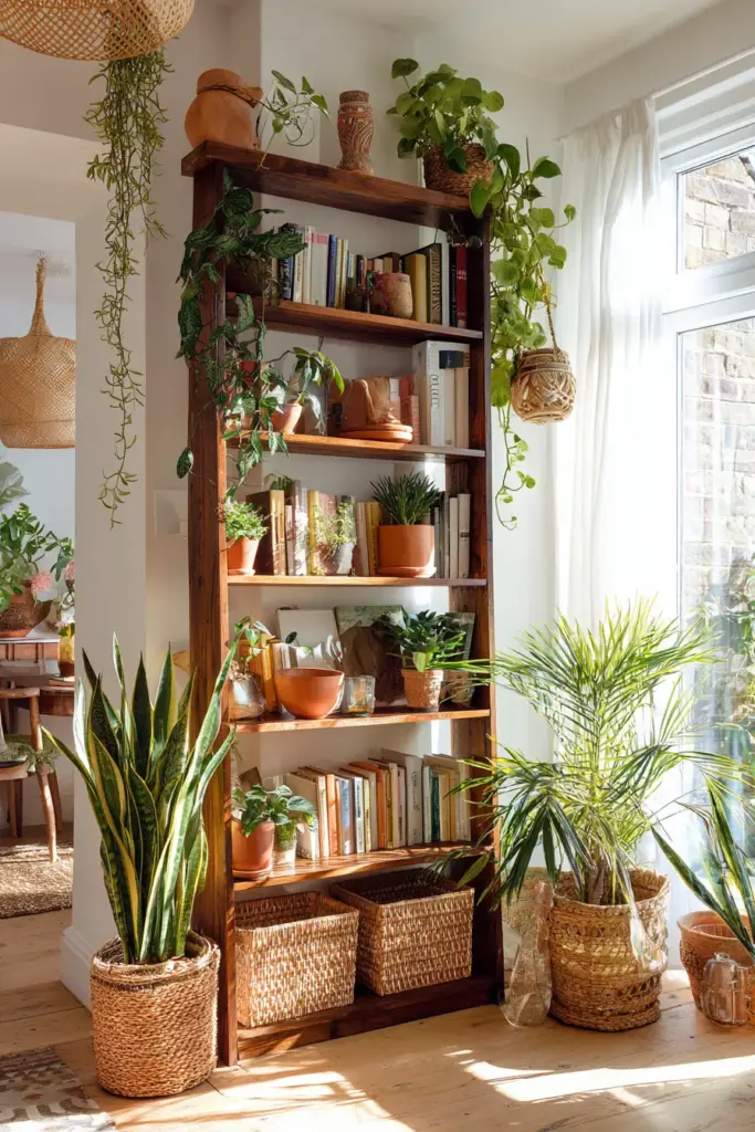
The Best Vertical Furniture for Small Living Rooms
Tall bookcases are the workhorses of vertical styling. A bookcase that reaches within a foot of the ceiling becomes an architectural feature, not just a storage solution. Style it with books, plants, ceramic objects, and small baskets for visual rhythm.
Vertical consoles and slim cabinets are ideal beside a TV wall or an entryway corner. Look for pieces that are narrow in depth (under 14 inches) and tall in height — they maximize storage without crowding the room.
Wall grids and pegboards offer the flexibility of a gallery wall with the function of a storage system. They work beautifully in modern rustic interiors when made from natural wood or matte black steel.
Ladder shelves are the rental-friendly answer to a built-in. They lean without drilling, hold books, plants, and folded throws, and bring a warm, casual structure to an empty corner.
Floating shelves in clusters can replace a bulky bookcase entirely. Stagger them at different heights for a collected, layered look — the kind that looks curated rather than installed.
Pulling the Eye Upward: Curtains, Art, and Lighting
Furniture is only part of the story. The way you dress your walls and windows does as much as any piece of furniture to shape how tall a room feels.
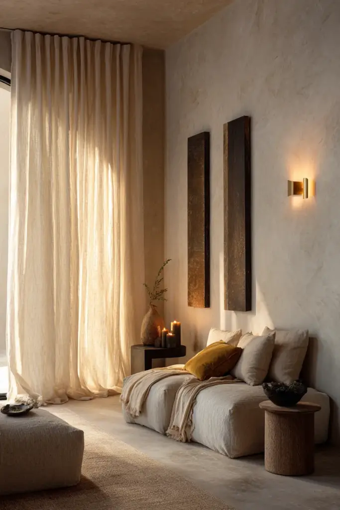
Curtains
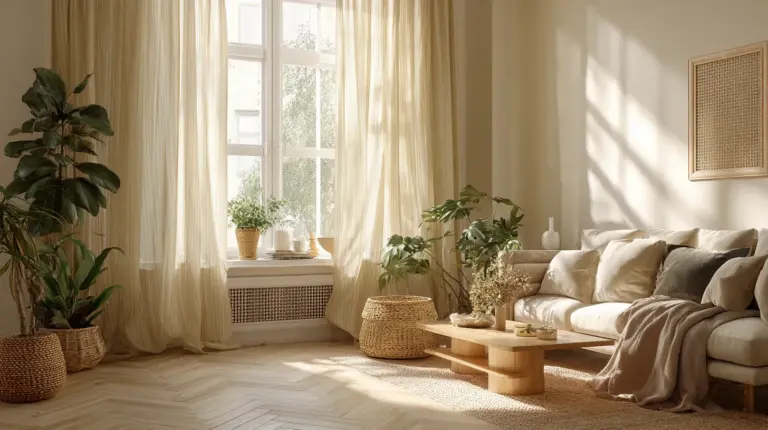
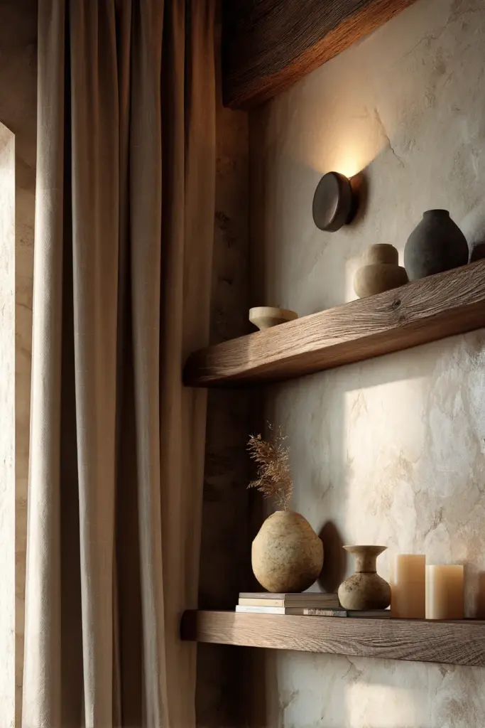
Hang curtain rods as high as possible — ideally within four to six inches of the ceiling. Let the panels fall all the way to the floor. This one change, more than almost any other, transforms a room’s perceived height.
Choose curtain fabrics in linen, cotton muslin, or a soft sheer weave. Light filters through them beautifully and keeps the room from feeling heavy. For a modern rustic feel, warm whites, oatmeal tones, and soft sage all work wonderfully.
Wall Art
Group art vertically rather than horizontally. A column of three prints hung close together draws the eye upward more effectively than a horizontal gallery spread. For a focal wall, consider one large, tall artwork — a portrait, a botanical print, a woven textile — that anchors the space with presence rather than clutter.
Keep the center of your largest piece at eye level (57–60 inches from the floor) and let smaller pieces extend upward above it.
Layered Lighting
Lighting is the quiet architect of any room. In a small living room, wall sconces placed at 60–65 inches pull the eye up and free your surfaces from lamps. A pendant or semi-flush ceiling fixture draws attention to the ceiling itself, making the room feel taller.
Layer at least three light sources: ambient (overhead), task (reading or accent), and decorative (candles, sconces, string lights). The warmth of layered light makes a small room feel intentional and cozy rather than cramped.
Vertical Zoning: Dividing Space Without Walls
In an open-plan or studio-adjacent living room, tall vertical elements can do the work of walls — defining zones without blocking light or flow.
A tall bookcase placed perpendicular to the room (or slightly angled) creates a reading nook separate from the TV area. A pair of tall floor plants flanking a sofa carves out a seating zone. A vertical console and wall art cluster signals where the entryway ends and the living room begins.
This technique, called vertical zoning, is one of the most underused tricks in small-space design. It gives a room structure and intention without adding walls, doors, or dividers.
Managing the TV Wall Vertically
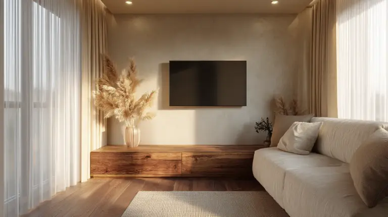
The TV wall is often the messiest vertical surface in a living room. Cables trail down. Components stack horizontally. A large screen sits on a low, wide unit that anchors the eye to the floor.
Here is a cleaner approach:
- Mount the TV on the wall at a comfortable viewing height (center screen at 42–48 inches from floor).
- Use a slim, tall media cabinet or floating media shelf below — not a wide, low console.
- Manage cables in a cable channel or a recessed cable conduit painted to match the wall.
- Add floating shelves above or beside the TV for components, plants, and decorative objects.
- Frame the TV with wall art or sconces to integrate it into the design rather than letting it dominate.
A well-composed TV wall reads as intentional design. A cluttered one reads as an afterthought — and in a small room, every wall carries weight.
Rental-Friendly Vertical Solutions
You do not need to own your home to make the most of vertical space. These solutions require minimal or no drilling:
- Freestanding ladder shelves — lean anywhere, hold plenty, and move easily
- Removable adhesive hooks — rated for real weight now, and they come off cleanly
- Tension rod shelving — works between two walls or inside deep shelving units
- Tall, freestanding bookcases — anchored safely with furniture straps (required for safety, not just aesthetics)
- Peel-and-stick wallpaper panels — add vertical visual interest without commitment
- Over-door organizers — often overlooked but genuinely useful for small items
Many of these solutions are also budget-friendly, which matters when you are furnishing thoughtfully rather than all at once.
The Power of Negative Space
Here is the mistake that undoes so many beautiful vertical arrangements: filling every inch. A wall crowded with shelves, art, plants, and sconces does not feel rich — it feels anxious.
Negative space — the intentional emptiness between objects — is what makes the filled spaces feel curated. It gives the eye a place to rest. It makes each element count.
When styling a vertical arrangement, step back and look. If everything is competing for attention, remove one piece. The edit is usually the most elegant choice.
A good rule: for every three or four objects on a shelf or wall, leave one open space. That breathing room is part of the design.
What Not to Do: Common Vertical Space Mistakes
Even with the best intentions, a few habits quietly undercut a room’s potential. Here is what to avoid:
- Hanging art too low. Most people hang art at standing eye level, which grounds the artwork in the lower half of the room. Raise it.
- Using only low, wide storage. A long, squat media console or low shelving unit anchors the eye to the floor. Choose taller, slimmer alternatives.
- Ignoring the ceiling zone. The space between your highest shelf and the ceiling is often wasted. A tall plant, a hanging pendant, or a decorative basket on the topmost shelf can bridge this gap beautifully.
- Overcrowding the walls. Too many elements compete and cancel each other out. Edit ruthlessly.
- Leaving cables unmanaged. A beautiful vertical wall arrangement is undermined immediately by trailing cords. Address cable management before styling.
- Treating every wall identically. Give each wall a distinct purpose — one for storage, one for art, one for windows and light. Variety creates rhythm.
Quick Checklist: Small Living Room Vertical Space
- Identify dead wall zones and assign each a purpose
- Hang curtain rods within 4–6 inches of the ceiling
- Choose tall, slim storage over wide, low storage
- Mount the TV at the right height and manage cables cleanly
- Group art vertically; keep the center at 57–60 inches from the floor
- Layer lighting with sconces, pendants, and ambient sources
- Use tall elements to create vertical zones within the room
- Leave intentional negative space in every arrangement
- Consider rental-friendly solutions if drilling is not an option
- Step back and edit — restraint is its own form of elegance
Conclusion
A small living room is not a limitation. It is an invitation to be deliberate — to choose what matters, to use every surface with care, and to design a space that feels complete rather than compressed.
When you learn to think vertically, the room opens. Light finds more places to land. The eye travels upward, and suddenly the ceiling feels like a gift rather than a boundary.
Start with one wall. Choose one shelf height. Hang one curtain rod four inches higher than you thought you should. See what shifts.
At ERYLIN, we believe that beauty and function are not opposites — they are conversation partners. Let your walls speak.
Frequently Asked Questions
How do you use vertical space in a small living room?
Start by identifying unused wall areas above furniture, beside windows, and in corners. Install tall storage like bookcases or floating shelves, hang curtain rods near the ceiling, and use wall sconces instead of table lamps to free up surface space. The goal is to move storage, art, and lighting upward so the floor stays open and the eye travels up.
What furniture works best in a small living room?
Choose furniture that is tall rather than wide, and slim rather than deep. Tall bookcases, vertical consoles, ladder shelves, and wall-mounted media units all maximize storage without eating floor space. Avoid low, wide pieces that anchor the eye to the floor and make the room feel shorter.
How can I make a small living room look bigger?
Hang curtains as high as possible, mount shelves above eye level, choose furniture with exposed legs (so the floor is visible beneath), use mirrors strategically to reflect light, and keep the floor as clear as possible. Vertical elements — tall curtains, tall storage, vertical art groupings — consistently make rooms feel larger and airier.
What should you not do in a small living room?
Avoid hanging art too low, using only low and wide storage, overcrowding walls with too many elements, ignoring cable management on the TV wall, and treating all four walls the same way. Also avoid blocking natural light with heavy drapes or oversized furniture — light is one of the most powerful tools for making a room feel generous.
How do you add storage in a small living room without making it feel crowded?
Use vertical storage rather than horizontal — tall bookcases, floating shelves clustered at different heights, and wall-mounted units keep storage off the floor without filling the visual field. Edit what you store: keep only what you love or regularly use, and leave intentional empty space in every arrangement. Negative space makes curated collections feel considered rather than cluttered.