Table of Contents
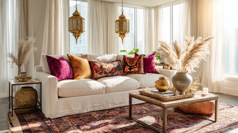
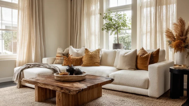
There’s a quiet shift happening in our homes—a gentle rebellion against the cool grays and stark whites that dominated the last decade. Warm tones are returning, not as a fleeting trend, but as an invitation to reconnect with comfort, naturalness, and the kind of beauty that feels like home.
This isn’t nostalgia. It’s a recalibration—a collective exhale after years of minimalist austerity. We’re craving spaces that wrap around us like a favorite sweater, rooms that glow golden in afternoon light, materials that age with grace and story.
From the earthy embrace of terracotta to the rich depth of walnut wood, warm tones are redefining what it means to live beautifully. They’re appearing in unexpected places: flooring that whispers underfoot, fabrics that beg to be touched, even in the colors we choose for our wardrobes and hair.
Let’s explore why this return matters, how to welcome it into your space, and what makes this moment in design feel so deeply right.
Why Warm Tones Are Making Their Triumphant Return
The Psychology of Warmth
Warm colors speak directly to our nervous system. Reds, oranges, yellows, and browns trigger feelings of comfort, joy, and vitality—emotions our spaces have been quietly hungry for. Studies in color psychology reveal that warm tones can actually increase perceived room temperature by several degrees, creating an immediate sense of coziness without adjusting the thermostat.
But there’s more at play than simple perception. After years of pandemic isolation and screen-heavy living, we’re instinctively seeking environments that feel alive and nurturing. Cool tones, while elegant, can feel clinical when overused. Warm tones bring us back to earth, literally and figuratively.
A Cultural Shift Toward Natural Living
The return of warm tones mirrors our growing desire for sustainable, nature-connected living. We’re drawn to materials that tell stories: reclaimed wood with visible grain, clay-fired ceramics, linen that softens with each wash. These elements naturally carry warm undertones that honor their origins.
This isn’t about perfection—it’s about authenticity. The slight variations in a terracotta tile, the golden patina developing on brass fixtures, the way cherry wood deepens over time. These imperfections are the point.
The Warm Tone Palette: Beyond Basic Browns
The Earthy Anchors
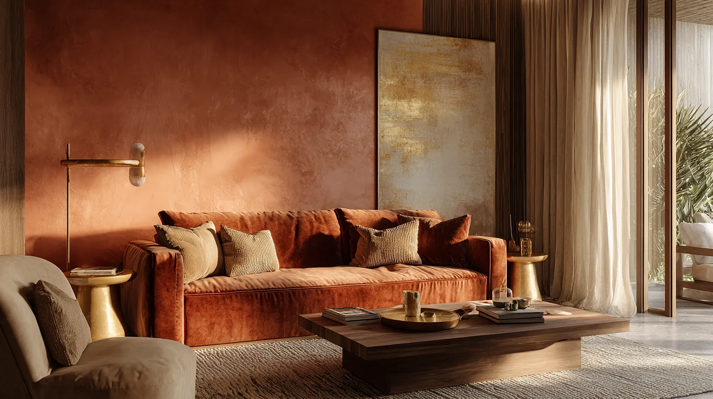
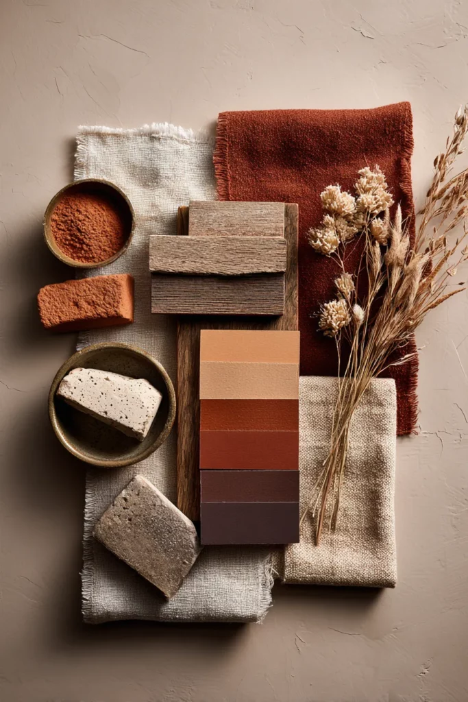
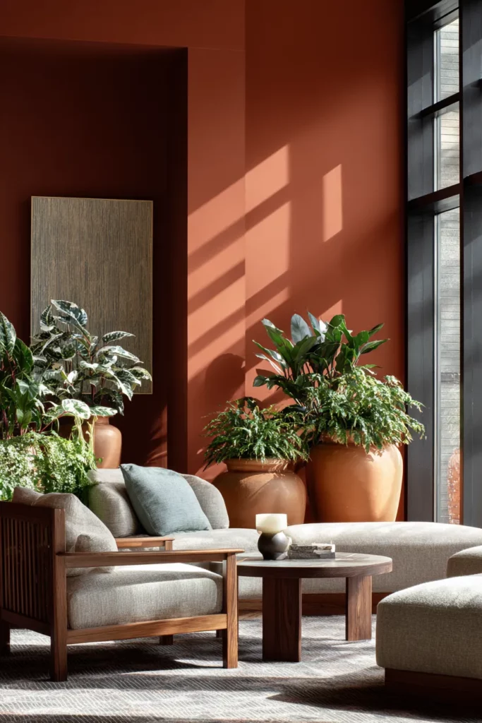
Terracotta has emerged as the unexpected hero of warm tone design. This dusty, clay-inspired hue ranges from soft peachy pinks to deep rust. It pairs beautifully with natural stone, particularly travertine, creating layers of texture that feel both ancient and contemporary.
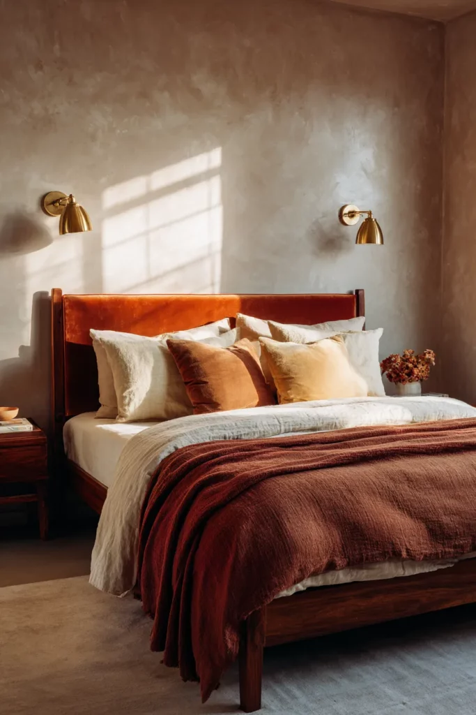
Ochre and mustard bring sophistication without heaviness. These colors work particularly well in textiles—think velvet throw pillows that catch the light, linen curtains that filter afternoon sun into liquid gold.
Burnt sienna and rust add drama and depth. Use them sparingly: a single accent wall, a statement piece of upholstered furniture, or in artwork that anchors a neutral room.
The Warm Neutrals Revolution
Pantone’s 2025 color forecasts confirm what designers have been observing: warm neutrals are replacing cool grays as our foundational tones. Mocha Mousse, Warm Taupe, and variations of Greige with golden undertones create flexible backdrops that feel finished rather than blank.
These colors have a secret power—they make natural light perform magic throughout the day. Morning sun brings out their golden notes; evening light deepens them into cozy amber.
The Rich Wood Renaissance
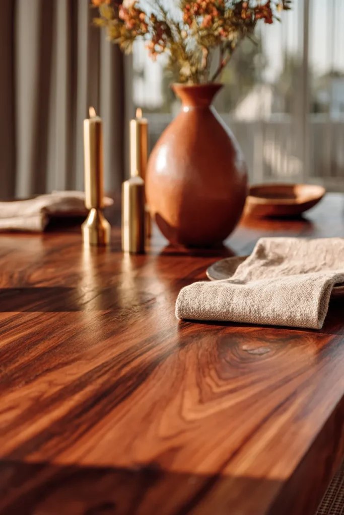
After decades of gray-washed and whitewashed wood, cherry, walnut, and mahogany are staging a remarkable comeback. These woods bring inherent warmth through their reddish-brown undertones and pronounced grain patterns.
Cherry wood, in particular, has an almost mystical quality—it starts lighter and deepens over time with sun exposure, becoming richer and more lustrous. It’s furniture that grows with you, a living element in your home.
How to Incorporate Warm Tones Throughout Your Home
Walls: The Foundation of Warmth
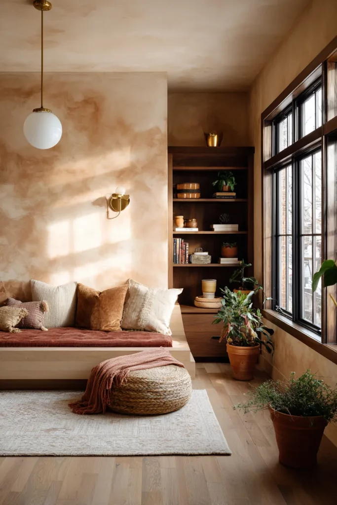
Your walls set the emotional temperature of a room. Consider these approaches:
- Full commitment: Paint entire rooms in warm neutrals like warm sand, soft terracotta, or clay pink
- Strategic accent walls: Use deeper tones—burnt orange, deep rust, or chocolate brown—on a single feature wall
- Textured applications: Limewash, Venetian plaster, or clay-based paints add dimensional warmth that flat paint can’t achieve
The key is understanding your light. North-facing rooms become instantly cozier with warm walls, while south-facing spaces can handle deeper, more saturated tones without feeling dark.
Flooring: The Often-Forgotten Canvas
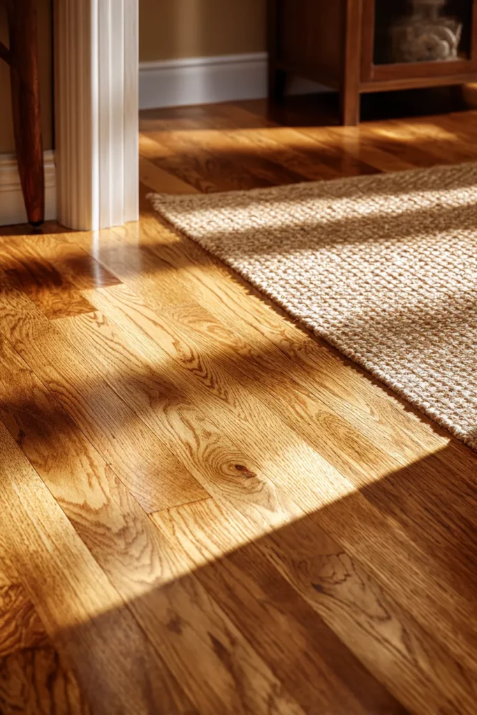
Flooring might be the most impactful way to introduce lasting warmth. Warm-toned hardwood in honey oak, natural walnut, or Brazilian cherry creates an instant foundation that influences every design decision above it.
For those not ready to renovate, layering becomes essential. Natural fiber rugs in jute, sisal, or wool in caramel and rust tones add warmth while protecting existing floors. The texture alone—rough, organic, slightly imperfect—contributes to the warm aesthetic.
Even tile can participate in this trend. Terracotta tiles, travertine stone, or porcelain that mimics warm wood tones work beautifully in kitchens and bathrooms where wood isn’t practical.
Fabrics and Textiles: Touchable Warmth
This is where warm tones become tactile. The combination of color and texture creates layered comfort:
Linen in rust, ochre, or natural ecru brings relaxed sophistication. It wrinkles beautifully, getting softer and more lustrous with age.
Velvet in burnt orange, deep terracotta, or chocolate brown catches light in ways that make rooms glow. A single velvet chair or cushion becomes an instant focal point.
Wool and bouclé in cream, camel, and warm gray add cozy texture without overwhelming color. These neutrals with warm undertones work as bridges between bolder warm accents.
Leather, especially in cognac, tan, or chestnut, ages into something more beautiful than when new. It’s warmth that improves with life.
Furniture: Statement Pieces in Warm Woods
The shift away from mid-century modern’s ubiquitous walnut and toward richer, redder woods signals a broader change in taste. We’re embracing furniture that feels substantial, heirloom-worthy, grounded.
Look for pieces in cherry with its subtle red undertones that deepen over time, mahogany for dramatic richness, or walnut for slightly cooler warmth that still reads as cozy. Mix wood tones freely—the old rule about matching wood throughout a room feels dated now.
Curved silhouettes in warm woods feel particularly on-trend: rounded dining tables, arched headboards, kidney-shaped desks. These soft shapes in rich tones create spaces that feel embracing rather than imposing.
Lighting: The Secret Ingredient
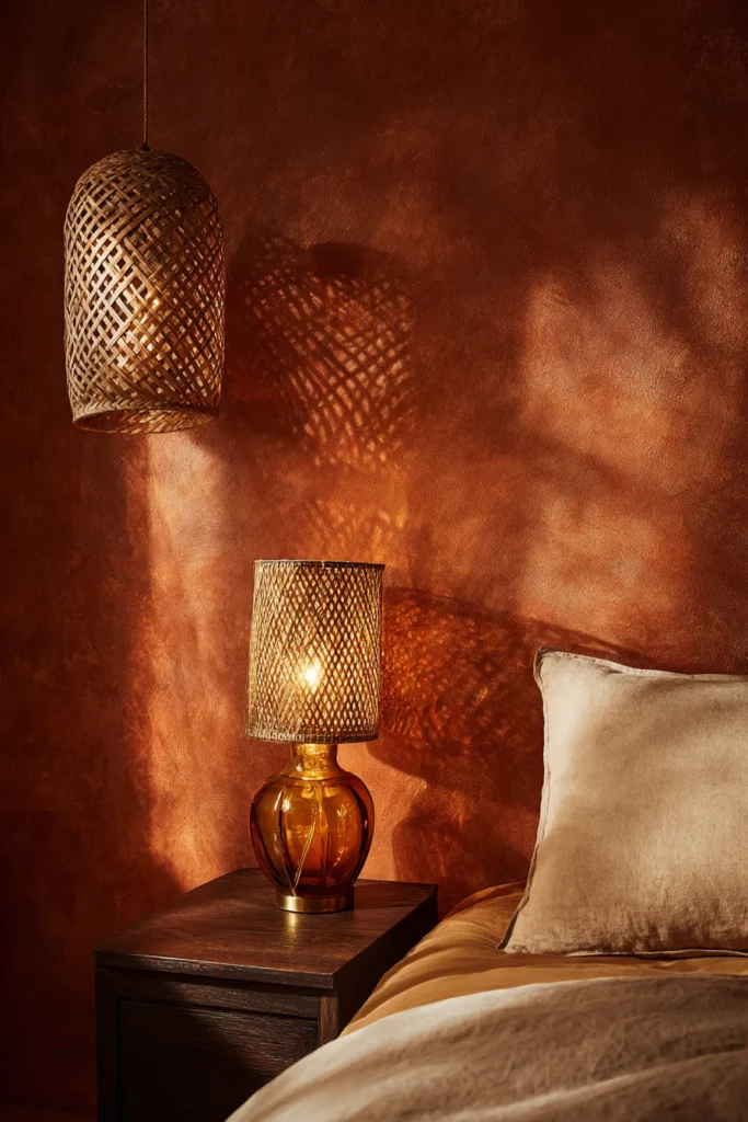
Even the warmest paint colors fall flat under cool-toned LED bulbs. Invest in warm white bulbs (2700K-3000K) that enhance rather than fight your warm palette.
Consider the fixtures themselves as opportunities for warmth: brass instead of chrome or nickel, amber glass shades that cast golden light, rattan or cane pendants that create beautiful shadow patterns.
Layered lighting at different heights—floor lamps, table lamps, wall sconces—creates pockets of warm glow that make rooms feel inhabited and loved.
Accessories: The Finishing Touches
Small touches amplify the warm tone story:
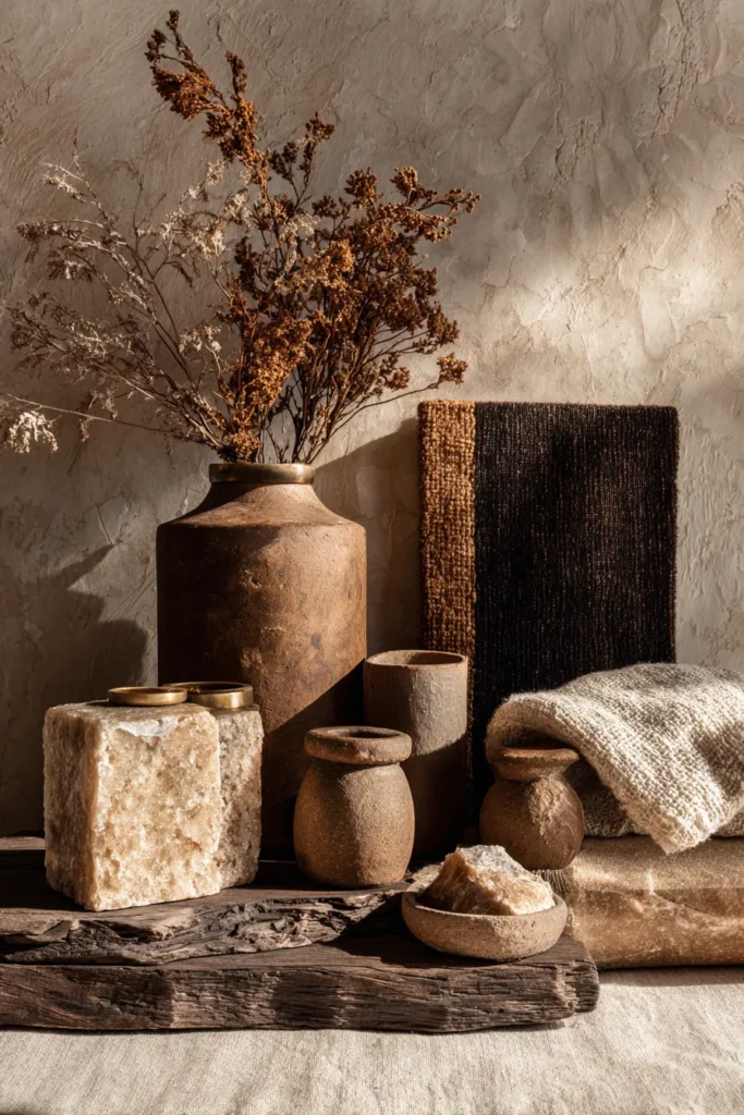
- Ceramics in terracotta, ochre-glazed pottery, or raw clay finishes
- Brass or copper hardware, picture frames, and decorative objects that develop warm patina
- Artwork featuring warm palettes—abstract rust and orange pieces, landscape photography at golden hour
- Plants in terracotta pots—the warm container enhances the living green
- Books with warm-toned spines (yes, this matters in styling)
Balancing Warm and Cool: The Secret to Sophistication
Why Balance Matters
An entirely warm space can feel monotonous or overwhelming. The most sophisticated interiors introduce cool elements as counterpoints—not to fight the warmth, but to make it sing.
Cool tones provide visual rest and prevent sensory overload. They create contrast that makes warm tones appear even richer and more intentional.
How to Create Balance
The 70-30 Rule: Let warm tones dominate approximately 70% of your palette, with cool accents comprising the remaining 30%. This creates cohesion while maintaining interest.
Strategic cool placements: Introduce cool blues or greens through:
- A single piece of artwork
- Decorative pillows that bridge warm and cool
- Plants (which naturally bring cool green into warm spaces)
- Touches of black or charcoal for grounding depth
Temperature transitions: Move gradually from very warm (rust, terracotta) through warm neutrals (camel, cream) to barely-cool neutrals (greige, soft blue-gray). This creates visual flow rather than jarring contrasts.
Warm Tones Beyond the Home: A Lifestyle Movement
Fashion’s Warm Embrace
The return of warm tones extends beyond interiors into our personal style. Fashion runways showcase earthy palettes: rust, caramel, chocolate brown, burnt orange. These colors feel both timeless and fresh—sophisticated neutral alternatives to black.
Building a warm-toned wardrobe creates natural synergy with your home environment. When your personal palette echoes your space, everything feels more intentional and cohesive.
The Warm Hair Revolution
Even hair color trends reflect this shift. Warm brunettes, copper reds, honey blondes, and rich chestnuts dominate salons after years of cool-toned ash and platinum. These warmer shades complement the golden light and earthy tones increasingly present in our homes.
The psychology here is fascinating—we’re seeking continuity between our personal presentation and our environments, creating holistic warmth in our daily lives.
Sustainable Warmth
Many warm-toned materials align naturally with sustainable choices: reclaimed wood, natural stone, clay-based finishes, organic textiles in undyed or naturally dyed warm tones. The connection between environmental consciousness and warm aesthetic isn’t coincidental—both honor natural processes and materials.
Practical Guide: Creating Your Warm Tone Sanctuary
Starting Small: The Commitment-Phobic Approach
Not ready to repaint? Begin here:
- Swap out textiles: Replace cool-toned pillows, throws, and curtains with warm alternatives
- Add a warm rug: This anchors the space and warms it literally and visually
- Introduce wood tones: A single piece of warm-wood furniture begins the conversation
- Change your bulbs: The fastest, cheapest transformation available
- Bring in warm metallics: Swap chrome for brass in small doses—cabinet pulls, picture frames, a mirror
Going Bold: The Full Commitment
Ready for transformation? Consider this progression:
Phase One: Foundation
- Paint walls in your chosen warm neutral
- Install or refinish flooring in warm-toned wood or stone
Phase Two: Major Pieces
- Invest in key warm-wood furniture pieces
- Choose upholstered pieces in warm fabrics
Phase Three: Layering
- Add multiple textile layers in varying warm tones
- Install warm-toned lighting fixtures
- Accessorize with ceramics, metals, and artwork
Color Palette Suggestions by Room
| Room | Base Tone | Accent Colors | Materials to Emphasize |
|---|---|---|---|
| Living Room | Warm Sand | Rust, Terracotta, Burnt Orange | Warm wood, brass, linen, leather |
| Bedroom | Soft Clay Pink | Deep Rust, Caramel | Cherry wood, velvet, soft wool |
| Kitchen | Warm Cream | Ochre, Warm Terracotta | Travertine, warm wood, copper |
| Bathroom | Warm Beige | Terracotta, Warm Marble | Natural stone, brass fixtures, teak |
| Home Office | Warm Taupe | Burnt Sienna, Warm Green | Walnut, leather, warm brass accents |
Your Warm Tone Checklist
Before beginning your warm tone transformation, consider these elements:
- Natural light assessment: Understand how light moves through your space throughout the day
- Existing undertones: Check what undertones your current pieces carry—cool or warm?
- Statement piece selection: Choose one substantial warm-toned piece as your anchor
- Layering strategy: Plan for multiple textures in your warm palette
- Balance points: Identify where you’ll introduce cool accents for contrast
- Lighting plan: Map out where warm-toned light sources will live
- Wood tone mixing: Decide which warm woods will feature prominently
- Textile selections: Choose 3-5 warm fabrics in varying textures
- Metallic finish: Commit to primarily brass, bronze, or copper
- Long-term pieces: Invest in quality items that age beautifully in warm tones
The Emotional Architecture of Warm Spaces
There’s something profoundly human about gravitating toward warmth. We’re biologically programmed to seek it—warmth meant survival, community, nourishment. When we bring warm tones into our homes, we’re answering an ancient call.
These spaces don’t just look different; they feel different. They slow us down, invite us to linger, encourage connection. In warm-toned rooms, conversations deepen, meals taste better, rest comes more easily.
This isn’t superficial design—it’s creating emotional architecture. The spaces we inhabit shape our internal states. Surrounding ourselves with warmth literally warms us from the outside in.
Looking Forward: The Future of Warm Design
2025 and Beyond
Design forecasters predict warm tones will continue evolving rather than fading. We’re moving toward:
Richer saturation: After years of pale neutrals, deeper jewel-warm tones are emerging—sapphire rust, emerald ochre, ruby terracotta.
Warm maximalism: Layering multiple warm tones and patterns together for richness and personality.
Biophilic warmth: Integrating living elements with warm materials—plants with terracotta, wood with natural stone, creating spaces that blur indoor-outdoor boundaries.
Artisanal warm finishes: Hand-plastered walls, hand-dyed textiles, hand-thrown ceramics—the mark of human hands in warm materials.
Sustainability Meets Warmth
The future of design increasingly links aesthetics with ethics. Warm-toned materials often align with sustainable practices:
- Reclaimed warm woods reduce demand for new harvest
- Natural clay and lime finishes avoid synthetic chemicals
- Undyed natural textiles in warm tones eliminate polluting dyes
- Quality warm-wood furniture becomes multi-generational
This convergence means choosing warmth increasingly means choosing responsibility—a beautiful alignment.
The return of warm tones isn’t a trend to capitalize on and abandon. It’s a homecoming. We’re remembering that our spaces should nourish us, that beauty can be soft and strong simultaneously, that the most enduring design choices honor what makes us fundamentally human.
At ERYLIN, we believe your home should be your warmest embrace—the place where the world’s edges soften and you can simply be. Warm tones help create that sanctuary.
Welcome them home.
Frequently Asked Questions
Why are warm tones making a comeback in interior design?
Warm tones are returning as a cultural shift away from the cool minimalism that dominated the 2010s. After years of austere grays and whites, people are craving comfort, connection, and spaces that feel emotionally nourishing. This movement also aligns with growing interest in natural, sustainable materials that inherently carry warm undertones. The psychological need for cozy, grounding environments—especially post-pandemic—has accelerated this return to warmth in our homes.
How do warm tones affect mood and atmosphere?
Warm colors trigger emotional responses associated with comfort, joy, and vitality by stimulating our nervous system. Research shows warm-toned spaces can make rooms feel several degrees warmer and create immediate feelings of coziness. These hues promote social connection and conversation, making them ideal for living rooms and dining areas. Warm tones also create a sense of groundedness and security—essential feelings in our often-chaotic modern lives.
What are the best warm colors for interiors?
The most versatile warm colors for interiors include terracotta, warm sand, ochre, rust, caramel, and warm taupe—colors that Pantone’s 2025 forecasts confirm as enduring. For wood tones, cherry, walnut, and mahogany offer rich warmth. These colors work beautifully as foundations, allowing you to layer deeper accents like burnt orange or chocolate brown. Start with warm neutrals on walls, then introduce richer tones through textiles, accessories, and wood furniture for a sophisticated, layered approach.
How do warm tones compare to cool tones?
Warm tones create intimate, cozy, and energizing spaces, while cool tones feel calming, spacious, and serene. Warm colors (reds, oranges, yellows, browns) advance visually, making rooms feel more enveloping, whereas cool colors (blues, greens, purples) recede, creating airiness. The most sophisticated spaces use both—typically a 70-30 ratio favoring warm with cool accents for balance. This combination prevents monotony while maintaining the emotional benefits of warmth. Neither is inherently better; they serve different emotional and functional purposes.
Can warm tones be incorporated into modern decor?
Absolutely. Modern design and warm tones create stunning combinations when approached thoughtfully. Use warm tones in clean-lined, contemporary furniture rather than ornate traditional pieces. Pair warm wood with sleek metal accents and minimal silhouettes. Choose warm neutrals instead of stark white for walls, creating softness without sacrificing modern simplicity. The key is restraint and quality—fewer, better pieces in beautiful warm materials rather than cluttered warmth. Modern warm design celebrates the material itself: gorgeous wood grain, beautiful textile texture, sculptural warm-toned ceramics in uncluttered spaces.