Table of Contents
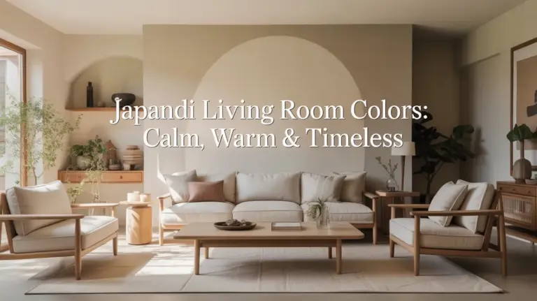
There’s something deeply calming about walking into a space that breathes. Not loudly, not forcefully—just a gentle inhale of light, warmth, and intention. That’s what Japandi colors bring to modern apartments: a palette that whispers rather than shouts, that invites you to slow down and simply be.
Japandi design marries the minimalist elegance of Japanese aesthetics with the cozy warmth of Scandinavian living. The result? A color story rooted in nature, balance, and quiet sophistication. It’s not about following trends—it’s about creating a home that feels like a soft exhale at the end of a long day.
In this guide, we’ll explore how to weave Japandi colors into your modern apartment, from the foundational neutrals that anchor every room to the earthy accents that add soul. Whether you’re working with a compact studio or a spacious loft, these hues create harmony without compromise.
Let’s begin where all beautiful spaces do: with color that feels like home.
What Are Japandi Colors?
Japandi colors are nature’s love letter to interior design. Think of early morning mist, sun-bleached linen, river stones warmed by afternoon light. These are hues that exist in the quiet spaces between stark white and deep charcoal—soft, muted, and endlessly versatile.
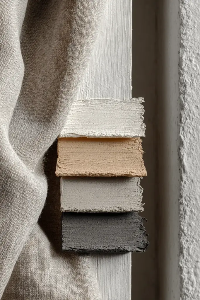
The core palette includes off-whites, warm beiges, gentle grays, and tans that create a calming foundation. Creams with subtle yellow undertones add warmth without overwhelming the senses. These neutrals aren’t bland—they’re rich with nuance, shifting subtly as daylight moves across your walls.
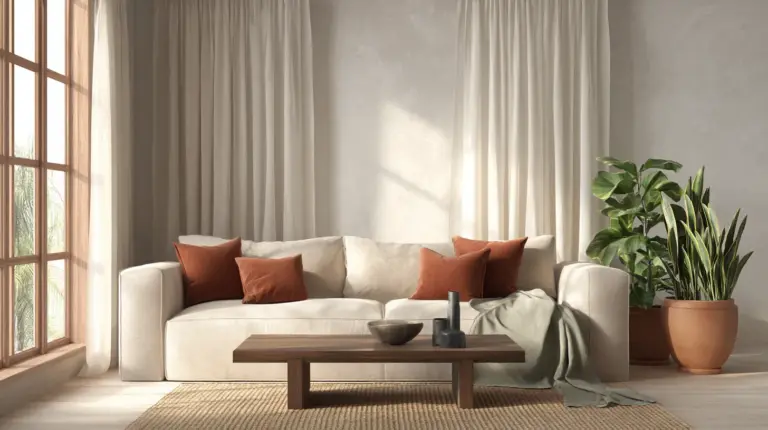
Then come the earth tones: sage green that echoes moss and eucalyptus, terracotta that brings the warmth of clay pottery, and soft taupes that ground the space. These aren’t accent colors in the traditional sense—they’re gentle companions that add depth and personality while maintaining that signature Japandi serenity.
The Psychology Behind the Palette
These colors work because they mirror the natural world. Our bodies respond to them instinctively, finding calm in tones that don’t demand attention. They create visual rest—essential in modern apartments where space is precious and overstimulation lurks around every corner.
Warm neutrals lower stress levels and invite relaxation. They make small spaces feel larger by reflecting light rather than absorbing it. And because they’re timeless, your apartment won’t feel dated in two years—a practical consideration for renters and homeowners alike.
Key Japandi Colors for Modern Apartments
Let’s break down the essential hues that transform ordinary apartments into Japandi sanctuaries.
Foundational Neutrals
Off-White and Cream form the backbone of any Japandi space. Choose shades with warm undertones—ivory, linen white, or cream with a whisper of beige. These colors expand visual space, crucial for compact modern apartments where every square meter counts.
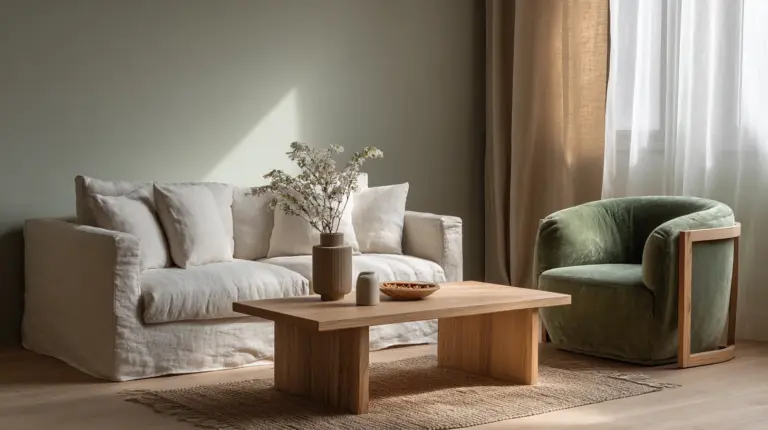
Paint your walls in these gentle hues, then layer in texture through fabrics and materials. A cream linen sofa against off-white walls creates depth without contrast. Natural light dances across these surfaces, making your apartment feel airy even on cloudy days.
Warm Grays and Taupes add sophistication without coldness. Look for grays with brown or beige undertones—think greige, mushroom, or warm stone. These work beautifully in bedrooms and living areas, creating cocoon-like comfort while maintaining the minimalist aesthetic.
Nature-Inspired Earth Tones
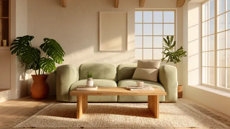
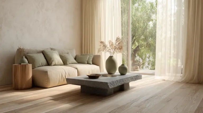
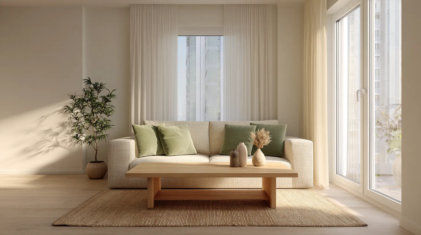
Sage Green and Muted Olive bring the outdoors in without overwhelming the calm. Use these sparingly—a single accent wall in the bedroom, throw pillows on a neutral sofa, or pottery displayed on open shelving. The key is restraint; these colors should feel like a breath of fresh air, not a bold statement.
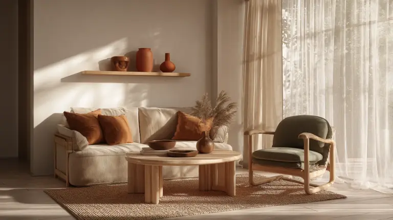
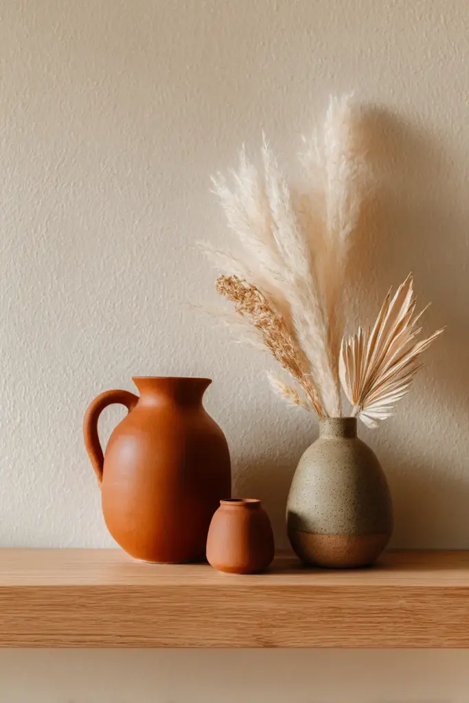
Terracotta and Soft Clay add warmth and humanity to modern spaces that risk feeling too sterile. A terracotta planter, clay-colored textiles, or rust-toned artwork introduces visual warmth while staying true to the natural palette. These hues pair beautifully with light woods and woven textures.
Soft Browns and Tans ground your space in earthy elegance. From café au lait to sandy beige, these colors create layers of warmth. Use them in larger furniture pieces—a tan leather armchair, brown linen curtains, or natural jute rugs that add texture underfoot.
Accent Darks for Depth
Charcoal and Black Details provide necessary contrast without harshness. Think matte black lighting fixtures, dark wood frames, or charcoal cushions that anchor lighter elements. These darks should appear in small doses—5-10% of your color composition—creating visual punctuation rather than dominating the space.
| Color Category | Examples | Best Uses | Mood Created |
|---|---|---|---|
| Foundational Neutrals | Off-white, cream, warm gray, taupe | Walls, large furniture, bedding | Calm, spacious, restful |
| Earth Tones | Sage green, terracotta, soft brown | Accent walls, textiles, pottery | Grounded, warm, natural |
| Accent Darks | Charcoal, matte black, dark walnut | Lighting, frames, small furniture | Sophisticated, balanced, defined |
Achieving Japandi in Small Modern Apartments
Small spaces demand thoughtful color choices. Japandi colors excel here because they maximize light and create visual continuity—essential tricks for making compact apartments feel generous.
Light Reflection Strategies
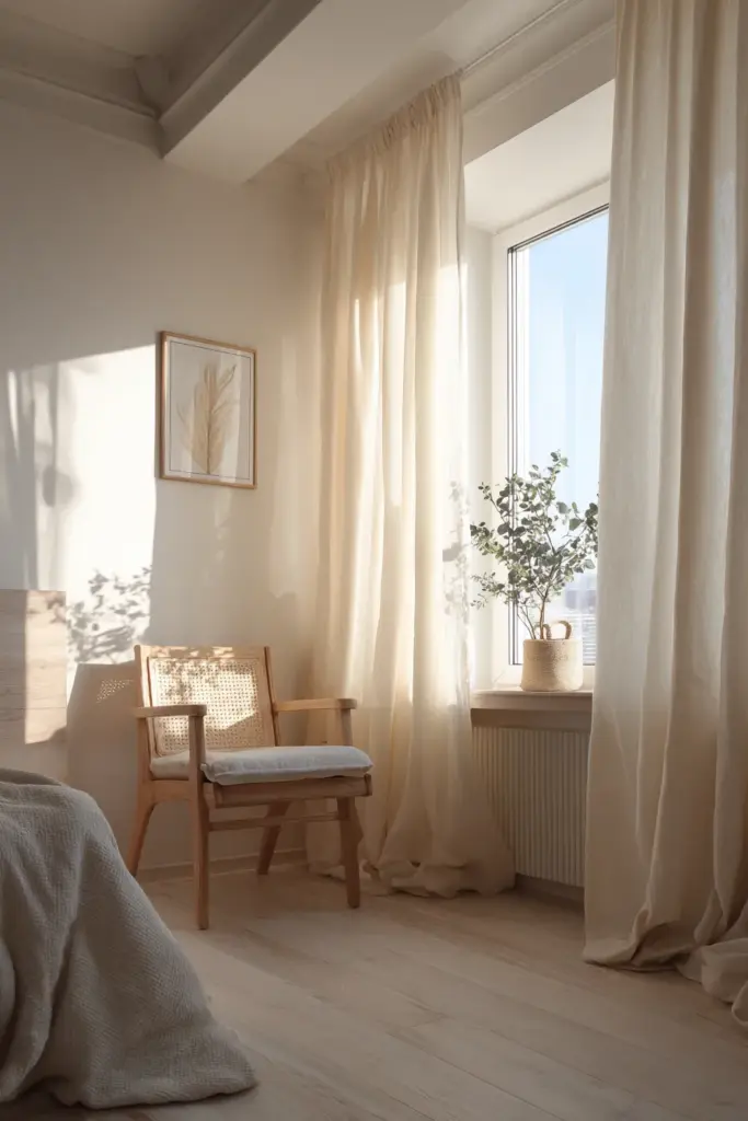
Start with light neutrals on walls and ceilings to bounce natural light throughout your space. In studios or apartments with limited windows, this becomes non-negotiable. Off-white or pale cream walls act as reflective surfaces, multiplying whatever sunlight enters.
Choose furniture in similar tones to create seamless flow. When your sofa, walls, and rugs exist in the same color family, the eye travels uninterrupted. This visual continuity tricks the brain into perceiving more space than physically exists.
Minimalism with Warmth
Decluttering is foundational to Japandi design, but it shouldn’t feel cold or sterile. Use warm neutrals and natural materials to maintain coziness while keeping surfaces clear. A single clay vase on a console table, a wool throw draped over a beige sofa—these small touches add warmth without clutter.
Multifunctional furniture in neutral tones serves double duty. A light wood coffee table with hidden storage, a cream ottoman that provides both seating and organization—these pieces maintain the minimalist aesthetic while solving practical problems endemic to small-space living.
Vertical Color Blocking
In apartments with low ceilings or awkward proportions, strategic color placement creates the illusion of height and balance. Paint the lower third of a wall in a warm taupe, leaving the upper portion in off-white. This grounds the space while drawing the eye upward.
Implementing Japandi Colors Room by Room
Living Room: The Heart of Calm
Your living room sets the tone for the entire apartment. Begin with a neutral sofa in cream, warm gray, or tan—this becomes your anchor piece. Layer in textiles: linen curtains in natural beige, wool cushions in sage green, a jute rug that adds organic texture.
Keep walls light to maximize the sense of space. Add depth through wood tones—a medium-toned coffee table, light oak shelving, bamboo blinds that filter harsh afternoon light. These natural materials introduce subtle color variation without disrupting the calm.
Accent with intention. A single piece of pottery in terracotta, a dark wood side table, or charcoal throw pillows provide visual interest without overwhelming the serene foundation. Remember: in Japandi design, empty space is as important as filled space.
Bedroom: A Sanctuary in Neutral
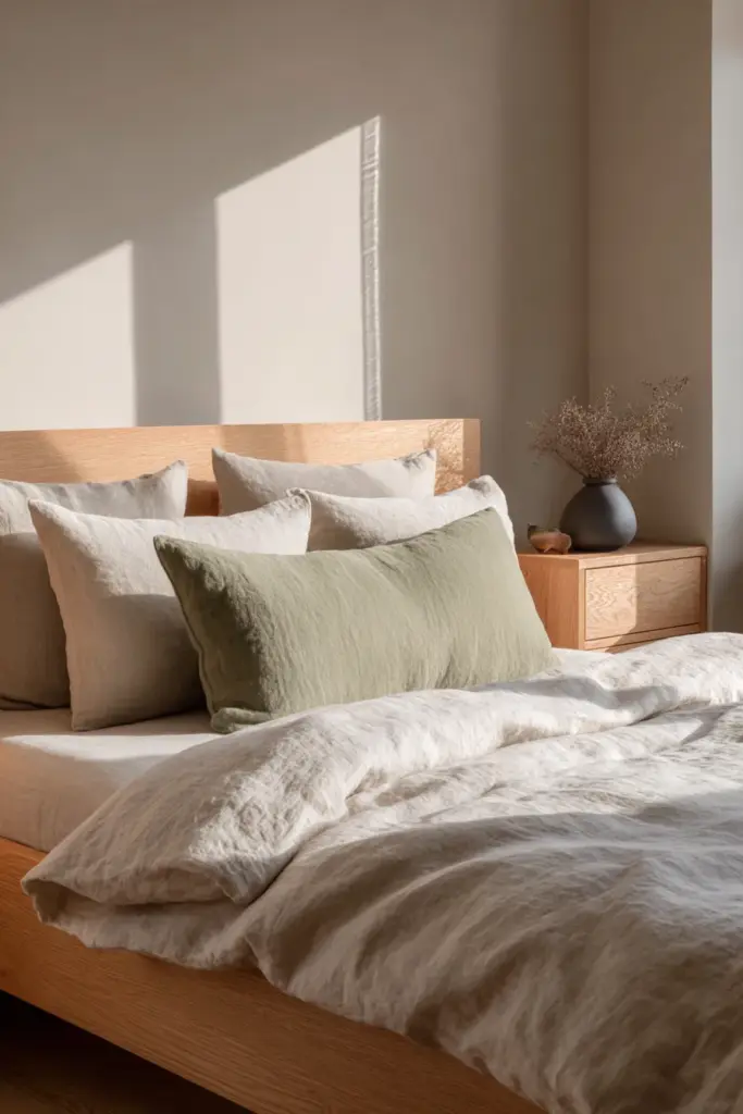
The bedroom demands the softest end of the Japandi spectrum. Paint walls in the palest cream or warm white—colors that feel like morning light. Choose bedding in layers of neutral: white linen sheets, a beige duvet, taupe throw blankets that invite touch.
Introduce one accent color through textiles. Sage green pillows, a muted olive throw, or rust-colored pottery on the nightstand. Keep it minimal—your bedroom should feel like a visual rest, a place where your eyes find nowhere they need to be.
Natural wood furniture in light to medium tones completes the sanctuary feel. A simple platform bed in oak, floating nightstands in pale ash, or a minimalist wardrobe in natural wood grain—these pieces blend into the calm rather than demanding attention.
Kitchen and Dining: Warm Functionality
Even in compact apartment kitchens, Japandi colors create breathing room. If you can paint cabinets, choose warm off-white or light sage. If not, work with what you have by adding neutral textiles and natural wood accessories.
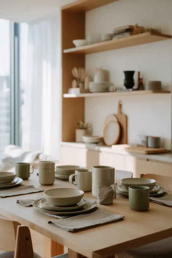
A dining table in light wood becomes the focal point. Surround it with simple chairs in natural finishes. Add warmth through ceramics: cream-colored plates, brown clay bowls, sage green mugs that make morning coffee feel ceremonial.
Open shelving displays these pieces beautifully—but only what you use regularly. Clutter destroys the Japandi aesthetic faster than poor color choices. Curate your displayed items to maintain both function and visual calm.
Budget-Friendly Japandi Color Transformation
You don’t need to repaint everything or buy new furniture to embrace Japandi colors. Start small and build layers over time.
Paint Power
A single can of quality paint in warm white or soft beige transforms a space. Focus on the most visible wall first—usually the one opposite the entrance. This immediately shifts the energy of your apartment without requiring complete renovation.
Local paint brands like Boysen offer excellent neutral options suited to Philippine humidity. Look for shades in their “Timeless Neutrals” or “Earth Tones” collections. Test samples on your wall, observing how they look in different light throughout the day.
Textile Layering
Neutrals in various textures create visual interest without color chaos. Start with a jute or sisal rug—affordable and instantly grounding. Add linen curtains in cream, cotton cushions in warm gray, and a wool throw in soft brown.
These layers build depth through texture rather than color contrast. The eye remains calm while still having interesting surfaces to appreciate. Shop local markets for handwoven textiles in natural fibers—they align perfectly with Japandi principles while supporting artisans.
Secondhand and Natural Finds
Thrift stores and online marketplaces offer solid wood furniture in need of minor refinishing. A dated wooden chair sanded and oiled becomes Japandi-perfect. Look for pieces in good structural condition, ignoring finish—you can always adjust color to match your palette.
Forage for natural elements: branches for simple arrangements, stones for styling shelves, dried grasses in neutral vases. Nature provides endless Japandi-appropriate décor for free. These organic touches add authenticity that expensive accessories can’t match.
Common Mistakes to Avoid
Too Much Gray, Not Enough Warmth
The quickest way to make Japandi feel cold? Choosing cool grays instead of warm ones. Always test your neutrals in natural light. If they read blue-gray or harsh white, they’re too cool. You want undertones that lean toward beige, cream, or warm stone.
This mistake happens frequently in modern apartments with lots of concrete and metal. These materials already skew cool, so warm neutrals become essential for balance. Add wood, natural fibers, and warm lighting to counteract industrial elements.
Matching Too Perfectly
Japandi isn’t about matchy-matchy coordination. Subtle variation within your neutral palette creates the layered, collected-over-time feel that makes this style work. Your cream sofa, beige walls, and tan rug shouldn’t be identical—they should be cousins, not twins.
Look for different undertones within the same color family. One neutral with yellow undertones, another with pink, a third with gray—together they create richness. Perfectly matched neutrals feel flat and lifeless.
Forgetting Texture
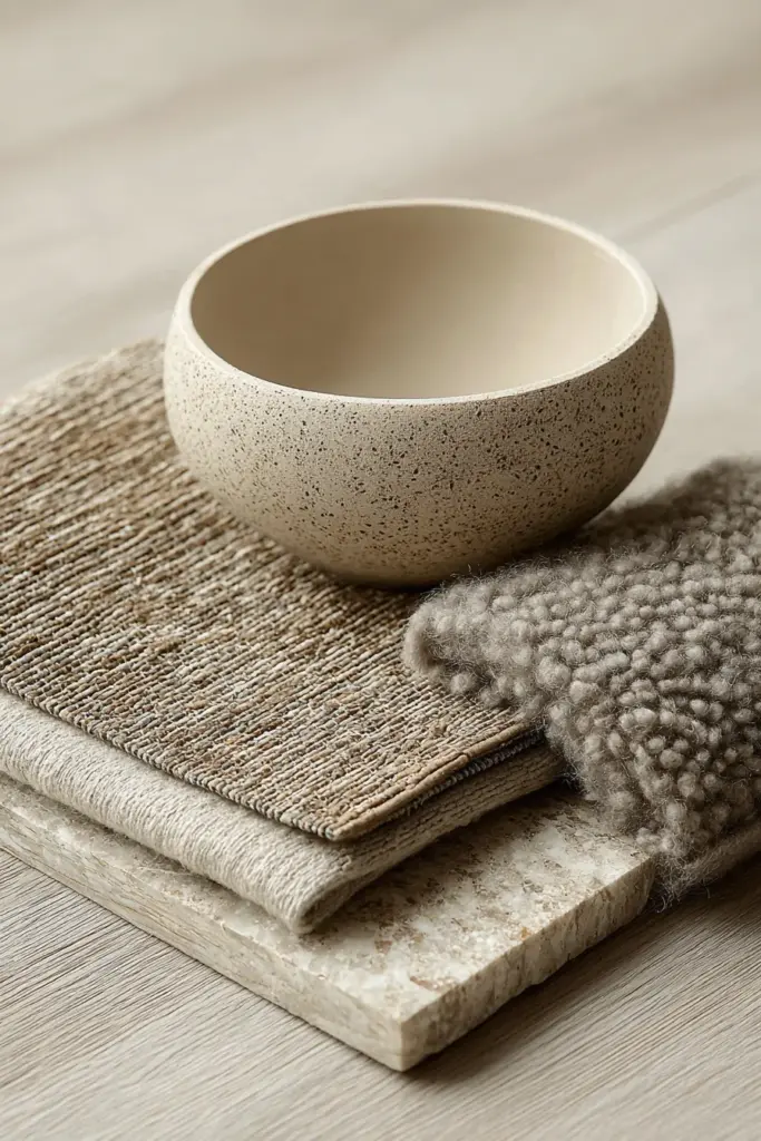
Color alone doesn’t create Japandi magic—texture does half the work. A room painted entirely in warm white could feel stark or calming depending on texture. Smooth painted walls, rough linen curtains, nubby wool throws, sleek wood surfaces—these varied textures prevent monotony.
In small apartments especially, texture becomes your secret weapon. It adds visual interest without requiring space or bold color. Invest in materials you can touch and appreciate: natural fibers, genuine wood, handmade ceramics.
Japandi Color Checklist for Modern Apartments
Here’s your practical guide to implementing these principles:
- Wall Color: Choose one foundational neutral (off-white, cream, or warm light gray) for most walls
- Accent Wall (optional): Select one earth tone (sage green, terracotta, or soft taupe) for a single feature wall
- Large Furniture: Stick to 2-3 neutral shades maximum (cream sofa, light wood coffee table, beige area rug)
- Textiles: Layer 3-4 neutrals through pillows, throws, and curtains in varied textures
- Natural Elements: Incorporate light to medium wood tones in 60-70% of furniture and accessories
- Dark Accents: Add depth with charcoal or black in 5-10% of décor (lighting, frames, small accessories)
- Green Touches: Introduce living plants or dried botanicals—they’re the only “color” that never disrupts Japandi calm
- Edit Ruthlessly: Remove any item that doesn’t serve function or bring genuine joy—clutter destroys this aesthetic
- Light Consideration: Test all colors in your apartment’s specific lighting conditions before committing
- Texture Balance: Ensure every neutral color includes varied textures to prevent visual flatness
The Emotional Architecture of Japandi Colors
Beyond aesthetics, these colors create emotional architecture—they shape how you feel moving through your apartment. Warm neutrals lower your heart rate when you walk through the door after a chaotic day. Earth tones ground you when anxiety creeps in. Clean, uncluttered surfaces allow your mind to rest.
This isn’t abstract design philosophy—it’s practical psychology applied to small-space living. Modern apartments in urban settings bombard us with visual noise. Japandi colors create a buffer, a soft landing place where your nervous system can finally downshift.
The beauty lies in simplicity. You’re not choosing between twenty paint colors or agonizing over pattern combinations. You’re selecting from nature’s palette—colors that have soothed humans for millennia. There’s wisdom in that simplicity, and freedom too.
Conclusion: Coming Home to Calm
Creating a Japandi-colored modern apartment isn’t about perfection. It’s about crafting a space that feels like a deep breath—familiar, gentle, yours. These colors don’t demand attention or try to impress visitors. They simply hold space for you to live fully, rest deeply, and find beauty in the everyday.
Start where you are. Choose one wall, one textile, one corner. Let warm neutrals and earth tones slowly transform your apartment into the sanctuary it’s meant to be. Watch how light plays differently across cream walls, how sage green pillows soften a hard day, how terracotta pottery makes your morning coffee feel like ceremony.
This is the gift of Japandi colors: they remind us that home isn’t about having more—it’s about creating space for what matters. And sometimes, the most profound beauty whispers rather than shouts.
Frequently Asked Questions
What are the main Japandi colors for apartment walls?
The most versatile Japandi wall colors include warm off-white, cream, and light beige—shades that reflect natural light and create spacious feelings in compact apartments. These foundational neutrals work beautifully with Philippine humidity and limited square footage. For accent walls, consider soft sage green or warm taupe to add depth without overwhelming the calm. Always choose paints with warm undertones rather than cool grays to maintain the cozy-minimalist balance essential to Japandi design.
Can I use Japandi colors in a small studio apartment?
Absolutely—Japandi colors excel in small spaces. Light neutrals like cream and off-white maximize natural light and create visual continuity, making studios feel larger. The minimalist approach inherent to Japandi design prevents visual clutter that makes small apartments feel cramped. Stick to 2-3 main neutrals, add texture through varied materials rather than color, and use multifunctional furniture in light wood tones. The result is a studio that breathes rather than overwhelms.
How do I add warmth to Japandi colors without breaking the aesthetic?
Warmth comes primarily through undertones and materials, not bold colors. Choose neutrals with beige or yellow undertones rather than cool grays. Layer natural materials like wood, linen, wool, and jute—these add visual warmth through texture. Introduce small doses of terracotta, rust, or warm brown through pottery, textiles, or artwork. Lighting plays a crucial role too; warm-toned LED bulbs (2700-3000K) make neutral palettes feel inviting rather than sterile.
What’s the difference between Japandi colors and regular minimalist colors?
Traditional minimalism often relies on stark white, cool gray, and black—a palette that can feel cold and clinical. Japandi colors introduce warmth through beiges, creams, and earth tones while maintaining minimalist simplicity. The Japanese wabi-sabi influence embraces natural imperfection, so Japandi neutrals have subtle variation and organic texture. Scandinavian hygge adds coziness through warm woods and soft textiles. The result is minimalism with soul—calm but never cold.
How often should I use accent colors in a Japandi apartment?
Use accent colors sparingly—the 80/20 rule works well. Let 80% of your palette remain neutral (off-white, cream, beige, warm gray), with 20% earth-toned accents (sage green, terracotta, soft brown). Within that 20%, no single accent should dominate. A sage green throw, terracotta vase, and brown cushion create layered interest without overwhelming the calm. In small apartments, err on the side of fewer accents—restraint is fundamental to Japandi design, and empty space serves as its own design element.