Table of Contents
There’s something quietly magical about walking into a room where everything just feels right. The furniture doesn’t shout for attention, yet each piece holds its ground with purpose. The colors whisper rather than announce, creating a backdrop that lets you breathe deeper, think clearer, settle softer into your own skin.
This is the heart of Japandi design—a beautiful marriage between Japanese minimalism and Scandinavian warmth. It’s where the zen philosophy of ma (negative space) meets the Danish concept of hygge (cozy contentment). And when it comes to furniture matching within this aesthetic, color becomes your most powerful yet subtle tool.
Getting Japandi color furniture matching right isn’t about following rigid rules. It’s about understanding how muted greens, warm beiges, soft grays, and natural wood tones dance together in your space. It’s learning which earth hues ground a room and which ones lift it, which combinations invite meditation and which encourage gentle conversation over morning coffee.
Let me walk you through this journey—not as a design manual, but as a conversation between friends who both believe that home should feel like the softest exhale at day’s end.
Understanding the Japandi Color Philosophy
Japandi palettes draw from nature’s most contemplative moments. Think of the pale gray sky just before dawn breaks. The sage green of moss on ancient temple stones. The warm beige of sun-bleached driftwood after months of ocean waves.
These aren’t colors that compete—they collaborate. The Japanese wabi-sabi principle embraces imperfection and natural beauty, while Scandinavian design adds functional warmth. Together, they create spaces that feel both intentional and effortless, curated yet lived-in.
Core Japandi Furniture Colors
Your Japandi furniture palette should center on these foundational hues:
- Natural wood tones (#8B7355 to #D4A574): Teak, oak, walnut, and ash in their honest, unvarnished glory
- Soft whites and off-whites (#F5F5F5 to #F5F2EB): Cream, ivory, and barely-there beiges
- Muted greens (#606C5A to #A8B5A2): Sage, moss, forest night, olive whispers
- Gentle grays (#C5C6C7 to #8A8D91): Dove gray, concrete, soft charcoal
- Warm earth tones (#B88F74 to #A0826D): Terra-cotta, clay, dusty rose, muted rust
Notice the hex codes—these specific shades matter. A bright kelly green disrupts the calm, but #8F9779 moss green settles the nervous system. True white (#FFFFFF) can feel stark and cold, while #F5F2EB off-white wraps you in warmth.
The 60-30-10 Rule for Japandi Furniture Layouts
Professional interior designers swear by this distribution method, and it works beautifully for Japandi spaces. Here’s how to apply it to your furniture color matching:
60% Dominant Color (usually neutral walls and largest furniture pieces): Your foundation shade creates the room’s overall mood. For most Japandi spaces, this means soft whites, warm beiges, or gentle grays covering walls, large sofas, or bed frames.
30% Secondary Color (medium furniture and textiles): This is where natural wood tones typically live—your dining table, coffee table, shelving units, or wooden chair frames. These pieces bridge your neutral base with accent colors.
10% Accent Color (smallest furniture items and décor): Muted greens in throw pillows, dusty rose in a single armchair, terra-cotta in ceramic side tables. These touches add personality without overwhelming the serenity.
Practical Application in Philippine Homes
In a typical Naic living room measuring 4×5 meters, this might look like:
- 60%: Beige (#F0EAD6) linen sofa and off-white (#F5F5F5) walls
- 30%: Natural oak (#C19A6B) coffee table and walnut (#8B7355) media console
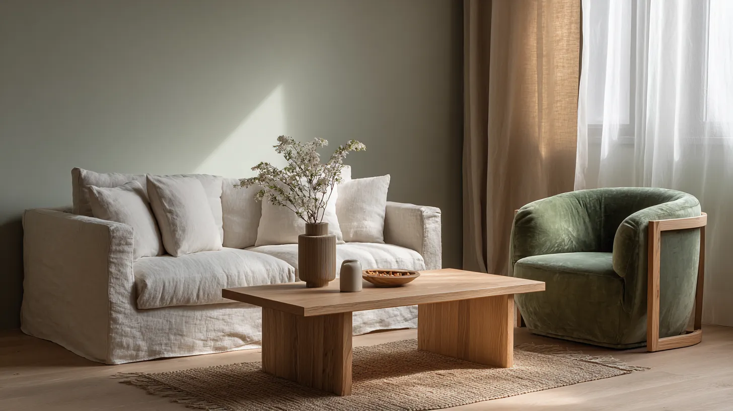
- 10%: Sage green (#8F9779) cushions and a single moss-colored (#606C5A) accent chair
The beauty? This formula works whether you’re furnishing a studio apartment or a family home.
Room-by-Room Japandi Furniture Color Matching
Living Room Serenity
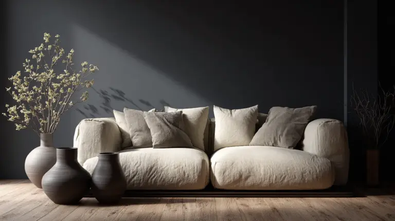
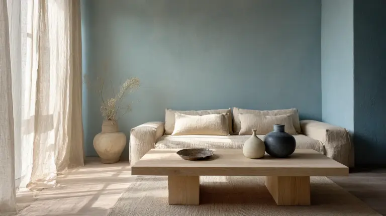
Your living room is where Japandi truly shines—it’s the space for both active gathering and quiet retreat. Start with a neutral-toned sofa as your anchor. A beige linen sectional (#E8DCC4) or soft gray upholstered piece (#C5C6C7) provides the calm canvas you need.
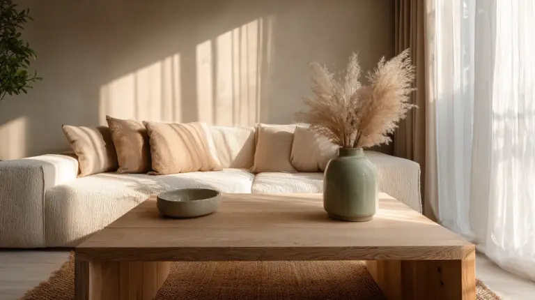
Layer in wooden furniture with intention. A light oak coffee table brings Scandinavian warmth, while a darker walnut side table adds Japanese depth. Don’t match woods exactly—the slight variation in tone creates visual interest while maintaining harmony.
For accent furniture, consider a single statement piece in muted green. A sage velvet armchair (#A8B5A2) or moss-colored ottoman (#606C5A) becomes a meditation corner without announcing itself. This is where you’ll naturally gravitate with your morning tea or evening book.
Bedroom Tranquility
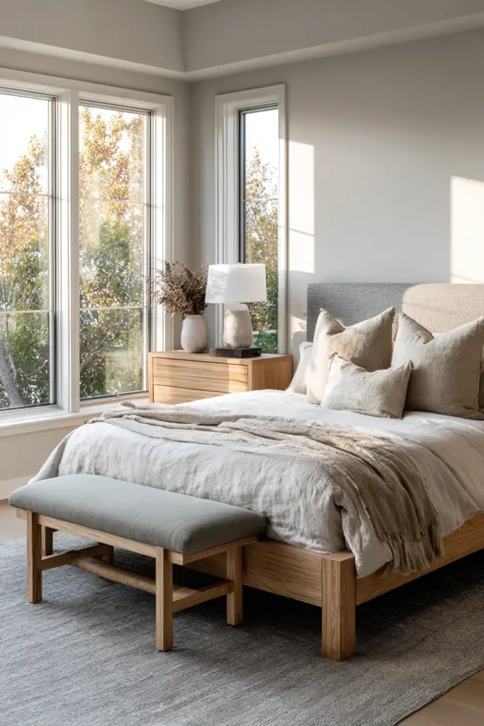
Bedrooms demand the softest end of the Japandi spectrum. Your bed frame should disappear into the background—think natural ash wood (#D4C5B0) or a pale gray upholstered headboard (#D3D5D7). The goal is furniture that doesn’t activate your mind when you’re trying to wind down.
Nightstands in slightly warmer tones (#C19A6B light oak) create gentle contrast without disruption. Avoid matching bedroom sets—they feel too formal for Japandi’s relaxed philosophy. Instead, choose pieces that share a color family but vary in exact shade and texture.
Accent with the palest greens and blues if you need color. A dusty blue-gray chair (#B4C4C7) or sage linen bench (#D4D9CE) at the foot of your bed adds just enough interest while maintaining the room’s drowsy, peaceful energy.
Dining Room Warmth
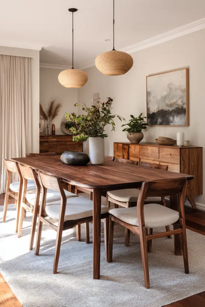
Dining spaces in Japandi homes lean slightly warmer to encourage lingering conversation. Your dining table should be the room’s hero—solid wood in medium tones like #8B7355 walnut or #A0826D teak becomes the gathering heart.
Chairs can play with contrast. Natural wood chairs with beige (#E8DCC4) or off-white (#F5F2EB) cushions feel classic Japandi. Or try a mix—four wooden chairs with two upholstered end chairs in soft gray (#C5C6C7). This creates visual rhythm while keeping the palette cohesive.
Storage furniture like sideboards should echo your table’s wood tone but can go lighter or darker by one shade. A credenza in light oak (#D4A574) pairs beautifully with a walnut table, creating depth through subtle variation rather than stark contrast.
Furniture Pairing Strategies by Material
Wood + Neutral Upholstery
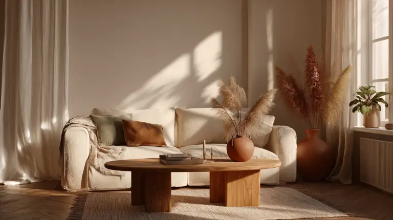
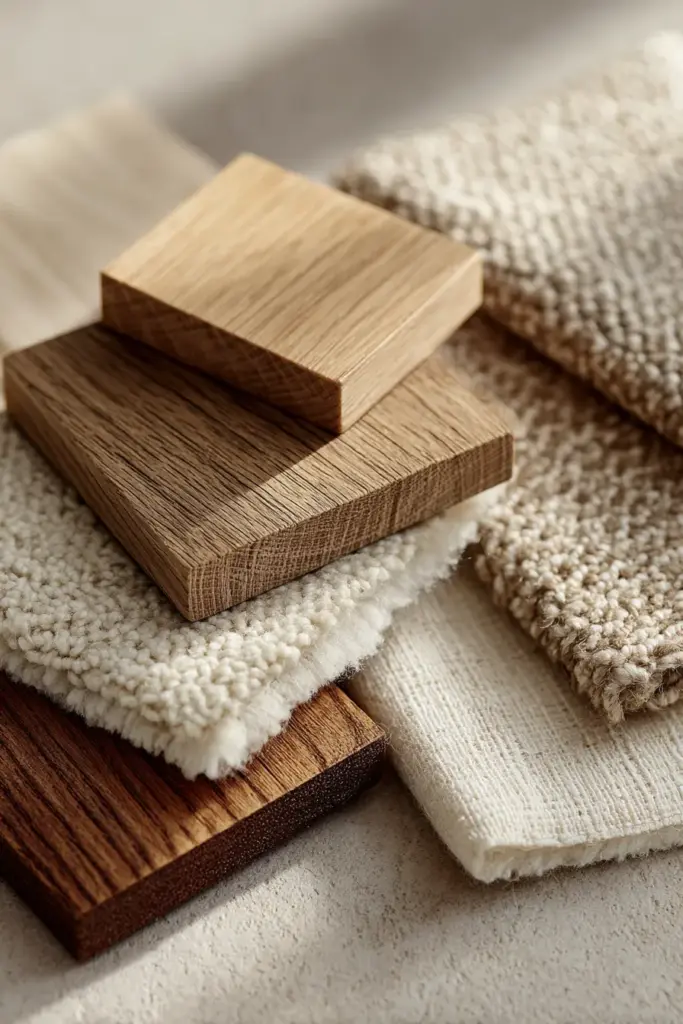
This is the most foolproof Japandi combination. Natural wood pieces (#8B7355 to #C19A6B) against neutral fabrics (#F5F5F5 to #E8DCC4) create instant harmony. The wood brings warmth and organic texture, while neutral upholstery provides visual rest.
Key principle: vary your wood tones slightly but stay within two shades of each other. A medium walnut coffee table, lighter oak shelving, and medium-dark teak dining chairs all coexist peacefully because they’re relatives, not twins.
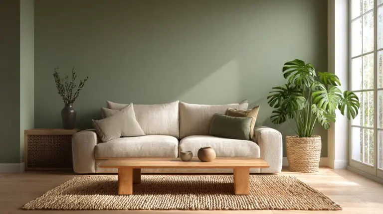
Monochromatic Neutral with Green Accents
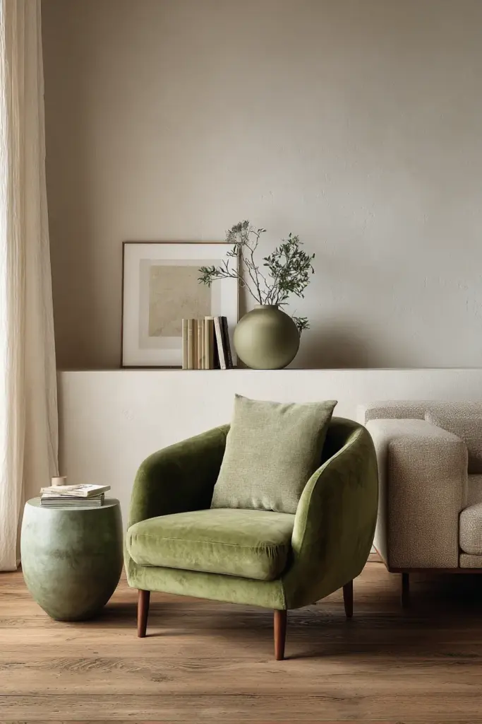
For smaller spaces or those new to Japandi, try an all-neutral furniture base—beiges, soft grays, and whites only. Then introduce green through a single furniture piece rather than just pillows and plants.
A sage green credenza (#A8B5A2), a moss-colored side table (#8F9779), or even a muted olive cabinet (#707F5E) becomes your room’s focal point. This strategy works brilliantly in Philippine homes where tropical light can wash out subtle color variations—the concentrated green holds its own.
Mixed Material Harmony
Japandi loves combining materials mindfully. A dining setup might include: wooden table + rattan chairs + linen cushions in complementary earth tones. The key is keeping colors within the same warmth family.
Example palette: #C19A6B oak table + natural rattan (which reads as #D4C5B0 visually) + #E8DCC4 beige linen cushions. All warm, all earthy, all peaceful. This mixed-material approach adds textural interest while the unified color temperature maintains calm.
Color Psychology for Mindful Furniture Choices
Science backs what Japandi designers have long intuited—certain colors genuinely affect our nervous system. Understanding this helps you choose furniture colors based on how you want each room to feel, not just how it looks.
Muted Greens: The Anxiety Soothers
Shades like #606C5A forest night and #8F9779 moss green have been shown to lower cortisol levels during 20-minute meditation sessions. These tones work exceptionally well for reading chairs, meditation cushions, or any furniture piece where you’ll practice stillness.
In the Philippine climate, these greens also connect indoor spaces to our lush outdoor environment without bringing in bright, energizing jungle greens. They’re the quiet greens—the ones you find in shade, not direct sun.
Warm Beiges and Soft Grays: The Nervous System Balancers
Colors like #F0EAD6 warm beige and #C5C6C7 dove gray create what psychologists call “low-stimulation environments.” Your eye doesn’t work hard to process them. This makes them ideal for large furniture pieces in bedrooms and living areas where you need your space to support rest, not demand attention.
For hot Philippine afternoons, these neutrals also reflect heat while maintaining that cozy hygge warmth Scandinavian design is famous for.
Natural Wood Tones: The Grounding Elements
There’s a reason wooden furniture remains central to Japandi style—it literally grounds us. Medium wood tones (#8B7355 to #C19A6B) provide visual and psychological stability. They’re neither too light (which can feel sparse) nor too dark (which can feel heavy).
In open-concept Philippine homes, wooden furniture pieces act as visual anchors that define zones without walls.
Practical Matching Guidelines for Philippine Spaces
Budget-Friendly Color Coordination
Creating Japandi furniture harmony doesn’t require luxury pieces. Here’s how to achieve the look with accessible Philippine options:
Local wood sources: Many Naic and Cavite furniture makers work with sustainable local hardwoods that naturally fall into Japandi’s color range. Acacia and mahogany, when given a light stain or oil finish, read as #A0826D to #8B7355—perfect Japandi territory.
Paint upgrades: Have mismatched furniture? A ₱400 can of matte beige (#E8DCC4) or soft gray (#C5C6C7) paint transforms disparate pieces into a cohesive set. Chalk paint works beautifully for this and requires no primer.
Textile unifiers: Can’t replace furniture yet? Slipcovers in Japandi neutrals (₱800-2000 for sofa covers in online Philippine shops) instantly shift the color story. Choose natural linen or cotton in off-whites and beiges.
Lighting Considerations for Color Accuracy
Philippine sunlight is intense and can completely change how furniture colors appear. That perfect #8F9779 sage chair might look washed-out yellow in direct afternoon sun or muddy brown under warm evening bulbs.
Strategy: Choose furniture colors one shade deeper than you think you want if your room gets strong natural light. A #707F5E darker moss will read as #8F9779 lighter moss under bright conditions.
For evening ambiance, install warm LED bulbs (2700K) that enhance wood tones and make neutrals glow rather than look dingy. Avoid cool white lights—they make Japandi palettes feel cold and institutional.
Small Space Color Tricks
Condos and smaller homes in urban Philippines need smart color matching to avoid feeling cramped. Here’s your furniture color strategy:
- Limit to three furniture colors maximum: Two neutrals + one wood tone keeps small spaces feeling open
- Use the lightest shades: #F5F5F5 off-white and #D4A574 light oak reflect light and expand perceived space
- Keep accent colors to truly small pieces: A #606C5A green side table rather than a green sofa
- Match furniture legs to flooring: Creates visual continuity that makes rooms feel larger
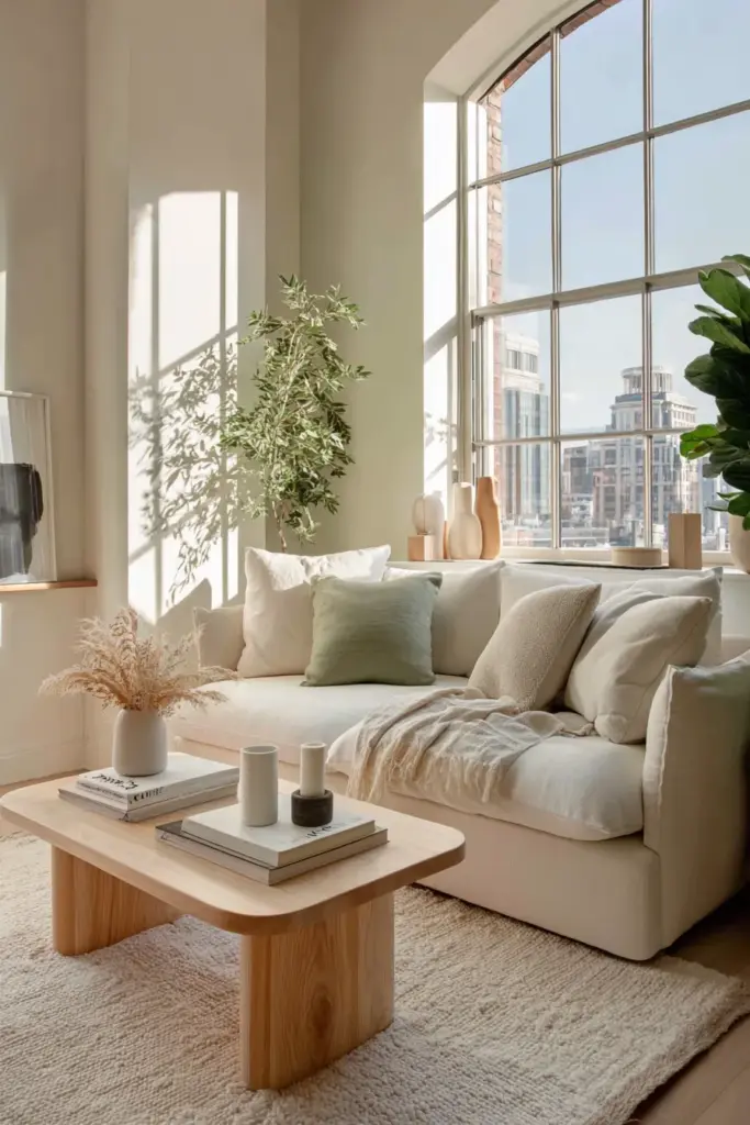
Essential Japandi Furniture Color Combinations
Here are tested palettes that work beautifully together:
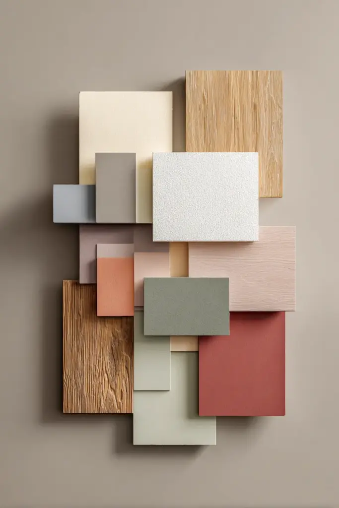
Palette 1: Dawn Serenity
Best for: Bedrooms, meditation corners, reading nooks
- Primary: #F5F2EB warm off-white (bed frame, walls)
- Secondary: #D4A574 light ash wood (nightstands, shelving)
- Accent: #8F9779 soft moss green (bench, cushions)
This combination mimics early morning light—soft, gentle, encouraging slow movement.
Palette 2: Forest Grounding
Best for: Living rooms, home offices, creative spaces
- Primary: #E8DCC4 warm beige (sofa, larger pieces)
- Secondary: #8B7355 medium walnut (coffee table, desk)
- Accent: #606C5A forest night green (armchair, ottoman)
Deeper tones create focus and contemplation while maintaining Japandi calm.
Palette 3: Neutral Elegance
Best for: Dining rooms, multi-purpose spaces, small condos
- Primary: #F5F5F5 soft white (walls, upholstered chairs)
- Secondary: #C19A6B natural oak (dining table, credenza)
- Accent: #B88F74 dusty rose (single chair, table runner)
This palette balances maximum light reflection with warm, welcoming touches.
Palette 4: Stone and Timber
Best for: Modern masculine spaces, minimalist homes
- Primary: #C5C6C7 dove gray (sectional, area definition)
- Secondary: #A0826D medium teak (all wooden furniture)
- Accent: #8A8D91 charcoal gray (media console, frames)
Cooler tones that still maintain organic warmth through wood presence.
Quick Reference: Japandi Furniture Color Matching
| Furniture Piece | Primary Color Options | Pairs Best With | Avoid Pairing With |
|---|---|---|---|
| Sofa/Sectional | #F5F5F5 off-white, #E8DCC4 beige, #C5C6C7 gray | All wood tones, green accents | Dark browns, bright whites |
| Coffee Table | #8B7355 walnut, #C19A6B oak, #D4A574 light wood | Neutral upholstery, muted greens | Matchy-matchy wood throughout |
| Dining Chairs | #F5F2EB cushions, #8B7355 wood frames | Wood tables, neutral sideboards | Glossy finishes, bold patterns |
| Accent Chairs | #8F9779 sage, #A8B5A2 moss, #B88F74 dusty rose | Neutral primary furniture | Multiple accent colors in one room |
| Bedroom Dresser | #D4A574 light ash, #C19A6B oak | Soft gray or beige beds | Overly dark woods in small rooms |
| Shelving Units | #D4A574 light wood, #C5C6C7 painted gray | All neutrals, minimalist décor | Heavy, dark wood in bright rooms |
Common Japandi Furniture Color Mistakes (and Fixes)
Mistake: Choosing furniture that’s too matchy. A bedroom set where bed, nightstands, and dresser are identical wood.
Fix: Keep furniture within the same color temperature (all warm or all cool) but vary exact shades by one or two steps.
Mistake: Adding too many accent colors. Green pillows + blue throw + rust chair + pink artwork.
Fix: Choose ONE accent color (ideally muted green) and stick with it throughout the space.
Mistake: Ignoring undertones. Mixing gray furniture with beige undertones (#D3C5C0) with gray furniture with blue undertones (#C5C6D0).
Fix: Test furniture samples together before buying. All your grays should lean the same direction—either all warm or all cool.
Mistake: Going too neutral and ending up with a lifeless room.
Fix: Ensure your wood furniture varies in depth—one light piece, one medium, one darker. This creates dimension within neutrals.
Seasonal Adjustments and Flexibility
Japandi furniture color matching isn’t static. In the Philippines, you might want different energy between rainy season and summer heat.
Rainy season months: Emphasize warmer tones. Bring forward #C19A6B oak pieces, add #B88F74 dusty rose cushions, use table linens in warm beiges. These colors counteract gray skies without fighting the Japandi aesthetic.
Hot summer months: Lead with cooler shades. Feature #C5C6C7 gray upholstery, style with #A8B5A2 lighter greens, use cotton slipcovers in #F5F5F5 soft white. These tones psychologically cool spaces when AC might not.
The beauty? Your core furniture colors stay the same. You’re just shifting emphasis through textiles and which pieces become focal points.
Essential Checklist: Building Your Japandi Furniture Palette
Before purchasing any furniture piece, run through this list:
- Is the color temperature consistent? (All pieces should lean warm OR cool, not mixed)
- Does it fall within the hex code ranges? (#F5F5F5-#F5F2EB for whites, #8B7355-#D4A574 for woods, #606C5A-#A8B5A2 for greens, #C5C6C7-#8A8D91 for grays)
- Will it follow the 60-30-10 rule in my specific room?
- Can I see actual color in my lighting conditions? (Always test samples at different times of day)
- Does it have natural, matte finish? (Glossy and high-shine contradict Japandi principles)
- Is there textural variety? (Smooth wood + woven textile + soft upholstery = visual interest without color chaos)
- Will this piece bring calm or stimulation? (Japandi prioritizes the former)
Bringing It All Together
Creating a Japandi furniture color palette isn’t about memorizing hex codes or following rigid formulas. It’s about developing an eye for quiet harmony—understanding why #8F9779 moss green settles your spirit in a way #00FF00 bright green never could. It’s recognizing that #E8DCC4 warm beige feels like a hug, while #FFFFFF stark white feels like a waiting room.
The furniture you choose in these colors becomes more than décor. It becomes the physical structure of your peace. The beige linen sofa where you exhale after long days. The walnut coffee table that grounds family evenings. The sage green reading chair that holds you through entire novels and half-dreamed afternoons.
In our fast-paced world, particularly here in the Philippines where life moves with tropical intensity, Japandi furniture color matching offers something radical: permission to slow down. To choose furniture not because it’s trendy or impressive, but because it creates the atmosphere where you become most yourself—calm, present, gently alive.
Start with one room. Choose your base neutral, add intentional wood tones, accent with a single muted green. Watch how the space transforms, how you transform within it. That’s the quiet magic of getting Japandi colors right—the room doesn’t just look beautiful. It feels like home.
Frequently Asked Questions
What is the Japandi color palette for furniture?
The Japandi furniture palette centers on soft neutrals—off-whites (#F5F5F5, #F5F2EB), warm beiges (#E8DCC4, #F0EAD6), and gentle grays (#C5C6C7)—paired with natural wood tones ranging from light oak (#D4A574) to medium walnut (#8B7355). Accent colors include muted greens like sage (#A8B5A2) and moss (#8F9779), plus earth tones like dusty rose (#B88F74) and terra-cotta. These colors create serene, minimalist spaces that balance Japanese zen with Scandinavian warmth.
How do I choose Japandi furniture colors for small Philippine spaces?
For condos and smaller homes, stick to lighter shades that reflect our intense tropical light—prioritize #F5F5F5 off-white upholstery and #D4A574 light wood furniture. Limit your palette to three colors maximum: one neutral base, one wood tone, and one subtle accent. Keep deeper colors like #606C5A forest green limited to truly small pieces like side tables rather than sofas. Match furniture legs to your flooring color to create visual continuity that makes spaces feel larger.
Can I mix different wood furniture colors in Japandi style?
Absolutely—in fact, you should. Japandi embraces subtle wood variation for visual interest. The key is keeping all wood tones within a two-shade range and the same temperature family. For example, #D4A574 light oak shelves + #C19A6B medium oak coffee table + #8B7355 walnut dining chairs work beautifully because they’re warm-toned relatives. Avoid mixing a cool ash wood (#D4D4D4) with warm teak (#A0826D)—the temperature clash disrupts Japandi’s harmony.
What colors pair best with natural wood Japandi furniture?
Natural wood furniture (#8B7355 walnut, #C19A6B oak, #D4A574 ash) pairs beautifully with soft neutrals—off-white (#F5F2EB) or beige (#E8DCC4) upholstery creates classic Japandi serenity. For more personality, add muted green accents: #8F9779 moss or #A8B5A2 sage in cushions or a single statement chair. Gentle grays (#C5C6C7) also work well for modern spaces. Avoid pairing warm woods with cool grays that have blue undertones, and skip stark white (#FFFFFF) which feels too harsh against organic wood tones.
How do I maintain Japandi furniture color harmony when decorating for Philippine seasons?
Your core Japandi furniture colors stay constant—invest in neutral upholstered pieces and quality wood furniture. Adjust seasonal feeling through textiles and styling rather than furniture replacement. During rainy months, layer warmer tones: #C19A6B oak side tables become focal points, add #B88F74 dusty rose throws, use warm beige (#F0EAD6) table linens. For hot summer, emphasize cooler shades: feature #C5C6C7 gray cushions, style with #A8B5A2 lighter green accents, swap to white cotton (#F5F5F5) slipcovers. This approach is budget-friendly and authentically Japandi.