Table of Contents
Japandi Living Room Color Mistakes That Keep Your Space from Feeling Like Home
There’s something quietly devastating about a room that almost works.
You’ve gathered all the right pieces—the low-slung sofa, the wooden coffee table, the ceramic vase catching afternoon light. But something feels off. The colors don’t breathe together. The walls feel cold instead of calm. Your carefully curated Japandi living room looks more like a waiting room than a sanctuary.
You’re not alone in this. The delicate balance between Japanese minimalism and Scandinavian warmth lives and dies in the details—and color is where most of us stumble. A shade too cool, and your space turns clinical. A tone too warm without the right contrast, and everything melts into beige oblivion.
Let’s walk through the color mistakes that might be quietly sabotaging your Japandi living room—and how to fix them with intention, not guesswork.
The “Sad Oatmeal” Effect: When All Your Neutrals Fight Each Other
Neutrals sound safe. But not all beiges, greys, and whites play well together—especially in the humid, golden light of homes in places like Quezon City.
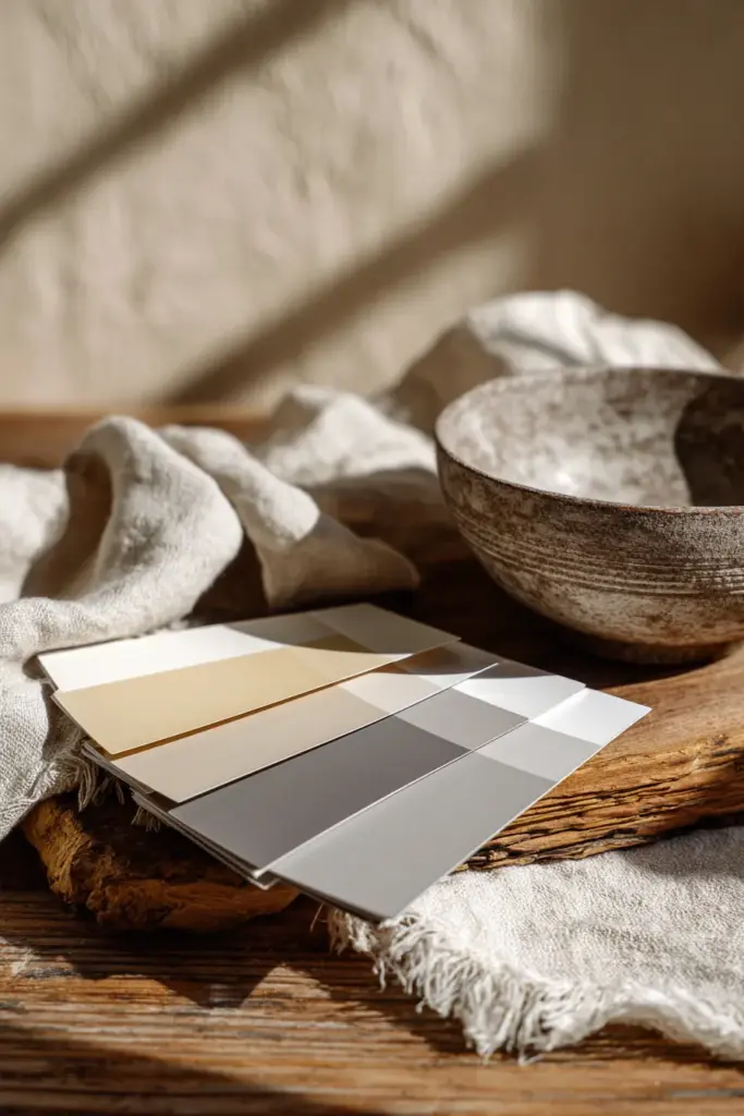
The problem? Undertone clash. You might pair a cool grey sofa with warm beige walls, thinking they’re both “neutral.” But cool greys have blue or green undertones, while warm beiges lean peachy or yellow. Under natural Philippine sunlight, this creates what I call the sad oatmeal effect—a muddy, confused palette that feels neither calm nor cozy.
How to Fix It
Test your paint swatches in actual daylight, not under store fluorescents. Hold your fabric samples against the wall at different times of day. Notice how morning light in the Philippines tends golden—colors that look “greige” in the store might turn sickly yellow by 10 AM.
Commit to either warm neutrals (cream, warm grey, soft taupe) or cool neutrals (off-white, charcoal, sage). Don’t try to have both unless you’re intentionally using one as a 10% accent. Brands like Boysen offer low-VOC options in both warm (“Almond Wisp”) and cool (“Cloudy Day”) families—pick your lane and stay in it.
The 60-30-10 rule becomes your anchor here: 60% dominant neutral, 30% secondary neutral from the same temperature family, 10% accent.
Ignoring the Light: Colors That Work in Stockholm Won’t Work in Manila
Scandinavian interiors are designed for soft, diffused northern light. Japanese spaces honor natural light as a material in itself. But tropical light? That’s a different beast entirely.
Bright, direct Philippine sunlight amplifies warm tones and exposes cool ones as harsh. That Pinterest-perfect icy white? In Quezon City, it might glare like a hospital corridor. That charcoal accent wall? Under midday sun, it could swallow your entire room in shadow.
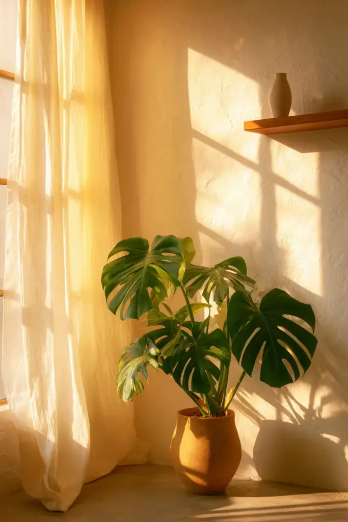
Adapt Your Palette to Your Latitude
Choose off-whites with warmth—think “warm ivory” or “natural linen” instead of stark white. These soften harsh tropical light without yellowing. For darker tones, opt for warm charcoals (brown-grey) over true black-greys. They absorb light without creating dead zones.
Layer in warm wood tones generously—teak, mango wood, light oak. These act as color mediators, bridging your neutrals and adding depth that pure paint can’t achieve. In humid climates, natural materials also introduce subtle texture that keeps monochrome from feeling flat.
Consider your room’s orientation. North-facing spaces get cooler light (even in the tropics) and can handle slightly warmer palettes. South-facing rooms flooded with afternoon sun need cooler neutrals to stay breathable.
The Bold Accent Trap: When One Bright Pillow Ruins Everything
Japandi is often misunderstood as “add one pop of color.” But here’s the truth: bold, saturated colors—think cobalt blue, mustard yellow, terracotta orange—belong to neither Japanese nor Scandinavian design traditions.
One bright throw pillow might seem harmless. But in a carefully calibrated neutral space, it acts like a shout in a library. Your eye goes straight to it, ignoring the subtle interplay of textures, the grain of the wood, the way shadow pools in a corner. The entire composition collapses.
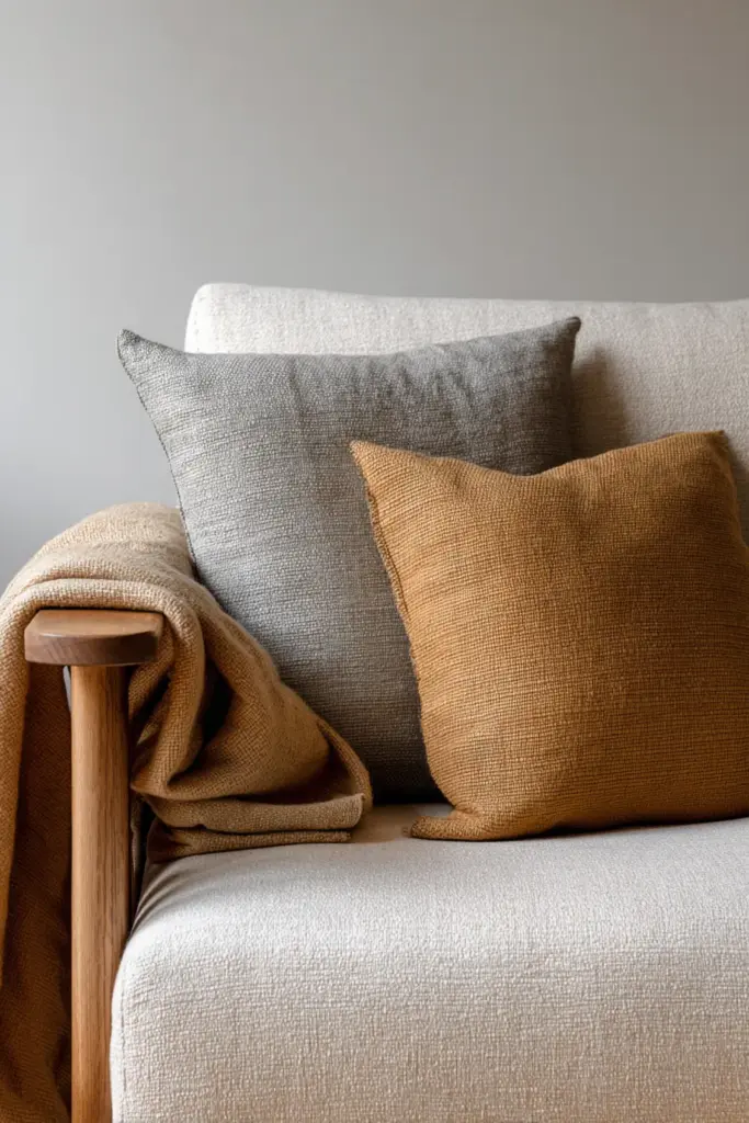
Choose Muted, Not Loud
Japandi accents should feel like whispers, not exclamation points. Instead of bright blue, try dusty slate blue. Instead of sunny yellow, consider warm ochre or clay. Instead of forest green, embrace muted sage or olive.
These colors carry enough personality to add interest without dominating. They’re inspired by natural pigments—the color of lichen on stone, aged brass, dried botanicals. Aim for colors that look like they’ve been sun-faded, gently worn by time.
In practice: if your accent color would look loud on a billboard, it’s too intense for Japandi. If it feels like something you’d find in nature after a soft rain, you’re on the right track.
The All-Grey Mistake: When Minimalism Turns Lifeless
Grey is the most overused color in modern “minimalist” design—and it’s killing the warmth that makes Japandi livable.
Yes, Scandinavian design loves grey. But it’s always warm grey balanced with blonde woods and soft whites. Japanese interiors prefer taupe-greys that nod to clay and stone. The mistake? Reaching for cool, blue-toned greys that feel sleek in showrooms but sterile at home.
Warm It Up or Walk Away
If you love grey, choose versions with brown or taupe undertones—sometimes called “greige.” These feel grounded rather than floaty. Pair them with warm-toned woods and cream accents to prevent the space from feeling like a concrete bunker.
Better yet, replace some grey with true earth tones. Think soft taupe, warm sand, mushroom brown. These have the same visual weight as grey but carry an organic warmth that grey can’t replicate.
Test this: hold a grey paint chip next to a taupe one in your room’s natural light. The grey might read blue or purple. The taupe stays neutral and alive. That’s the difference between a room that feels calm and one that feels cold.
Forgetting Texture: Why Flat Colors Fall Flat
Here’s a color mistake that isn’t about hue at all—it’s about finish and texture. Even the perfect palette can feel lifeless if every surface is painted in the same matte finish, with no textural variation to catch light differently.
Japandi celebrates wabi-sabi—the beauty of imperfection, the richness of natural wear. This means your colors shouldn’t just sit on surfaces; they should live in them.
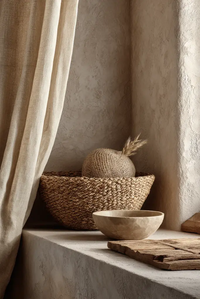
Layer Texture Like You Layer Color
Use linen curtains instead of polyester—the weave catches light, adding depth to your neutral palette. Choose a jute rug over flatweave—the natural fiber introduces warm browns organically. Add rattan or woven baskets—they’re functional and bring in blonde, honey-toned neutrals.
Your walls don’t need to be perfectly smooth. Consider a lime wash or textured plaster finish in warm white—it creates subtle shadow play that makes neutral walls feel dimensional rather than flat.
Even your furniture matters here. A smooth leather sofa reads differently than linen upholstery, even in the same taupe. The leather reflects light slightly; the linen absorbs it softly. Both are neutral, but they create different textural “colors” in your space.
The Missing Middle: No Transition Between Light and Dark
Many Japandi attempts fall into a two-tone trap—light walls, dark furniture, nothing in between. This creates harsh contrast instead of the gentle gradient Japandi is known for.
The missing element? Mid-tones. These bridge your lightest and darkest values, creating visual rest stops for the eye and making the whole palette feel cohesive rather than jumpy.
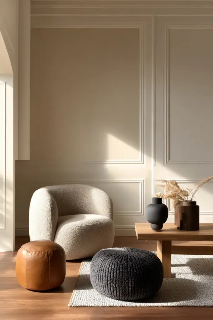
Build a Gradient, Not a Checkerboard
If your walls are cream (light) and your sofa is charcoal (dark), you need mid-tones to mediate. This could be a medium taupe armchair, warm grey-brown shelving, or caramel leather poufs. These pieces occupy the middle ground, softening the transition.
Think of it like a sunset gradient—you don’t go straight from pale sky to dark horizon. There are layers of peach, mauve, deeper rose in between. Your room needs the same gradual shift.
A practical formula: light walls (60%), medium wood furniture and textiles (30%), dark accents and grounding pieces (10%). The middle 30% is what most people forget—and it’s what makes everything else harmonious.
Plant Colors That Clash Instead of Complete
Greenery is Japandi’s natural accent—but even plants can create color chaos if you’re not thoughtful about their relationship to your palette.
Deep emerald foliage against cool grey walls can feel jarring—the warmth of the green fights the coolness of the grey. Dusty succulents might disappear against warm beige, adding no visual interest at all.
Match Your Greens to Your Neutrals
If you’ve chosen warm neutrals (beiges, warm greys, taupes), opt for plants with warm-toned foliage—monstera, pothos, fiddle leaf figs. Their deep, slightly yellow-greens complement your palette rather than clash with it.
If you’ve committed to cooler neutrals (off-whites, cool greys), choose plants with blue-green or silvery foliage—eucalyptus, snake plants, certain ferns. They’ll feel integrated rather than added as an afterthought.
In humid climates like the Philippines, tropical plants are abundant and natural—but they’re also vivid. Balance their lushness with plenty of breathing room. One large monstera in a natural woven basket can be a focal point. Ten different plant varieties in colorful pots becomes visual noise.
The Seasonal Mismatch: Colors That Don’t Breathe with the Climate
Japandi design is deeply tied to seasonal awareness—but most guides are written for temperate climates with four distinct seasons. In tropical regions with wet and dry seasons, your color strategy needs adjustment.
During the monsoon months, rooms can feel darker and damper. Colors that looked warm in dry season might suddenly feel heavy or dull. Meanwhile, the hot season intensifies light, making cool colors feel more comfortable but warm tones potentially overwhelming.
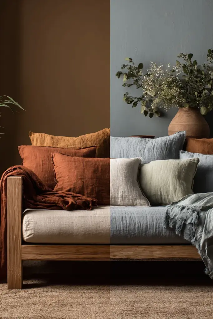
Adjust Without Repainting
You don’t need to repaint every season—just swap textiles strategically. During rainy months, introduce slightly warmer throws, cushions in clay or rust tones, perhaps a warmer-toned rug. These small additions counteract the grey light coming through windows.
In peak summer heat, replace those with cooler-toned linens—soft grey-blue, pale sage, cool taupe. Keep the same neutral base walls and furniture, but let your accent layers breathe with the season.
This is especially important in spaces without strong temperature control. Color psychology matters: cooler tones genuinely feel cooler in hot weather; warmer tones add psychological coziness when it’s dreary outside.
Small Space Color Disasters: Making Tiny Rooms Tinier
In compact living rooms—common in city apartments—color mistakes are magnified. Dark walls can shrink space. Too many mid-tones create clutter. High contrast chops the room into pieces.
The instinct is to go all-white, but that strips away Japandi’s warmth. The solution is more nuanced.
Color Zone Without Fragmenting
Use your lightest neutrals on walls and ceiling—this maintains spaciousness. But introduce depth through furniture and accents in medium and darker tones. This creates visual interest without closing in the space.
Employ tonal layering—variations of the same color family rather than different colors. For example, walls in warm ivory, a sofa in warm sand, cushions in deeper taupe. The eye reads this as harmonious and spacious because there’s no jarring contrast.
Avoid dark accent walls in small spaces—they work in large rooms with high ceilings but can feel oppressive in compact areas. Instead, bring depth through a single dark wood media console or a charcoal ceramic vase—focal points that ground without dominating.
Multi-functional furniture in mid-tones helps too—a storage ottoman in warm grey serves purpose without visually fragmenting your color scheme.
The Checklist: Quick Fixes for Common Japandi Color Mistakes
Before you commit to any color decision, run through this:
- Undertone test: Do all your neutrals share the same temperature (warm OR cool)?
- Daylight check: Have you viewed colors in your actual space at multiple times of day?
- 60-30-10 rule: Is your palette weighted correctly—60% dominant, 30% secondary, 10% accent?
- Texture layer: Are you introducing color through varied materials, not just paint?
- Mid-tone presence: Do you have bridging colors between your lightest and darkest values?
- Muted accents: Are your pops of color soft and nature-inspired, not bright and bold?
- Plant harmony: Do your greens complement your neutrals’ undertones?
- Seasonal awareness: Can you adjust warmth/coolness through textiles as light changes?
- Finish variety: Are you mixing matte, textured, and natural materials for depth?
- Space consideration: Are your color choices appropriate for your room size and light levels?
The Path Back to Harmony
Fixing color mistakes doesn’t require starting over—it requires seeing clearly what’s already there.
Stand in your living room at sunset, when light is most honest. Notice where your eye catches, where it stumbles. Pay attention to how the room makes you feel, not just how it looks in photos. Japandi isn’t about perfect staging; it’s about lived-in peace.
Maybe you need to swap that cool grey throw for warm taupe. Perhaps your walls need a single coat of warmer white. It might be as simple as removing one too-bright pillow, or as involved as replacing curtains with natural linen.
The beauty of Japandi color is that it’s forgiving once you understand its principles. Nature doesn’t make jarring mistakes—bark doesn’t clash with stone, sand doesn’t fight with driftwood. Your room shouldn’t either.
Start small. Make one change. Live with it. Then another. Let your space evolve toward harmony rather than forcing it into someone else’s Pinterest board.
Color is patient. Your room will wait while you learn to listen.
How do I fix an inconsistent Japandi color palette?
Apply the 60-30-10 rule: 60% dominant neutral, 30% secondary supporting color, 10% accent. First, identify if your undertones are fighting—are you mixing warm beiges with cool greys? Choose one temperature family and stick with it. Remove any bold or saturated colors that create jarring contrast. Add mid-tone pieces (medium taupe, warm brown) to bridge gaps between your lightest and darkest values. The goal is a gradient, not a collection of unrelated colors.
What are the biggest Japandi color mistakes to avoid?
Avoid mixing warm and cool undertones without intention—it creates muddy, incoherent spaces. Don’t use bold, saturated accent colors; they destroy Japandi’s calm. Skip all-grey schemes that lack warmth, and don’t forget mid-tones between light and dark. Never ignore your actual lighting conditions—test colors in natural daylight specific to your location. Finally, don’t overlook texture; flat surfaces in perfect colors still feel lifeless without varied materials and finishes.
Can I use Japandi colors in a small living room?
Absolutely—Japandi’s neutral palette actually suits small spaces when done right. Use your lightest neutral (warm ivory or off-white) on walls to maintain openness. Introduce depth through tonal layering: furniture in medium neutrals (sand, warm taupe) and small dark accents (charcoal ceramics, black metal frames). Avoid dark accent walls or high-contrast patterns that fragment space. Instead, create cohesion through variations of one color family. Add warmth with natural materials rather than bold colors—wood tones and organic textures keep small rooms feeling cozy without closing them in.There’s something quietly devastating about a room that almost works.
You’ve gathered all the right pieces—the low-slung sofa, the wooden coffee table, the ceramic vase catching afternoon light. But something feels off. The colors don’t breathe together. The walls feel cold instead of calm. Your carefully curated Japandi living room looks more like a waiting room than a sanctuary.
You’re not alone in this. The delicate balance between Japanese minimalism and Scandinavian warmth lives and dies in the details—and color is where most of us stumble. A shade too cool, and your space turns clinical. A tone too warm without the right contrast, and everything melts into beige oblivion.
Let’s walk through the color mistakes that might be quietly sabotaging your Japandi living room—and how to fix them with intention, not guesswork.
The “Sad Oatmeal” Effect: When All Your Neutrals Fight Each Other
Neutrals sound safe. But not all beiges, greys, and whites play well together—especially in the humid, golden light of homes in places like Quezon City.
The problem? Undertone clash. You might pair a cool grey sofa with warm beige walls, thinking they’re both “neutral.” But cool greys have blue or green undertones, while warm beiges lean peachy or yellow. Under natural Philippine sunlight, this creates what I call the sad oatmeal effect—a muddy, confused palette that feels neither calm nor cozy.
How to Fix It
Test your paint swatches in actual daylight, not under store fluorescents. Hold your fabric samples against the wall at different times of day. Notice how morning light in the Philippines tends golden—colors that look “greige” in the store might turn sickly yellow by 10 AM.
Commit to either warm neutrals (cream, warm grey, soft taupe) or cool neutrals (off-white, charcoal, sage). Don’t try to have both unless you’re intentionally using one as a 10% accent. Brands like Boysen offer low-VOC options in both warm (“Almond Wisp”) and cool (“Cloudy Day”) families—pick your lane and stay in it.
The 60-30-10 rule becomes your anchor here: 60% dominant neutral, 30% secondary neutral from the same temperature family, 10% accent.
Ignoring the Light: Colors That Work in Stockholm Won’t Work in Manila
Scandinavian interiors are designed for soft, diffused northern light. Japanese spaces honor natural light as a material in itself. But tropical light? That’s a different beast entirely.
Bright, direct Philippine sunlight amplifies warm tones and exposes cool ones as harsh. That Pinterest-perfect icy white? In Quezon City, it might glare like a hospital corridor. That charcoal accent wall? Under midday sun, it could swallow your entire room in shadow.
Adapt Your Palette to Your Latitude
Choose off-whites with warmth—think “warm ivory” or “natural linen” instead of stark white. These soften harsh tropical light without yellowing. For darker tones, opt for warm charcoals (brown-grey) over true black-greys. They absorb light without creating dead zones.
Layer in warm wood tones generously—teak, mango wood, light oak. These act as color mediators, bridging your neutrals and adding depth that pure paint can’t achieve. In humid climates, natural materials also introduce subtle texture that keeps monochrome from feeling flat.
Consider your room’s orientation. North-facing spaces get cooler light (even in the tropics) and can handle slightly warmer palettes. South-facing rooms flooded with afternoon sun need cooler neutrals to stay breathable.
The Bold Accent Trap: When One Bright Pillow Ruins Everything
Japandi is often misunderstood as “add one pop of color.” But here’s the truth: bold, saturated colors—think cobalt blue, mustard yellow, terracotta orange—belong to neither Japanese nor Scandinavian design traditions.
One bright throw pillow might seem harmless. But in a carefully calibrated neutral space, it acts like a shout in a library. Your eye goes straight to it, ignoring the subtle interplay of textures, the grain of the wood, the way shadow pools in a corner. The entire composition collapses.
Choose Muted, Not Loud
Japandi accents should feel like whispers, not exclamation points. Instead of bright blue, try dusty slate blue. Instead of sunny yellow, consider warm ochre or clay. Instead of forest green, embrace muted sage or olive.
These colors carry enough personality to add interest without dominating. They’re inspired by natural pigments—the color of lichen on stone, aged brass, dried botanicals. Aim for colors that look like they’ve been sun-faded, gently worn by time.
In practice: if your accent color would look loud on a billboard, it’s too intense for Japandi. If it feels like something you’d find in nature after a soft rain, you’re on the right track.
The All-Grey Mistake: When Minimalism Turns Lifeless
Grey is the most overused color in modern “minimalist” design—and it’s killing the warmth that makes Japandi livable.
Yes, Scandinavian design loves grey. But it’s always warm grey balanced with blonde woods and soft whites. Japanese interiors prefer taupe-greys that nod to clay and stone. The mistake? Reaching for cool, blue-toned greys that feel sleek in showrooms but sterile at home.
Warm It Up or Walk Away
If you love grey, choose versions with brown or taupe undertones—sometimes called “greige.” These feel grounded rather than floaty. Pair them with warm-toned woods and cream accents to prevent the space from feeling like a concrete bunker.
Better yet, replace some grey with true earth tones. Think soft taupe, warm sand, mushroom brown. These have the same visual weight as grey but carry an organic warmth that grey can’t replicate.
Test this: hold a grey paint chip next to a taupe one in your room’s natural light. The grey might read blue or purple. The taupe stays neutral and alive. That’s the difference between a room that feels calm and one that feels cold.
Forgetting Texture: Why Flat Colors Fall Flat
Here’s a color mistake that isn’t about hue at all—it’s about finish and texture. Even the perfect palette can feel lifeless if every surface is painted in the same matte finish, with no textural variation to catch light differently.
Japandi celebrates wabi-sabi—the beauty of imperfection, the richness of natural wear. This means your colors shouldn’t just sit on surfaces; they should live in them.
Layer Texture Like You Layer Color
Use linen curtains instead of polyester—the weave catches light, adding depth to your neutral palette. Choose a jute rug over flatweave—the natural fiber introduces warm browns organically. Add rattan or woven baskets—they’re functional and bring in blonde, honey-toned neutrals.
Your walls don’t need to be perfectly smooth. Consider a lime wash or textured plaster finish in warm white—it creates subtle shadow play that makes neutral walls feel dimensional rather than flat.
Even your furniture matters here. A smooth leather sofa reads differently than linen upholstery, even in the same taupe. The leather reflects light slightly; the linen absorbs it softly. Both are neutral, but they create different textural “colors” in your space.
The Missing Middle: No Transition Between Light and Dark
Many Japandi attempts fall into a two-tone trap—light walls, dark furniture, nothing in between. This creates harsh contrast instead of the gentle gradient Japandi is known for.
The missing element? Mid-tones. These bridge your lightest and darkest values, creating visual rest stops for the eye and making the whole palette feel cohesive rather than jumpy.
Build a Gradient, Not a Checkerboard
If your walls are cream (light) and your sofa is charcoal (dark), you need mid-tones to mediate. This could be a medium taupe armchair, warm grey-brown shelving, or caramel leather poufs. These pieces occupy the middle ground, softening the transition.
Think of it like a sunset gradient—you don’t go straight from pale sky to dark horizon. There are layers of peach, mauve, deeper rose in between. Your room needs the same gradual shift.
A practical formula: light walls (60%), medium wood furniture and textiles (30%), dark accents and grounding pieces (10%). The middle 30% is what most people forget—and it’s what makes everything else harmonious.
Plant Colors That Clash Instead of Complete
Greenery is Japandi’s natural accent—but even plants can create color chaos if you’re not thoughtful about their relationship to your palette.
Deep emerald foliage against cool grey walls can feel jarring—the warmth of the green fights the coolness of the grey. Dusty succulents might disappear against warm beige, adding no visual interest at all.
Match Your Greens to Your Neutrals
If you’ve chosen warm neutrals (beiges, warm greys, taupes), opt for plants with warm-toned foliage—monstera, pothos, fiddle leaf figs. Their deep, slightly yellow-greens complement your palette rather than clash with it.
If you’ve committed to cooler neutrals (off-whites, cool greys), choose plants with blue-green or silvery foliage—eucalyptus, snake plants, certain ferns. They’ll feel integrated rather than added as an afterthought.
In humid climates like the Philippines, tropical plants are abundant and natural—but they’re also vivid. Balance their lushness with plenty of breathing room. One large monstera in a natural woven basket can be a focal point. Ten different plant varieties in colorful pots becomes visual noise.
The Seasonal Mismatch: Colors That Don’t Breathe with the Climate
Japandi design is deeply tied to seasonal awareness—but most guides are written for temperate climates with four distinct seasons. In tropical regions with wet and dry seasons, your color strategy needs adjustment.
During the monsoon months, rooms can feel darker and damper. Colors that looked warm in dry season might suddenly feel heavy or dull. Meanwhile, the hot season intensifies light, making cool colors feel more comfortable but warm tones potentially overwhelming.
Adjust Without Repainting
You don’t need to repaint every season—just swap textiles strategically. During rainy months, introduce slightly warmer throws, cushions in clay or rust tones, perhaps a warmer-toned rug. These small additions counteract the grey light coming through windows.
In peak summer heat, replace those with cooler-toned linens—soft grey-blue, pale sage, cool taupe. Keep the same neutral base walls and furniture, but let your accent layers breathe with the season.
This is especially important in spaces without strong temperature control. Color psychology matters: cooler tones genuinely feel cooler in hot weather; warmer tones add psychological coziness when it’s dreary outside.
Small Space Color Disasters: Making Tiny Rooms Tinier
In compact living rooms—common in city apartments—color mistakes are magnified. Dark walls can shrink space. Too many mid-tones create clutter. High contrast chops the room into pieces.
The instinct is to go all-white, but that strips away Japandi’s warmth. The solution is more nuanced.
Color Zone Without Fragmenting
Use your lightest neutrals on walls and ceiling—this maintains spaciousness. But introduce depth through furniture and accents in medium and darker tones. This creates visual interest without closing in the space.
Employ tonal layering—variations of the same color family rather than different colors. For example, walls in warm ivory, a sofa in warm sand, cushions in deeper taupe. The eye reads this as harmonious and spacious because there’s no jarring contrast.
Avoid dark accent walls in small spaces—they work in large rooms with high ceilings but can feel oppressive in compact areas. Instead, bring depth through a single dark wood media console or a charcoal ceramic vase—focal points that ground without dominating.
Multi-functional furniture in mid-tones helps too—a storage ottoman in warm grey serves purpose without visually fragmenting your color scheme.
The Checklist: Quick Fixes for Common Japandi Color Mistakes
Before you commit to any color decision, run through this:
- Undertone test: Do all your neutrals share the same temperature (warm OR cool)?
- Daylight check: Have you viewed colors in your actual space at multiple times of day?
- 60-30-10 rule: Is your palette weighted correctly—60% dominant, 30% secondary, 10% accent?
- Texture layer: Are you introducing color through varied materials, not just paint?
- Mid-tone presence: Do you have bridging colors between your lightest and darkest values?
- Muted accents: Are your pops of color soft and nature-inspired, not bright and bold?
- Plant harmony: Do your greens complement your neutrals’ undertones?
- Seasonal awareness: Can you adjust warmth/coolness through textiles as light changes?
- Finish variety: Are you mixing matte, textured, and natural materials for depth?
- Space consideration: Are your color choices appropriate for your room size and light levels?
The Path Back to Harmony
Fixing color mistakes doesn’t require starting over—it requires seeing clearly what’s already there.
Stand in your living room at sunset, when light is most honest. Notice where your eye catches, where it stumbles. Pay attention to how the room makes you feel, not just how it looks in photos. Japandi isn’t about perfect staging; it’s about lived-in peace.
Maybe you need to swap that cool grey throw for warm taupe. Perhaps your walls need a single coat of warmer white. It might be as simple as removing one too-bright pillow, or as involved as replacing curtains with natural linen.
The beauty of Japandi color is that it’s forgiving once you understand its principles. Nature doesn’t make jarring mistakes—bark doesn’t clash with stone, sand doesn’t fight with driftwood. Your room shouldn’t either.
Start small. Make one change. Live with it. Then another. Let your space evolve toward harmony rather than forcing it into someone else’s Pinterest board.
Color is patient. Your room will wait while you learn to listen.
Frequently Asked Questions
What colors are used in Japandi living rooms?
Japandi living rooms center on warm neutrals—off-whites, warm beiges, soft taupes, and warm greys (greiges). Secondary colors include earthy tones like clay, warm ochre, and muted sage. Accent colors should be nature-inspired and subdued: dusty blue, olive green, or soft terracotta. The key is choosing colors with depth but low saturation—nothing bright or primary. In tropical climates like the Philippines, lean toward warmer neutrals to balance intense natural light.
Frequently Asked Questions
Your room likely uses too many cool-toned neutrals without enough warm elements to balance them. Cool greys, stark whites, and blue-undertone colors create a clinical feel. Add warmth through natural wood furniture (teak, oak, mango wood), warm-toned textiles (oatmeal linen, camel leather), and layered textures (jute rugs, woven baskets). Also check your lighting—cool LED bulbs (5000K+) make spaces feel sterile; switch to warm bulbs (2700K) that mimic natural light.
What colors are used in Japandi living rooms?V
Japandi living rooms center on warm neutrals—off-whites, warm beiges, soft taupes, and warm greys (greiges). Secondary colors include earthy tones like clay, warm ochre, and muted sage. Accent colors should be nature-inspired and subdued: dusty blue, olive green, or soft terracotta. The key is choosing colors with depth but low saturation—nothing bright or primary. In tropical climates like the Philippines, lean toward warmer neutrals to balance intense natural light.
Why does my Japandi room look cold or sparse?
Your room likely uses too many cool-toned neutrals without enough warm elements to balance them. Cool greys, stark whites, and blue-undertone colors create a clinical feel. Add warmth through natural wood furniture (teak, oak, mango wood), warm-toned textiles (oatmeal linen, camel leather), and layered textures (jute rugs, woven baskets). Also check your lighting—cool LED bulbs (5000K+) make spaces feel sterile; switch to warm bulbs (2700K) that mimic natural light.
How do I fix an inconsistent Japandi color palette?
Apply the 60-30-10 rule: 60% dominant neutral, 30% secondary supporting color, 10% accent. First, identify if your undertones are fighting—are you mixing warm beiges with cool greys? Choose one temperature family and stick with it. Remove any bold or saturated colors that create jarring contrast. Add mid-tone pieces (medium taupe, warm brown) to bridge gaps between your lightest and darkest values. The goal is a gradient, not a collection of unrelated colors.
What are the biggest Japandi color mistakes to avoid?
Avoid mixing warm and cool undertones without intention—it creates muddy, incoherent spaces. Don’t use bold, saturated accent colors; they destroy Japandi’s calm. Skip all-grey schemes that lack warmth, and don’t forget mid-tones between light and dark. Never ignore your actual lighting conditions—test colors in natural daylight specific to your location. Finally, don’t overlook texture; flat surfaces in perfect colors still feel lifeless without varied materials and finishes.
Can I use Japandi colors in a small living room?
Absolutely—Japandi’s neutral palette actually suits small spaces when done right. Use your lightest neutral (warm ivory or off-white) on walls to maintain openness. Introduce depth through tonal layering: furniture in medium neutrals (sand, warm taupe) and small dark accents (charcoal ceramics, black metal frames). Avoid dark accent walls or high-contrast patterns that fragment space. Instead, create cohesion through variations of one color family. Add warmth with natural materials rather than bold colors—wood tones and organic textures keep small rooms feeling cozy without closing them in.