Table of Contents
There’s something deeply restorative about a space that breathes. Not just in the literal sense, but in the way light moves across a wall, how shadows soften in the afternoon, how colors seem to hold you gently rather than demand your attention.
This is the quiet magic of Japandi colors—a palette born from the marriage of Japanese wabi-sabi and Scandinavian hygge. It’s minimalism without coldness, warmth without clutter, simplicity with soul.
If you’ve been craving a home that feels like a soft exhale after a long day, where every shade whispers calm and every corner invites stillness, you’re in exactly the right place. Let’s explore the colors that transform rooms into sanctuaries.
What Makes Japandi Colors Different?
Japandi isn’t just another design trend. It’s a philosophy wrapped in pigment.
Unlike stark modernism or overly rustic farmhouse palettes, Japandi colors live in the in-between. They’re the shades you find in nature during its quietest moments: early morning mist, clay drying in the sun, linen left in the breeze. These are colors that don’t compete—they collaborate.
The palette centers on neutral tones as your foundation: soft whites, warm beiges, gentle grays, and muted taupes. Then come the earthy accents—sage greens, dusty terracotta, charcoal blacks, and the occasional whisper of dusty blue. Every color serves a purpose: to ground you, to calm you, to let your mind rest.
The Essential Japandi Color Palette
Soft Whites and Warm Creams
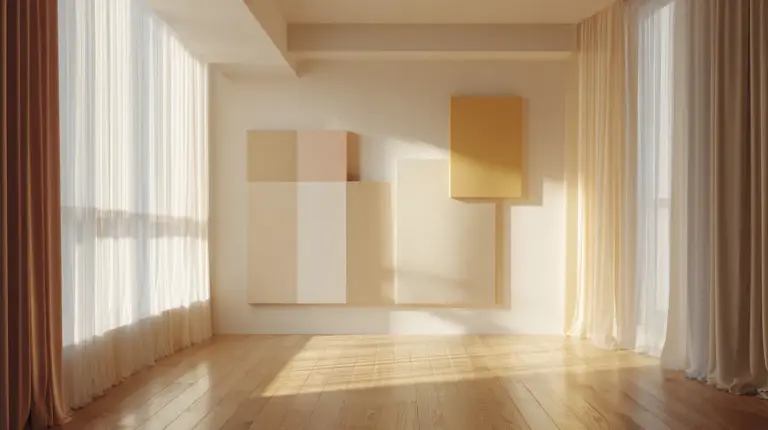
Think of these as your canvas. Not the sterile white of a hospital, but the warm glow of rice paper, aged linen, or morning light filtering through sheer curtains.
Crisp White (HEX: #FAF9F5 | RGB: 250, 249, 245) brings airiness without feeling cold. It’s perfect for walls in small spaces—especially in Cavite homes where natural light dances differently throughout the day. This shade reflects light beautifully while maintaining warmth.
Ivory Cream (HEX: #F5F5DC | RGB: 245, 245, 220) adds a touch more comfort. Use it in bedrooms where you want that cocooning effect, or in living rooms paired with natural wood tones. It’s like wrapping your space in a cashmere blanket.
Muted Taupes and Warm Beiges
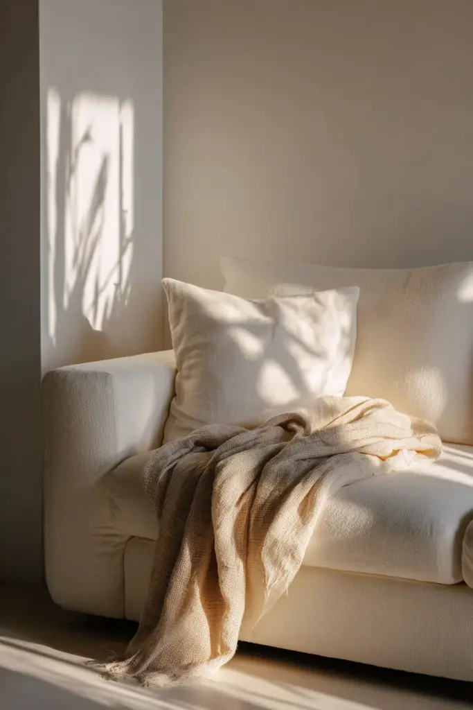
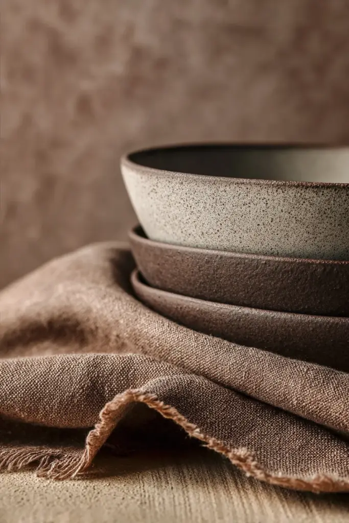
Taupe is the unsung hero of Japandi design. It’s neither gray nor brown but somehow both—a chameleon that shifts with the light.
Greige (HEX: #C9B8A8 | RGB: 201, 184, 168) is your go-to for accent walls or larger furniture pieces. In the Philippines, Boysen’s “Beige Blush” comes close to this sophisticated neutral. It pairs beautifully with rattan, bamboo, and light oak.
Warm Sand (HEX: #D2B48C | RGB: 210, 180, 140) brings earthiness without heaviness. Consider this for throw pillows, area rugs, or even a painted dresser. It’s cozy without being rustic, refined without being precious.
DIY Mixing Tip: Create your own custom taupe by mixing yellow ochre with gray paint at a 1:3 ratio. Add white to lighten. This budget-friendly method works beautifully with local Boysen or Davies paints.
Gentle Grays and Soft Charcoals
Gray in Japandi isn’t cold—it’s contemplative. These are the shades of river stones, morning fog, and weathered wood.
Dove Gray (HEX: #D3D3D3 | RGB: 211, 211, 211) works wonders in kitchens and bathrooms. It’s clean without being clinical, modern without being stark. Pair it with brass fixtures for unexpected warmth.
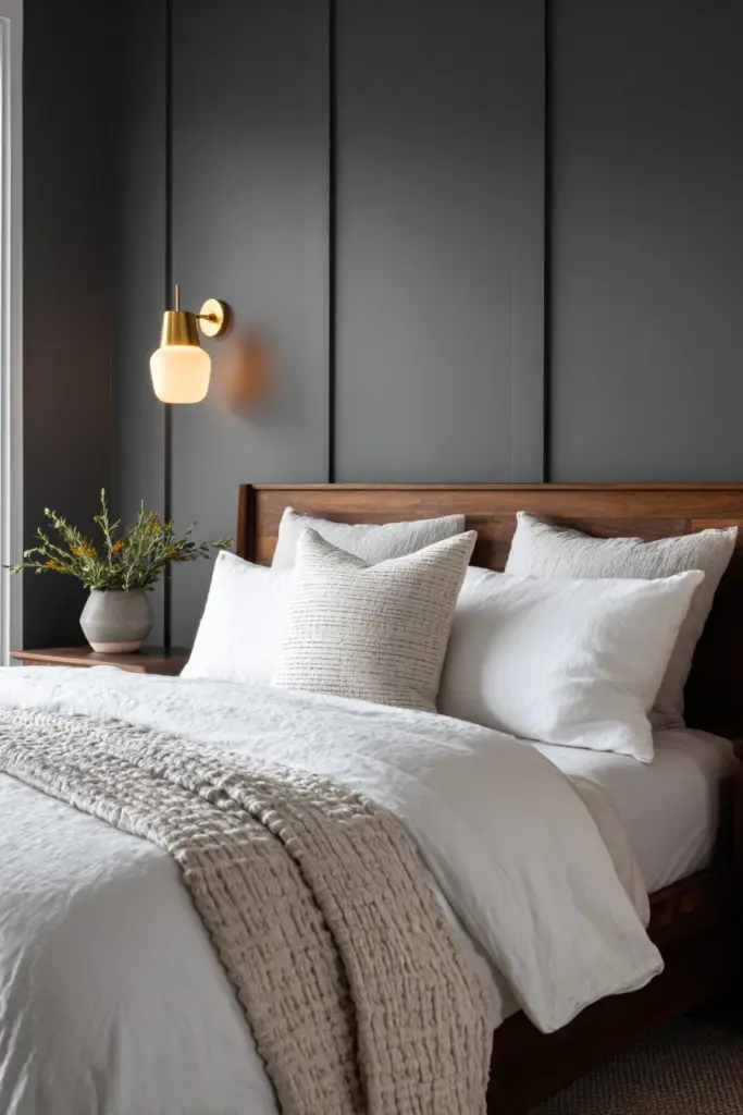
Charcoal (HEX: #36454F | RGB: 54, 69, 79) provides essential contrast. Use it sparingly—a single accent wall, window frames, or statement furniture. In small living rooms common in Silang, a charcoal sofa against warm cream walls creates depth without overwhelming.
Earthy Accents: Nature’s Finishing Touches
Muted Greens
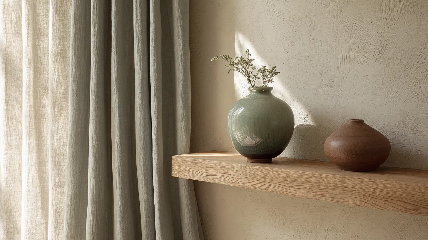
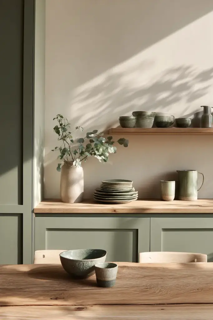
Sage Green (HEX: #9CAF88 | RGB: 156, 175, 136) is scientifically proven to reduce stress by approximately 20%. Bring it in through plants (obviously), but also through textiles, pottery, or a painted bookshelf.
Pale Green (RGB: 152, 251, 152) works beautifully in spaces where you want to encourage rest—reading nooks, meditation corners, or alongside your bed.
Earthy Browns and Terracotta
Terracotta (HEX: #E2725B | RGB: 226, 114, 91) adds unexpected warmth. One or two handmade pots, a throw blanket, or artwork can introduce this color without overwhelming your calm palette.
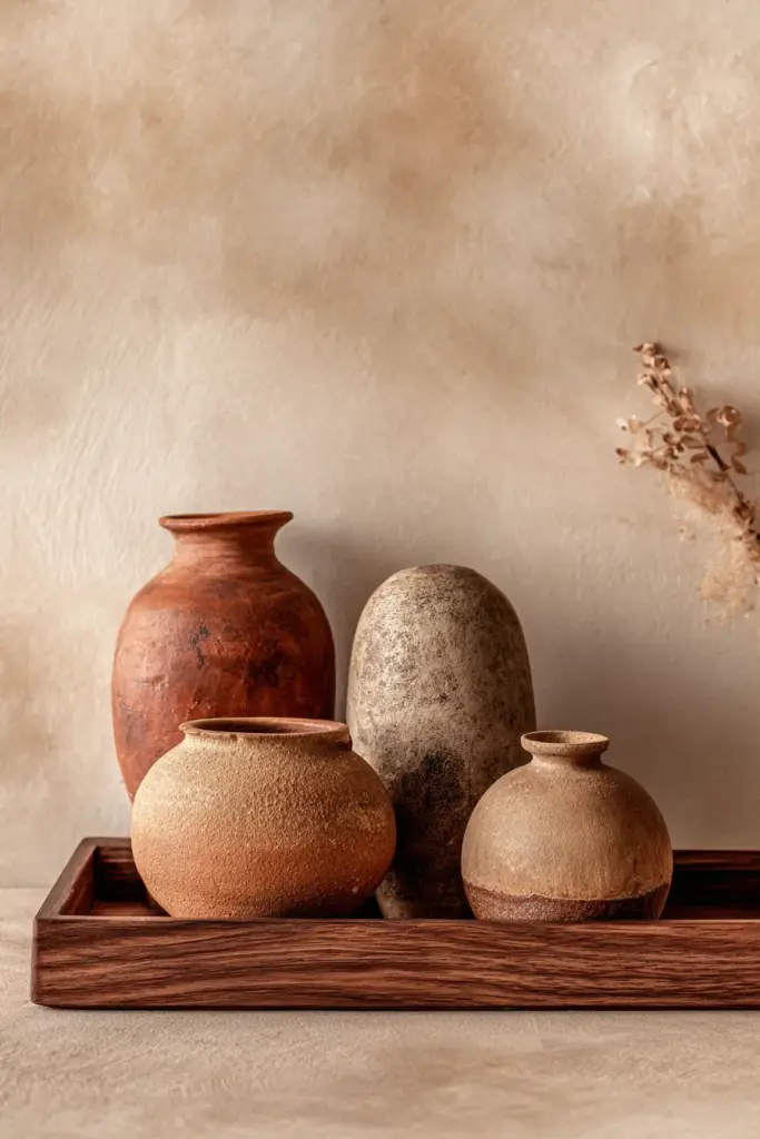
Walnut Brown (HEX: #5C4033 | RGB: 92, 64, 51) appears naturally through wooden furniture. Seek out pieces with visible grain—that’s where wabi-sabi truly sings.
Dusty Blues
Powder Blue (HEX: #B0C4DE | RGB: 176, 196, 222) brings a whisper of coolness. It’s particularly lovely in bedrooms or home offices where you want to encourage both calm and clarity.
Japandi Colors by Room: Practical Applications
Living Room Serenity
Your living room is where life happens—conversations, quiet Sundays, evening tea. The colors should support all of it.
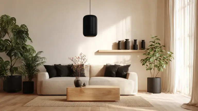
Base palette: Crisp white walls, greige sofa, charcoal accent chair. Add warmth through a warm sand area rug and walnut coffee table.
Accent strategy: Introduce sage green through velvet cushions (texture matters!), dusty blue in a ceramic vase, and terracotta in small decorative objects. Keep it to 2-3 accent pieces maximum.
For small Philippine living rooms (common in Cavite condos), lighter walls with one darker furniture piece create visual depth without making the space feel cramped.
Bedroom Calm
Bedrooms need the gentlest version of Japandi colors—nothing should stimulate or energize here.
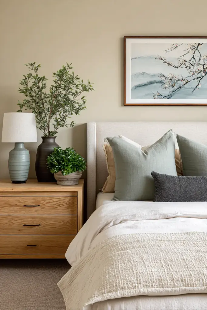
Wall color: Ivory cream or the palest sage. Bedding: Layers of soft whites and warm beiges in linen or organic cotton. Accent wall: Consider a muted taupe behind the headboard.
Lighting tip: Warm LED strips (2700K) along baseboards enhance these colors beautifully without harsh overhead lighting. Smart strips allow you to adjust throughout the evening as natural light fades.
Kitchen and Dining Warmth
Kitchens benefit from slightly more contrast. Dove gray cabinetry with crisp white walls and walnut countertops creates a balanced, functional beauty.
Add warmth through terracotta dishware, sage green linens, and natural fiber placemats. These spaces should feel nourishing—not just for the body, but for the eyes.
Color Psychology: Why These Shades Work
Japandi colors aren’t chosen randomly. They’re rooted in how our brains respond to nature.
Neutrals (whites, beiges, grays) reduce cognitive load. Your brain doesn’t have to process competing information, allowing genuine relaxation. Studies show that spending time in predominantly neutral spaces can lower cortisol levels by up to 15%.
Earthy accents like sage green and terracotta trigger our biophilic response—our innate connection to nature. Even when we can’t be outdoors, these colors remind our nervous system of natural environments, promoting calm.
Muted tones lack the intensity of bright colors, meaning they don’t trigger alertness responses. This is crucial for spaces meant for rest and restoration.
Budget-Friendly Japandi Color Strategies
DIY Paint Mixing for Philippine Homes
You don’t need expensive imported paints. Here’s how to create Japandi tones with local brands:
Custom Greige: Mix Boysen’s “Gray Cement” with “Manila Cream” at a 2:1 ratio. Adjust with white for your desired lightness.
Perfect Sage: Combine Davies’ “Green Meadow” with white paint at a 1:4 ratio. Add a tiny drop of gray to mute.
Warm Taupe: Start with beige, add small amounts of gray and a whisper of yellow ochre until you achieve that perfect warm-cool balance.
Sustainable Color Choices
Choose low-VOC paints from brands like Boysen’s Healthy Home line. These emit fewer harmful chemicals, aligning with Japandi’s emphasis on wellness and environmental respect.
For textiles, consider naturally dyed fabrics. Abaca fiber in natural beige or banana fiber textiles in soft creams support local artisans while maintaining your palette.
Upcycling tip: Transform old furniture by painting it in Japandi tones. A worn dresser becomes a statement piece with dove gray paint and new brass pulls.
Seasonal Adaptations for the Philippines
Our tropical climate influences how colors appear and feel.
Dry season (March-May): Emphasize cooler tones—dove gray, powder blue—to psychologically counter heat. Keep crisp whites fresh by cleaning monthly (tropical dust accumulates faster).
Rainy season (June-November): Lean into warmer neutrals—warm sand, ivory cream—to counter gray skies. Add more terracotta and warm wood tones for coziness.
Year-round strategy: Invest in removable elements (cushion covers, throws, small décor) in seasonal accent colors. Your base palette stays constant while small touches adapt.
Technology Meets Tradition: Smart Color Integration
AR palette visualizers let you test Japandi colors before committing. Apps like Color Snap allow you to photograph your space and digitally apply different shades—crucial for small rooms where paint mistakes feel costly.
Smart LED strips in tunable whites enhance Japandi colors throughout the day. Set them to 3000K during morning for energizing warmth, dimming to 2200K at night for relaxation. This technology supports circadian rhythms while maintaining your calm palette.
Digital mood boards: Use Pinterest or Canva to combine your chosen HEX codes with texture photos and furniture inspiration. This visual planning prevents impulse purchases that don’t serve your overall vision.
Common Mistakes to Avoid
Too Much Gray
Gray without warmth becomes institutional. Always balance cool grays with warm beiges, natural wood, or warm metals like brass or copper.
Forgetting Texture
Japandi colors shine through texture variation. A monochromatic room needs linen next to wool next to ceramic next to wood. Same color family, different tactile experiences.
Neglecting Black
Pure black provides essential grounding. Without it, even the best neutral palette can feel washed out. Add it through window frames, picture frames, or slim furniture legs.
Artificial Plants in Wrong Tones
If using faux greenery (humidity concerns in PH homes), ensure the green is muted. Bright artificial plants clash violently with Japandi’s soft palette.
Your Japandi Color Checklist
Before making any color decisions, consider:
- Natural light: How does each shade look at 8am, noon, and 6pm in your space?
- Existing elements: What wood tones, flooring, or fixtures must you work with?
- Room size: Lighter shades expand small spaces; darker accents create intimacy in larger rooms
- Function: Active spaces can handle more contrast; rest spaces need gentler transitions
- Personal resonance: Which colors make you exhale? Trust your body’s response
- Budget flexibility: Can you DIY some shades or need ready-made matches?
- Maintenance: Light neutrals in tropical climates need quarterly deep cleaning
Bringing It All Together
| Color | HEX Code | RGB Values | Best Used For | Philippine Paint Match |
|---|---|---|---|---|
| Crisp White | #FAF9F5 | 250, 249, 245 | Walls, ceilings | Boysen “Permacoat White” |
| Ivory Cream | #F5F5DC | 245, 245, 220 | Bedrooms, accent walls | Davies “Antique White” |
| Greige | #C9B8A8 | 201, 184, 168 | Furniture, large accents | Boysen “Beige Blush” (custom) |
| Dove Gray | #D3D3D3 | 211, 211, 211 | Kitchens, bathrooms | Davies “Gray Seal” (lightened) |
| Sage Green | #9CAF88 | 156, 175, 136 | Accents, textiles | Custom mix (see DIY section) |
| Charcoal | #36454F | 54, 69, 79 | Contrast elements | Boysen “Charcoal Gray” |
Conclusion: Colors That Hold Space for You
There’s a moment that happens in a well-colored room. You walk in after a long day, and your shoulders drop. Your breathing deepens. The space doesn’t ask anything of you—it simply holds you.
That’s what Japandi colors offer. Not perfection, but peace. Not excitement, but ease. They’re colors that understand that sometimes the most beautiful thing a home can do is let you rest.
As you begin transforming your space, remember: this isn’t about following rules rigidly. It’s about creating a palette that feels like coming home. Let the neutrals ground you, the earthy tones connect you, and the gentle contrasts guide your eye without demanding attention.
Your home is waiting to exhale with you. Start with one wall, one cushion, one thoughtful color choice. The calm you’re seeking is already there, waiting to emerge through these quiet, beautiful shades.
Frequently Asked Questions
What is the Japandi color palette?
The Japandi color palette centers on neutral tones inspired by nature—soft whites (HEX: #FAF9F5), warm beiges, muted grays, and gentle taupes. Earthy accents like sage green (RGB: 156, 175, 136), terracotta, and charcoal provide subtle contrast. This palette blends Japanese wabi-sabi simplicity with Scandinavian hygge warmth, creating timeless, calming spaces that feel both minimal and cozy.
What colors make up Japandi style?
Japandi style uses layers of neutrals—crisp whites, ivory creams, warm taupes, and dove grays—as the foundation. Black accents (charcoal, dark wood frames) add definition, while muted greens, dusty blues, and soft terracotta bring nature indoors. The key is balance: predominantly neutral with strategic pops of earthy color that don’t overwhelm.
Are neutral colors calming in Japandi design?
Yes, scientifically proven to be calming. Neutral colors reduce cognitive load, allowing your brain to process less visual information and promoting relaxation. Studies show neutral-dominant spaces can lower cortisol levels by up to 15%. In Japandi design, these neutrals create easy-to-style, timeless backgrounds that support both wabi-sabi and hygge philosophies of mindful, comfortable living.
What are the best Japandi colors for small living rooms in the Philippines?
For small Philippine living rooms (common in Cavite and Metro Manila), use crisp white walls (Boysen u0022Permacoat Whiteu0022) to maximize light reflection. Add one charcoal or greige furniture piece for depth without heaviness. Introduce sage green and warm sand through textiles—these earthy tones feel spacious yet cozy. Avoid multiple dark colors that can make compact spaces feel cramped.
How do I mix custom Japandi paint colors with local Philippine brands?
Create custom taupe by mixing Boysen’s u0022Manila Creamu0022 with u0022Gray Cementu0022 at a 1:3 ratio, adjusting with white. For sage green, combine Davies’ u0022Green Meadowu0022 with white (1:4 ratio) plus a drop of gray. For greige, blend yellow ochre with gray base at 1:3, adding white to desired lightness. Always test on poster board in your actual lighting before committing to walls.