Table of Contents
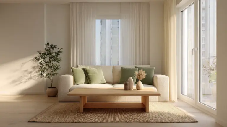
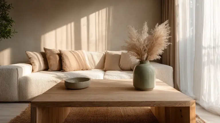
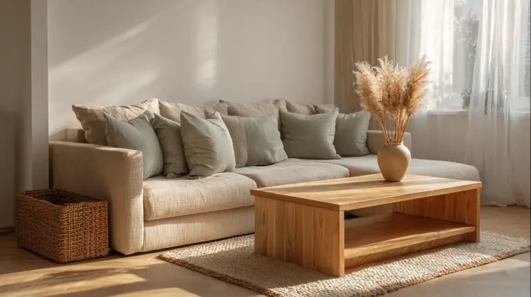
There’s something quietly transformative about a room that breathes in shades of one. A monochromatic Japandi living room doesn’t shout for attention—it whispers, invites, holds space. It’s where Scandinavian hygge meets Japanese wabi-sabi, all wrapped in layers of beige, taupe, cream, and charcoal.
This isn’t minimalism that feels cold. It’s minimalism with a soul—where every cushion, every grain of wood, every shadow cast by natural light tells a story of intentionality. The palette may be restrained, but the warmth runs deep.
If you’ve been craving a living room that feels like an exhale after a long day, this is your invitation. Let’s explore how monochromatic Japandi design creates spaces that are both grounding and elevated, simple yet deeply sensory.
What Is Monochromatic Japandi Style?
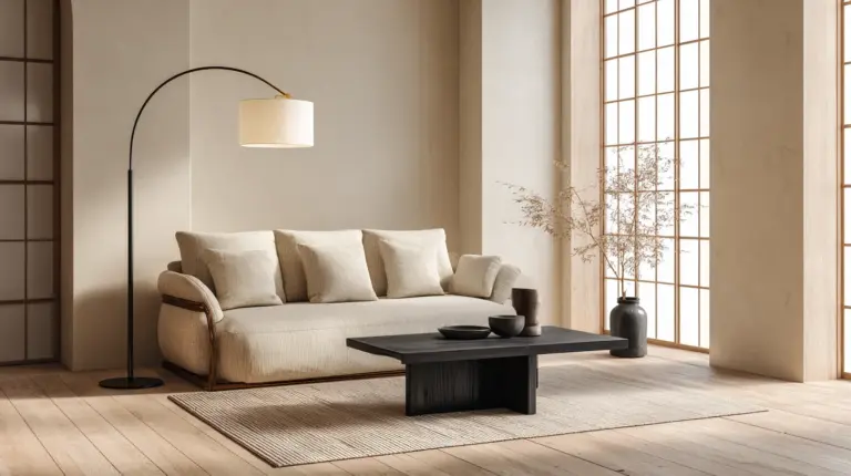
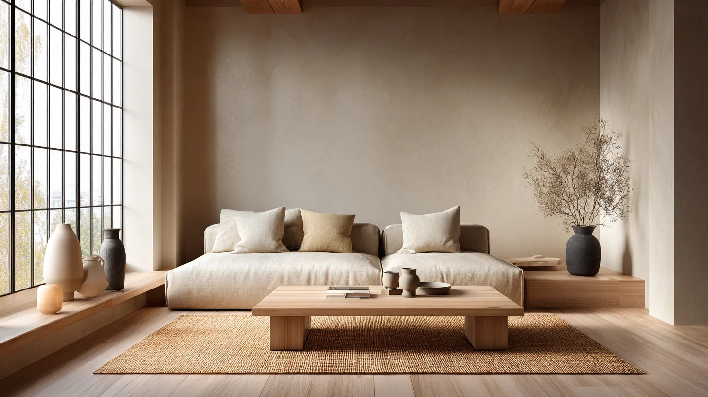
Japandi living rooms blend the clean lines and functionality of Scandinavian design with the organic textures and mindful simplicity of Japanese aesthetics. When you layer this philosophy with a monochromatic color palette, you amplify its calming effect—creating visual harmony through subtle tonal variations rather than contrasting hues.
Think of it as a visual meditation. Beiges melt into taupes. Warm grays nestle beside cool creams. Charcoal anchors lighter tones without disrupting the flow.
The beauty lies in restraint. By limiting your palette to one color family, you’re free to explore depth through texture, light, and material—allowing natural wood grains, linen weaves, and matte ceramics to become the stars of your space.
Core Elements of a Monochromatic Japandi Living Room
Natural Materials as Your Foundation
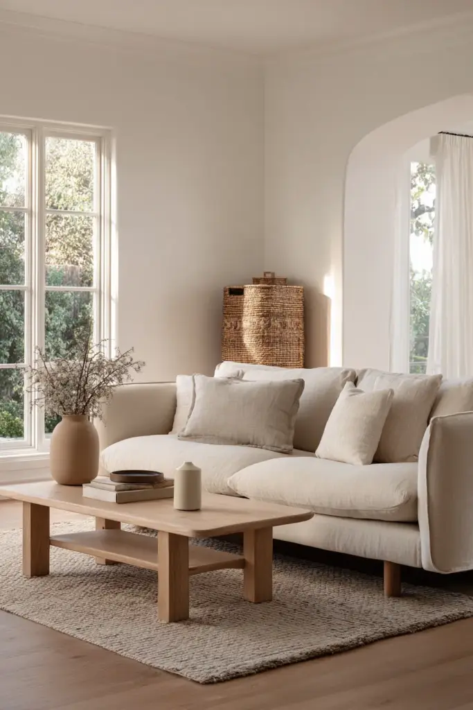
In monochromatic Japandi design, natural materials aren’t decorative—they’re essential. Raw-edge oak tables, hand-woven jute rugs, and unglazed ceramic vases bring organic warmth to neutral palettes.
Look for furniture in light wood tones—ash, birch, or pale oak—that echo the soft neutrals on your walls. A low-profile wooden coffee table with visible grain patterns adds visual interest without introducing new colors.
Incorporate stone elements subtly. A travertine side table or river rock accents in your planters ground the space in earth-toned authenticity.
The Monochromatic Color Palette Decoded
Your palette should flow like watercolor—soft transitions rather than stark divisions. Start with a base neutral (warm white, soft beige, or light gray) for walls and large furniture pieces.
Layer in mid-tones through textiles and secondary furniture. Think taupe linen sofas, sand-colored throw pillows, or a greige area rug that bridges warm and cool.
Anchor with deeper shades sparingly. Charcoal accents in a ceramic lamp base, graphite cushion covers, or a slate-toned throw blanket add necessary depth without breaking the monochromatic spell.
| Tone Level | Color Examples | Where to Use |
|---|---|---|
| Base | Warm white, cream, light beige | Walls, ceiling, large sofa |
| Mid-tone | Taupe, sand, greige, soft gray | Rugs, curtains, accent chairs |
| Accent | Charcoal, deep taupe, mushroom brown | Throw pillows, small decor, textiles |
Minimalist Furniture with Maximum Impact
Low-profile sofas are the heart of Japandi living rooms. Choose designs with clean lines, exposed wooden legs, and neutral upholstery in linen or cotton blends.
Keep furniture pieces grounded—literally. Floor-hugging seating and tables create horizontal visual flow, making rooms feel more spacious and serene.
Opt for multifunctional pieces that honor the “less is more” philosophy. A storage ottoman in pale oak serves as extra seating, a footrest, and hidden organization—all while maintaining your monochromatic aesthetic.
Layered Lighting for Dimensional Warmth
Lighting in monochromatic spaces must work harder to create depth. Layered lighting—ambient, task, and accent—prevents your room from feeling flat or one-dimensional.
Install dimmable LED strips behind floating shelves or under low cabinets. The warm glow in neutral tones enhances your monochromatic palette while adding architectural interest.
Choose paper pendant lights or woven rattan fixtures. These natural materials diffuse light softly, casting gentle shadows that add movement and texture to neutral walls.
Creating Texture and Depth in Monochromatic Spaces
The Art of Textile Layering
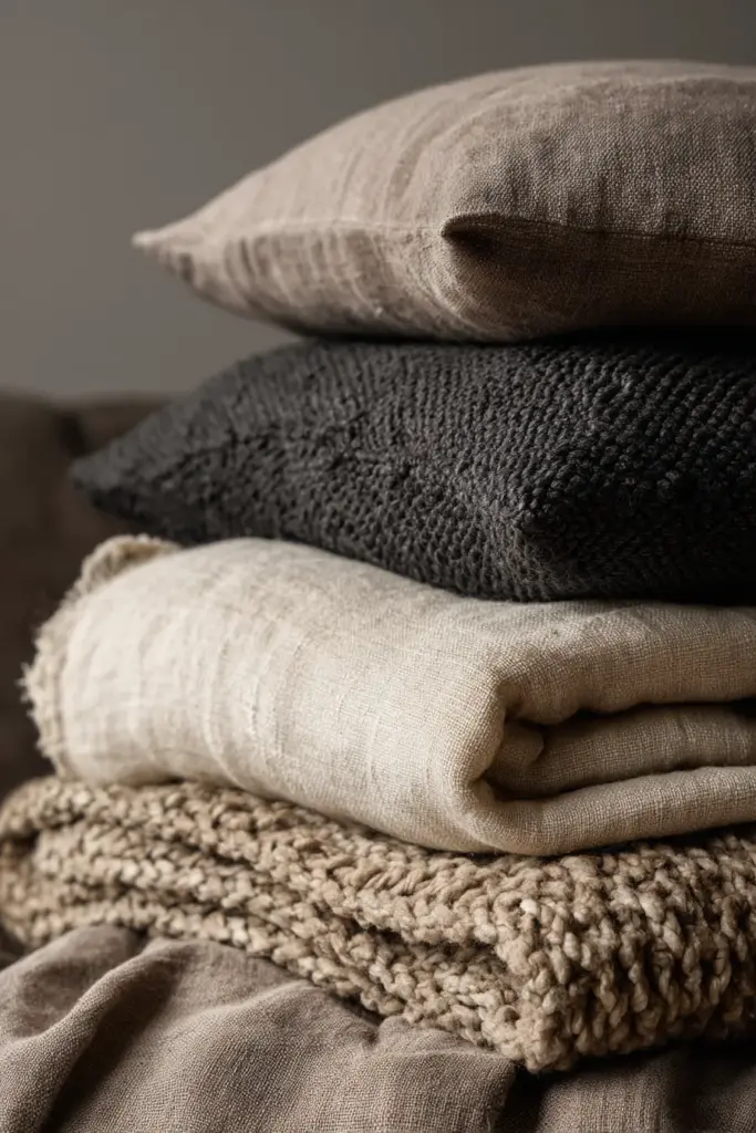
Without color contrast, texture becomes your storyteller. Layer different weaves, weights, and finishes to create visual richness within your neutral palette.
Drape a chunky knit throw in oatmeal over your taupe linen sofa. Add cushions in various textures—nubby bouclé, smooth cotton, ribbed velvet—all within your chosen color family.
Don’t forget window treatments. Sheer linen curtains in cream filter natural light beautifully while maintaining privacy and contributing to your layered neutral aesthetic.

Incorporating Sustainable Textures
Wabi-sabi celebrates imperfection and natural aging. Choose handmade ceramics with slight irregularities, vintage wooden stools with patina, or hand-loomed textiles with subtle variations.
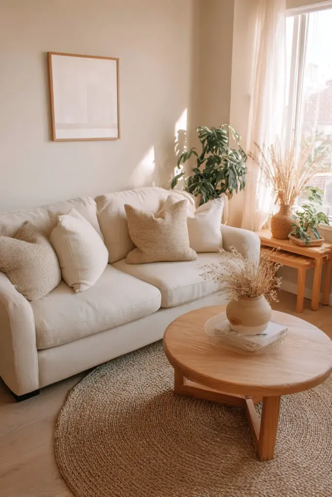
Introduce woven elements liberally. A jute rug adds rough texture underfoot. Bamboo blinds bring organic pattern. Rattan baskets provide sculptural storage while staying true to your earthy tones.
These sustainable choices align with Japandi’s mindful philosophy while enriching your monochromatic scheme through varied tactile experiences.
Strategic Use of Negative Space
In monochromatic design, what you don’t include matters as much as what you do. Negative space—the breathing room around furniture and objects—allows your neutral palette to truly shine.
Resist the urge to fill every corner. Leave walls mostly bare, perhaps with a single piece of minimalist line art in charcoal on cream.
This intentional emptiness isn’t cold—it’s contemplative. It gives your eye places to rest and makes each carefully chosen element feel more significant.
Bringing Nature Inside: Plants and Biophilic Elements
Choosing Plants for Monochromatic Harmony
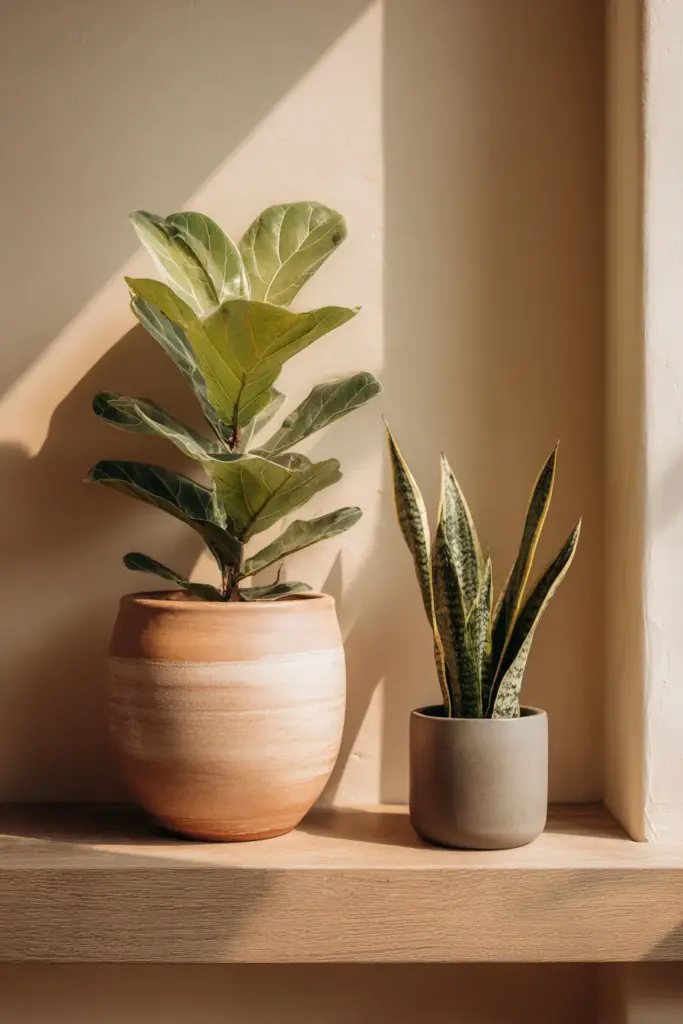
Indoor plants add the only “color” that truly belongs in a monochromatic Japandi living room—living green that feels like an extension of natural materials rather than a departure.
Select plants with architectural presence. A fiddle leaf fig in a simple terracotta pot, a sculptural snake plant in a matte gray planter, or trailing pothos in a woven basket all complement neutral tones.
For 2025 trends, consider moss walls or kokedama (Japanese moss balls) as biophilic accents that introduce organic texture without overwhelming your restrained palette.
Natural Light as a Design Element
Windows are your best asset in monochromatic spaces. Natural light reveals the subtle variations between beige and taupe, cream and ivory, creating shifting visual interest throughout the day.
Keep window treatments minimal. Opt for light-filtering shades in natural linen or bamboo that maintain your color story while celebrating sunlight.
Position mirrors strategically to amplify natural light. A large floor mirror with a simple oak frame reflects both light and your carefully curated neutral palette, making spaces feel more expansive.
Budget-Friendly Monochromatic Japandi Ideas
DIY Projects Under $500
Creating a monochromatic Japandi living room doesn’t require luxury spending. Upcycling furniture in neutral tones is both sustainable and budget-conscious.
Sand and refinish an old wooden coffee table in a light natural stain. Paint mismatched thrift store frames in coordinating shades of taupe and cream for a cohesive gallery wall.
Make your own textured throw pillows using affordable linen fabric from craft stores. Simple envelope-style covers in various neutral tones add custom texture for under $50.
Affordable Natural Materials
Budget natural materials exist if you know where to look. IKEA’s jute rugs, seagrass baskets, and bamboo accessories offer authentic texture at accessible price points.
Shop secondhand for solid wood furniture. A vintage oak dresser for $200 beats a new particleboard piece every time—and aligns perfectly with Japandi’s sustainable ethos.
Use paint strategically. A single gallon of warm white or soft beige can transform walls, creating your monochromatic foundation for under $50.
Smart Shopping Strategy
| Item | Budget Option | Estimated Cost |
|---|---|---|
| Jute area rug (6×9) | IKEA, Target | $80-150 |
| Linen throw pillows (4) | DIY or H&M Home | $40-80 |
| Low-profile coffee table | Facebook Marketplace | $100-200 |
| Neutral curtains | Uniqlo Home | $60-100 |
| Ceramic vases (3) | Thrift stores | $15-30 |
| Total | $295-560 |
Small-Space Monochromatic Japandi Adaptations
Maximizing Apartment Living Rooms
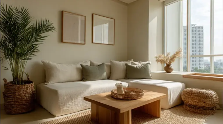
Small-space Japandi thrives on the style’s inherent minimalism. In compact living rooms, monochromatic palettes make spaces feel larger by eliminating visual clutter.
Choose furniture with exposed legs—they create visual flow and make rooms feel less cramped. A taupe linen loveseat on wooden legs appears lighter than a bulky sectional.
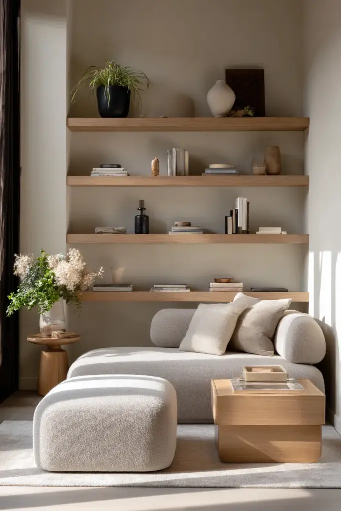
Install floating shelves in the same finish as your walls. This camouflage effect provides storage without visual weight, maintaining your serene monochromatic atmosphere.
Multifunctional Furniture Essentials
In smaller spaces, every piece must earn its place. Multifunctional furniture embodies Japandi’s practical elegance while staying true to your neutral palette.
A storage ottoman in pale oak serves as a coffee table, extra seating, and hidden storage for blankets and books. Choose one upholstered in neutral linen for cohesive style.
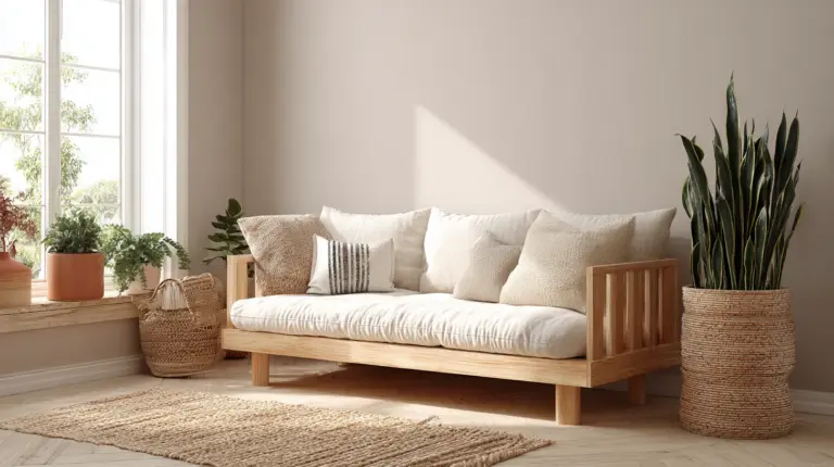
Consider a low platform daybed that functions as both sofa and guest bed. Dress it in layers of neutral textiles—taupe sheets, cream duvet, beige cushions—for monochromatic versatility.
2025 Trends in Monochromatic Japandi Design
Biophilic Monochromatic Layers
The emerging 2025 trend combines monochromatic restraint with bold biophilic elements. Think preserved moss wall panels in natural green-brown tones that complement rather than contrast with beige walls.
Integrate living walls with trailing plants in neutral planters. The organic movement adds life without disrupting your tonal harmony.
This evolution maintains Japandi’s calming essence while answering our growing need for nature connection in urban living spaces.
Smart Home Integration
Dimmable LED technology now offers warm-toned smart bulbs that adapt to your monochromatic scheme. Program lighting to shift from energizing cool beige in mornings to warm taupe ambiance by evening.
Voice-controlled blinds in natural materials maintain your aesthetic while adding convenient functionality. Choose bamboo or linen options that disappear into your neutral palette.
The key is integration without intrusion—technology that serves your lifestyle while respecting your design philosophy.
Common Mistakes to Avoid
Too Much Sameness
The biggest pitfall in monochromatic design? Creating a space that feels flat. Combat this by varying textures aggressively—smooth ceramics against rough jute, matte paint beside glossy wood.
Don’t fear tonal variation within your palette. A room entirely in one shade of beige feels sterile, but beige graduating through taupe to mushroom brown feels intentional and sophisticated.
Include one or two slightly deeper anchor pieces. That charcoal throw or graphite planter prevents your space from floating away in too much lightness.
Neglecting Warmth
Cold monochrome happens when you lean too heavily into grays without balancing with warm undertones. Japandi should feel like a gentle embrace, not a sterile gallery.
Choose warm whites over stark whites. Select beiges with honey undertones rather than pink undertones. Add natural wood tones liberally—they’re the secret ingredient that makes neutral palettes feel lived-in.
Layer in soft textiles. A chunky wool throw or linen cushions add both physical and visual warmth that prevents your monochromatic space from feeling austere.
Essential Monochromatic Japandi Checklist
Before declaring your living room complete, ensure you’ve addressed these elements:
- Base neutral palette established through walls and large furniture pieces
- Three tonal variations within your chosen color family (light, medium, deep)
- Natural wood furniture in light tones with visible grain
- Layered textiles in various textures (linen, cotton, wool, jute)
- Low-profile seating with clean lines and neutral upholstery
- Dimmable lighting in multiple layers (ambient, task, accent)
- Living plants in simple, neutral planters
- Negative space intentionally preserved for visual breathing room
- Sustainable materials that honor both Scandinavian and Japanese design ethics
- Multifunctional pieces that serve practical needs beautifully
- Natural light maximized through minimal window treatments
- Textured storage solutions (woven baskets, wooden boxes) in neutral tones
Conclusion: The Soul of Stillness
A monochromatic Japandi living room isn’t about restriction—it’s about revelation. When you remove the noise of competing colors, you discover what remains: the grain of wood, the play of shadow, the softness of well-worn linen.
This is design as meditation. Every beige cushion, every taupe wall, every charcoal accent becomes a deliberate choice in service of calm. You’re not just decorating a room—you’re creating a sanctuary from a world that constantly demands your attention.
In the end, monochromatic Japandi offers something precious: permission to slow down. Permission to appreciate subtlety. Permission to find beauty not in what you add, but in what you have the courage to leave out.
Welcome home to your quiet place. Welcome to the gentle power of neutral tones, natural materials, and mindful restraint. Welcome to a living room that finally lets you breathe.
Frequently Asked Questions
What colors are used in monochromatic Japandi living rooms?
Monochromatic Japandi palettes center on neutral tones within a single color family—typically beige, taupe, gray, cream, and charcoal. The key is selecting variations of one base color, from light to deep tones, creating depth through subtle gradation rather than contrast. Warm whites, sand tones, greige (gray-beige blends), and soft mushroom browns work beautifully together while maintaining serene visual harmony.
How do I create a monochromatic Japandi living room on a budget?
Start with affordable natural materials like IKEA jute rugs, thrift store wooden furniture refinished in light stains, and DIY linen pillow covers. Paint is your most cost-effective tool—transform walls with warm neutrals for under $50. Shop secondhand for solid wood pieces, use natural elements like branches in simple vases, and focus on texture variation (rough jute, smooth cotton, chunky knits) rather than expensive furniture. A cohesive monochromatic look costs $300-600 if you’re strategic.
What furniture fits monochromatic Japandi style?
Choose low-profile sofas with clean lines and neutral linen or cotton upholstery, preferably with exposed wooden legs in light oak or ash. Look for minimalist coffee tables in natural wood with visible grain, floor cushions or poufs in neutral tones, and multifunctional storage ottomans. Avoid ornate details—select pieces with simple silhouettes, sustainable materials, and practical functionality. All furniture should sit low to the ground, creating horizontal visual flow.
Can I add color accents to a monochromatic Japandi living room?
While monochromatic design thrives on tonal restraint, living plants are the perfect u0022coloru0022 addition—green feels like an extension of natural materials rather than a disruption. If you want subtle warmth, introduce it through varied wood tones (lighter ash against warmer oak) or by leaning into warm beiges and taupes. True color accents aren’t traditional to this aesthetic, but if needed, keep them minimal and natural—terracotta, sage green, or soft rust in small doses.
How do I prevent a monochromatic room from feeling boring?
Texture is your secret weapon. Layer different materials aggressively—nubby bouclé against smooth linen, rough jute beneath polished wood, matte ceramics beside glossy surfaces. Vary your lighting sources to create dimensional shadows. Use tonal variation within your color family (three or more shades from light to deep). Incorporate negative space intentionally, allowing breathing room that makes each element feel significant. Add living plants for organic movement. The richness comes from how materials interact, not from color variety.