Table of Contents
There’s something tender about a north-facing room. The light enters soft and steady, never harsh, never dramatic. It asks for colors that understand its quiet temperament—shades that don’t fight the coolness but gently warm it from within.
If you’re drawn to Japandi design, you already know the beauty of restraint. The marriage of Japanese minimalism and Scandinavian hygge lives in earthy neutrals, natural textures, and spaces that breathe. But in a north-facing room, where natural light leans blue and shadows linger longer, your color choices become even more intimate.
This is where warmth meets wabi-sabi. Where beige isn’t boring—it’s grounding. Where greige becomes your gentlest ally.
Let’s explore how to choose Japandi colors that transform your north-facing room into a cozy, luminous retreat that feels both calming and alive.
Understanding North-Facing Light and Color Psychology
North-facing rooms receive indirect, diffused light throughout the day. In the Northern Hemisphere, this means cooler, bluer tones dominate your space naturally. Without careful color selection, these rooms can feel flat, cold, or uninviting—even with beautiful furniture and thoughtful lighting ideas.
The psychology here is fascinating. Studies show that warm neutrals in low-light environments can boost feelings of calm by up to 25% compared to stark whites or cool greys. Your walls aren’t just surfaces—they’re mood makers.
Japandi design already champions muted, nature-inspired palettes. But in a north-facing space, you’ll want to lean into the warmer end of that spectrum. Think of colors that remind you of sun-warmed linen, clay pottery after rain, or sand at golden hour.
The Color Temperature Sweet Spot
Your goal is to balance the inherent coolness of northern light with undertones that feel inviting. This doesn’t mean abandoning Japandi’s signature restraint—it means being intentional about which neutrals you choose.
Warm beiges with yellow or pink undertones will reflect light more gently than stark whites. Soft taupes and greiges with brown bases create depth without darkness. Even your accent colors—muted charcoals, sage greens, terracotta—should carry warmth in their DNA.
Best Japandi Color Palette for North-Facing Living Rooms 2025
Let’s get specific. These are the colors that work hardest in north-facing Japandi spaces, with hex codes for precision and mood effects you can feel.
| Color Name | Hex Code | Undertone | Best For | Mood Effect |
|---|---|---|---|---|
| Frosted Sand | #F5F3EE | Warm cream | Walls | Opens space, reflects light softly |
| Warm Greige | #D9D0C7 | Beige-grey blend | Feature walls | Cozy depth, versatile backdrop |
| Soft Bamboo | #F7F4E9 | Yellow-cream | Ceilings, trim | Brightness without harshness |
| Clay Taupe | #C9B8A8 | Brown-pink | Accent walls | Grounded, intimate warmth |
| Stone Path Grey | #ACA59A | Warm grey | Furniture, textiles | Sophisticated calm |
| Muted Sage | #A8A88A | Green-grey | Accents, plants | Natural connection, breathing room |
| Charcoal Ember | #4A4845 | Warm black | Details, frames | Contrast without coldness |
These aren’t random neutrals. Each carries warmth in its undertones—the secret ingredient for north-facing success.
Primary Wall Colors: Your Foundation
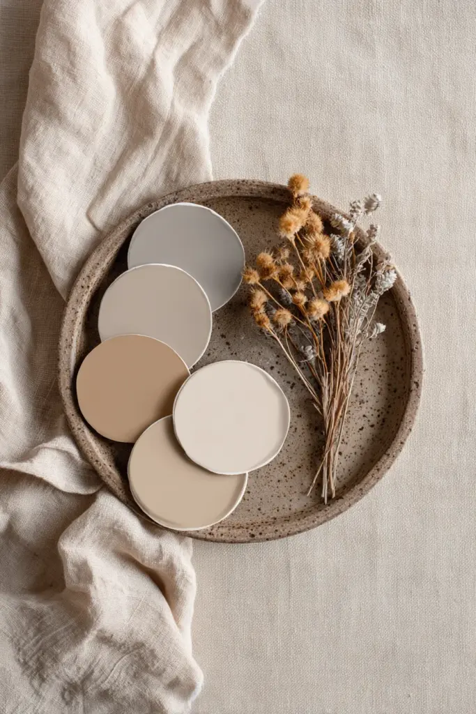
Start with Frosted Sand (#F5F3EE) or Warm Greige (#D9D0C7) as your main wall color. These shades have enough body to feel present but enough lightness to keep your space open.
Frosted Sand works beautifully in smaller north-facing rooms, bouncing whatever light enters while maintaining warmth. It pairs effortlessly with natural wood tones and woven textures—core Japandi elements.
Warm Greige offers slightly more definition. It’s perfect for larger living rooms where you want subtle dimension without adding visual weight. The beige-grey balance keeps things neutral while the warm undertones prevent that institutional feel.
Accent and Trim Strategy
Use Soft Bamboo (#F7F4E9) on trim, window frames, or ceiling to create gentle contrast without stark white. This technique is especially effective in Japandi interiors where you want cohesion rather than sharp boundaries.
For an accent wall behind your cozy furniture, try Clay Taupe (#C9B8A8). This deeper neutral adds warmth and intimacy—ideal behind a low-profile sofa or minimalist shelving unit. It creates a visual anchor without overwhelming the room’s quiet aesthetic.
Japandi Earthy Tones for Low Natural Light Spaces
North-facing rooms thrive on earth-connected colors. These are the pigments found in clay, sand, stone, and bark—materials that Japandi design already celebrates through texture.
The beauty of earthy tones in low light is their ability to feel warm even when they’re technically neutral. They carry the memory of sun and soil, bringing organic warmth that artificial colors can’t replicate.
Warm Beige and Sandy Tones
Beige gets a bad reputation, but in a north-facing Japandi room, it’s transformative. Look for beiges with pink or yellow undertones—never grey or green, which will amplify the room’s natural coolness.
Sandy beiges (#E8DCC8 to #D9C7B0) work especially well in humid climates like Calabarzon. These tones reflect light gently while hiding minor wall imperfections common in moisture-prone areas. Choose mold-resistant paints with low VOC formulas for both health and longevity.
Pair sandy walls with natural jute rugs, linen curtains in oatmeal tones, and blonde wood furniture. The monochromatic layering creates depth through texture rather than color contrast—very Japandi, very calming.
Muted Greens and Soft Browns
Introduce muted sage (#A8A88A) or olive-tinted grey (#8B8D7A) through textiles, pottery, or a single painted alcove. These colors bring nature inside without the brightness of true greens, which can feel jarring in low light.
Soft browns—think terracotta (#C77966) or dried earth (#9D8B7A)—work beautifully as small accents. A clay pot holding a sansevieria, a woven basket in burnt umber, leather cushion covers. These touches add warmth without competing with your neutral base.
Paint Selection Tips for North-Facing Japandi Bedrooms
Bedrooms demand extra softness. North-facing sleeping spaces need colors that embrace you at dawn and dusk, when that cool northern light is most apparent.
Choose off-whites with cream or blush undertones rather than pure white. Colors like Soft Bamboo (#F7F4E9) or a slightly deeper warm cream (#F0EBE3) create a cocoon effect. They feel gentle on the eyes as you wake and calming as you wind down.
Creating Warmth Without Brightness
Your north-facing bedroom should feel warm, not necessarily bright. There’s a difference. Brightness can be energizing, but bedrooms need tranquility.
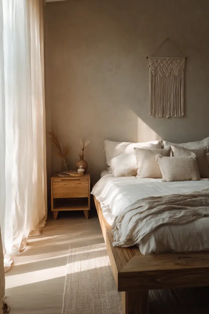
Use Clay Taupe (#C9B8A8) or Stone Path Grey (#ACA59A) on the wall behind your bed. These deeper neutrals feel enveloping—like being wrapped in soft linen. They also create beautiful contrast with white bedding and natural wood nightstands.
Keep other walls lighter to maintain airiness, but don’t fear depth on one wall. In Japandi design, this kind of asymmetry honors wabi-sabi principles—finding beauty in imbalance.
Fabric and Textile Color Coordination
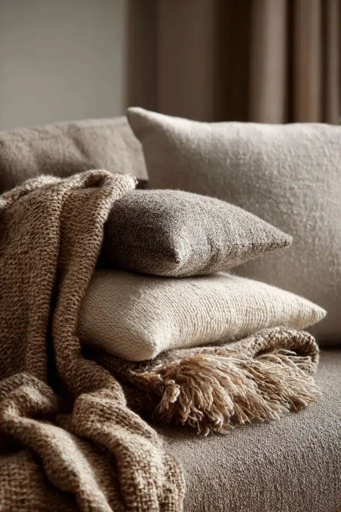
Your textiles should echo and deepen your wall colors. In a north-facing bedroom with Frosted Sand walls, layer:
- Oatmeal linen duvet covers
- Taupe wool throw blankets
- Stone-grey cotton sheets
- Cream macramé wall hangings
Notice the tonal variation. Everything sits within the warm neutral family, but the textural diversity creates richness. This is how Japandi spaces avoid feeling flat—through material depth rather than color contrast.
Lighting Enhancement for North-Facing Japandi Interiors
Paint color alone won’t solve a north-facing room’s light challenges. Strategic lighting completes the transformation.
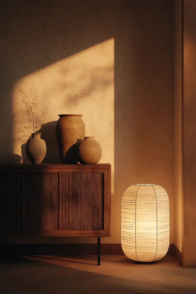
Layer your lighting like you layer your neutrals—with intention and variety. Ambient, task, and accent lighting all play roles in warming your space artificially when natural light can’t do the work alone.
Smart LED Choices
Choose bulbs rated at 2700K to 3000K—warm white territory. Cooler bulbs (4000K+) will fight against your carefully chosen warm paint colors, making the room feel sterile despite your efforts.
Install dimmer switches everywhere possible. The ability to adjust light intensity throughout the day helps you work with the changing quality of northern light. Morning might need more brightness; evening benefits from a gentle glow.
Natural Light Reflection Strategies
Mirrors aren’t just decorative in north-facing rooms—they’re functional light multipliers. Place a large mirror opposite your window to bounce light deeper into the space.
Choose frames in warm wood tones or matte brass rather than cool silver. Even your mirror frames contribute to the overall warmth quotient.
Use sheer curtains in cream or oatmeal rather than white. They filter light without blocking it, adding warmth to incoming rays while maintaining privacy. Avoid heavy, dark curtains that will further limit your precious natural light.
Material and Furniture Color Matching
Japandi furniture already skews toward natural materials—blonde woods, light oak, ash, bamboo. In north-facing rooms, these choices become even more important.
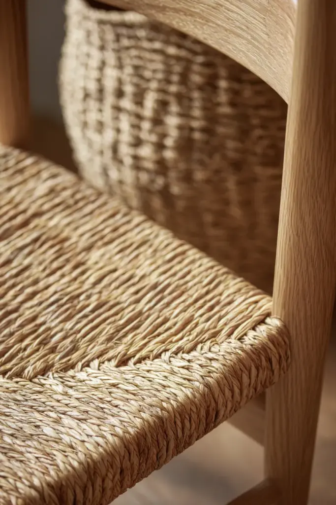
Avoid dark woods like walnut or mahogany, which will absorb light and feel heavy. Stick with light to medium wood tones that reflect warmth. Japanese white oak, Scandinavian birch, and natural rattan all work beautifully.
Multifunctional Furniture in Warm Tones
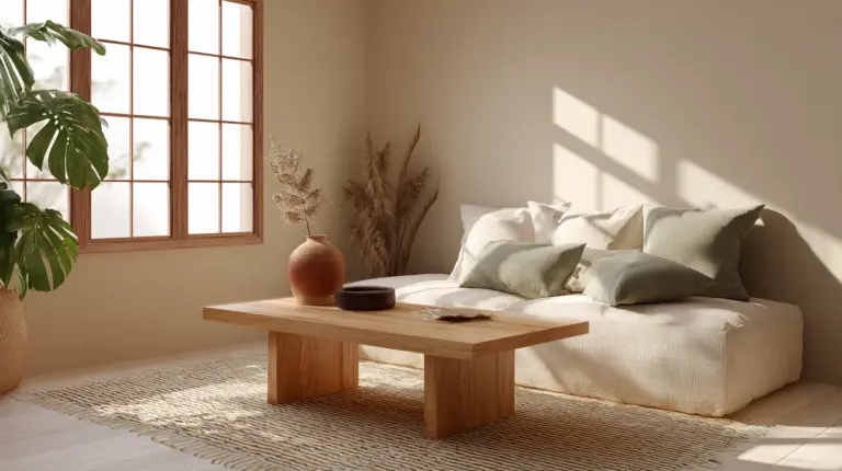
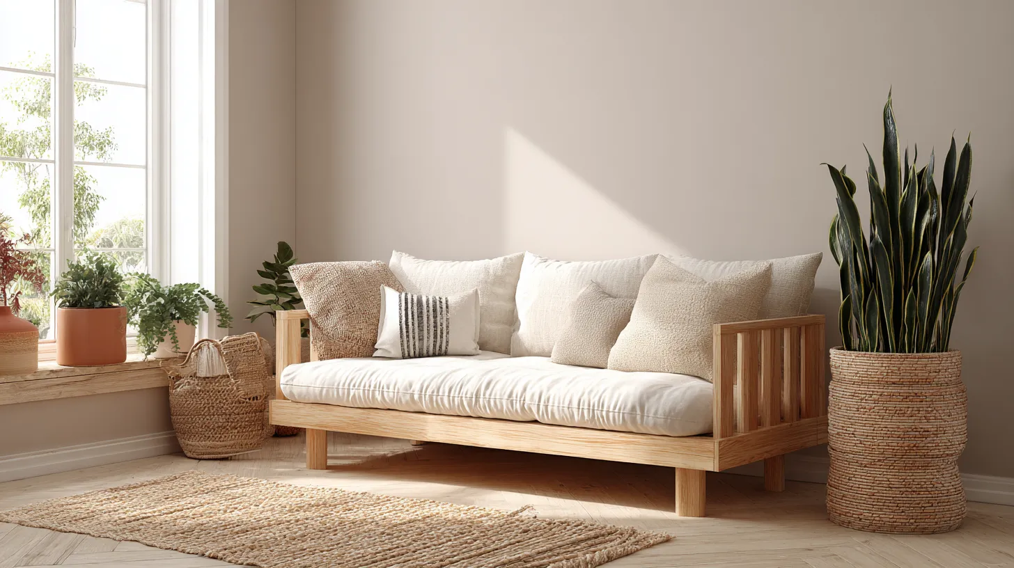
Low-profile sofas in sand linen (#E5DCC5) or warm grey bouclé (#C5BCB0) provide substantial furniture pieces without visual weight. The light, warm fabrics keep your room feeling open.
Storage solutions should blend rather than contrast. Choose storage baskets in natural seagrass, shelving in blonde wood, and cabinets in warm white or greige. Everything should feel cohesive—like the room grew together organically.
Accent Furniture and Decor
Here’s where you can introduce slightly deeper tones. A coffee table in medium oak, a side chair in Clay Taupe fabric, ceramic vases in terracotta and sand.
These accents provide visual interest without breaking the calm, monochromatic vibe that defines Japandi style. Think of them as punctuation marks—subtle but necessary.
Plant Pairings and Natural Elements
Plants bring life and softness to any Japandi interior, but in north-facing rooms, choose species that thrive in lower light.
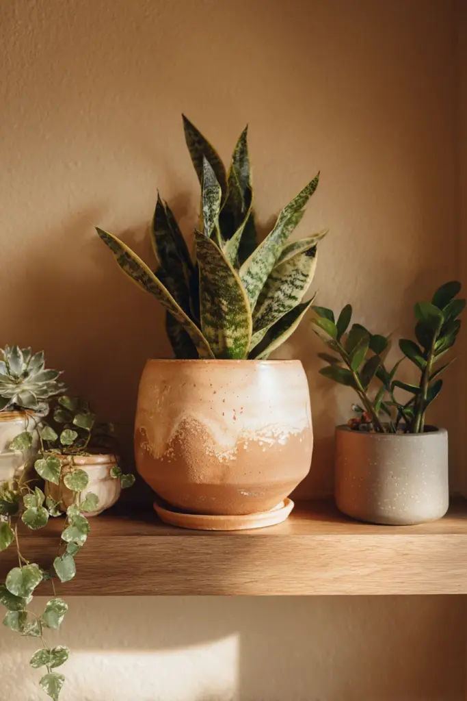
Sansevieria (snake plants) in terracotta pots add vertical interest and warm clay tones. Pothos in ceramic planters cascade gently, their green leaves contrasting softly with neutral walls. ZZ plants tolerate low light beautifully and their glossy leaves reflect what little light enters.
Pot Color Strategy
Your planters contribute to the overall palette. Choose:
- Terracotta (#C77966) for warmth and texture
- Warm white ceramic (#F5F3EE) for subtle cohesion
- Natural wood planters in light oak or bamboo
- Muted grey stoneware (#ACA59A) for sophistication
Avoid bright white or black planters, which create harsh contrast. Keep everything in the warm neutral family, even down to your plant accessories.
Budget-Friendly Japandi Color Implementation
Transforming your north-facing room doesn’t require a complete renovation. Start small and layer intentionally.
$50-100 Budget
- One gallon of quality warm neutral paint for an accent wall
- Two linen throw pillows in complementary tones
- One large terracotta planter with a low-light plant
- Warm LED bulbs (2700K) for existing fixtures
This minimal investment creates immediate warmth without overwhelming your space or wallet.
$100-200 Budget
- Full room paint in Frosted Sand or Warm Greige
- Sheer cream curtains for light filtering
- Jute area rug in natural tones
- Three warm-toned LED bulbs
- Two ceramic vases in sand and clay tones
- Linen table runner or throw blanket
This mid-range approach covers all basics—walls, textiles, lighting, and accents.
DIY Mixing for Sustainable Color
Create custom tones by mixing:
- White base paint + small amounts of raw umber = warm greige
- White base + yellow ochre = soft sandy beige
- White base + burnt sienna = clay taupe
Start with 90% white and add color gradually until you achieve your desired warmth. This sustainable approach reduces waste and allows perfect customization.
Climate Considerations for Humid Environments
If you live in humid climates like Calabarzon, your paint choice needs additional consideration. Moisture and mold can plague north-facing rooms that receive less sun to naturally dry and ventilate.
Choose mold-resistant, breathable paints with low VOC formulas. Brands offering tropical-climate formulations often include additives that prevent mildew growth—essential for maintaining your beautiful warm neutrals.
Test your chosen color in small sections before committing. Humidity can affect how paint appears when dry. Colors may appear slightly darker or more saturated in humid conditions.
Ensure proper ventilation. Even beautiful colors can’t save a room with persistent moisture issues. Use dehumidifiers if needed, especially in rainy seasons.
North-Facing Japandi Room Transformation Checklist
Before you begin, use this checklist to ensure comprehensive transformation:
- Assess your current lighting: Note when room feels coldest/darkest
- Test paint samples: Apply 2’x2′ sections and observe throughout the day
- Inventory existing furniture: Identify what stays and what warm tones you need
- Plan lighting layers: Determine where you need ambient, task, and accent lights
- Choose complementary textiles: Ensure fabrics support your color palette
- Select low-light plants: Research species that thrive in northern exposure
- Consider climate needs: Choose appropriate paint formulations
- Budget accordingly: Prioritize walls and lighting, add accents over time
- Maintain natural materials: Ensure wood, stone, and plant elements feel cohesive
Work through this systematically rather than rushing. Japandi design honors process and intentionality.
Creating Cohesion Across Connected Spaces
If your north-facing room opens into south or east-facing spaces, maintain color continuity while allowing subtle shifts.
Use your warmest neutrals in the north-facing area, then gradually lighten as you move toward brighter rooms. This creates natural flow without jarring transitions.
For example: Warm Greige in the north-facing living room, Frosted Sand in the adjacent hallway, and Soft Bamboo in the sun-filled dining room. The progression feels organic rather than abrupt.
Maintain consistent accent colors throughout—if you use Muted Sage and Charcoal Ember in the north room, echo them in other spaces through textiles or small decor pieces.
Conclusion: Embracing the Quiet Beauty
North-facing rooms ask for patience. They don’t shout or dazzle—they whisper. And in that whisper lies profound beauty if you’re willing to listen.
Japandi colors honor this quietness. They don’t try to fake brightness or fight the natural coolness. Instead, they wrap the space in warmth from within—like hands cupped around tea on a grey morning.
Your north-facing room can become your sanctuary. A place where muted taupe walls glow softly at twilight, where cream-colored linen catches whatever light filters through, where the shadows feel intentional rather than sad.
Choose colors that feel like home—warm, grounded, alive. Let texture do the talking when color stays quiet. And remember: in Japandi design, restraint isn’t absence. It’s clarity.
Your north-facing room is waiting. Not for brightness, but for warmth. Not for contrast, but for cohesion. Give it the gentle, earthy palette it deserves, and watch it transform into the most peaceful space in your home.
Frequently Asked Questions
What are the best Japandi colors for a north-facing living room?
Warm greige (#D9D0C7), frosted sand (#F5F3EE), and clay taupe (#C9B8A8) work beautifully. These shades carry warm undertones that counter the cool northern light while maintaining Japandi’s neutral aesthetic. Pair them with blonde wood furniture and natural textiles for a cohesive, inviting space that feels bright despite limited natural light.
Should I use white paint in a north-facing Japandi bedroom?
Avoid stark white, which appears cold and flat in northern light. Instead, choose off-whites with cream, beige, or blush undertones like Soft Bamboo (#F7F4E9). These warmer whites reflect light gently while maintaining the clean, minimal aesthetic Japandi design requires. The subtle warmth prevents that institutional feeling common in north-facing rooms with pure white walls.
How do I make a north-facing room feel warmer with Japandi colors?
Layer warm neutral tones across walls, textiles, and furniture. Use beige or greige paint with yellow or pink undertones, add linen curtains in oatmeal or cream, choose warm-toned wood furniture in oak or ash, and introduce terracotta or clay accents through pottery and planters. Install warm LED bulbs (2700K) to enhance the effect artificially when natural warmth is limited.
What accent colors work with Japandi neutrals in low light?
Muted sage (#A8A88A), soft terracotta (#C77966), and warm charcoal (#4A4845) complement Japandi neutrals without overwhelming low-light spaces. These earthy accents provide visual interest while maintaining the calm, nature-inspired palette. Use them sparingly through textiles, pottery, or a single painted detail to add depth without disrupting the room’s tranquil atmosphere.
Can I use grey in a north-facing Japandi room?
Yes, but choose greys with warm undertones—greige or taupe-grey blends rather than cool slate or blue-grey. Stone Path Grey (#ACA59A) works well because it leans brown rather than blue. Avoid using grey as your dominant wall color; instead, incorporate it through furniture upholstery or textiles where it adds sophistication without amplifying the room’s natural coolness.