Table of Contents
There’s a quiet magic in the way light falls across linen, how the grain of oak wood whispers under your fingertips, how a single shade of taupe can hold both warmth and calm. This is the heart of Japandi design — a beautiful marriage of Japanese minimalism and Scandinavian coziness that speaks in textures and tones rather than shouts.
When we talk about pairing colors and textures in Japandi style, we’re not just decorating rooms. We’re crafting environments that breathe, that invite you to slow down, to notice the subtle beauty in everyday moments.
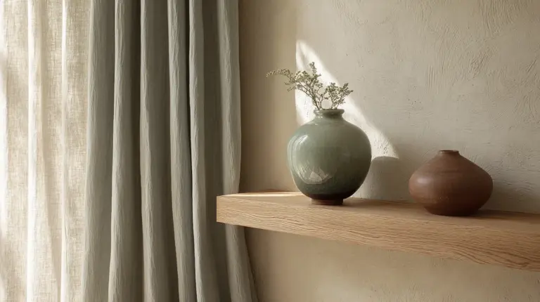
The dance between color and texture is where Japandi truly comes alive. A cloud-white wall gains depth when paired with rough-woven rattan. A smooth ceramic vase becomes poetry against linen’s gentle crinkle. These aren’t accidents — they’re thoughtful choices that create rooms you want to live in, not just look at.
Let’s explore how to weave these elements together in your own space, creating a home that feels both grounded and light, intentional yet effortless.
What Colours Are Used in Japandi Style?
The Japandi palette is a love letter to nature, pulled from earth and sky and the quiet spaces between seasons. These aren’t colors that demand attention — they earn it through their gentle sophistication and ability to make every other element in a room feel more beautiful.
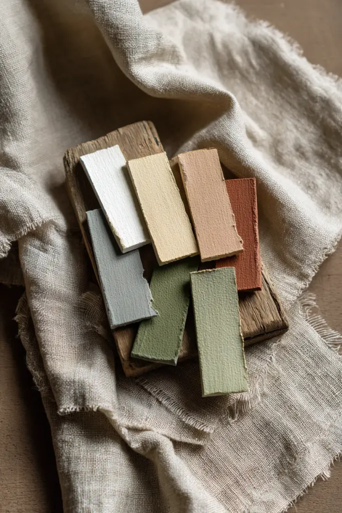
At its foundation, Japandi embraces muted neutrals: soft whites like #F5F4F0 warm ivory, gentle grays hovering around #D4D2CE silver sage, and beiges that lean toward taupe rather than yellow. These base tones create a canvas that feels expansive yet cozy, never cold or sterile.
Earth tones ground the palette with deeper intention. Think clay terracotta (#C07A5A), warm taupe (#8B7F77), soft charcoal (#4A4A48), and the kind of brown that reminds you of aged leather or morning coffee. These colors anchor a space without weighing it down.
Accent colors arrive like seasonal gifts — sage green (#B8C5B0) borrowed from moss and lichen, dusty pink (#D4BAB0) that catches the light like sunset on stone, and muted blue-grays (#A8B5B2) that echo overcast skies. Use them sparingly, like brushstrokes rather than paint pours.
The beauty of this palette lies in its restraint. Each color has breathing room. Each shade supports the others rather than competing for attention.
The Meaning of the Japandi Color Palette
Understanding why these colors matter transforms how you use them. The Japandi palette isn’t arbitrary — it’s a philosophical choice rooted in two profound design traditions that both seek to honor nature and create peaceful living environments.
From Japanese design comes wabi-sabi — the art of finding beauty in imperfection and impermanence. This philosophy embraces natural materials in their authentic states, which means colors that age gracefully, that show the hand of craft, that connect us to the organic world. Japanese interiors have long favored neutral tones that allow architectural elements and natural textures to take center stage.
Scandinavian design contributes hygge — that untranslatable Danish concept of cozy contentment. Nordic homes battle long, dark winters with warmth and light, choosing pale colors that maximize natural illumination while layering in textiles and woods that make spaces feel embracing rather than stark.
When these traditions merge, the resulting palette serves multiple purposes. It promotes tranquility by eliminating visual chaos and creating harmonious relationships between all elements in a room. It fosters warmth through carefully chosen undertones — even the coolest grays have a whisper of warmth that prevents them from feeling institutional. Most importantly, it maintains a nature connection that keeps us grounded, surrounding us with colors we might find on a forest walk or beach stroll.
This isn’t just aesthetic preference. These colors demonstrably affect mood and mindset, creating environments that support rest, creativity, and genuine presence.
How to Create a Japandi Color Palette for Your Space
Building your own Japandi palette is an intuitive process, but having a framework helps ensure harmony. Think of it as composing music — you need a foundation, melody, and occasional flourishes.
Step 1: Choose Your Foundation Neutrals
Start with two or three base neutrals that will cover 60-70% of your space — walls, larger furniture pieces, primary textiles. Consider:
- Off-white (#F7F5F2 alabaster or #E8E6E1 cloud white) for walls that reflect light without glare
- Warm gray (#C8C6C1 dove or #B5B3AE greige) for larger upholstered pieces
- Natural beige (#E0D5C7 oat or #D4C4B0 sand) for wood tones and foundational textiles
Test these colors together in your actual space. Morning light transforms everything, and what looks perfect in a showroom might feel wrong in your living room.
Step 2: Add Depth with Earth Tones
Select one or two deeper earth tones to occupy 20-30% of your palette. These create visual weight and prevent the space from floating away into blandness:
- Charcoal gray (#3C3C3A) for metal accents and ceramics
- Warm terracotta (#B8755E) for pottery or accent textiles
- Rich taupe (#756F67) for wood furniture or woven pieces
These darker tones should feel natural rather than dramatic — think “tree trunk” rather than “black lacquer.”
Step 3: Introduce Seasonal Accents
Reserve 5-10% of your palette for subtle accent colors that can shift with seasons or mood:
- Sage green for spring and summer freshness
- Dusty rose for warmth during cooler months
- Soft indigo (#5D6E7D) for unexpected sophistication
Keep these accents understated. A single throw pillow or ceramic vase is often enough.
Step 4: Test and Adjust
Gather physical samples — paint chips, fabric swatches, wood samples. Arrange them together on a board and live with it for a few days. Notice how they interact with your existing light, flooring, and architectural features. Trust your instincts, but give yourself time to truly see the combinations.
What Textures Are Used in Japandi Design?
If color is Japandi’s vocabulary, texture is its grammar — the structure that gives everything meaning. The layering of varied surfaces transforms a monochromatic space from simple to sublime.
The Rule of Three
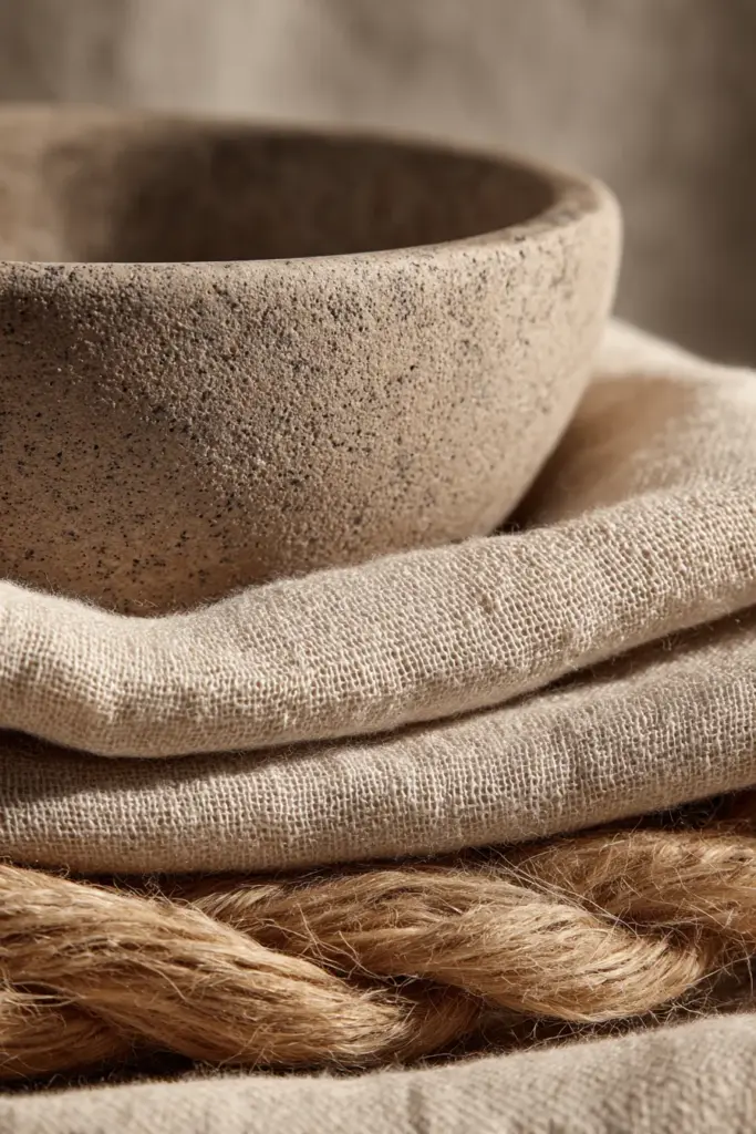
Japandi design often employs a “rule of three” when layering textures: pair smooth, rough, and soft elements within any given vignette or zone. This creates balanced complexity that keeps the eye engaged without overwhelming the senses.
Smooth textures provide calm sophistication. Think polished ceramics, smooth-planed oak or walnut, matte painted surfaces, or the cool touch of concrete. These surfaces reflect light subtly and create moments of visual rest.
Rough textures add organic authenticity and tactile interest. Introduce them through natural rattan or woven seagrass, unfinished or wire-brushed wood, stone or aggregate surfaces, and handmade pottery with visible throwing marks. These surfaces absorb light and create shadow play that adds dimension.
Soft textures deliver comfort and warmth. Layer in linen upholstery and curtains, wool throws and cushions, cotton waffle-weave bedding, and natural fiber rugs like jute or sisal. These materials invite touch and make spaces feel welcoming rather than museum-like.
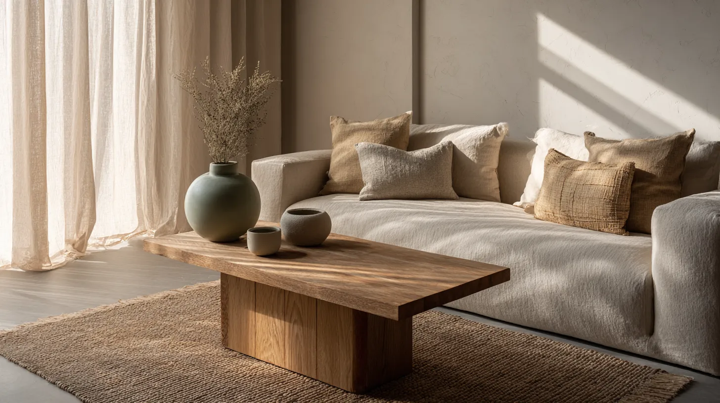
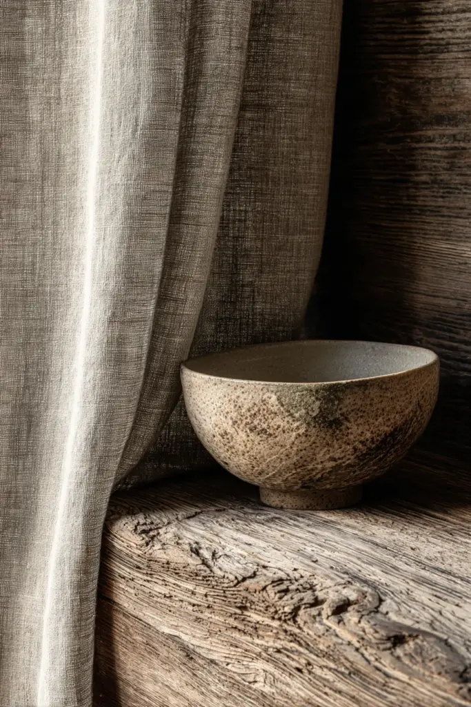
The magic happens in unexpected combinations — rough jute beneath a smooth ceramic bowl on your coffee table, soft wool pillows against a smooth leather sofa, a linen tablecloth draping over a roughly textured wood table.
Material Choices That Define Japandi Texture
Certain materials appear repeatedly in successful Japandi spaces because they embody the aesthetic’s core values:
- Light woods: Oak, ash, and beech bring warmth without darkness
- Woven elements: Rattan, bamboo, and wicker add organic pattern
- Natural fibers: Linen, cotton, and wool provide softness with substance
- Stone and clay: Concrete, limestone, and ceramics ground the space
- Paper and fabric: Shoji screens and canvas introduce delicate contrast
Each material tells a story of natural origins and human craft, reinforcing the connection to nature that defines Japandi philosophy.
How to Mix Textures and Colors in Japandi Design
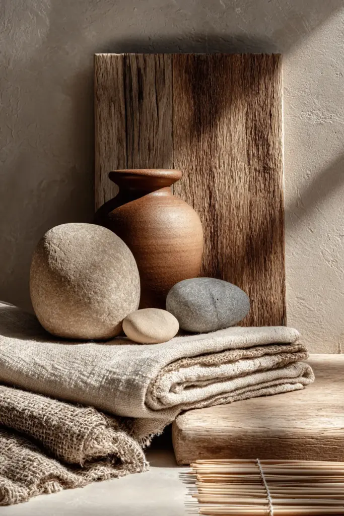
The real artistry emerges when you begin pairing specific textures with particular colors — this is where theory becomes lived experience, where rooms transform into homes.
Pairing Principles for Harmony
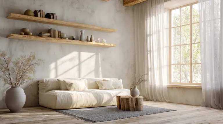
Light neutrals love rough textures. Cloud white (#E8E6E1) or warm ivory walls gain dimension when paired with rough-woven wall hangings, grasscloth wallpaper, or heavily textured plaster. The contrast prevents pale spaces from feeling flat or sterile.
Earth tones embrace smooth surfaces. That beautiful terracotta accent works best in smooth ceramic or matte-painted wood rather than rough, porous materials. Smooth surfaces allow deeper colors to appear sophisticated rather than rustic.
Soft textures amplify color subtlety. When you introduce accent colors like sage green or dusty rose, carry them through soft textiles — linen curtains, wool throws, cotton cushions. The texture softens the color, making it feel integrated rather than added as an afterthought.
Dark tones need textural variation. If you’re incorporating charcoal or deep brown, vary the texture significantly. A smooth charcoal vase beside a rough charcoal stone creates interest; two smooth charcoal objects feel heavy.
Room-by-Room Application
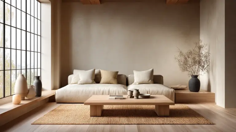
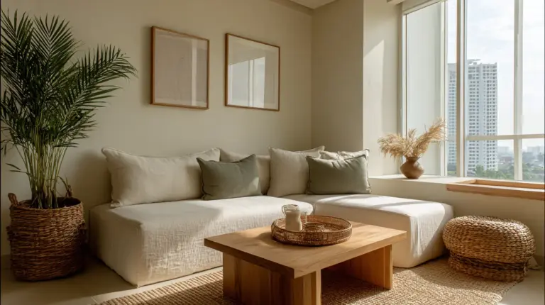
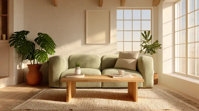
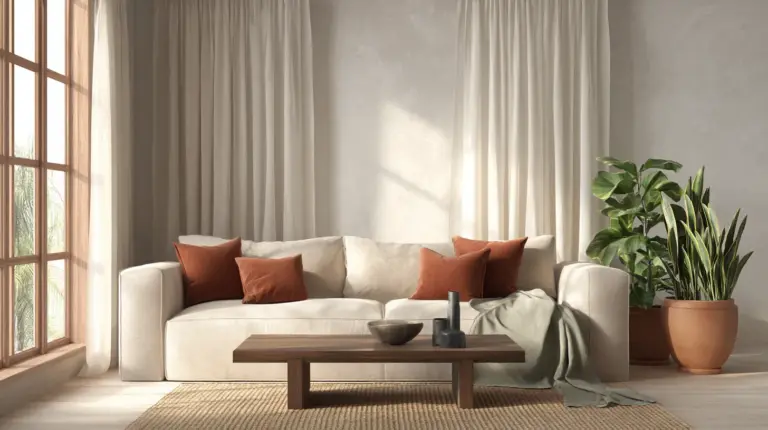
Living Room: Start with cloud white walls (#E8E6E1) and a large oat-colored linen sofa. Add a rough jute rug in natural beige, smooth oak coffee table, and soft wool throw in sage green. Introduce depth with smooth ceramic vessels in warm terracotta and charcoal.
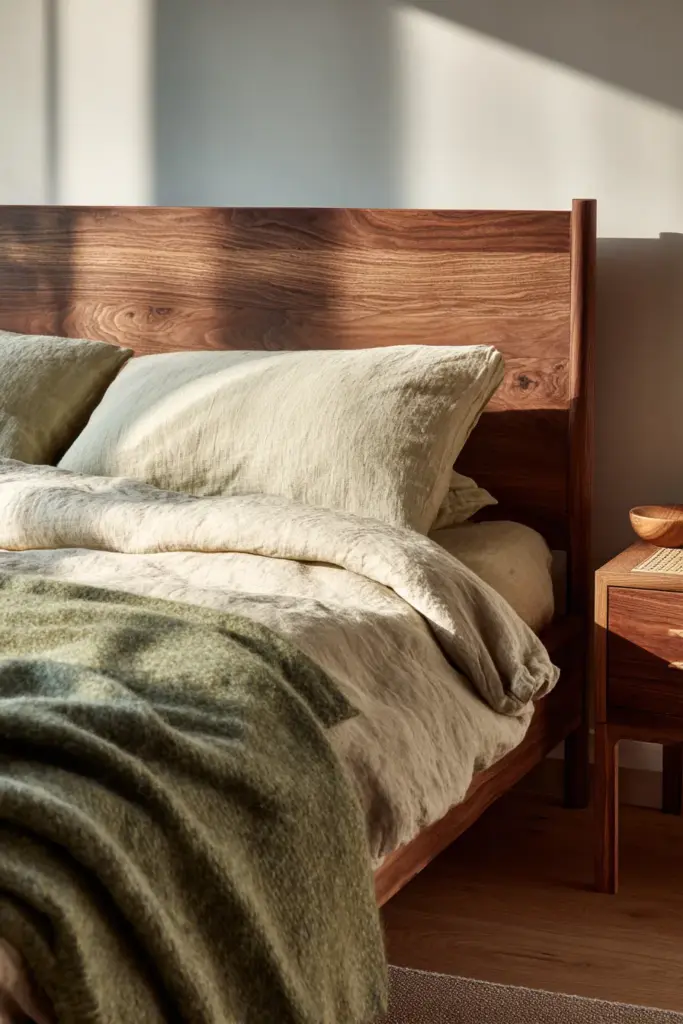
Bedroom: Layer warm ivory walls (#F7F5F2) with smooth walnut bed frame, soft linen bedding in dove gray (#C8C6C1), and rough rattan bedside tables. Add a soft wool area rug in natural taupe and smooth table lamp in matte black ceramic.
Kitchen: Pair smooth alabaster cabinets with rough concrete countertops or textured stone. Introduce warmth through smooth wood shelving in oak, soft linen dish towels in sand tones, and smooth ceramic dishware in mixed neutral glazes.
The goal is creating rhythm — a gentle visual dance between smooth and rough, light and deeper, soft and structured.
Texture Pairing Formulas for Small Spaces
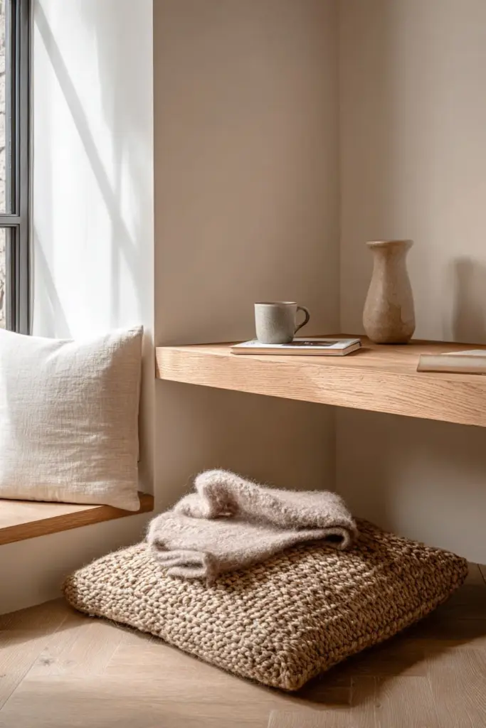
Smaller rooms benefit enormously from thoughtful texture and color pairing because every surface has outsized impact. These formulas maximize spaciousness while maintaining Japandi’s signature warmth.
The Minimalist Formula
For rooms under 150 square feet, use:
- 70% smooth textures in the lightest neutrals (#F7F5F2 to #E8E6E1)
- 20% one rough natural texture (rattan or jute) in similar light tones
- 10% soft texture in a single accent color (sage or dusty rose)
This keeps the space feeling open while preventing sterility. The rough texture provides just enough visual interest, and the soft accent adds necessary warmth.
The Layered Cozy Formula
For spaces that need to feel larger but still intimate:
- Start with light walls and smooth flooring (pale oak or light concrete)
- Layer a rough textured rug in natural fiber (jute, sisal, or seagrass)
- Add furniture with smooth surfaces but visible wood grain
- Introduce soft textiles in graduated neutral tones (lightest near windows, slightly deeper in corners)
This creates depth perception through texture rather than contrasting colors, which maintains cohesion while adding dimension.
Emerging Trends: Bio-Textiles and Sustainable Pairings
Japandi’s future is increasingly conscious, with new materials and approaches that honor the aesthetic’s nature-forward philosophy while addressing contemporary environmental concerns.
Bio-based textiles like hemp linen, organic cotton, and bamboo viscose are replacing conventional options. These materials often have more visible texture and slight color variation, which actually enhances the Japandi aesthetic’s embrace of natural imperfection.
Upcycled and reclaimed materials bring unique textures and patinas that new materials can’t replicate. Reclaimed wood with weathered surfaces, repurposed textile wall hangings, and ceramics made from recycled clay all contribute authentic texture stories.
Natural dyes create the muted, complex colors that define Japandi better than synthetic alternatives. Indigo fermentation produces those perfect dusty blues, madder root creates soft terracottas, and walnut husks yield rich browns with organic variation.
These sustainable choices don’t compromise the aesthetic — they enhance it, creating spaces that feel both timeless and forward-thinking.
Key Takeaways: Your Japandi Color and Texture Checklist
Before finalizing your space, ensure you’ve addressed these essential elements:
- Foundation established: 60-70% light neutrals (#F5F4F0 to #D4D2CE range) on walls and major pieces
- Earth tone anchors: 20-30% deeper tones (terracotta, taupe, charcoal) for visual weight
- Accent sparingly: 5-10% subtle color (sage, dusty rose, soft indigo) for personality
- Rule of three: Every zone includes smooth, rough, and soft textures
- Light woods dominant: Oak, ash, or beech as primary wood tones
- Natural fibers layered: Linen, cotton, wool, jute present throughout
- Smooth surfaces balanced: Ceramics, polished wood, or matte finishes for visual rest
- Rough elements grounding: Rattan, grasscloth, or textured stone adding organic authenticity
- Texture contrasts intentional: Rough with light colors, smooth with earth tones
- Sustainable when possible: Bio-textiles and reclaimed materials chosen consciously
This isn’t a rigid formula — it’s a framework that allows your personal aesthetic to emerge within Japandi’s harmonious principles.
A Table of Perfect Pairings
| Color | Hex Code | Best Texture Match | Room Application |
|---|---|---|---|
| Cloud White | #E8E6E1 | Rough rattan, woven grass | Living room walls with textured furniture |
| Warm Ivory | #F5F4F0 | Smooth oak, soft linen | Bedroom walls with wood and textile layers |
| Dove Gray | #C8C6C1 | Soft wool, smooth ceramic | Upholstered pieces with pottery accents |
| Warm Taupe | #8B7F77 | Rough jute, smooth walnut | Flooring and furniture combination |
| Terracotta | #C07A5A | Smooth glazed ceramic | Kitchen accent pottery |
| Sage Green | #B8C5B0 | Soft linen, rough stone | Textile accents against natural stone |
| Charcoal | #3C3C3A | Smooth matte metal, soft cotton | Light fixtures with soft textile balance |
Bringing It All Together
The art of Japandi color and texture pairing isn’t about perfection — it’s about presence. It’s about creating spaces where you notice the afternoon light catching on linen, where running your hand along a table’s wood grain becomes a small meditation, where coming home feels like exhaling.
Start small if you feel overwhelmed. Choose one room, one corner even, and apply these principles with intention. Select your foundation neutral. Add one rough texture. Layer in something soft. Notice how it feels. Adjust. Trust the process.
The beauty of Japandi is that it’s forgiving. There’s no single “right” combination, only the combinations that feel right to you in your space with your light and your daily rhythms. These principles serve as guides, not rules — ways to help you create the tranquil, warm, nature-connected spaces that this aesthetic celebrates.
As you develop your eye for these pairings, you’ll begin to see the potential in unexpected places. That piece of driftwood becomes a sculptural element against pale walls. Those vintage linen napkins become the perfect sage accent your dining room needed. A smooth stone from the beach transforms into a beautiful paperweight on your warm-toned desk.
This is the gift of understanding Japandi’s language of color and texture: you learn to speak it fluently, to create beauty not through accumulation but through thoughtful pairing, through the poetry of surfaces meeting light, through the quiet confidence of restraint.
Your home becomes a place that doesn’t just look beautiful in photographs — it feels beautiful in every moment you live within it. And isn’t that, after all, what home should be?
Frequently Asked Questions
What is the difference between Japandi and Scandinavian color palettes?
While both embrace light neutrals, Japandi incorporates more earth tones and slightly warmer undertones compared to Scandinavian design’s cooler whites and grays. Japandi adds subtle colors like sage green and terracotta that rarely appear in pure Scandinavian spaces, and it uses more natural wood tones rather than painted white wood. The overall effect is warmer and more grounded while maintaining the bright, airy quality Scandinavian design is known for.
Can I use bold colors in Japandi design?
Bold colors work in Japandi design when used with extreme restraint and always in muted, desaturated versions. Instead of bright red, consider deep rust terracotta. Rather than vibrant blue, choose dusty indigo. The key is ensuring any bolder color appears in small doses — a single art piece, one ceramic vessel, or a small textile accent — and that it still reads as natural and organic rather than synthetic or jarring.
How many textures should I layer in one room?
Aim for 4-6 distinct textures distributed throughout a room. More than this risks visual chaos; fewer may feel flat. For example, a living room might include smooth painted walls, rough jute rug, soft linen sofa, smooth oak coffee table, woven rattan basket, and soft wool throw. The textures should distribute across all height levels — flooring, furniture, and accessories — to create balanced complexity.
What’s the best color for small Japandi bedrooms?
Warm ivory (#F7F5F2) or alabaster (#F5F4F0) works beautifully for small bedrooms because these off-whites maximize natural light while maintaining warmth. Pair with smooth light oak or ash furniture, soft linen bedding in slightly deeper tones like oat (#E0D5C7), and minimal rough texture through one rattan element. Add one soft accent in sage green or dusty rose through a single throw or small pillow. This combination makes small spaces feel larger without sacrificing the cozy intimacy bedrooms require.
Should Japandi texture pairing differ by season?
Absolutely. Texture layering can shift seasonally while maintaining your color palette. In warmer months, emphasize smooth surfaces and lighter textiles — linen, cotton, polished ceramics. As temperatures cool, introduce additional soft textures through wool throws, heavier woven baskets, and perhaps a sheepskin rug. The colors remain consistent, but the textural weight adapts to create seasonal comfort. This approach honors the Japandi principle of living in harmony with natural cycles.
How do I add texture without adding clutter?
Focus on texture within functional items rather than purely decorative objects. Choose a roughly textured jute rug instead of a smooth one. Select linen curtains over synthetic alternatives. Opt for handmade ceramics with visible texture for everyday dishes. Use woven baskets for storage instead of bins. Display books with varied spine textures on shelves. This way, every textured element serves a purpose, maintaining Japandi’s essential minimalism while achieving the layered complexity that makes spaces feel complete.
Can I mix metallic finishes in Japandi color schemes?
Yes, but choose matte or brushed metallic finishes rather than polished chrome or bright brass. Oil-rubbed bronze, brushed brass with a patina, matte black steel, and aged copper all work beautifully because they read as natural materials with texture rather than reflective shine. Use metals sparingly — light fixtures, cabinet hardware, picture frames — and stick to one or two metallic finishes throughout a space to maintain cohesion. The metals should blend into the overall palette rather than punctuate it.
What’s the most common mistake in Japandi color and texture pairing?
The most frequent mistake is using too many smooth textures in light colors, creating spaces that feel more clinical than calm. People correctly embrace the neutral palette but forget that texture is what brings it to life. Without rough and soft elements to balance all those smooth surfaces, rooms feel cold rather than serene. The second most common error is introducing too many accent colors — Japandi’s power comes from restraint, and adding four or five different accent shades fragments the peaceful cohesion that makes the aesthetic so appealing.