Table of Contents
There’s something deeply calming about walking into a room where every piece feels like it belongs. Not matched in that overly curated way, but harmonious—like notes in a quiet song.
This is the heart of Japandi design. It takes the warm embrace of Scandinavian hygge and weaves it together with the mindful simplicity of Japanese wabi-sabi. The result? Spaces that breathe, furniture that grounds you, and colors that wrap around you like linen on skin.
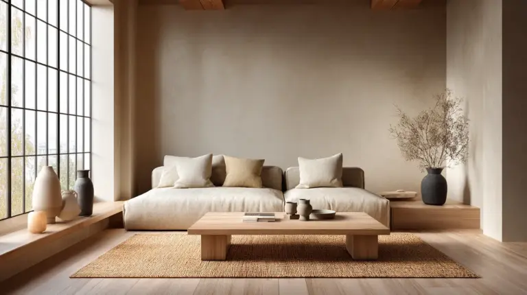
If you’ve been drawn to soft whites, weathered woods, and those perfectly muted greens, you’re already speaking Japandi. But matching furniture in this style isn’t about rules—it’s about feeling. It’s understanding how a taupe sofa softens against creamy walls, or how a walnut table anchors a room filled with light.
Let’s walk through this together, slowly and intentionally, the way Japandi itself unfolds.
What Colors Are Used in Japandi Style?
Japandi lives in the space between whisper and warmth. The palette is rooted in nature—think of morning fog, river stones, bare branches against winter skies.
Neutral base colors form the foundation: warm whites (#F5F5F0), soft beiges (#E8E3D6), and light grays (#D3D0CB). These aren’t stark or cold. They carry undertones of cream, sometimes a hint of blush or greige, like sunlight filtered through paper screens.
Earthy accent tones add depth without drama. Sage green (#B8C5B0), terracotta (#C87E63), muted blue (#8FA1B3), and warm taupe (#B09B8A) emerge like quiet moments—never competing, always complementing. These colors remind us of clay pots, moss on stone, the pale sky at dusk.
Natural wood hues tie everything together. Think oak (#D4AF85), walnut (#6B5345), and bamboo tones that range from honey to amber. Wood isn’t just furniture in Japandi—it’s the thread that connects floor to table to shelf, bringing organic warmth into every corner.
The 60-30-10 Rule for Japandi Harmony
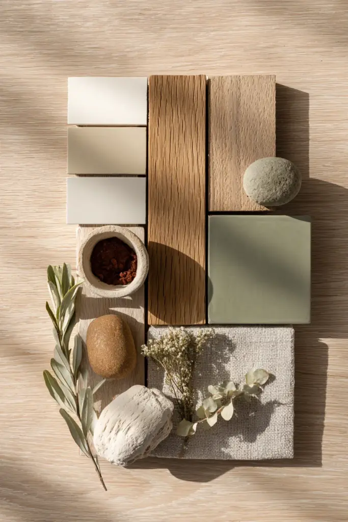
Color balance in Japandi follows an intuitive rhythm. Dedicate 60% of your space to neutral base colors—walls, large furniture pieces, primary textiles. This creates the calm canvas Japandi needs.
Use 30% for natural wood tones. Your dining table, shelving, bed frame, or accent chairs should introduce warmth through grain and texture. Mix light and medium woods freely—oak with walnut, bamboo with teak—as long as they share similar undertones.
Reserve 10% for muted accent colors. A sage green throw pillow, terracotta vase, or smoky blue ceramic piece. These touches punctuate without shouting, like commas in a peaceful sentence.
Understanding the Japandi Color Palette for Furniture
The beauty of Japandi furniture matching lies in its flexibility within structure. You’re creating conversations between pieces, not perfect replicas.
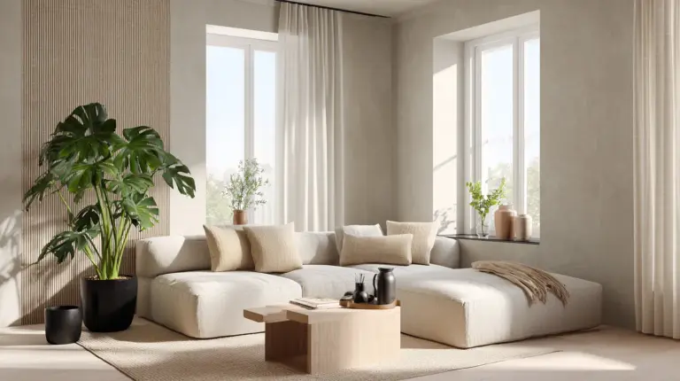
Warm neutrals anchor multifunctional furniture beautifully. A beige linen sofa (#E6DDD3) pairs seamlessly with a creamy wall while leaving room for darker wood coffee tables. Warm gray upholstery (#C4BFB6) offers versatility—it grounds lighter spaces and softens darker ones.
Creamy white furniture (#F3F0E8) brings Scandinavian lightness to heavier Japanese-inspired forms. Picture a low-profile white oak bed frame against walls in soft taupe, or open shelving painted in whisper-white holding handmade pottery in earthy clay tones.
Natural wood furniture needs no translation—it is Japandi. Look for pieces with visible grain, minimal treatment, and honest construction. A solid oak dining table, walnut sideboard, or rattan chair speaks the language fluently.
Matching Wood Furniture Tones in Japandi
Can you mix wood tones in Japandi? Absolutely—this is where the style finds its soul. Japanese design has always celebrated the beauty of imperfection and variety, while Scandinavian tradition embraces practicality and heritage pieces.
The key is undertone harmony. Warm woods (oak, ash, bamboo) naturally complement each other even when they differ in darkness. A light oak bench can sit beside a medium walnut table if both carry golden or honey undertones.
Contrast through placement, not clash. If your main furniture piece is a substantial walnut dining table, balance it with lighter oak chairs. The eye travels between them, finding rhythm rather than discord.
Incorporate raw and finished woods together. A reclaimed teak bench with weathered texture adds wabi-sabi character next to a smooth, oiled oak sideboard. The variation tells a story of time and care.
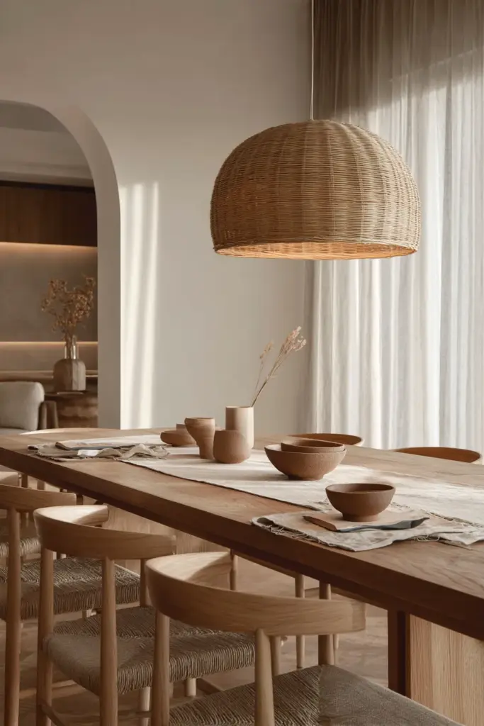
How to Match Furniture in Japandi Design
Matching furniture in Japandi isn’t about buying complete sets. It’s about understanding weight, texture, and visual temperature.
Start with your largest neutral piece. Usually your sofa or bed. Choose colors that fall within the warm neutral spectrum—beige, oatmeal, warm gray, or soft taupe. This becomes your anchor point.
Layer contrasting textures. A linen sofa against a wool rug, smooth ceramic beside woven rattan, matte painted cabinets next to natural wood shelving. Texture creates interest where color stays quiet.
Consider visual weight. Japandi embraces low-profile furniture—pieces that sit close to the ground, reducing visual clutter. Match a low platform bed with a simple wooden bench rather than ornate nightstands. Keep lines clean and forms honest.
Color Coordination for Small Spaces
For homes in places like Naic where space comes at a premium, Japandi’s restraint becomes a gift. Choose multifunctional furniture in neutral colors that visually recedes—think cream storage benches, taupe folding tables, or light gray convertible sofas.
Maximize light wood tones to expand the feeling of space. Bamboo shelving, light oak floating desks, and rattan storage baskets keep things open and airy. The grain adds interest without adding weight.
Limit accent colors to two. Perhaps sage green and terracotta, or muted blue and warm ochre. Use them sparingly—a cushion here, a throw there—so the space doesn’t feel busy or fragmented.
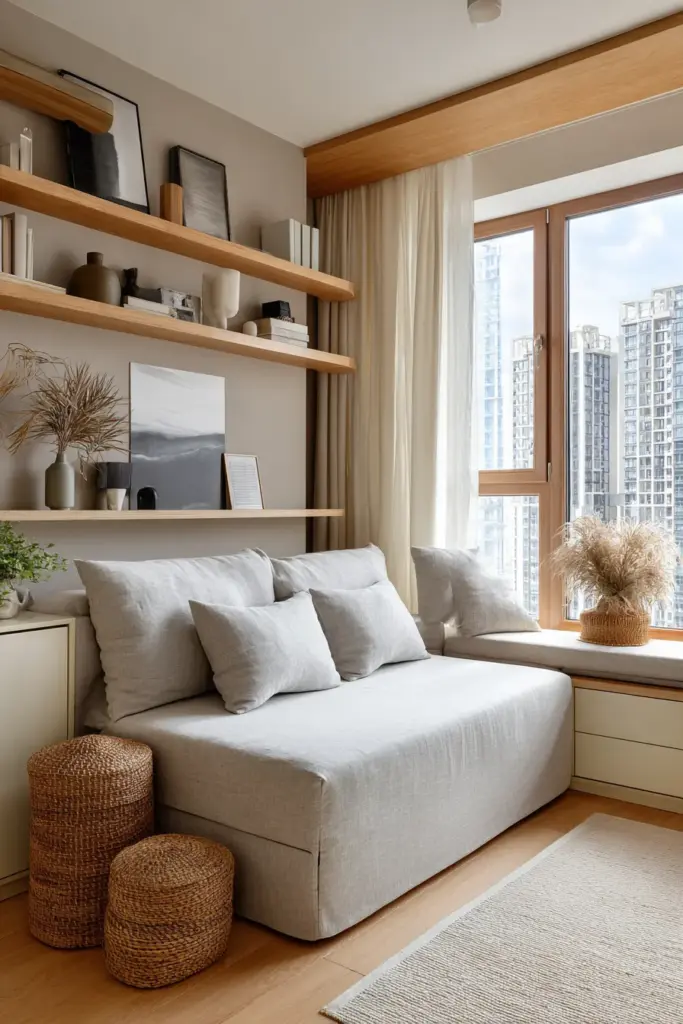
Japandi Neutral Colors for Furniture: A Practical Guide
Let’s get specific. Here are the neutral colors that form Japandi’s backbone, with their character and ideal applications.
| Color Name | HEX Code | Undertone | Best For | Pairs With |
|---|---|---|---|---|
| Creamy White | #F3F0E8 | Warm, slight yellow | Walls, linens, light cabinets | Any wood tone, sage green |
| Warm Taupe | #B09B8A | Earthy brown-gray | Upholstery, rugs, curtains | Walnut, terracotta, cream |
| Soft Beige | #E8E3D6 | Neutral with warmth | Large furniture, walls | Oak, bamboo, muted blue |
| Smoky Gray | #C4BFB6 | Cool-warm balance | Accent chairs, storage | All wood tones, sage, white |
| Light Sand | #D9CFC1 | Desert warmth | Sofas, cushions, throws | Darker woods, black accents |
| Pale Sage | #B8C5B0 | Cool green-gray | Accent pieces, textiles | Natural woods, warm neutrals |
These aren’t paint-by-numbers rules. They’re starting points for your own intuition to follow.
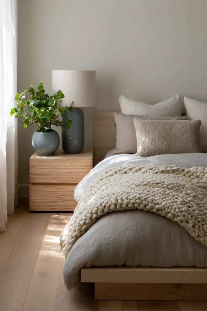
Furniture Color Matching Room by Room
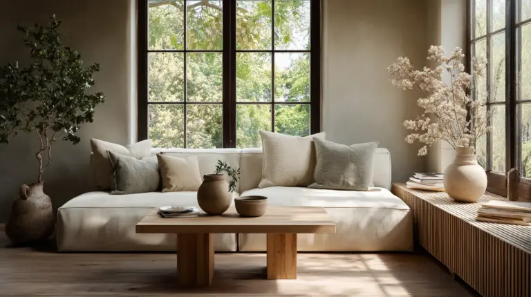
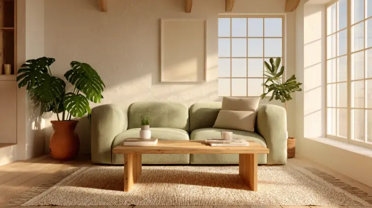
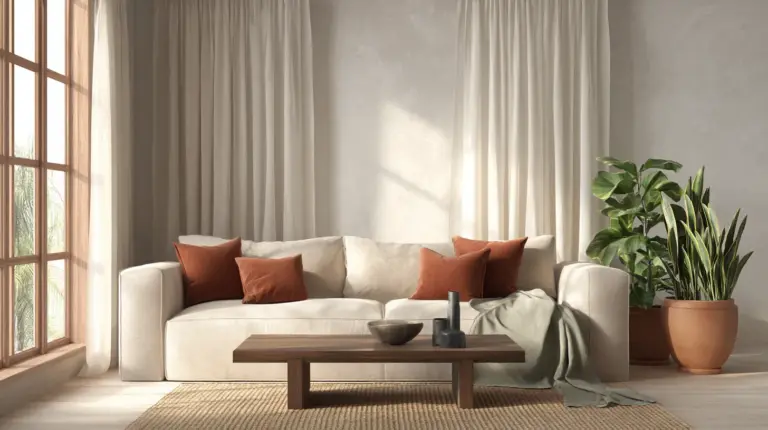
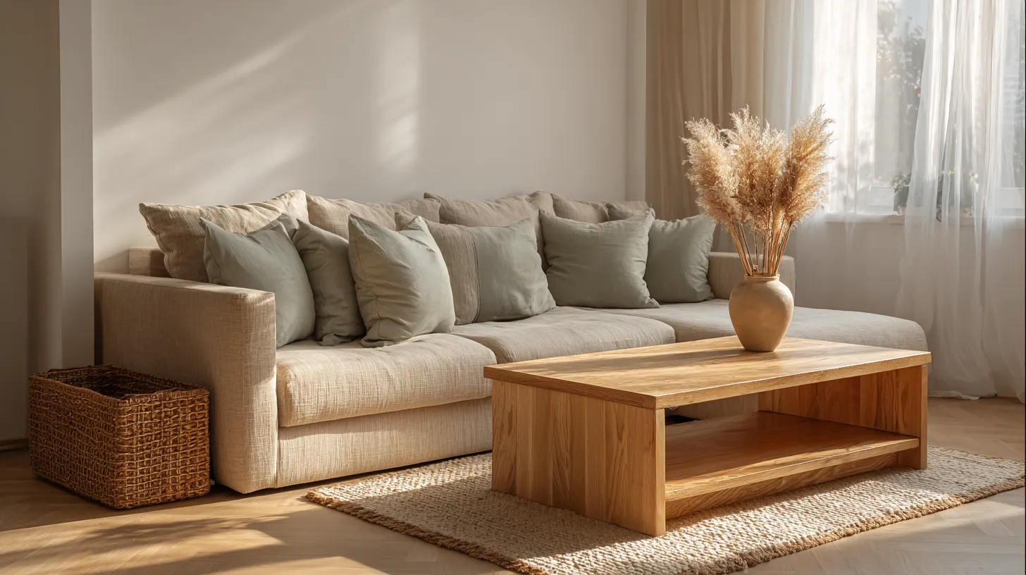
Living room: Anchor with a beige or warm gray sofa (#E6DDD3). Add a natural oak coffee table and walnut shelving. Introduce sage green through cushions and a single terracotta ceramic piece.
Bedroom: Choose a low platform bed in light wood or creamy white. Dress it with warm taupe linens and a chunky knit throw in oatmeal. Keep nightstands simple—light oak or bamboo—and add a single muted blue pottery lamp.
Dining area: Center a solid wood table—walnut or oak—with mismatched chairs in complementary wood tones. Paint the accent wall in soft beige (#E8E3D6) and hang simple linen curtains in warm white.
Sustainable Furniture Choices for Japandi Interiors
Japandi’s philosophy extends beyond aesthetics into mindfulness about materials and sourcing. This is design with a conscience.
Choose FSC-certified woods. Look for furniture made from responsibly harvested oak, bamboo, or teak. In the Philippines, consider locally sourced narra or molave for custom pieces that honor both the style and the environment.
Embrace upcycled furniture. Japandi celebrates the beauty of age and wear. An old wooden bench stripped and re-stained in warm ochre tones carries more soul than factory-fresh replicas. Visit local woodworkers or restoration shops for one-of-a-kind finds.
Select low-VOC finishes. Whether you’re painting a cabinet in soft beige or sealing a wooden table, choose paints and stains with minimal chemical off-gassing. Your home should breathe as easily as you do.
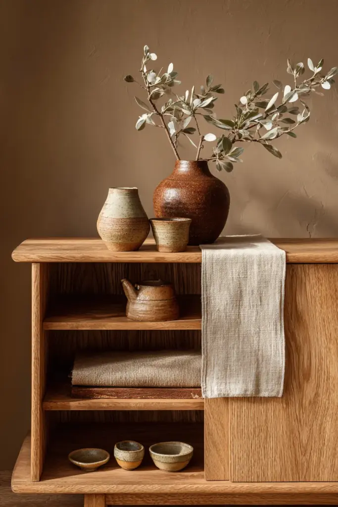
Budget-Friendly Japandi Furniture Matching
You don’t need a luxury budget to create Japandi harmony. Start with what you have and transform it with intention.
DIY furniture staining brings old pieces into the palette. Sand down a dated dark table and apply a light oak stain. Transform mismatched chairs with warm taupe cushions made from affordable linen-look fabric.
Shop secondhand strategically. Look for solid wood pieces with good bones—structure matters more than color. A scratched teak sideboard becomes beautiful again with light sanding and natural oil treatment.
Invest in fewer, better pieces. Rather than filling a room with cheap furniture, choose one quality item—perhaps a solid oak bench under $200—and build around it slowly. Japandi rewards patience and curation.
How Lighting Affects Japandi Furniture Colors
Color never exists in isolation. Light transforms everything—a truth Japandi design understands intimately.
Warm LED lighting (2700K) enhances the coziness of Japandi palettes. It deepens beiges into caramels, makes sage greens feel earthier, and gives wood tones a honeyed glow. This is the light of early evening, of candles and contentment.
Natural daylight reveals the true character of neutrals. Those warm grays show their undertones—some lean purple, others green or beige. Test furniture colors near windows before committing, watching how they shift from morning to afternoon.
Layered lighting creates depth. Combine overhead ambient light with task lighting (simple wooden table lamps with linen shades) and accent lighting (LED strips under floating shelves). Each layer brings out different aspects of your color palette.
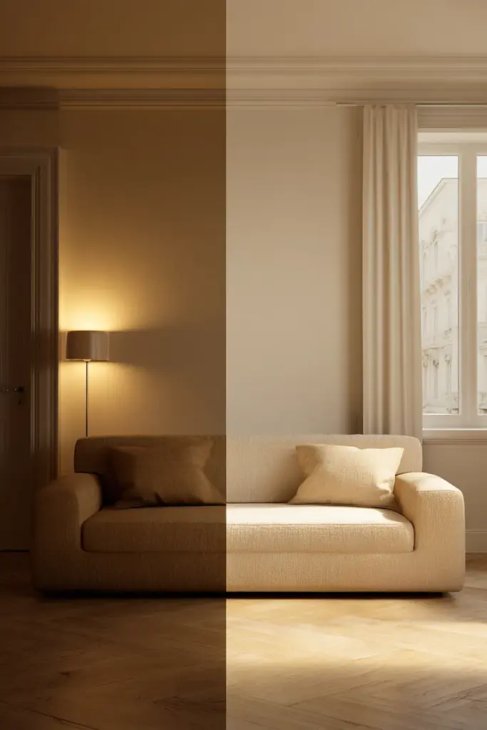
Testing Colors Before Committing
Paint large sample boards (2×2 feet minimum) in your chosen neutrals. Move them around the room, propping against furniture at different times of day. Notice how your beige sofa looks against warm taupe walls at sunset versus noon.
Bring fabric swatches home before buying upholstered furniture. Drape them over existing pieces, hold them near your wood furniture, see them in your actual lighting. Colors that sang in the showroom might whisper differently in your space.
The Psychology of Japandi Colors
There’s science behind why Japandi spaces feel so restorative. Color affects our nervous system, our mood, even our breathing.
Sage green reduces stress by approximately 20% according to environmental psychology studies. It’s no accident that this color appears throughout Japandi design—it literally calms us, lowering cortisol and inviting deeper breaths.
Warm neutrals create psychological safety. Beiges, taupes, and soft grays don’t demand attention or trigger alertness. They’re the visual equivalent of a gentle hand on your shoulder—reassuring, grounding, present.
Natural wood tones connect us to nature even indoors. Studies show that visible wood grain in furniture reduces stress markers and increases feelings of warmth and comfort. We’re biologically drawn to organic materials.
Creating Emotional Harmony Through Color
Japandi furniture matching isn’t just about aesthetics—it’s about crafting how a room feels. Too many cool tones can feel sterile; too many warm ones might feel heavy.
Balance cool and warm neutrals within each room. A cool smoky gray chair beside a warm beige sofa, both unified by a natural wood coffee table in the middle. The temperature variation keeps the space alive while staying calm.
Use muted accent colors to introduce specific emotions. Sage green for tranquility in bedrooms, terracotta for gentle energy in dining areas, muted blue for focused calm in workspaces.
Practical Japandi Furniture Matching Checklist
Before you buy or arrange furniture, run through these touchpoints:
- Does the piece have clean, simple lines without excessive ornamentation?
- Is the color within the warm neutral or muted accent palette (beige, taupe, warm gray, sage, terracotta)?
- Can you see natural material qualities—wood grain, linen texture, clay finish?
- Does it serve a clear function without being purely decorative?
- Will it work well at low visual height, contributing to openness?
- Does the undertone (warm or cool) harmonize with your existing pieces?
- Is there visible craftsmanship or evidence of thoughtful construction?
- Could it age gracefully, developing patina rather than looking worn?
These questions guide you toward authentic Japandi choices rather than superficial approximations.
Common Furniture Matching Mistakes to Avoid
Mixing too many wood species without attention to undertone. Three different woods with conflicting undertones (red oak, gray-washed pine, orange-toned teak) create discord. Stick to 2-3 wood types maximum.
Choosing overly cool grays that lean blue or purple. These feel Nordic winter rather than Japandi warmth. Test grays against natural light—if they read cool, choose warmer alternatives.
Adding too many accent colors. Japandi breathes through restraint. Six different accent colors—even muted ones—fragment the calm. Limit yourself to two, maybe three maximum.
Ignoring scale and proportion. A massive sectional sofa in a small room fights Japandi’s principle of space and breath, regardless of color. Choose appropriately sized furniture that respects the room’s dimensions.
Emerging Trends in Japandi Color Furniture Matching (2026)
Japandi continues evolving while honoring its roots. Here’s what’s emerging in 2026.
Adaptive color temperatures are gaining attention. Smart LED systems that shift from cool morning light to warm evening glow let you see how your furniture palette transforms throughout the day. This technology serves Japandi’s emphasis on natural rhythms.
Deeper earth tones are entering the palette. Rust (#A66B4C), deep moss (#6B7F5C), and charcoal (#4A4744) add more grounding weight while maintaining muted sophistication. They work beautifully as accent furniture pieces.
Japandi maximalism might sound contradictory, but it’s emerging as a sub-style. This approach layers more texture and slightly more color variation while keeping the fundamental principles intact. Think three muted accent colors instead of one, or mixing more diverse global craft pieces.
Digital Tools for Visualizing Furniture Matches
Technology now supports intuitive color matching. Upload photos of your space to AI palette generators that suggest complementary furniture colors based on existing elements. Apps can simulate how a sage green chair would look against your cream walls before you buy.
Create digital mood boards in Canva using Japandi color templates. Drop in furniture images, adjust their colors digitally, and see the full room composition before making purchases. This saves money and reduces the environmental cost of returns.
Conclusion
There’s a moment when a room finally comes together. When the last piece finds its place and suddenly everything makes sense—not because it’s perfect, but because it’s whole.
That’s what Japandi furniture matching offers. Not a formula to follow, but a feeling to trust. It’s knowing that warm taupe and natural oak belong together the way morning light belongs to breakfast. It’s understanding that muted sage doesn’t compete with beige—it completes it.
Your home should hold you gently. It should let you breathe deeper, think clearer, rest more fully. Japandi colors do this through their quietness, their earthiness, their refusal to shout.
Start small if you need to. One wooden bench. One sage cushion. One wall painted in that perfect warm white you’ve been dreaming about. Each choice is a step toward a space that feels like coming home—every single time you walk through the door.
Frequently Asked Questions
What are the best neutral furniture colors for Japandi style?
The core Japandi furniture neutrals include warm white (#F3F0E8), soft beige (#E8E3D6), warm taupe (#B09B8A), and light gray with warm undertones (#C4BFB6). These colors work beautifully for sofas, beds, and larger upholstered pieces. They provide a calm foundation while allowing natural wood furniture to shine. Choose neutrals with warm undertones rather than stark whites or cool grays to maintain Japandi’s inviting character.
Can you mix different wood tones in Japandi interiors?
Yes, mixing wood tones is actually encouraged in Japandi design. The key is matching undertones—combine woods that all lean warm (oak, ash, bamboo) or all lean cool (gray-washed pine, weathered teak). You can pair light oak chairs with a medium walnut table successfully if both have golden undertones. Limit yourself to 2-3 wood species per room and let them vary in darkness rather than temperature. This creates depth while maintaining harmony.
What accent colors work with Japandi furniture?
Muted, earthy accent colors complement Japandi’s neutral furniture beautifully. Sage green (#B8C5B0), terracotta (#C87E63), muted blue (#8FA1B3), warm ochre, and soft moss are ideal choices. Use these sparingly—representing about 10% of your color palette through cushions, throws, pottery, or small accent chairs. These colors should feel like they came from nature, never bright or saturated. They add personality without disrupting the calm.
How do I match furniture for small Japandi-style rooms?
For small spaces, stick to light-colored furniture that visually recedes—creamy whites, soft beiges, and light warm grays. Choose multifunctional pieces like storage benches in neutral tones or convertible sofas in warm taupe. Use light wood tones (bamboo, light oak) extensively as they reflect light and create airiness. Limit accent colors to just two and apply the 60-30-10 rule strictly: 60% neutral walls and large furniture, 30% natural wood, 10% muted accents. Keep furniture low-profile to maximize perceived space.
What lighting is best for Japandi furniture colors?
Warm LED lighting at 2700K enhances Japandi furniture colors beautifully, deepening the warmth of beiges and making wood tones glow. Combine overhead ambient lighting with table lamps featuring linen or paper shades for layered illumination. Maximize natural daylight during the day—it reveals the true character of neutral furniture and wood grain. Avoid cool-white bulbs above 3000K as they make warm neutrals look dingy and work against Japandi’s cozy atmosphere. Test all furniture colors under your actual home lighting before purchasing.