Table of Contents
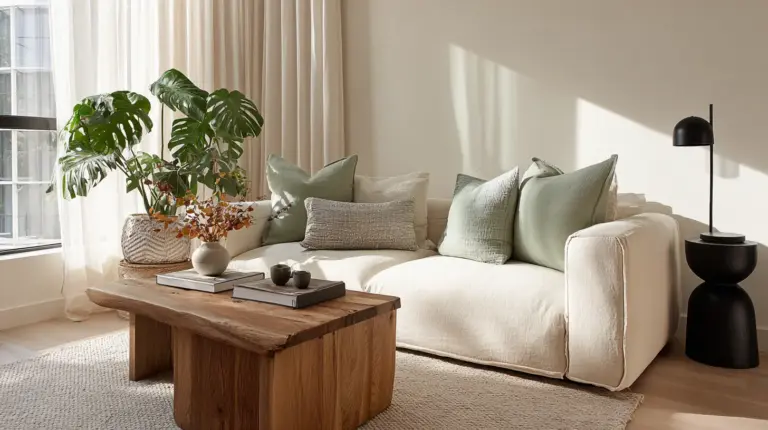
There’s something quietly powerful about a room that breathes. Where soft beiges meet weathered wood, where sage greens whisper against linen whites, and every surface feels touched by sunlight and soil. This is the heart of Japandi design—a gentle fusion of Japanese minimalism and Scandinavian warmth that draws its entire soul from nature itself.
If you’ve been searching for colors that calm rather than compete, that ground rather than distract, you’re in exactly the right place. Japandi nature-inspired colors aren’t just paint swatches or fabric samples. They’re an invitation to slow down, to notice the moss on morning stones, the cream in winter sky, the terracotta beneath your bare feet.
In this guide, we’ll walk through the complete Japandi color palette together—from foundational neutrals to earthy accents, from muted greens to charcoal depths. You’ll learn exact hex codes, room-specific applications, and even DIY mixing recipes for those who love getting hands-on. Whether you’re designing a small Manila apartment or reimagining your living room, these colors will help you create spaces that feel effortlessly calm.
Let’s explore how nature’s most honest hues can transform your home into a sanctuary.
What is the Japandi Color Palette?
The Japandi color palette is nature distilled into its most peaceful form. It combines the wabi-sabi philosophy of finding beauty in imperfection with the Scandinavian love of light-filled, cozy spaces called hygge. The result? Colors that feel like they’ve been borrowed from forests, beaches, and mountain mornings.
At its core, this palette embraces neutrals—soft whites (#FFFAFA snow white, #F5F5DC beige), warm taupes (#D2B48C tan), and gentle grays. These foundational tones create breathing room, allowing natural materials like oak, rattan, and linen to shine without visual competition.
But Japandi doesn’t stop at neutrals. It weaves in earthy tones like warm browns (#8B4513 saddle brown), terracotta (#E2725B), and nature’s most calming accent: greens. From sage green (#A8BFA3) to olive green (#808000) and moss (#8A9A5B), these muted botanicals reduce stress by grounding us in organic beauty. Studies suggest sage green can lower cortisol levels by approximately 20%, making it more than just aesthetically pleasing.
This palette refuses to shout. Instead, it murmurs.
Core Japandi Nature-Inspired Colors Explained
Neutral Foundation Colors
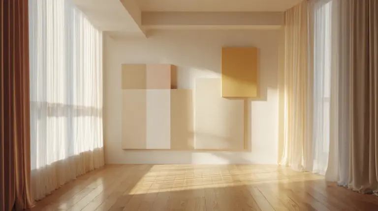
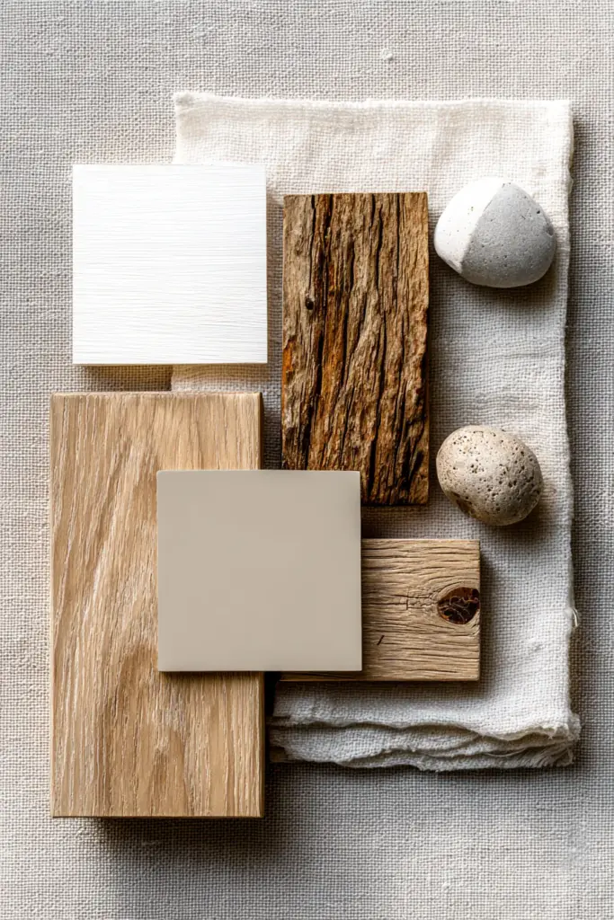
Off-Whites and Soft Beiges form the canvas of every Japandi space. Think alabaster (#FAFAF0), ivory (#FFFFF0), and warm beige (#F5F5DC)—colors that catch morning light and hold it gently. These aren’t stark or clinical; they’re the color of raw linen, of rice paper, of clouds before rain.
Pair these with natural wood tones in oak (#C19A6B), ash, or light walnut. The wood doesn’t need to match perfectly—slight variations add authenticity, like trees in a forest never grow identical.
For depth, introduce taupe (#483C32) and greige (gray-beige blend, #8B8680). These transitional neutrals bridge walls and furniture, creating layers without adding visual weight. They’re especially effective in humid Philippine climates where lighter tones prevent spaces from feeling closed in.
Earthy Accent Tones
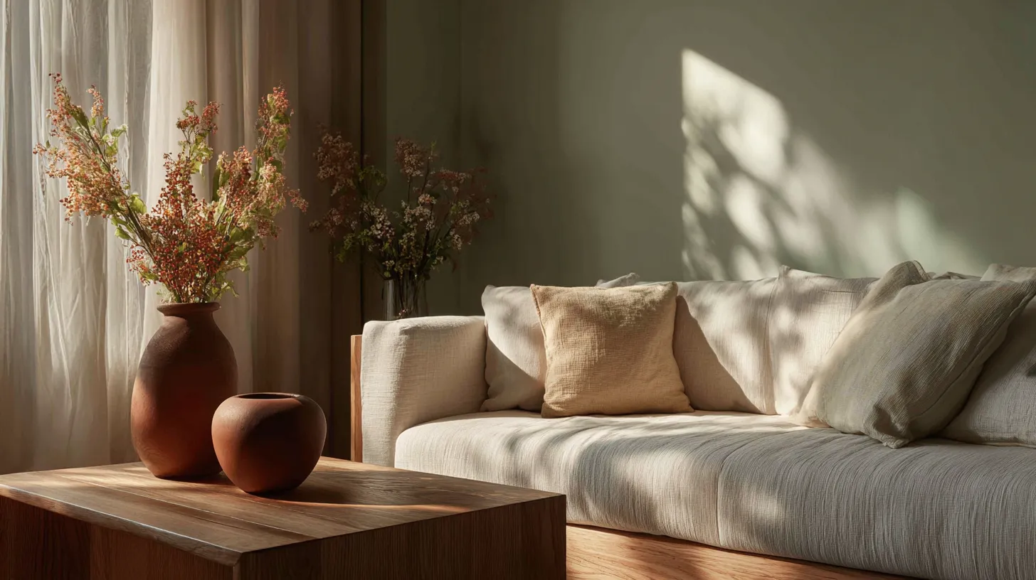
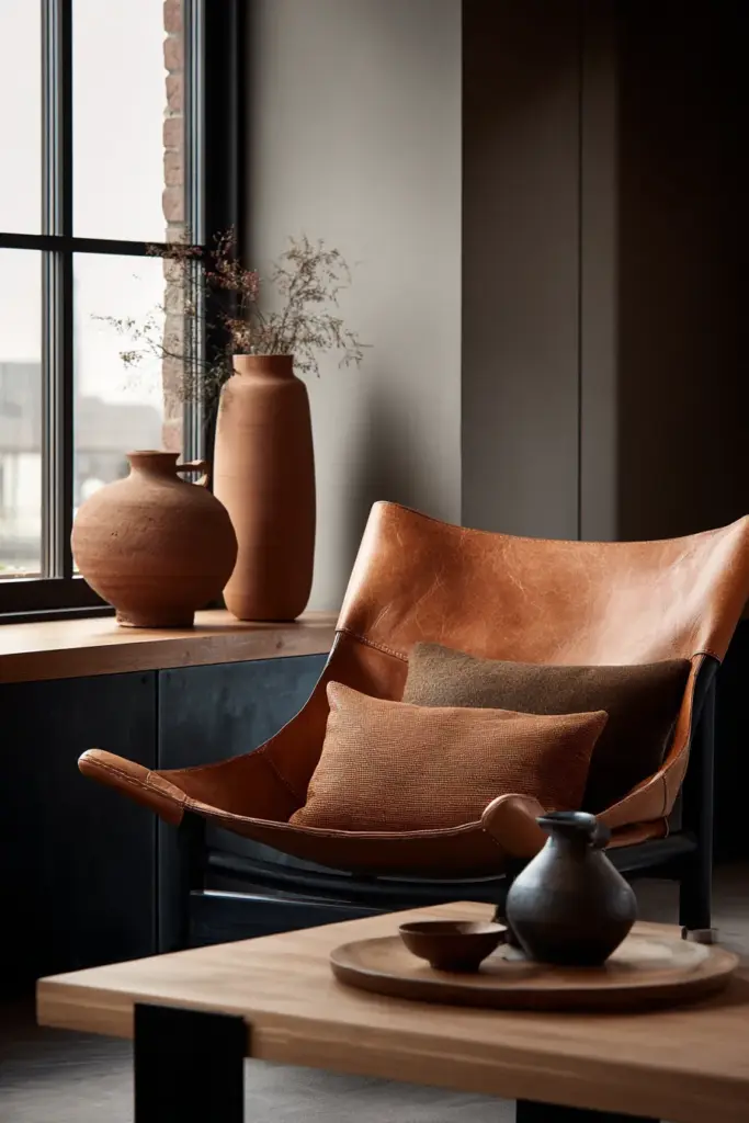
Warm browns bring weight and warmth. Use saddle brown (#8B4513) in wooden furniture, chestnut (#954535) in ceramic vases, or caramel (#FFD59A) in throw pillows. These tones echo bark, clay, and autumn leaves—materials humans have gravitated toward for millennia.
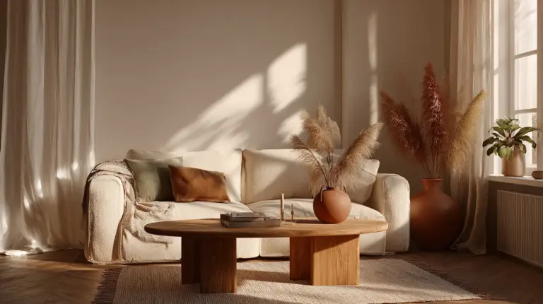
Terracotta (#E2725B) adds unexpected richness without breaking Japandi’s calm. A terracotta planter against cream walls, rust-colored cushions on a beige sofa—these touches feel like sunset filtering through curtains. Terracotta works beautifully in kitchens and dining areas, spaces where warmth should feel literal and inviting.
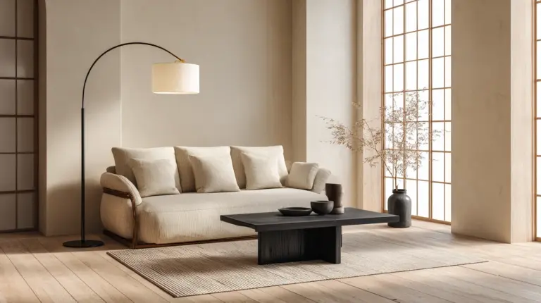
Charcoal (#36454F) and soft black (#2C2C2C) anchor the palette. Use them sparingly—in steel frames, matte hardware, thin table legs. These darker accents create visual punctuation, the way a calligrapher’s brush pauses between strokes.
Nature’s Green Spectrum
If neutrals are Japandi’s foundation, greens are its heartbeat. These aren’t electric or tropical—they’re the colors of things that grow slowly, quietly, persistently.
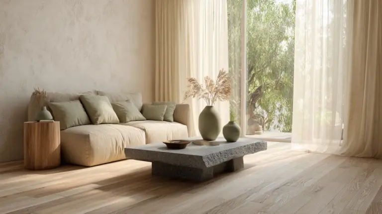
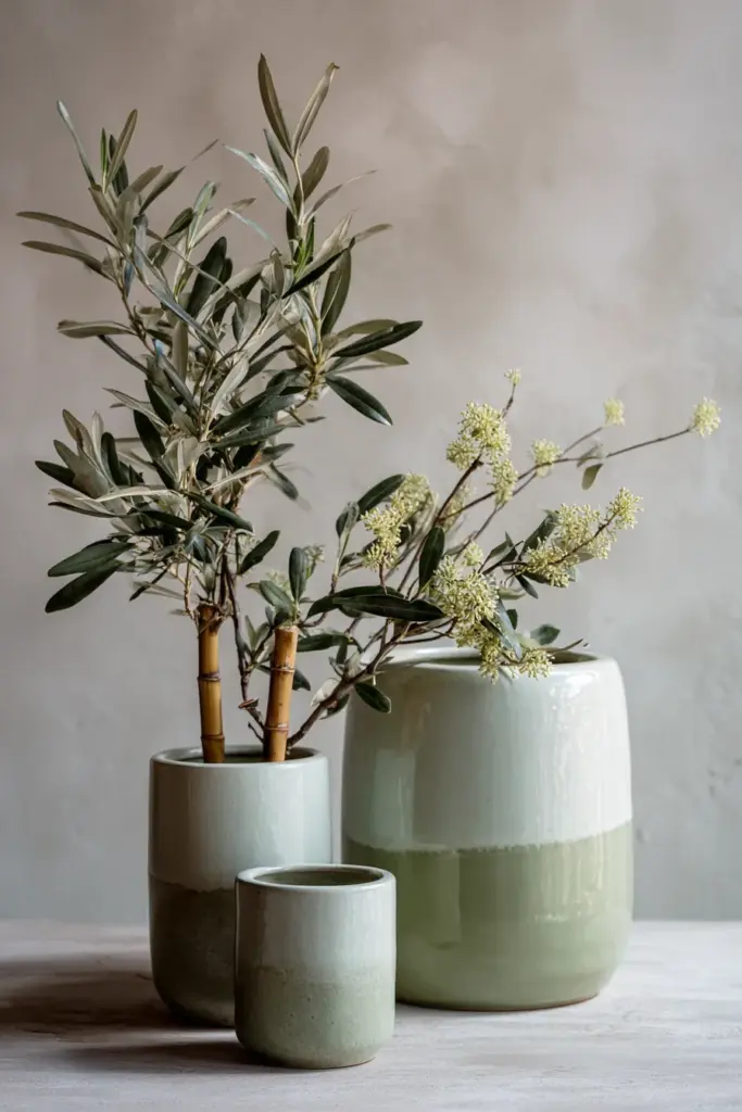
Sage green (#A8BFA3 or #9CAF88) is the star performer. It pairs beautifully with white oak, softens stark whites, and brings immediate serenity. Use it on accent walls behind platform beds, in kitchen cabinetry, or as upholstered dining chairs. Sage green also has remarkable versatility across seasons—it feels fresh in spring, grounding in autumn.
Olive green (#808000) adds more earthiness. It’s sage’s deeper cousin, wonderful in larger spaces or rooms with abundant natural light. Consider olive for reading nook walls or as velvet curtain fabric that puddles softly on light wood floors.
Moss green (#8A9A5B) and celadon (#ACE1AF) round out the spectrum. Moss works in textiles—think knitted throws or linen table runners. Celadon, inspired by Japanese pottery glazes, shines in ceramic accents like bowls, planters, or pendant lamp shades.
Seasonal Color Variations
Spring/Summer Japandi leans lighter. Emphasize cream (#FFFDD0), soft sage (#C4D4C0), and pale terracotta (#E9A896). These colors maximize natural light, creating airiness essential in warmer months. Add subtle blues like powder blue (#B0E0E6) sparingly—in cotton bedding or hand-thrown pottery.
Autumn/Winter Japandi deepens slightly. Bring forward camel (#C19A6B), rich olive (#6B8E23), warm taupe (#B38B6D), and charcoal (#36454F). Layer textures here—chunky knit throws in oatmeal, velvet cushions in mushroom brown, wool rugs in slate gray. The palette stays muted but feels more enveloping, like wrapping yourself in cashmere.
Seasonal shifts don’t require repainting. Simply swap textiles, add seasonal branches (bare winter stems, fresh spring eucalyptus), and adjust lighting warmth.
Room-by-Room Japandi Color Applications
Japandi Living Rooms
Start with walls in soft white (#FAF9F6) or warm beige (#F5F5DC). This creates the essential brightness that makes Scandinavian spaces so inviting, while allowing Japanese-inspired minimalism to breathe.
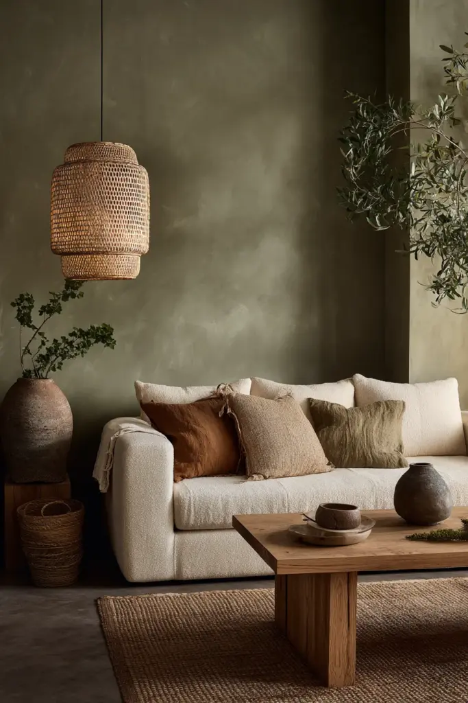
Your sofa becomes the focal neutral—choose oatmeal (#EAE0C8), greige (#8B8680), or light taupe (#B8A294) in linen or bouclé. Layer with cushions in sage green, terracotta, and charcoal. One pattern maximum—perhaps a subtle geometric in cream and olive.
Add a low wooden coffee table in natural oak or ash. Don’t match wood tones obsessively; slight variations feel more organic. Place a ceramic bowl in celadon on the table, fill it with river stones or dried grasses.
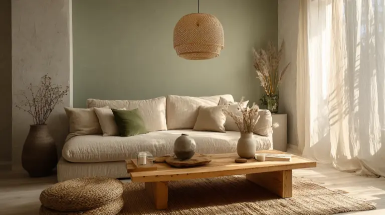
Accent wall option: One wall in sage green (#A8BFA3) behind your seating area creates instant calm without overwhelming. Pair with white oak floating shelves displaying pottery in cream, brown, and soft black.
Japandi Bedrooms
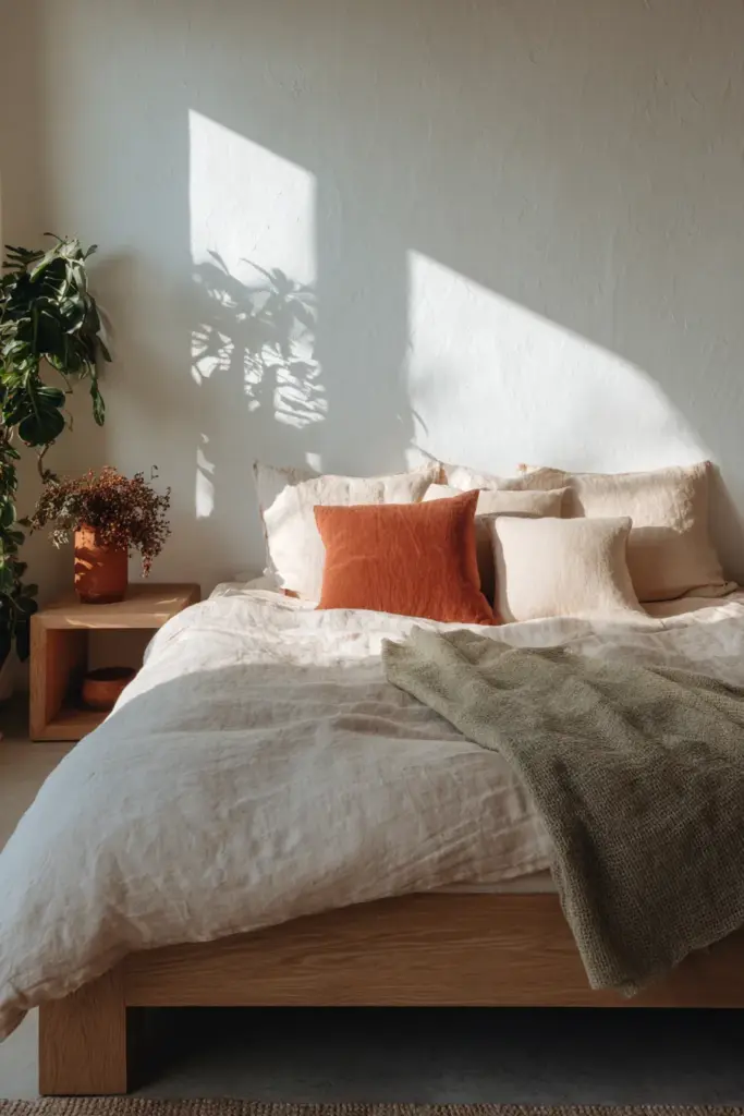
Bedrooms demand the palette’s softest whispers. Paint walls alabaster (#FAFAF0) or the palest greige (#D3CBC1). Choose bedding in natural linen—undyed cream or warm white (#FFF8F0). The texture matters as much as the color here.
A low platform bed in light wood grounds the room. Add a sage green throw folded at the foot, terracotta pillows for warmth, and perhaps one charcoal accent in a reading lamp or picture frame.
Window treatments should filter rather than block. Choose sheer curtains in off-white or light taupe. If you need blackout capability for tropical climates, layer with linen curtains in warm beige that can be drawn aside during day.
Keep nightstands minimal—one small vase with a single stem, a wooden tray, nothing more. The color palette here supports sleep, not stimulation.
Japandi Kitchens and Dining Areas
Kitchens benefit from cabinetry in soft sage (#B2C2A3) or warm gray-beige (#A39E93) paired with countertops in light stone or white oak butcher block. Add warmth through terracotta tiles for backsplash or open shelving brackets in matte black.
For dining areas, a natural wooden table (oak, ash, or walnut) surrounded by chairs in mixed finishes creates interest. Upholster chairs in sage linen or leave wood natural with cream cushions. Hang a ceramic pendant in celadon or frosted glass for soft overhead lighting.
Practical tip for humid climates: In Philippine homes, prioritize humidity-resistant wood treatments. Teak and bamboo naturally resist moisture while maintaining Japandi’s organic aesthetic. Choose low-VOC paints in lighter colors to prevent heat absorption.
Small Space Adaptations
Small spaces thrive in Japandi colors because the palette inherently expands rather than closes. Lead with whites and beiges (#FFFAFA, #F5F5DC) on walls and large furniture pieces. This maximizes light reflection crucial in compact rooms.
Introduce sage green and olive through smaller items: cushions, throws, small plants in terracotta pots. Use charcoal minimally—perhaps just in picture frames or a single narrow shelf bracket.
Vertical emphasis helps: Paint one accent wall in warm taupe (#B8A294) on the wall with your tallest piece of furniture. This draws the eye upward, creating height perception. Keep floors light—natural wood or pale tiles in cream (#FFFDD0).
DIY Color Mixing Recipes for Japandi Tones
Creating custom Japandi colors lets you achieve perfect undertones for your specific lighting. Here are practical recipes:
Custom Beige: Mix white base paint + ochre (2% by volume) + tiny drop of raw umber. Test on cardboard first. This creates warm beige (#F5E6D3) that reads neither yellow nor pink.
Perfect Sage: Start with white + forest green (8-10%) + touch of gray (2%). For softer sage, increase white ratio. For autumn sage, add a whisper of burnt sienna.
Warm Taupe: White base + raw umber (5%) + touch of red oxide (1%). This creates taupe (#B8A294) with neither purple nor brown dominance—essential for Japandi’s warmth.
Soft Terracotta: White + burnt sienna (15%) + yellow ochre (3%). Adjust ratios for lighter or deeper terracotta. Too orange? Add tiny amount of complementary blue.
Charcoal Wash: For accent walls, mix charcoal gray + white (40% white) for soft charcoal (#65696C) that adds depth without darkness.
Always test colors on large poster boards and view them in morning, afternoon, and evening light before committing to walls.
The Psychology Behind Japandi Nature Colors
Why these colors calm us physiologically: Nature-inspired neutrals and greens trigger parasympathetic nervous system responses—the “rest and digest” state. Our ancestors spent millennia in environments dominated by earth tones, greens, and sky blues. These colors signal safety, abundance, and calm.
Sage green specifically has been studied for stress reduction. Research indicates it can lower cortisol levels by approximately 20%, reducing anxiety and promoting mental clarity. It’s why hospitals increasingly use sage in healing spaces.
Warm neutrals (beiges, taupes, warm whites) provide visual rest. They don’t demand attention or processing energy from our brains. In homes where we’re constantly stimulated by screens and schedules, these colors offer relief.
Darker accents like charcoal create necessary contrast and definition. Without them, all-neutral spaces can feel washed out or unfinished. The key is restraint—5-10% darker tones maximum.
This isn’t just aesthetic preference. It’s biology meeting design.
Sustainability and Low-VOC Paint Options
Japandi philosophy naturally aligns with sustainability. Choose low-VOC or zero-VOC paints to maintain healthy indoor air quality—essential in humid climates where ventilation can be challenging.
Brands offering excellent Japandi-compatible colors in eco-formulas include Benjamin Moore’s Natura line, Sherwin-Williams’ Harmony, and Behr’s Premium Plus. Look for certifications like Green Seal or Greenguard Gold.
For wood finishes, select water-based stains and sealers in natural tones. Avoid polyurethane’s yellowing effect on light woods—it ages poorly and conflicts with Japandi’s clean aesthetic.
Sustainable material choices: Pair your color palette with bamboo flooring (rapidly renewable), reclaimed wood furniture, organic cotton textiles in natural dyes, and locally-sourced rattan. These materials already exist in perfect Japandi tones—letting nature do the color work.
Consider clay-based paints for select accent walls. They’re zero-VOC, breathe naturally (regulating humidity), and come in earthy tones like clay beige, terracotta, and warm gray. They’re particularly suitable for Philippine climates.
Complete Japandi Color Palette with Hex Codes
Here’s your comprehensive reference guide for exact color matching:
| Color Name | Hex Code | RGB Values | Best Uses |
|---|---|---|---|
| Snow White | #FFFAFA | 255,250,250 | Walls, ceilings, baseboards |
| Alabaster | #FAFAF0 | 250,250,240 | Walls, large furniture |
| Warm Beige | #F5F5DC | 245,245,220 | Walls, sofas, bedding |
| Cream | #FFFDD0 | 255,253,208 | Textiles, curtains |
| Taupe | #483C32 | 72,60,50 | Accent walls, upholstery |
| Greige | #8B8680 | 139,134,128 | Large furniture, rugs |
| Sage Green | #A8BFA3 | 168,191,163 | Accent walls, cabinetry, chairs |
| Olive Green | #808000 | 128,128,0 | Textiles, curtains, pottery |
| Moss Green | #8A9A5B | 138,154,91 | Throws, plants, accents |
| Celadon | #ACE1AF | 172,225,175 | Ceramics, small accents |
| Terracotta | #E2725B | 226,114,91 | Planters, cushions, art |
| Saddle Brown | #8B4513 | 139,69,19 | Wood furniture, leather |
| Camel | #C19A6B | 193,154,107 | Textiles, wood tones |
| Charcoal | #36454F | 54,69,79 | Hardware, frames, legs |
| Soft Black | #2C2C2C | 44,44,44 | Minimal accents |
Save this table for shopping trips, paint consultations, and online ordering. Bring hex codes to your local paint store for exact matching.
Pairing Japandi Colors with Natural Materials
Colors mean little without materials to embody them. Here’s how to marry palette and texture:
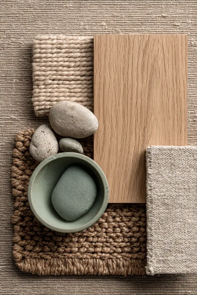
Light woods (oak, ash, maple) in natural finishes amplify whites and beiges. Leave wood unsealed or use matte water-based finishes that preserve grain visibility and color honesty.
Rattan and cane bring warm honey tones (#C8A882) that bridge beige walls and olive accents. Choose rattan pendant lights, headboards, or storage baskets. Their woven texture adds visual interest without color competition.
Linen textiles in undyed natural (#F5F2E8) or light sage embody Japandi’s casual sophistication. Linen’s texture and slight wrinkle-ability communicates “lived-in” rather than “staged”—the essence of wabi-sabi.
Ceramic and stoneware in celadon, cream, or terracotta bring handmade irregularity. Choose pieces with visible glaze variations or slight asymmetry. Perfection contradicts Japandi philosophy.
Stone elements like river rocks (gray, taupe, black) in wooden bowls, or slate coasters, anchor the palette physically and visually. Stone’s weight and coolness balance wood’s warmth.
Natural fiber rugs in jute (#C9B589), sisal, or wool in oatmeal tones define spaces while maintaining the earth-tone foundation. Avoid high-pile—Japandi favors low, textural rugs that complement rather than compete.
Lighting Considerations for Japandi Colors
Light transforms color. Your carefully chosen sage green reads completely differently at noon versus evening. Plan accordingly.
Natural light maximization is fundamental. Keep window treatments minimal—sheer white linen or light bamboo blinds. In rooms with limited natural light, choose the lightest palette versions: snow white walls, pale beige furniture, minimal darker accents.
Artificial lighting warmth matters immensely. Choose bulbs in 2700K-3000K (warm white) range. Cooler bulbs (4000K+) make beiges look gray and greens look sickly. Install dimmer switches to adjust intensity—Japandi spaces should glow, not glare.
Layered lighting strategy: Combine overhead ambient light (perhaps a paper lantern or frosted glass fixture), task lighting (brass or black metal reading lamps with warm bulbs), and accent lighting (LED strips behind floating shelves to wash sage walls in soft light).
Biophilic lighting pairings: Position lights to highlight natural materials—uplights behind a fiddle leaf fig cast beautiful shadows on cream walls, spotlight a celadon vase, or add picture lights to botanical prints. This integrates nature-inspired colors with actual living elements.
Philippine homes benefit from brightness during day, intimacy at night. White walls and light furniture reflect intense tropical sun effectively, while dimmers and warm bulbs create cozy evenings.
Japandi Color Checklist: Your Quick Reference
Use this checklist when planning or refreshing your Japandi space:
Foundation (60-70% of space):
- Walls in soft white (#FFFAFA), alabaster (#FAFAF0), or warm beige (#F5F5DC)
- Large furniture in oatmeal, greige, or light taupe
- Natural wood flooring or light tile
- Neutral window treatments (sheer white or light taupe)
Secondary Colors (20-30%):
- Sage green (#A8BFA3) or olive (#808000) accent wall or cabinetry
- Natural wood furniture in oak, ash, or light walnut
- Area rug in jute, sisal, or cream wool
- Textiles in beige, cream, and soft sage
Accents (5-10%):
- Terracotta (#E2725B) in planters or pillows
- Charcoal (#36454F) in hardware, frames, or table legs
- Moss green (#8A9A5B) in throws or small textiles
- Celadon (#ACE1AF) ceramics or pottery
Materials to Include:
- Light wood (oak, ash, bamboo)
- Linen or cotton textiles
- Ceramic or stoneware pottery
- Rattan or cane accents
- Natural fiber rug
- Living plants (monstera, snake plant, fiddle leaf fig)
Avoid:
- Bright, saturated colors (no electric blue, hot pink, or neon)
- High contrast (no black walls with white furniture)
- Overly matched sets (let woods and neutrals vary slightly)
- Heavy patterns (keep patterns minimal and geometric)
- Plastic or obviously synthetic materials
Creating Your Personal Japandi Palette
Every home has unique lighting, architecture, and energy. Use this framework to personalize:
Step 1: Assess your natural light. North-facing rooms? Go warmer with beiges and terracotta. South-facing with abundant sun? You can handle cooler greens and more white.
Step 2: Choose your hero color—the one accent that speaks to you. Is it sage green? Terracotta? Olive? This becomes your signature throughout the home in varying amounts.
Step 3: Sample everything. Buy small paint samples and poster boards. Paint large swatches and live with them for a week. View them morning, noon, and evening.
Step 4: Start with textiles. It’s easier to swap a sage pillow than repaint a wall. Test your color relationships through cushions, throws, and curtains first.
Step 5: Commit gradually. Paint one room, live with it, adjust. Japandi isn’t about instant transformation—it’s about thoughtful, intentional evolution.
For Philippine homes specifically: Prioritize humidity-resistant materials, maintain good airflow (colors look muddy in stuffy spaces), and embrace lighter tones that reflect rather than absorb tropical heat.
Conclusion: The Soul of Japandi Colors
We return, finally, to where we began—to the quiet power of a room that breathes. You’ve now held the complete Japandi color palette in your hands: the soft whites that catch first light, the sage greens that ground and calm, the warm woods that remind us what’s real, the terracotta that glows like sunset on skin.
These aren’t just colors. They’re a way of being present in your home. A sage wall behind your bed doesn’t simply look peaceful—it creates peace, morning after morning. Cream linen curtains don’t just filter light—they transform harsh brightness into honeyed afternoon warmth.
When you choose Japandi nature-inspired colors, you’re choosing to let the outside in. You’re saying yes to the moss that grows on stones, the clay beneath fields, the moment when beach sand meets driftwood. You’re building a home that doesn’t compete for attention but offers it—fully, generously, endlessly.
Start small if you need to. A single sage cushion. A terracotta pot with basil. A switch from stark white walls to the softest alabaster. Watch how one calm color invites another, how your space slowly exhales, how you begin to breathe differently within it.
This is Japandi. This is nature, invited home. This is you, finally resting.
Frequently Asked Questions
What is the Japandi color palette?
The Japandi color palette combines neutral foundations (soft whites, warm beiges, taupes) with earthy accents (browns, terracotta) and nature-inspired greens (sage, olive, moss). It typically features 60-70% neutrals, 20-30% natural wood tones and secondary earthy colors, and 5-10% muted green or dark accents. The palette draws from both Japanese wabi-sabi minimalism and Scandinavian hygge warmth, creating spaces that feel calm, organic, and effortlessly sophisticated.
What colors are best for small Japandi spaces in tropical climates?
For small spaces in humid, tropical areas like the Philippines, prioritize light, reflective tones: snow white (#FFFAFA), alabaster (#FAFAF0), and warm beige (#F5F5DC) on walls to maximize light and create airiness. Use humidity-resistant woods like bamboo or teak in natural finishes. Add sage green (#A8BFA3) and terracotta (#E2725B) sparingly through textiles and small accents. Keep charcoal minimal—just in thin hardware or frames. Choose low-VOC, breathable paints and ensure good ventilation to prevent colors from appearing dull or muddy.
How do I create a Japandi color scheme from scratch?
Start with a neutral base: choose one foundational white or beige for walls (#FFFAFA snow white or #F5F5DC warm beige). Select natural wood furniture in oak or ash with visible grain. Add one signature green—sage (#A8BFA3) or olive (#808000)—in an accent wall, cabinetry, or major textile like curtains or a sofa. Layer warm accents through terracotta pottery, camel-toned textiles, and charcoal in minimal hardware. Test colors with samples in your specific lighting before committing. Aim for 70% neutrals, 20% naturals and secondary tones, 10% deeper accents.
What are the best Japandi accent colors beyond green?
Beyond sage and olive greens, effective Japandi accent colors include terracotta (#E2725B) for warmth and earthiness—wonderful in planters, cushions, or kitchen tiles; warm browns like saddle brown (#8B4513) and caramel (#FFD59A) in wood furniture and leather; charcoal (#36454F) and soft black (#2C2C2C) for definition in hardware, frames, and table legs; and subtle powder blue (#B0E0E6) used minimally in spring/summer textiles. Keep all accents muted rather than saturated—Japandi avoids bright, competing colors in favor of nature’s softer palette.
How can I transition my existing space to Japandi colors without full renovation?
Begin with textiles: swap bright cushions for sage green, oatmeal, and terracotta versions in linen or cotton. Replace heavy curtains with sheer white or light taupe panels. Add a jute or cream wool rug. Paint one accent wall in soft sage while keeping others in existing neutral tones. Introduce natural wood elements through floating shelves, a coffee table, or picture frames. Switch to warm-white bulbs (2700K) to transform your existing colors. Display pottery in celadon, cream, and terracotta. Remove colorful clutter and artwork, replacing with minimal botanical prints or leaving walls bare. This approach costs less but delivers significant Japandi transformation.