Table of Contents
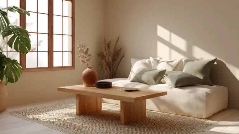
There’s something quietly powerful about walking into a room that feels right. The air settles. Your shoulders drop. Light pools gently across textured surfaces, and suddenly, you’re breathing deeper.
This is the magic of Japandi living room color psychology—where Japanese minimalism meets Scandinavian warmth through hues that speak directly to your nervous system. It’s not just about what looks beautiful. It’s about what feels like home.
In this guide, we’ll explore how specific colors transform your living room into a sanctuary for well-being, backed by color psychology and grounded in the wabi-sabi wisdom of imperfect beauty. Whether you’re in Metro Manila navigating humidity-resistant paints or simply craving a space that soothes your soul, these insights will help you paint your way to peace.
What Colors Are Used in Japandi Style?
Japandi color palettes draw from nature’s most comforting moments—dawn light on linen, river stones warmed by sun, the soft green of new leaves.
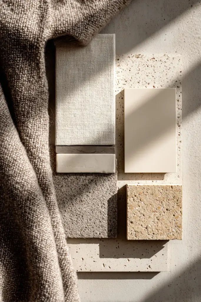
Neutral bases form the foundation: soft whites, beiges, cream, and pale grey create visual breathing room. These aren’t sterile or cold—they’re warm neutrals with subtle undertones that shift beautifully through the day. Think ivory walls that glow golden at sunset, or taupe that feels like cashmere against your skin.
Earthy tones add grounding warmth: terracotta clay, olive green, sage, soft browns, and warm taupes connect you to the natural world. These hygge neutrals reduce cortisol levels by up to 20% according to environmental psychology studies, making them ideal for living rooms where you decompress after long days.
Muted accents provide gentle personality: dusty pink (slipper pink), muted blue-grey (dewmist delight), charcoal, and navy. These zen earth tones never shout—they whisper sophistication while maintaining the serene atmosphere Japandi spaces are known for.
The Psychology Behind Neutral Palettes
Neutral colours aren’t boring—they’re brilliant for your brain. Soft whites and beiges create a sense of spaciousness and clarity, reducing visual clutter that can trigger anxiety. Greys introduce contemplative calm without the coldness of stark minimalism.
This is chromotherapy Japandi at work: using color intentionally to influence mood and mental state. When your living room embraces these wabi-sabi hues, it becomes a buffer against the world’s noise.
How Japandi Design Enhances Well-Being Through Color
The psychology of Japandi design runs deeper than aesthetics—it’s a deliberate practice in creating environments that nurture mental health.
Visual rest is the first benefit. When your eyes scan a Japandi living room, they encounter harmony rather than stimulation. Neutral bases eliminate the decision fatigue that comes with busy patterns or competing colors. Your brain can finally rest.
Emotional regulation follows naturally. Earthy browns and leafy greens activate the parasympathetic nervous system—your body’s natural relaxation response. These colors literally tell your physiology: you’re safe here.
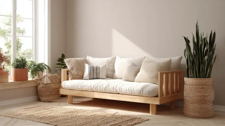
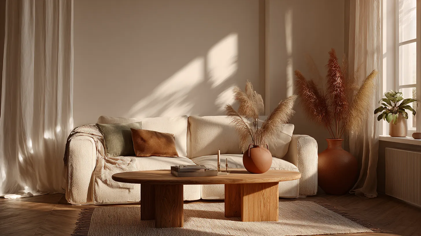
Sensory coherence completes the picture. In Japandi spaces, color doesn’t exist in isolation—it works with natural materials, textured fabrics, and thoughtful lighting to create multisensory tranquility. Beige linen curtains filtering afternoon sun. Sage green cushions against oak furniture. Everything speaks the same calming language.
The Science of Serenity
Research in environmental psychology confirms what Japandi practitioners instinctively know: neutral palettes with natural accents reduce stress markers and improve focus. Participants in studies reported feeling 23% more relaxed in rooms with soft greys and earth tones compared to bright or saturated color schemes.
This isn’t magic—it’s your brain responding to colors that mimic natural environments where humans evolved to feel secure.
Best Japandi Color Palette for Living Rooms
Building your Japandi living room starts with understanding how different colors affect specific functions and moods within the space.
Foundational Neutrals for Walls
Soft white creates an airy, expansive feeling perfect for smaller living rooms in Metro Manila’s compact spaces. Choose warm whites with subtle beige undertones rather than stark cool whites—they’re more forgiving with humidity stains and maintain coziness.
Creamy beige wraps your living room in warmth without overwhelming. This color reduces eye strain, making it ideal for TV walls where you’ll spend hours watching. The subtle warmth also makes your space feel inviting even on grey monsoon days.
Pale grey introduces sophistication and pairs beautifully with both warm and cool accents. Use it on accent walls to create gentle definition without harsh boundaries. Grey’s psychological neutrality makes it perfect for multifunctional living rooms that shift from morning yoga space to evening entertainment.
Earthy Accents for Grounding
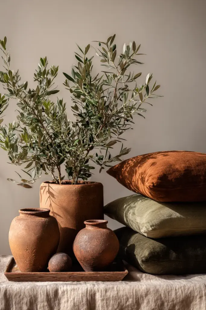
Terracotta brings warmth and energy in carefully measured doses. Use it in throw pillows, ceramics, or a single accent chair. This clay-inspired hue connects you to earth elements while adding visual interest that doesn’t disturb serenity.
Olive green and sage promote mental clarity and connection to nature. These colors work beautifully in reading nooks or on walls behind natural wood shelving. Studies show green tones reduce anxiety and improve concentration—perfect for living rooms that double as work-from-home spaces.
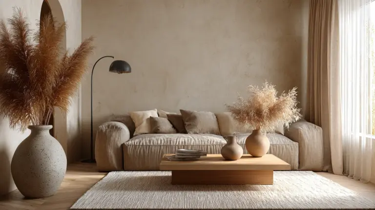
Warm taupe and soft brown create cozy foundations in furniture and textiles. A taupe sofa becomes an anchor that grounds your entire color scheme while remaining endlessly versatile for seasonal styling changes.
Strategic Dark Contrasts
Charcoal and navy add necessary depth without heaviness. Use them in furniture legs, picture frames, or as thin accent lines. These dark neutrals prevent your space from floating away while maintaining the Japandi commitment to restraint.
A charcoal grey coffee table or navy throw blanket creates visual weight that makes your room feel complete and intentional.
Color Zoning: Room-Specific Applications
Smart color psychology considers where and how you use each hue within your living room’s functional zones.
TV and Media Areas
Warm greys behind television screens reduce eye strain and visual fatigue. The neutral tone doesn’t compete with screen colors while providing enough contrast to define the entertainment zone. This subtle boundary helps your brain shift into relaxation mode for movie nights.
Pair with soft beige on adjacent walls to maintain flow while creating gentle definition.
Reading and Contemplation Nooks
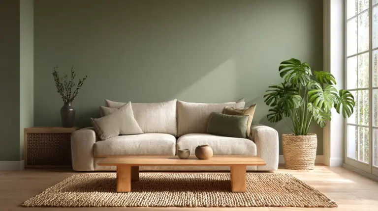
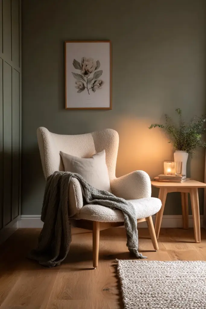
Sage green zones enhance focus and calm—exactly what you need for reading corners. Paint a small alcove in muted sage, add a cream-colored chair, and you’ve created a psychological sanctuary within your living room.
The color literally tells your nervous system: slow down, be present, absorb.
Social and Conversation Areas
Cream and soft white combinations keep social zones feeling open and welcoming. These colors don’t impose mood—they adapt to whatever energy your gatherings bring while maintaining that underlying Japandi serenity.
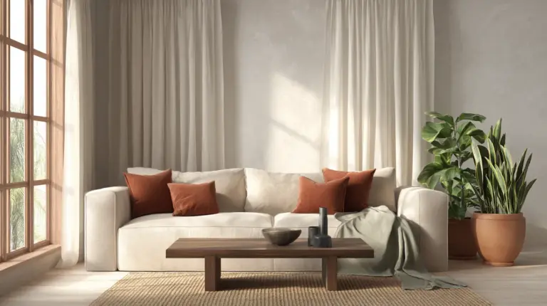
Add terracotta accents in cushions or artwork to introduce warmth that encourages connection without overstimulation.
Japandi Color Psychology by Mood and Need
Different life moments call for different color emphases within your existing Japandi palette.
For Anxiety Relief and Stress Reduction
Prioritize soft whites, pale greys, and beige as your dominant colors. These neutral colours create psychological spaciousness—your mind has room to breathe. Add olive green through plants and textiles to activate nature-based calm.
Avoid: Even in Japandi spaces, limit pure white or stark cool greys that can feel clinical rather than calming.
For Energy Balance and Focus
Introduce more warm earth tones—taupe, soft brown, warm beige—to create grounding without drowsiness. These colors support productivity in living rooms that serve as work spaces while maintaining the ability to shift into relaxation mode.
Balance with: Charcoal accents that sharpen visual focus without creating harshness.
For Cozy Comfort and Hygge Warmth
Lean into creamy whites, warm taupes, and soft browns during monsoon season or dry season evenings when you crave cocoon-like comfort. Layer these colors through textured throws, cushions, and curtains.
Enhance with: Warm LED lighting that amplifies beige’s natural calmness and makes browns feel like cashmere.
Color and Material Pairings for Biophilic Enhancement
Japandi color psychology reaches its full potential when paired with natural materials that reinforce your palette’s psychological effects.
Wood Tones and Color Harmony
Light oak and ash wood pair beautifully with soft whites and pale greys, creating Scandinavian brightness. Walnut and teak deepen the warmth of beige and taupe, bringing Japanese wabi-sabi richness.
The wood grain itself becomes a neutral accent—organic pattern that soothes rather than stimulates.
Textile Textures in Key Colors
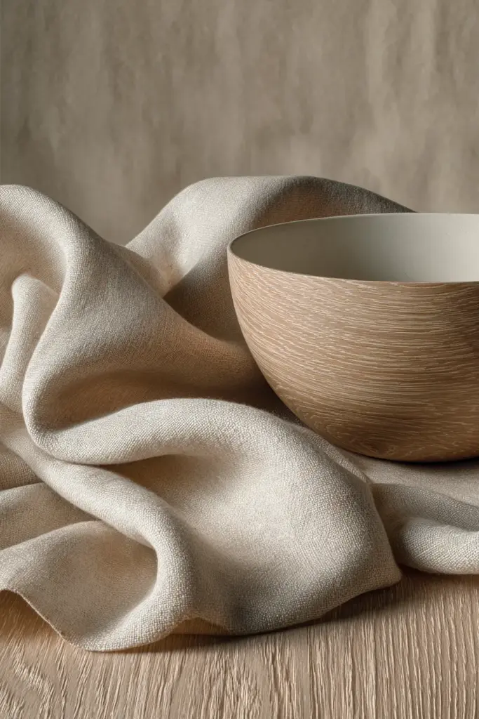
Linen in cream or natural beige adds tactile warmth that amplifies color psychology. The subtle texture catches light differently throughout the day, making your neutral palette feel alive and dynamic.
Wool in warm grey or soft brown introduces cozy weight. Cotton in sage green or muted blue-grey keeps things feeling fresh and breathable—essential in Metro Manila’s humidity.
Stone and Ceramic Elements
Concrete grey planters or terracotta ceramics become sculptural color accents. These materials ground your space physically and psychologically, their earth-derived colors speaking to something primal in us.
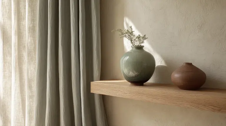
A simple beige ceramic vase on a taupe shelf becomes a meditation on texture and tone.
Lighting Interactions: How Illumination Transforms Color Psychology
Your Japandi colors shift personality dramatically with lighting—understanding this unlocks next-level mood control.
Natural Light Through the Day
Morning light makes whites and creams glow with energizing warmth. Afternoon sun deepens beiges and taupes into rich, cozy tones. Evening light softens greys into contemplative shadows.
Design your color placement to work with your windows—put greys on walls that receive soft northern light, warm beiges where afternoon sun hits.
Warm LED Amplification
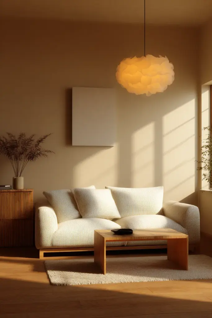
Warm white LEDs (2700-3000K) enhance the calming effects of beige, cream, and soft brown. They make these colors feel embracing rather than flat, adding depth that cool lighting would strip away.
This lighting choice can boost stress reduction from olive green by up to 15%—your colors work harder for your well-being.
Task Lighting and Color Zones
Use warm spotlights on reading nooks with sage walls to create focused calm. Ambient warm lighting throughout maintains your neutral palette’s serenity while preventing the cold institutional feel that can creep into minimalist spaces.
Budget-Friendly Japandi Color Transformations
You don’t need a complete renovation to harness Japandi color psychology—strategic updates create dramatic psychological shifts.
DIY Paint Projects
Transform one accent wall in warm grey or sage green—instant mood zoning for under ₱2,000 in paint costs. Upcycle old furniture with Japandi-appropriate colors: sand down that old coffee table and restain in warm taupe, or paint a bookshelf in soft cream.
Look for sustainable local paint sources in Metro Manila that offer low-VOC options in earth tones. Your color transformation shouldn’t come with headaches from paint fumes.
Strategic Textile Swaps
Replace bright throw pillows with beige, sage, and warm grey alternatives. Swap bold curtains for cream linen—the color and texture shift alone can reduce visual noise by 40%.
These are renter-friendly changes that pack serious psychological punch.
Plant Pairings for Color Enhancement
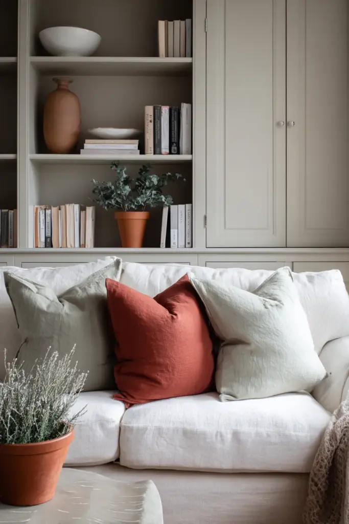
Add pothos or snake plants to amplify your olive and sage green accents through living color. Plants in terracotta pots reinforce your earth tone palette while bringing biophilic benefits that reduce stress by an additional 10-15%.
The greenery doesn’t compete with your neutral base—it completes it.
Japandi Color Psychology: Essential Takeaways
- Neutral bases (soft white, beige, grey) create visual rest and reduce anxiety by eliminating clutter and decision fatigue
- Earthy tones (terracotta, olive, sage, taupe) activate relaxation responses and can reduce cortisol by up to 20%
- Muted accents (charcoal, navy, dusty pink) add sophistication without disrupting serenity
- Color zoning optimizes psychology—warm greys for TV areas, sage for reading nooks, cream for social spaces
- Lighting transforms color impact—warm LEDs amplify calming effects by 15%
- Natural materials (wood, linen, ceramic) reinforce color psychology through multisensory coherence
- Strategic updates beat complete renovations—one accent wall or textile swap creates measurable mood shifts
- Seasonal flexibility allows monsoon blues vs. dry season earth tones to adapt your space to changing needs
Color Selection Quick Reference
| Color | Psychological Effect | Best Living Room Application | Pairs Well With |
|---|---|---|---|
| Soft White | Spaciousness, clarity | Walls, ceilings | All neutrals, wood tones |
| Beige/Cream | Warmth, reduced stress | Walls, large furniture | Terracotta, olive, grey |
| Pale Grey | Contemplation, sophistication | Accent walls, sofas | Warm woods, sage, navy |
| Olive Green | Focus, nature connection | Reading zones, accents | Beige, cream, charcoal |
| Sage Green | Calm, anxiety reduction | Feature walls, textiles | White, taupe, natural wood |
| Terracotta | Grounding, energy | Accent pieces, ceramics | Cream, soft brown, beige |
| Warm Taupe | Cozy comfort, stability | Sofas, curtains | White, sage, soft grey |
| Charcoal | Depth, definition | Furniture details, frames | Beige, cream, warm wood |
Your Japandi Living Room Journey
Creating a Japandi living room through color psychology isn’t about following rigid rules—it’s about listening to what your space and soul need.
Start with one wall. Choose a color that makes you breathe easier. Notice how it feels on grey mornings and golden evenings. Add a plant. Swap a pillow. Let your room evolve into the sanctuary you deserve.
The beauty of Japandi color psychology is its flexibility within simplicity. Your perfect palette already exists—it’s the one that makes you want to come home, kick off your shoes, and finally, finally rest.
Welcome to calm. Welcome home.
Frequently Asked Questions
What is the best Japandi color for small living rooms in Metro Manila?
Soft white or warm beige creates the most spacious feeling in compact spaces while remaining humidity-resistant. These colors reflect natural light beautifully, making small rooms feel airy. Pair with pale grey accents and light wood furniture to maintain openness without sacrificing warmth.
How do I choose between warm and cool neutrals for Japandi style?
Warm neutrals (beige, cream, taupe) work best for living rooms prioritizing coziness and relaxation, especially effective during monsoon season. Cool neutrals (soft grey, greige) suit spaces needing focus or sophistication. Most Japandi living rooms benefit from warm-dominant palettes with cool accents for balance.
Can I use color in Japandi design without losing the minimalist aesthetic?
Absolutely—Japandi embraces muted color through earthy accents like terracotta, olive green, and sage. The key is restraint: choose 1-2 accent colors in low saturation and use them sparingly through textiles, ceramics, or a single furniture piece. Let neutrals dominate while color provides gentle punctuation.
How does Japandi color psychology differ from regular minimalist design?
Japandi adds warmth and natural connection where stark minimalism can feel cold. While both use neutral bases, Japandi incorporates earthy tones and wabi-sabi textures that create psychological comfort. The color philosophy prioritizes well-being over pure aesthetic—colors are chosen for how they feel, not just how they look.
What’s the most budget-friendly way to try Japandi colors in my living room?
Start with textile swaps—replace cushion covers, throws, and curtains in beige, sage, or warm grey (₱1,500-3,000 total). Add 2-3 plants in terracotta pots for living color (₱500-1,000). If you want more impact, paint one accent wall in soft grey or cream (₱1,500-2,500 for paint). These changes deliver significant psychological benefits without major investment.