Table of Contents
There’s a quietness that settles into a room when color and texture speak the same language. Not silence—something warmer. The kind of calm that comes from earth meeting light, from linen folded beside raw wood, from walls that breathe in shades of clay and sand.
This is the heart of Japandi design. It’s where Japanese minimalism and Scandinavian coziness find common ground—not just in philosophy, but in palette and touch. Natural textures Japandi colors aren’t decorative afterthoughts. They’re the foundation of a home that feels both grounded and airy, intentional yet effortless.
Imagine running your hand along a weathered oak table, its grain visible beneath a matte finish. Picture terracotta pottery catching afternoon light, or a sage linen throw draped over charcoal cotton. These aren’t just design choices—they’re sensory invitations to slow down, to notice, to feel.
Today, we’re exploring how to weave natural textures with Japandi’s signature earth tones. From selecting your palette to layering materials room by room, we’ll guide you through creating spaces that honor beauty in restraint.
Understanding the Japandi Color Palette
The Foundation: Muted Neutrals and Earth Tones
The Japandi color palette draws from landscapes untouched by artificial light. Think morning fog over rice fields. Driftwood bleached by sun and salt. Clay pots drying in the shade.
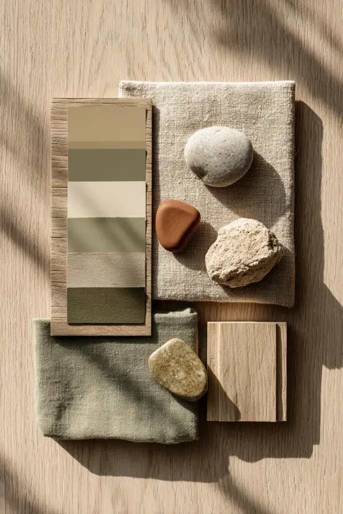
Core neutral tones include warm beige (#D8BE85), soft grey (#E8E8E8), and off-white (#F5F5F4). These aren’t stark whites or cold greys—they carry warmth, like natural fibers warmed by body heat. Taupe and sand create the visual equivalent of a whisper, allowing textures to become the conversation.
Earthy browns anchor the palette. Walnut wood tones, warm ochre (#CC7722), and rustic umber bring depth without weight. These colors work like shadows in nature—defining space while maintaining softness.
Accent Colors: Where Warmth Meets Restraint
Japandi embraces color through earth’s quiet moments. Sage green (#B2AC88) recalls moss on stone, while olive green nods to weathered leaves. Terracotta (#E2725B) adds warmth reminiscent of sunset-lit clay, perfect for humid climates where you crave visual comfort.
Charcoal and matte black provide grounding accents. Use them sparingly—in iron fixtures, picture frames, or ceramic vessels. They create contrast without disruption, like calligraphy on parchment.
Coral and rust appear as whispers, not shouts. A single cushion in dusty coral. A ceramic bowl in burnt sienna. These touches honor wabi-sabi—the beauty of imperfection and impermanence.
Natural Textures That Define Japandi Aesthetics
Wood: The Soul of Japandi Design
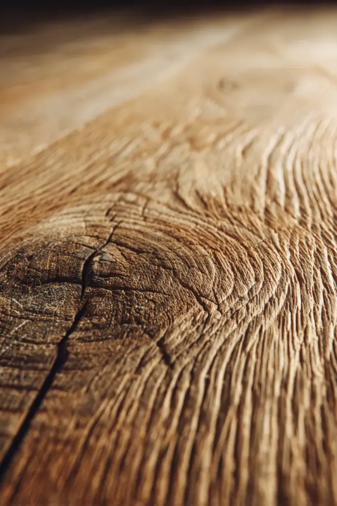
Wood isn’t just a material in Japandi spaces—it’s a meditation on time and growth. Exposed grain tells stories. Knots and irregularities become features, not flaws.
Light woods like oak, ash, and birch maintain the Scandinavian brightness Japandi requires. Their honey tones catch light beautifully, warming rooms without overwhelming them. Consider a Japanese platform bed in natural oak, or floating shelves in unstained ash.
Darker woods—walnut, teak, aged pine—add Japanese depth. Use them strategically: a walnut dining table, teak accent chairs, or reclaimed wood wall paneling. The contrast between light and dark woods creates visual rhythm, like alternating verses in poetry.
Sand wood surfaces to reveal natural grain rather than hiding it beneath heavy stains. Oil finishes preserve texture while protecting against wear. In Silang’s humid climate, sealed wood prevents warping while maintaining that essential tactile quality.
Organic Fabrics: Linen, Cotton, and Beyond
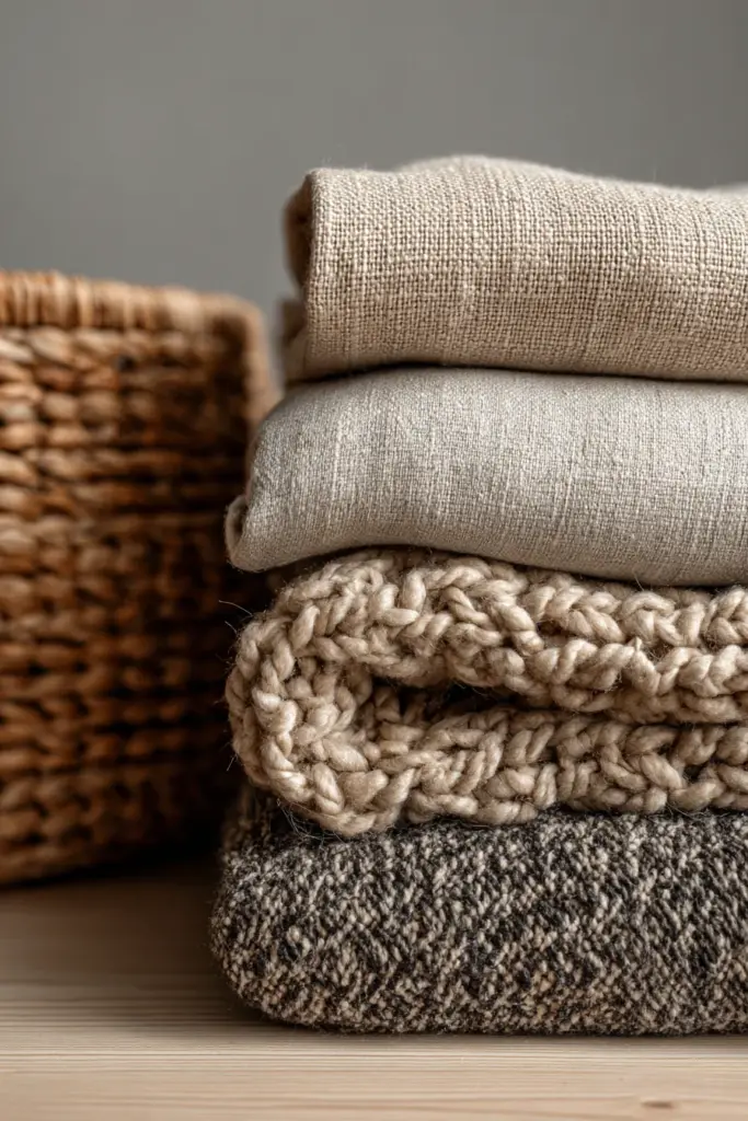
Japandi textiles whisper rather than announce. Linen leads this textile symphony—breathable, textured, slightly wrinkled in that perfectly imperfect way. Choose linen curtains in natural beige to filter light softly. Layer linen throws in sage or clay over cotton sofas.
Cotton in its most natural state—undyed, loosely woven—brings Scandinavian hygge to Japanese restraint. Look for stone-washed cotton bedding in warm grey, or cushion covers in organic cotton with visible weave patterns.
Philippine abaca offers a local, sustainable alternative with gorgeous texture. Its natural blonde color and rope-like quality make it ideal for baskets, wall hangings, or woven storage solutions. Pair abaca with rattan for authentic tropical Japandi fusion.
Wool adds winter warmth without visual heaviness. Choose chunky-knit throws in oatmeal or charcoal. Their three-dimensional texture creates depth while maintaining the muted palette.
Stone, Clay, and Earth Elements
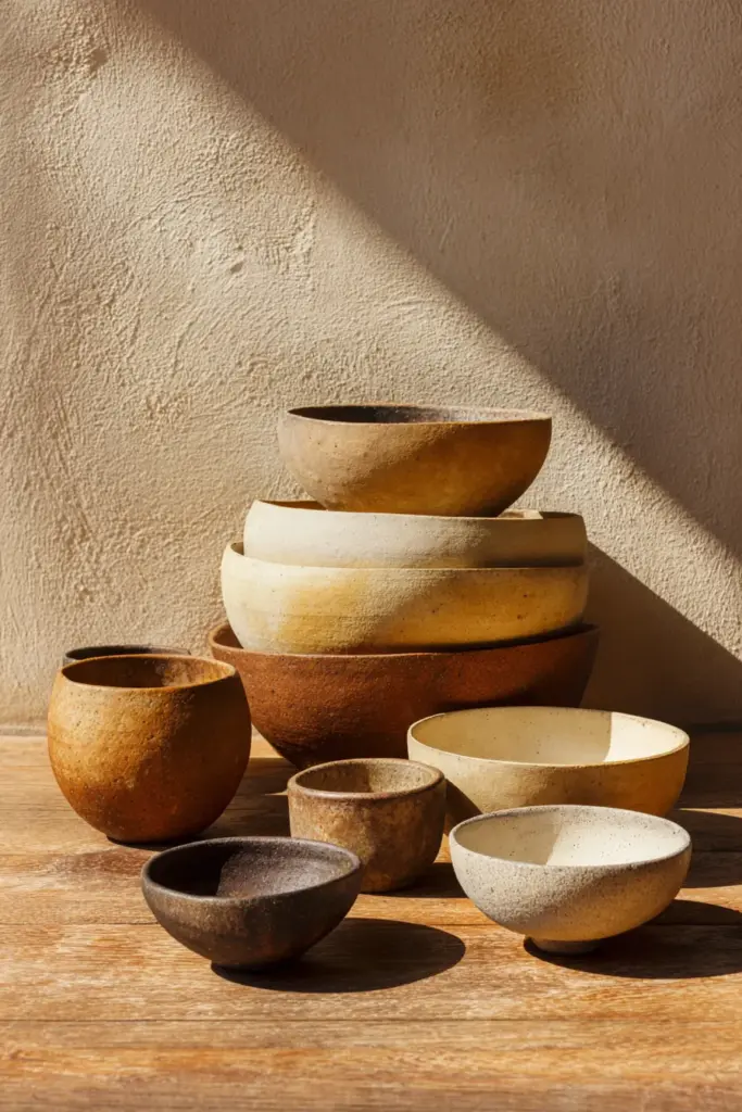
Ceramics bring earth’s memory into your home. Handmade pottery in terracotta, unglazed stoneware, or matte clay finishes embodies wabi-sabi perfectly. Each piece carries maker’s marks—fingerprints, slight asymmetry, color variation.
Stone surfaces ground Japandi interiors literally and figuratively. Consider limestone countertops, slate tile in bathrooms, or river rock accents in planters. Their cool touch and matte finish contrast beautifully with warm wood tones.
Concrete embraces industrial minimalism with Japanese restraint. Polished concrete floors in charcoal grey, concrete planters, or raw concrete accent walls create textural interest. Seal them properly in humid conditions to prevent moisture damage.
Color and Texture Layering Techniques
Creating Depth Through Tonal Variation
Japandi doesn’t rely on bold color contrast—it builds interest through subtle tonal shifts. Layer three to five shades within the same color family for sophisticated depth.
Start with your base: warm beige walls. Add medium tones through furniture—a taupe linen sofa, ochre cushions. Introduce darker accents via walnut side tables or charcoal ceramic vases. This creates visual movement without chaos.
Texture becomes your differentiator when colors are similar. A beige wool rug beneath a beige linen sofa works because their textures speak different languages. One is plush and dimensional; the other is flat and slightly crisp. Your eye reads this as intentional layering, not monotony.
Light plays differently across textures. Matte clay absorbs light; polished wood reflects it. Raw linen diffuses it; smooth stone bounces it back. Use this interplay to create ambient variation throughout the day.
The 70-20-10 Japandi Rule
Professional designers use this formula for balanced interiors:
- 70% neutral base colors (beige, off-white, soft grey) across walls, large furniture, flooring
- 20% secondary earth tones (sage green, warm browns, taupe) in medium furniture, textiles, area rugs
- 10% accent colors (terracotta, charcoal, rust) in decorative objects, artwork, small textiles
This prevents overwhelming your senses while allowing personality to emerge. In practice: cream walls, a natural oak dining set, beige linen curtains (70%), sage green dining chairs and an ochre throw (20%), terracotta pottery and black iron candleholders (10%).
Adjust ratios based on natural light. Rooms with abundant sunlight can handle more muted neutrals. Darker spaces benefit from slightly increasing warm accent percentages to prevent coldness.
Balancing Smooth and Rough Textures
Visual interest in Japandi comes from textural dialogue. Pair smooth with rough, soft with hard, matte with subtle sheen.
Place a chunky knit throw (rough, soft) over a leather chair (smooth, firm). Position a glazed ceramic bowl (smooth, reflective) on reclaimed wood (rough, matte). Hang linen curtains (soft, textured) beside concrete walls (hard, smooth).
This principle extends to flooring and walls. Wide-plank oak floors (smooth but grainy) pair beautifully with textured plaster walls. Polished concrete floors balance rough-hewn wooden beams overhead.
Don’t forget vertical texture. Wood slat walls, woven wall hangings in natural fibers, or three-dimensional ceramic tiles add tactile interest without cluttering horizontal surfaces.
Room-by-Room Texture and Color Application
Living Room: The Art of Texture Layering
Your living room sets the tonal foundation for your entire home. Start with neutral walls in warm off-white or soft beige—these become your canvas for textural expression.
Anchor the space with a natural fiber rug. Jute or sisal in their raw states provide visual texture while maintaining color restraint. Layer a smaller, softer rug on top—perhaps in sage green wool or ochre cotton—to create a designated seating area.
Furniture selection follows the 70-20-10 rule naturally. A large beige linen sectional (70%) grounds the room. Add sage green accent chairs (20%) for color variation. Introduce terracotta cushions and a charcoal throw (10%) for warmth and depth.
Smart lighting enhances matte finishes beautifully. Use warm LED bulbs (2700-3000K) in paper pendant lamps or wooden floor lamps. Avoid harsh overhead lighting—instead, create pools of light at different heights to emphasize textures.
Plant walls or large potted plants in ceramic planters add living texture. Monstera, snake plants, or fiddle leaf figs introduce organic shapes and subtle green tones that complement sage and olive accents.
Bedroom: Sanctuary in Neutral Tones
Bedrooms demand the softest iteration of Japandi colors. Think morning light through linen: warm, diffused, gentle.
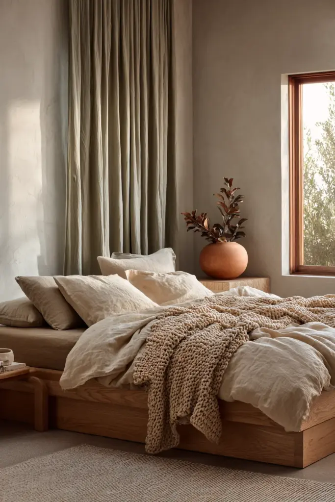
Choose bedding in natural linen or organic cotton—off-white, warm beige, or soft grey. Layer textures: a lightweight linen duvet, a chunky knit throw at the foot, velvet or cotton cushions against the headboard. Each layer should be touchable, inviting, soothing.
The bed frame itself becomes a texture statement. A Japanese-inspired platform bed in light oak provides clean lines and visible grain. Alternatively, an upholstered headboard in natural linen adds soft texture against potentially stark walls.
Keep accent colors minimal. A single terracotta vase on the nightstand. Charcoal-framed art above the bed. Sage green curtains filtering morning light. Your bedroom palette should whisper you awake, not shout.
Flooring matters here more than anywhere. If possible, install light oak or bamboo flooring—warm underfoot, visually calming. Add a plush wool rug in oatmeal or taupe beside the bed for that first morning step.
Kitchen and Dining: Where Function Meets Beauty
Kitchens challenge Japandi principles with practical demands, but natural materials answer elegantly.
Consider wood or bamboo countertops sealed for water resistance. Their warm tones and visible grain soften the functionality of kitchen spaces. Alternatively, light stone or concrete countertops in warm grey provide durability with textural interest.
Cabinet colors follow the neutral palette: warm beige, soft sage green, or natural wood finishes. Avoid high-gloss—choose matte or satin finishes that don’t reflect harshly under task lighting. Open shelving in natural wood displays handmade ceramics and creates breathing room.
Dining areas embrace terracotta and earthy browns more freely than other spaces. These colors stimulate appetite while maintaining calm. Use them in dining chairs, table linens, or a statement ceramic centerpiece.
Texture layering here is practical: smooth stone counters, rough wooden cutting boards displayed as art, linen tea towels in sage or ochre, matte ceramic dishware in earth tones. Each item is both beautiful and functional—the essence of Japandi philosophy.
Bathroom: Spa-Like Texture Contrasts
Transform your bathroom into a private onsen through strategic texture and color choices.
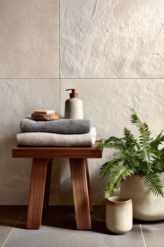
Stone and wood dominate here, balanced carefully. A teak bath mat or stool brings warmth against cool slate tiles. Limestone or travertine walls in soft beige create a neutral backdrop for darker accents.
Textiles matter despite humidity concerns. Quick-dry cotton towels in warm grey or beige maintain the palette. A cotton bath mat in charcoal provides contrast. Linen shower curtains (treated for moisture) in off-white filter light beautifully.
Ceramic vessels for soap, cotton swabs, or bath salts add handmade touches. Choose unglazed terracotta or matte stoneware in earth tones. These small elements accumulate into a cohesive sensory experience.
Plants thrive in bathroom humidity—ferns, pothos, or peace lilies in ceramic planters introduce living green tones naturally. Place them on wooden shelves or stone ledges for maximum textural contrast.
Budget-Friendly Japandi Implementation
DIY Upcycling for Natural Textures
You don’t need expensive furniture to achieve Japandi aesthetics. Transformation lives in technique, not price tags.
Sand old wooden furniture to reveal natural grain. Strip away dark stains or paint, then finish with natural oil or beeswax. That dated dresser becomes a Japandi statement piece with weekend effort.
Dye existing textiles in earth tones using natural methods. Strong tea creates beautiful warm beiges. Avocado pits yield soft pinks. Turmeric produces golden ochre. This sustainable approach aligns perfectly with Japandi’s mindful consumption values.
Paint walls yourself in high-quality neutral tones. Two coats of warm off-white transform a space dramatically. Add texture through inexpensive methods: limewash techniques, subtle sponging, or DIY venetian plaster effects.
Sourcing Local Materials in the Philippines
Silang and surrounding Calabarzon areas offer abundant sustainable resources for Japandi design.
Local craftspeople create beautiful rattan furniture at accessible prices. Visit weekend markets for handwoven abaca baskets, bamboo organizers, or coconut wood bowls. These authentic pieces carry more soul than imported items.
Philippine ceramics—particularly from Rizal province—offer gorgeous earth-toned pottery. Support local artisans while acquiring unique wabi-sabi pieces with inherent imperfections that make them perfect.
Reclaimed wood from renovation projects or furniture shops provides affordable material for DIY shelving, headboards, or accent walls. Its weathered texture requires no additional treatment—time has already created beauty.
Multifunctional Furniture Hacks
Japandi minimalism demands pieces that earn their space through multiple functions.
A low wooden bench serves as coffee table, extra seating, and storage (with added baskets underneath). Platform beds with built-in drawers eliminate need for separate dressers. Floating shelves in natural wood display items while keeping floors clear.
Ottoman cubes in natural linen provide seating, footrests, and hidden storage. Nesting tables in light oak offer flexibility—use all three when entertaining, tuck away when not needed.
Murphy beds or sofa beds in neutral fabrics maximize small spaces without compromising aesthetics. Choose clean-lined designs in beige linen or taupe cotton that blend seamlessly when closed.
Color Psychology and Mood in Japandi Spaces
How Earth Tones Affect Wellbeing
Japandi’s color choices aren’t arbitrary—they’re psychologically grounding.
Beige and warm greys reduce cortisol levels, creating physiological calm. These colors don’t demand attention, allowing your nervous system to settle. In humid climates like the Philippines, they also create visual coolness without cold sterility.
Terracotta and ochre stimulate gentle warmth and creativity without overstimulation. They’re particularly effective in dining areas (encouraging appetite and conversation) or creative workspaces (fostering flow states).
Sage and olive greens connect us to nature even indoors. Studies show green tones reduce eye strain and improve focus—ideal for home offices or reading nooks. They also pair beautifully with natural light, changing character throughout the day.
Charcoal and black, used minimally, provide visual anchors. They create depth and prevent spaces from feeling washed out. Psychologically, they represent grounding and stability—earth itself.
Seasonal Adjustments for Philippines Climate
Tropical humidity demands adaptive color strategies within Japandi frameworks.
During the rainy season, increase warm accent percentages slightly. Add rust-colored throws, terracotta pottery, or ochre cushions. These compensate for reduced natural light and create psychological warmth.
In hot dry months, lean toward cooler neutrals. Emphasize soft greys, off-whites, and sage greens. Remove heavier wool textiles in favor of lightweight linen. The palette remains Japandi but breathes easier.
Year-round, avoid colors that show humidity damage easily. Skip crisp whites that yellow; choose off-whites instead. Select matte finishes over high-gloss that shows every water spot.
Consider paint with mildew-resistant properties in earth tones. Modern formulations come in beautiful beiges and warm greys that maintain Japandi aesthetics while addressing practical concerns.
Essential Checklist for Natural Textures Japandi Colors
Color Selection Fundamentals
- Start with 3-4 neutral base colors: warm beige, soft grey, off-white, taupe
- Add 2-3 secondary earth tones: sage green, warm brown, ochre
- Choose 1-2 accent colors: terracotta, charcoal, rust, coral
- Test paint samples in different lighting throughout the day
- Ensure 70-20-10 ratio: neutrals-secondary-accents
- Select matte or satin finishes over high-gloss
- Consider climate when choosing paint formulations
Texture Layering Essentials
- Mix 3-5 different textures per room minimum
- Balance smooth (glass, polished wood) with rough (jute, raw linen)
- Layer soft (cotton, wool) with hard (stone, concrete)
- Include natural wood with visible grain
- Add handmade ceramics in earth tones
- Incorporate living plants for organic texture
- Use natural fiber rugs (jute, sisal, wool)
Material Priorities
- Wood: Light oak, ash, or walnut in natural finishes
- Fabrics: Linen, organic cotton, abaca, wool
- Ceramics: Unglazed terracotta, matte stoneware, handmade pottery
- Stone: Limestone, slate, river rock, or concrete
- Metal: Matte black or dark bronze iron (minimal use)
- Baskets: Rattan, bamboo, woven abaca
- Avoid: Plastic, synthetic fabrics, chrome, high-gloss anything
Room-Specific Quick Reference
| Room | Primary Colors | Key Textures | Essential Elements |
|---|---|---|---|
| Living Room | Beige, sage, terracotta | Linen, jute, wood | Layered rugs, textured throws, ceramic vases |
| Bedroom | Off-white, warm grey, sage | Linen, cotton, wool | Natural wood bed, layered bedding, soft lighting |
| Kitchen | Beige, ochre, warm brown | Wood, stone, linen | Natural counters, open shelving, matte ceramics |
| Bathroom | Soft grey, beige, charcoal | Stone, teak, cotton | Wood accents, unglazed pottery, plants |
| Office | Warm grey, sage, beige | Wood, linen, paper | Natural desk, woven storage, indirect lighting |
Conclusion: Creating Your Japandi Sanctuary
Designing with natural textures and Japandi colors isn’t about following rigid rules. It’s about creating space that holds you gently—that doesn’t demand anything but offers everything.
Start small if you need to. Paint one wall in warm beige. Add a linen throw to your sofa. Place a handmade ceramic bowl where morning light catches it. Notice how these small changes shift the energy in your home. How you breathe differently in rooms that honor restraint and beauty equally.
The magic of Japandi isn’t in perfection—it’s in the perfectly imperfect. The linen that wrinkles beautifully. The wood grain that tells its tree’s story. The handmade bowl slightly asymmetrical from the potter’s touch. These aren’t flaws. They’re invitations to slow down and really see.
Your home should feel like exhaling. Like the moment you slip into clean linen sheets. Like afternoon light filtering through natural fabric. This is what natural textures and earth-toned colors offer—not just beauty, but belonging.
We’d love to see how you bring these ideas into your own space. What textures speak to you? Which earth tones feel like home?
Frequently Asked Questions
What colors are in the Japandi color palette?
The Japandi color palette centers on muted earth tones and warm neutrals: soft beige (#D8BE85), off-white (#F5F5F4), warm grey, taupe, and charcoal. Secondary colors include sage green (#B2AC88), olive green, walnut brown, and ochre (#CC7722). Accent colors are terracotta (#E2725B), rust, coral, and matte black—used sparingly for depth. Avoid bright, saturated colors; instead choose desaturated, matte versions of earth tones. Think sand, clay, moss, stone—colors that exist naturally in landscapes. The overall effect should be calming, warm, and understated, allowing natural textures to take center stage while colors provide subtle depth and variation.
How do you layer textures in Japandi style without creating clutter?
Successful texture layering follows the principle of intentional restraint. Select 3-5 distinct textures per room: pair smooth surfaces (polished wood, glazed ceramic) with rough ones (raw linen, jute rugs). Layer soft textiles (cotton throws, wool cushions) against hard furniture (wooden tables, stone counters). The key is keeping colors within the same family—when a beige linen sofa meets a beige wool rug, texture creates interest without visual chaos. Use negative space generously. Each textured element should have breathing room to be appreciated individually. Choose quality over quantity: one beautiful handmade ceramic bowl makes more impact than five mediocre ones.
What natural materials work best for Japandi interiors in humid climates?
For tropical humidity like the Philippines, prioritize moisture-resistant natural materials. Teak, bamboo, and sealed oak handle humidity well while maintaining Japandi aesthetics. Philippine abaca and tightly-woven rattan provide local, sustainable texture options. For fabrics, choose quick-dry linen and organic cotton over heavy wool in most spaces. Stone (limestone, slate) and properly sealed concrete work beautifully in bathrooms and kitchens. Avoid unsealed wood which warps, and skip materials prone to mildew like heavy velvets. Ceramics in terracotta or stoneware are naturally humidity-friendly. Use dehumidifiers in enclosed spaces and ensure proper ventilation. Choose matte paints with mildew-resistant properties in earth tones—modern formulations maintain Japandi colors while addressing climate challenges.
Can I mix Japandi colors with existing furniture in different styles?
Absolutely—Japandi’s neutral palette is remarkably forgiving and adaptable. Start by identifying which existing pieces fit the earth-tone spectrum: brown leather, natural wood, beige upholstery, or grey metal. These work immediately. For items in colors outside the palette, consider simple updates: dye or reupholster bright cushions in sage or terracotta, sand and oil stained furniture to reveal natural wood, or use neutral linen slipcovers over patterned pieces. Modern, mid-century, or rustic furniture often transitions easily into Japandi spaces—clean lines and natural materials matter more than specific style labels. The unifying factor is your color palette and texture choices in surrounding elements: walls, textiles, and decorative objects should follow Japandi principles even if some furniture pieces don’t.
What’s the difference between Japandi and other neutral design styles like Organic Modern?
While both embrace neutrals and natural materials, Japandi has distinct characteristics. Japandi specifically blends Japanese minimalism with Scandinavian coziness—it emphasizes wabi-sabi (embracing imperfection), lower furniture profiles, and strict color restraint within muted earth tones. Organic Modern tends toward brighter whites, allows bolder accent colors, and incorporates more curved sculptural forms. Japandi favors straight lines, functional simplicity, and handmade imperfection. Its color palette is warmer and more earth-focused than typical Scandinavian design alone, but more restrained than some Organic Modern interpretations. Japandi also emphasizes negative space and intentional emptiness as design elements—fewer, better-chosen pieces rather than curated abundance. The textures in Japandi lean toward matte, natural, and subtly worn rather than polished or overly refined.