Table of Contents
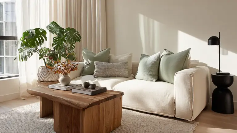
There’s a quiet magic in watching warm afternoon light touch cool stone surfaces. The way a room breathes when earthy terracotta meets soft sage. This is the heart of Japandi design—a gentle conversation between temperature and tone.
Japandi style doesn’t ask you to choose between warmth and coolness. Instead, it invites both to dance together in your space. The result? Rooms that feel grounded yet airy, cozy yet uncluttered.
Understanding how to balance these tones transforms a room from merely decorated to truly lived-in. Let’s explore how warm and cool palettes work together to create the serene, minimalist beauty Japandi is known for.
What Is Japandi and Why Does Tone Temperature Matter?
Japandi merges Japanese wabi-sabi with Scandinavian hygge—two philosophies that celebrate imperfection and comfort. This fusion creates interiors that honor both simplicity and soul.
Tone temperature shapes how a space feels, not just how it looks. Warm tones (beiges, terracottas, honey woods) wrap us in comfort and energy. Cool tones (soft grays, muted blues, sage greens) offer calm and mental clarity.
The Japandi philosophy asks for balance. Neither extreme warmth nor stark coolness, but a middle path where both coexist peacefully.
Understanding Warm Tones in Japandi Design
The Soul of Warm Japandi Colors
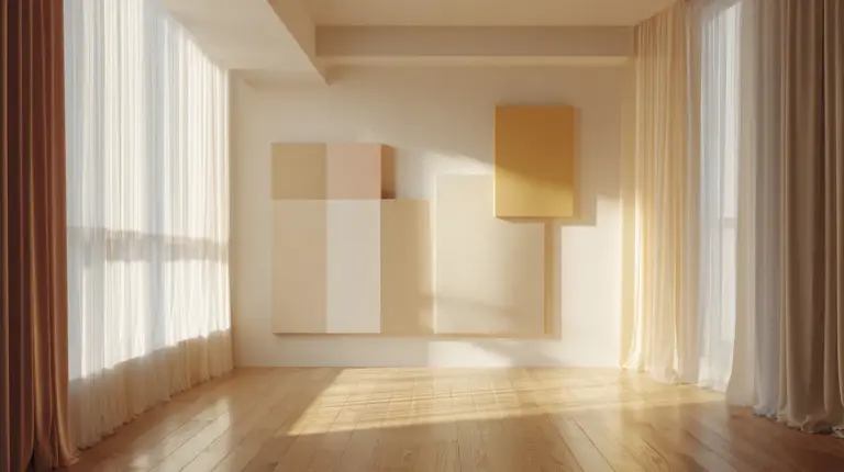
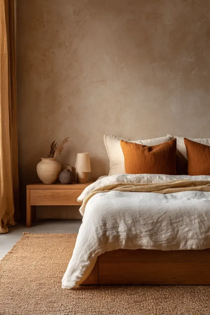
Warm tones in Japandi feel like sunlight filtering through linen curtains. Think cream (#F5F5DC), warm beige (#D2B48C), and terracotta (#E07A5F). These colors ground your space with organic richness.
Natural wood tones—oak, teak, light walnut—add textural warmth without demanding attention. They whisper rather than shout. Pair these with warm whites and oatmeal hues for a foundation that feels inherently welcoming.
Warm tones shine in spaces where you gather, rest, and recharge. They boost emotional comfort and make large rooms feel intimate.
Where to Use Warm Accents
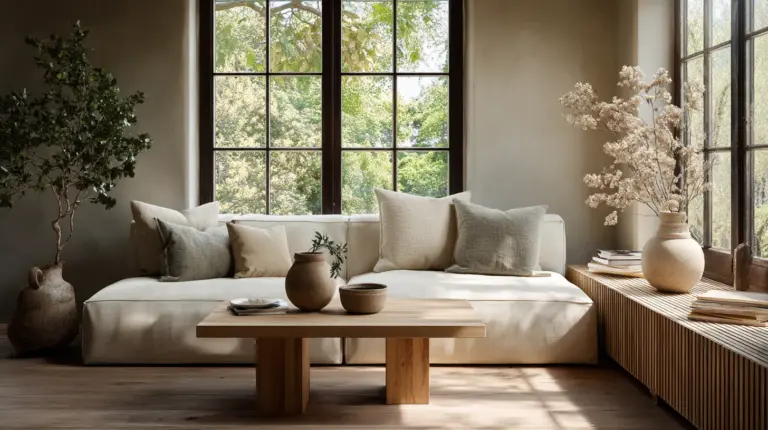
Layer warm tones through textiles and natural materials. A taupe linen sofa, terracotta throw pillows, or a honey-toned wooden coffee table all contribute warmth without overwhelming.
Consider warm tones for south-facing rooms that receive abundant natural light throughout the day. The sunlight enhances these earthy hues beautifully. In Philippines homes where humidity is constant, warm tones create cozy contrast against bright tropical light.
Use 2700K lighting (soft warm) in living rooms and bedrooms to amplify these earthy colors during evening hours.
Exploring Cool Tones in Japandi Spaces
The Breath of Cool Japandi Colors
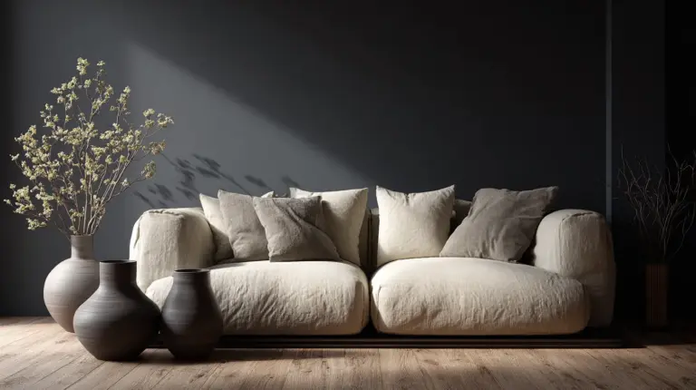
Cool tones bring the exhale to Japandi’s inhale. Soft gray (#A9A9A9), muted sage (#A8CABA), charcoal (#36454F), and dusty blue (#B0C4DE) create visual breathing room.
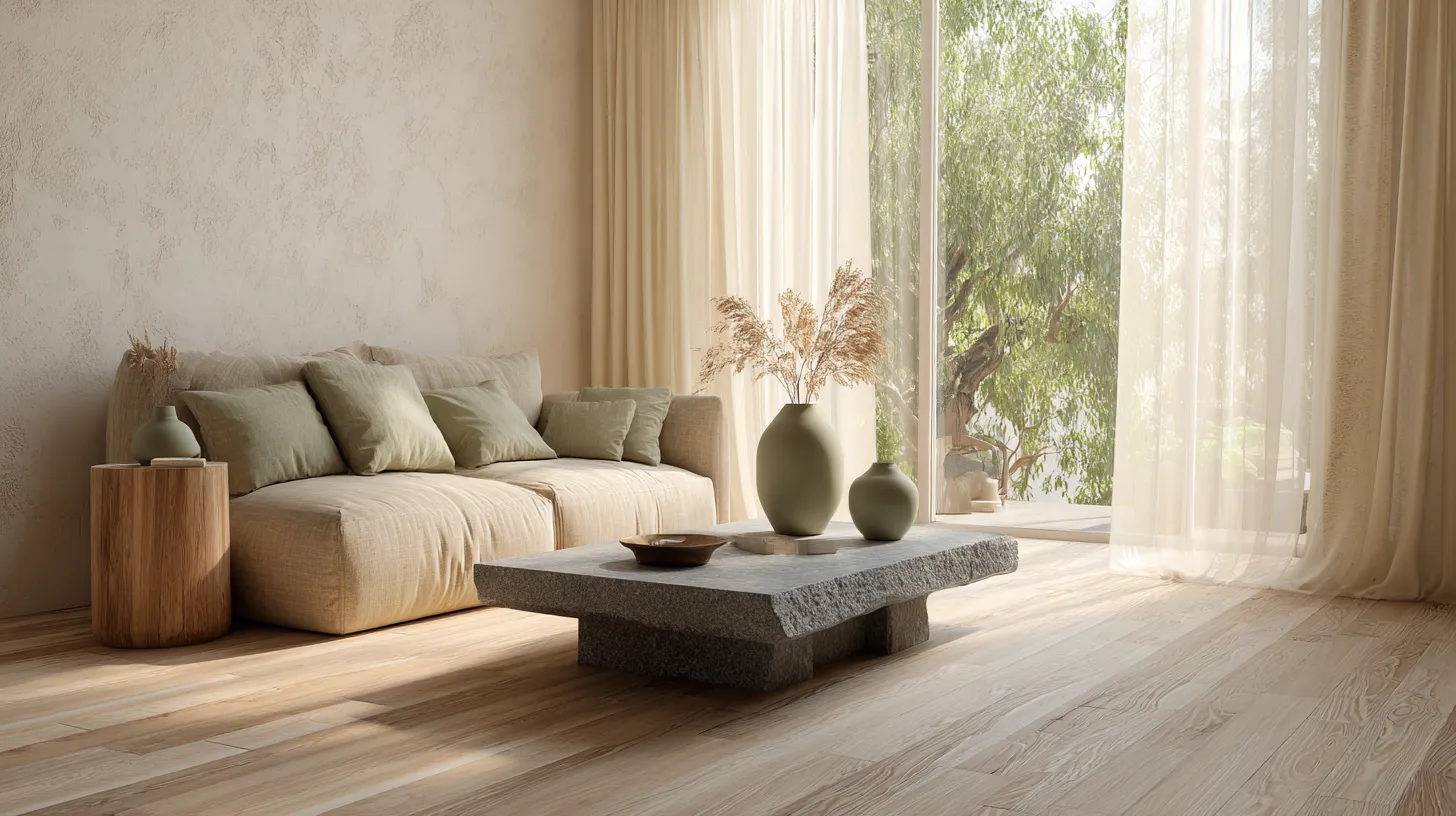
These colors recede rather than advance, making small spaces feel larger and busy minds feel quieter. Cool tones evoke natural elements—stone, water, misty mornings, shadowed forests.
In Japandi design, cool doesn’t mean cold. These are subdued, gentle versions—grays with taupe undertones, blues kissed with green, greens that lean toward beige.
Strategic Placement of Cool Colors
Cool tones excel in work areas, bathrooms, and north-facing rooms that naturally receive less warm light. They enhance focus and create a sense of spaciousness.
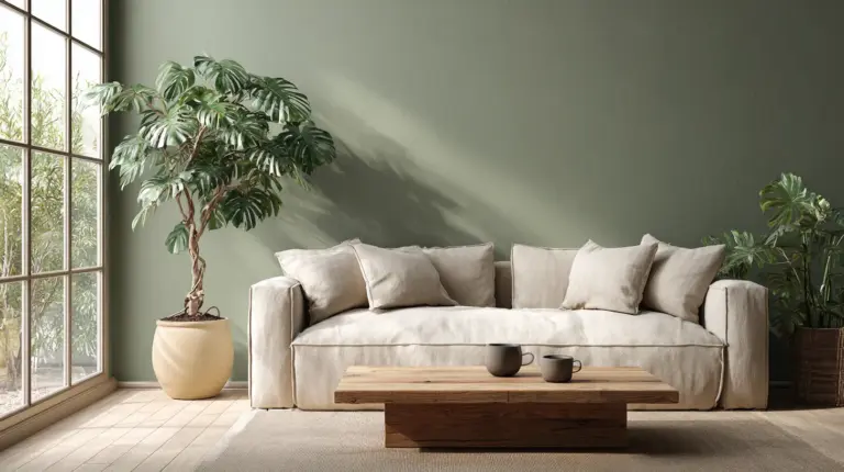
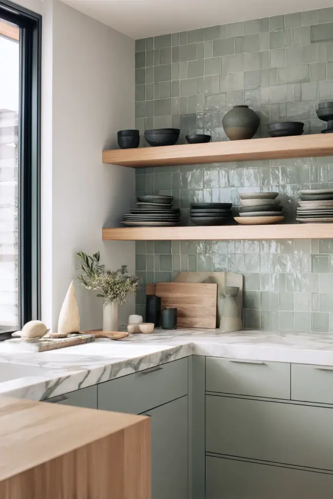
Use cool grays for larger surfaces like walls or area rugs. This creates a neutral backdrop that allows warm wood furniture to stand out beautifully. Muted sage works wonderfully in kitchens and dining spaces, bringing nature indoors without bright boldness.
Pair cool tones with 3500K lighting (neutral cool) for workspaces or kitchens where task lighting matters. This balances the coolness without making spaces feel sterile.
The Art of Balancing Warm and Cool Japandi Tones
The 70-30 Principle
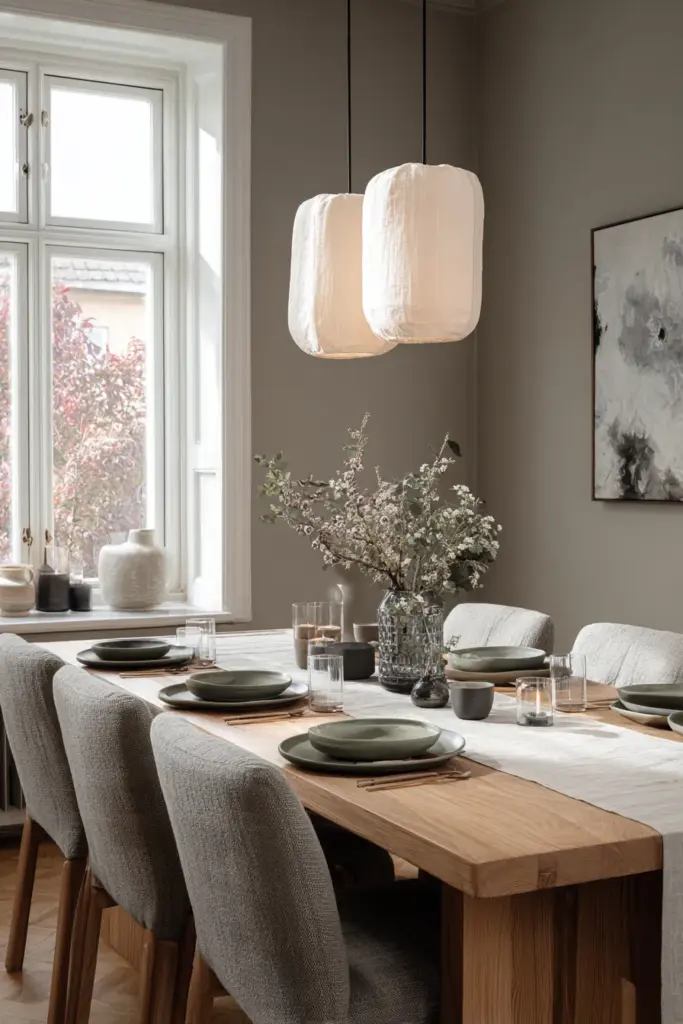
Think of tone balance as a gentle seesaw, not a tug-of-war. Most successful Japandi spaces follow a 70-30 split—70% of one temperature family, 30% of the other.
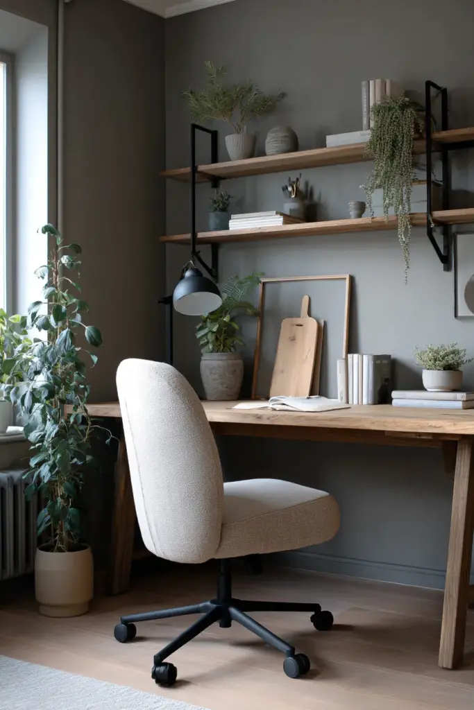
Choose a dominant tone based on your room’s natural light and purpose. A cozy bedroom might be 70% warm (cream walls, oak floors, beige textiles) with 30% cool accents (soft gray throw, sage plant pots). An airy home office reverses this—cool gray walls and furniture with warm wood desk and terracotta accessories.
This principle prevents spaces from feeling too sterile or too heavy. Balance is the key to Japandi’s signature serenity.
Color Psychology in Tone Selection
Warm tones stimulate social connection and physical comfort. They’re ideal for living rooms, dining areas, and bedrooms where relaxation is paramount. These colors can even make cooler climates feel warmer psychologically.
Cool tones support mental clarity and calm focus. They reduce visual stimulation, making them perfect for meditation corners, home offices, or bathrooms. In humid tropical environments like the Philippines, cool tones can make spaces feel fresher and more comfortable.
Understanding these psychological effects helps you design spaces that serve your daily life, not just your aesthetic preferences.
Room-by-Room Tone Strategy
| Room | Dominant Tone | Accent Tone | Key Elements |
|---|---|---|---|
| Living Room | Warm (beige, oatmeal) | Cool (soft gray, sage) | Wood furniture, linen textiles, stone accents |
| Bedroom | Warm (cream, taupe) | Cool (muted blue) | Natural wood bed, cotton bedding, minimal décor |
| Kitchen | Cool (light gray, white) | Warm (wood, terracotta) | Clean surfaces, wooden utensils, earth-toned ceramics |
| Bathroom | Cool (stone gray, white) | Warm (bamboo, honey tones) | Natural stone, wood vanity, neutral towels |
| Home Office | Cool (charcoal, sage) | Warm (oak, tan) | Functional furniture, plants, warm task lighting |
Creating Your Japandi Color Palette: Practical Steps
Start with Your Base Neutrals
Begin with off-white (#FAF9F6) or warm white walls as your canvas. This creates flexibility for both warm and cool layering. Avoid stark bright white—it’s too harsh for Japandi’s soft aesthetic.
Choose flooring in natural wood tones with warm undertones, or if using tile or stone, opt for cool grays with subtle texture. Your base should feel grounded and natural, never synthetic or overly polished.
These foundational choices set the temperature baseline for everything that follows.
Layer Through the 60-30-10 Rule
Apply interior design’s classic proportion rule: 60% dominant color (walls, large furniture), 30% secondary color (smaller furniture, rugs), 10% accent color (décor, pillows, art).
If your 60% is cool gray walls, make your 30% warm—a tan sofa, light wood dining table. Your 10% can bridge both temperatures—perhaps sage pillows or charcoal ceramics.
This structure prevents color chaos while allowing personality to emerge through thoughtful layering.
Add Natural Materials for Temperature Texture
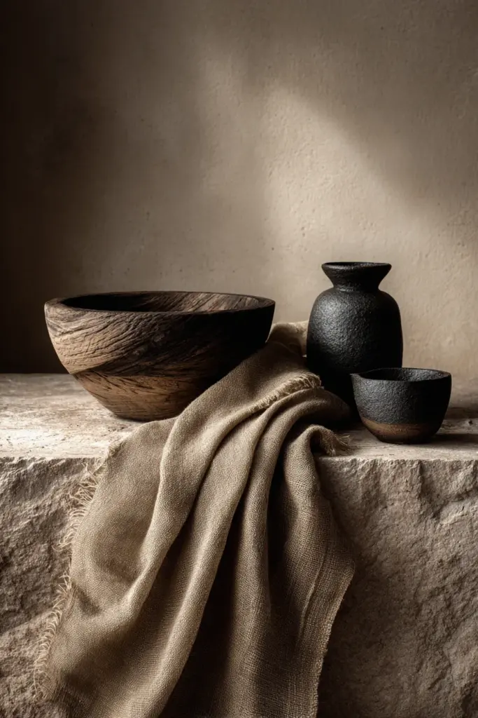
Materials carry temperature beyond color alone. Warm materials include leather, wood, jute, linen, wool, and rattan. Cool materials include stone, concrete, ceramic, glass, and metal.
A cool gray room with warm wood shelving, linen curtains, and a jute rug feels balanced. A warm beige space with stone countertops, ceramic vases, and metal lighting fixtures finds equilibrium.
Texture is temperature’s silent partner—don’t overlook its power to shift how a color feels in your space.
Seasonal Shifts: Adapting Warm-Cool Balance
Embracing Warmer Tones in Cooler Months
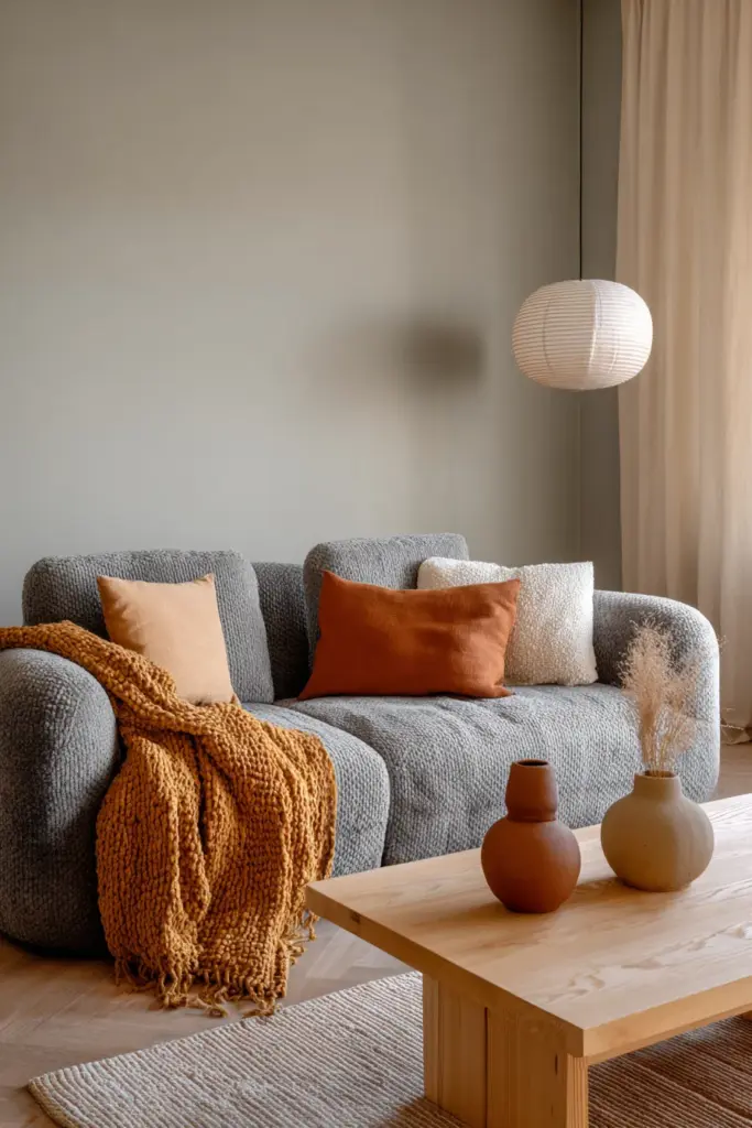
Even in tropical climates, rainy seasons bring cooler, grayer days. This is when you can introduce warmer textiles—ochre throws, rust-colored cushions, deeper terracotta accents.
Swap cool-toned artwork for pieces with warmer undertones. Add candlelight or increase your use of 2700K bulbs for golden ambient lighting. These small adjustments shift your space’s emotional temperature without requiring renovation.
Keep the changes subtle and reversible. Japandi avoids dramatic seasonal overhauls in favor of gentle, mindful transitions.
Cooling Down for Warmer Weather
When heat and humidity rise, emphasize your cool tones. Display more sage greenery, switch to white or light gray linens, and maximize natural ventilation.
Consider temporary changes like replacing warm wooden decorative items with cooler ceramic or glass pieces. Use 4000K lighting in the daytime to keep spaces feeling fresh and energized.
In the Philippines, this might mean rotating out heavy textiles entirely during peak summer months while maintaining your warm wood furniture as permanent grounding elements.
Common Mistakes When Balancing Japandi Tones
Avoiding Temperature Extremes
Too much warmth without cool balance creates spaces that feel cramped and overstimulating. All terracotta, honey wood, and warm beige can overwhelm rather than comfort.
Conversely, too much coolness—all gray, white, and stone—feels clinical and uninviting. Japandi requires both temperatures to achieve its signature tranquility.
If your space feels “off,” assess your temperature ratio. You likely need to introduce the missing temperature family through accents or materials.
Ignoring Natural Light Conditions
A north-facing room naturally leans cool due to limited direct sunlight. Adding predominantly cool tones here can make it feel dreary. Instead, warm it up with wood, beige, and 2700K lighting.
South-facing rooms flooded with warm sunlight can handle more cool tones without feeling cold. They need the cooling balance of grays and sage to prevent feeling too hot visually.
Work with your natural light, not against it.
Over-Matching Colors
Japandi celebrates subtle variation, not perfect coordination. Don’t try to match every beige or gray exactly—this creates flat, lifeless spaces.
Instead, layer different temperatures of the same color family. Combine warm beige with cool beige, or soft gray with charcoal. This depth creates visual interest while maintaining harmony.
Think of it as variations on a theme, not a monochrome exercise.
Your Japandi Warm-Cool Tone Checklist
Before finalizing your design choices, consider these essential checkpoints:
- Assess natural light: Note which rooms receive warm afternoon sun versus cool morning light
- Choose a dominant temperature: Decide whether your space leans 70% warm or 70% cool based on function and light
- Select your base neutral: Off-white, warm white, or soft gray for walls and large surfaces
- Layer the opposite temperature: Add 30% of contrasting tones through furniture and textiles
- Include natural materials: Balance wood (warm) with stone or ceramic (cool)
- Test your lighting: Use 2700K for warm ambiance, 3500K for balanced task lighting, 4000K for cool brightness
- Add living elements: Plants in neutral ceramic or terracotta pots bridge warm and cool beautifully
- Adjust seasonally: Rotate accent colors and textiles to match climate shifts
- Trust your instinct: If a space feels too heavy or too stark, adjust your temperature balance
- Maintain simplicity: Fewer items in balanced tones trump many items in confused temperatures
Finding Your Personal Japandi Temperature
Not every home needs the same warm-cool ratio. Your personal comfort matters more than rigid rules.
If you naturally gravitate toward coziness, lean 60-70% warm with cool breathing room. If you crave clarity and calm, go 60-70% cool with warm anchoring. Both approaches honor Japandi principles when executed with intention.
Consider your daily rhythms too. Morning people might prefer cooler, energizing tones in living spaces. Evening nesters might want more warmth throughout. Your home should support your life, not an Instagram aesthetic.
The beauty of Japandi is its flexibility within structure—a framework that adapts to individual needs while maintaining design integrity.
Conclusion: The Temperature of Home
Japandi warm and cool tones aren’t about decoration—they’re about creating atmosphere. About how you want to feel when you walk through your door after a long day.
The balance you strike between earth and sky, between terracotta and sage, between honey wood and soft stone—this becomes the emotional temperature of your home. It’s deeply personal, quietly beautiful, and endlessly soothing.
Start with one room. Notice how it feels at different times of day. Add what’s missing—a warm throw if it feels too stark, a cool ceramic vase if it feels too heavy. Let balance emerge gradually, naturally, like Japandi itself.
Your home is waiting to breathe in this perfect, peaceful equilibrium.
Frequently Asked Questions
What is the best Japandi color palette for small spaces?
Lean 70% cool tones (soft gray, white, muted sage) to create spaciousness, then add 30% warm accents through wood furniture and beige textiles. Cool colors recede visually, making small rooms feel larger, while warm touches prevent sterility. Keep furniture minimal and let natural light define the space.
Is Japandi style more warm-toned or cool-toned?
Japandi balances both—it’s neither exclusively warm nor cool. The style typically uses a 60-70% dominant temperature with 30-40% of the opposite temperature. Most spaces feature neutral cool bases (gray, white) warmed by natural wood, or warm beige foundations cooled by stone and sage accents. Balance is essential.
How do I transition my existing décor to Japandi tones?
Start by removing bold, saturated colors. Introduce neutral warm or cool base pieces—a beige sofa or gray rug. Add the opposite temperature through smaller items like pillows, ceramics, or wood accents. Replace synthetic materials with natural ones (linen, wood, stone). The transition should feel gradual and organic, not dramatic.
What hex codes work best for Japandi warm and cool tones?
Warm tones: Cream (#F5F5DC), warm beige (#D2B48C), terracotta (#E07A5F), oatmeal (#E8DCC4). Cool tones: Soft gray (#A9A9A9), sage green (#A8CABA), charcoal (#36454F), dusty blue (#B0C4DE). Use these as starting points, adjusting based on your lighting and existing materials.
Can I use Japandi warm-cool balance in tropical climates?
Absolutely—Japandi works beautifully in humid environments like the Philippines. Emphasize cool tones (light gray, white, sage) for visual freshness, then add warm wood furniture and natural textiles for grounding. Choose humidity-resistant materials like teak, bamboo, and linen. Maximize natural ventilation and use 3500-4000K lighting during hot months for an airy feel.