Table of Contents
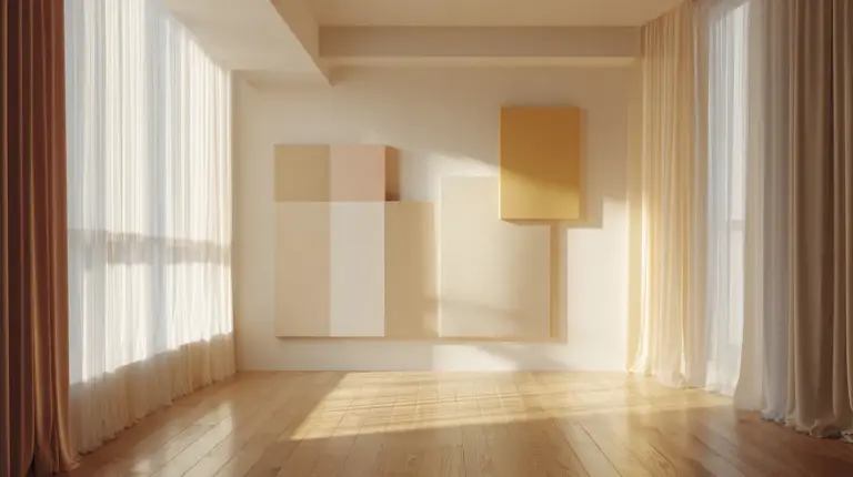
The light catches differently in a Japandi living room. It pools on pale oak floors, skims across linen upholstery, then disappears into the deep charcoal of a ceramic vase. This is the dance between light and dark—a signature move in Japandi design that turns ordinary spaces into sanctuaries.
If you’ve been drawn to Japandi style but hesitated at its reputation for all-white minimalism, you’re not alone. The truth is richer and more textured. Light dark Japandi living room colors embrace both ends of the spectrum, creating rooms that feel grounded yet airy, cozy yet spacious.
This guide will walk you through the essential color palettes, practical applications, and design secrets that make light dark Japandi work. Whether you’re repainting an entire room or simply adding darker accents, you’ll discover how to balance shadow with luminosity.
Let’s begin where all great design starts—with understanding the foundation.
Understanding Light Dark Japandi Color Philosophy
The Essence of Balanced Contrast
Japandi design merges Japanese wabi-sabi with Scandinavian hygge, two philosophies that celebrate natural beauty and purposeful living. In color terms, this means avoiding extremes. Light dark Japandi isn’t about stark black-and-white contrasts; it’s about gentle gradations that honor both brightness and depth.
Think of morning fog settling over dark earth. That soft transition from light to shadow—that’s your color roadmap. The palette draws from nature’s own contrasts: birch bark against wet stone, cream-colored sand meeting charcoal cliffs, pale sky above a deep forest.
Why Dark Elements Matter
Dark tones ground a space emotionally. They add weight and warmth that prevents minimalism from feeling cold. In Japandi living rooms, darker colors—like deep browns (#3E2723), forest greens (#606C5A), or charcoal grays (#2F2F2F)—create visual anchors that make lighter elements feel intentional rather than sparse.
These shadows also highlight texture beautifully. A dark wall reveals every weave in a macramé hanging, every grain line in wooden shelving.
Essential Light Dark Japandi Color Palettes
The Foundation: Neutral Base Colors
Your primary palette should whisper, not shout. Start with these versatile neutrals:
- Warm Cream (#F0E5D0): Softer than white, with honey undertones
- Greige (#D4CFC9): The perfect gray-beige hybrid
- Warm White (#F5F5F0): Just off-white, never stark
- Soft Gray (#E8E6E1): A whisper of cool without feeling cold
These light tones handle 60-70% of your room—walls, large furniture pieces, window treatments. They reflect natural light while maintaining warmth, essential for creating that signature Japandi glow.

The Depth: Dark Accent Colors
Now layer in your shadows. Dark Japandi colors provide essential contrast and depth:
- Charcoal (#3E3E3E): Sophisticated, never harsh
- Deep Brown (#4A3728): Like aged leather or dark walnut
- Navy Blue (#2B3A42): Midnight calm with slight warmth
- Forest Night (#3F4F3C): Muted green with brown undertones
- Black Bean (#1C1C1B): Softer than pure black
Use these for 20-30% of your design—accent walls, large furniture pieces, cabinetry, or architectural details like exposed beams.
The Soul: Earth-Tone Accents
The final 10-15% brings life through nature-inspired mid-tones:
- Terracotta (#CC8B7C): Sun-warmed clay
- Sage Green (#9CAF88): Fresh herb gardens
- Warm Taupe (#C8B8A8): River stones after rain
- Soft Blue (#B0C4D9): Morning sky reflection
These colors appear in textiles, pottery, artwork, and smaller decor elements.
Room-by-Room Color Application
Walls: Setting Your Light-Dark Foundation
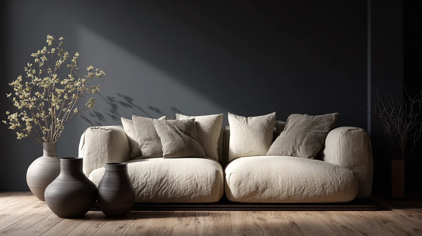
Light Wall Strategy: Paint three walls in warm cream (#F0E5D0) or soft gray (#E8E6E1). Reserve one wall—ideally behind your sofa or media console—for a deeper tone like charcoal (#3E3E3E) or navy blue (#2B3A42). This creates instant depth without overwhelming smaller spaces.
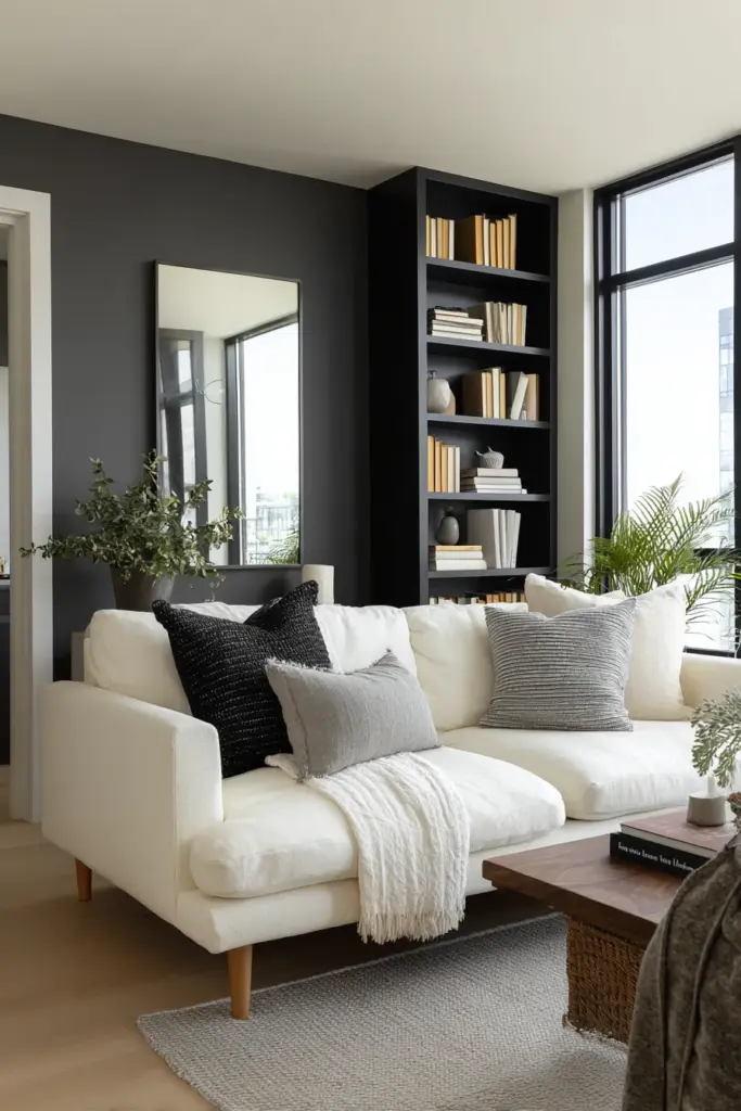
For apartments under 400 square feet, keep all walls light but introduce darkness through large-scale artwork or a floor-to-ceiling bookshelf in dark wood.
Dark Wall Strategy: If your living room receives abundant natural light, consider painting all walls in a warm greige (#D4CFC9) with one dramatic accent in deep brown (#4A3728). The key is warm undertones—cool grays can feel sterile in Japandi spaces.
Floors: Grounding Your Palette
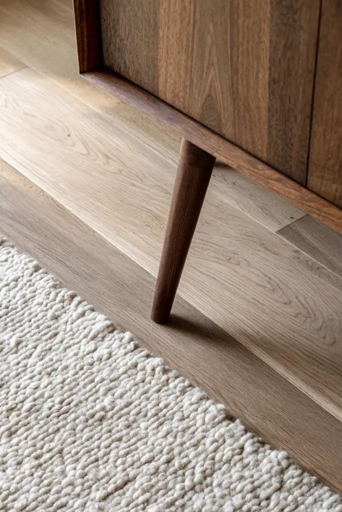
Natural wood floors in medium to dark tones anchor light dark Japandi beautifully. Oak, walnut, or bamboo in their natural state (no orange-toned stains) provide organic warmth. If you’re working with existing flooring, layer jute or wool area rugs in cream or soft gray to bridge the color story.
For concrete or tile floors, consider a matte finish in warm gray or leave them natural. The subtle texture becomes part of your palette.
Furniture: The Major Color Players
Your sofa sets the tone—literally. Choose upholstery in one of these proven combinations:
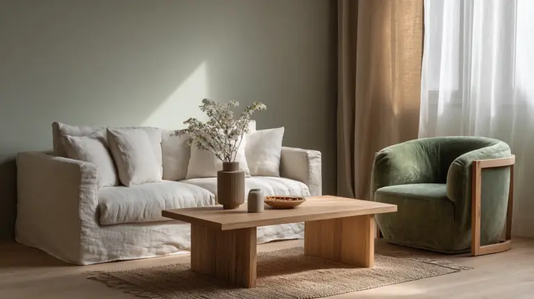
Light Sofa + Dark Accents: Cream linen sofa, charcoal throw pillows, dark walnut coffee table
Dark Sofa + Light Balance: Charcoal wool sofa, cream throw blanket, light oak side tables
Mid-Tone Harmony: Warm taupe sofa, mix of light and dark pillows, varied wood tones
Wood furniture should span the light-dark spectrum. A light ash bookshelf balances a dark walnut media console. This variation creates visual interest while maintaining cohesion.
Lighting and Color Temperature
Natural Light Maximization
Light dark Japandi depends on natural light to showcase its nuances. Keep window treatments minimal—sheer linen curtains in warm white or leave windows bare if privacy allows. The way daylight travels across different color values throughout the day is part of the design’s living quality.
South-facing rooms can handle darker walls; north-facing rooms need more light tones to compensate for cooler natural light.
Artificial Lighting Strategy
Layered lighting in warm color temperatures (2700K-3000K) is essential. Use these layers:
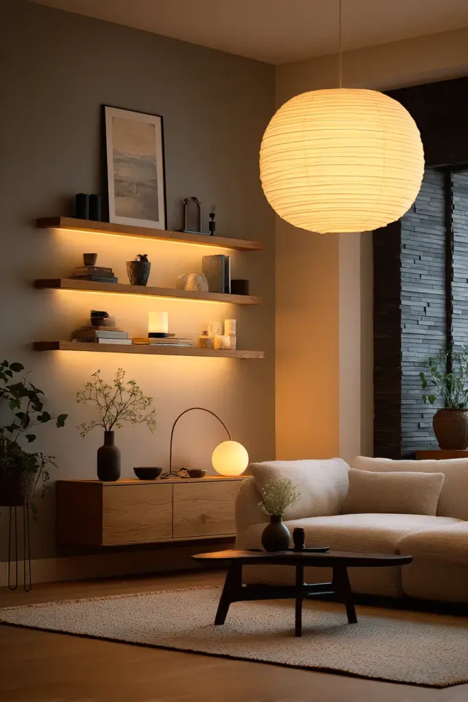
- Ambient: Recessed ceiling lights or paper lantern pendants
- Task: Arc floor lamps with linen shades near reading areas
- Accent: LED strips behind floating shelves, uplighting for plants
Avoid cool white bulbs—they turn your carefully chosen warm neutrals into sterile grays. Dimmer switches let you adjust mood from bright morning energy to evening coziness.
Texture and Material Considerations
How Materials Affect Color Perception
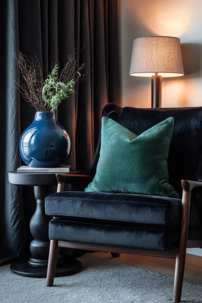
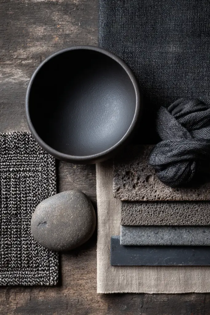
A charcoal velvet pillow reads darker and richer than charcoal cotton. Matte finishes absorb light, making colors appear deeper; subtle sheens reflect light, brightening the same hue. This matters enormously in light dark Japandi.
Matte Textures (absorb light, deepen color):
- Unglazed ceramic vases
- Wool throws and rugs
- Matte-finish wood furniture
- Plaster or clay walls
Subtle Sheen Textures (reflect light, brighten color):
- Glazed pottery
- Linen with natural slub
- Oiled wood surfaces
- Satin-finish paint
Mix both types to create dimensional color play. A matte charcoal bowl on a glossy dark wood table creates two different expressions of the same dark tone.
Natural Materials as Color Elements
In Japandi design, materials are colors. Consider:
- Light woods (ash, maple, light oak): Bring warm cream tones naturally
- Dark woods (walnut, wenge, ebonized oak): Provide deep brown anchors
- Stone (granite, marble, slate): Introduce authentic grays
- Rattan and bamboo: Add honey-toned warmth
- Concrete: Offers cool gray modernity
Choose materials in their honest, unaltered states. No high-gloss finishes or artificial coloring—authenticity is the point.
Small Space and Budget-Friendly Strategies
Adapting Light Dark Japandi for Apartments
Small living rooms benefit from a 70% light / 30% dark ratio to maintain openness. Apply darkness strategically:
- One accent wall rather than multiple dark surfaces
- Dark furniture with visible legs (appears lighter, less bulky)
- Vertical dark elements (tall bookshelf, floor-to-ceiling curtains) that draw the eye up
- Mirrors to reflect both light and dark, multiplying the palette
Avoid dark ceilings in spaces under 9 feet high—they compress the room visually.
Affordable Color Transitions
Paint: Quality low-VOC paint costs $40-55 per gallon and covers approximately 400 square feet. One gallon transforms an accent wall for under $60 including supplies.
DIY Color Mixing: Create custom Japandi shades by mixing:
- Pure white + raw umber (for warm cream)
- Gray + beige (for perfect greige)
- Charcoal + warm brown (for softened black)
Test on poster board before committing to walls.
Upcycled Furniture: Sand and refinish existing pieces in dark wood stain ($15-25 per quart). A light pine dresser becomes rich walnut-toned storage, adding dark elements without new furniture costs.
Thrifted Textiles: Source linen, wool, and cotton throws at estate sales. Even if colors aren’t perfect, natural fibers dye beautifully with tea (for warm tones) or natural indigo (for deep blue-grays).
Seasonal Color Variations
Winter: Embracing Deeper Tones
Cold months call for moody warmth. Shift your ratio to 60% light / 40% dark. Add:
- Charcoal wool blankets
- Deep brown leather poufs
- Navy blue velvet pillows
- Dark pottery with matte finishes
The increased darkness creates cocoon-like coziness when daylight hours shorten.
Summer: Lightening the Load
Warm weather welcomes airiness. Return to 75% light / 25% dark by:
- Swapping heavy dark throws for cream linen
- Rotating in lighter wood accessories
- Adding white ceramic pieces
- Introducing soft blue accents
The dark elements remain but recede, letting brightness dominate.
Common Mistakes to Avoid
Too Much Contrast
Pure white walls with jet-black furniture feels more modern minimalism than Japandi. The aesthetic requires gentle contrast—warm cream with charcoal, not stark opposites. If your room feels graphic rather than organic, add mid-tone bridges like taupe or warm gray.
Ignoring Undertones
Cool grays clash with warm browns, creating visual discord. All your neutrals should share undertones—either warm (yellow, red, orange base) or cool (blue, green base). Test paint samples next to your existing furniture before committing.
Over-Accessorizing
More dark accents don’t mean more depth. Ten small black objects create clutter; one substantial dark bookshelf creates presence. Apply the Japandi principle of “just enough”—each dark element should earn its place.
Sustainability and Health Considerations
Low-VOC Paint Selection
Conventional paints release volatile organic compounds that affect air quality. For Japandi living rooms—spaces meant for wellbeing—choose paints with VOC levels under 50 g/L. Brands like Benjamin Moore Natura, Sherwin-Williams Harmony, or Clare offer full color ranges in low-VOC formulas.
These cost $5-10 more per gallon but support healthier indoor environments, aligning with Japandi’s wellness philosophy.
Sustainable Dark Wood Sources
Dark wood furniture carries environmental impact. Prioritize:
- FSC-certified wood: Ensures responsible forest management
- Reclaimed wood: Salvaged from old buildings, beautifully aged
- Bamboo: Fast-growing, naturally dark when heat-treated
- Local hardwoods: Reduces transportation emissions
Ask retailers about sourcing before purchasing. True Japandi values mindful consumption.
Creating Your Personal Light Dark Balance
Assessing Your Space
Stand in your living room at different times of day. Notice where natural light enters, where shadows pool, which walls feel heavy or light. This observation informs your color strategy.
High Natural Light = Can handle more dark tones
Low Natural Light = Requires light dominance with strategic dark accents
Medium Natural Light = Perfect for balanced 65% light / 35% dark
Testing Before Committing
Never select colors from small paint chips. Purchase sample sizes ($3-5 each) and paint 2×2 foot sections on different walls. Live with them for several days, observing how they shift from morning to evening light.
Place furniture and textiles near the samples. Your cream sofa might look beautiful against Sample A but washed out against Sample B.
Design Checklist: Light Dark Japandi Living Room
Use this as your planning guide:
Color Foundation
- Primary light neutral selected (cream, greige, or warm white)
- Secondary dark anchor chosen (charcoal, deep brown, or navy)
- 2-3 earth-tone accents identified (terracotta, sage, warm taupe)
- All colors share consistent undertones (all warm OR all cool)
Material Selection
- Light wood pieces sourced (ash, maple, or light oak)
- Dark wood pieces selected (walnut, dark teak, or ebonized oak)
- Mix of matte and subtle sheen textures planned
- Natural fiber textiles chosen (linen, wool, cotton)
Application Strategy
- Wall color ratio decided (70-30, 65-35, or 60-40 light to dark)
- Accent wall location chosen if applicable
- Large furniture pieces assigned colors
- Lighting plan includes warm bulbs (2700K-3000K)
- Budget allocated ($40-60 per gallon paint, $15-25 stain)
Sustainability Check
- Low-VOC paints selected (under 50 g/L)
- Wood sources verified (FSC, reclaimed, or local)
- Upcycling opportunities identified
- Natural, non-toxic materials prioritized
Bringing It All Together
Light dark Japandi living room colors tell a story about balance—not just in design, but in life. The interplay of brightness and shadow reflects the Japanese concept of ma (negative space) and the Scandinavian love of lagom (just the right amount).
When you walk into your completed space, you should feel both energized and calm. The light tones invite you in; the dark tones ask you to stay. Morning coffee tastes different in this light. Evening conversations feel more intimate against these shadows.
This isn’t about following rigid formulas. It’s about understanding the principles, then trusting your instincts. Your living room is a living thing—it breathes with the seasons, shifts with your needs, grows more beautiful as you grow more comfortable within it.
Start small if you’re uncertain. Paint one accent wall in charcoal. Add a deep walnut coffee table to your cream-sofa setup. Layer in a navy throw pillow. Watch how these darker elements change the room’s energy, its sense of groundedness and warmth.
The most successful light dark Japandi spaces aren’t designed in a day. They evolve through thoughtful additions, careful subtractions, and patient observation. Give yourself permission to adjust, to try, to live with choices before making them permanent.
Your space is waiting—light and shadow both—to welcome you home.
Frequently Asked Questions
What colors are in a Japandi color palette?
Japandi palettes center on neutral tones like warm whites, beiges, soft grays, and greige, complemented by earthy accents such as muted greens, warm browns, terracotta, and sage. The palette draws directly from natural materials—think unfinished wood, stone, and clay. Light dark Japandi specifically incorporates deeper tones like charcoal, navy blue, and deep brown alongside these neutrals for dimensional contrast.
Can Japandi be dark?
Yes, dark Japandi is a sophisticated evolution of traditional Japandi style. It incorporates black, deep navy, forest greens, and rich browns while maintaining balance with light neutrals like cream and warm white. The key is avoiding stark contrast—dark Japandi uses warm-toned shadows rather than cold blacks, creating cozy, grounded spaces that still feel open and breathable. Abundant natural light makes darker palettes particularly successful.
What is the best color for a Japandi living room?
The best Japandi living room color depends on your natural light and desired mood. For walls, soft beige (#E8DCC8), warm gray (#D4CFC9), or greige (#C8B8A8) offer versatile foundations. For furniture, cream linen or warm taupe provide light anchors, while charcoal or deep brown add essential depth. Most successful Japandi living rooms use a light dominant color (covering 65-70% of surfaces) balanced with darker accent pieces.
How do I choose Japandi paint colors?
Start by assessing your room’s natural light throughout the day—high light allows more dark tones, low light requires lighter dominance. Select low-VOC paints with warm undertones, avoiding cool grays that feel sterile. Purchase sample sizes and paint large test sections on different walls, living with them for 3-5 days before deciding. Place existing furniture near samples to ensure cohesion. Aim for a 65-75% light to 25-35% dark ratio in most spaces.
What colors go with Japandi style?
Japandi style pairs beautifully with warm woods (oak, walnut, teak), soft blues reminiscent of water or sky, muted terracotta, sage green, and warm taupe. Avoid bold, saturated hues—stick to nature-inspired muted shades that could exist in a forest, on a beach, or in a mountain landscape. Metals should be matte black, brushed brass, or blackened steel. The golden rule: if the color could be found in nature’s quieter moments, it works with Japandi.