Table of Contents
There’s something quietly powerful about walking into a room that breathes.
Not the kind of breathing that comes from air conditioning or open windows, but the kind that comes from balance—where every shade, every surface, every shadow feels intentional yet effortless. That’s the magic of neutral Japandi living room colors: they don’t shout for attention. They invite you to pause, to soften, to simply be.
Japandi design marries the warm minimalism of Scandinavian hygge with the thoughtful restraint of Japanese wabi-sabi. The result? A color palette that celebrates imperfection, embraces natural materials, and honors the beauty of simplicity. If you’ve been craving a space that feels both grounded and luminous, where taupe meets timber and stone whispers alongside linen, you’re in exactly the right place.
Let’s explore how to create a living room that feels like a sanctuary—one neutral tone at a time.
What Is the Japandi Color Palette?
The Japandi color palette is built on muted neutrals that reflect nature in its quietest moments.
Think of early morning light filtering through rice paper screens. The soft grey of river stones. The warm beige of sun-bleached driftwood. These aren’t colors that compete—they complement. They create layers of calm that shift gently with the light throughout the day.
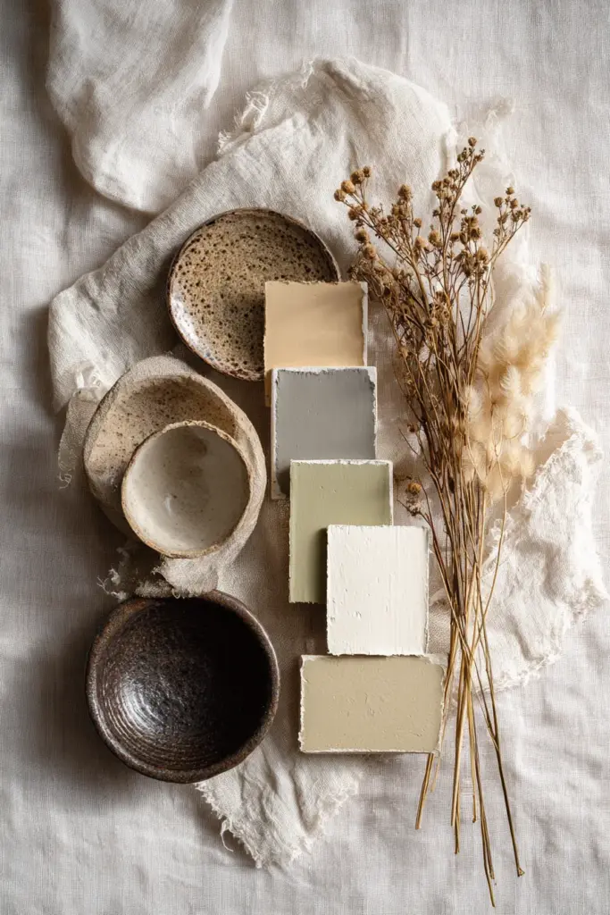
At its core, the Japandi palette includes off-whites, soft browns, muted beiges, taupes, warm greys, and strategic black accents. You’ll also find subtle earth tones like sage green, moss, olive, and terracotta woven in like whispers. The goal isn’t to create a monochromatic void—it’s to build depth through texture, tone, and natural variation.
Core Neutral Shades for Japandi Living Rooms
Here are the foundational colors that anchor any Japandi space:
| Color Family | Shade Examples | Hex Codes | Best For |
|---|---|---|---|
| Warm Whites | Cream, ivory, eggshell | #F5F5F0, #FAF9F6 | Walls, ceilings, base layer |
| Beiges & Taupes | Sand, latte, greige | #E8DCC4, #C9B8A8 | Walls, upholstery, textiles |
| Soft Greys | Dove grey, warm grey | #C0B9B0, #A8A199 | Accent walls, furniture |
| Warm Browns | Caramel, walnut, ochre | #B08968, #7D5E3F | Wood tones, leather accents |
| Earth Greens | Sage, moss, olive | #9CAF88, #87916D | Plants, pillows, ceramics |
| Charcoal & Black | Deep charcoal, matte black | #3E3E3E, #1C1C1C | Frames, fixtures, grounding accents |
Each of these shades carries weight without heaviness. They’re the colors of clay, stone, bark, and sky—elements that have existed long before trends.
Why Neutral Colors Work So Beautifully in Japandi Design
Neutral colors aren’t boring. They’re spacious.
When you strip away visual noise, what remains is room for the eye to rest, for the mind to settle. In Japandi design, neutrals serve a higher purpose: they honor the principles of wabi-sabi (finding beauty in imperfection) and hygge (creating cozy contentment). These philosophies teach us that a crack in a ceramic vase or a knot in a wooden table isn’t a flaw—it’s a story.
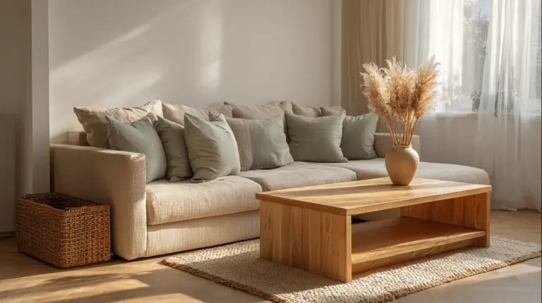
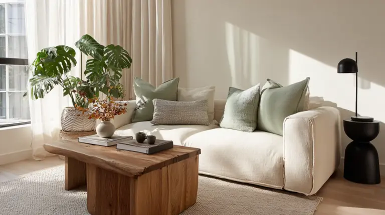
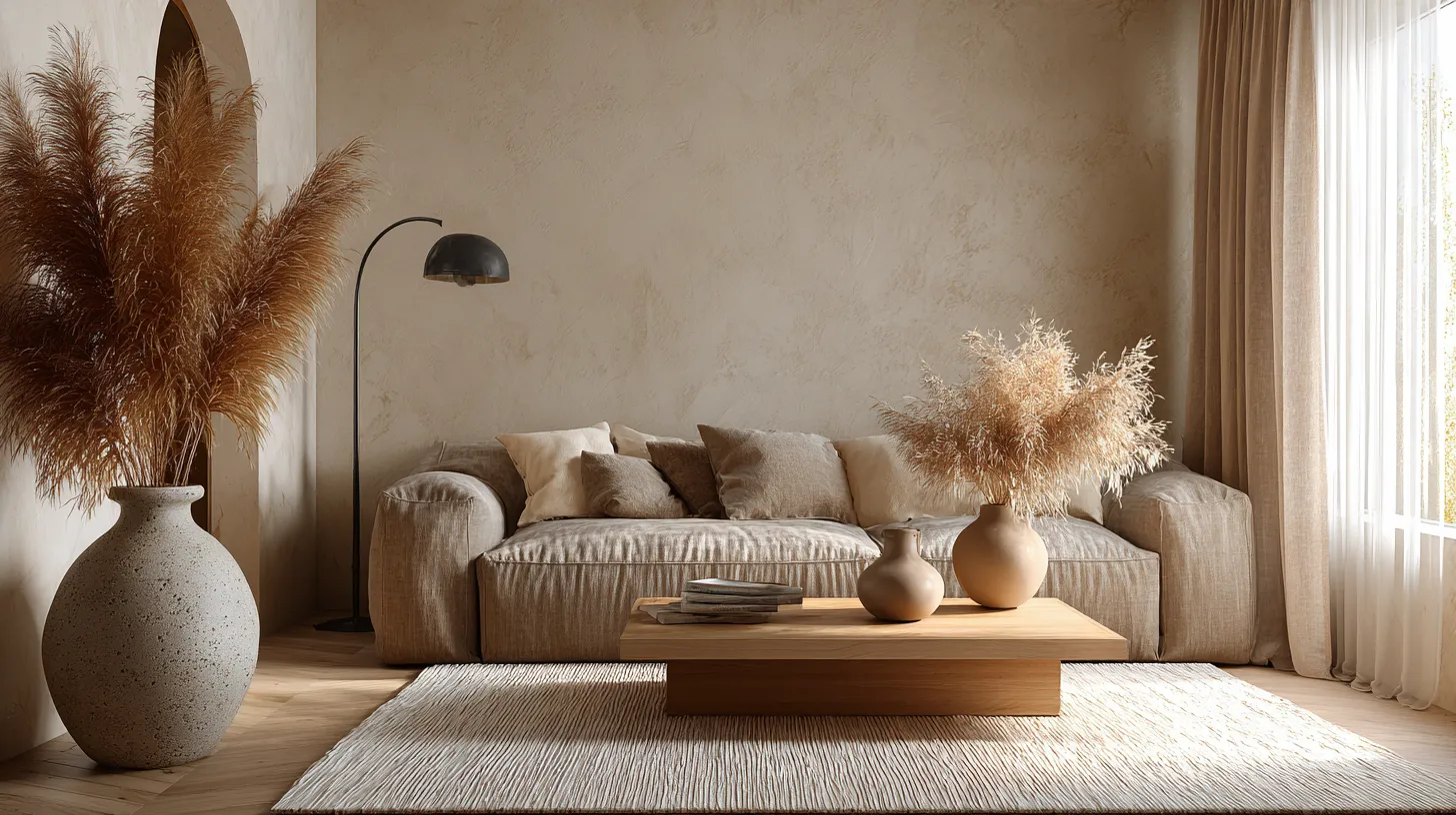
Neutrals allow those stories to shine. A linen sofa in warm beige doesn’t compete with the organic grain of a live-edge coffee table. Soft grey walls let handmade pottery become the focal point. Black steel light fixtures add definition without dominating.
The Psychological Impact of Neutral Japandi Tones
There’s science behind the serenity. Neutral colors—especially those with warm undertones—reduce visual stress and promote relaxation. They lower cortisol levels and create a sense of spaciousness, making even smaller living rooms feel airy and open.
When you pair these calming shades with natural textures like wool, cotton, and wood, you activate multiple senses at once. The result is a living room that doesn’t just look peaceful—it feels that way, too.
How to Create Your Japandi Living Room Color Palette
Building a Japandi color palette is like composing a quiet song. You start with a foundation, layer in harmonies, and add just enough contrast to keep things interesting.
Here’s a step-by-step approach that works every time.
Step 1: Choose Your Base Neutral
Your base color will cover the largest surface area—typically your walls. For Japandi living rooms, the most versatile options are warm whites, soft beiges, or light greiges.
- Warm white (e.g., #FAF9F6): Creates an open, airy feel. Perfect for small spaces or rooms with limited natural light.
- Soft beige (e.g., #E8DCC4): Adds warmth and coziness. Ideal for larger living rooms or spaces with abundant windows.
- Light greige (e.g., #D4CFC7): Offers sophisticated balance between grey and beige. Works beautifully with both warm and cool wood tones.
Whatever you choose, test paint samples on multiple walls and observe them at different times of day. Morning light reveals different undertones than evening glow.
Step 2: Layer in Secondary Neutrals
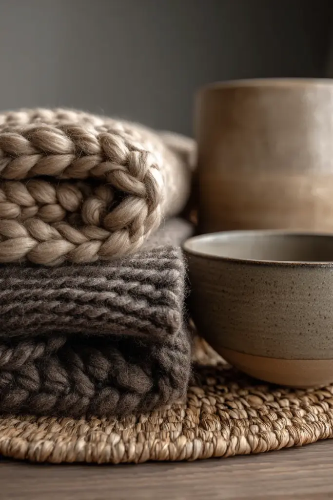
Once your base is set, introduce 2-3 secondary neutrals through furniture, rugs, and larger textiles.
- Taupe upholstery: A sofa in warm taupe (#C9B8A8) grounds the space without feeling heavy.
- Warm grey accents: Throw pillows or a wool rug in dove grey (#C0B9B0) add subtle depth.
- Natural linen: Curtains in undyed linen bring texture and softness while filtering light beautifully.
The key is to create tonal variation rather than stark contrast. Think of the way sand shifts from pale to golden depending on where the light hits.
Step 3: Add Warm Wood Tones
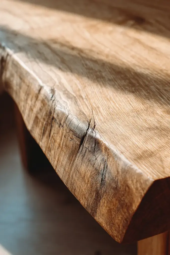
Wood isn’t just a material in Japandi design—it’s a color. And it’s essential.
Choose wood tones that lean warm rather than cool: walnut, oak, teak, or ash. These bring organic richness that prevents neutral palettes from feeling clinical. A blonde oak coffee table, a walnut media console, or bamboo shelving adds life without disrupting the calm.
For flooring, light to medium wood tones work best. They reflect natural light and create visual flow from wall to floor.
Step 4: Introduce One or Two Earth Accents
This is where your palette gains personality. Choose one or two muted earth tones to sprinkle throughout the room:
- Sage green (#9CAF88): Add through potted plants, ceramic vases, or a single accent chair.
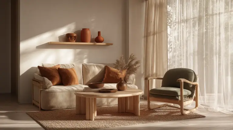
- Terracotta (#C97D60): Introduce via throw pillows, a handwoven basket, or a textured planter.
- Moss green (#87916D): Use sparingly in artwork, books, or a cozy throw blanket.
These accents should feel like they grew there naturally—never forced or overly coordinated.

Step 5: Ground with Strategic Black Accents
Black isn’t harsh in Japandi spaces—it’s defining. Use it in small, intentional doses to add structure and sophistication:
- Matte black steel light fixtures
- Charcoal picture frames
- Black ceramic bowls or decorative objects
- Dark hardware on furniture or shelving
The goal is to create visual punctuation marks that guide the eye without overwhelming the senses.
Room-Specific Neutral Japandi Color Applications
Small Living Rooms
For compact spaces, lighter neutrals are your best friend. Stick to warm whites (#FAF9F6) and pale beiges (#F0E9DD) on walls to maximize the sense of openness.
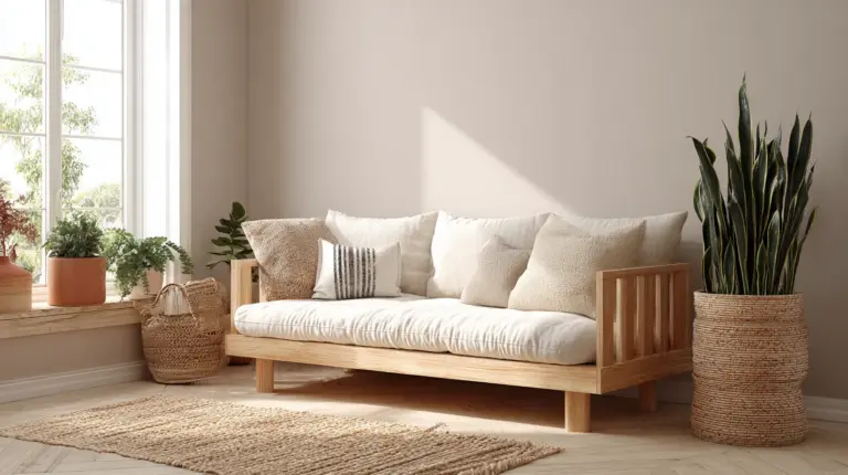
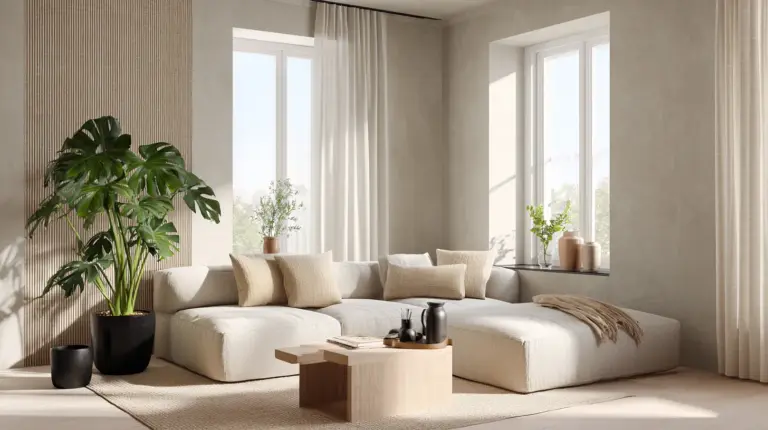
Keep furniture low-profile in light taupe or natural wood. Add a textured cream rug to define the seating area. Introduce greenery through a tall fiddle-leaf fig or hanging pothos to draw the eye upward and create vertical interest.
Open-Concept Living Areas
Larger, open spaces can handle deeper neutrals. Try soft grey (#C0B9B0) or warm greige (#D4CFC7) on an accent wall behind the sofa to create subtle zoning.
Layer in a chunky wool rug in oatmeal, a linen sectional in warm taupe, and a mix of wood tones—blonde oak for the coffee table, darker walnut for the media console. This variety adds visual richness without sacrificing harmony.
Living Rooms with Abundant Natural Light
If your space is flooded with sunlight, you can embrace slightly deeper tones. Warm beige (#E8DCC4) or soft greige (#D4CFC7) on walls will glow during the day and feel cozy at night.
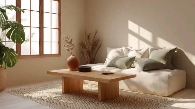
Balance bright windows with linen or bamboo shades in natural tones. Add a bouclé sofa in cream, layered with cushions in sage green and charcoal grey.
The Role of Lighting in Neutral Japandi Palettes
Here’s a secret many design articles miss: neutral colors change dramatically with lighting.
A warm beige wall might look peachy under cool LED bulbs or grey under harsh fluorescents. For Japandi living rooms, lighting is non-negotiable.
Choosing the Right Light Temperature
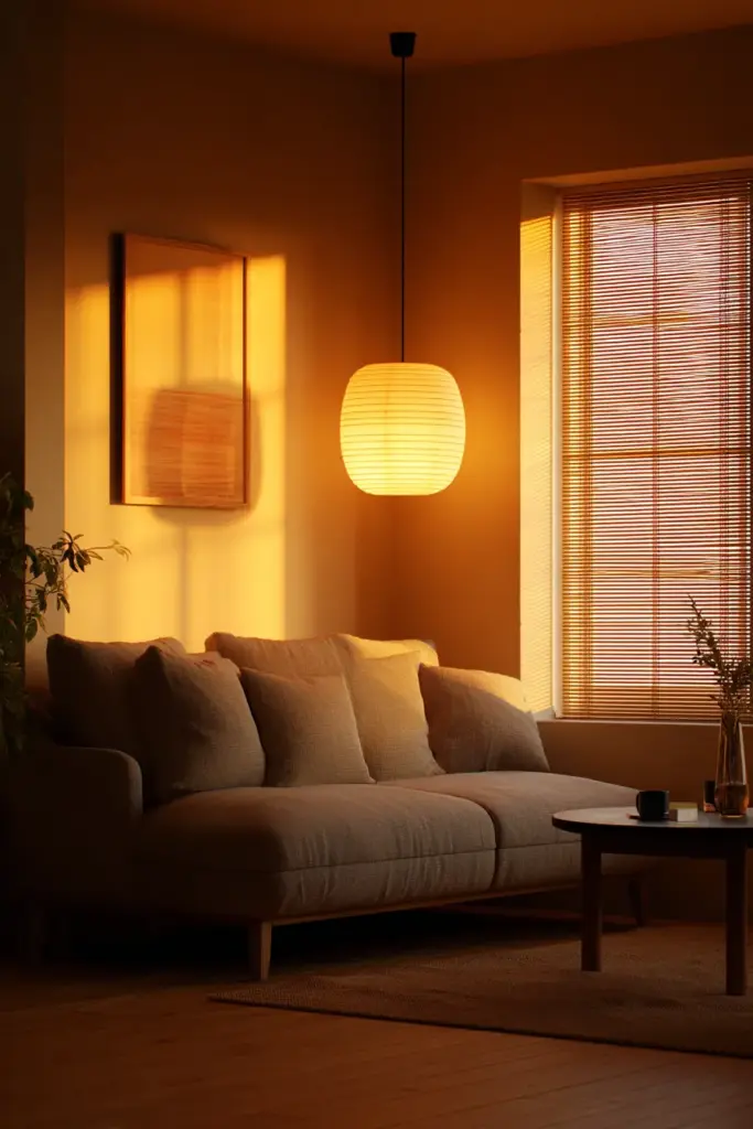
Always opt for warm white LEDs (2700K–3000K). This color temperature enhances the warmth in beige, taupe, and brown tones while softening greys and whites. It mimics the quality of natural candlelight or early evening sun—exactly the atmosphere you want.
Avoid cool white or daylight bulbs (4000K+). They’ll make your carefully chosen neutrals look flat, sterile, or even slightly blue.
Layering Light Sources
Just as you layer colors, layer light:
- Ambient lighting: A simple pendant or flush mount in natural materials (wicker, paper, wood) for overall illumination
- Task lighting: A sculptural floor lamp in black metal beside the sofa for reading
- Accent lighting: LED strips behind floating shelves or picture lights over artwork to highlight texture
Dimmer switches are essential. They let you adjust the mood from bright and energizing to soft and intimate.
Textures That Bring Neutral Colors to Life
Neutral Japandi palettes rely on texture to create visual interest. Without it, even the most thoughtful color scheme can fall flat.
Think of texture as the soul of your neutral palette. Here’s how to layer it effectively:
Natural Textiles
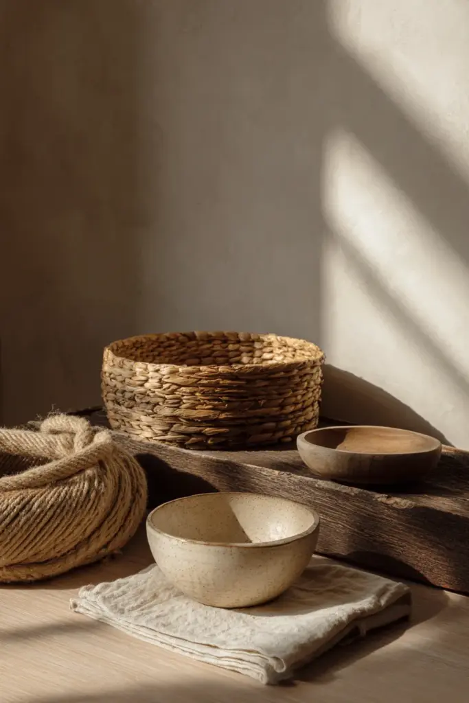
- Linen: Curtains, pillow covers, or a throw in undyed natural linen add organic softness
- Wool: A chunky knit blanket or handwoven rug brings warmth and tactile appeal
- Cotton: Canvas cushion covers or a cotton dhurrie rug offer breathable, casual comfort
- Jute or Sisal: A natural fiber rug grounds the space with earthy texture
Organic Materials
- Rattan or Cane: A side chair, basket, or lampshade introduces subtle pattern through weaving
- Bamboo: Blinds, shelving, or decorative accents add vertical texture
- Stone or Concrete: A concrete planter or stone sculpture provides cool, mineral contrast
- Ceramic: Handmade vases or bowls with visible glaze variations celebrate wabi-sabi
Wood Grain
Every piece of wood furniture should show its grain. Avoid high-gloss or painted finishes—natural, matte, or oiled wood is the standard. The imperfections, knots, and variations are what make each piece unique.
Common Mistakes to Avoid with Neutral Japandi Colors
Even the most serene palettes can go wrong. Here’s what to watch for:
Mistake 1: Going Too Monochromatic
If everything is the same shade of beige, the room will feel flat. Create depth by using at least 3–4 different neutrals with varying undertones.
Mistake 2: Forgetting Warm Undertones
Cool greys and stark whites can make a Japandi living room feel Scandinavian-only, missing the warmth of Japanese design. Always lean toward warm, earthy undertones.
Mistake 3: Over-Accessorizing
Japandi is about restraint. Resist the urge to fill every surface. Let empty space exist. Choose a few meaningful objects over many decorative ones.
Mistake 4: Ignoring Natural Light
Paint colors look different on north-facing vs. south-facing walls. Test samples in your actual space before committing to gallons of paint.
Mistake 5: Using Harsh Lighting
Cool LED bulbs will sabotage even the most beautiful neutral palette. Always choose warm white (2700K–3000K) for that soft, inviting glow.
Sustainable and Budget-Friendly Neutral Paint Options
You don’t need designer paint brands to achieve authentic Japandi neutrals. Here are affordable, eco-conscious options:
Budget-Friendly Brands
- Behr: “Swiss Coffee” (warm white), “Almond Wisp” (soft beige), “Silver Drop” (warm grey)
- Valspar: “Tempered Gray” (greige), “Woodlawn Vanilla” (cream), “Perfect Taupe”
- Benjamin Moore: “White Dove” (soft white), “Revere Pewter” (greige), “Grant Beige”
Eco-Friendly Paint Lines
- Clare Paint: Zero-VOC, comes in neutral Japandi-friendly shades like “Current Mood” and “Dirty Martini”
- Backdrop: Low-VOC with colors like “Linen White” and “Seashell”
- Sherwin-Williams Harmony: Zero-VOC line with excellent neutrals
DIY Color Mixing Tips
If you’re feeling adventurous, you can customize neutrals by asking paint stores to adjust base colors. Add a touch of ochre to white for warmth, or mix grey and beige bases for a custom greige. Most stores offer this service at no extra cost.
Your Neutral Japandi Living Room Checklist
Ready to transform your space? Here’s your quick-reference guide:
- Base Wall Color: Warm white, soft beige, or light greige
- Secondary Neutrals: Taupe upholstery, warm grey accents, natural linen textiles
- Wood Tones: Walnut, oak, teak, or ash furniture with visible grain
- Earth Accents: One or two muted tones (sage green, moss, terracotta)
- Black Details: Matte fixtures, frames, or hardware for definition
- Textures: Mix linen, wool, cotton, jute, rattan, ceramic, and natural wood
- Lighting: Warm white LEDs (2700K–3000K) in layered sources
- Plants: Greenery in ceramic or terracotta planters
- Minimal Accessories: Choose fewer, meaningful objects over clutter
- Open Space: Let emptiness exist—it’s part of the design
Conclusion: Creating Your Calm
A neutral Japandi living room isn’t just about what you add—it’s about what you allow.
You allow light to move across textured linen. You allow wood grain to show its history. You allow imperfect ceramics to sit beside sleek steel. You allow yourself to breathe in a space that doesn’t demand anything from you except presence.
These colors—warm beige, soft taupe, gentle grey, honest wood—aren’t trying to impress anyone. They’re inviting you home to yourself, to the kind of beauty that doesn’t shout but sustains. To the calm that comes from knowing exactly what you need, and nothing more.
Your living room is waiting to exhale with you.
FAQs About Neutral Japandi Living Room Colors
What are the main colors in Japandi style?
Japandi style centers on muted neutrals: warm whites, soft beiges, taupes, warm greys, and greiges. These are complemented by natural wood tones (walnut, oak, teak) and subtle earth accents like sage green, moss, or terracotta. Black appears sparingly in matte finishes for definition. The palette reflects nature in its quietest state.
How do I create a Japandi color palette for my living room?
Start with a warm neutral base for walls (beige, greige, or soft white). Layer 2-3 secondary neutrals through furniture and textiles (taupe sofa, grey rug, linen curtains). Add warm wood tones in furniture. Introduce one earth accent color (sage or terracotta). Ground with strategic black details. Always use warm white lighting (2700K) to enhance the palette.
What’s the difference between Scandinavian and Japandi neutrals?
Scandinavian neutrals lean cooler—think bright whites, light greys, and pale woods. Japandi neutrals embrace warmth: creamy beiges, taupes, and richer wood tones. Japandi also incorporates more earth accents (moss green, ochre) and celebrates imperfection through wabi-sabi philosophy, whereas Scandi design tends toward pristine minimalism.
Can I use Japandi neutrals in a small living room?
Absolutely. Light neutrals (warm white #FAF9F6, pale beige #F0E9DD) maximize the sense of space in small rooms. Keep furniture low-profile in light taupe or natural wood. Add a cream textured rug and vertical greenery to draw the eye up. Avoid dark accent walls—stick to lighter tones throughout.
What are the best paint brands for Japandi neutral colors?
Budget-friendly options include Behr (u0022Swiss Coffee,u0022 u0022Almond Wispu0022), Valspar (u0022Tempered Grayu0022), and Benjamin Moore (u0022White Dove,u0022 u0022Revere Pewteru0022). For eco-conscious choices, try Clare Paint (zero-VOC), Backdrop (low-VOC), or Sherwin-Williams Harmony. Always test samples in your space under different lighting conditions before committing.