Table of Contents
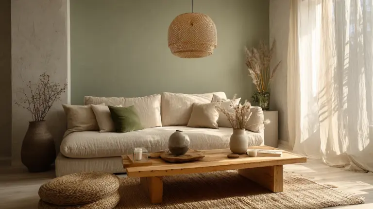
There’s something profoundly comforting about a living room that shifts with the seasons. The way light filters through your windows in March feels entirely different from the golden glow of October evenings. Your space should breathe with those changes, wrapping you in colors that reflect the rhythm of nature outside.
Japandi design—that beautiful marriage of Japanese minimalism and Scandinavian hygge—thrives on this connection to the natural world. It’s not about dramatic transformations or costly renovations. It’s about subtle shifts in your Japandi color palette that honor each season’s unique mood and light.
Whether you’re curled up on a taupe sofa during monsoon season or welcoming spring’s soft awakening, the colors you choose shape how your home feels. They influence your calm, your energy, your sense of belonging in your own space.
Let’s explore how to create a living room that flows gracefully through every season, grounding you in beauty that feels both timeless and deeply responsive to the world around you.
Understanding the Core Japandi Color Palette
Before we dance through the seasons, let’s establish your foundation. The Japandi color scheme is rooted in neutral tones—think warm whites, soft beiges, gentle taupes, and that perfect greige that sits somewhere between grey and beige. These aren’t cold or sterile; they’re the color of morning mist, river stones, and raw linen.
Layer in earthy accents like sage green, terracotta, and muted charcoal. These hues echo the natural materials central to Japandi style: the grain of walnut wood, the cool touch of stone, the organic warmth of rattan. The philosophy of wabi-sabi celebrates imperfection and authenticity, which means your colors should feel lived-in, never overly polished.
The magic lies in balance. Light and dark dance together—off-white walls might host a deep forest green throw, or a cream sofa could be grounded by a charcoal wool rug. This interplay creates depth without chaos, sophistication without pretension.
Key Neutral Foundation Colors
Your base palette should include these versatile warm neutrals:
- Warm white (#FAF9F6): Not stark, but creamy and inviting
- Beige (#F5F5DC): The color of natural linen and sand
- Taupe (#B8A89A): Grounding, warm, endlessly adaptable
- Greige (#C7BDB5): The perfect middle ground for walls
- Light grey (#D3D3D3): Cool yet soft, ideal for contrast
Spring Japandi Living Room Palette: Earthy Awakening
Spring in a Japandi living room feels like opening windows after a long winter. The air changes, and so should your space. This season calls for soft sage green, light cream, and the palest hints of pastel pink—colors that whisper rather than shout.
Imagine monsoon mist (#E8EBE4), that barely-there grey-green that captures humid mornings in Calabarzon. Pair it with kelp (#B5AA96), a soft greenish-beige that brings the outdoors in without overwhelming your senses. These muted hues create a backdrop that feels fresh yet grounded.
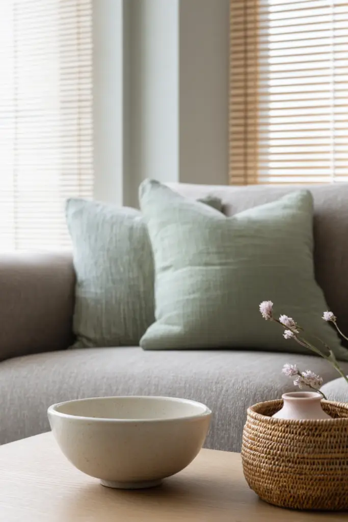
For accent pieces, consider a throw pillow in dusty sage (#A8CABA) or a ceramic vase in cream (#FFFDD0). The light in spring is softer, more diffused—especially during rainy season—so these colors help brighten spaces without harsh contrast.
Spring Color Combinations
| Color Name | HEX Code | Best Used For | Season Mood |
|---|---|---|---|
| Monsoon Mist | #E8EBE4 | Walls, large textiles | Fresh, airy |
| Soft Sage | #A8CABA | Accent pillows, plants | Growth, renewal |
| Light Cream | #FFFDD0 | Furniture, curtains | Gentle brightness |
| Kelp | #B5AA96 | Wood tones, rugs | Earthy stability |
| Pale Blush | #F4E4E0 | Ceramics, artwork | Subtle warmth |
Spring Styling Tips
Bring in natural materials like bamboo blinds that filter the strong tropical sun. Swap heavy winter textiles for lightweight linen throws in cream or pale sage. If you’re working with north-facing rooms common in Philippine homes, these lighter tones help combat the lower natural light.
Add living greenery—not just for aesthetics, but to improve air quality during humid months. A fiddle leaf fig in a natural clay pot or trailing pothos in a cream ceramic planter reinforces the season’s gentle energy. The green acts as your primary accent color, supported by your neutral base.
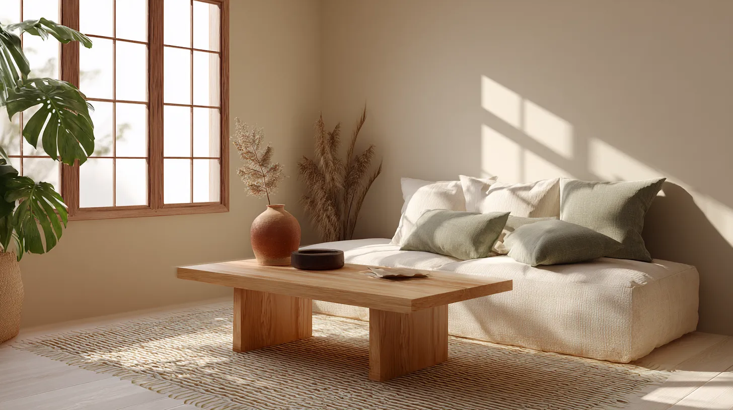
For multifunctional furniture, choose pieces in light oak or ash that won’t visually weigh down the room. A low-profile coffee table in natural wood finish paired with floor cushions in monsoon mist creates flexible seating that feels appropriate for the season’s informal, fresh mood.
Summer Japandi Palette: Sun-Bleached Serenity
Summer demands restraint. When the heat rises and light becomes intense, your Japandi living room should feel like a cool refuge. Think sun-bleached driftwood, sandy beaches at dawn, the pale interior of a seashell.
Your base stays light: off-white (#FAF0E6) for walls, ivory (#FFFFF0) for larger furniture pieces. But summer is where you can introduce slightly warmer earthy tones—a touch of terracotta (#D4735E) in a single accent chair, or mustard yellow (#DFAF2C) in a single throw pillow. Just one or two warm notes against your cool foundation.
The key is keeping 80% of your palette in the cool-to-neutral range. Too much warmth makes a space feel hotter. Instead, lean into light grey textiles, white oak furniture, and perhaps a pale blue-grey (#C4D4DA) that echoes morning sky before the heat sets in.
Summer Material Choices
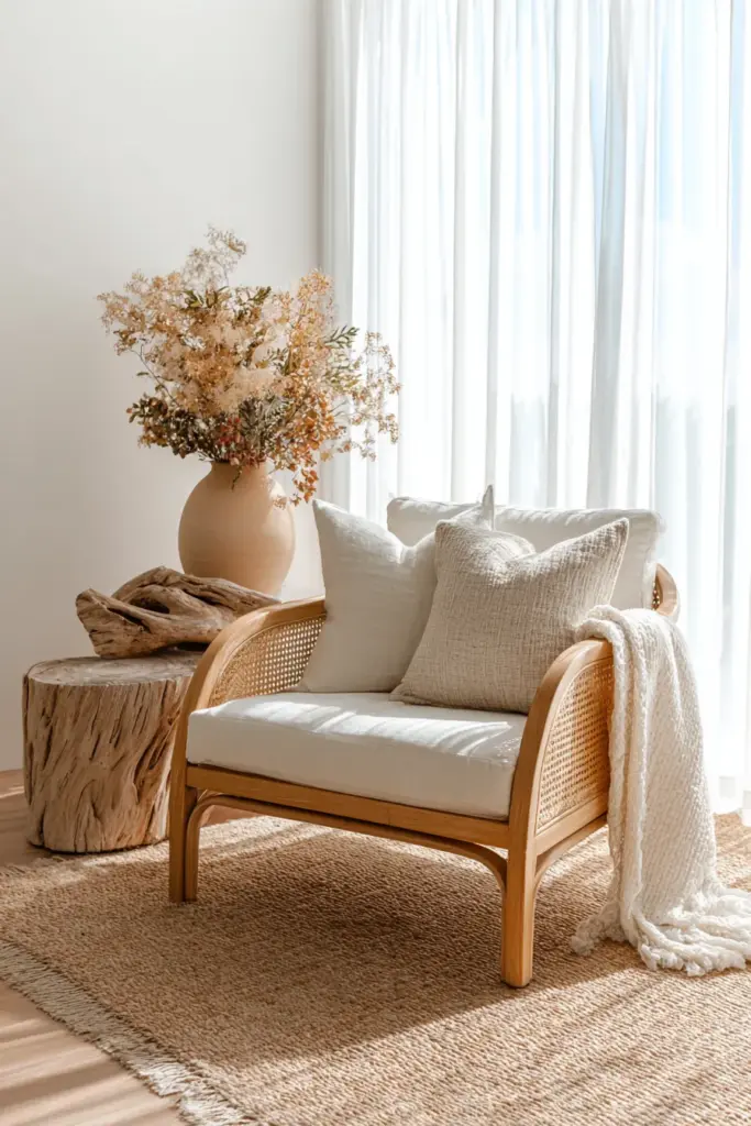
Natural rattan furniture shines in summer. Its airy, woven texture doesn’t trap heat visually or physically. A rattan lounge chair with cream cushions becomes your retreat. Pair it with a jute rug in natural fiber tones—the texture adds interest while the color stays beautifully neutral.
Replace heavy wool with cotton and linen. A linen sofa cover in off-white or the palest taupe breathes with you. Sheer curtains in ivory allow light to filter through without the harsh glare, creating that signature Japandi glow.
Consider how colors interact with tropical humidity. Humidity-resistant paints in your chosen palette prevent mildew and maintain that fresh, clean look essential to the aesthetic. In Silang and other Calabarzon areas, this practical consideration keeps your seasonal refresh looking beautiful for months.
Summer Accent Strategy
| Primary Base (80%) | Warm Accents (15%) | Cool Accents (5%) |
|---|---|---|
| Off-white, Ivory, Light grey | Terracotta, Warm beige | Pale blue-grey, Soft white |
| Purpose: Cool foundation | Purpose: Grounding warmth | Purpose: Sky connection |
Autumn Japandi Living Room: Earth Tones & Warmth
Autumn is Japandi’s most generous season for color. As days shorten and temperature drops slightly, your living room can embrace richer earth tones while staying true to the style’s muted sophistication.
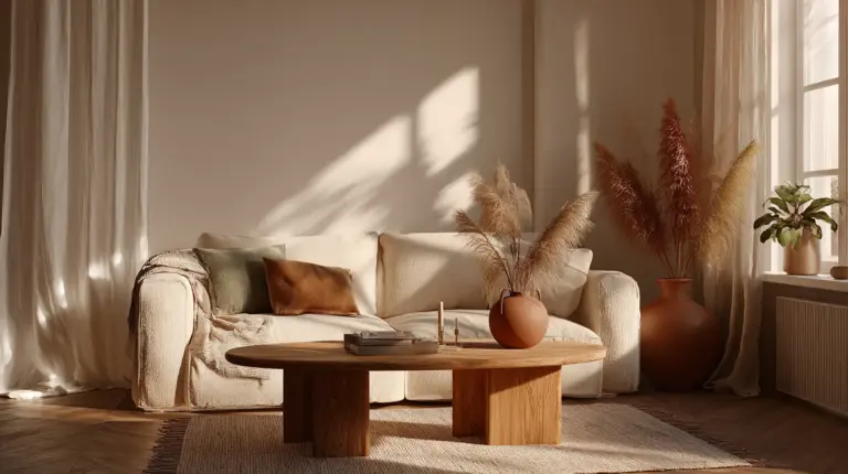
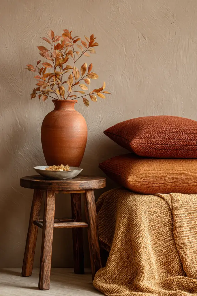
Mustard yellow (#DFAF2C) becomes a featured player—not loud or bright, but the soft yellow of dried leaves. Burnt reds (#B85C5C) and rust (#B7410E) appear in textiles and pottery. These aren’t the saturated oranges of Halloween; they’re the colors of terra cotta clay, autumn persimmons, and aged brick.
Your neutral base shifts slightly warmer. Instead of cool greys, lean into warm browns like walnut (#6B4423) for furniture or decorative objects. Taupe deepens to something more substantial. Even your whites might take on a creamier, more buttery quality (#FFF8DC).
Autumn Layering Technique
This is the season for layering textures in harmonious tones. A taupe linen sofa gains depth with throws in rust and mustard. Add cushions in various earth tones—one in burnt sienna, another in deep sage, a third in cream with subtle geometric patterns.
The Japanese concept of wabi-sabi truly shines in autumn palettes. These colors celebrate natural aging and patina. A vintage leather ottoman in cognac brown, a hand-thrown ceramic bowl with irregular glaze in ochre tones—imperfection becomes beauty.
Lighting matters enormously. As natural daylight decreases, warm up your space with 2700K LED bulbs that enhance rather than wash out your autumn palette. The right lighting temperature makes taupe feel cozy rather than drab, and brings mustard accents to gentle life.
Autumn Color Psychology
Studies in hygge principles suggest that taupe and warm browns boost feelings of calm by approximately 25%. These grounded colors quite literally ground you—connecting you to earth and creating psychological safety. In a world that speeds up, your autumn living room becomes sanctuary.
For Philippine homes where “autumn” might mean the start of cooler, drier months, these colors work beautifully with the climate shift. They provide warmth without heaviness, especially effective as evening temperatures drop and you’re spending more time indoors.
Featured Autumn Combinations
- Harvest Glow: Walnut wood + Mustard yellow + Cream + Rust accents
- Forest Floor: Deep taupe + Sage green + Burnt sienna + Off-white
- Cozy Minimal: Warm beige walls + Cognac leather + Ivory textiles + Charcoal details
Winter Japandi Colors: Cozy Minimalism
Winter in Japandi style isn’t about bright red and green. It’s about creating winter coziness through deeper neutrals, subtle navy touches, and the perfect balance of light and dark that makes a room feel like a warm embrace.
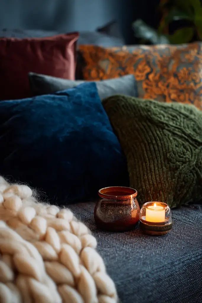
Your palette goes moody but never dark. Navy blue (#1B2845) might appear in a single accent—throw pillows, a wool blanket, or artwork. Forest green (#2C5F3E) in a deeper shade than spring’s sage. Burgundy (#800020) used sparingly in a single decorative piece. These rich tones anchor the space without overwhelming it.
But the majority of your room stays in sophisticated neutrals. Brindle (#9B8B7E), that soft brown-grey, creates warmth without heaviness. Pair it with the coolness of light grey marble or stone accessories. The contrast—warm and cool, light and dark—defines winter Japandi.
Winter Textile Strategy
This is the season to bring out thicker, more tactile fabrics. A chunky knit throw in cream or oatmeal color (#E4DCC6) draped over your sofa. Wool area rugs in charcoal grey with subtle geometric patterns. Velvet cushions in muted burgundy or deep forest green add luxury without flash.
Hygge principles guide winter styling—it’s about touch as much as sight. Soft, warm, inviting textures in restrained colors create spaces that beg you to curl up and stay awhile. The Scandinavian DNA in Japandi design truly shows itself here.
For tropical climates like Silang, winter might mean slightly cooler evenings and increased rainfall. Monsoon-proof colors—those deeper, richer tones that don’t show moisture or staining—become practical as well as beautiful. Consider easy-to-clean performance fabrics in your chosen winter palette.
Winter Lighting & Warmth
Embrace warmer artificial lighting. 2700K bulbs create golden pools of light that make navy look sophisticated rather than stark, and help burgundy accents glow gently. Layer your lighting—floor lamps with warm fabric shades, table lamps with wooden bases, perhaps string lights with warm white bulbs draped subtly for ambiance.
Candles become functional décor. Choose unscented or subtly scented options in natural wax, housed in simple ceramic or concrete holders in grey or white. The flickering light adds movement and warmth to your winter color scheme.
Winter Palette Table
| Color Category | Color Names | HEX Codes | Application Tips |
|---|---|---|---|
| Deep Neutrals | Brindle, Charcoal, Warm taupe | #9B8B7E, #36454F, #B38B6D | Rugs, large furniture, walls |
| Cool Accents | Navy blue, Forest green | #1B2845, #2C5F3E | Pillows, throws, minimal use |
| Warm Accents | Burgundy, Rust | #800020, #B7410E | Single pieces, artwork |
| Light Balance | Cream, Oatmeal, Soft white | #FFFDD0, #E4DCC6, #F8F8FF | Textiles, balance darkness |
Adapting Seasonal Palettes for Philippine Climate
Living in Calabarzon or other tropical regions means your “seasons” look different from classic four-season climates. But you can absolutely embrace seasonal Japandi color shifts based on your local weather patterns.
Dry season (typically November-May) corresponds to your “summer” and “spring” palettes—lighter, airier colors that reflect the intense sun and warmer temperatures. Wet season (June-October) aligns with “autumn” and “winter” palettes—those richer, grounding tones that feel cozy when rain drums on your roof.
Monsoon-Proof Color Choices
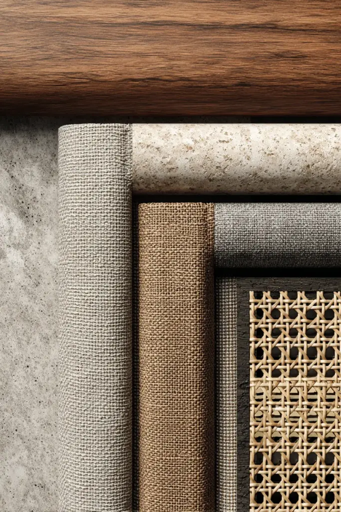
Choose humidity-resistant paints and finishes. Brands like Nippon offer dupes for premium colors that withstand tropical moisture. Sage green in matte finish resists mildew better than glossy options. Taupe and greige are forgiving—they don’t show water spots or humidity staining the way pure white might.
For furniture, consider treated natural materials. Sealed walnut wood, powder-coated metal frames, treated rattan that won’t warp. Your color choices remain authentic to Japandi while your material choices acknowledge your climate reality.
Low-light spaces—common in homes with smaller windows or northern exposure—benefit from lighter palettes year-round. If your living room doesn’t get strong natural light, stick closer to cream, light grey, and soft beige even during “winter” months. Add depth through texture rather than darker colors.
Budget-Friendly Seasonal Transitions
You don’t need to repaint walls or buy new furniture with each season. Smart, budget-conscious transitions focus on textiles and accessories:
$50 DIY Seasonal Refresh:
- Two new throw pillow covers (₱800 each)
- One lightweight throw blanket (₱1,500)
- Small ceramic vase or planter (₱500)
- New candles or natural décor items (₱500)
$500 Professional Update:
- Full set of seasonal cushions (₱5,000)
- Area rug in seasonal palette (₱8,000)
- Larger furniture piece like ottoman or side table (₱12,000)
- Professional paint refresh for one accent wall (₱5,000)
Color Quiz: Find Your Seasonal Starting Point
Question 1: Does your living room get direct afternoon sun?
- Yes → Start with summer’s cooler palette as your base
- No → Spring/autumn’s mid-tones work year-round
Question 2: Do you prefer warm or cool undertones?
- Warm → Lean toward beige, taupe, mustard, rust
- Cool → Emphasize grey, sage, navy, soft blue-grey
Question 3: How much color are you comfortable with?
- Minimal → Stick to neutrals, vary by shade depth seasonally
- Moderate → Add one or two accent colors per season
- Bold (within Japandi) → Feature three coordinated accent colors
Seasonal Japandi Color Checklist
Use this guide when planning your seasonal refresh:
Foundation (stays consistent year-round):
- Base wall color in warm white, greige, or light taupe
- Main furniture in natural wood tones or neutral upholstery
- Area rug in versatile neutral (can be layered over seasonally)
Spring Updates:
- Swap to sage green, pale blush, or kelp accents
- Bring in fresh plants and botanical prints
- Choose lightweight linen or cotton textiles
- Add ceramic pieces in cream or soft green
Summer Adjustments:
- Lighten everything—off-white, ivory, palest grey
- Minimal warm accents (one terracotta piece maximum)
- Maximize natural light with sheer curtains
- Incorporate rattan and natural fiber textures
Autumn Transitions:
- Layer in mustard, rust, burnt sienna accents
- Introduce warmer wood tones and leather
- Swap to heavier textiles in earth tones
- Add depth with varied textures in similar hues
Winter Coziness:
- Bring in navy, forest green, burgundy (sparingly)
- Focus on soft, touchable fabrics in deeper neutrals
- Warm up lighting with 2700K bulbs
- Layer throws and cushions in rich but muted tones
Climate Considerations:
- Choose humidity-resistant finishes for tropical climates
- Adapt “seasons” to local wet/dry patterns
- Prioritize pet and kid-proof materials if needed
- Consider resale value—neutrals appeal universally
The Art of Transitioning Between Seasons
The shift from one seasonal palette to another shouldn’t feel jarring. Japandi design values gradual, mindful change. As one season ends, begin introducing hints of the next while gradually packing away the previous season’s most distinctive pieces.
Late summer to early autumn: Keep your light base but start introducing one mustard or rust accent. Maybe a single cushion or a small decorative bowl. Let the transition be gentle, like the weather itself shifts gradually.
Winter to spring: Before you pack away all the deep tones, lighten your textiles first. Swap navy throws for sage green ones while keeping your deeper wood tones. Add fresh plants before you fully commit to pastels.
This gradual approach also respects your budget. You’re not buying an entirely new room four times a year—you’re thoughtfully evolving your space with intention and awareness.
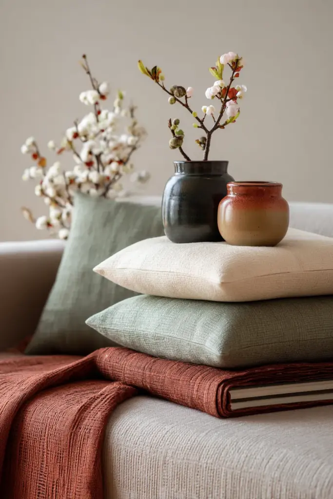
Sustainable Japandi Color Transitions
Upcycling perfectly aligns with wabi-sabi principles. That navy cushion from winter? Overdye it sage green for spring. The mustard throw from autumn? Fold it away and bring it back next year—quality pieces in true Japandi style last for years.
Consider a core neutral capsule of furniture and large pieces that work year-round, then rotate smaller, less expensive accessories seasonally. This approach reduces waste, saves money, and keeps you from the exhausting cycle of constant purchasing.
Shop secondhand for vintage pieces in your seasonal colors. A terracotta pottery piece from a thrift store carries more soul than mass-produced décor. The slight imperfections and history align beautifully with Japanese aesthetic philosophy.
Looking Ahead: 2026 Color Trends in Japandi Design
While Japandi remains rooted in timeless neutrals, subtle trends emerge that keep the style fresh. For 2026, watch for bio-luminescent accents—not actual glowing paint, but colors inspired by bioluminescence like soft aqua-grey and pale seafoam incorporated as minor accents.
Deeper embrace of imperfect colors is rising—hand-mixed paint shades that aren’t quite uniform, natural dyes that fade beautifully over time. This honors wabi-sabi even further, celebrating the unique character of handcrafted color.
More integration of natural color shifts—fabrics that intentionally change with sun exposure, wood that deepens with age. Rather than fighting these natural processes, 2026 Japandi celebrates them as part of a room’s living story.
Creating Your Personal Seasonal Color Story
The beauty of seasonal Japandi colors lies in personal interpretation. Your living room should reflect your life, your climate, your daily rhythms. Use these palettes as foundation, then adjust based on what brings you peace.
Maybe you’re drawn to slightly cooler tones year-round. Perhaps you want more color than traditional Japandi suggests. These guidelines aren’t rules—they’re starting points for creating a space that supports how you want to feel.
Pay attention to how different colors affect your mood in your specific space. That sage green that looks serene in photos might feel dull in your north-facing room. Trust your response. Japandi design ultimately serves life, not the other way around.
Document your journey. Take photos of your space through the seasons. Notice what works, what doesn’t, how light changes throughout the year. This awareness deepens your connection to your home and refines your ability to create spaces that truly nurture you.
Bringing It All Together
Seasonal Japandi living room colors aren’t about following rigid rules or achieving magazine-perfect rooms. They’re about creating a home that breathes with you through the year—lighter when you need airiness, richer when you crave comfort, always grounded in the natural materials and muted sophistication that define this beautiful design philosophy.
Your living room becomes a reflection of time’s passage, nature’s rhythms, and your own evolving needs for sanctuary and beauty. The colors you choose—whether monsoon mist in spring or brindle in winter—shape not just how your room looks, but how it feels to come home at the end of each day.
Start small. Choose one season’s palette and try it. Notice what changes. Let your space teach you what it needs, season by season, year by year.
Frequently Asked Questions
What colors are used in Japandi design?
Japandi design centers on warm neutrals like beige, taupe, and greige, complemented by muted earth tones such as sage green, terracotta, and soft charcoal. The palette includes lots of warm white, light grey, and natural wood tones from oak to walnut. Accent colors stay soft and nature-inspired—dusty pink, rust, mustard yellow, navy blue—always used sparingly to maintain the style’s calm sophistication.
What is the best color for a Japandi living room?
The best foundational color is greige or warm taupe for walls, as it provides a versatile, warm-yet-neutral backdrop that works across all seasons. For furniture, natural wood tones in light oak or walnut create authentic Japandi style. These bases allow you to shift seasonal accents easily while maintaining the room’s essential calm character. If choosing a single color for maximum impact, soft sage green works beautifully year-round in tropical climates.
How do I adapt Japandi colors for tropical Philippine weather?
Focus on humidity-resistant paint finishes in your chosen palette, especially for monsoon season. During dry months (November-May), embrace lighter colors like off-white and pale sage. In wet season (June-October), shift to slightly richer tones like warm taupe and soft rust that forgive moisture and feel cozy during rains. Choose sealed natural materials and washable textiles. Prioritize ventilation and natural airflow, which lighter color schemes visually enhance.
Can I use Japandi colors in a small, low-light living room?
Absolutely—lighter Japandi colors actually help small, dim spaces feel larger and brighter. Stick with warm white, light beige, and soft grey as your base. Add warmth through 2700K LED lighting rather than darker paint colors. Use mirrors with natural wood frames to reflect available light. Keep to the lighter end of seasonal palettes year-round, adding depth through varied textures in similar tones rather than darker colors.
What’s the difference between Japandi and Scandinavian color palettes?
While both use neutrals extensively, Japandi incorporates warmer, earthier tones inspired by Japanese wabi-sabi philosophy—think walnut wood, terracotta clay, and muted greens. Scandinavian design often skews cooler with more pure whites and light greys. Japandi embraces imperfect, natural color variations and patina, while Scandinavian style traditionally favors cleaner, brighter finishes. Both prioritize nature, but Japandi interprets it through an earthier, slightly darker lens balanced with airy minimalism.