Table of Contents
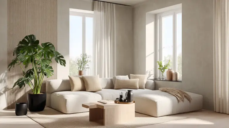
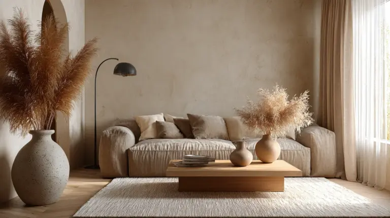
There’s something magical about walking into a small living room that breathes rather than gasps. Where every corner whispers calm instead of shouting clutter. This is the quiet promise of Japandi colors—a seamless marriage between Japanese minimalism and Scandinavian warmth that transforms even the tiniest spaces into sanctuaries of light and air.
If you’re navigating life in a compact apartment, especially in tropical climates like the Philippines, you already know the challenge. Limited square footage can feel stifling under harsh colors or too-dark tones. But the Japandi color palette offers something rare: colors that expand your walls, soften your mood, and invite natural light to linger longer.
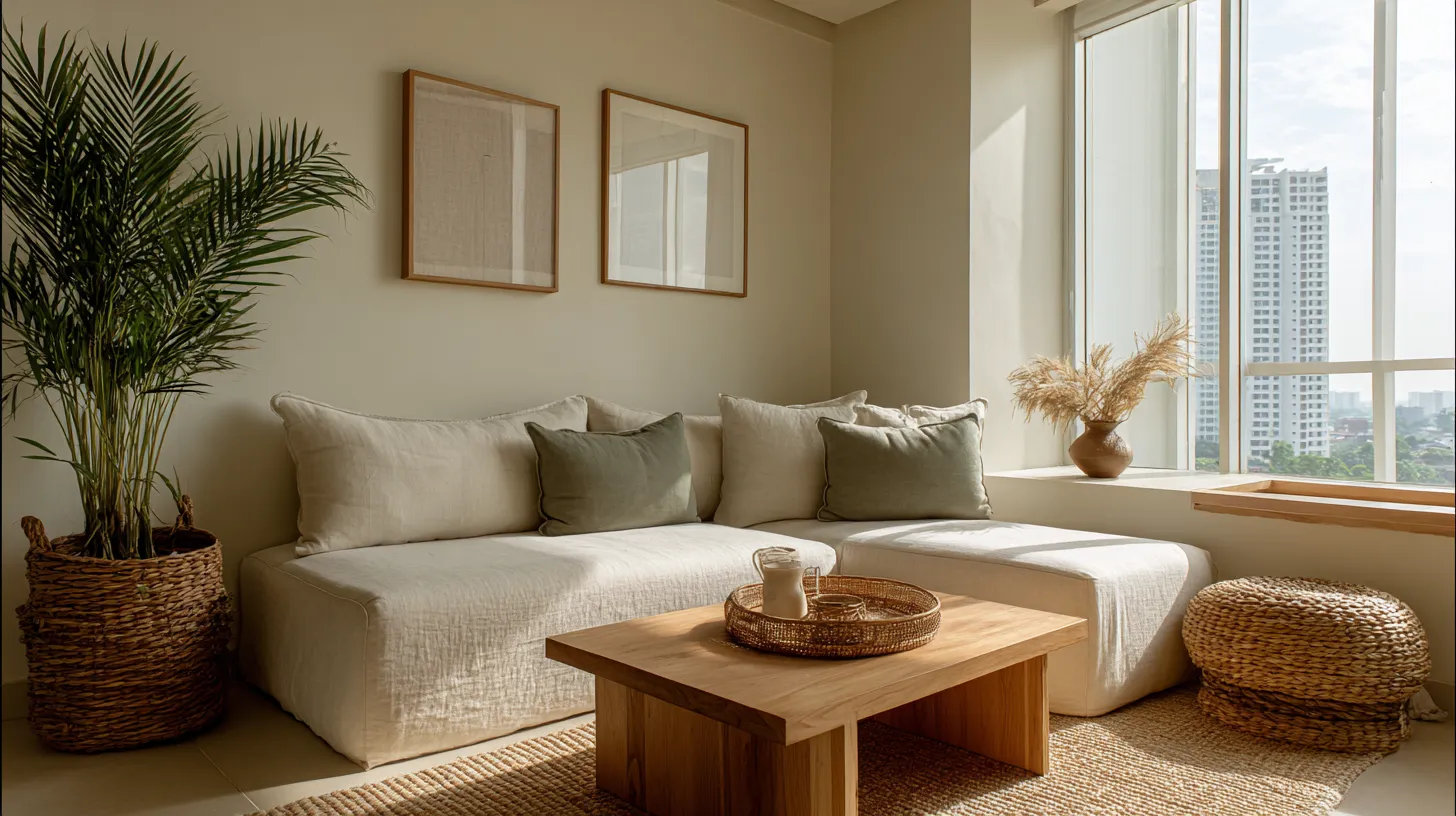
In this guide, we’ll explore how to curate a Japandi color scheme specifically for small living rooms—from choosing the perfect greige for your walls to layering textures that add depth without visual weight. Whether you’re working with a 15-square-meter condo in Manila or a cozy townhouse in Silang, these principles will help you create a space that feels twice its size and infinitely more peaceful.
Let’s begin where all good design starts: with color as a gentle guide, not a loud demand.
Understanding the Japandi Color Philosophy
The Soul of Neutral Harmony
Japandi colors aren’t just aesthetically pleasing—they’re philosophically rooted in wabi-sabi (embracing imperfection) and hygge (cultivating coziness). The palette revolves around earthy neutrals that mimic nature’s quietest moments: the pale gray of morning mist, the warm beige of sun-bleached linen, the soft green of moss after rain.
These colors work by receding rather than advancing. In small spaces, this optical trick is everything. A room painted in warm greige (that perfect blend of gray and beige) feels open and uninterrupted, allowing your eye to travel freely rather than bumping against visual barriers.
Core Japandi Colors for Compact Rooms
The foundation of any Japandi small living room includes:
- Soft whites and off-whites (#F8F6F0, #FAF9F6) – These expand walls and reflect precious natural light
- Greige tones (#D2C4A8, #C8B8A0) – Warm enough for comfort, neutral enough for calm
- Taupe and sand (#B09A84, #D4C4B0) – Earthy mid-tones that ground the space
- Charcoal and slate (#4A4A4A, #6B6B6B) – Used sparingly as anchoring accents
- Muted greens (#A8B5A0, #B8C5B0) – Sage and moss tones that bring nature indoors
- Natural wood tones – Blonde oak, ash, or light teak for warmth
Notice what’s missing: no stark whites that glare in tropical sunlight, no bright accent walls that shrink rooms, no trendy colors that date quickly.
Choosing Your Base Wall Color
The 60-30-10 Rule for Small Spaces
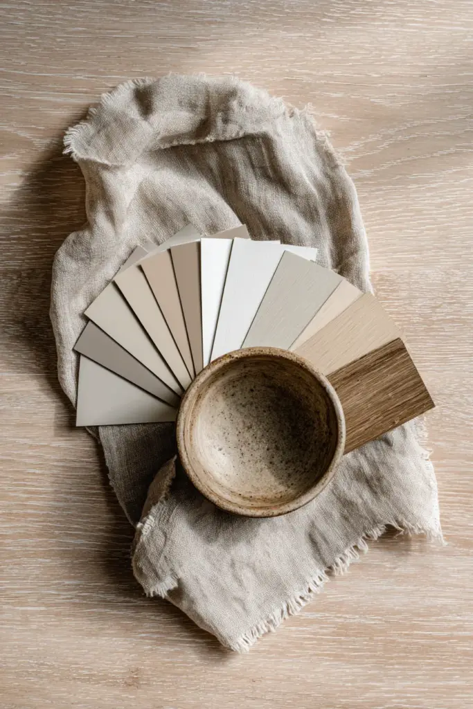
In a cramped living room, your wall color does 70% of the spatial heavy lifting. Choose a color that sits between white and beige—what designers call “greige”—and watch your walls seemingly step backward.
For Philippine homes dealing with humidity, opt for mold-resistant paint formulations in these shades. Brands available locally often carry “warm gray” or “natural linen” that translate beautifully to the Japandi aesthetic. The key is testing swatches in your actual lighting—what looks perfect in the hardware store might read too pink or too yellow once you’re home.
Temperature Matters in Tropical Climates
If your living room faces north and stays cooler, lean into warmer greiges with beige undertones (#DDD5C7). For sun-drenched western exposures that heat up by afternoon, choose cooler taupes with subtle gray undertones (#C9C0B8) to psychologically cool the space.
This isn’t just about aesthetics—color temperature affects how we perceive room size and comfort. Warm neutrals make small spaces feel cozy but can be overwhelming in already-hot rooms. Cool neutrals expand visually but risk feeling sterile without proper layering.
Layering Secondary and Accent Colors
Creating Depth Without Visual Weight
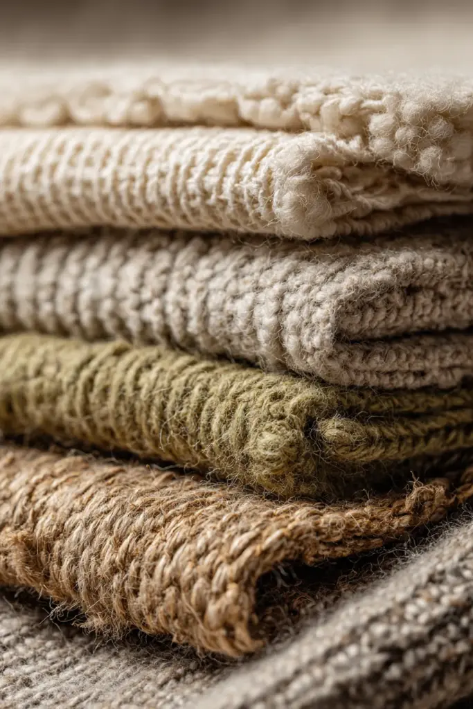
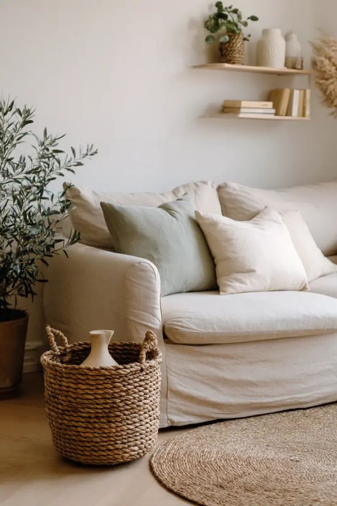
Once your walls establish calm, introduce secondary colors through larger furniture pieces. A natural linen sofa in oatmeal (#E8DCC8), a rattan accent chair in honey tones, or a low-profile coffee table in ash wood—these pieces add color variation while maintaining the neutral flow.
The magic happens when you layer textures in similar tones. A greige wall behind a taupe sofa topped with cream cushions and a sand-colored throw creates incredible depth. Your eye registers dimension and interest, but the cohesive color story prevents the cluttered feeling that plagued your space before.
Strategic Accent Moments
Japandi style uses accent colors like punctuation marks—sparingly but powerfully. In a small living room, limit yourself to one or two accent tones:
- Sage green in throw pillows or a single statement plant
- Charcoal in picture frames, light fixtures, or a minimalist side table
- Terracotta in a handmade ceramic vase or single textile piece
- Deep indigo in a small floor cushion or art piece
These accents should comprise no more than 10% of your visual field. Think of them as whispers that draw the eye to specific areas, creating focal points that guide movement through your small space.
Furniture and Material Choices
Multi-Functional Pieces in Neutral Palettes
Small living rooms demand furniture that works twice as hard. A storage ottoman in natural linen serves as seating, a coffee table, and hidden storage—all while maintaining the calm color palette. A wall-mounted shelf system in light oak provides display space without eating floor area.
Choose furniture in the same color family as your walls but in different materials. If your walls are greige paint, select a sofa in greige linen, add a greige wool rug, and layer greige cotton cushions. The varied textures create interest while the unified color scheme expands the perceived space.
Natural Materials as Color Contributors
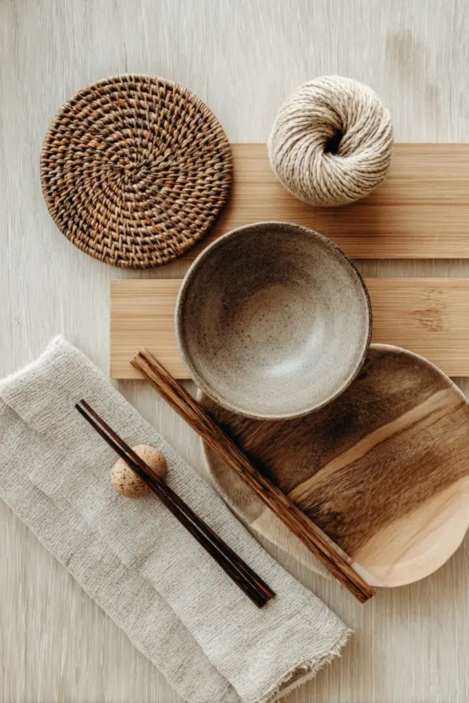
In Japandi design, materials are the color story. Consider:
- Rattan and wicker – Honey and caramel tones that add warmth
- Light wood – Ash, oak, and bamboo in blonde finishes
- Linen and cotton – Undyed natural fabrics in cream and oatmeal
- Wool and jute – Textured neutrals for rugs and throws
- Ceramic and stoneware – Matte finishes in earth tones
These materials thrive in humid Philippine climates better than synthetics. Rattan actually improves with moisture, while natural fibers allow airflow that synthetic fabrics block.
Lighting as a Color Tool
Maximizing Natural Light
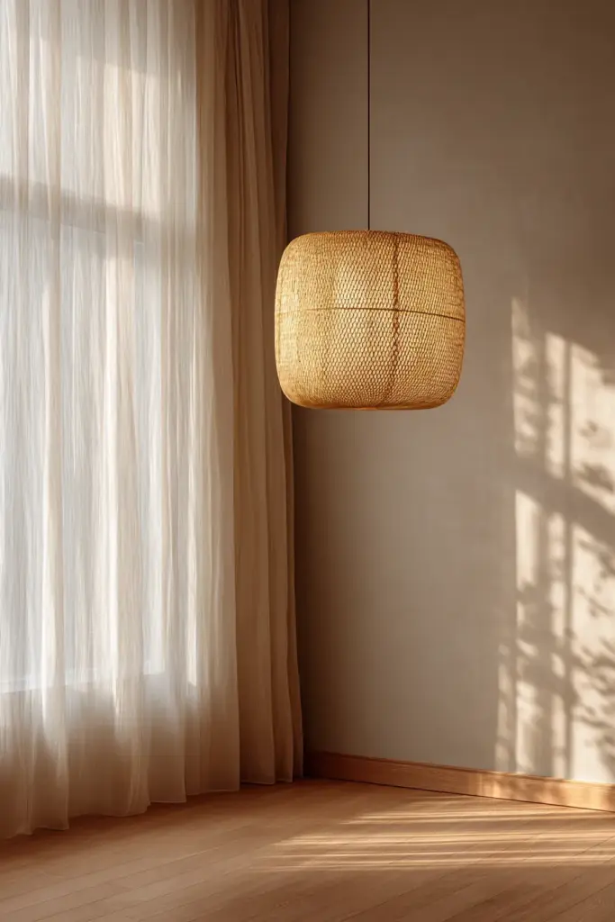
In small spaces, light is your most powerful color. Japandi interiors worship natural light, so start by removing heavy curtains that block precious rays. Replace them with sheer linen panels in cream or soft white that diffuse harsh tropical sun while maintaining privacy.
If your living room has limited windows, use mirrors strategically to bounce light into dark corners. A large mirror with a simple wood frame placed opposite your window effectively doubles your natural light and makes the room feel significantly larger.
Artificial Lighting That Mimics Nature
For evening hours, layer your lighting with warm LED bulbs (2700-3000K) that cast the same glow as afternoon sunlight. Avoid cool white bulbs that make neutral colors look gray and uninviting.
Install dimmable fixtures so you can adjust intensity based on mood and time of day. A pendant light in natural rattan, wall sconces with linen shades, and a floor lamp with a ceramic base—all in neutral tones—provide functional lighting that reinforces your color scheme rather than competing with it.
Smart Lighting for Tiny Spaces
For budget-conscious Philippine homeowners, LED strip lighting under floating shelves or behind your TV console creates ambient glow that makes walls recede. Choose warm white LEDs that enhance your greige and taupe palette rather than washing it out.
Budget-Friendly Japandi Color Makeover
PHP 5,000 Starter Palette
You don’t need a complete renovation to achieve Japandi calm. Here’s a realistic budget breakdown for a 20-square-meter living room:
| Item | Estimated Cost (PHP) | Impact |
|---|---|---|
| Mold-resistant greige paint (2 gallons) | 1,500 | Transforms entire space |
| Cotton slipcover for existing sofa (beige/taupe) | 1,200 | Updates largest furniture piece |
| Jute or cotton rug (120x180cm) | 800 | Grounds the room |
| Linen cushion covers (4 pieces) | 600 | Adds texture layers |
| Rattan storage basket | 400 | Combines function and aesthetic |
| LED warm bulbs (4 pieces) | 300 | Improves color rendering |
| Thrifted ceramic pieces in neutral tones | 200 | Finishing touches |
| Total | 5,000 | Complete color refresh |
DIY Paint Recipes for Custom Neutrals
If you can’t find the perfect greige locally, create your own by mixing:
- Warm greige: 1 gallon off-white + 2 tablespoons raw umber + 1 tablespoon yellow ochre
- Cool taupe: 1 gallon soft gray + 1 tablespoon burnt umber
- Sage accent: 1 cup white + 1 teaspoon forest green + 1/2 teaspoon yellow
Always test on poster board first and observe in different lighting conditions before committing to walls.
Upcycling Furniture Into Japandi Style
Transform existing pieces with these budget-friendly techniques:
- Sand and refinish dark wood furniture with light oak stain
- Paint dated pieces in matte greige or soft white
- Replace colorful upholstery with neutral linen or cotton
- Remove ornate hardware and install simple brass or wood knobs
- Cover plastic surfaces with natural fiber contact paper
Color Psychology in Small Spaces
How Neutrals Affect Mood and Productivity
Research shows that greige tones can boost focus by up to 20% compared to stark white or bold colors. The visual rest provided by muted neutrals reduces cognitive load, making small living rooms feel like restorative retreats rather than cramped boxes.
Warm neutrals trigger the release of serotonin, the same hormone associated with sunlight and happiness. This is why Japandi living rooms feel inherently calming—the colors literally affect your brain chemistry.
Adapting Colors for Philippine Climate
In tropical humidity, colors can look different than in the temperate climates where Japandi originated. Scandinavian off-whites might appear dingy in our intense sunlight, while Japanese charcoals can feel oppressive in small, hot rooms.
Adjust by:
- Choosing greiges with less gray and more warm beige undertones
- Using lighter versions of traditional Japandi colors
- Incorporating more natural ventilation elements (rattan screens, open shelving)
- Selecting humidity-resistant materials that won’t yellow or mold
Essential Checklist for Japandi Color Success
Before you start your small living room transformation, ensure you have:
- Wall color tested in your actual lighting (morning, afternoon, evening)
- Color temperature confirmed – warm for north-facing, cool for sun-drenched
- 60-30-10 rule applied – 60% wall color, 30% furniture, 10% accents
- Natural materials sourced – rattan, wood, linen, jute, ceramic
- Lighting plan finalized – maximize natural light, layer warm artificial
- Multi-functional furniture identified – every piece should serve 2+ purposes
- Accent colors limited – choose 1-2 maximum for the entire space
- Budget allocated – prioritize paint and one statement furniture piece
- Mold-resistant products selected – crucial for Philippine humidity
- Texture variety planned – similar colors in different materials
Room Size Optimization Through Color
Visual Tricks for Expanding Space
The right Japandi colors can make a 15-square-meter room feel like 25. Here’s how:
Monochromatic walls and ceiling: Paint both in the same greige to eliminate visual boundaries. Where does the wall end and ceiling begin? Exactly—and that ambiguity expands perceived volume.
Lighter floors: If possible, choose light wood or pale jute rugs rather than dark surfaces that visually anchor and shrink the space.
Gradient effect: Use your darkest neutral (charcoal) lowest (rug, low furniture legs), mid-tones at eye level (sofa, cushions), and lightest neutrals highest (walls, ceiling). This mimics nature and feels spacious.
Dealing with Low Ceilings
Small Philippine apartments often have 2.4-meter ceilings that can feel crushing. Combat this with vertical color tricks:
- Paint the ceiling 2-3 shades lighter than walls
- Use floor-to-ceiling sheer curtains in cream
- Install tall, narrow shelving in light wood
- Choose low-profile furniture that creates more vertical breathing room
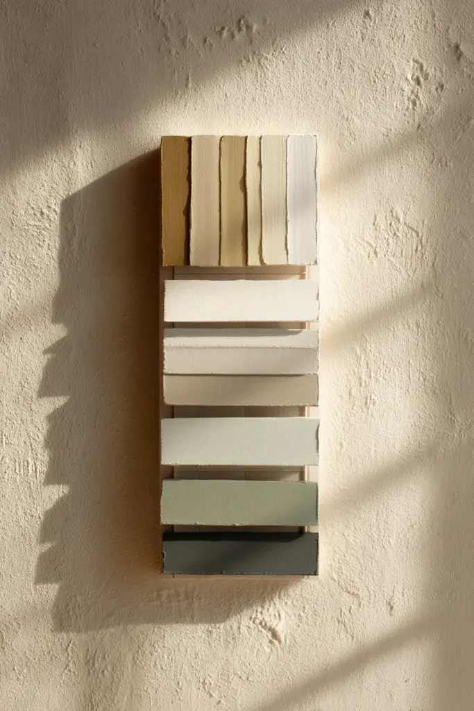
Japandi Color Palette Quick Reference
Primary Palette (Walls & Large Surfaces)
- Warm Greige: #D2C4A8 – Perfect for most rooms, expands space
- Cool Taupe: #C9C0B8 – Ideal for sun-drenched western exposures
- Soft White: #FAF9F6 – For maximum light reflection
- Sand Beige: #E8DCC8 – Cozy warmth without closing in
Secondary Palette (Furniture & Textiles)
- Oatmeal: #DDD5C7 – Sofas, chairs, large textiles
- Honey Rattan: #C8A882 – Natural furniture tones
- Ash Wood: #B8AFA0 – Coffee tables, shelving
- Natural Linen: #E5DDD0 – Cushions, throws, curtains
Accent Palette (10% of Space)
- Sage Green: #A8B5A0 – Plants, small textiles
- Charcoal: #4A4A4A – Frames, fixtures, anchoring pieces
- Terracotta: #D4957C – Single ceramic piece
- Soft Black: #2C2C2C – Minimal metal accents
Maintaining Your Japandi Color Scheme
Preventing Color Drift Over Time
Small spaces show dirt and discoloration faster than large rooms. Maintain your Japandi serenity by:
- Cleaning walls quarterly with gentle soap and water to prevent yellowing
- Rotating textiles seasonally to prevent sun fading
- Treating wood regularly with natural oils to maintain color
- Addressing mold immediately – humidity is the enemy of light colors
- Refreshing paint every 2-3 years in high-traffic small spaces
Seasonal Color Adjustments
While Japandi is timeless, small adjustments keep it fresh:
- Dry season (February-May): Introduce slightly cooler tones, add more whites
- Monsoon season (June-September): Layer warmer textiles, add cozy textures
- Cool months (November-January): Maximum warmth with rust and terracotta accents
These shifts require no repainting—just swapping throw pillows, blankets, and small decorative pieces.
Technology Integration in Neutral Spaces
Smart Home Elements That Don’t Break the Aesthetic
Modern small living rooms benefit from technology that disappears into the Japandi palette:
- Smart LED strips behind furniture that adjust color temperature throughout the day
- Wooden smart speakers (many brands now offer bamboo or walnut finishes)
- Neutral-toned smart thermostats for climate control
- Multi-functional IoT ottomans with hidden charging ports and storage
- Minimalist smart switches in matte black or brushed brass
Choose tech that serves function without visual clutter, and hide cords religiously—they’re the antithesis of Japandi calm.
Common Mistakes to Avoid
Color Pitfalls in Small Japandi Rooms
Even experienced decorators stumble. Watch for these errors:
Too much white: Stark white in tropical climates reflects glare and feels sterile. Always choose off-whites or greiges instead.
Mismatched undertones: Mixing warm and cool neutrals creates visual chaos. Test your colors together before committing.
Neglecting the ceiling: A forgotten white ceiling floating above greige walls looks disjointed. Paint it the same or slightly lighter than walls.
Over-accessorizing: Just because it’s neutral doesn’t mean you need more of it. Japandi is about restraint.
Ignoring texture: All-one-color without texture variation feels flat and depressing. Layer materials aggressively.
Wrong wood tones: Dark mahogany or cherry wood fights the light, airy Japandi vibe. Stick to blonde woods exclusively.
Frequently Asked Questions
What colors make a small living room look bigger in Japandi style?
Warm greige (#D2C4A8), soft taupe (#C9C0B8), and off-white (#FAF9F6) are the most effective at expanding small spaces. These colors reflect light without glare and create an uninterrupted visual flow that tricks the eye into perceiving more square footage. Pair them with light wood furniture and minimal accents for maximum spaciousness.
Can I add color to a Japandi small living room?
Yes, but sparingly. Japandi accommodates muted accent colors like sage green, soft terracotta, or dusty blue in amounts no greater than 10% of your space. Add these through single cushions, small ceramics, or artwork rather than large furniture pieces. The key is maintaining the neutral foundation while introducing gentle pops that feel organic rather than jarring.
How do I choose between warm and cool Japandi neutrals?
Consider your room’s light exposure and climate. For north-facing Philippine rooms that stay cooler, warm greiges with beige undertones add necessary coziness. For sun-drenched western exposures, cooler taupes with gray undertones provide visual relief from heat. Test paint swatches at different times of day—the right neutral will feel restful in both morning and afternoon light.
What’s the best budget-friendly way to start a Japandi color scheme?
Begin with wall paint in a mold-resistant greige (approximately PHP 1,500 for small rooms) and one neutral slipcover for your largest furniture piece (PHP 800-1,500). These two changes create 80% of the visual impact. Then gradually add natural texture through thrifted jute rugs, cotton cushions, and rattan baskets. You can achieve a complete Japandi transformation for under PHP 5,000 if you prioritize wisely.
Do Japandi colors work in Philippine tropical climate?
Absolutely, with smart adaptations. Choose lighter versions of traditional Japandi neutrals to counteract our intense sunlight. Opt for mold-resistant paint formulations essential for humidity. Replace synthetic textiles with natural fibers like cotton, linen, and rattan that breathe in tropical heat. Focus on colors with warm undertones since our strong sunlight can make cool grays look harsh. With these adjustments, Japandi colors thrive in Philippine homes.